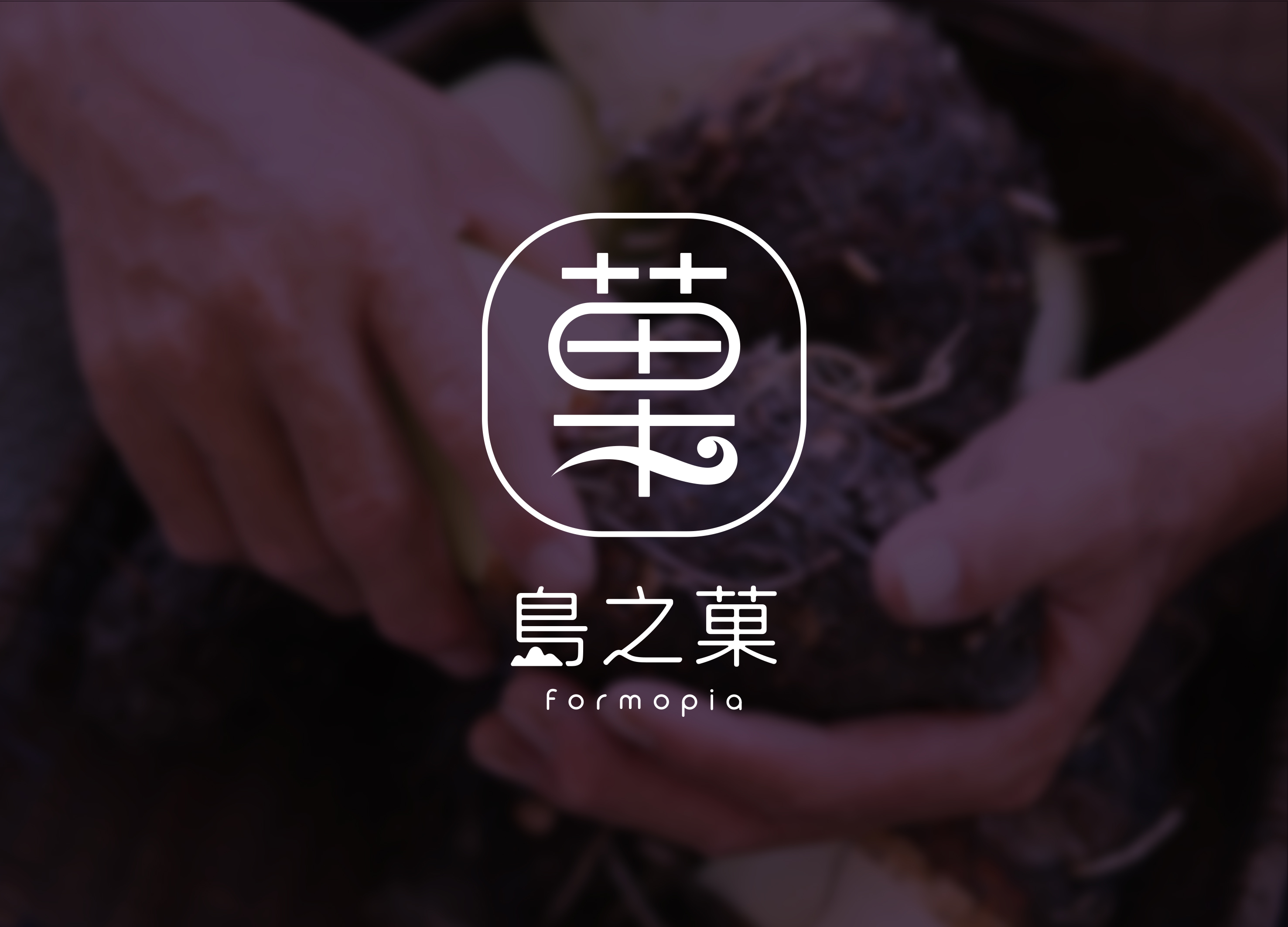
Formopia Brand Design
Communication
Area
Chinese Taipei
Year
2025
Award
WINNER
Client
ONONGS FOODS Co., Ltd.
Affiliation
HUNG JUI CHUN AND LIN CHUN CHANG
Designer
HUNG JUI CHUN, LIN CHUN CHANG, WU PEI NA
English
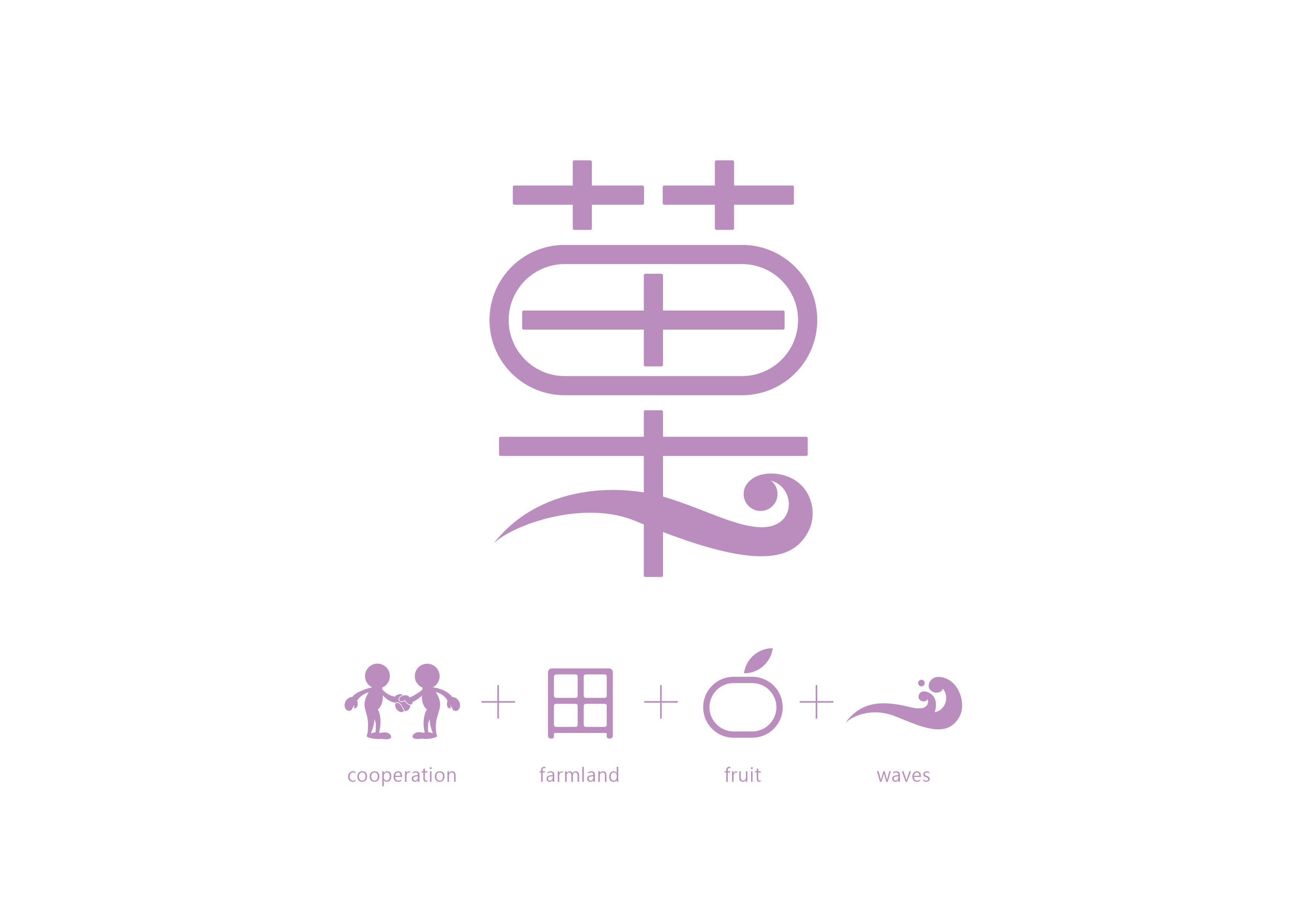
Formopia is Formosa with Topia, creating desserts exclusive to Taiwan via Taiwan’s agricultural products. It is a brand expecting to become a regional revitalization base for Taiwan. The logo is made of the elements: collaboration, garden, fruits, waves to form the word Dessert, the purple corresponds to the intention where the mother enterprise began with taro; pink and green brings cozy and natural images.
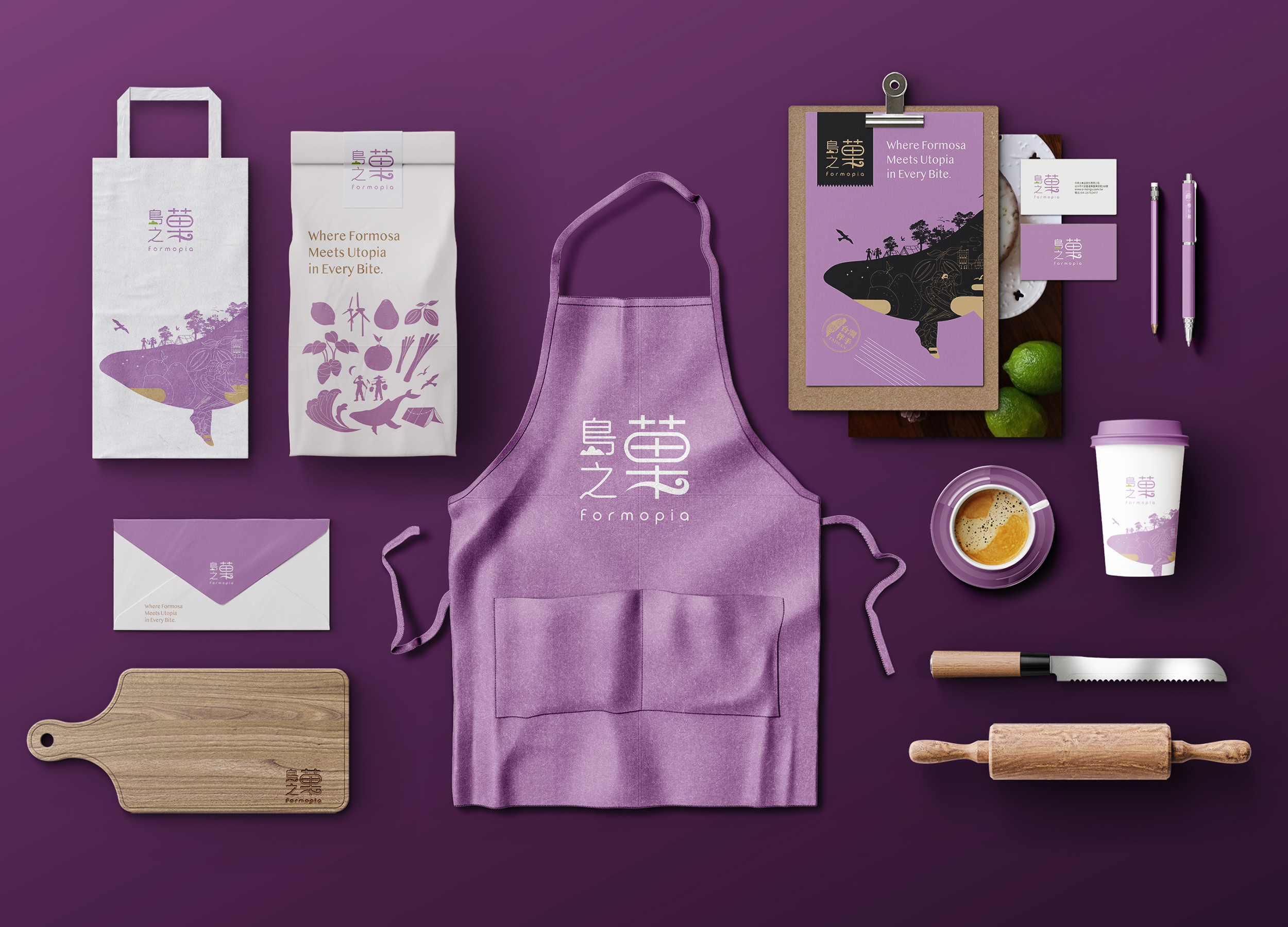
Extended items are based on the elements of island and fruits, conveying symbiotic relationship between people, island, and agricultural products via illustrations.
Native
因臺灣屬於海島,「島之菓」即為來自臺灣的菓物,透過臺灣的農產品,創作屬於臺灣的甜點;島也猶如平台,象徵品牌期待為地方農民與青年創造更多機會、彼此合作,一起為地方創生努力。
島之菓英文名「Formopia」,為臺灣別稱「Formosa」與烏托邦(utopia)的字根「Topia」之複合字,象徵臺灣為甜點的烏托邦,也呼應著島之菓的品牌理念:島之菓不僅為甜點品牌,更期許成為臺灣地方創生的復育基地。
Where Formosa Meets Utopia in Every Bite為品牌標語,如同品牌故事之縮寫,象徵在每一口甜點中都融合了臺灣農特產與對土地的愛,每一口都是對理想世界的期許。
品牌標誌以合作概念、田園、果實與象徵海島的海浪元素結合成「菓」字,搭配以轉折較為圓潤之黑體標準字,清楚呈現中英名稱。標準色以紫、粉、綠色為主,紫色呼應母企業以芋頭起家的初衷;粉色代表果實色彩及溫暖感受;綠色帶出地方創生理念,呈現自然及可靠形象。
因品牌發源地古有「海翁窟港」之名,故延伸品項以鯨魚比為島,在其中承載著農作物與果實,以品牌溫暖、自然的調性為底蘊,透過插畫呈現人、島嶼與農產品之共生關係,並傳達給消費者。
Judging Comments
Formopia has been recognized for its innovative approach to branding, seamlessly blending Taiwan’s rich agricultural heritage with a modern dessert experience. The logo, incorporating elements of collaboration, nature, and waves, visually embodies the brand’s mission to create Taiwan-exclusive desserts. The thoughtful color palette—purple for its taro origins, and pink and green for a natural, inviting feel—enhances brand recognition. Through island- and fruit-themed illustrations, Formopia effectively conveys a symbiotic relationship between people, land, and agriculture, positioning itself as a leader in regional revitalization and cultural branding.
Positive Comments


Hallucinogenic Mushrooms
Sejong University
Korea
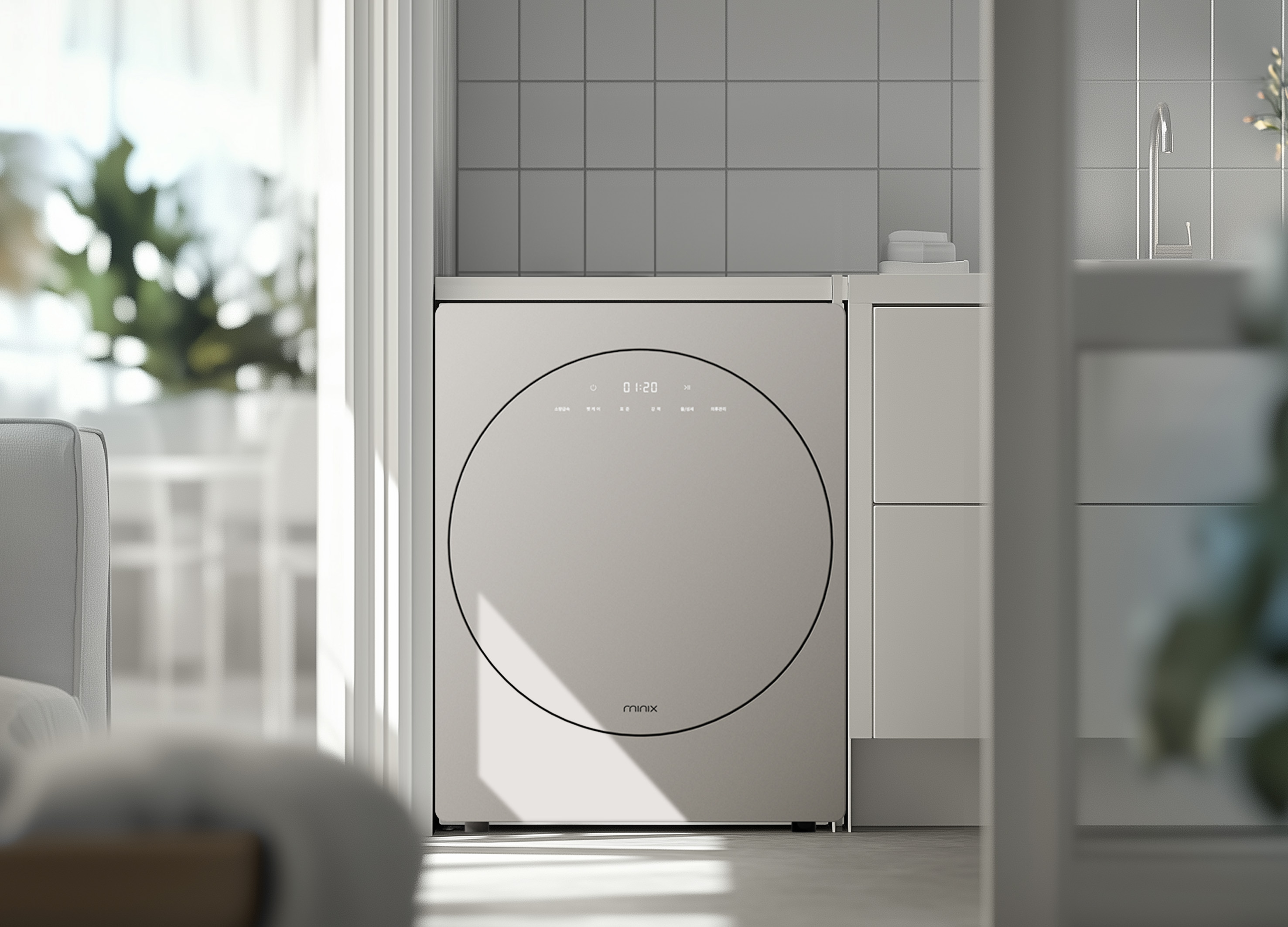
minix clothes dryer
Athome Corp.
Korea
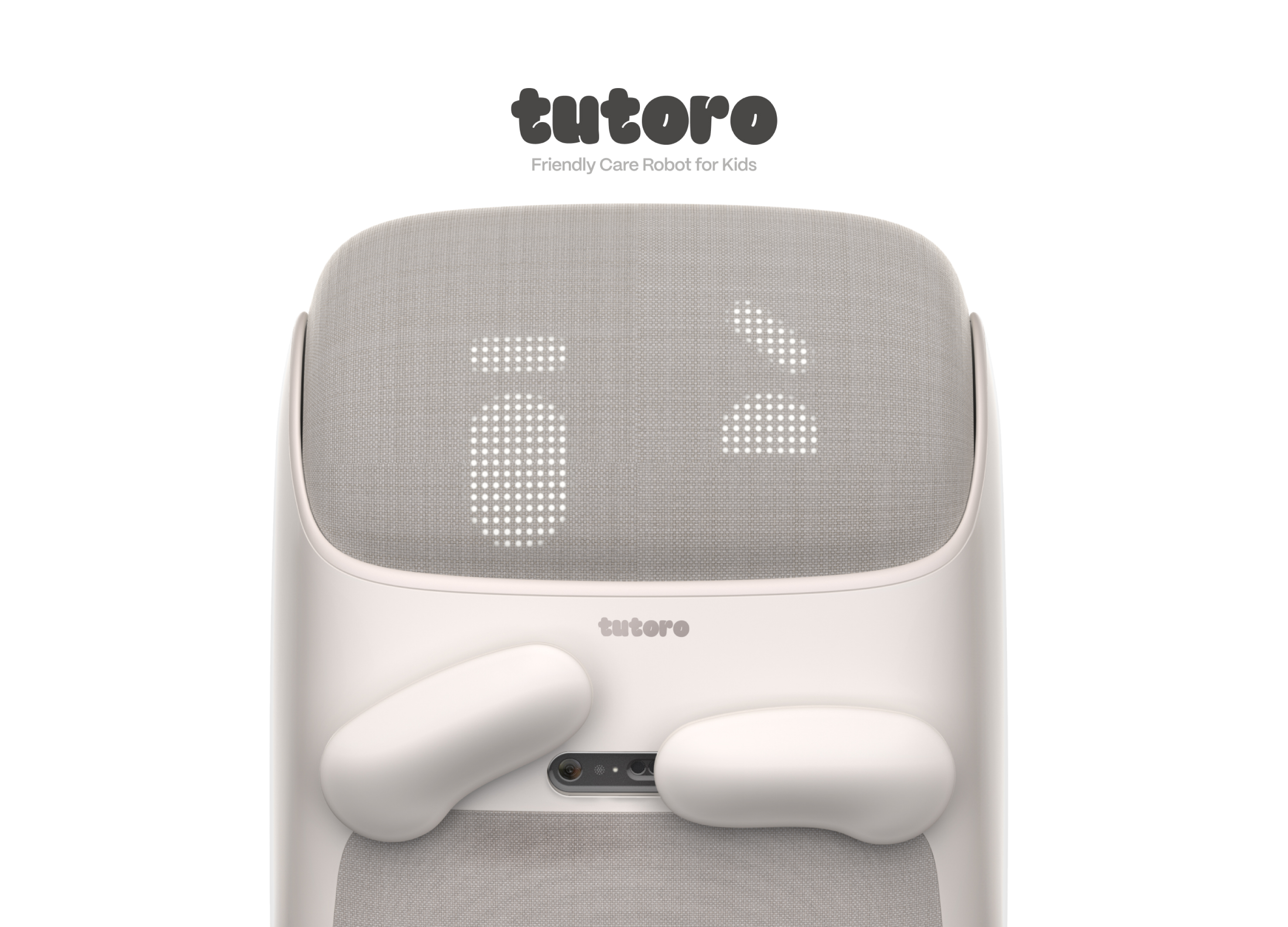
Tutoro
Hongik University
Korea
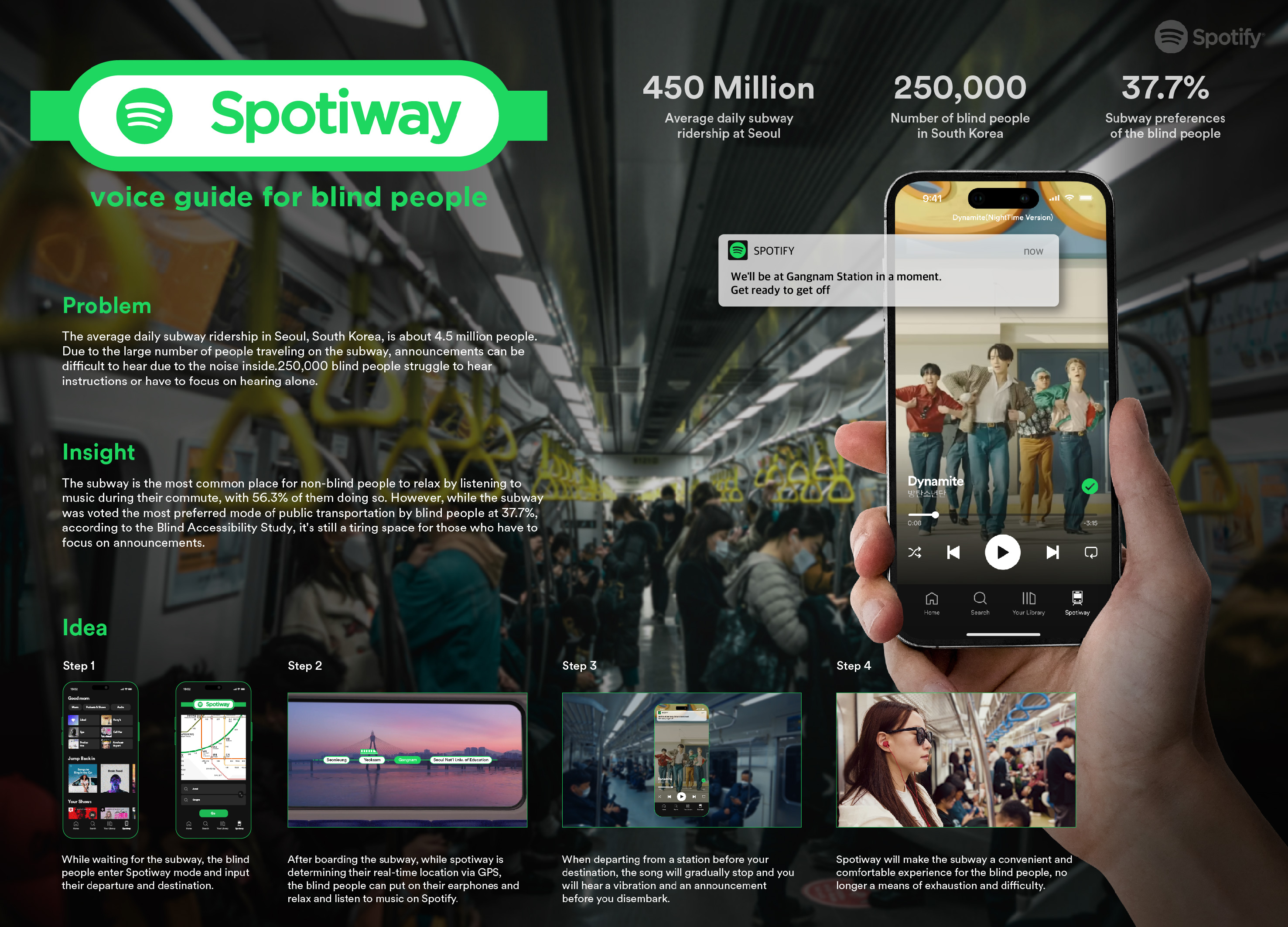
Spotiway.voice guide for blind people
Dongseo University
Korea
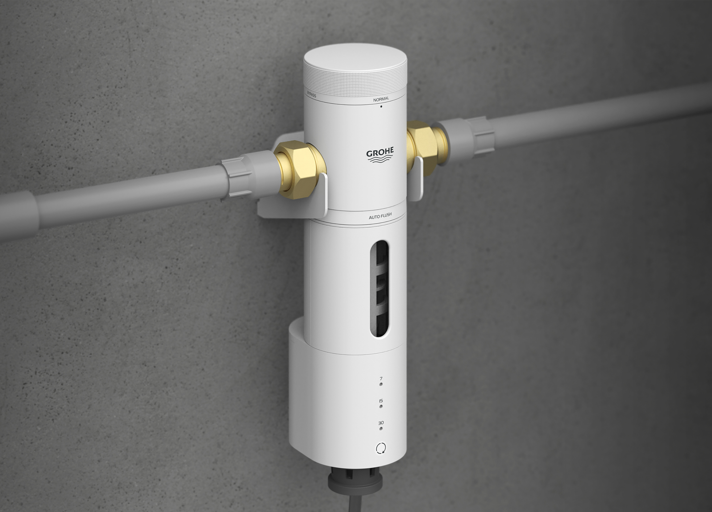
Grohe PreFilter
GROHE
Singapore
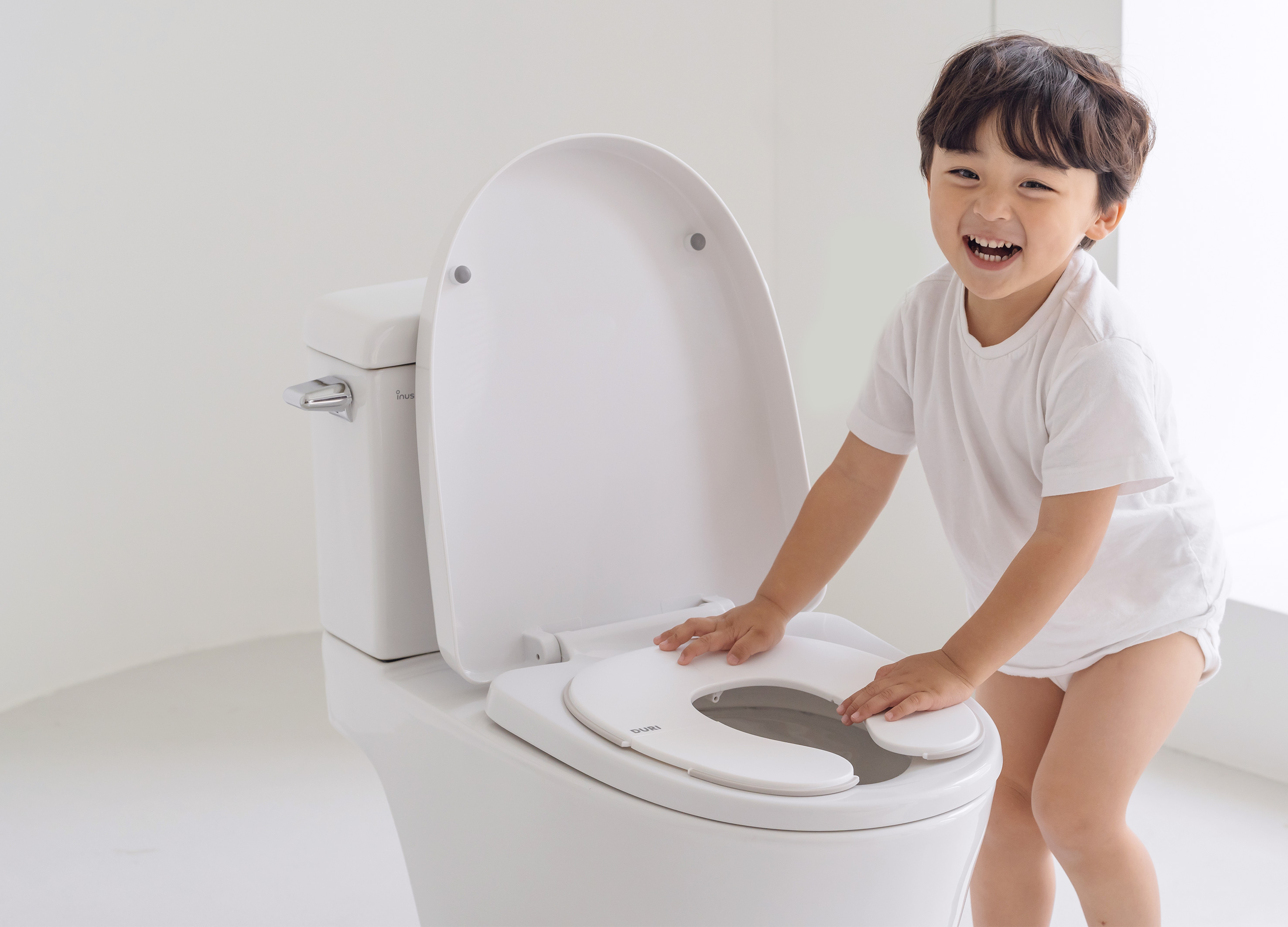
DURI portable folding potty
PRESENT
Korea
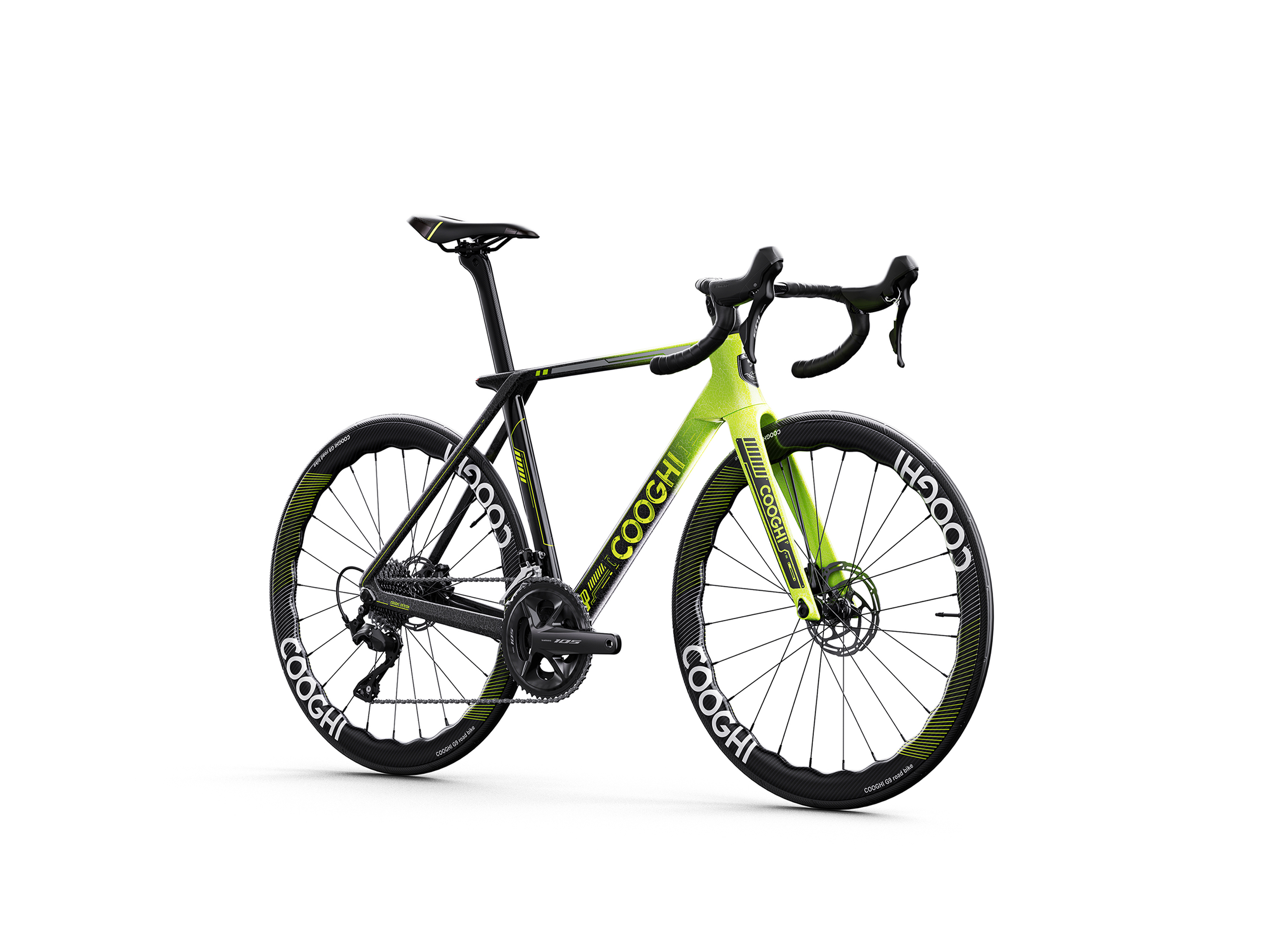
COOGHI G9 Green Mamba road bike
Shenzhen COOGHI Funkids Technology Co., Ltd.
China
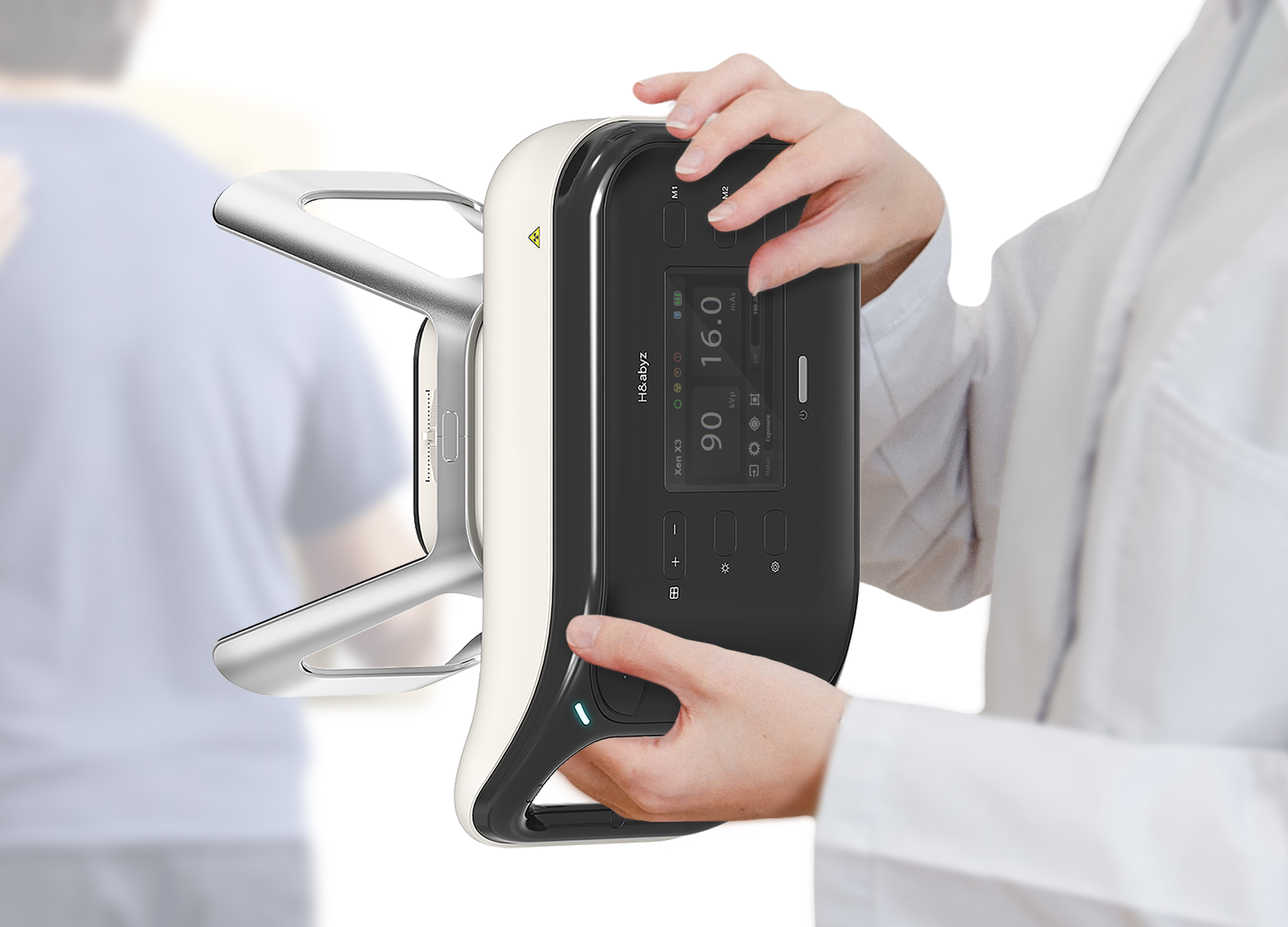
H n abyz HnX 1 Portable X Ray
GODESIGN
Korea
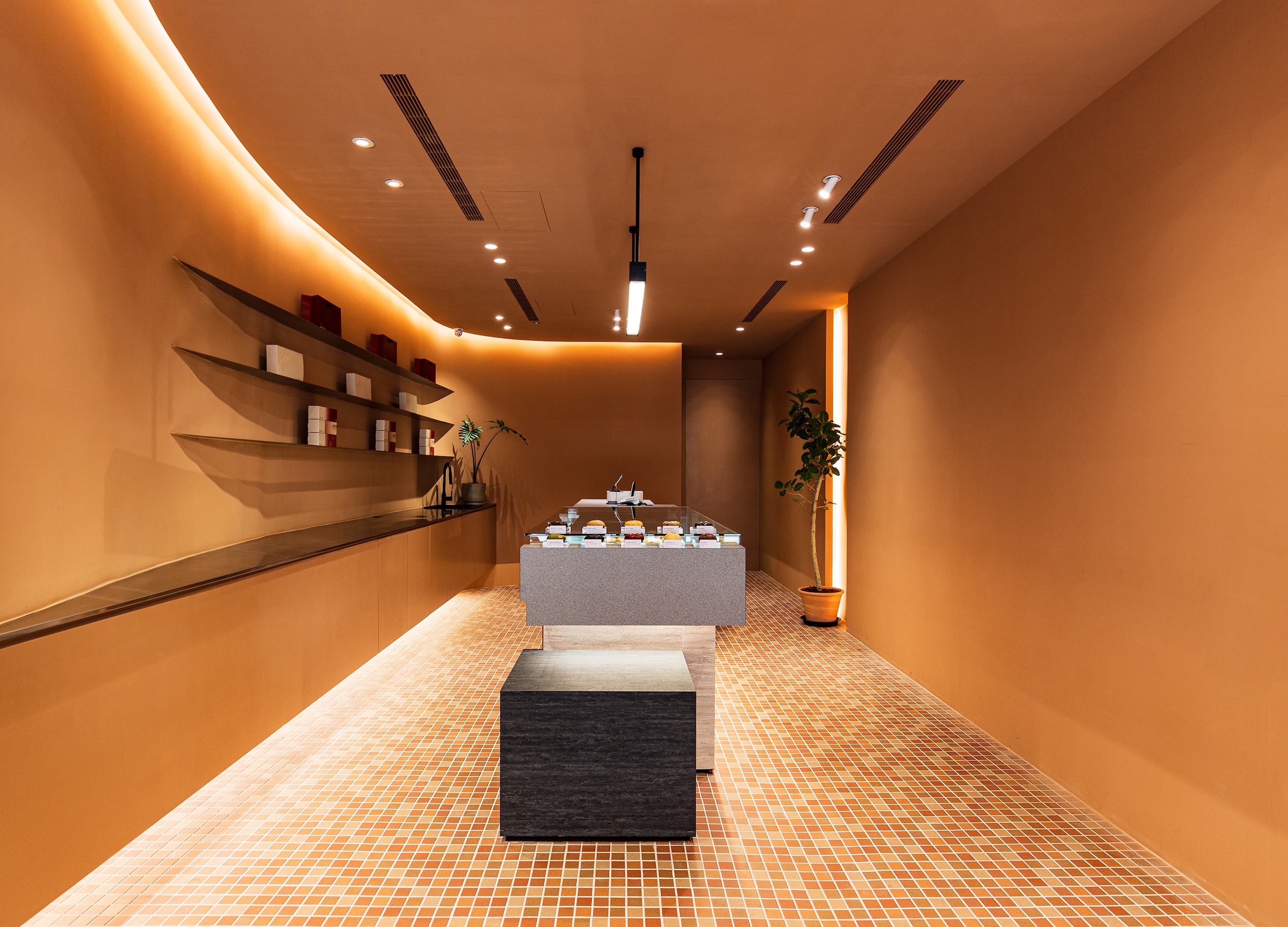
SWEETFULL
Union Atelier
Chinese Taipei
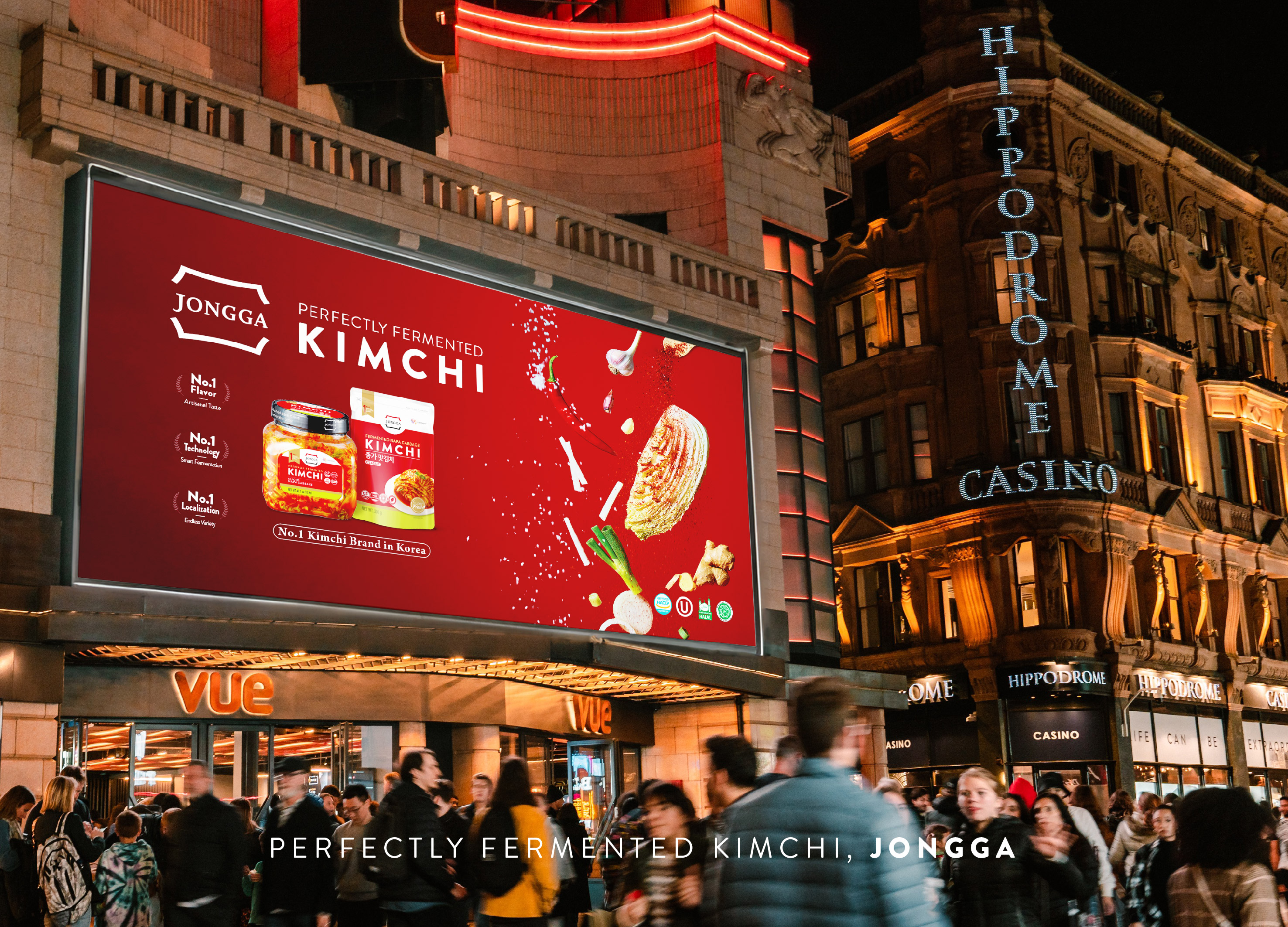
Global JONGGA Kimchi Design
Daesang Corporation Co., Ltd.
Korea
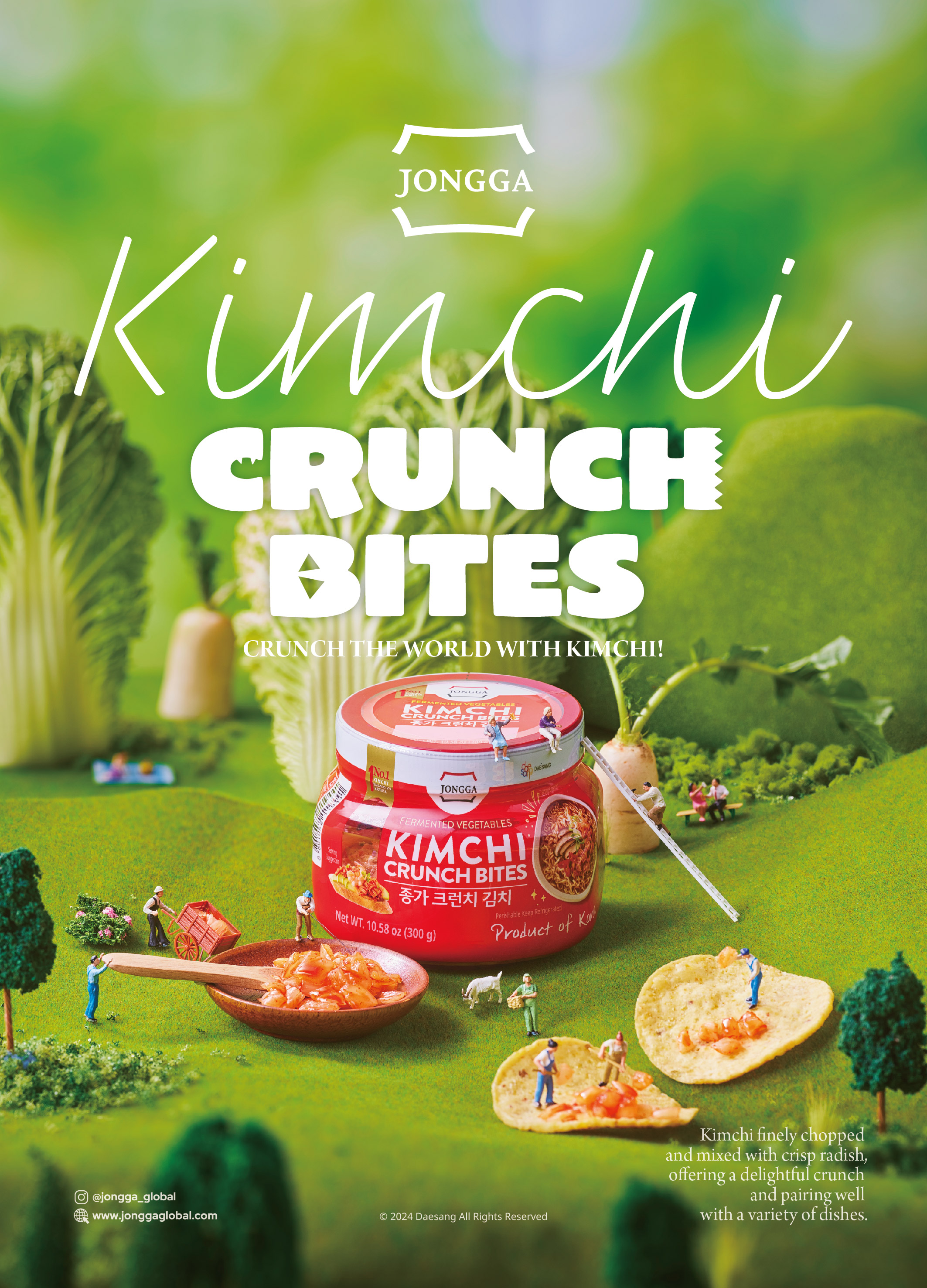
KIMCHI CRUNCH BITES CRUNCH THE WORLD
Daesang Corporation Co., Ltd.
Korea
Healthy Pleasure Park
HYNUDAI ENGINEERING Co., Ltd.
Korea


Partner & Sponsor
More


info@asiadesignprize.com
#14057, 905 49, Beolmal-ro 102beon-gil,
Dongan-gu, Anyang-si, Gyeonggi-do, Korea
#14057, 905 49, Beolmal-ro 102beon-gil,
Dongan-gu, Anyang-si, Gyeonggi-do, Korea
Founder: Doyoung Kim
Business Registration Number: 454-86-01044
Online Sales License No.: 2021-Anyang Dongan-1081
Copyright © DESIGNSORI Co., Ltd.
Business Registration Number: 454-86-01044
Online Sales License No.: 2021-Anyang Dongan-1081
Copyright © DESIGNSORI Co., Ltd.
