TIDA Identity Rebrand
Communication

Area
Taiwan
Year
2025
Award
WINNER
Client
Taiwan Industrial Design Association
Affiliation
BENZHI Design Consultant Co., Ltd.
Designer
Chen Hsin Yu
English
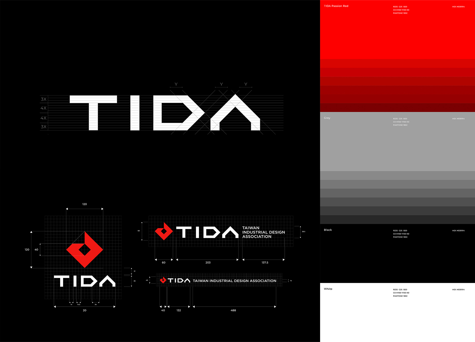
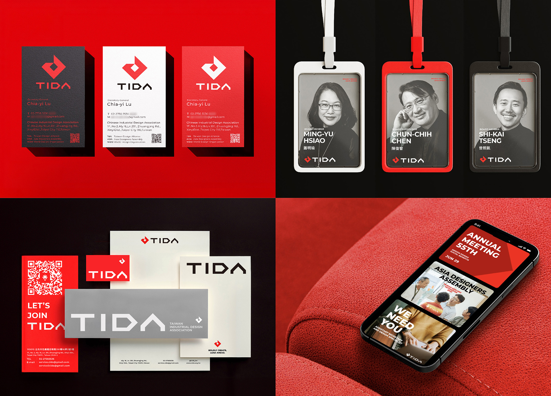
The Taiwan Industrial Design Association (TIDA), founded in 1967, marks its 55th anniversary with a refreshed brand identity. Retaining its original logo, TIDA refined it with a grid system to ensure timelessness and durability.
The logotype reflects TIDA’s core values: “Courageous” (breaking boundaries), “Passion” (fueling creativity), and “Excellence” (setting benchmarks). The letters C, D, and A form arrows, symbolizing leadership and forward movement, with A pointing upward, reflecting international growth.
This update strengthens TIDA’s global image, laying the foundation for the next 50 years of innovation and progress.
Native
TIDA(為Taiwan Industrial Design Association之縮寫 )成立於1967,為台灣第一個以工業設計專業設計師為核心所成立的社團法人。
迎來 55 週年之際,TIDA 推出全新品牌識別,藉此續燃推動設計服務的烈火,帶來截然不同的嶄新氣象,迎接新的開始。視覺重塑的目標以統一品牌視覺,中立形象、普遍性,不受時代影響、帶出工業產品,給人強度和耐用感。
我們選擇保留 TIDA 原有的標誌,並以網格系統優化,構建堅固有依循的品牌標誌,並透過標準字設計將品牌三大精神「果敢(突破傳統思維和限制,推動設計領域的進步);熱忱 (不停激發創意,投注全力促使大家持續學習、成長);卓越 (追求最高品質,創造出經典和具有國際水準的標竿)」將這三個關鍵詞融入品牌識別。以上理念結合標誌的方正樣貌,最終將C、D、A 作為不同方向的箭頭,呈現出「協會帶領著大家,向左、向右和向前邁進」,而 A 還蘊含往上、往外的方向,不但象徵一起更好的意涵,也顯現 CIDA 積極往國際拓展的動力。
透過系統性的整理,讓 TIDA 對外形象擁有一致性,加強在國際上的品牌形象,為未來的發展注入新的活力,為下一個 50 年凝聚力量,指引方向,持續勇於創造、引領前行。
Website
Judging Comments
TIDA's refreshed brand identity has been widely praised for its effective blend of tradition and modernity. The updated logo, enhanced with a grid system, ensures longevity and relevance while maintaining the original design’s essence. The use of arrows in the letters "C," "D," and "A" symbolizes leadership and forward momentum, aligning with TIDA’s core values of courage, passion, and excellence. This revitalization strengthens TIDA's global presence, paving the way for continued innovation and progress in the next 50 years.
Positive Comments


Hallucinogenic Mushrooms
Sejong University
Korea
minix clothes dryer
Athome Corp.
Korea
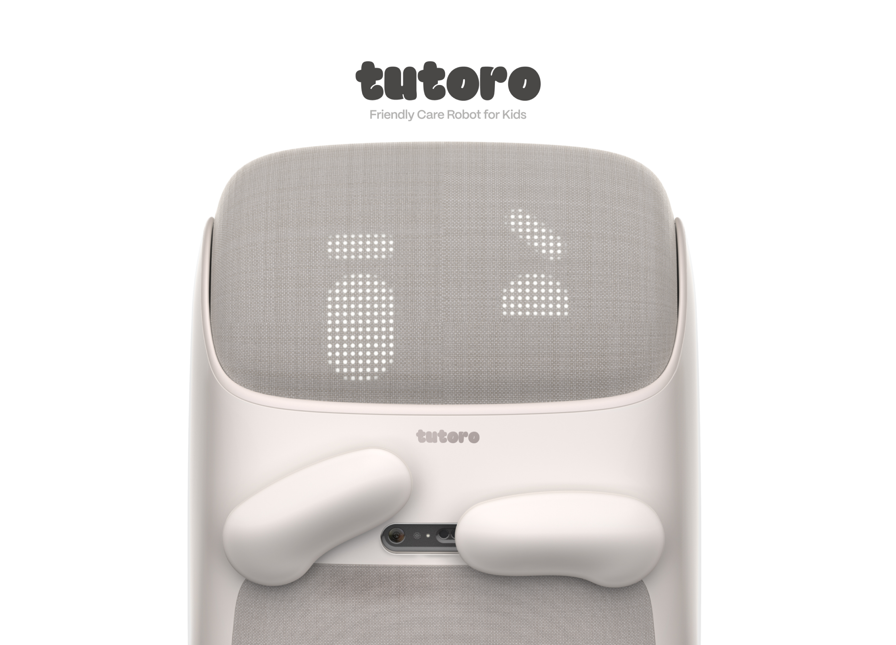
Tutoro
Hongik University
Korea
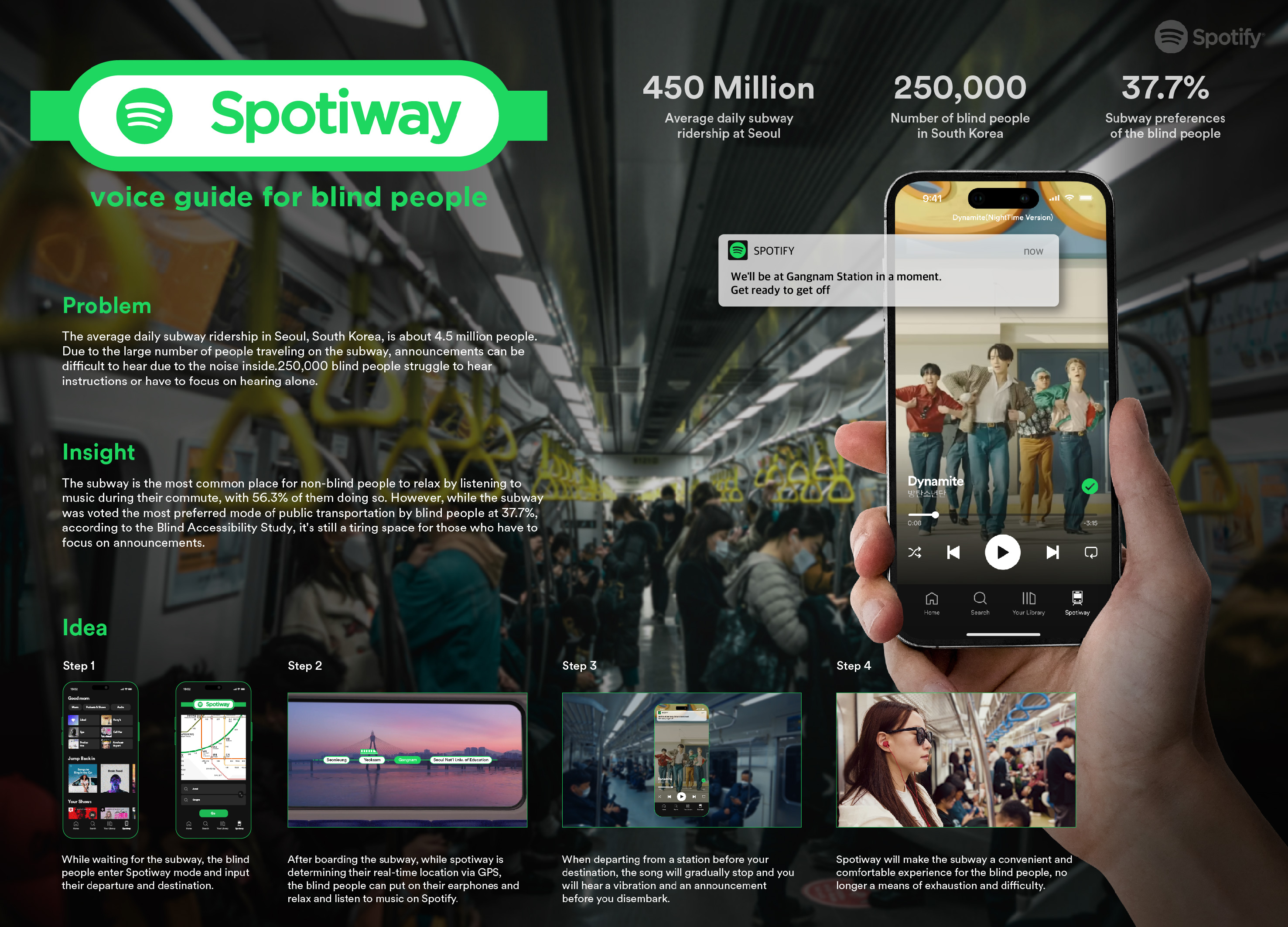
Spotiway.voice guide for blind people
Dongseo University
Korea
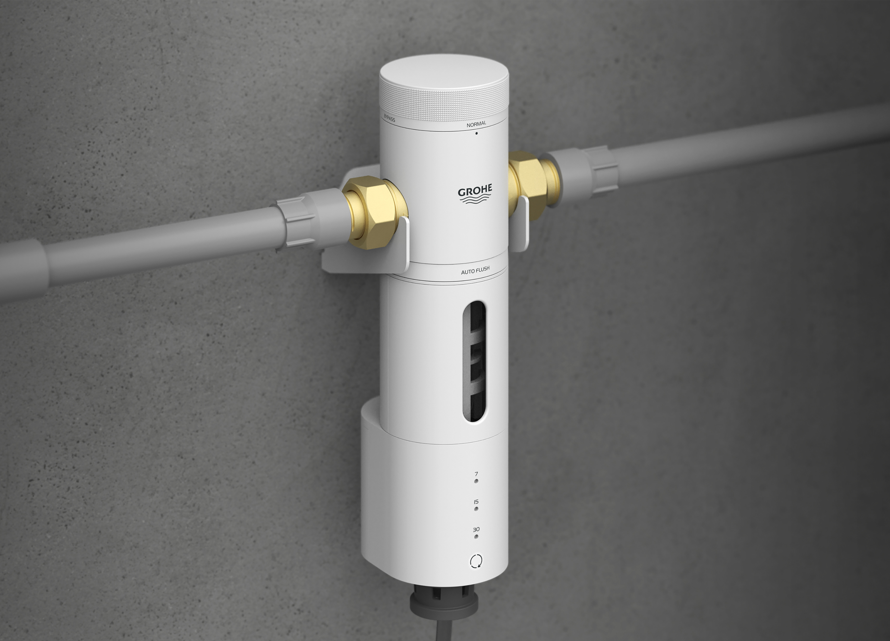
Grohe PreFilter
GROHE
Singapore
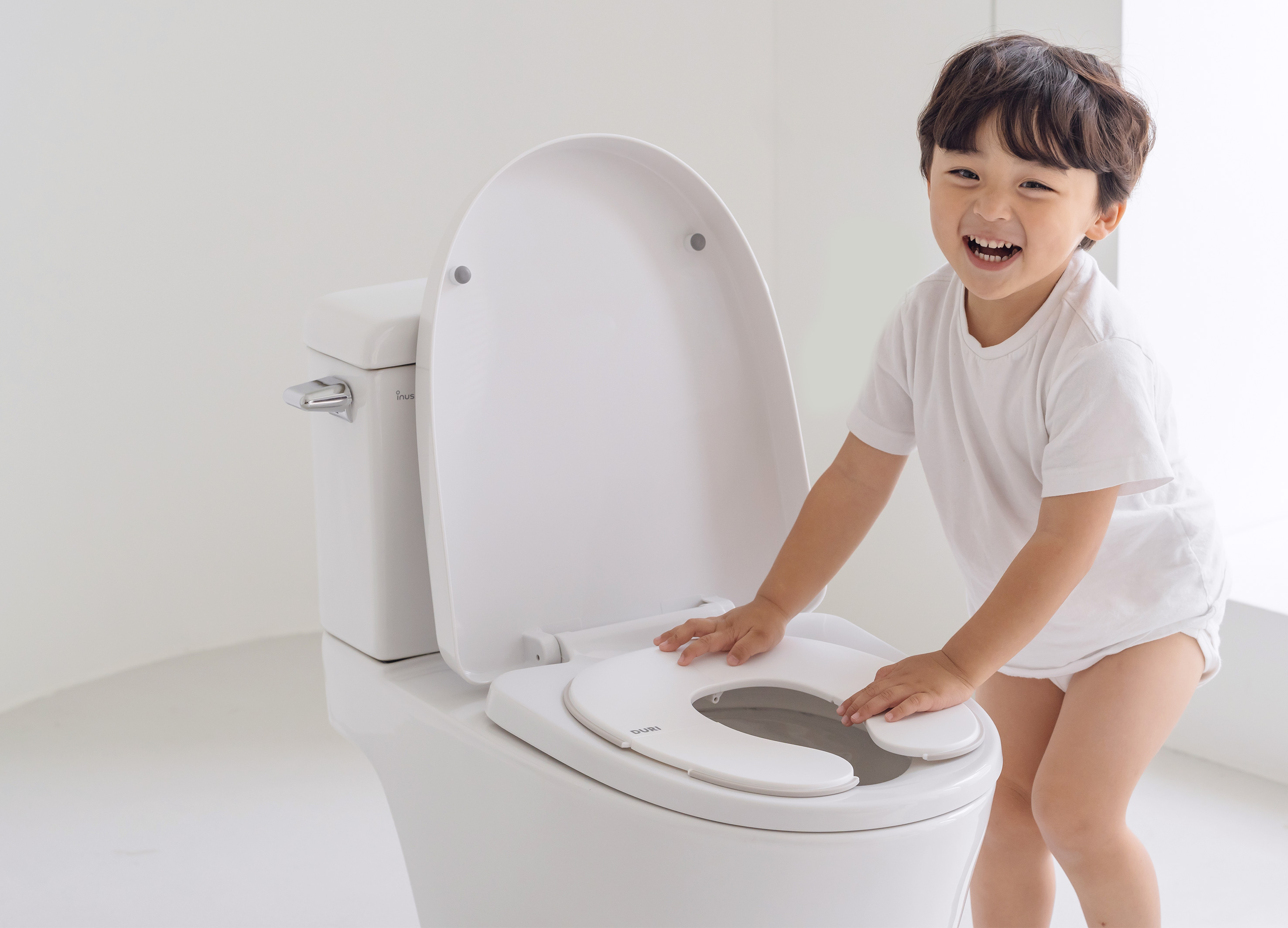
DURI portable folding potty
PRESENT
Korea
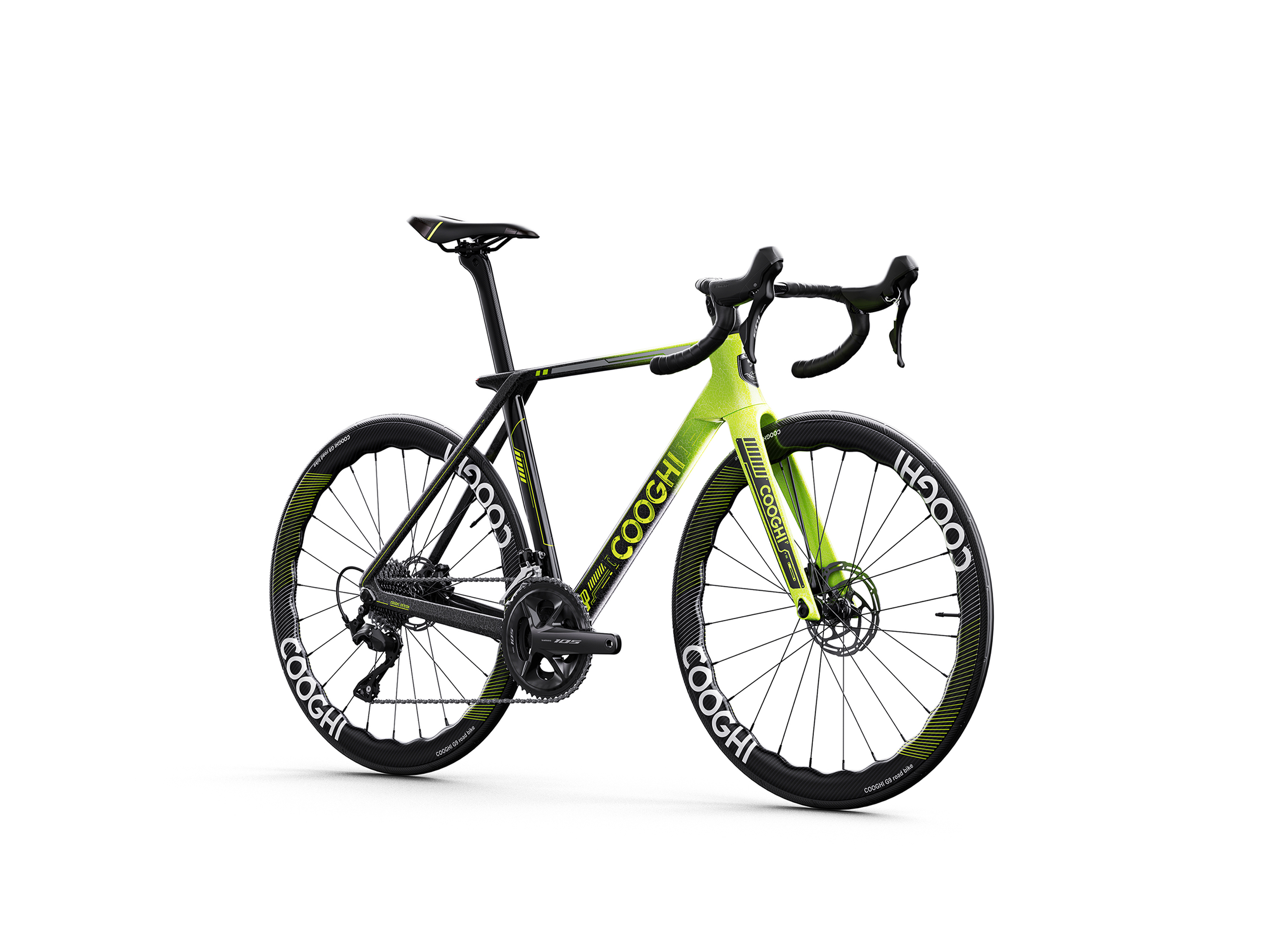
COOGHI G9 Green Mamba road bike
Shenzhen COOGHI Funkids Technology Co., Ltd.
China
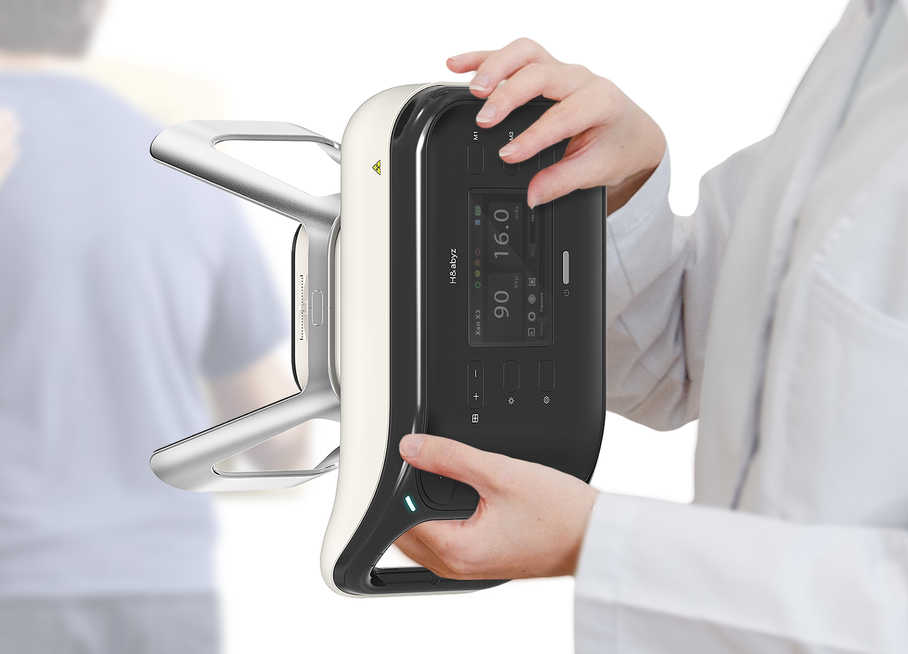
H n abyz HnX 1 Portable X Ray
GODESIGN
Korea
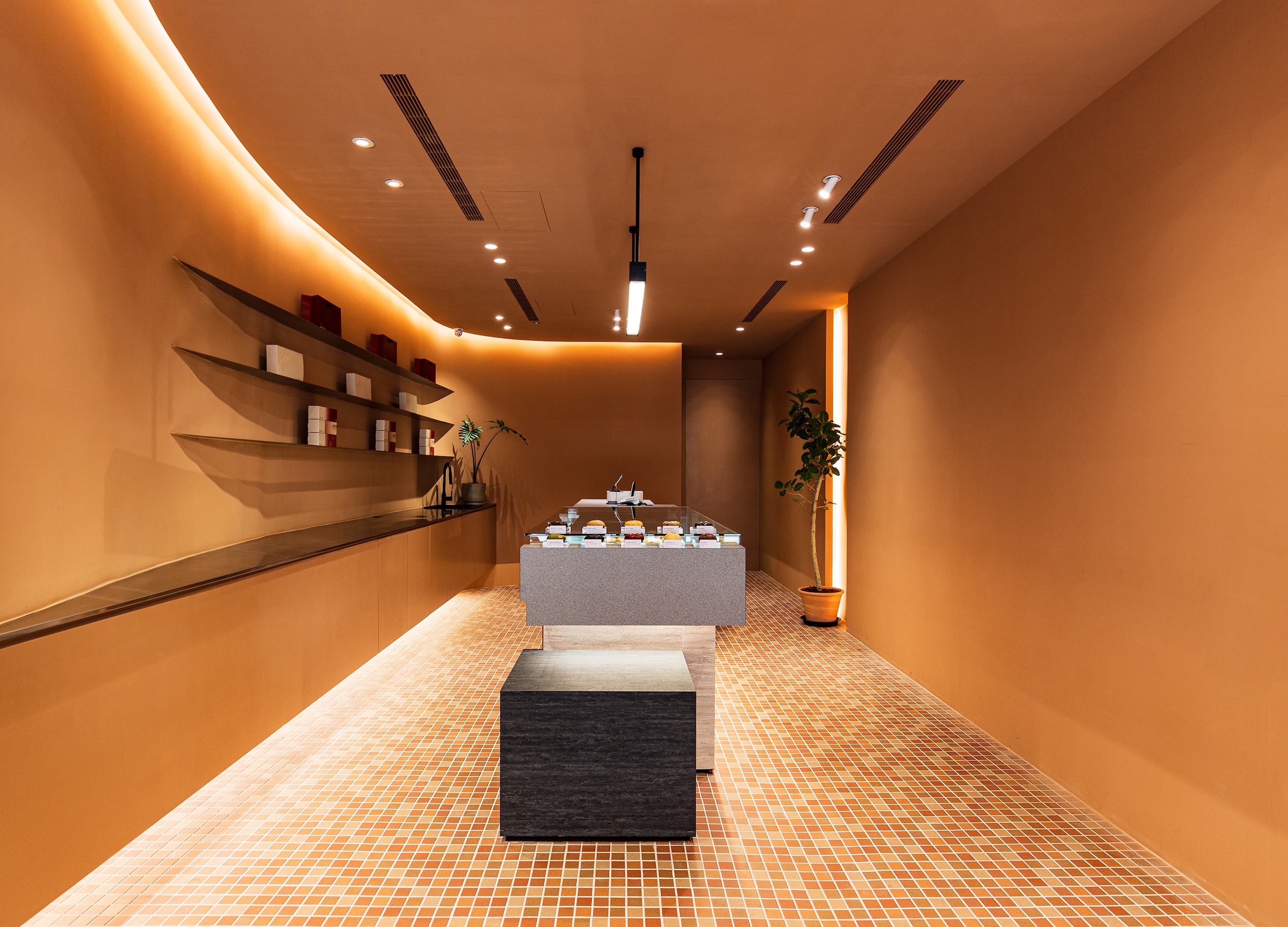
SWEETFULL
Union Atelier
Chinese Taipei

Global JONGGA Kimchi Design
Daesang Corporation Co., Ltd.
Korea

KIMCHI CRUNCH BITES CRUNCH THE WORLD
Daesang Corporation Co., Ltd.
Korea
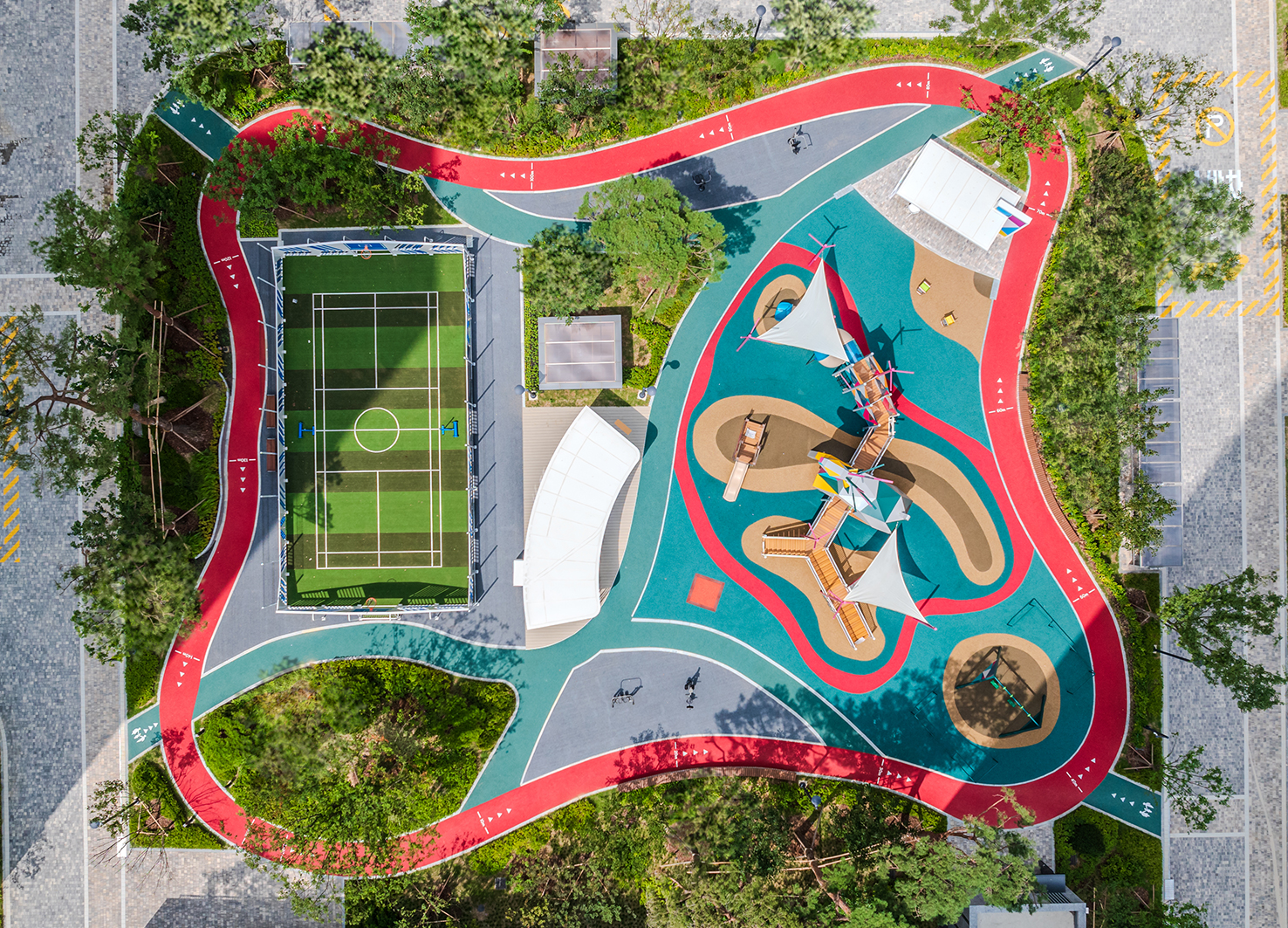
Healthy Pleasure Park
HYNUDAI ENGINEERING Co., Ltd.
Korea


Partner & Sponsor
More


info@asiadesignprize.com
#14057, 905 49, Beolmal-ro 102beon-gil,
Dongan-gu, Anyang-si, Gyeonggi-do, Korea
#14057, 905 49, Beolmal-ro 102beon-gil,
Dongan-gu, Anyang-si, Gyeonggi-do, Korea
Founder: Doyoung Kim
Business Registration Number: 454-86-01044
Online Sales License No.: 2021-Anyang Dongan-1081
Copyright © DESIGNSORI Co., Ltd.
Business Registration Number: 454-86-01044
Online Sales License No.: 2021-Anyang Dongan-1081
Copyright © DESIGNSORI Co., Ltd.
