Kuma
Communication

Area
Taiwan
Year
2025
Award
WINNER
Client
Kuma Co., Ltd.
Affiliation
Existence Design Co., Ltd.
Designer
HUANG ZI YU
English
Kuma is inspired by indigenous Taiwanese mythology, with the black bear symbolizing guardianship and the bond between people and nature. Committed to local production, from identity design to distillation and bottling, the brand promotes Taiwanese culture and supports the local economy. The design blends traditional calligraphy, window lattice graphics, and 1980s illustrations, incorporating local ingredients used in gin production as visual elements to showcase Taiwan’s unique features. The colors blue, red, purple, and green represent time, land, humanity, and the beauty of plants. Kuma brings Taiwan’s story to the world.
Native
昆麻 Kuma 的靈感來自台灣原住民族神話中象徵守護與契約的黑熊(Kuma)。品牌致力於傳遞台灣土地的美好,向台灣的大自然與文化致敬。
1. 核心精神:台灣故事,世界共鳴
昆麻堅守台灣的起源,從品牌識別、玻璃瓶設計到原料、生產、蒸餾與裝瓶,全程支持在地生產。每一瓶昆麻琴酒展現卓越品質,除了推廣台灣文化故事,也促進在地經濟,並將台灣獨特魅力帶向國際。
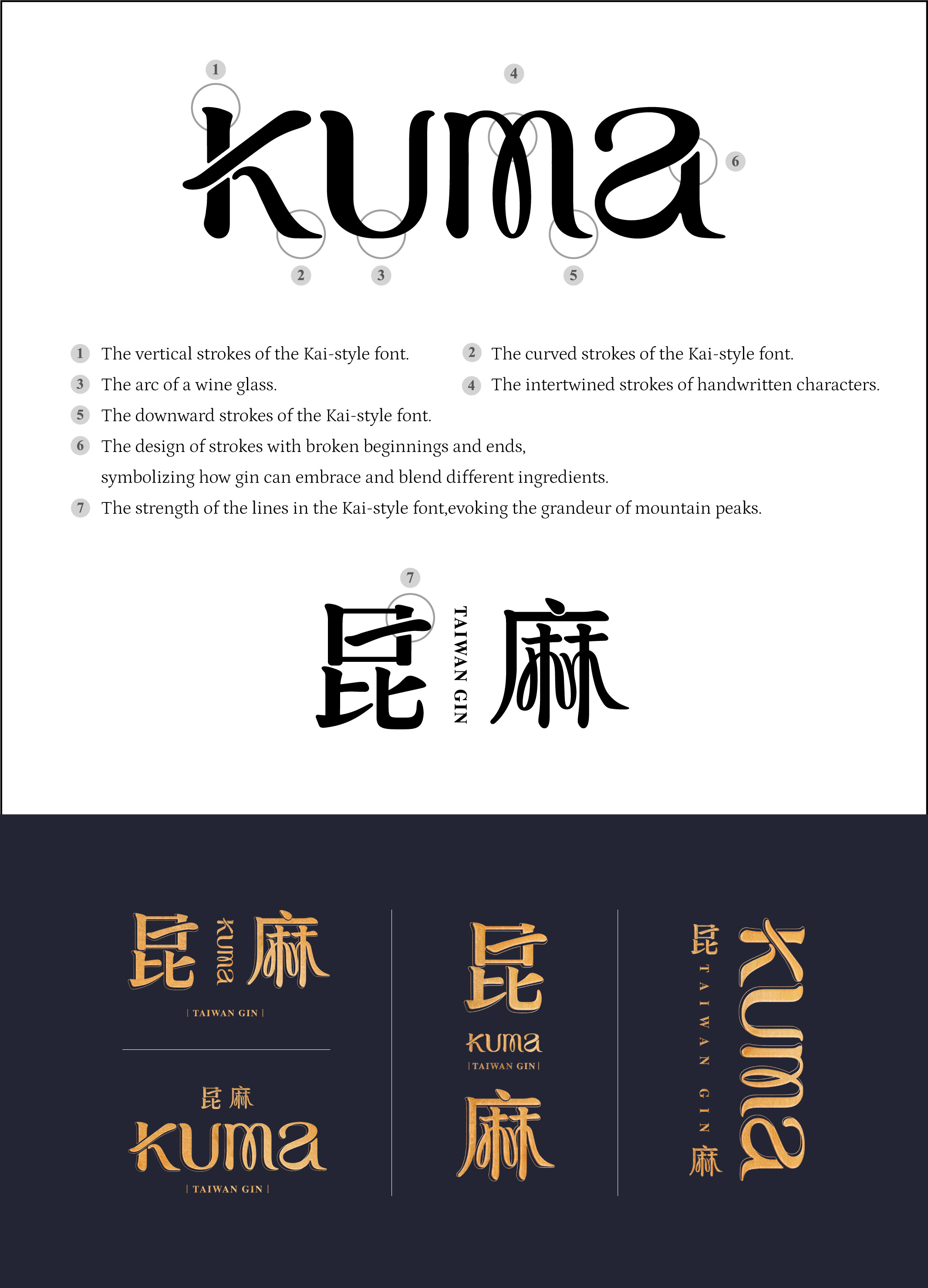
2. 品牌識別設計:展現台灣特色
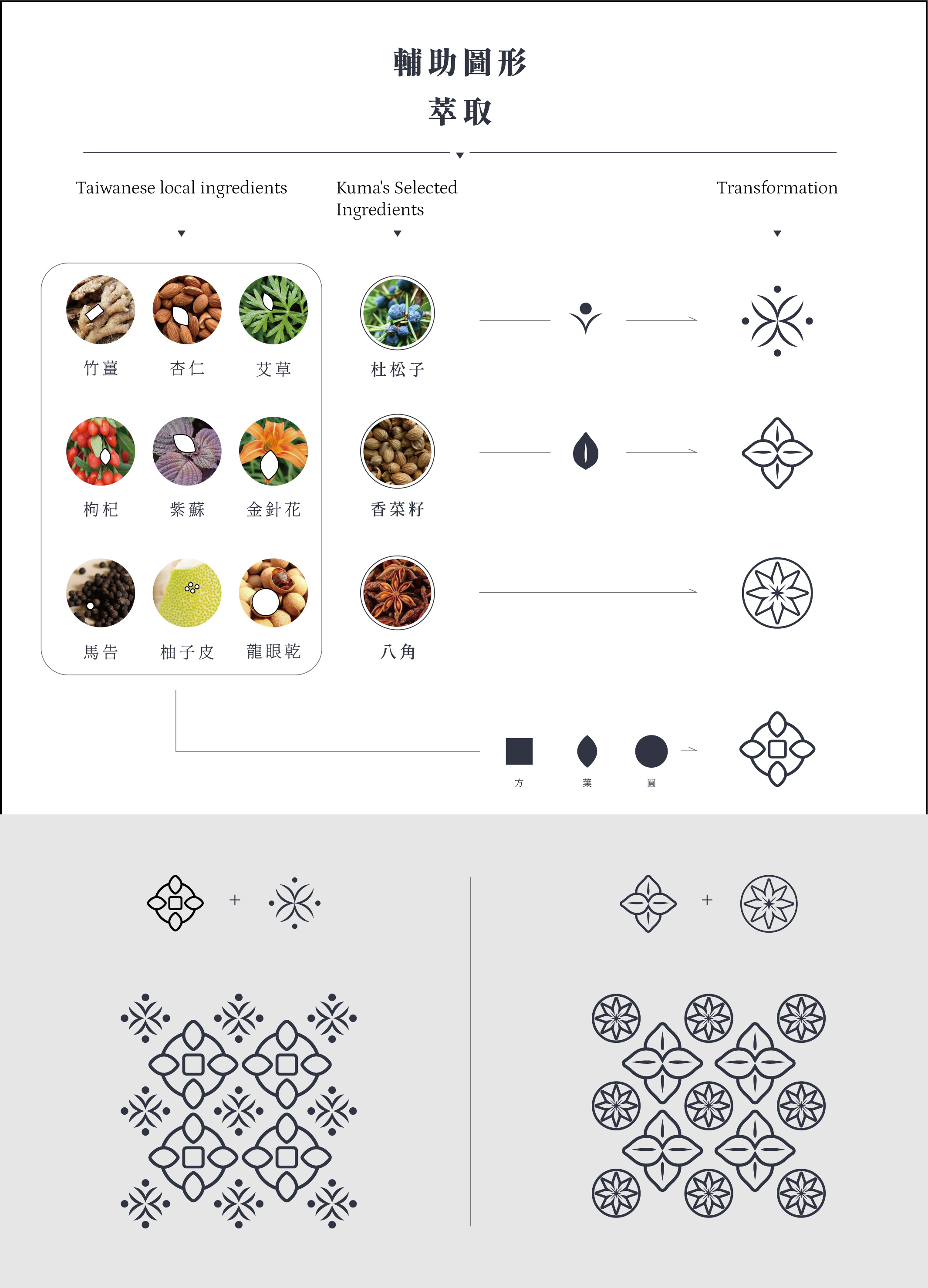
品牌設計以傳統楷體字體、融合天然原料與窗花特色的圖形,以及描繪80年代文化背景的插畫,構築專屬於 Kuma 的視覺語言,表達對台灣的熱情與傳承。此外,品牌設計還運用了製作琴酒的台灣在地原料,如台農57號地瓜、刺蔥、文旦、烏龍茶等,將這些精選原物料轉化為視覺元素,並應用於輔助圖形的設計中,展現台灣在地食材的精華與文化底蘊。
3. 色彩計劃:人、時、地、物
藍色象徵時間、紅色代表土地、紫色表達人性智慧、綠色體現天然植物之美,色彩傳遞品牌與土地的連結。
昆麻的整體設計風格,展現了台灣1980年代自由與新文化崛起的鮮明個性。這份設計語言與品牌精神相輔相成,希望透過琴酒這一載體,將台灣的故事推向世界更多的角落。
Website
Judging Comments
Kuma’s design is praised for its strong cultural connection, beautifully blending Taiwan’s indigenous heritage with modern elements. The use of the black bear as a symbol of guardianship resonates deeply with local mythology, while the integration of traditional calligraphy and 1980s-inspired illustrations creates a visually appealing and cohesive brand. The thoughtful incorporation of local ingredients in the design further emphasizes the brand's commitment to showcasing Taiwan’s uniqueness. The color scheme thoughtfully reflects key aspects of Taiwanese life—time, land, humanity, and nature—making Kuma a powerful ambassador for Taiwanese culture.
Positive Comments


Hallucinogenic Mushrooms
Sejong University
Korea
minix clothes dryer
Athome Corp.
Korea
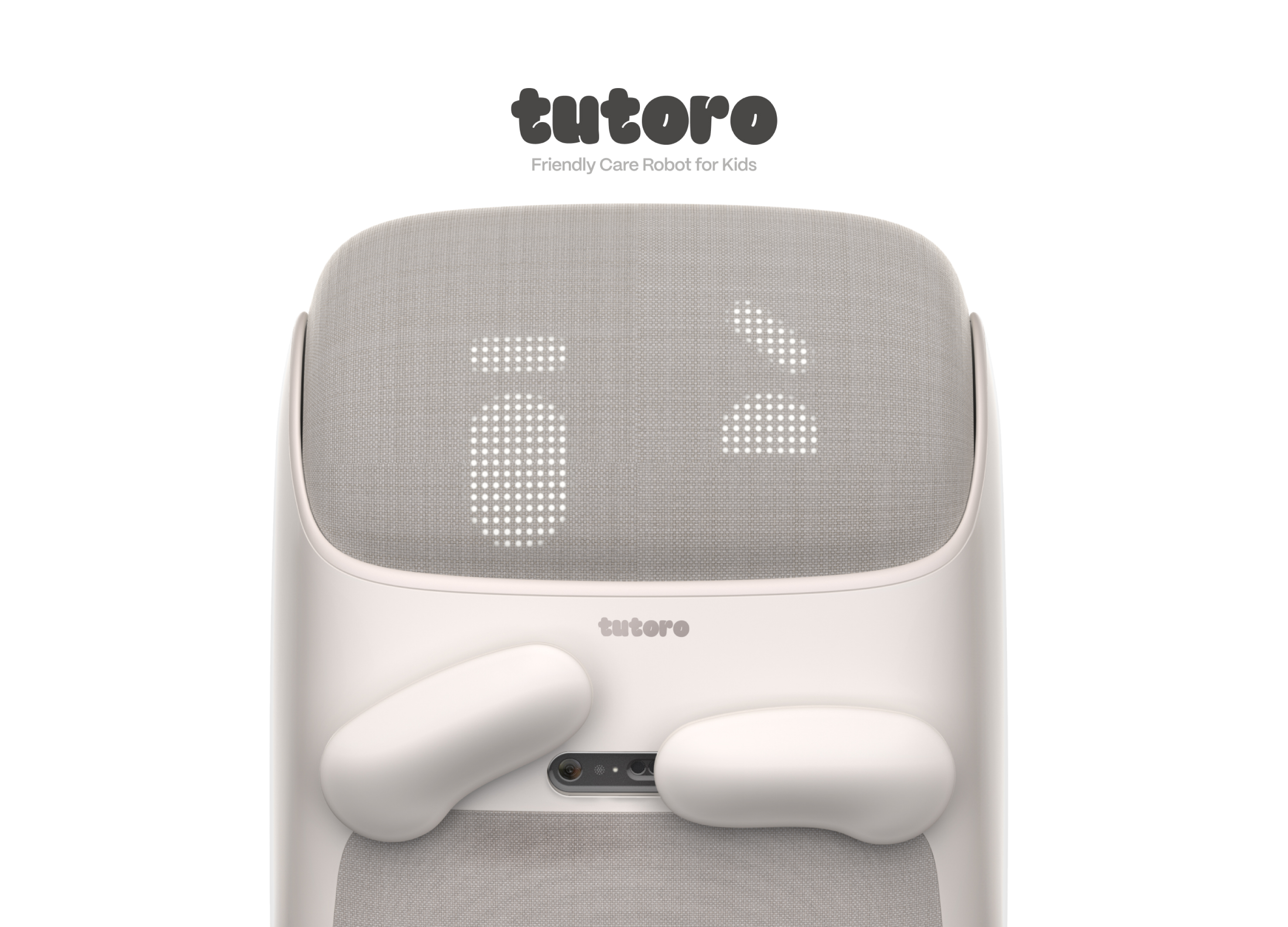
Tutoro
Hongik University
Korea
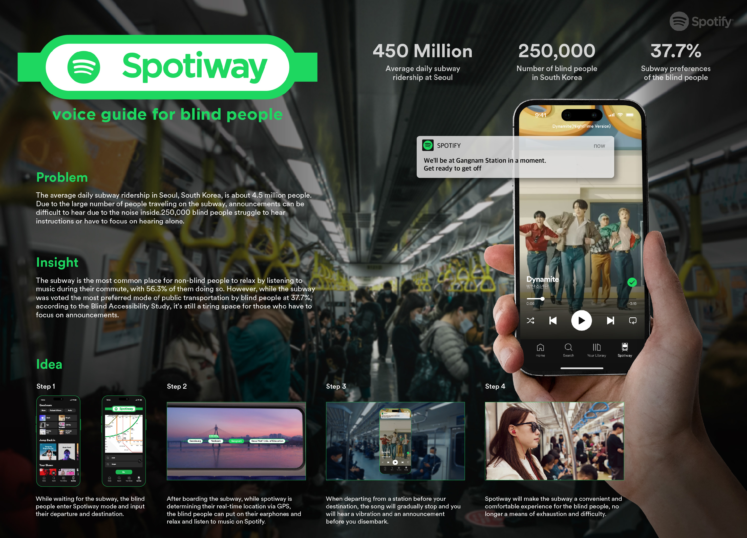
Spotiway.voice guide for blind people
Dongseo University
Korea
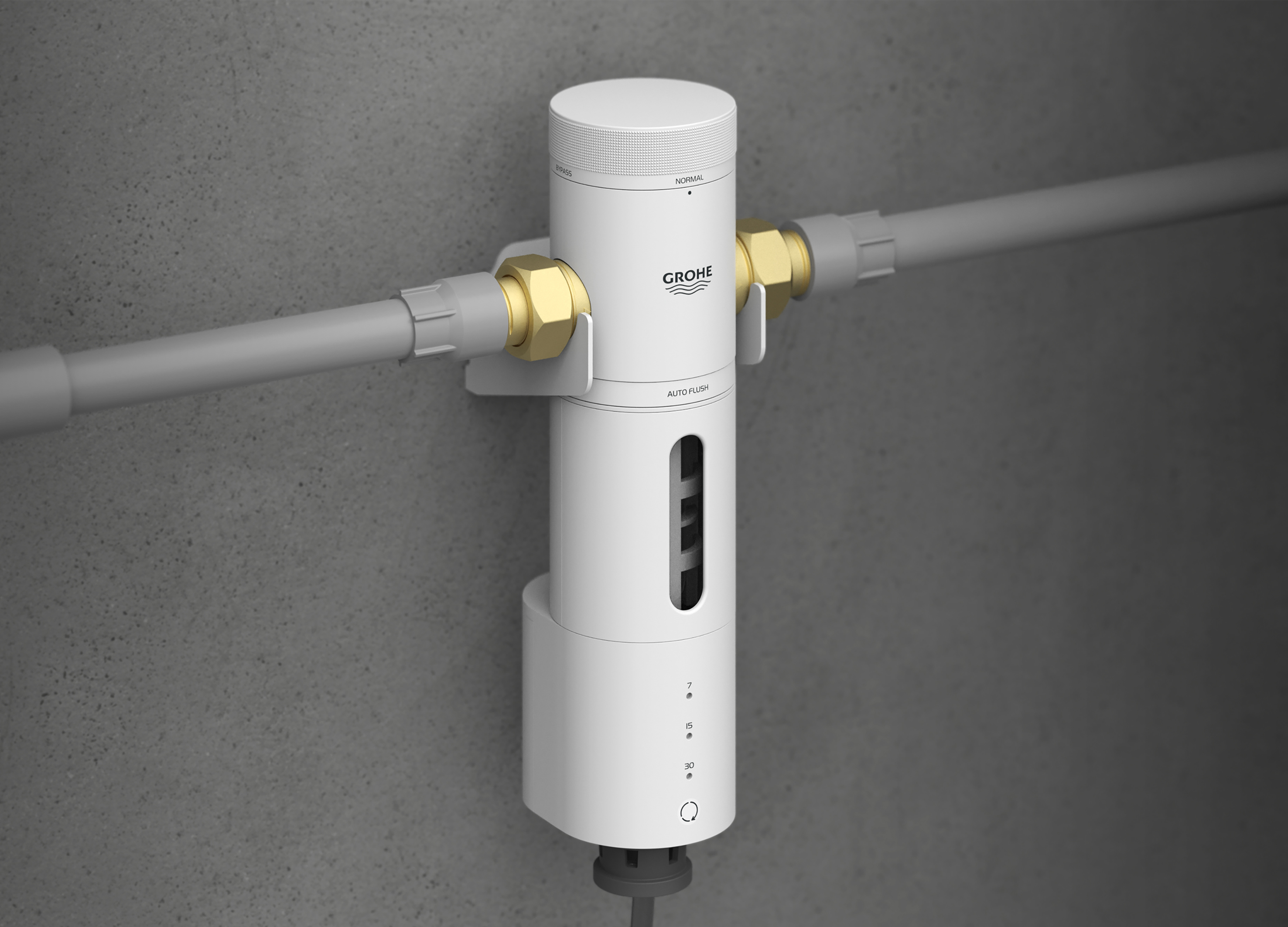
Grohe PreFilter
GROHE
Singapore
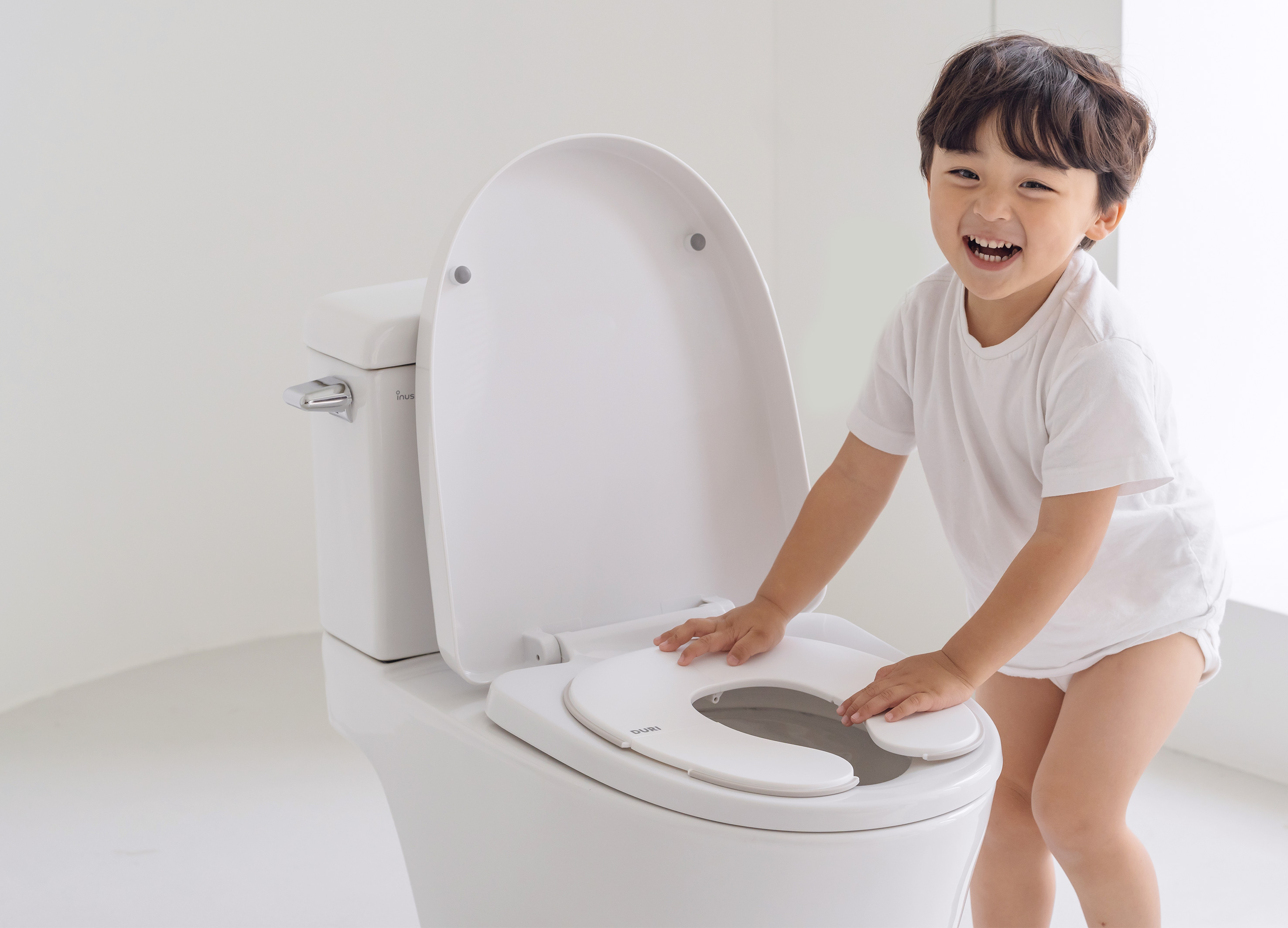
DURI portable folding potty
PRESENT
Korea
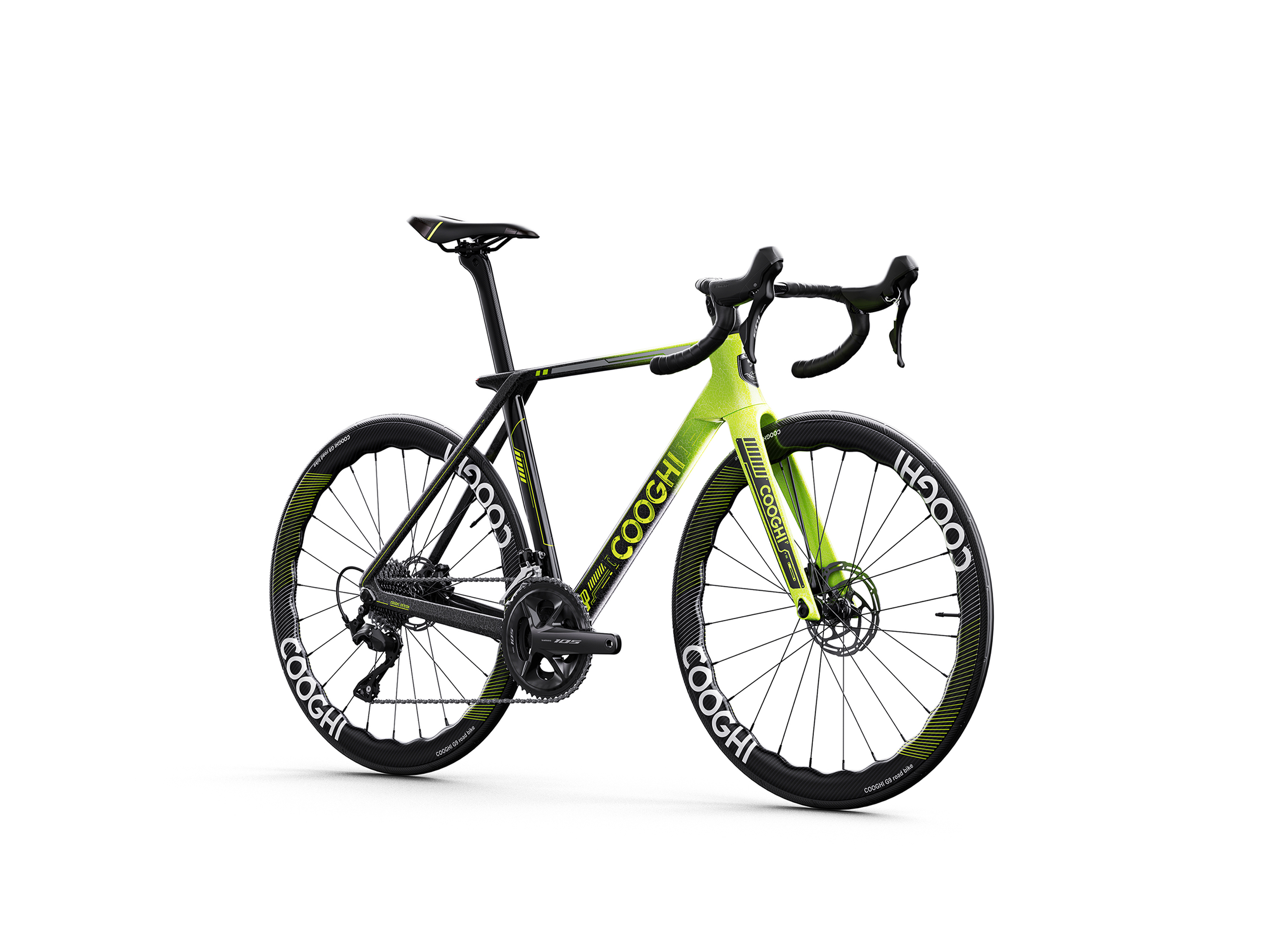
COOGHI G9 Green Mamba road bike
Shenzhen COOGHI Funkids Technology Co., Ltd.
China
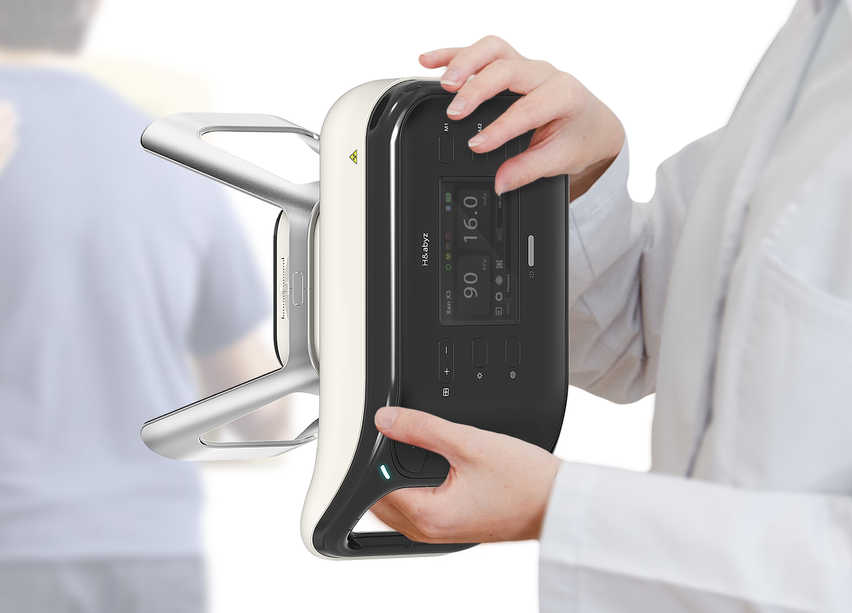
H n abyz HnX 1 Portable X Ray
GODESIGN
Korea
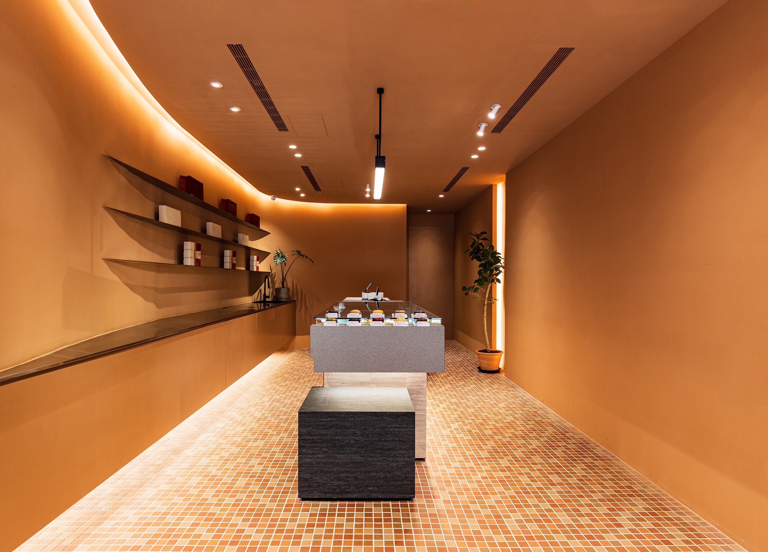
SWEETFULL
Union Atelier
Chinese Taipei
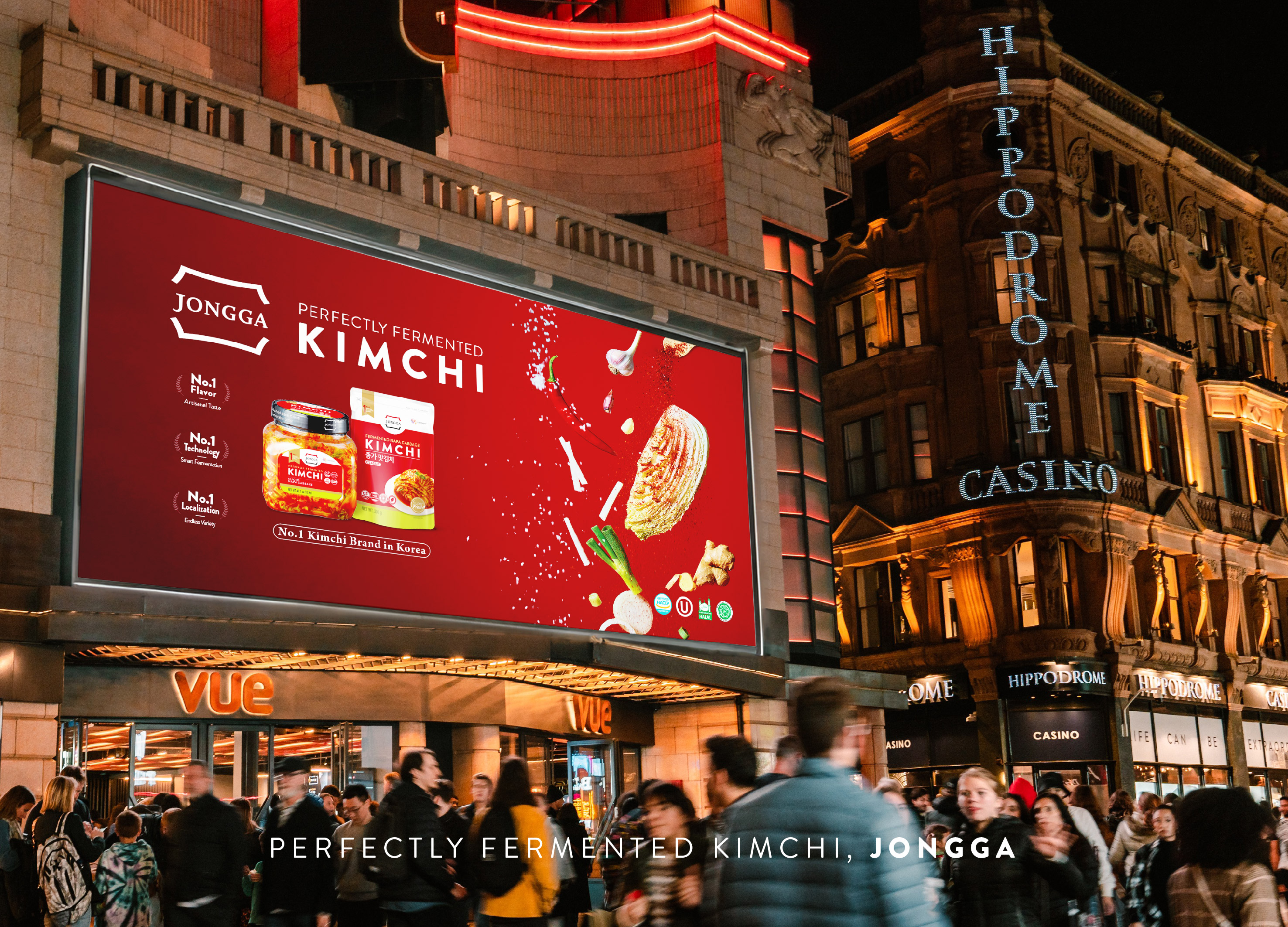
Global JONGGA Kimchi Design
Daesang Corporation Co., Ltd.
Korea
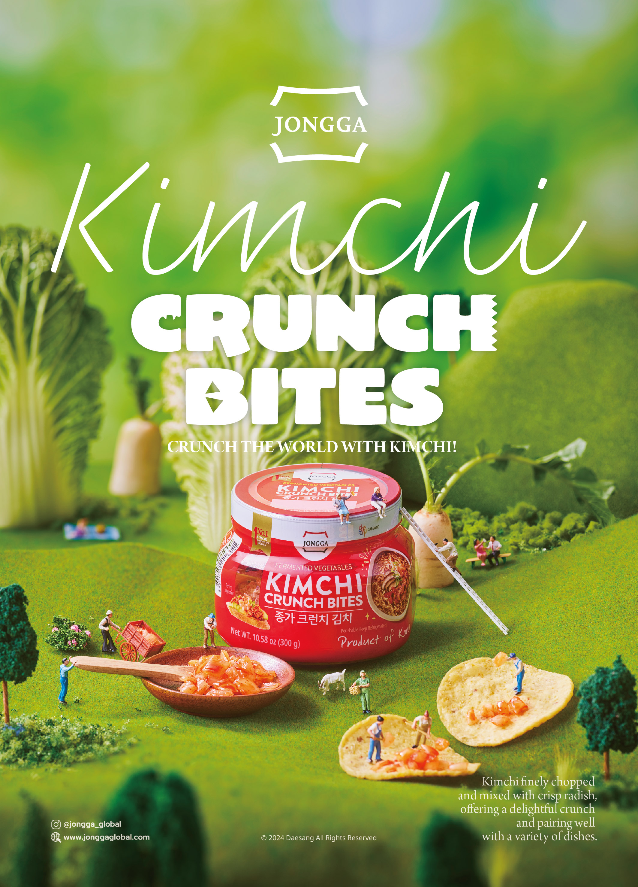
KIMCHI CRUNCH BITES CRUNCH THE WORLD
Daesang Corporation Co., Ltd.
Korea
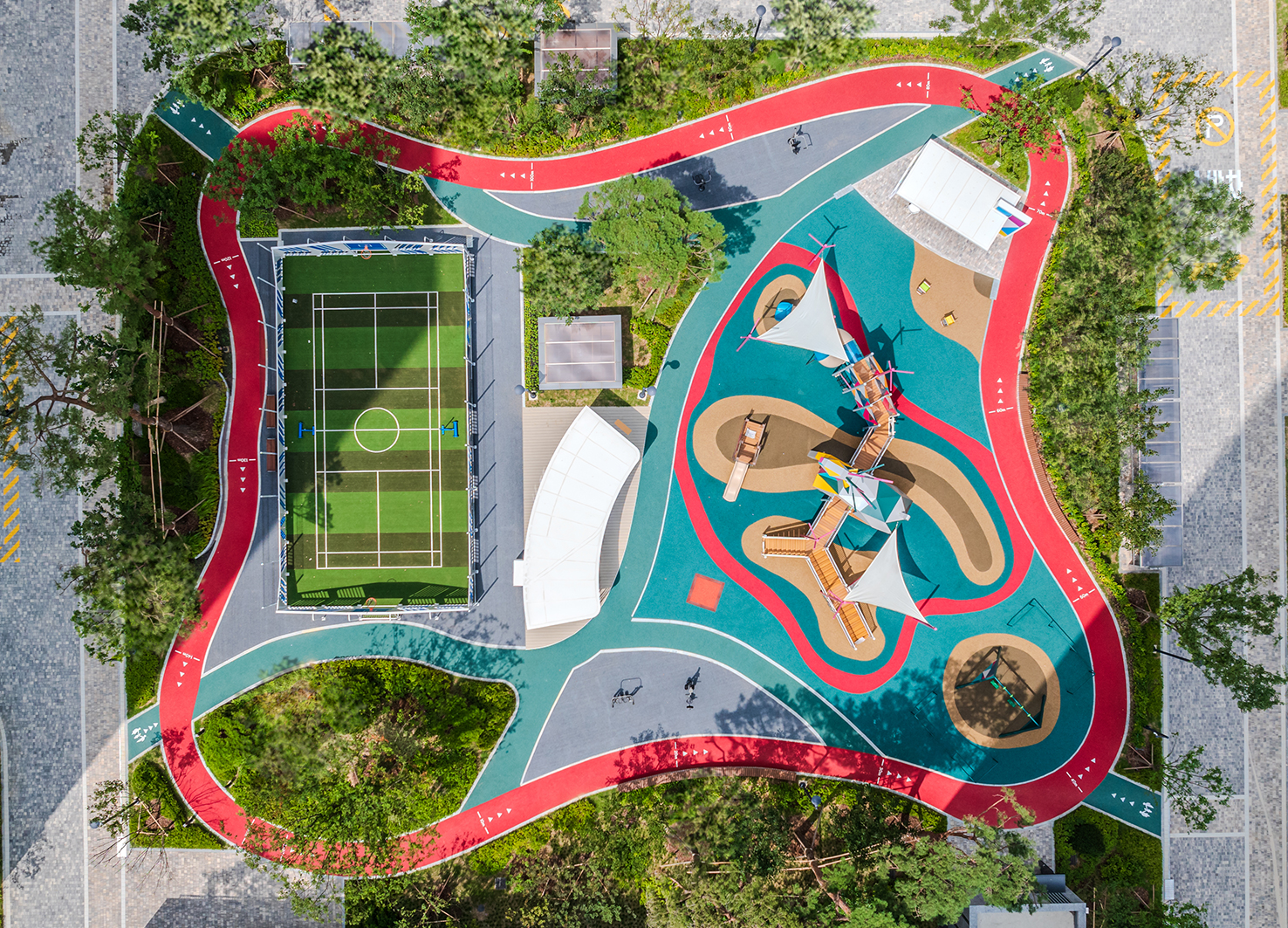
Healthy Pleasure Park
HYNUDAI ENGINEERING Co., Ltd.
Korea


Partner & Sponsor
More


info@asiadesignprize.com
#14057, 905 49, Beolmal-ro 102beon-gil,
Dongan-gu, Anyang-si, Gyeonggi-do, Korea
#14057, 905 49, Beolmal-ro 102beon-gil,
Dongan-gu, Anyang-si, Gyeonggi-do, Korea
Founder: Doyoung Kim
Business Registration Number: 454-86-01044
Online Sales License No.: 2021-Anyang Dongan-1081
Copyright © DESIGNSORI Co., Ltd.
Business Registration Number: 454-86-01044
Online Sales License No.: 2021-Anyang Dongan-1081
Copyright © DESIGNSORI Co., Ltd.
