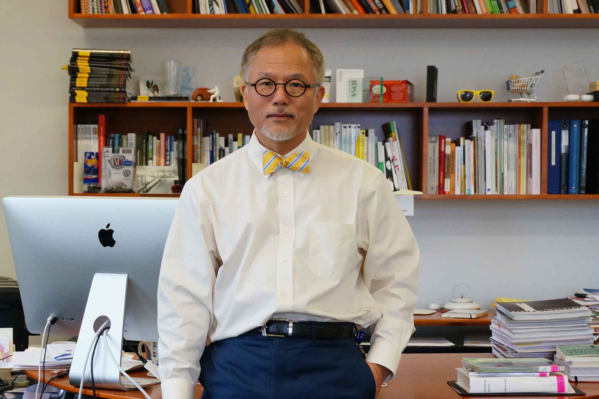
Director JoongHyun Cho Founder of DueDance
To begin, could you briefly introduce yourself and share the values you have considered most important in your design practice so far?
I am a brand and graphic designer who began my career at Naver, where I worked as a brand designer before moving on to serve as CDO at an IT proptech company. Later, I advised D.CAMP (Banks Foundation for Young Entrepreneurs), supporting early and growth stage startups by diagnosing brand challenges and helping them establish execution roadmaps. More recently, I founded Studio DeuDance, where I focus on rebranding and brand strategy projects for a range of IT companies. For me, design has always been less about surface aesthetics and more about constructing justification, the “why” behind a particular form or language. My practice is rooted in demonstrating, through logic, data, and writing, why design decisions matter and how they affect business. Collaboration, for me, is built on mutual respect and support, and I approach visual language not as decoration but as an operative tool that enables clarity, consistency, and trust in the way brands communicate.
You mentioned that your work is often described as “Korean.” What do you think defines Korean design, and how has that influenced your style?
I was born and educated entirely in Korea, without any overseas academic background. Ironically, this absence of international training often drew curiosity from audiences abroad, who began to recognize a distinctive “Koreanness” in my work. That outside perspective, in turn, prompted me to reflect more deeply on what defines Korean design and how those cultural traits have shaped my own practice.
In my view, the essence of Korean design can be understood through three interconnected qualities: speed, hybridity, and legible complexity. The quality of speed arises from Korea’s fast paced social and economic environment, which encourages bold and decisive placement of information as well as a willingness to experiment rapidly without hesitation. Hybridity, often described as “jjambbong culture,” is rooted in Korea’s long history of absorbing and remixing diverse influences. This produces a visual vocabulary that is eclectic, layered, and unapologetically mixed. Together these factors generate what I call legible complexity, an aesthetic where density, contrast, and multiplicity coexist yet remain structured enough for the viewer to read and understand. In my own design grammar I have adopted these principles as core methods. I emphasize bold contrasts, high density layering of colors and textures, and hierarchies that are deliberately flexible rather than rigid. The goal is not to overwhelm with complexity for its own sake but to build systems where energy and intensity are transformed into clarity. For me, this balance between richness and readability is not only the foundation of my personal style but also a defining rhythm of contemporary Korean design.
Korean design often absorbs external influences quickly and reinterprets them into new identities. How does this “Korean-style reinterpretation” appear in your own work? Could you give some concrete examples?
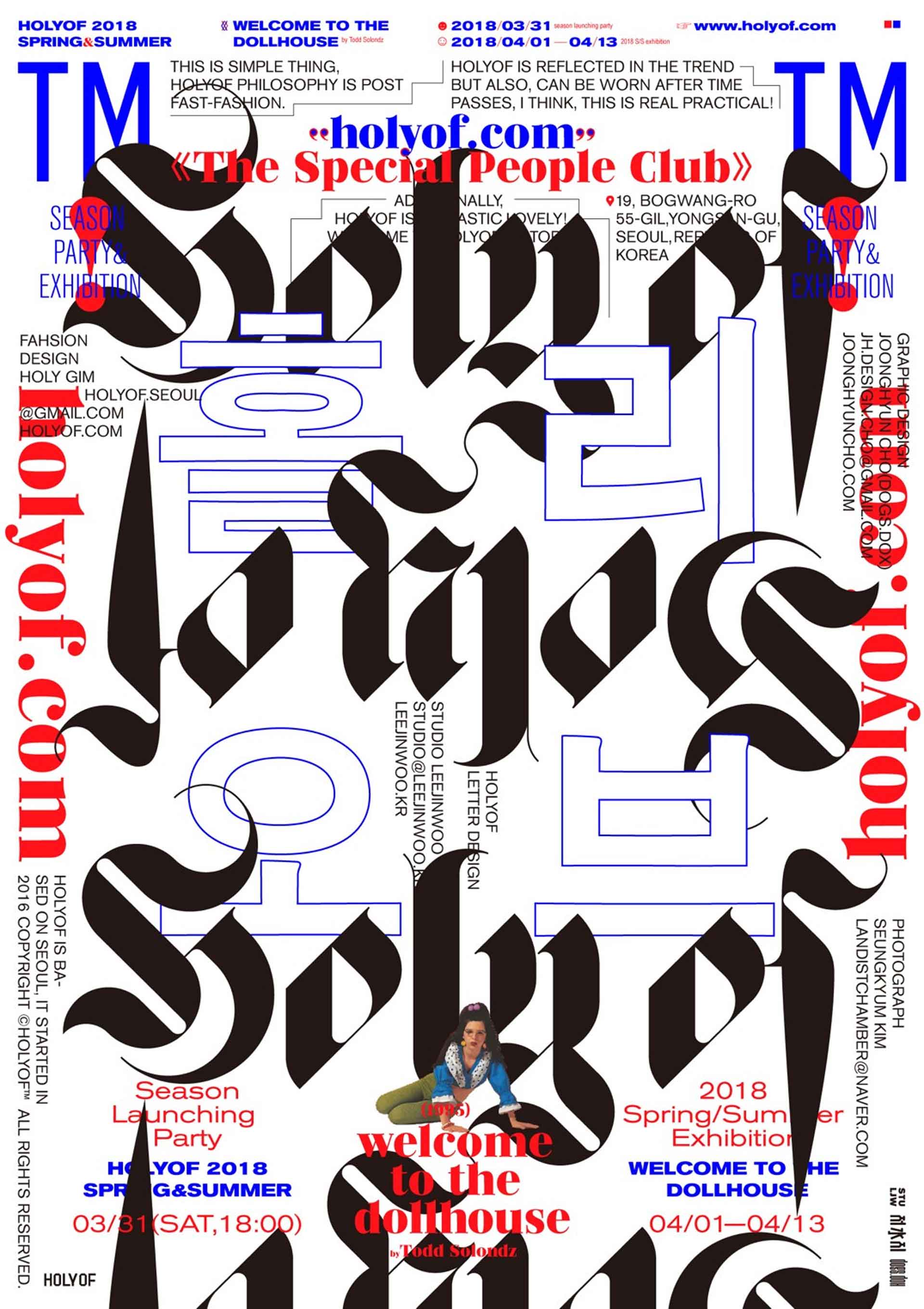
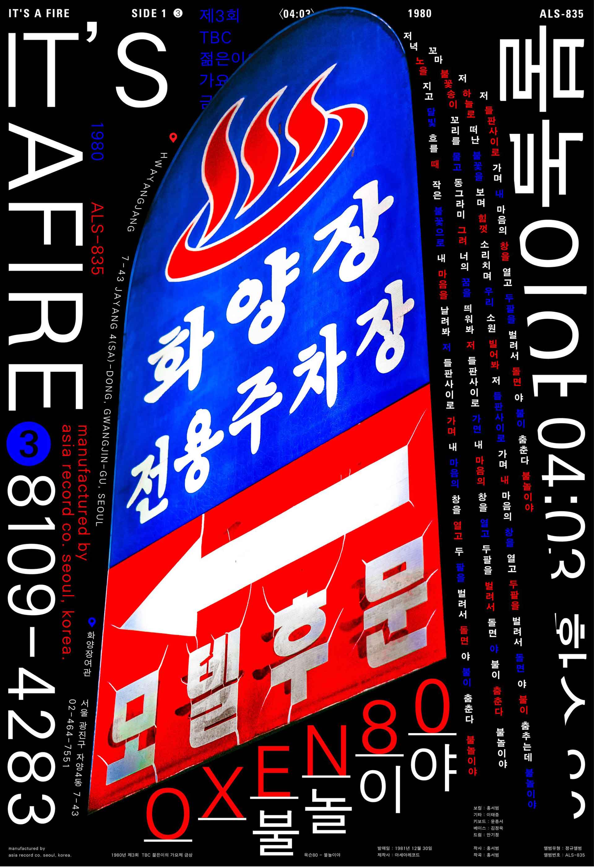
My generation of designers grew up in an environment where, thanks to the internet, real time comparison and learning from abroad were possible. As I worked on posters, I naturally became conscious of international standards and sought to meet them by increasing the density of information and form.
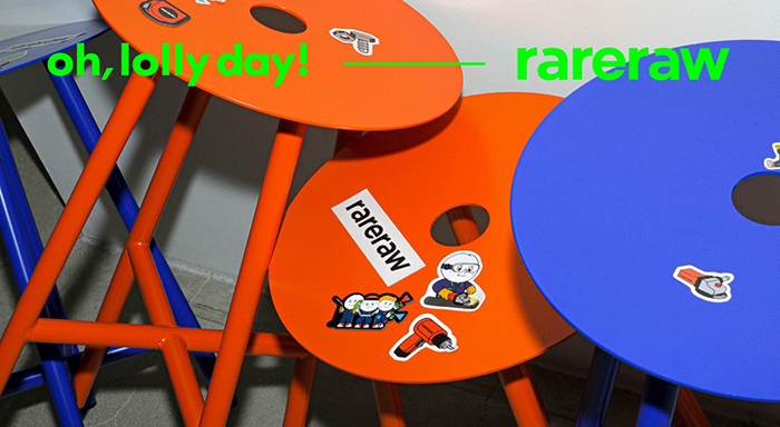
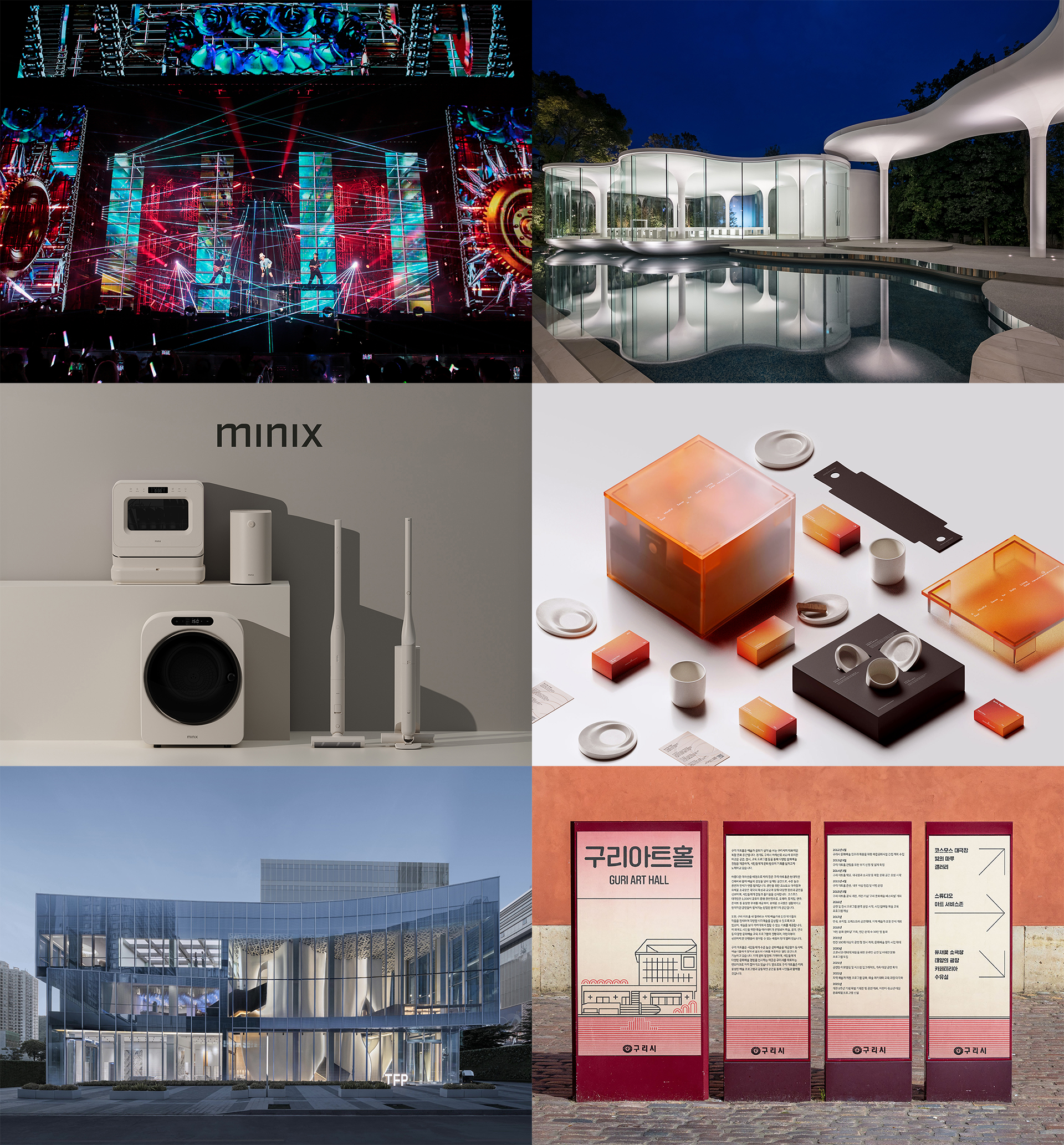
But I do not simply overload density. I first anchor the theme, tone, and message with contextually justified words or sentences. Then I source graphic elements from my own life and surroundings, such as objects in my studio and autobiographical experiences, or from Korean subcultures, including signage and everyday urban artifacts such as disposable lighters. For me, Koreanness is not confined to traditional patterns; it is more accurately revealed in today’s urban signifiers and in the active mixing of Hangul and English.
You have conducted workshops abroad. What differences or identities in Asian design cultures stood out to you through these experiences?
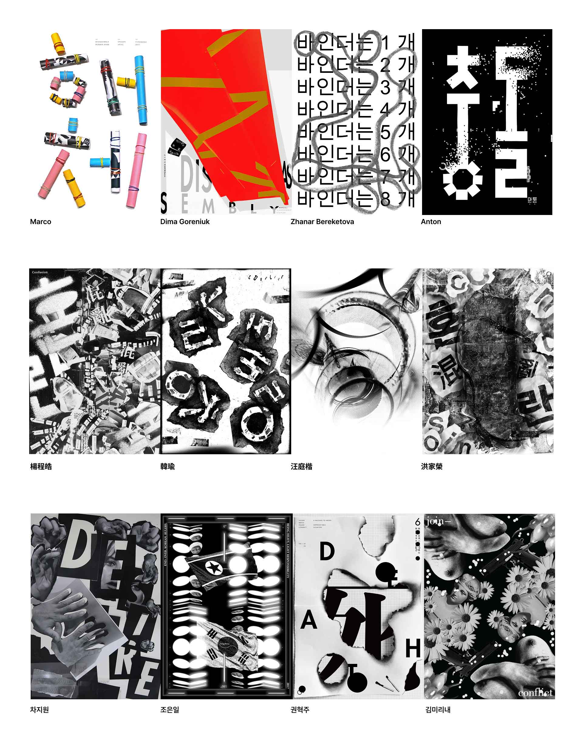
I cofounded the poster design workshop group WKSP, which led to invitations from universities in Korea and overseas. Among them, the sessions at Stroganov Art Academy in Moscow and Kun Shan University in Taiwan were especially memorable. In Russia, the emphasis fell on composition and bold color contrast. In Taiwan, drawing and analog process took center stage. In Korea, students tended to complete work within digital environments and iterate quickly.
In one assignment, we asked participants to reinterpret the unfamiliar shapes of Hangul in their own posters. Russian students translated Hangul into geometric, grid based structures. Taiwanese students leaned into script like rhythms and drawing based approaches. The results often echoed the spirit of Ahn Sangsoo’s experiments that “break the square frame” and Park Woo hyuk’s poetic typography, where structural play and layering create meaning that can travel across cultures.
What I witnessed above all was this: when designers encounter Hangul for the first time, regional aesthetics do not vanish; they reconfigure into new structural experiments. The encounter becomes a catalyst that reveals each culture’s default grammar, how it balances form and meaning, order and spontaneity, analog touch and digital precision, and that exchange is where a shared Asian identity begins to show itself.
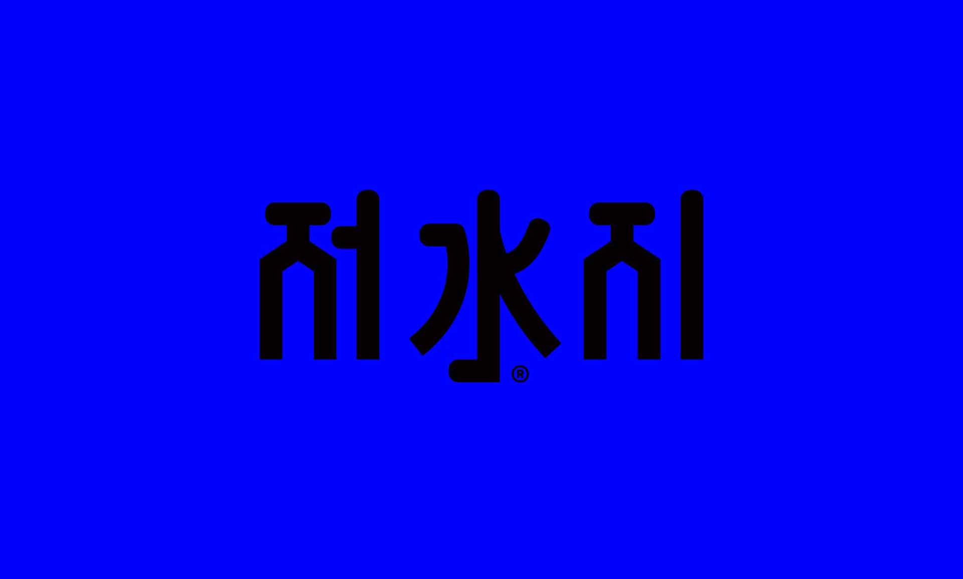
Your typographic experiments often combine Hangul, Chinese characters, and symbols (such as ®). What sparked this approach, and what message are you trying to convey?
I bring letters to the frontline of information. I first fix the “core narrative” through writing, then translate it into grids, line spacing, and kerning, and only afterward layer graphics. Different writing systems (Hangul, Chinese, Latin) and symbols (®™, →, №, (), [] etc.) are treated as materials, while reading order and hierarchy are strictly controlled. This principle is: letters come first, structure follows.
Why include symbols? Because they are not only forms but also signals of trust. Even a new identity, when paired with ® or ™, is quickly perceived as a regulated, credible brand. I treat symbols as navigational language: arrows, numbers, brackets act as small UIs that guide information flow. The mix of scripts and signs is organized through hierarchy, rhythm, and spacing. Ultimately, these experiments aim not at decorative chaos, but at creating legible complexity. Audiences decode the mixed layers in sequence, experiencing the logic of the brand through that process.

In brand identity projects, how do you see the cultural and visual power of Hangul? Could you share cases where adopting a Hangul logo has led to tangible outcomes, such as sales or investment growth?
Hangul’s block structure provides both unique form and cultural resonance. Early-stage startups must extract recognition and recall (Top-of-Mind pathways) with limited resources. That is why I often recommend Hangul wordmarks.
The reasons are clear:
1. Simplified pronunciation & recognition: English spellings often cause mispronunciations or confusion; Hangul removes that barrier.
2. Top-funnel clarity: Search and direct access improve as brand name consistency rises, and hashtags/mentions converge in one direction.
3. Organizational consensus: Internal communication quickly aligns on brand language rules (sound, spelling, applications).
For example, “탈잉” (Tal-ing) once emphasized its English form “Taling,” but inconsistencies in pronunciation (Tal-ling, Tol-ling, Tul-ling) led them to consolidate under the Hangul logo. Publicly available data also confirm this strategy. In my experience, such transitions not only strengthen brand recognition but also positively influence investor perception.
In your philosophy, what does the concept of “boundarylessness” mean? How is this enacted in real projects?
Boundarylessness is crossing cultural, linguistic, and formal borders while maintaining informational order. It’s about embracing Korea’s hybrid culture (“jjambbong”) as a strength, open to the world yet rooted in place. Practically, it means unifying multilingual and multiscript systems, experimental media, and both digital and physical contexts into coherent reading experiences. The focus is not mixing for its own sake, but setting rules that allow the mix to remain legible. So for each brand and project (posters included), I design a distinct “operating system.” Outwardly it may look free or disorderly, but rules such as typographic skeletons, hierarchies of scripts and symbols, and quantified rhythm and density ensure legibility. In short, I allow disorder only after I have established the order of legibility. This is my practice of “legible complexity.”
Finally, in your view, what is the legacy of Asian design, and how should it evolve?
The legacy of Asian design, in my perspective, lies in its enduring aesthetics of translation and hybridity. Across centuries, Asian cultures have demonstrated a remarkable ability to absorb, adapt, and rearrange different scripts, symbols, and technologies into entirely new visual and cultural orders. This legacy is not about passive borrowing; it is about active transformation that turns diversity into coherence and complexity into new systems of meaning.
In my own work, I aim to systematize these inherited qualities of speed, hybridity, and density into what I call legible complexity. Rather than celebrating chaos or eclecticism for their own sake, I focus on how multiple layers of language, symbol, and form can coexist while remaining intelligible. What matters most in this process is not appropriation, but equitable interoperability and reciprocity, a model of exchange where different traditions, tools, and aesthetics operate on equal footing. Importantly, this exchange must remain open and democratic, never monopolized by particular groups or elite classes, if it is to reflect the true vitality of Asia’s design spirit.
Looking forward, I believe Asian design should evolve through both research and practice that reinforces this ethos of openness. This includes continuing investigations into variable fonts and multiscript grids, integrating Hangul, Latin, and Chinese into interoperable typographic systems that reflect our multilingual realities. It also means systematically archiving and transforming urban signs, vernacular typography, and everyday symbols into operational design rules that can inform future projects. Finally, I see great potential in treating local research languages and cultural markers not as nostalgic artifacts but as raw materials for new experiments in type, branding, and systems design. In this way, Asian design can extend its legacy of hybridity and translation into a forward looking framework, one that is not only regionally rooted but globally resonant.


#14057, 905 49, Beolmal-ro 102beon-gil,
Dongan-gu, Anyang-si, Gyeonggi-do, Korea
Business Registration Number: 454-86-01044
Online Sales License No.: 2021-Anyang Dongan-1081
Copyright © DESIGNSORI Co., Ltd.
