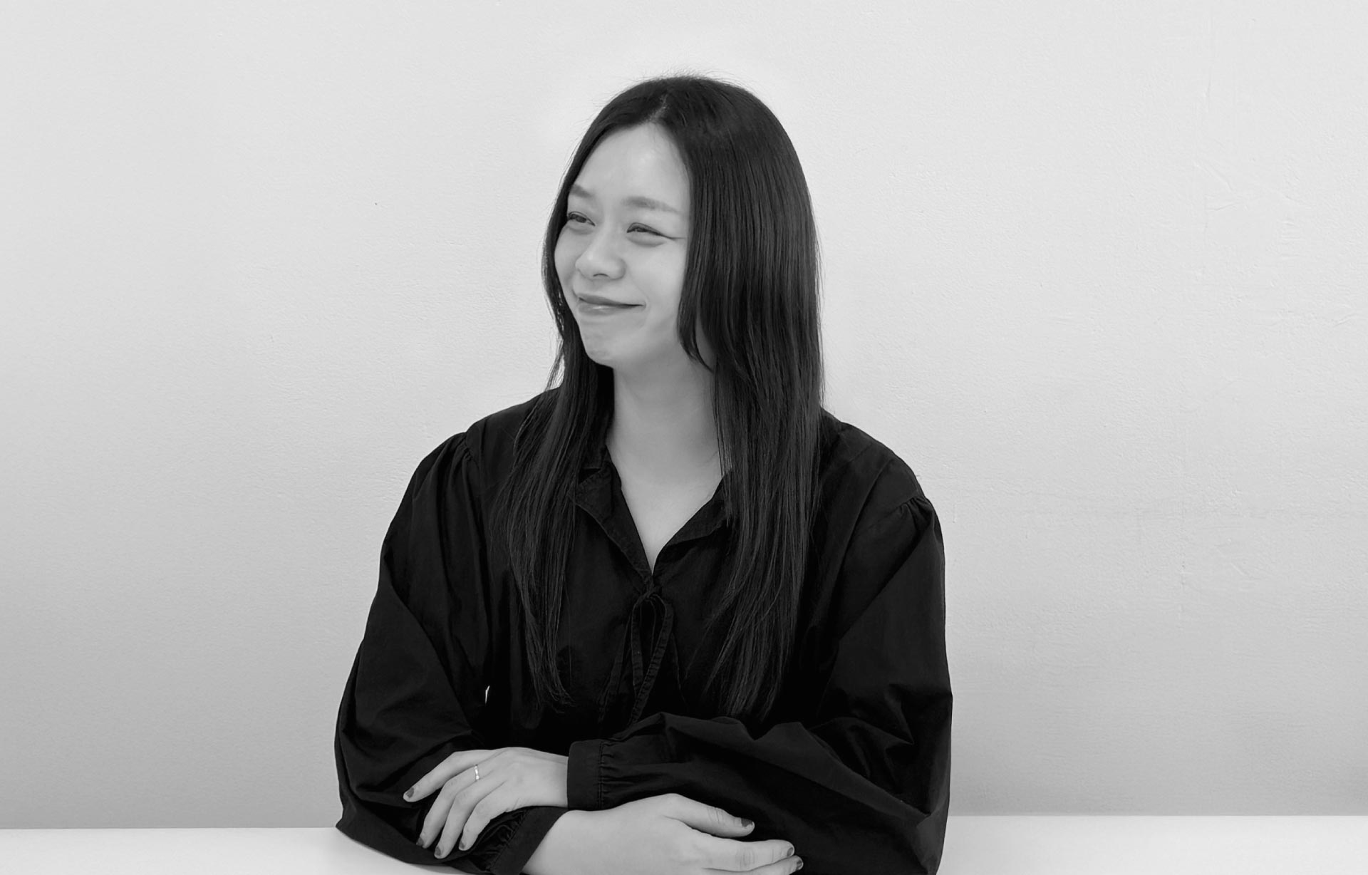
Director Inok Cho Founder of Studio Onsil
"Inok Cho, a graphic designer and the director of Studio Onsil, has played a key role in shaping the emotional touchpoints of global K-POP culture through her work on album packages for artists like BLACKPINK’s Jennie and BTS. As K-POP expands beyond music to become a global cultural phenomenon, the role of the designer who constructs its visual language has become increasingly strategic and multidimensional. In this interview, we explore how Studio Onsil interprets musical worlds and sonic narratives into visual form, what fundamentally distinguishes K-POP design from traditional branding, and how the global status of Asian design is being redefined in real time. Director Inok Cho offers profound insights, reminding us that “design is not about tools—it is about people,” and reflects on the intuition and attitude designers must uphold in an era of rapid technological change."
Please give us a brief introduction of yourself and tell us about the direction of Studio Onsil.
I’m Inok Cho, a graphic designer and the director of Studio Onsil. As the studio’s lead, I oversee and guide the full process of each project, ensuring that all components flow seamlessly from concept to execution. Onsil is not bound by a fixed design style. We prioritize flexibility, allowing us to interpret and express a wide range of concepts and moods across different projects. Our strength lies in decoding each project’s unique universe and translating it into its most suitable visual form.
K-POP album design is often seen as more than just a visual product. How would you describe its essential differences compared to standard branding projects?
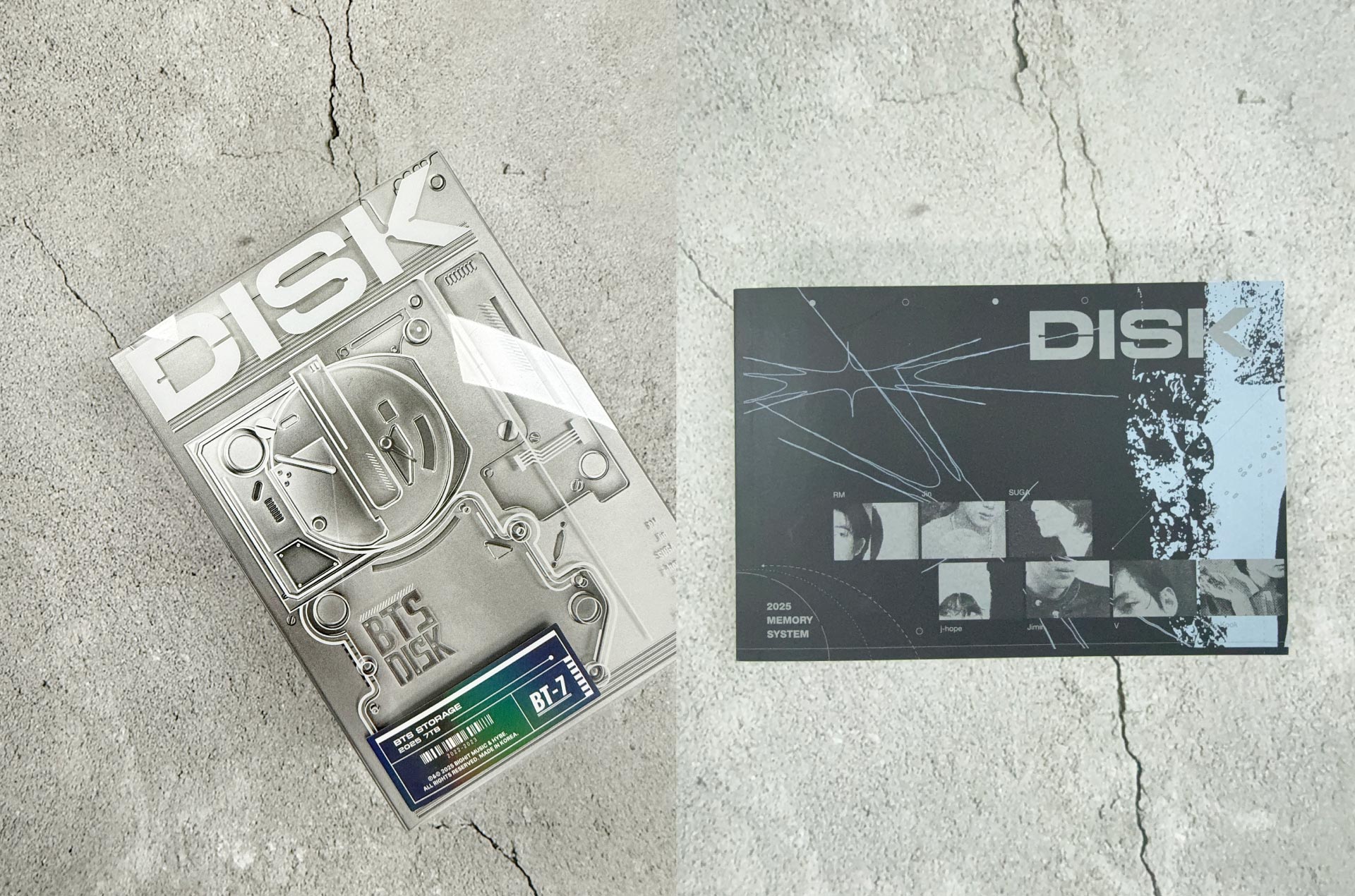
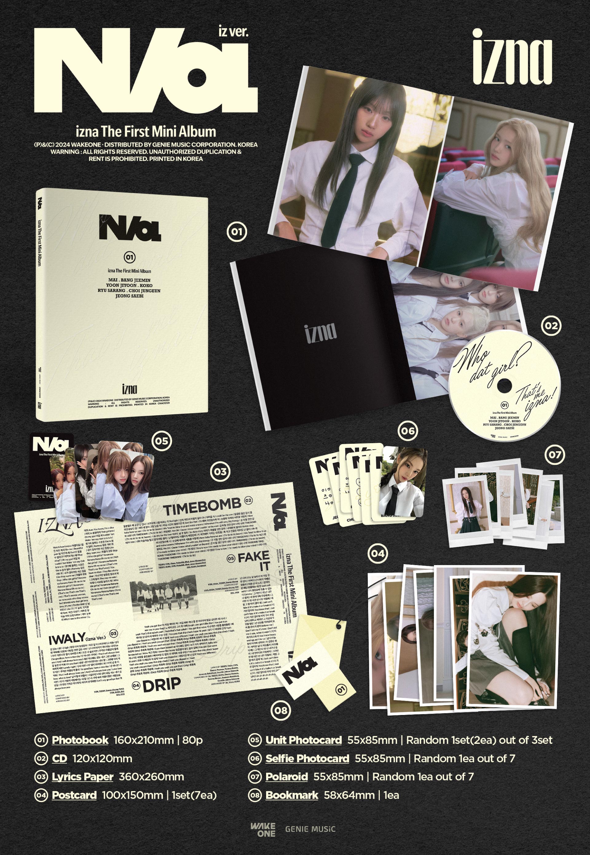
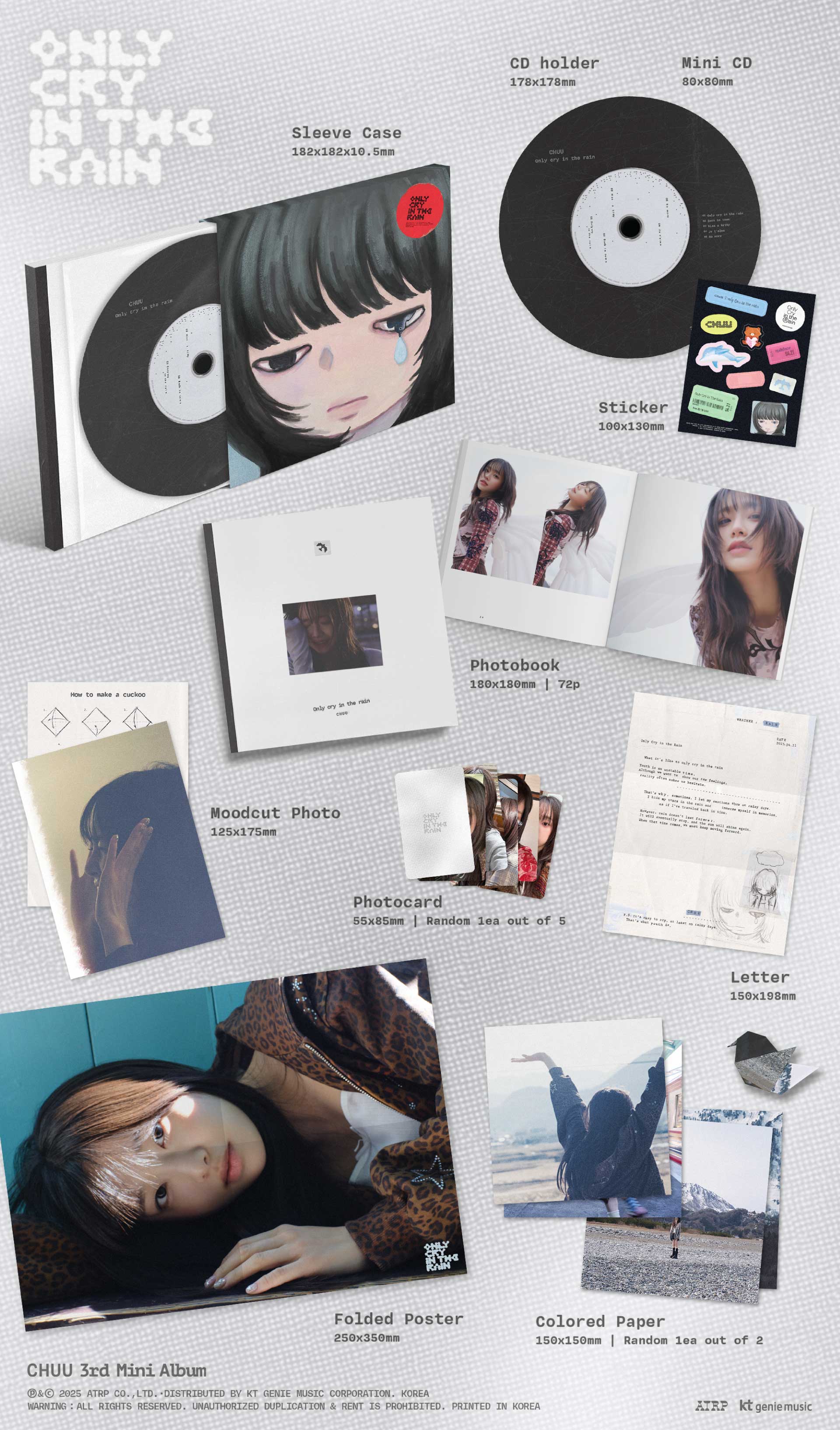
At the heart of K-POP design are two essential elements: music and fandom. While traditional branding is about building and maintaining a consistent identity over time, K-POP design must reinvent itself with every album. Each release comes with a new emotional trajectory, concept, and universe—requiring an entirely different visual language. In this sense, K-POP design is closer to a one-time emotional installation art. Our role is to translate the feelings and atmosphere conveyed through music into a physical, visual object that fans can experience. It’s about creating a tactile emotional medium—something fans can hold in their hands that bridges the music and their own emotional journey.

Among the many artist projects you’ve worked on, which was the most challenging or memorable for you personally?
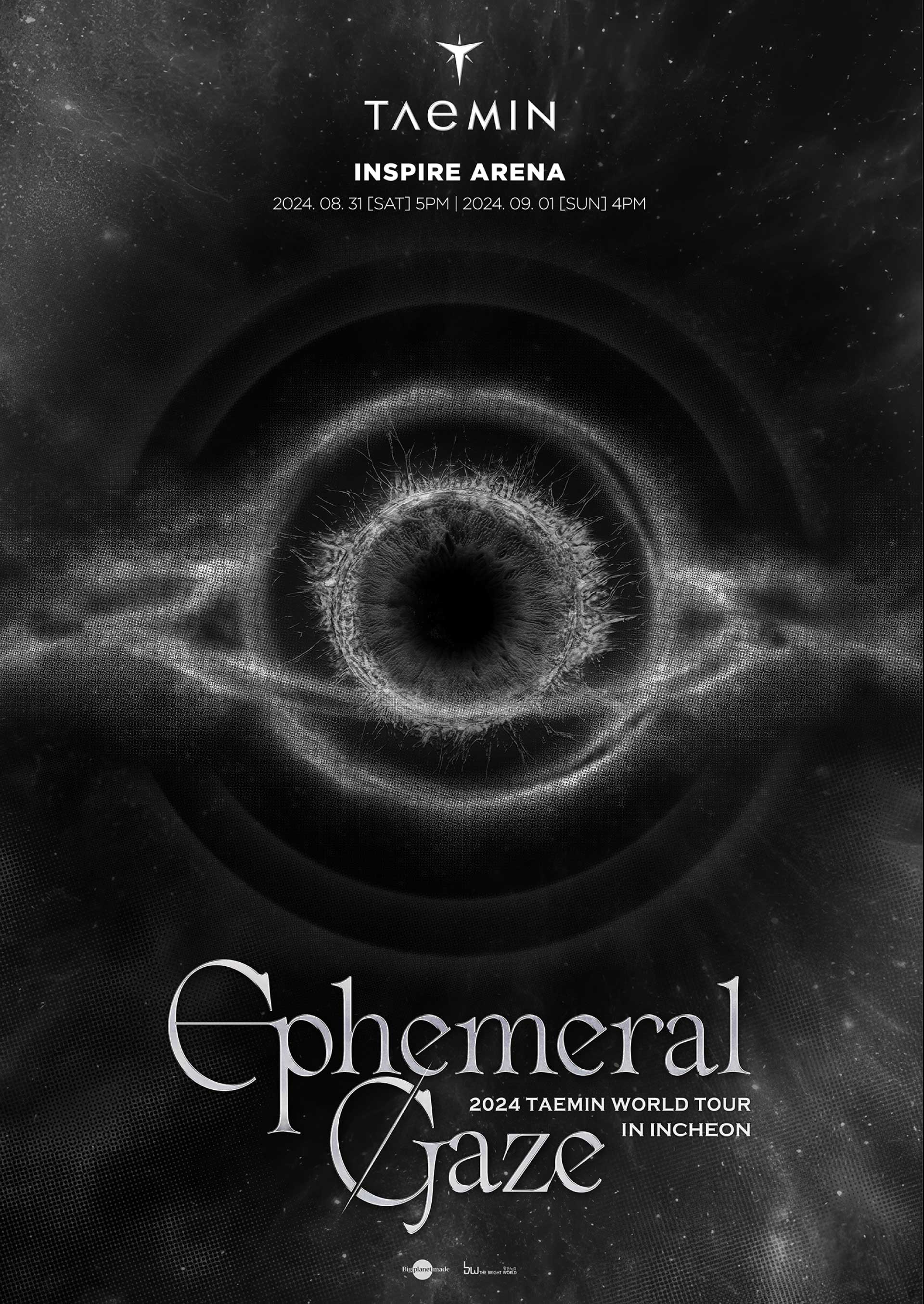
Every project presents a new challenge, but one that stands out is Jennie’s full-length album. The artist’s identity and the album’s narrative were exceptionally well-defined, making it a powerful experience to unpack and visualize those layers. From the overall structure of the album packaging to each individual photobook page and insert, every detail was meticulously designed to align with the story’s emotional rhythm. Our goal was to mirror the emotional resonance of the music with equal intensity in the visuals—so that listeners would feel, “This sound could only be visualized this way.”

When working on K-POP design for a global fanbase, how do you approach cultural sensitivity and cross-cultural communication?
Because K-POP is built on a global fandom, cultural awareness is absolutely essential. A single pictogram, color, or phrase might have unintended racial or political connotations in different countries. So we always try to review our designs through the lens of global communication, actively scanning for potential misinterpretations. K-POP design is also one of the fastest feedback-driven fields—reactions from fans across cultures arrive in real time. This allows us to continuously reassess our visual strategies from a variety of cultural viewpoints. We’ve learned to treat design not just as a visual artifact, but as something that must function harmoniously within cultural contexts.
As K-POP has become a global cultural phenomenon, have you noticed any changes in the perception of Asian design?
Absolutely. In recent years, we’ve felt a tangible shift in how Asian design is perceived. We now receive direct collaboration requests from Japan, China, Thailand, and other Asian countries. In fact, we’re currently working on a Japan-based album release. Globally, there’s growing interest in the designers behind K-POP content, and Korea is increasingly seen not only as a leader in music but also in album design, visual trends, and packaging. In response to these expectations, we aim to harmonize Asian aesthetics with contemporary expression in every project we take on.
Studio Onsil is preparing a new design label, Furt Layout. How does it differ from your existing work, and what future direction do you envision for it?
Until now, Studio Onsil has focused on visualizing the worlds of clients and artists. Furt Layout, on the other hand, is a design label that aims to showcase our philosophy in a more autonomous and experimental way. Through this label, we want to collaborate with independent or emerging artists—starting from a single track and building an entire visual world around it. This isn’t about responding to external requests, but rather about leading creative direction from the designer’s own point of view. We hope this initiative will reveal a different facet of Studio Onsil’s identity.
Are you planning to expand your network with more Asian or global designers and artists? How do you think a platform like ADP can support this vision?
If ADP leads to international designers or studios discovering our work and reaching out, that in itself would be a meaningful connection. We already have projects underway in Japan and China, and we’re deeply interested in how design studios there work—what print technologies they use, and how their visual sensibilities are shaped. Directly experiencing each country’s workflow opens up new possibilities to combine those methods with Korean aesthetics. I believe ADP can serve as a crucial hub for such collaborations—a platform where Asia’s design communities can learn from and inspire one another.
AI technology is rapidly entering the design field. Are you feeling any practical changes in the workflow? How do you see AI fitting into K-POP design?
Entertainment design is one of the fastest-evolving areas, and AI is already being adopted in many parts of our workflow. From generating images to testing concepts and adjusting layouts, designers are using AI to overcome time constraints and expand their creative bandwidth. Some fans may still be hesitant about AI-influenced outputs, but we believe AI can be a helpful tool for enhancing expression. Especially in K-POP—where speed and emotion must coexist—AI will likely become a valuable assistant, helping designers explore new visual possibilities while maintaining their own artistic sensibilities.
Lastly, what do you believe is the most important mindset for today’s designers? Any advice for those shaping the legacy of K-POP and Asian design?
In an era where tools and technologies evolve rapidly, I believe the most important things for designers remain: fundamentals and sincerity. No matter how advanced the technology becomes, the ability to sense nuance, emotional flow, and human warmth is still irreplaceable. In fact, the more digital our world becomes, the more we value analog sensibilities. At its core, design is not about tools—it’s about people. The way a designer approaches their craft deeply affects the outcome. Especially in these rapidly changing times, staying centered and trusting one’s own intuition is the strongest foundation a designer can have.

editor@asiadesignprize.com


#14057, 905 49, Beolmal-ro 102beon-gil,
Dongan-gu, Anyang-si, Gyeonggi-do, Korea
Business Registration Number: 454-86-01044
Online Sales License No.: 2021-Anyang Dongan-1081
Copyright © DESIGNSORI Co., Ltd.
