
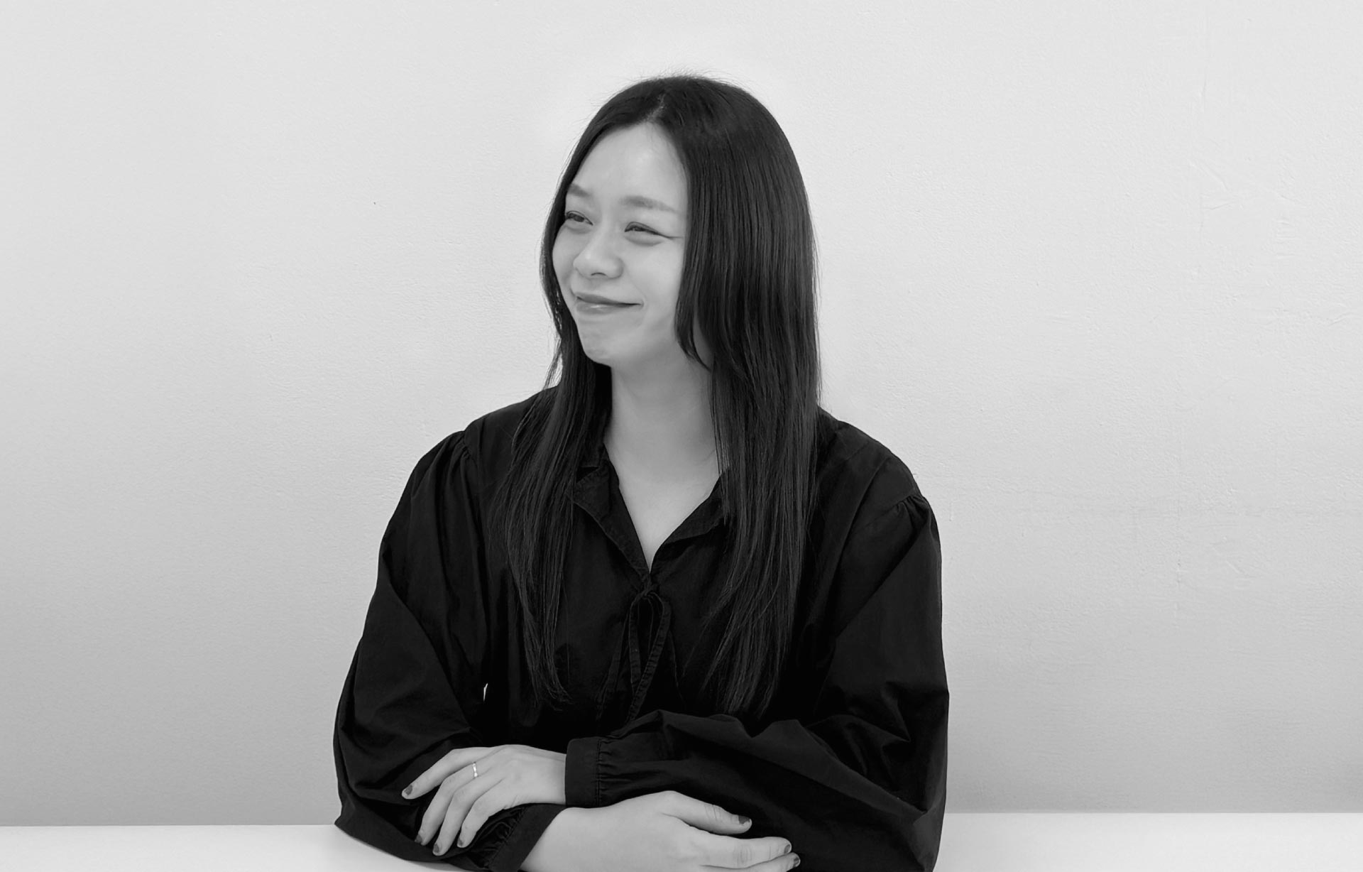
Director Masahito Hanzawa
Cofounder of Power Graphixx
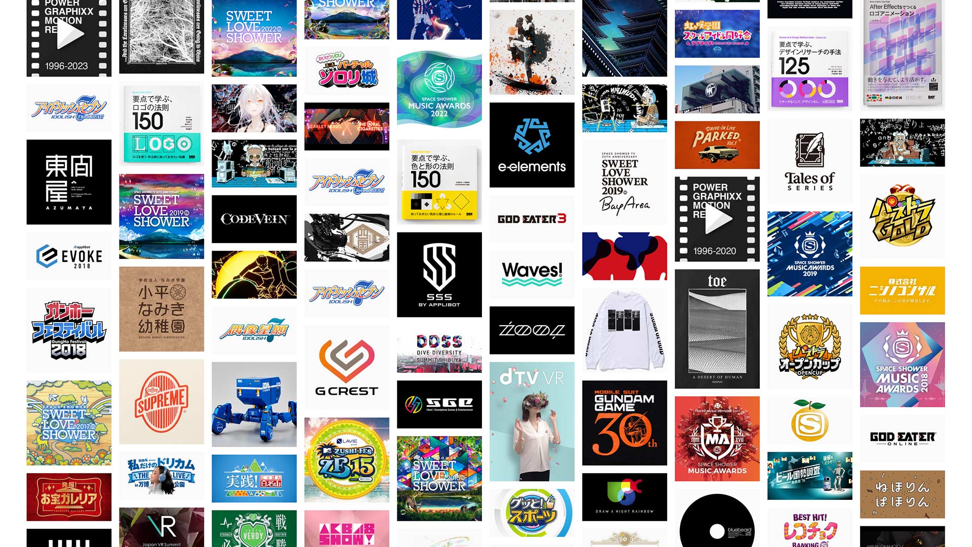
Power Graphixx is a Tokyo-based design studio known for expanding the boundaries of visual language. Founded in 1996 by two architecture students, the studio has since evolved into a platform for exploring the liminal spaces between graphic and motion design, 2D and 3D, structure and emotion. With a foundation in self-directed experimentation, Power Graphixx represents a unique axis in Japanese design—less about surface aesthetics and more about constructing “scenes” and orchestrating “narratives.” In this ADP Journal interview, cofounder Masahito Hanzawa reflects on the studio’s philosophies, methodologies, and the cultural dimensions that inform their cross-disciplinary approach. Through music, games, cities, and pixels, Power Graphixx continues to design stories that transcend medium and discipline—offering insights not only to designers but to all who shape cultural content.
To begin, could you briefly introduce yourself and the vision behind Power Graphixx?
My name is Masahito Hanzawa and I am responsible for graphic design at Power Graphixx. My colleague Yoshiyuki Komatsu focuses on motion graphics. Our studio was founded in Tokyo in 1996, originally by a group of architecture students who became fascinated with visual design and video production. Most of our skills were not acquired through formal education but through self initiated learning and exploration. What began as curiosity gradually grew into a deeper realization that design has the power to shape daily life, culture, and communication. That belief lies at the heart of our studio’s philosophy. We see design not only as a means of visual representation but as a tool to bridge emotion and structure. We aim to expand the scope of what design can achieve, maintaining both artistic experimentation and conceptual clarity even within the framework of industry projects. Our vision is to keep stretching the boundaries between disciplines and create new ways to connect people with meaning.
Your portfolio spans a wide range of genres, tones, and moods. How do you approach working across such diverse fields, and how do you adapt your design language for each context?
At the beginning of every project, we focus on understanding the client’s core needs and the real issue behind the brief. Rather than applying a consistent visual style, we construct new problem solving strategies for each case. This method leads us to create visual languages that are always tailored and effective. Our priority is to transform complex ideas into clear and powerful design expressions. This philosophy allows us to work across different tones and genres while staying conceptually grounded. If you look at our archive of the past 25 years, it’s not a collection of style variations but a spectrum of solution strategies. We believe that visual adaptability is key, and that good design is less about self expression and more about interpretation and empathy. We don’t pursue visual consistency for its own sake but instead seek consistency in clarity and purpose.

< © 2012 Nike, Inc.>
In your view, is there something culturally distinctive about how design projects are managed in Japan? For example, Korean projects often operate on tight deadlines. Have you noticed any patterns by country or by industry?
Most of our domestic clients come from the entertainment industry including games, music, television, and sports. In Japan, these collaborations tend to follow a detailed process with thorough meetings, structured feedback, and gradual refinement toward a final product. The way Japanese teams work often reflects a preference for precision, balance, and shared responsibility.
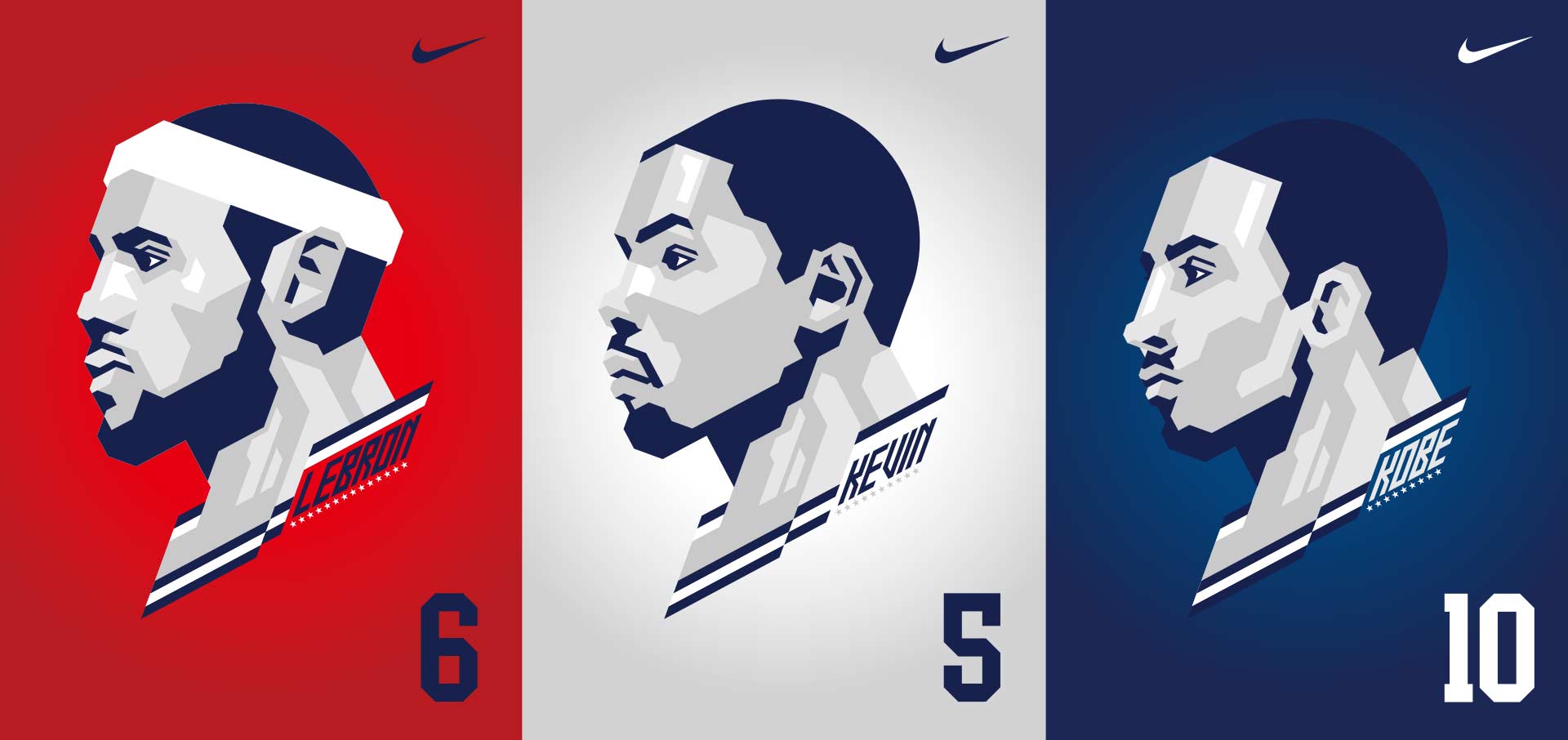
In contrast, overseas clients frequently offer more open ended direction, often saying things like “just send us what you think is best.” This difference reflects not just workflow but deeper cultural perspectives on authorship and trust. For example, we created flat geometric illustrations of the USA Olympic basketball team for the London Games. The work was expected to be iconic and immediate, reflecting a more direct communication culture. Working across regions, we have learned to interpret and adjust to these varying dynamics, which we believe is a critical part of being a designer in a global context.
Many of your works incorporate bold 3D aesthetics. What led you to expand from 2D to 3D, and how have you developed your techniques for blending the two?
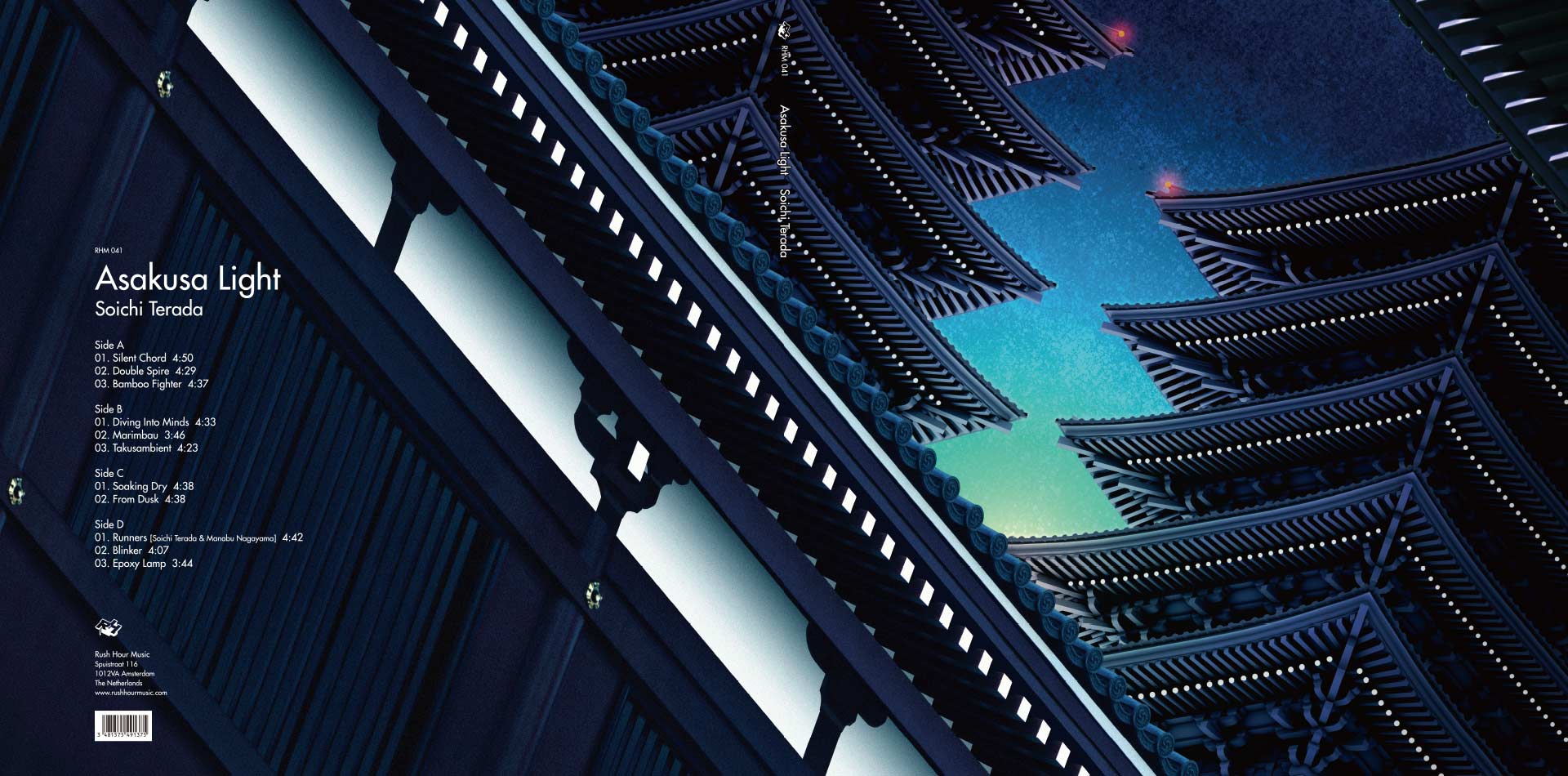
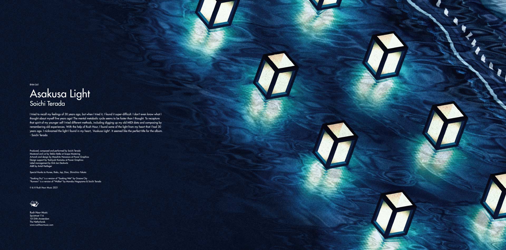
We originally started by experimenting with ways to add depth to 2D visuals. But over time, we became fascinated with reversing that process—taking 3D models and reimagining them as 2D compositions. This method created a subtle visual tension, a kind of controlled distortion that became central to our style. A good example is the cover art for Soichi Terada’s “Asakura Light,” released by Rush Hour Music in the Netherlands. While it appears three dimensional at first glance, it is actually a flat isometric illustration made from three distinct layers—foreground, background, and sky. We deliberately crafted the visual to make viewers question what they were seeing. That ambiguity creates a moment of engagement and makes the work more memorable. This blend of dimensions, and the friction between them, has become one of our signature techniques.
< © SPACE SHOWER MUSIC AWARDS >
Was there a project where 2D and 3D elements came together particularly well—one that best represents Power Graphixx’s unique approach?
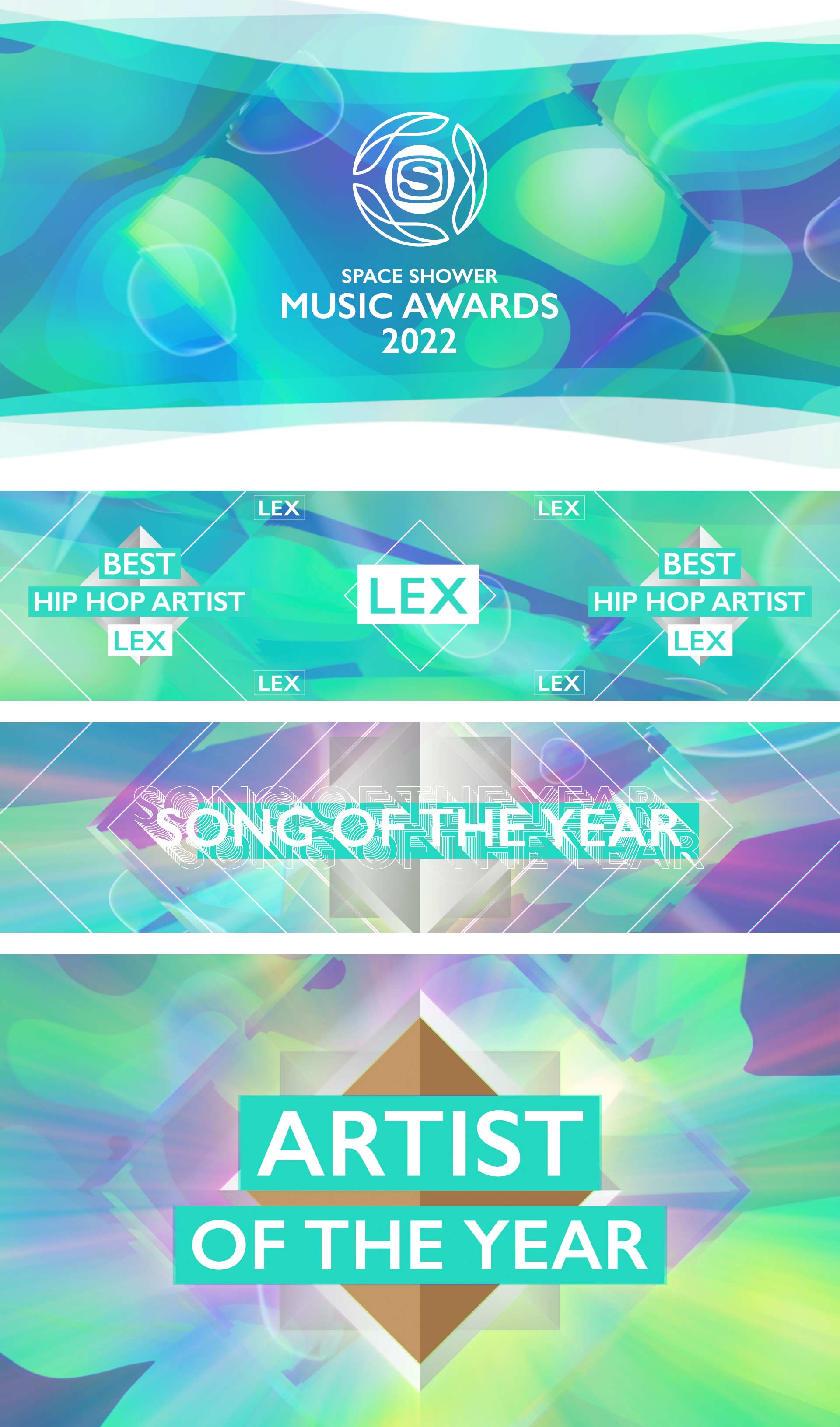
Among our various music award and festival projects, the “SPACE SHOWER MUSIC AWARDS 2022” stands out as a project where we intentionally fused 2D and 3D design elements. The theme that year was “fluidity and change,” which we interpreted visually by extracting contour lines from 3D objects and converting them into animated 2D textures. We produced content for nearly thirty categories including opening sequences, live performance backdrops, and award visuals. Each needed to feel distinct yet coherent within one overall style. To achieve this, we layered typography onto organically morphing motion graphics to create a hybrid identity that felt alive. It captured what we call a borderless design language, one that moves effortlessly between dimensions and holds emotional rhythm throughout.
Your works are known not only for their tools and techniques but also for their atmosphere and narrative depth. How important is storytelling in your design process?
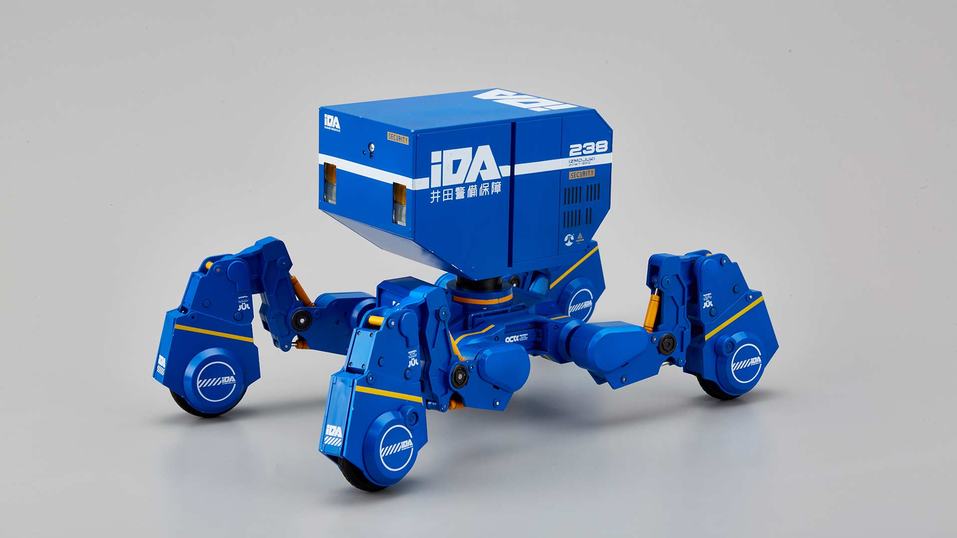
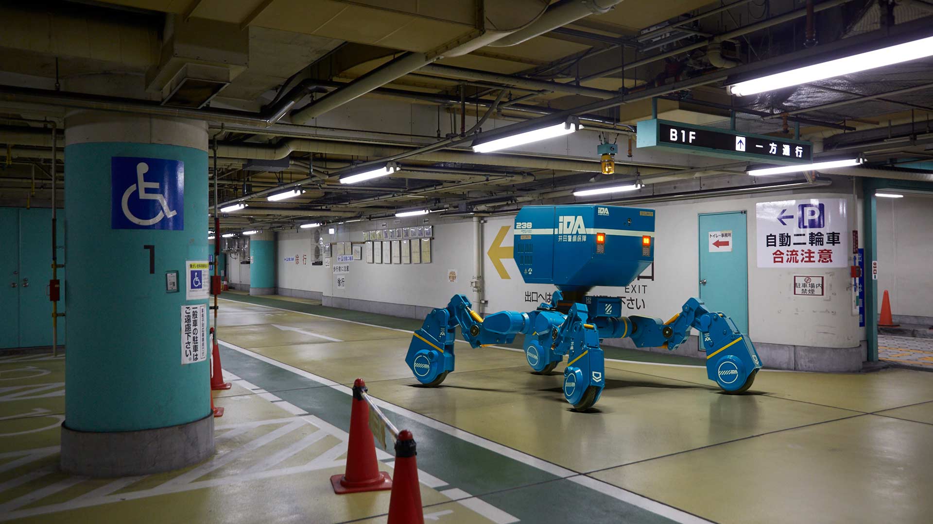
In the entertainment field, design must align with emotional context and narrative structure. We see design as a medium for atmosphere, not just function. Our process often begins by sensing the emotional tone of a project—its tempo, its mood—before diving into visuals. A notable example is our collaboration with IZUMOJUKI and 1000toys. We co developed a fictional world around a heavy machinery brand, and created visual designs that were later manufactured as collectible art toys. There was no client brief. Instead, the three teams built the world together. Our designs didn’t just depict machines—they evoked imagined cityscapes and the unseen stories they might carry. We aimed to design scenes that prompt interpretation, not prescribe meaning. That emotional openness is key to our idea of storytelling through design.
As a Japanese designer working internationally, what do you see as the distinctive characteristics of Japanese graphic and motion design compared to global practices?
Our core design philosophy is rooted in the process of removing the unnecessary and refining what remains to its essential form. This is not merely an aesthetic preference for minimalism, but a deliberate method for amplifying the meaning and resonance of each visual element. When only the essentials remain, design has the power to communicate more deeply. It can deliver a strong message without complexity, and it can hold emotional nuance within simplicity. We believe this approach reveals the universal value and strength of design itself. While this way of thinking is influenced by modernist principles, it is also deeply informed by Japan’s cultural foundation and sensibility. In our view, design is not only about what is visible, but also about the meaning that emerges from what is intentionally left blank or unspoken. The identity of Japanese design lies not in surface-level visual style, but in a quiet posture—one that shows respect for the viewer and gently handles emotion. It creates a structure of empathy that needs no verbal explanation. Within this quiet tension, we aim to craft stories and fine-tune the balance of their delivery. That is the direction we continue to pursue through our work.
Finally, what advice would you give to young Asian designers exploring both commercial work and experimental art?
Keep asking yourself what kind of designer you want to be. In the rush of client work and deadlines, it’s easy to lose sight of your original values and goals. That is why it’s important to revisit your first inspirations and hold onto your creative core. Even when working on commercial projects, never forget your own voice. Use those jobs as training grounds to refine your thinking and your craft. At the same time, make room for experimentation—not just in aesthetics but in mindset. Balance is essential. The most successful designers are those who navigate between the practical and the poetic, the market and the message. Design is not a product—it’s a lifelong process of becoming.

editor@asiadesignprize.com


#14057, 905 49, Beolmal-ro 102beon-gil,
Dongan-gu, Anyang-si, Gyeonggi-do, Korea
Business Registration Number: 454-86-01044
Online Sales License No.: 2021-Anyang Dongan-1081
Copyright © DESIGNSORI Co., Ltd.
