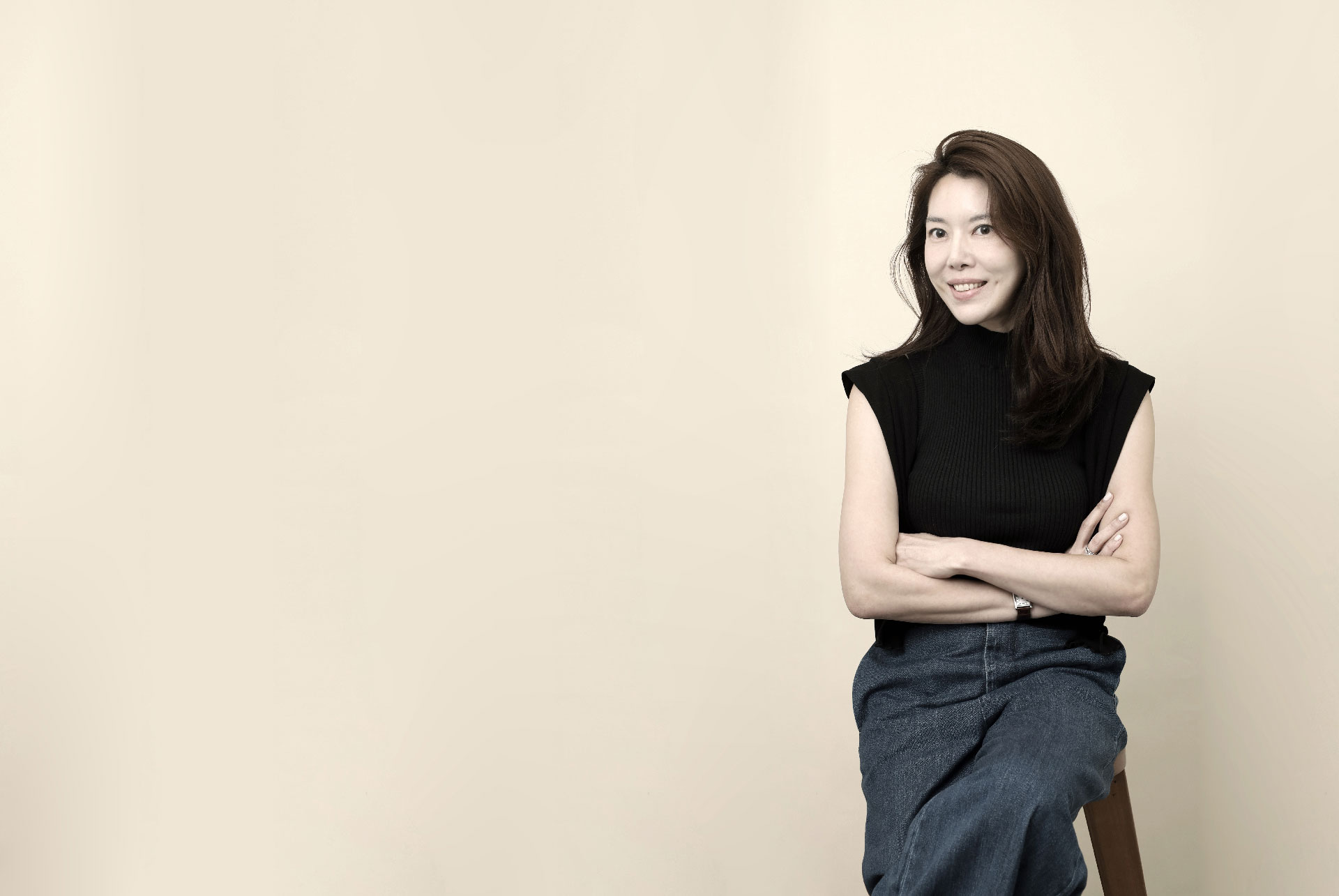
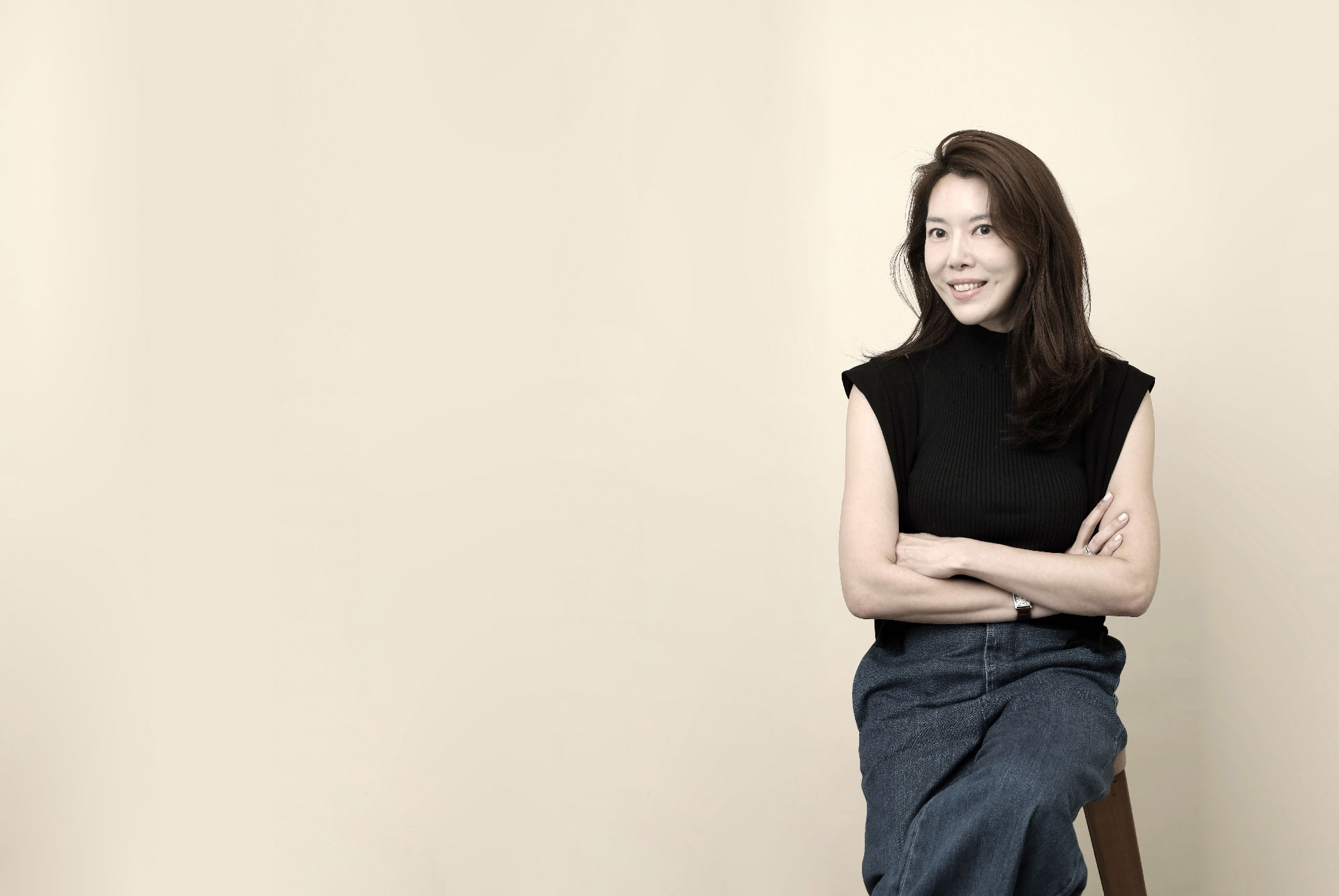
Cath Kwon Creative Director of WOO.K Concept
"Headquartered in Singapore, WOO.K Concept is a brand and spatial design studio and a partner of INITIA GROUP, which operates F&B and wellness businesses across Singapore, Malaysia, and Indonesia. The studio brings a consistent vision to every stage of a project, from brand concept and strategy to naming, brand identity, graphics, spatial design, products, services, and the completion of the physical space. Through GOCHU Korean Dining, Creative Director Cath Kwon communicates a distinctly Korean sensibility through materials, light, circulation, and service rather than overt cultural symbols. Behind the recognition of three different projects at the K-Design Award lies a shared commitment: preserving each brand’s individual identity while carrying its ideas through to operations and technical implementation. In this interview, we discuss the development of the three brands, how a cave motif became the basis for different experiences, how cultural authenticity is balanced with local sensibilities in overseas markets, and how collaboration brings design and operations together into a unified customer experience."
Please introduce WOO.K Concept and the people taking part in this interview. Your partner, INITIA GROUP, operates multiple brands across beauty, wellness, dining, education, and lifestyle. What values guide WOO.K Concept when developing and designing brands with such different characteristics, and what role does design play in that process?
We are Cath Kwon, Creative Director, and Chu, Interior Design Lead, at WOO.K Concept, a brand and spatial design studio and a partner of INITIA GROUP. We believe INITIA GROUP’s work across different sectors reflects an ambition to introduce new experiences and value throughout people’s everyday lives, extending beyond the growth of individual businesses. Beauty, wellness, dining, education, and lifestyle may appear to be separate fields, but they are all closely connected to daily life. By developing and operating brands across these areas, INITIA GROUP connects the experience and insights it accumulates and continues to create new possibilities.
Through our work together, we have found that one of the group’s defining qualities is its commitment to giving every brand a clear personality and purpose. It places importance on creating meaningful experiences in people’s lives that extend beyond the products or services themselves. Within this process, design does much more than make a brand visually attractive. It defines what the brand communicates, what values it conveys, and how customers should remember the experience. At WOO.K Concept, we begin by clearly defining the essence of a brand. We then extend it across identity, space, graphics, products, and other points of contact. We place particular importance on allowing the brand’s philosophy to emerge naturally through the physical space and the customer experience.
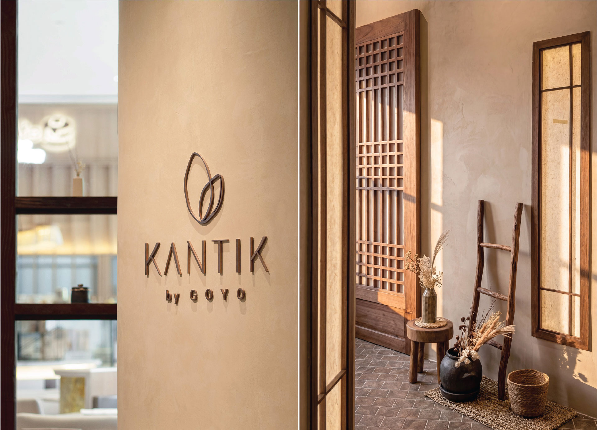
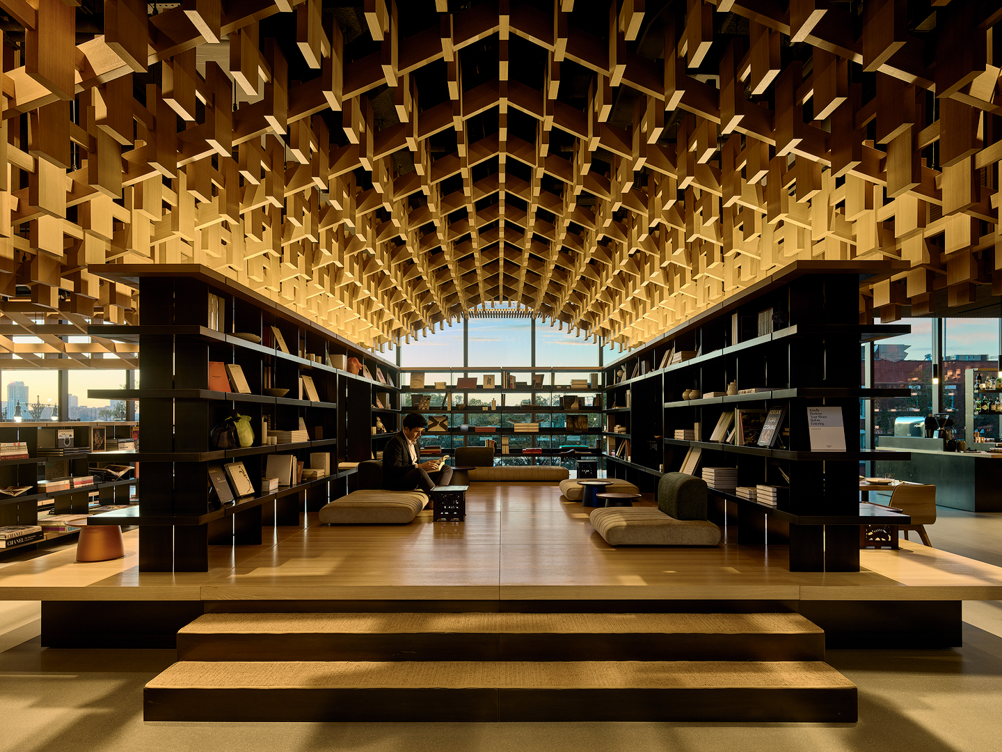
< Kantik by Goyo, K-DESIGN AWARD 2026 GRAND PRIZE >
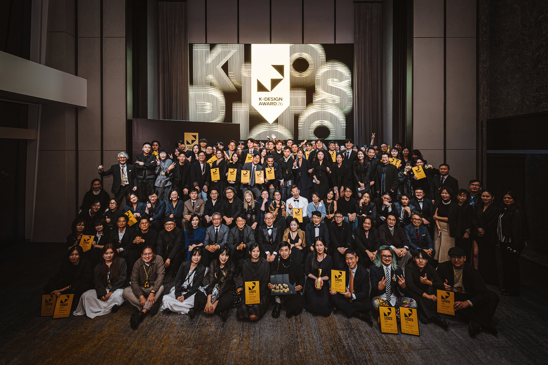
Kantik by Goyo, DRIM GOLD, and GOCHU Korean Dining were all recognized at the K-Design Award. What does this recognition mean to WOO.K Concept, particularly given that the three projects differ in character and function? Why did you enter each project, and what do you believe enabled all three to receive awards?
Having all three projects recognized carries a special meaning for us. Beyond receiving three awards, we value the fact that the stories of three different brands were appreciated on their own terms. At the beginning of a project, our first question is, “What can belong uniquely to this brand?” That comes before deciding which style to use. We then consider what aspect of the brand might make people stop and take notice. By entering these three projects, we wanted to show the diversity of the brands we create. Kantik by Goyo, DRIM GOLD, and GOCHU Korean Dining differ in scale, atmosphere, and the experiences they offer customers. We therefore focused on presenting each project’s story as honestly and clearly as possible.
At the same time, we were committed to maintaining a consistent direction from the initial concept through to the smallest spatial details. Although the projects developed in different ways, they share a clear understanding of the brand that was carried through into the completed space and experience. That is what makes these awards particularly meaningful. They recognize our process of discovering each brand’s appeal and expressing it in its own way, rather than validating a single signature style.
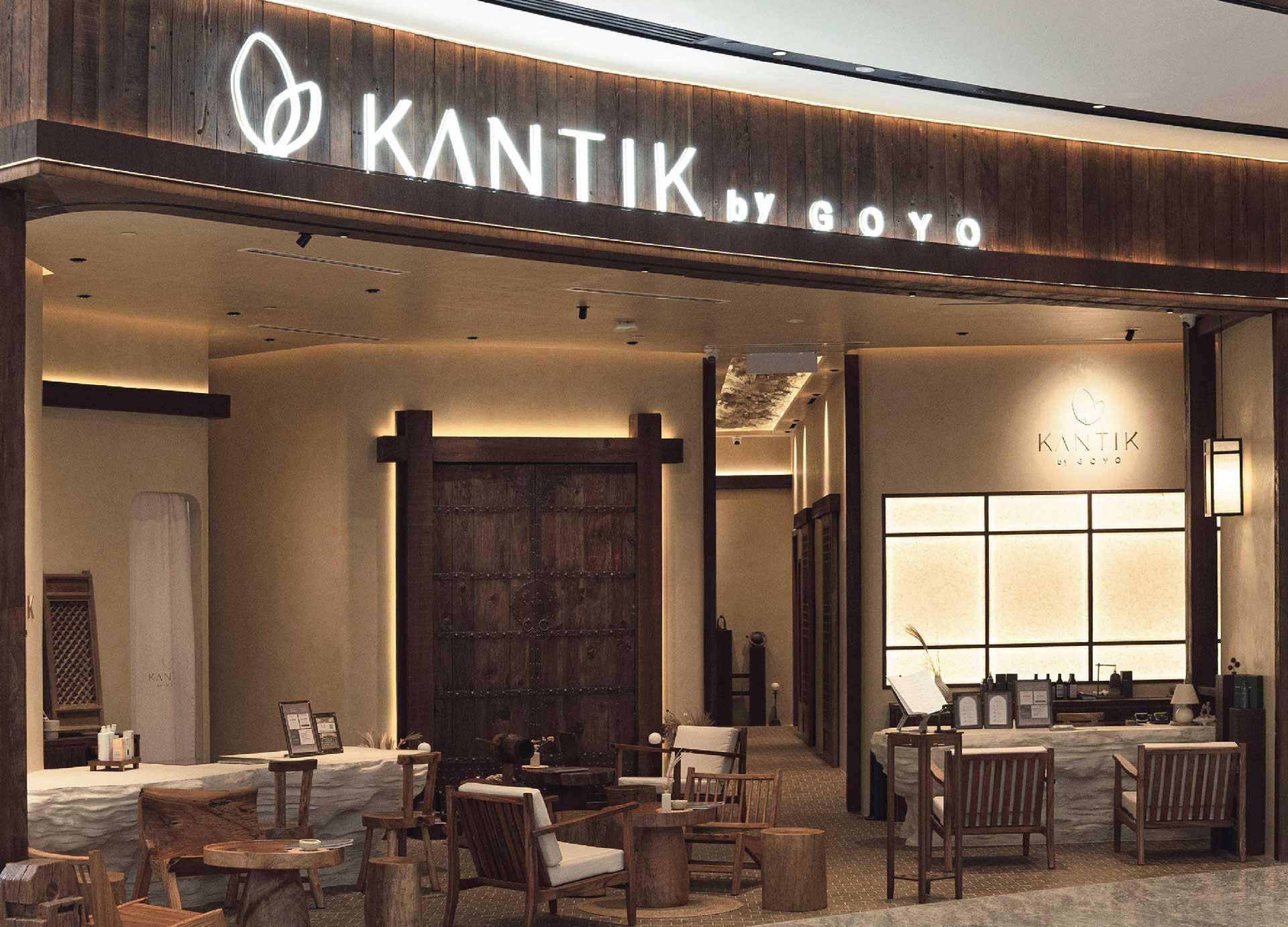
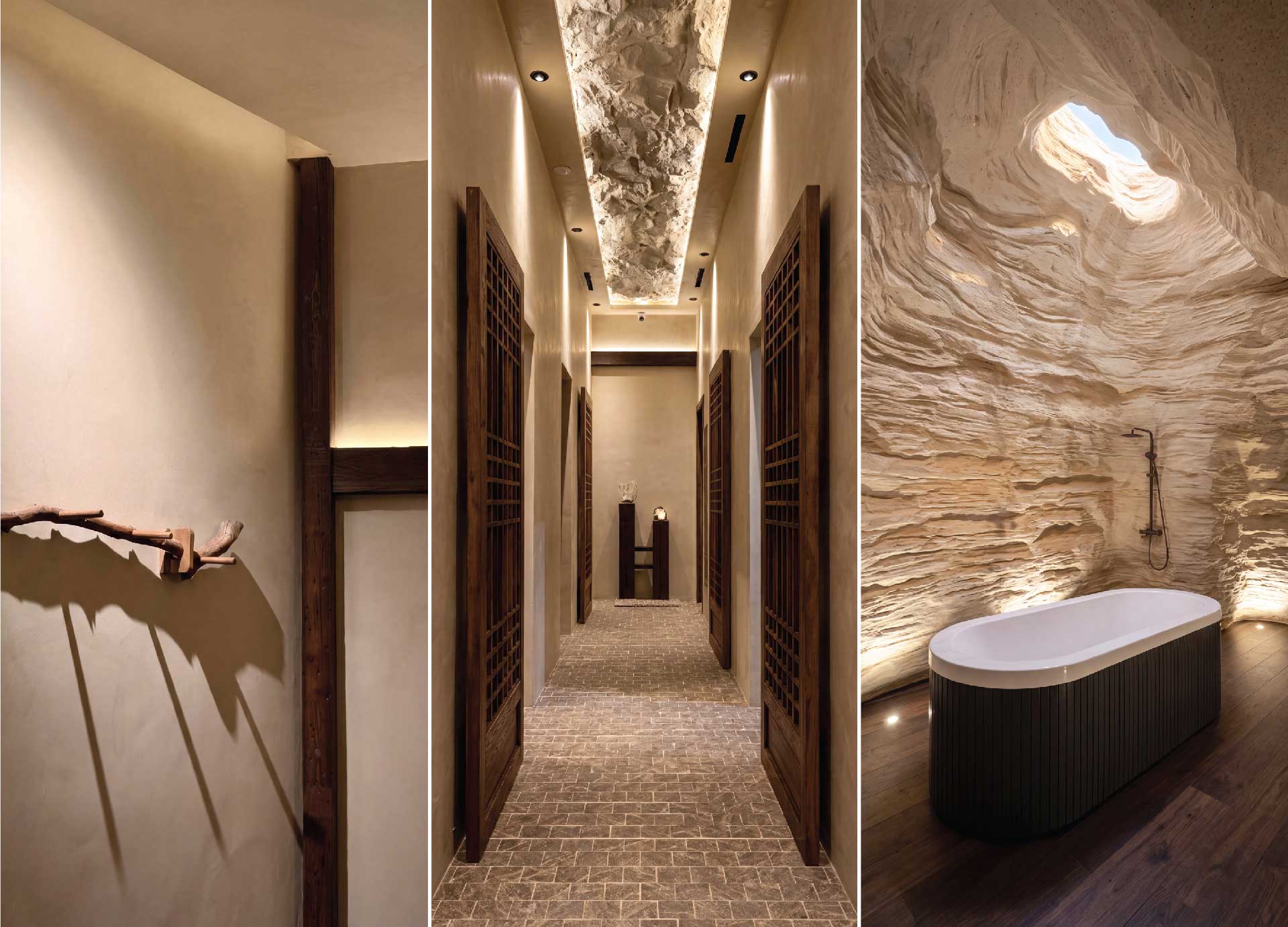
< Kantik by Goyo, K-DESIGN AWARD 2026 GRAND PRIZE >
Kantik by Goyo is a wellness space developed around Korean healing philosophies and the restrained aesthetics of hanok, traditional Korean houses. How did you interpret the idea of Korean healing, and how did you make it feel natural within Malaysia’s urban environment and to local customers? How do the head spa, body care, traditional Korean body scrubbing, natural materials, and fluid spatial transitions come together as a restorative experience?
Our first consideration when designing KANTIK was how to make Korean wellness feel accessible and familiar in Malaysia. We already had GOYO, a head spa brand that began in Singapore. While GOYO offers a contemporary interpretation of Korean wellness culture in Singapore, KANTIK was created to extend that experience into Malaysia’s different cultural and environmental context. We began with the local language when naming the brand. KANTIK comes from the Malay word cantik, meaning “beautiful.” We felt that this word captured our approach to wellness. We wanted to express the idea of recovering one’s natural beauty by caring for and restoring the body and mind, rather than focusing solely on outward appearance. We also wanted to bring together the philosophy of stillness associated with GOYO and the idea of beauty expressed by cantik. KANTIK therefore became a new interpretation of Korean wellness philosophy through Malaysian language and culture, with an identity of its own.
We envisioned KANTIK as a space for ritual: a place where people could step away from the pace of daily life, reconnect with their bodies, receive care from head to toe, cleanse themselves, and recover their energy. This went beyond providing a selection of treatments or recreating Korean wellness culture exactly as it exists in Korea. We translated qualities such as openness, flow, a relationship with nature, and the warmth of materials into the spatial experience. KANTIK is located in TRX, one of Kuala Lumpur’s most sophisticated shopping malls, within a fast-moving, highly contemporary urban environment. We therefore placed particular importance on the sense of ease customers feel as soon as they enter. We screened out external noise and views and arranged a sequence of layered spaces that gradually leads visitors further inside. Local media have described KANTIK as a place to experience the stillness of a hanok within the city.
It was equally important that the different treatments feel like stages of one restorative journey. We connected the atmosphere and circulation so that moving from the head spa to facial and body care, and then to traditional Korean body scrubbing, becomes a ritual of gradually releasing tension. KANTIK offers these services together as a complete wellness experience. The body scrub room was one of the spaces we considered most carefully. We interpreted the Korean practice of sesin, or traditional body scrubbing, as an experience of entering a natural cave to cleanse the body and restore energy. We designed the entire room to feel like a cave. Working with a specialist in sculptural wall finishes, we created the walls and ceiling by hand. We adjusted each surface, texture, and curve to give this constructed environment the depth and tactile qualities of a natural cave.
At the top of the ceiling, we wanted to evoke the moment of looking upward from inside a cave and seeing a shaft of light. We revised the design several times and worked closely with the specialist, considering how light would enter the actual space and how the depth would be perceived by someone lying down. Our intention was for the room to connect the physical act of washing the body with the sensation of being cleansed in nature. We see it as the space where KANTIK’s philosophy of purification and restoration can be experienced most directly.
< DRIM GOLD, K-DESIGN AWARD 2026 GRAND PRIZE >
DRIM GOLD began with the Korean word “deurim,” which conveys the act of offering something with care and respect, and reinterprets Korean barbecue as a spatial narrative. How is this concept reflected in the contrast between hanok and cave forms, the sculptural entrance, materials, lighting, and the grilling service at the table? What role do less visible technical elements, such as the custom downdraft extraction system, play in preserving the atmosphere and customer experience?
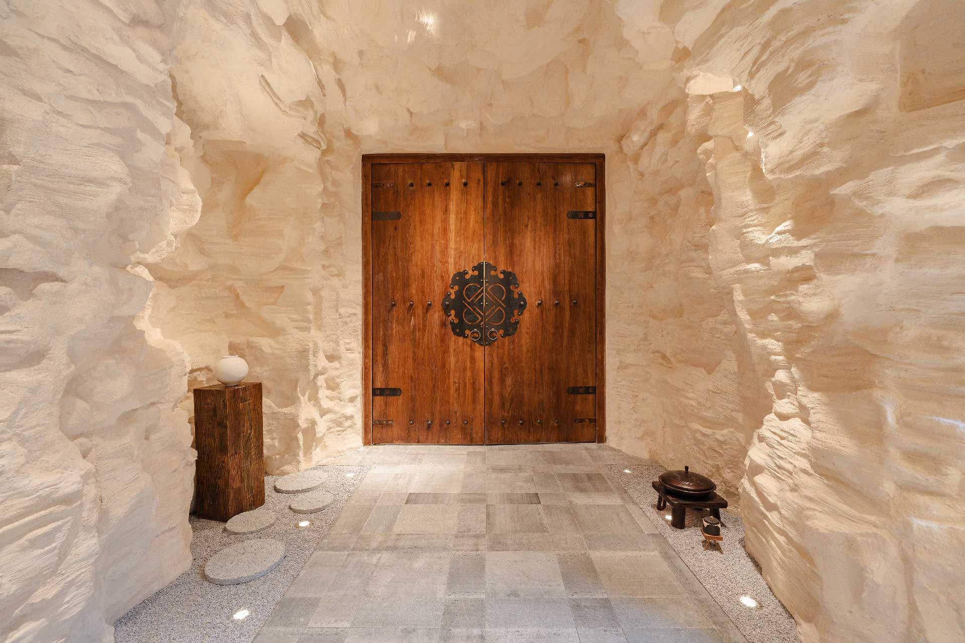
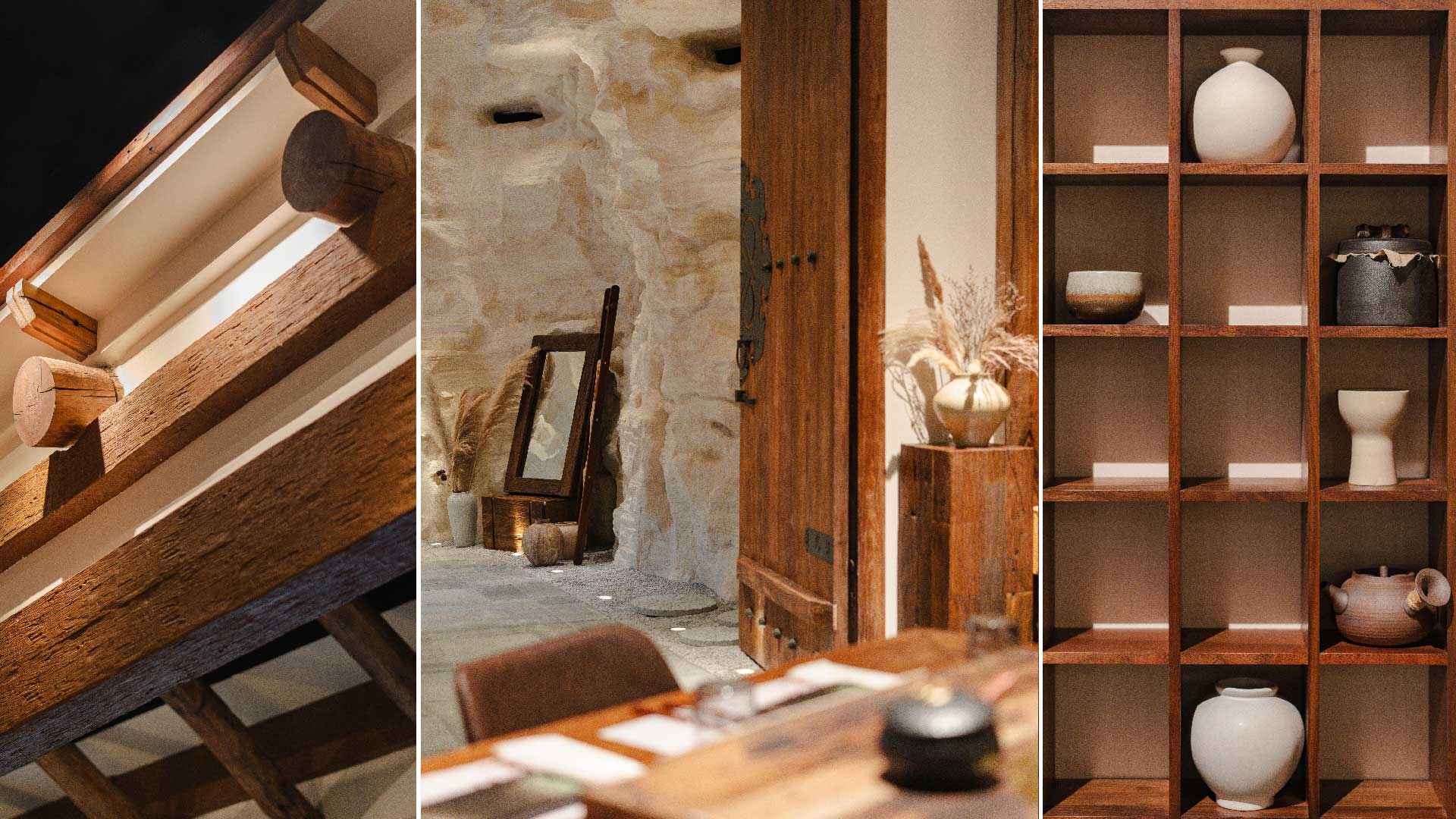
DRIM GOLD, located on Sentosa in Singapore, began with the meaning of deurim: offering something with care and respect. We wanted customers to experience this idea throughout their visit, from entering the restaurant to finishing their meal and leaving. It needed to extend beyond graphics and decoration. We therefore chose a cave as the starting point of the spatial journey. Customers pass through a sculptural cave entrance and then through a hanok doorway, gradually leaving the everyday atmosphere outside. Inside, warm timber, natural textures, and restrained lighting create a deeper sense of comfort.
A cave and a hanok may appear to be very different images, but we saw a common quality in both: they surround people and invite them to stay. In this project, we placed particular importance on the sensations created by materials. Looking back, there is another interesting connection between our three winning projects. They were developed during a period when we were especially drawn to sculptural wall finishes. We were interested in allowing the walls themselves to become a spatial landscape. At DRIM GOLD, this interest developed into the cave form. Handcrafted curves and textures give the entire space the presence of a sculpture. At KANTIK, we worked with a specialist to handcraft the walls and ceiling of the body scrub room into a cave-like environment.
The same interest in a material and technique developed in very different directions according to the brand. Another essential element was the grilling service at the table. We interpreted the meaning of deurim through the act of carefully preparing and offering something to another person. The moment when a staff member grills the meat and serves it to a customer became an important part of the brand experience. To support that experience, the technical systems had to work without disturbing the atmosphere. We incorporated a custom downdraft extraction system that effectively manages smoke and heat while keeping the equipment as unobtrusive as possible. We wanted to preserve both the enjoyment of Korean barbecue and the sense of immersion in the space. This design approach has also been recognized in Singapore.
DRIM GOLD received the highest honor at the Singapore Good Design Award 2026, one of the country’s leading design awards. Its recognition at the K-Design Award is especially meaningful because the brand’s value and design have now been acknowledged in another context and under different judging criteria. Ultimately, the cave, hanok, materials, lighting, grilling service, and concealed technical systems all serve the same purpose. We want customers to leave with the feeling that they have been treated with genuine care, as well as having enjoyed a good meal. That was the experience we envisioned for DRIM GOLD.
< Gochu Korean Dining, K-DESIGN AWARD 2026 WINNER >
GOCHU Korean Dining builds on the character of an existing country club and introduces Korean dining as a new lifestyle experience through the elemental themes of nature, fire, and caves. What challenges and opportunities did you identify at the beginning? Please also explain how you transformed a neglected slope into a green landscape and made expansive glazing and a wood-fired grill central to the space.
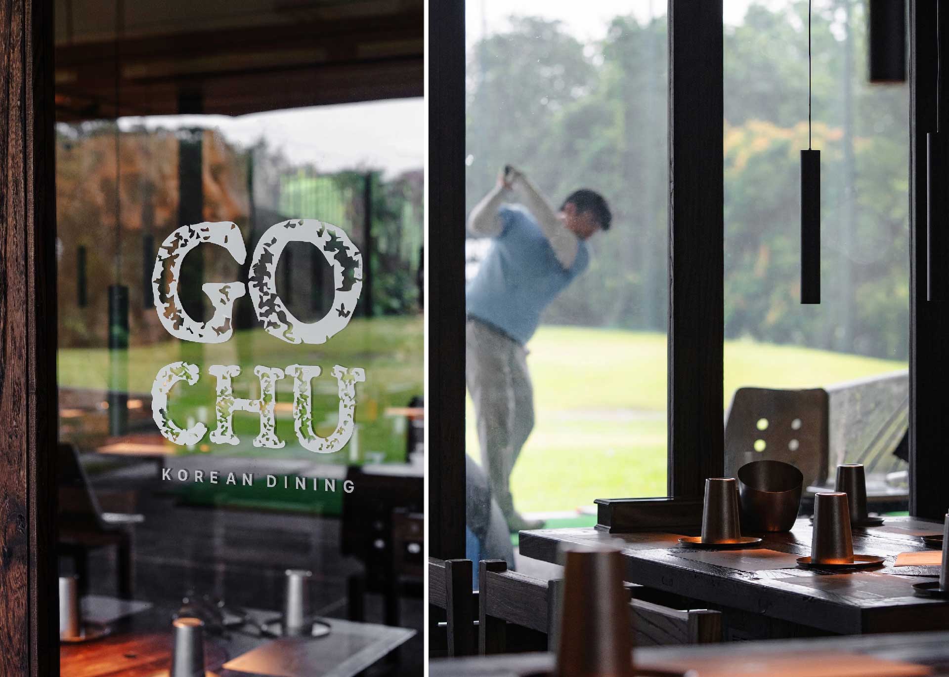
The first thing we encountered at GOCHU was the difficulty of the location. It sits within the golf driving range at Orchid Country Club on the outskirts of Singapore. It was not a location that could naturally attract diners in the way a conventional restaurant might. When we first visited, the site felt rough for a dining venue. There was exposed earth and an unmaintained green slope behind it. To be honest, our initial reaction was a sigh. But we decided to work with those limitations and create an experience that could belong only to this place. Naming is always an important starting point when we create a brand. We first look for Korean words that international customers can pronounce and remember easily while also expressing the meaning we want the brand to carry.
GOYO, DRIM, MODU, and GOCHU are examples. We look for names that retain Korean meaning and feeling while remaining accessible to customers overseas. GOCHU began with this same consideration. We chose a name that would be easy to pronounce and difficult to forget. From there, we developed a menu centered on grilled and braised bone-in meat, creating a natural connection to Korean food. We also introduced fried stuffed chili peppers as a signature dish that golfers and other visitors could enjoy casually. As we developed the brand and menu together, we arrived at an idea we found particularly compelling: the elemental experience of holding a bone and eating meat inside a cave. A cave evokes one of humanity’s earliest places of shelter, while holding meat and eating it with one’s hands is an instinctive experience. We developed the cave into a concept connecting the entire GOCHU experience. We even created custom GOCHU packaging for disposable gloves so that eating with one’s hands would feel like a natural part of the experience.
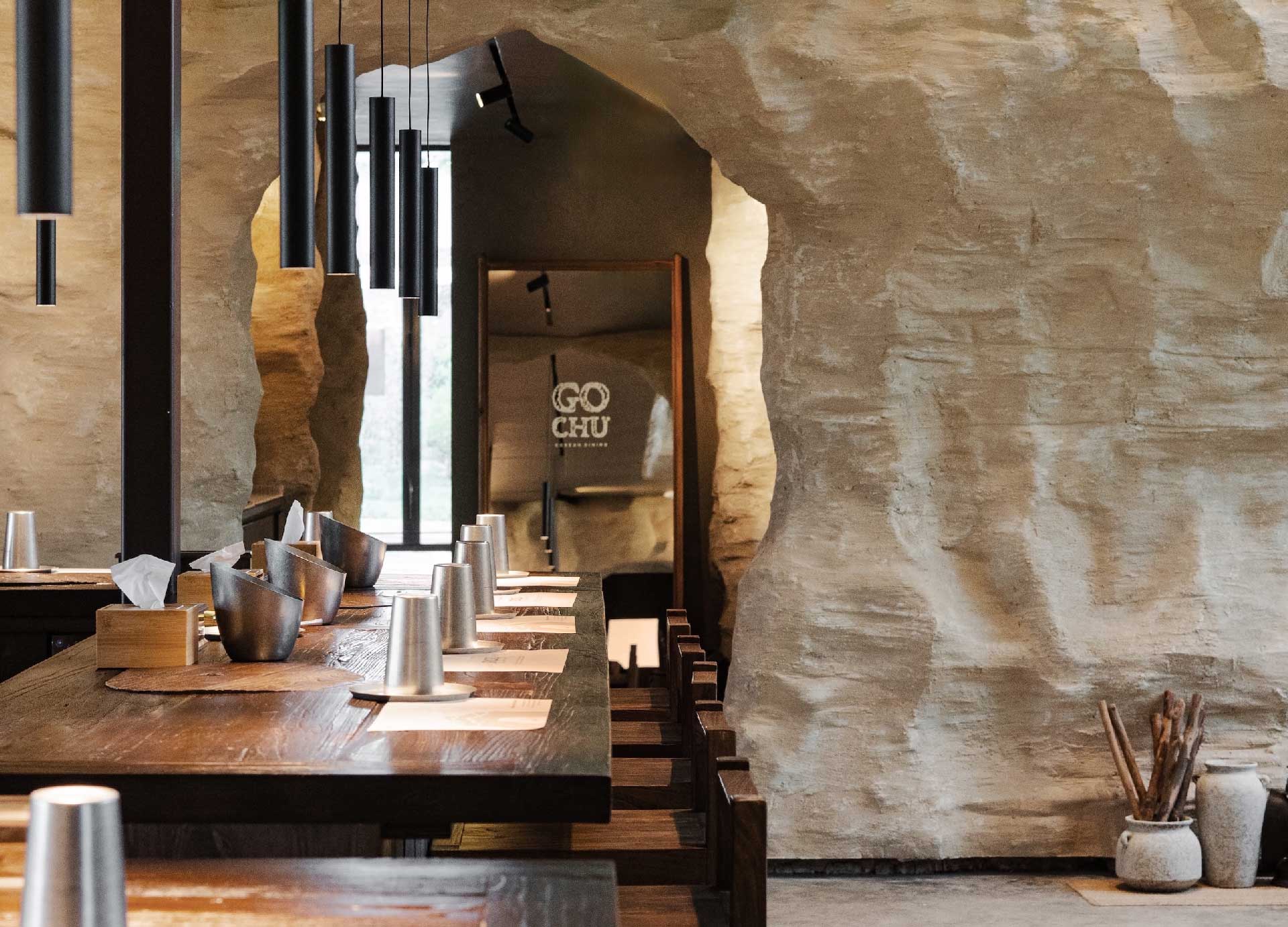
Spatially, we focused on creating the sensation of entering a cave. Instead of maintaining a constant ceiling height, we allowed it to drop and then rise unexpectedly, giving visitors a sense of depth and discovery as they move through the space. Rough textures and lighting reinforce this elemental atmosphere. We then transformed the green slope at the rear, initially one of the site’s biggest problems, into one of GOCHU’s greatest strengths. We planned the landscaping ourselves, reorganized the planting, and brought the view into the restaurant through expansive glazing. A cave can easily feel dark and heavy. We wanted to create the contrast of unexpectedly encountering a carefully planted natural landscape from within it.
Customers can feel as though they are inside a cave while looking out at Singapore’s greenery, experiencing two different spatial qualities at once. Fire was another essential element. We placed the wood-fired grill at the center of the space so that cooking itself would become part of the experience. The cave, nature, fire, and food eaten by hand come together to create GOCHU’s distinctive sensory dining experience. GOCHU did not begin with ideal conditions. It developed by reconsidering each apparent disadvantage and finding what could make the location special. The golf course setting, the sloping landscape, and the cave concept initially appeared to be separate challenges. By connecting them, we were able to create a destination that people would make a deliberate journey to visit.
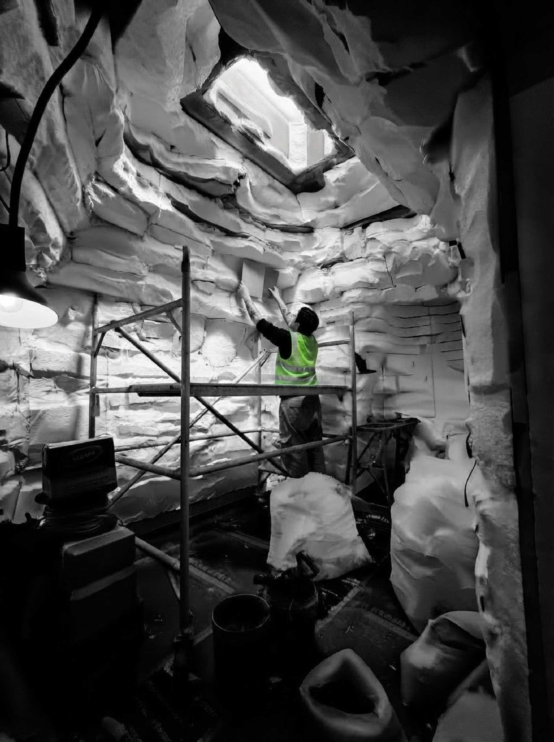
The cave appears as a recurring spatial archetype across all three projects, but its meaning and experience change in each one. At Kantik by Goyo, it becomes a refuge for cleansing and restoration; at DRIM GOLD, a passage into another world; and at GOCHU, a place associated with the origins of fire and cooking. What drew WOO.K Concept to this archetype, and how did you develop the same motif into different brand experiences?
We did not set out to use a cave motif across all three projects. As each project developed, this elemental spatial form naturally connected with the experience the brand wanted to express. We were drawn to caves because they are part of a universal human experience that reaches far back in history. They have been places of protection, rest, gathering, fire, and food. That makes the cave a spatial archetype capable of carrying very different stories, without belonging exclusively to one culture. We carefully differentiated what people would experience within each cave.
At Kantik by Goyo, we interpreted it as a place to turn inward and care for oneself. Because it became a body scrub space for cleansing and restoring the body away from the city, we focused on the cave’s enveloping qualities and sense of security. At DRIM GOLD, it became a means of crossing a threshold. Customers pass through the cave at the entrance, leave the everyday atmosphere behind, and encounter the hanok and dining space beyond. Here, the cave is primarily a transitional space leading into a new experience.
At GOCHU, we connected it to the elemental experience of eating. The cave, fire, wood, and meat held and eaten by hand express the instinctive pleasures of food. To be honest, there is also a more personal reason. In our work, we sometimes become particularly interested in a material or a method of expression for a period of time. When that happens, we ask ourselves whether we can express it in a completely different way for another brand.
The same material can produce entirely different results depending on its form, texture, lighting, scale, and relationship with surrounding materials. Starting from a shared interest and arriving at different answers is a process we find very engaging. Although a cave motif is visible in all three projects, the spaces ultimately became very different. What matters to us is continually exploring how a material or method of expression can create a new experience for each brand. These three projects illustrate that way of working particularly well.
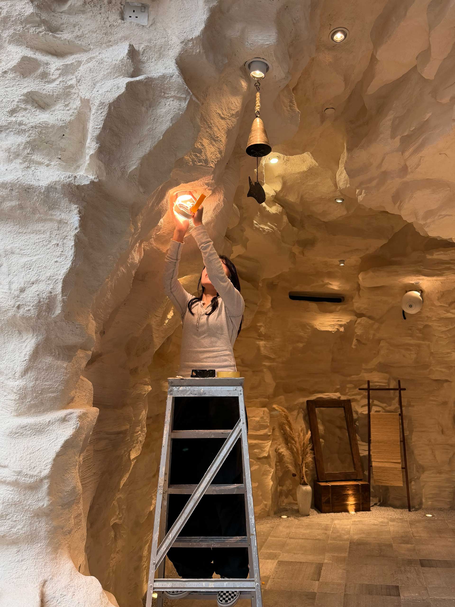
The three projects integrate form and materials with lighting, ventilation, cooking methods, service circulation, and staff interaction. How do specialists in brand strategy, spatial design, operations, engineering, wellness, and dining collaborate within an actual project? When design quality and operational efficiency conflict, how do you make decisions and resolve the differences?
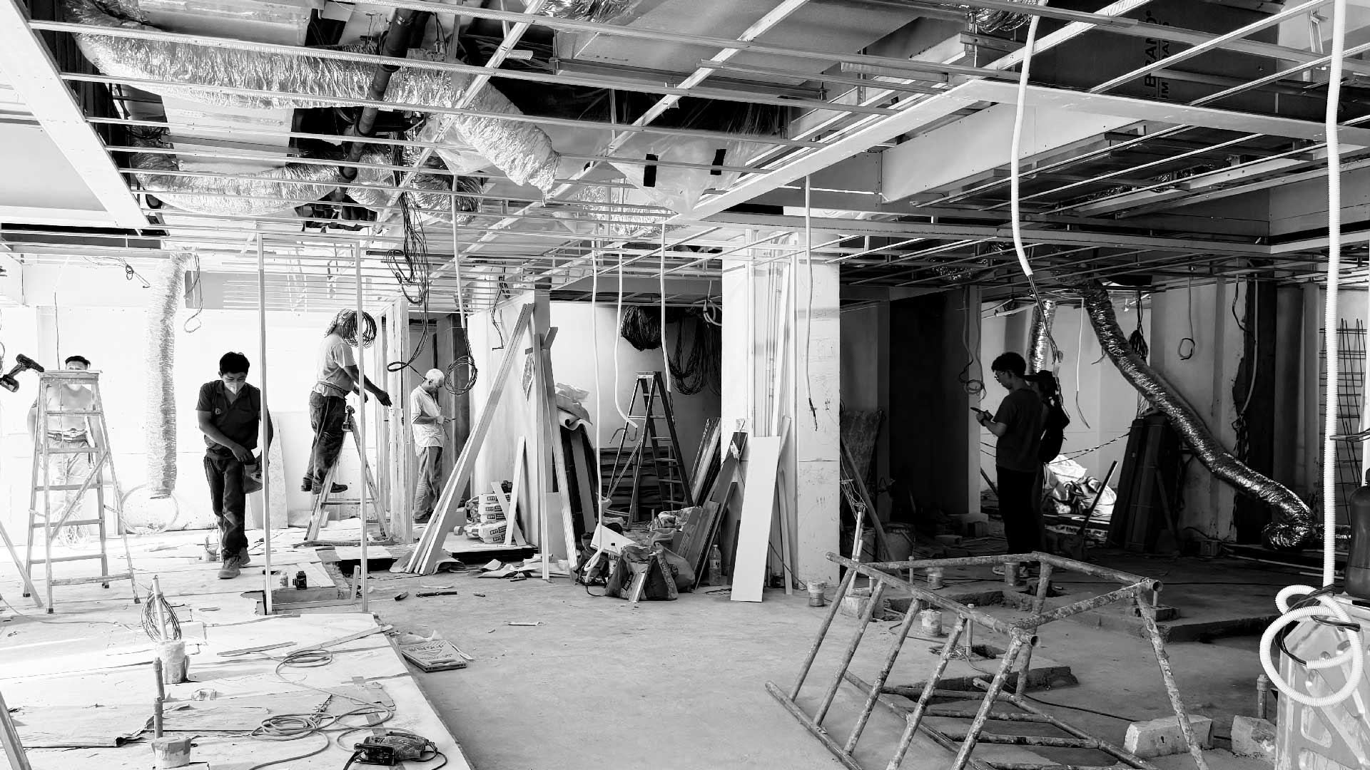
As a brand and spatial design studio, WOO.K Concept works continuously with INITIA GROUP’s project, operations, and construction teams to develop brands and spaces together. We see brand strategy, spatial design, and operations as interconnected parts of the same process. Every moment in which a customer experiences a brand is part of its design. When planning a layout, we discuss it thoroughly with the people from each INITIA department who will actually work in the space. Together, we review staff circulation, working methods, the sequence of service, and the relationship between the kitchen and dining area. A layout that looks good but makes the staff’s work difficult cannot be considered a good space.
We begin by defining the brand experience we want to create and then work with the different teams to determine how it can be realized through the space and its operations. Technical and operational requirements are considered from the beginning. For example, DRIM GOLD’s grilling service required much more than installing a grill at each table. We wanted to preserve the experience of staff grilling meat in front of customers while ensuring that smoke and heat would not obstruct their views or conversations. We therefore worked with the engineering team to develop a custom downdraft extraction system. At KANTIK, we designed circulation, transitions between spaces, operating procedures, and staff service together so that the head spa, body care, and body scrubbing would form one continuous restorative experience.
Of course, design and operations sometimes conflict. When that happens, our first question is, “Is this truly necessary to the customer experience?” If a detail is simply visually attractive, we may let it go to improve operational efficiency. If it is essential to understanding and experiencing the brand, we look for another way to make it work. INITIA GROUP’s willingness to understand our design intentions and help find solutions is an important part of this collaboration. Our shared goal is a strong brand experience. Design, operations, and technology must work together to achieve it. Customers encounter something that feels natural and beautiful, while behind the scenes, the brand, project, operations, and engineering teams are working in close coordination. That is how we believe lasting brands and good spaces are made.
WOO.K Concept brings together designers and staff from different countries and professional backgrounds. What kind of organizational culture and working methods help these perspectives come together in a project? When introducing a brand rooted in Korean culture to another country, how do you balance cultural authenticity with the sensibilities of local customers?
When people from different backgrounds work together, we value an environment in which they can freely express different ideas. Everyone brings their experience and expertise to the discussion, and we work together to find the direction most appropriate for the brand. When introducing a brand rooted in Korea to an overseas market, we pay particular attention to preserving the sensibilities we recognize through our own experience as Koreans. Many aspects of Korean culture are difficult to explain from the outside. The temperature and texture of food, the way ingredients are handled, the way people are treated, and the balance between density and openness in a space can be difficult to articulate precisely because we have experienced them so naturally. We believe the Korean “soul” resides in these small details.
We look closely at qualities that a Korean person would recognize instinctively. In food, that might be the way a dish is plated and served. In a space, it might be the texture of a material, the light, the use of openness, or the way service is delivered. These things feel familiar to someone who has experienced them in Korea, even without an explanation. As the person directing the overall brand, I review these details together with Chu, who leads spatial design. Drawing on our direct experience of Korean culture, we explain and share these sensibilities so that team members from other cultural backgrounds can understand them as well.
We also continue to consult the local operations team about how customers will actually respond. An element that is so familiar in Korea that it requires no explanation may feel unfamiliar in Singapore or Malaysia. We make specific decisions for each project about what to preserve and what needs to be communicated more accessibly. What we seek to preserve is the sensibility and emotional character that have developed within Korean culture. Working with diverse teams allows us to express those qualities in ways that sit comfortably within the local context.
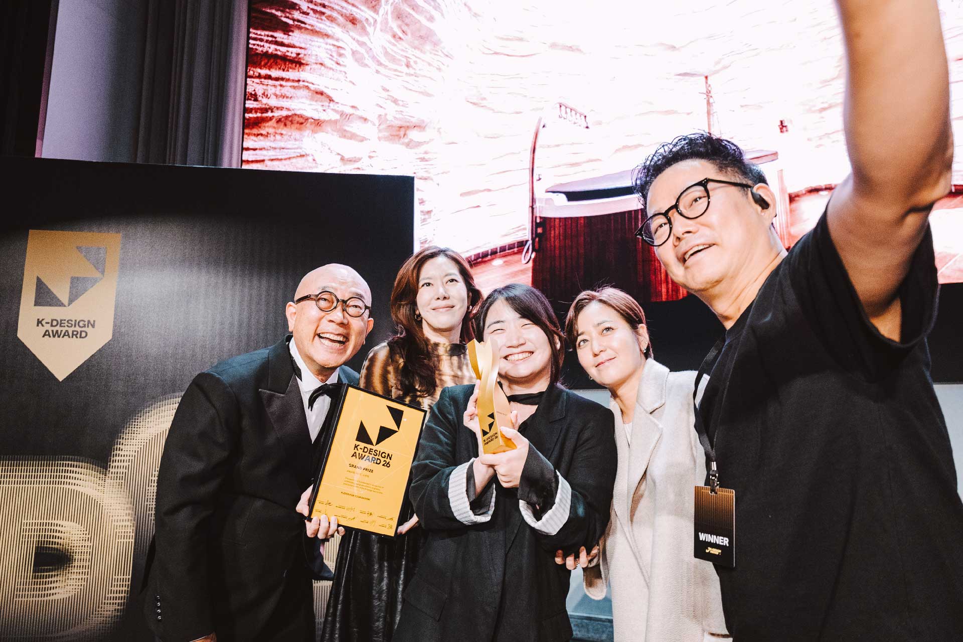
What enables WOO.K Concept to maintain a high standard across brands with different characteristics and to receive recognition for several projects at once? Among discovering and testing ideas, internal design standards, research, experimentation, and feedback after opening, which factors matter most? Following these awards, how would you like to develop your approach to brands and spaces, and what are your ambitions in Asia and the wider global market?
Through working on several projects, we have come to see our greatest strength as the determination to carry a good idea through to completion. Discovering new ideas, conducting research, and testing them are all important. Ultimately, however, the quality of a brand and its space depends on how faithfully a good idea becomes an actual experience. Our partner, INITIA GROUP, actively works with us to identify and protect the elements essential to that experience. Even within the practical constraints of a budget, the group helps us find a way to retain an element that is indispensable to the brand or creates a powerful “wow factor” in the space. That trust matters greatly to us. It is a partnership that considers the value a design creates for the brand alongside its cost.
Our starting point is always an understanding of people and the brand. We think first about what someone should feel and remember when experiencing it. As we look for that answer, we freely explore the cultures, materials, and spatial languages the project requires. The spaces we create in the future may draw on many different cultural references. If a Korean approach offers the best answer for a brand, we will explore it in depth. If another culture or design language provides a better direction, we will look there. Our priority is to create the best possible experience for each brand.













#14057, 905 49, Beolmal-ro 102beon-gil,
Dongan-gu, Anyang-si, Gyeonggi-do, Korea
Business Registration Number: 454-86-01044
Online Sales License No.: 2021-Anyang Dongan-1081
Copyright © DESIGNSORI Co., Ltd.