Regions
Korea
Year
2022
Award
WINNER
Client
Peridot Corp.
Affiliation
EIDETIC
Designer
Olivia Shin, Rona Shin
English
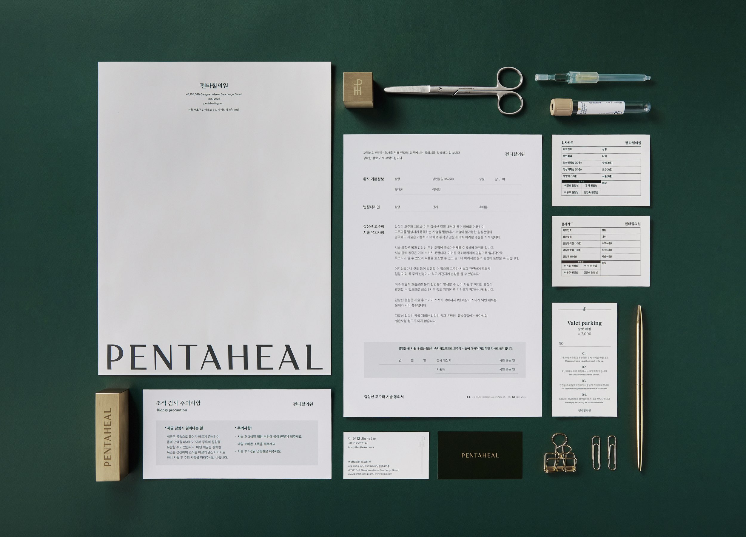
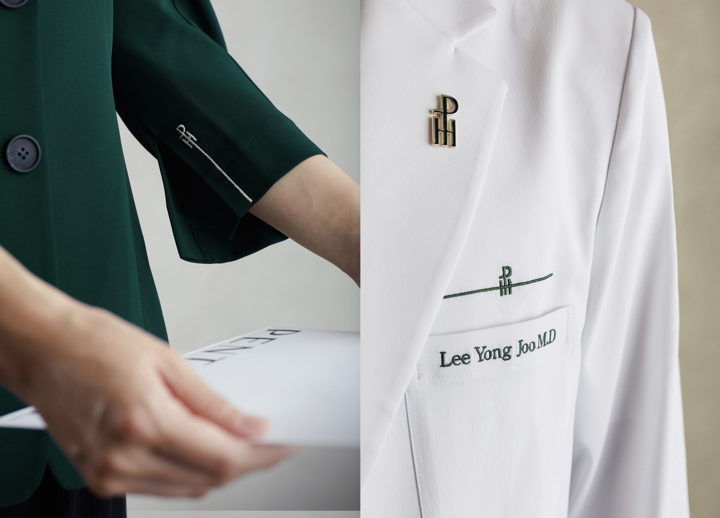
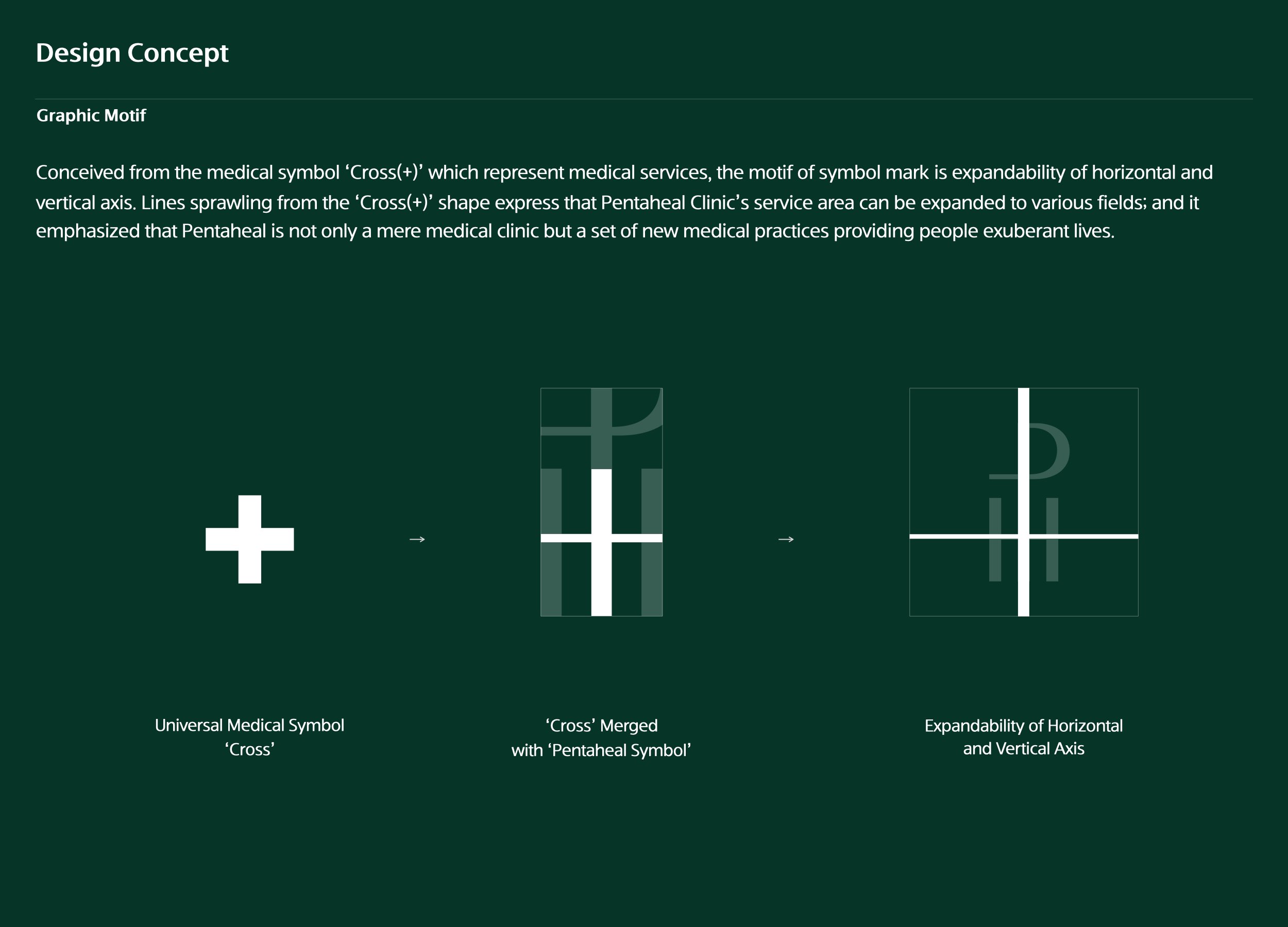
Every letter, except 'P, T, H', has a unique serif that expresses Pentaheal’s global medical vision. For symbol mark, 'P, T, H’ abbreviated new symbol has been integrated with the universal medical symbol 'cross'. The axis of the symbol mark is extended in both directions, to be used on various shapes and sizes of the brand application items. Each line sprawling from the 'Cross(+)' shape represents the core value of #pioneering #leading #central #trust; and it differentiates Pentaheal as a set of medical practices that goes beyond treating people to providing people exuberant lives.
Native
의료 서비스를 상징하는 Medical symbol ‘Cross (+)’에서 착안하여 가로축과 세로축의 확장성을 모티브로 심볼마크를 디자인하였습니다. Pentaheal의 알파벳 ‘P, T, H’를 활용하여 Cross(+) 형태를 연상할 수 있도록 조합하였습니다. P와 T를 유기적으로 연결하였고 H를 심볼 아래 쪽에 배치함으로써 견고하고 단단한 모양의 심볼마크가 설계되었습니다. '십자(+)'자 형태에서 뻗어나온 선은 펜타힐 클리닉의 서비스 영역이 다양한 분야로 확장될 수 있음을 나타냅니다. 심볼마크의 가로, 세로축을 적극 활용하여 'Cross(+)'의 확장성을 시각적으로 강조하였으며 심볼마크의 확장은 인쇄물, 유니폼, 병원 사이니지, 소셜 디자인을 이어주는 형태로 일관된 브랜드 아이덴티티를 구축하고 있습니다. ‘Cross(+)’ 형태에서 확장되어 뻗어가는 각각의 라인은 #pioneering #leading #central #trust의 핵심가치를 나타내며, 이는 펜타힐이 병원을 넘어 사람들에게 활기 넘치는 삶을 제공하는 새로운 의학이라는 차별성을 강조합니다.
Positive Comments


PRESORE
Northeastern University
China
Nip Steamer
Daejin University
Korea
BTRC
Politecnico di Milano
China
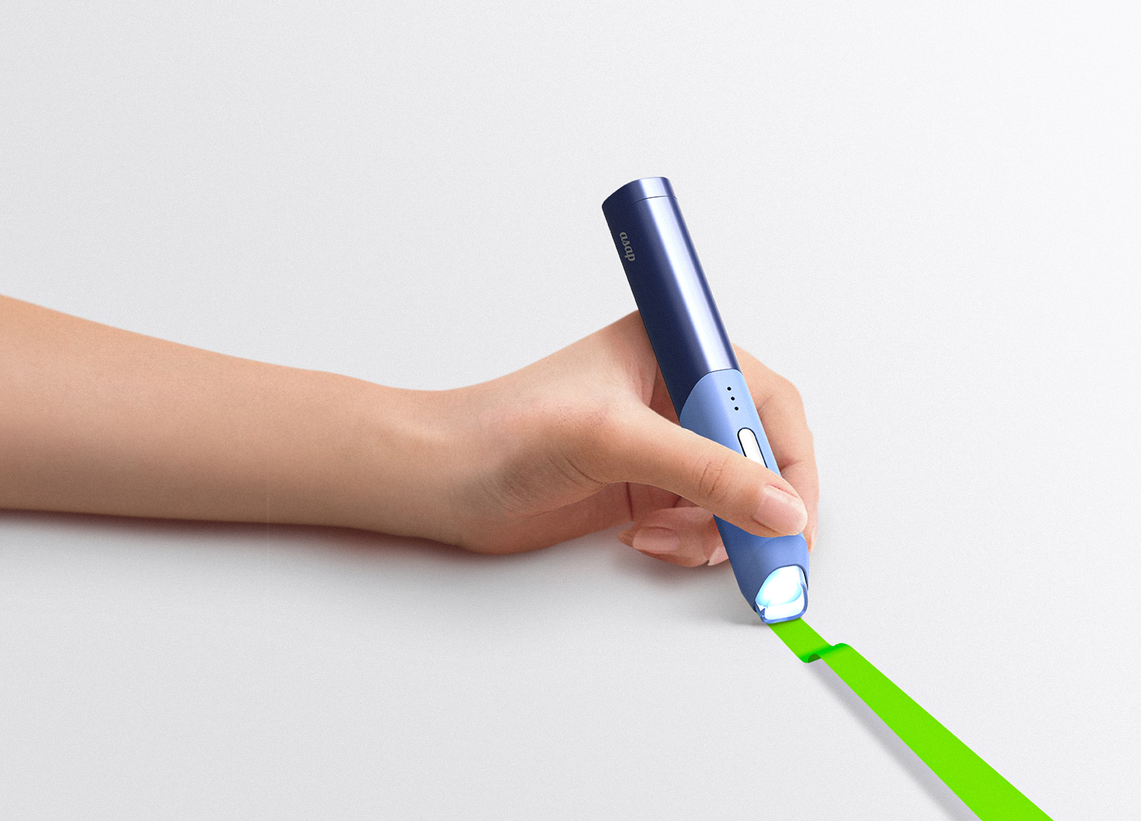
ASAP
chungang university
Korea
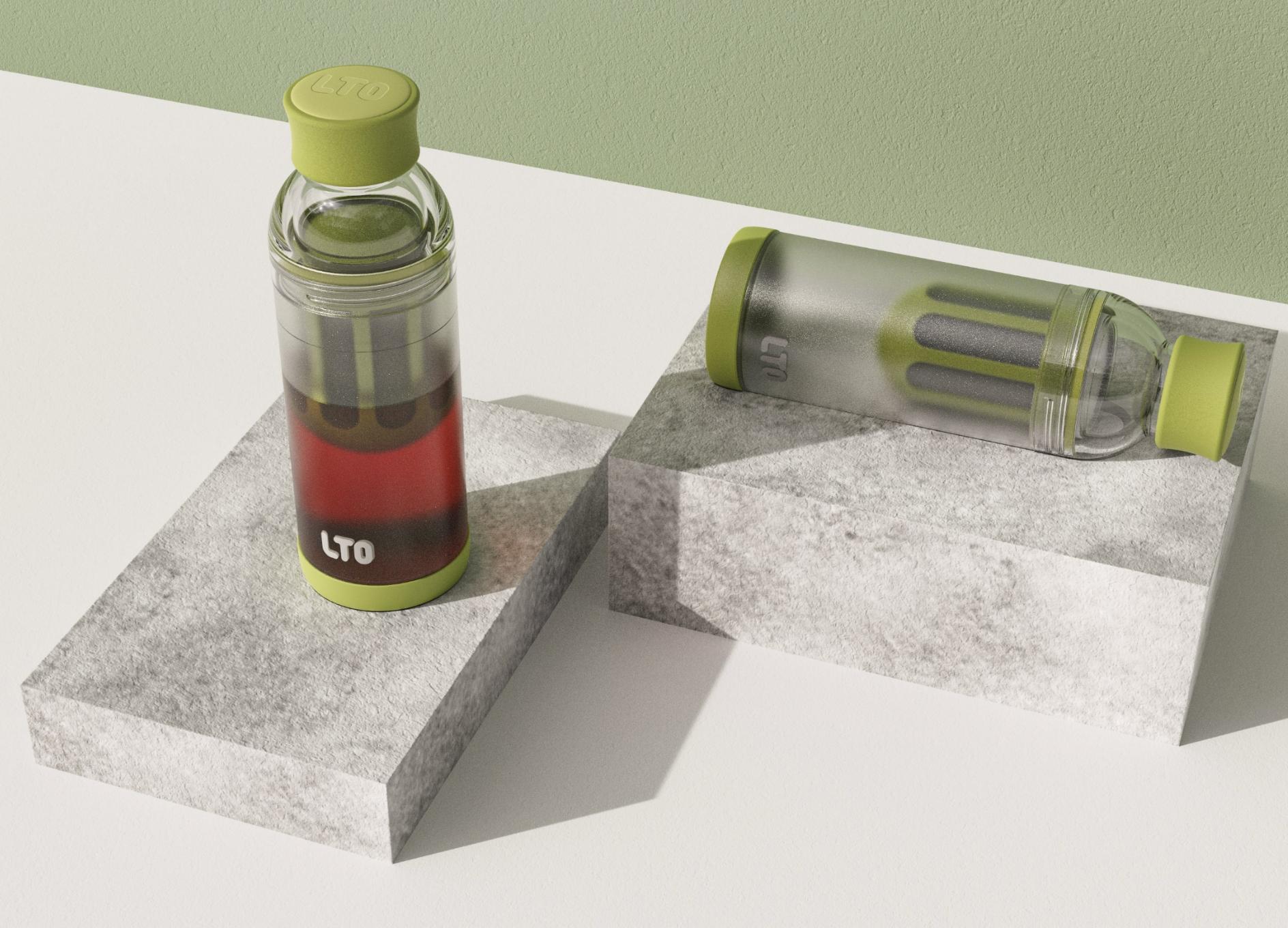
LTO Portable Cold Brew Coffee Bottle
Good Cultural Creative Industry Shanghai Co., Ltd.
China
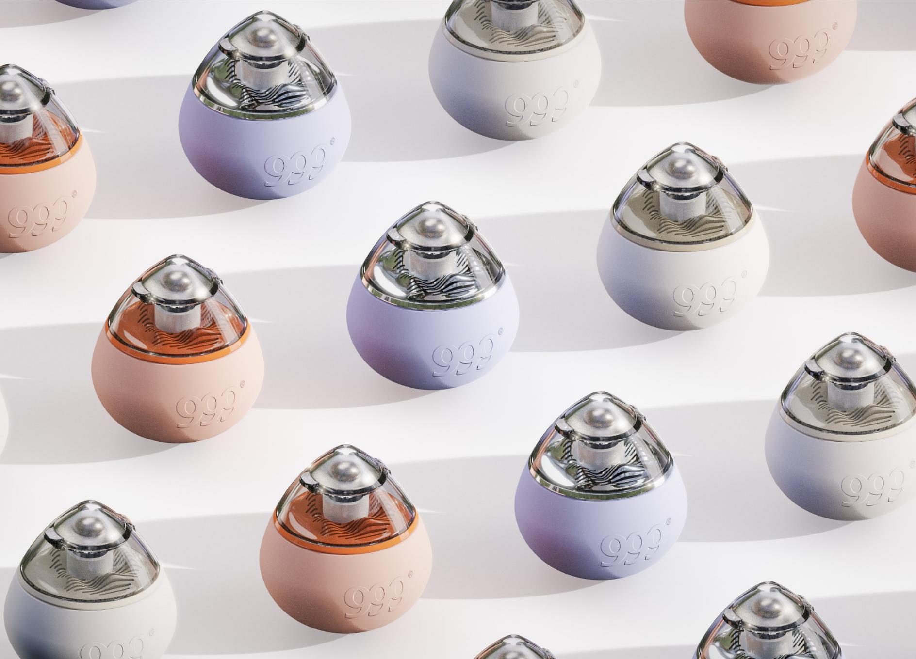
999 Brand new Cooling Ointment
Good Cultural Creative Industry Shanghai
China
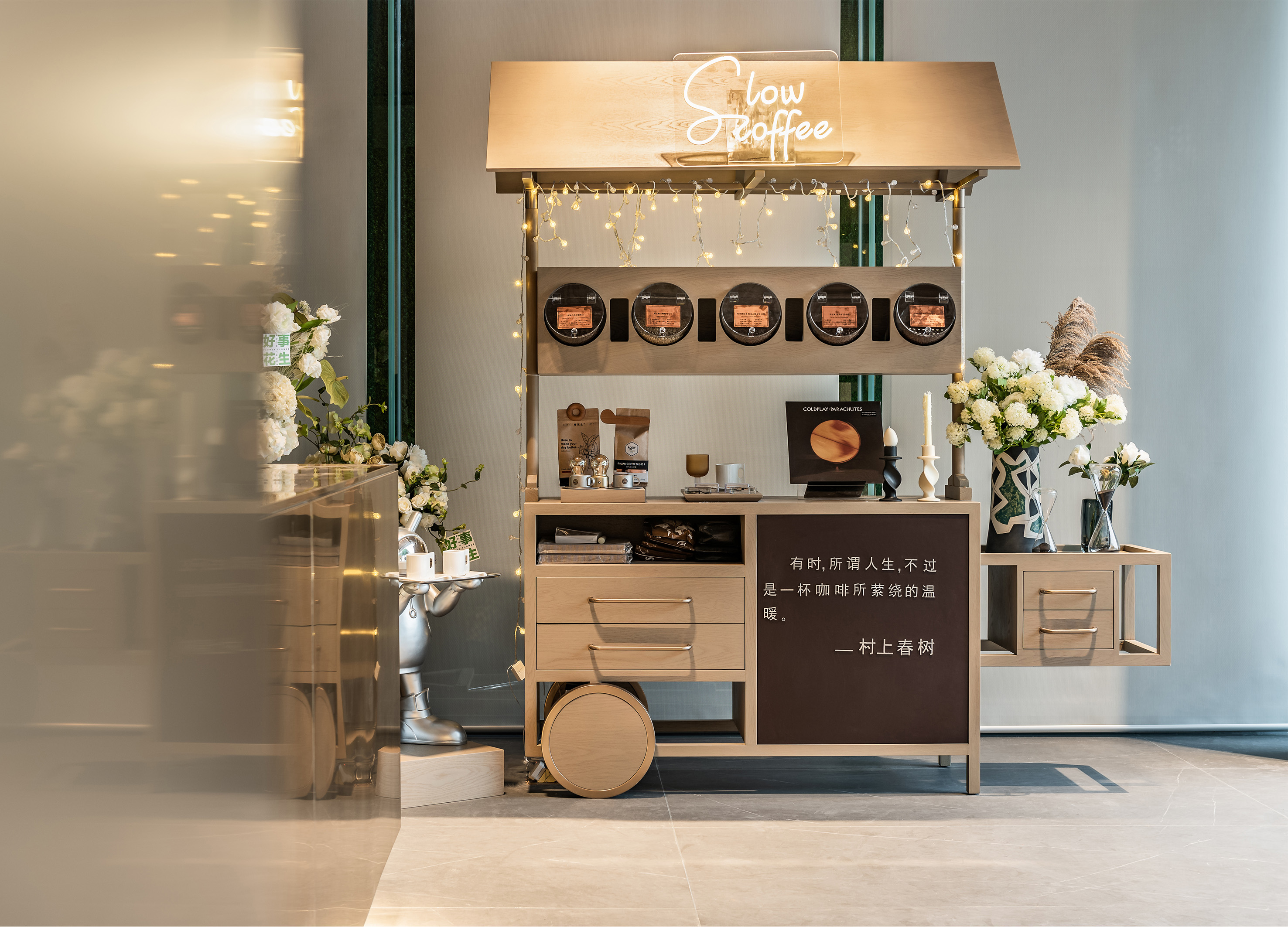
ZHONGHAI LIWAN SHANGCHEN MARKETING CENTER
BEIJING SHANHE JINYUAN ART AND DESING STOCK Co., Ltd.
China
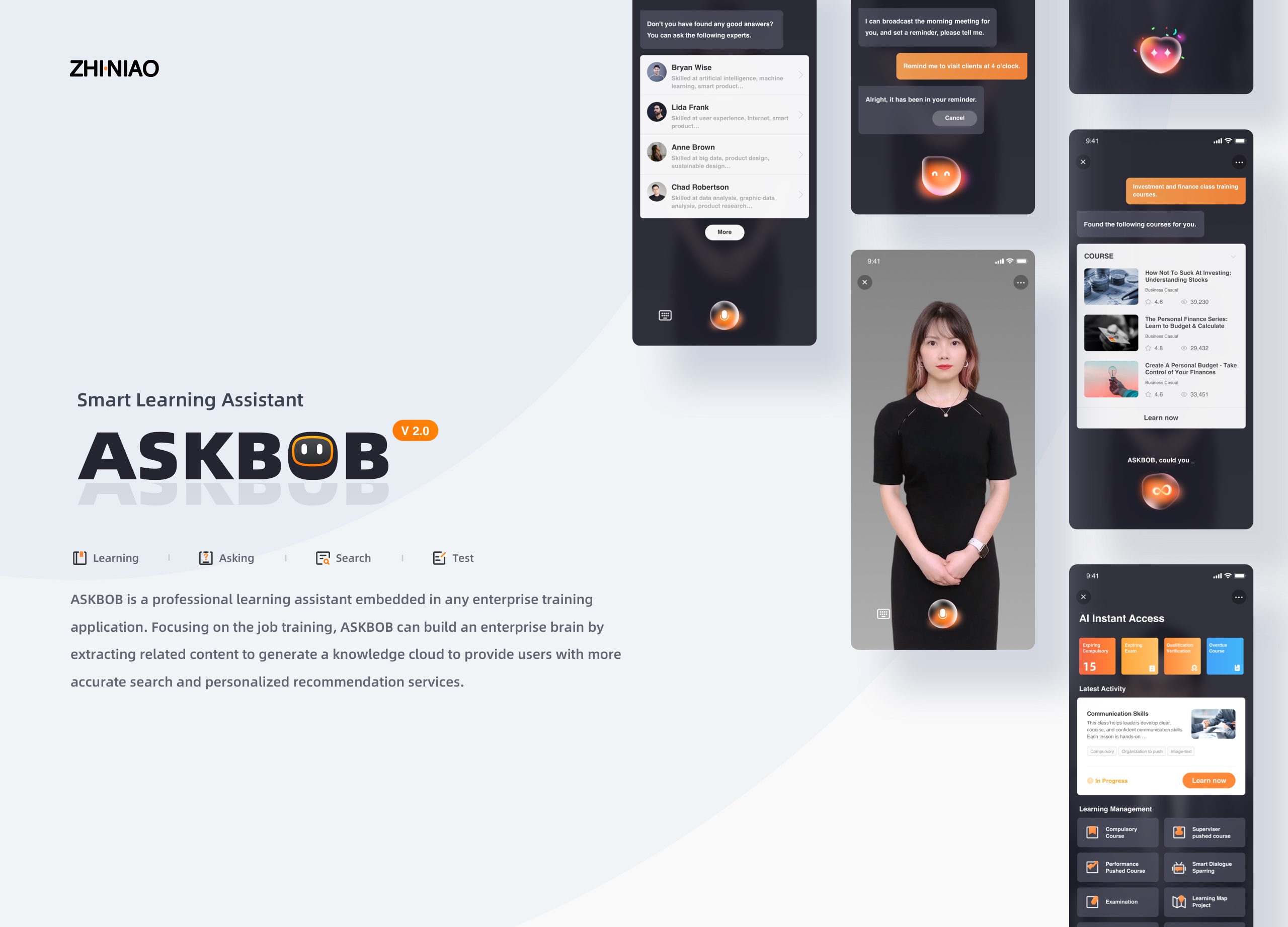
AI Learning Assistant ASKBOB
Ping An International Smart City Technology Co., Ltd.
China
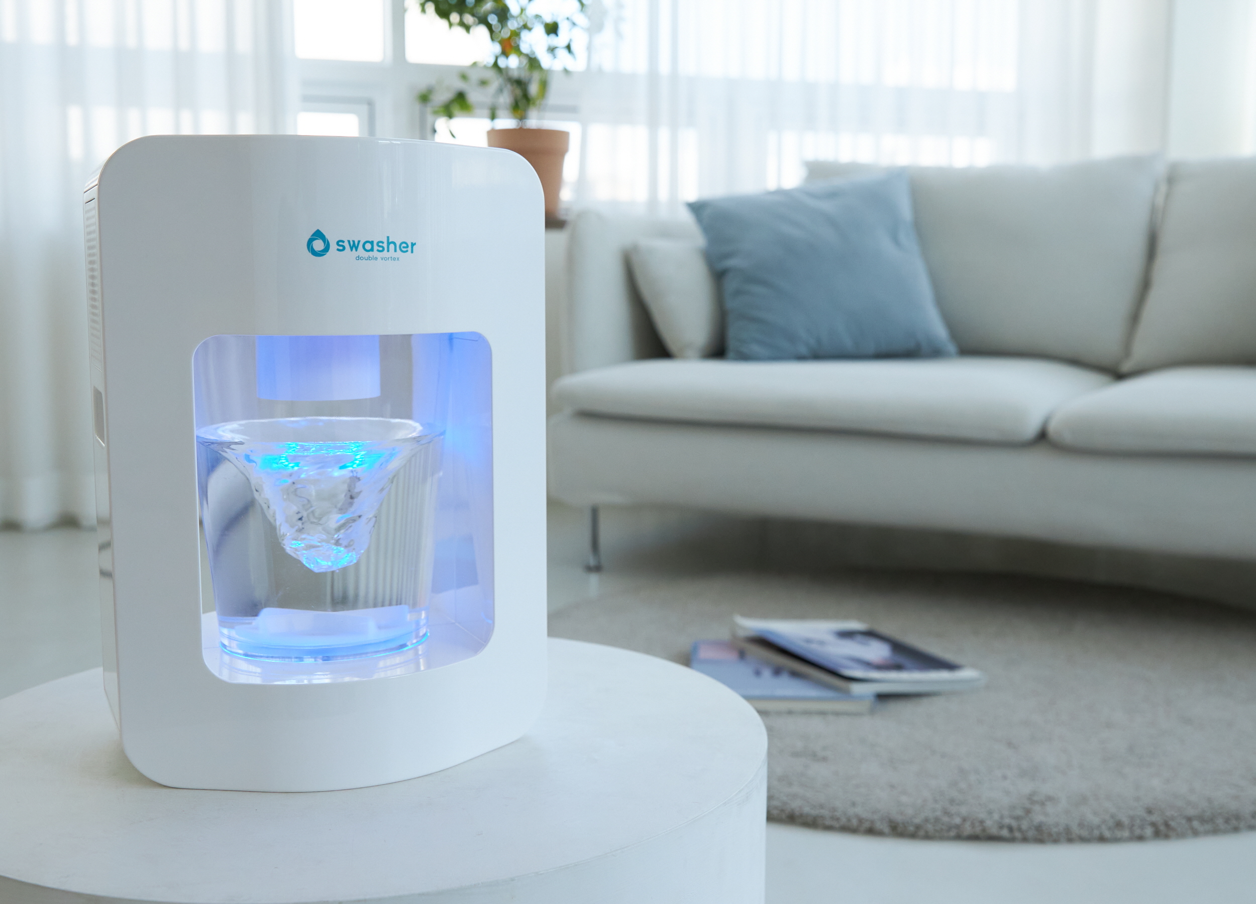
swasher001
GONGGONG Co., Ltd.
Korea

B 815AS
OTOS Co., Ltd.
Korea
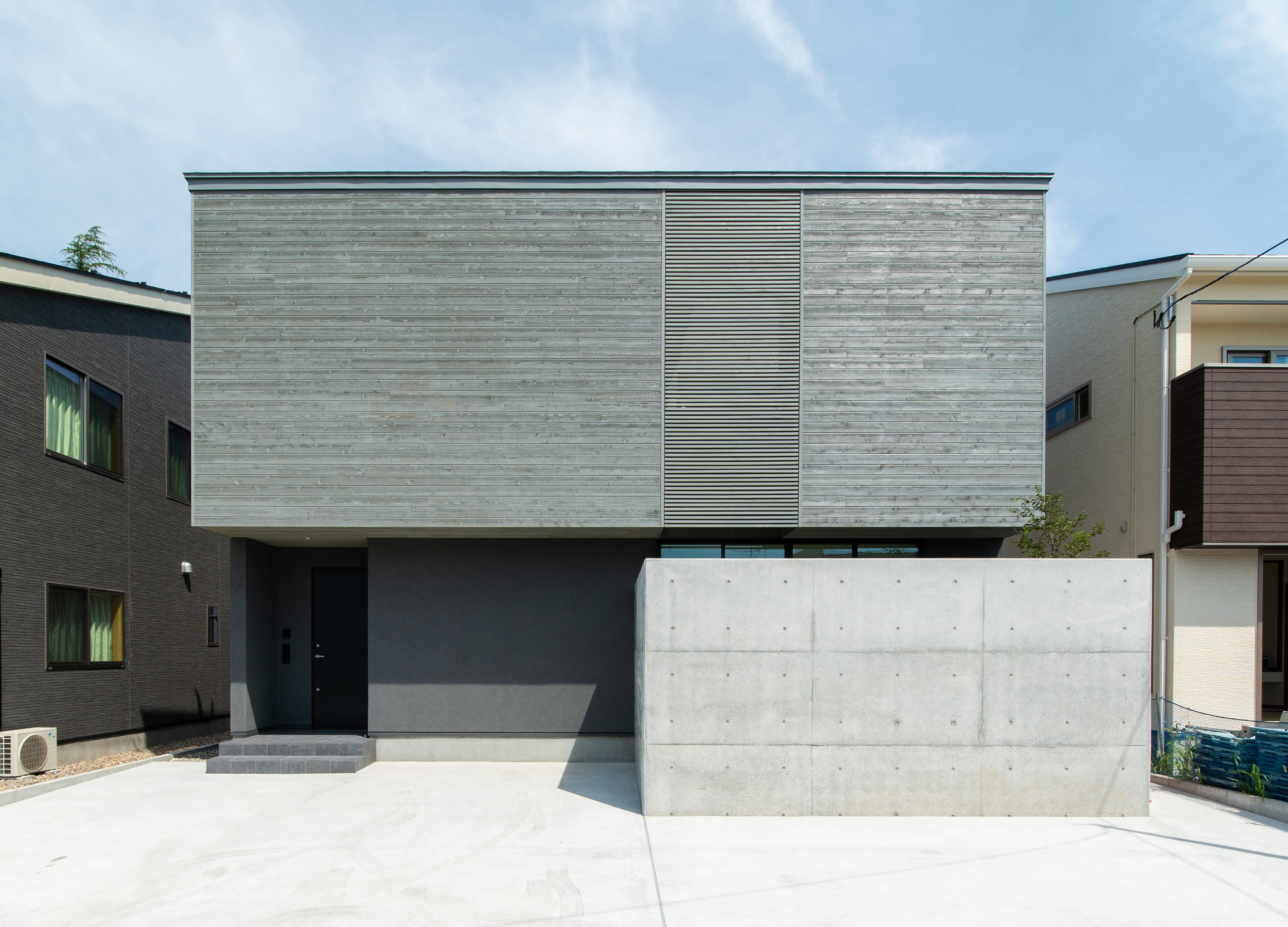
House with a garden
kiryu construction
Japan
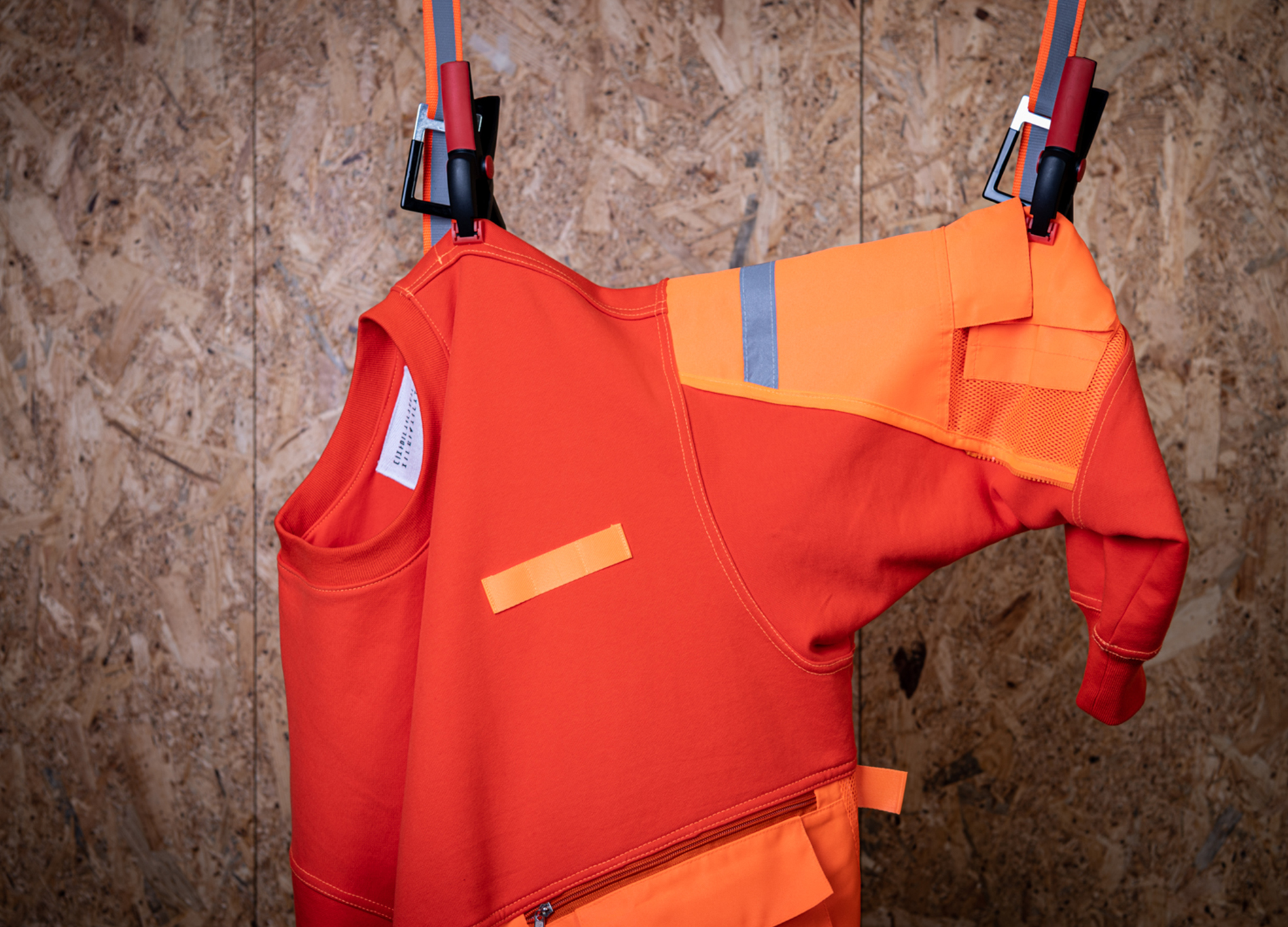
JJSSBROS Workwear
JJSSBROS Pte
Korea
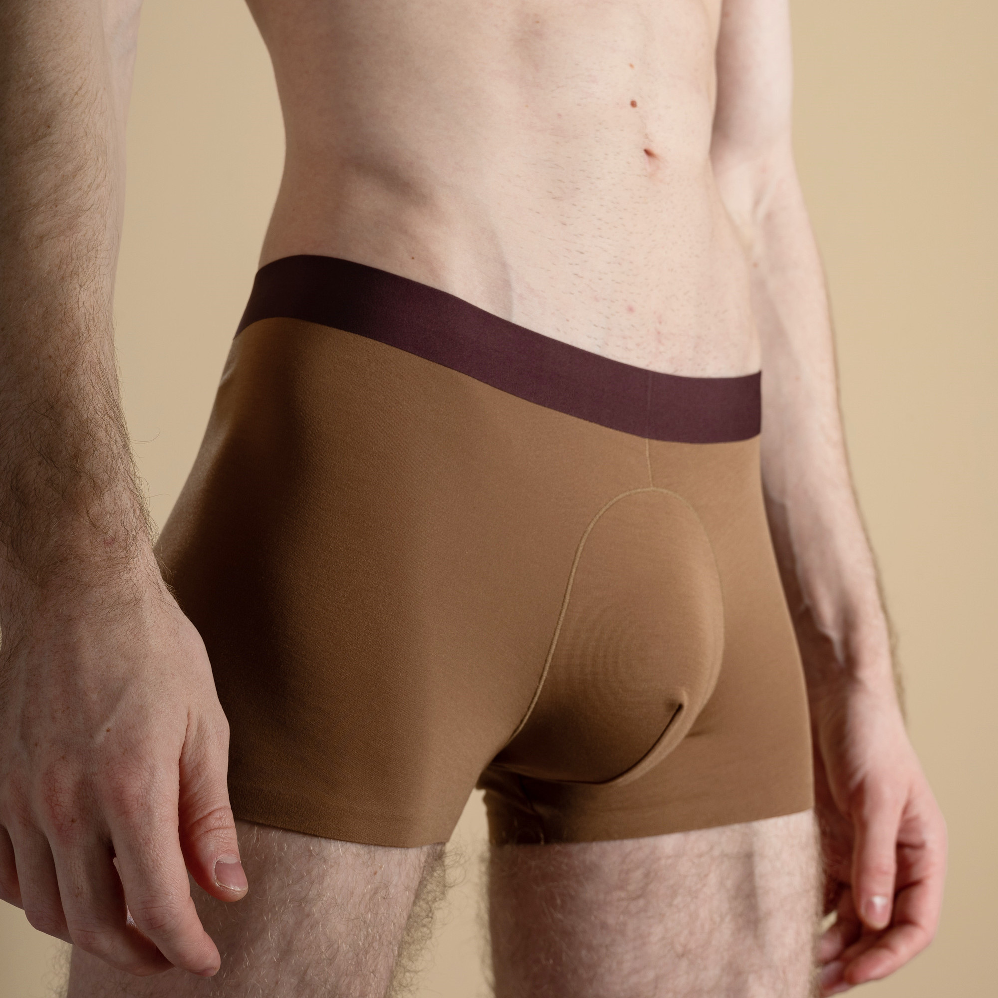
Banshan Boxer Brief
Hefei ACE Clothing Co., Ltd.
China
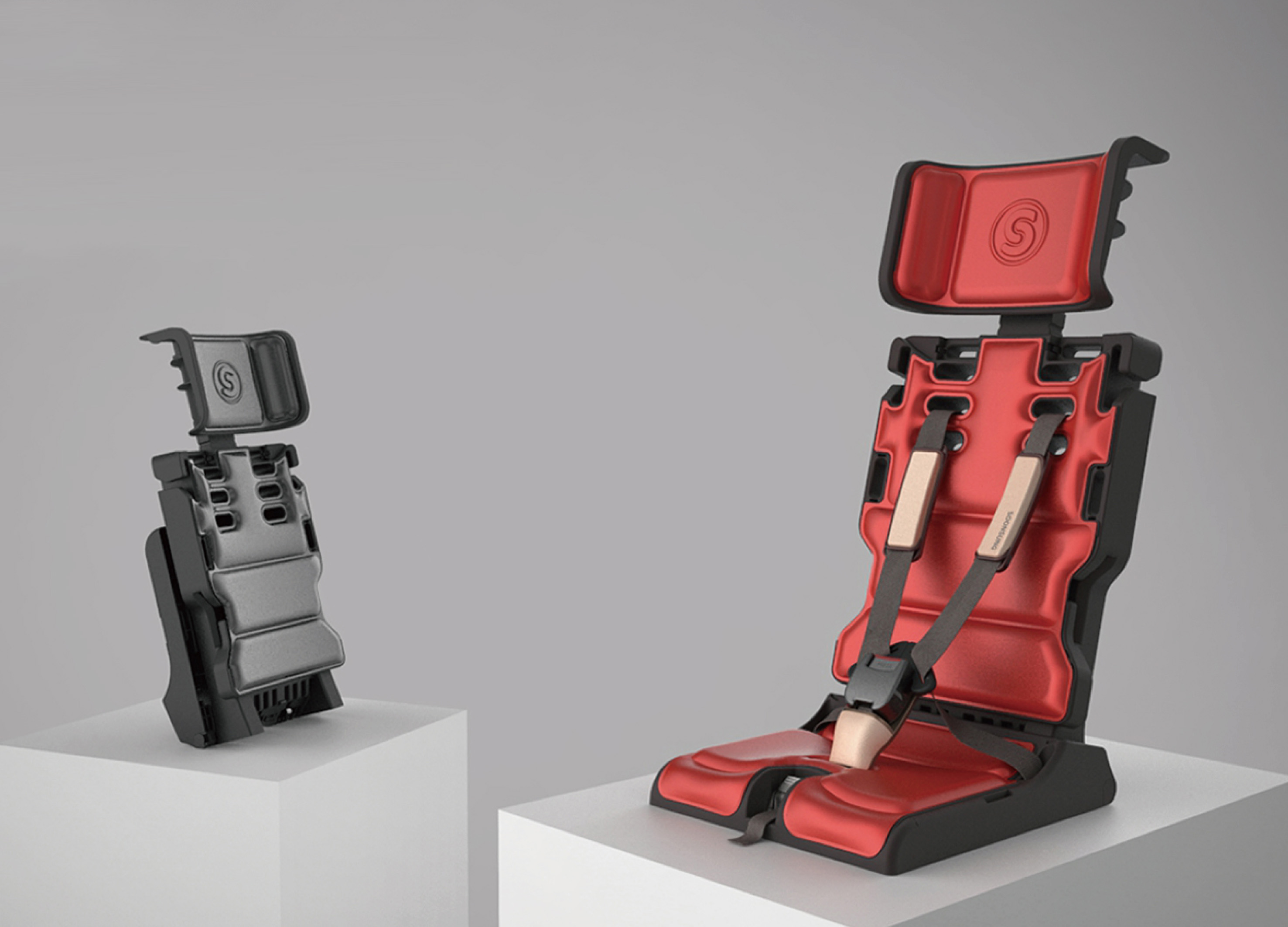
Child safety seat for a school vehicle Ciily
IAM communication
Korea
PENTAHEAL Clinic Rebranding
EIDETIC
Korea
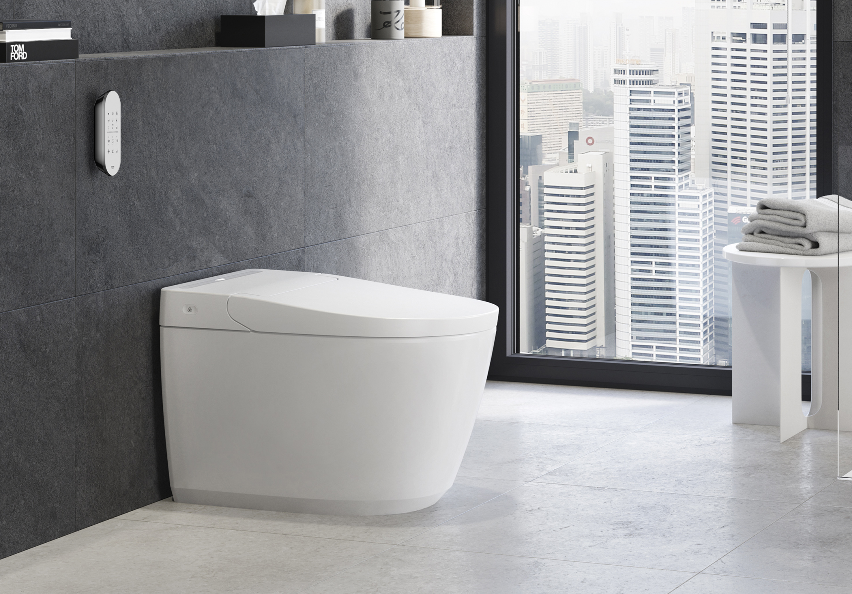
IGINA Shower Toilet Collection
GROHE
Singapore
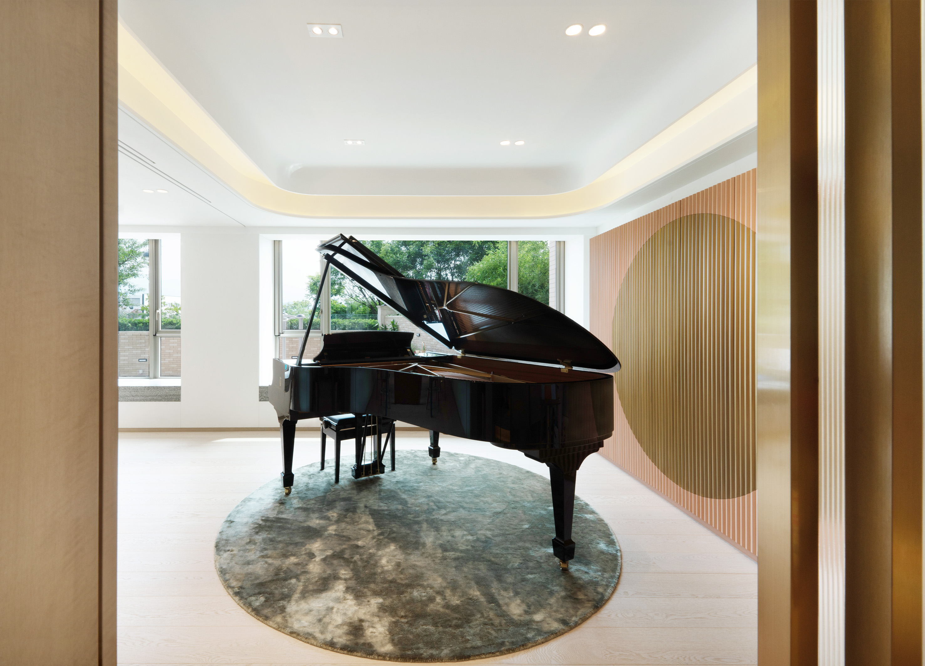
Mayfair by the sea
AQUEOUS DESIGN LIMITED
China Hong Kong
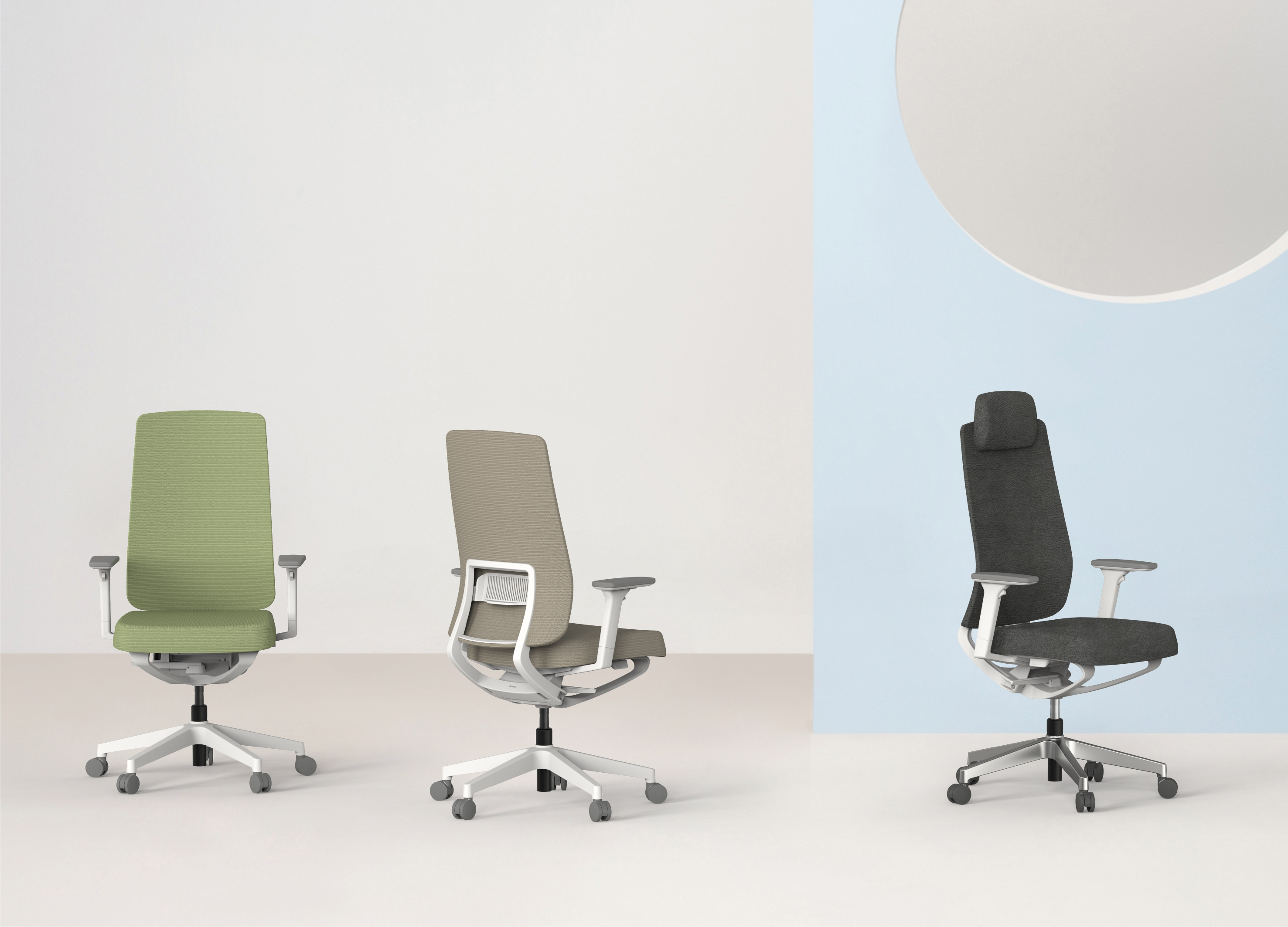
A5
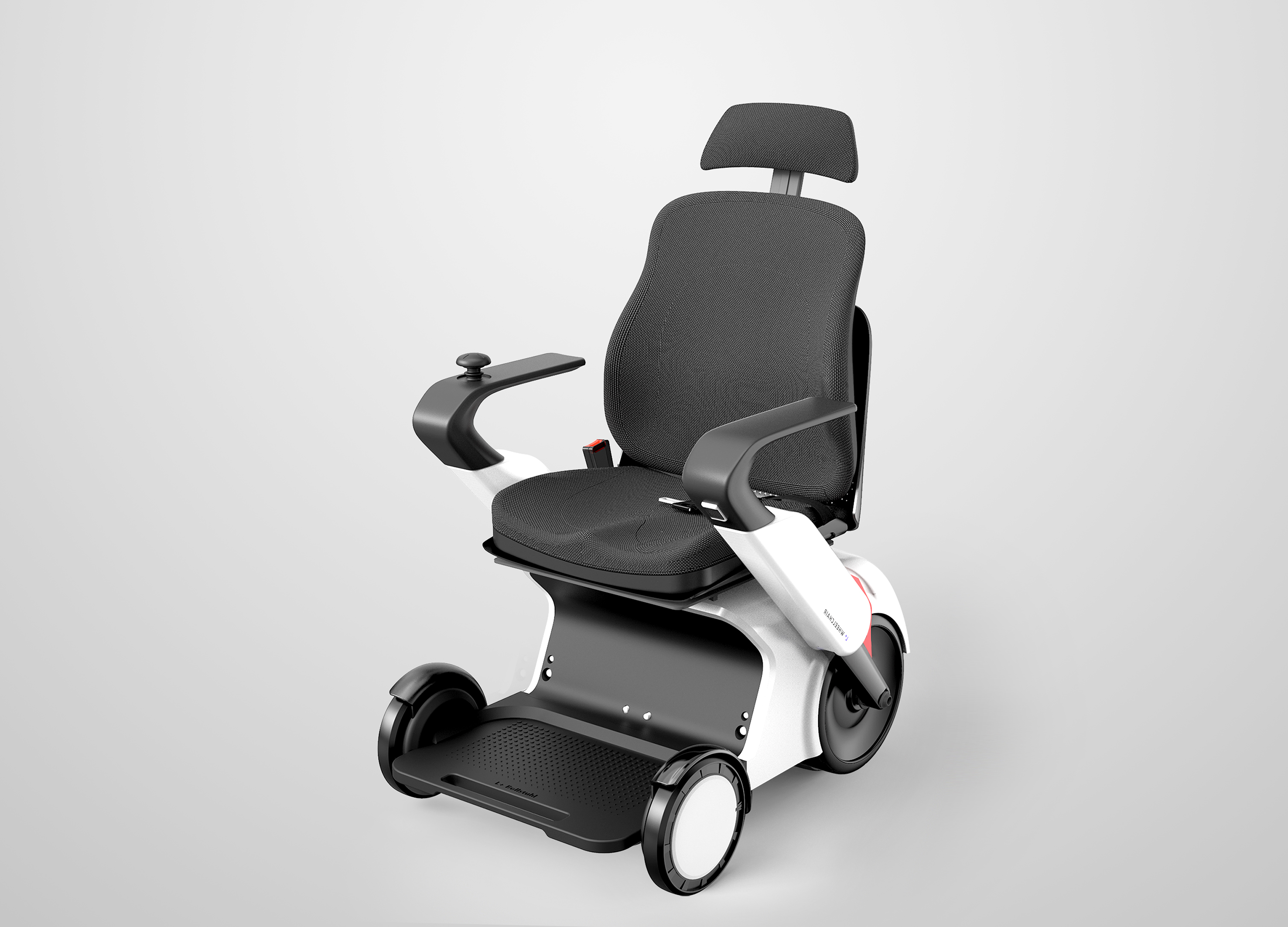
dawonchairs
Korea


Partner & Sponsor
More


info@asiadesignprize.com
#14057, 905 49, Beolmal-ro 102beon-gil,
Dongan-gu, Anyang-si, Gyeonggi-do, Korea
#14057, 905 49, Beolmal-ro 102beon-gil,
Dongan-gu, Anyang-si, Gyeonggi-do, Korea
Founder: Doyoung Kim
Business Registration Number: 454-86-01044
Online Sales License No.: 2021-Anyang Dongan-1081
Copyright © DESIGNSORI Co., Ltd.
Business Registration Number: 454-86-01044
Online Sales License No.: 2021-Anyang Dongan-1081
Copyright © DESIGNSORI Co., Ltd.
