SIMPLICITEA
Communication
Regions
Chinese Taipei
Year
2025
Award
WINNER
Affiliation
Cool Mai Design
Designer
Patrick Cheng, Clyde Lai
English
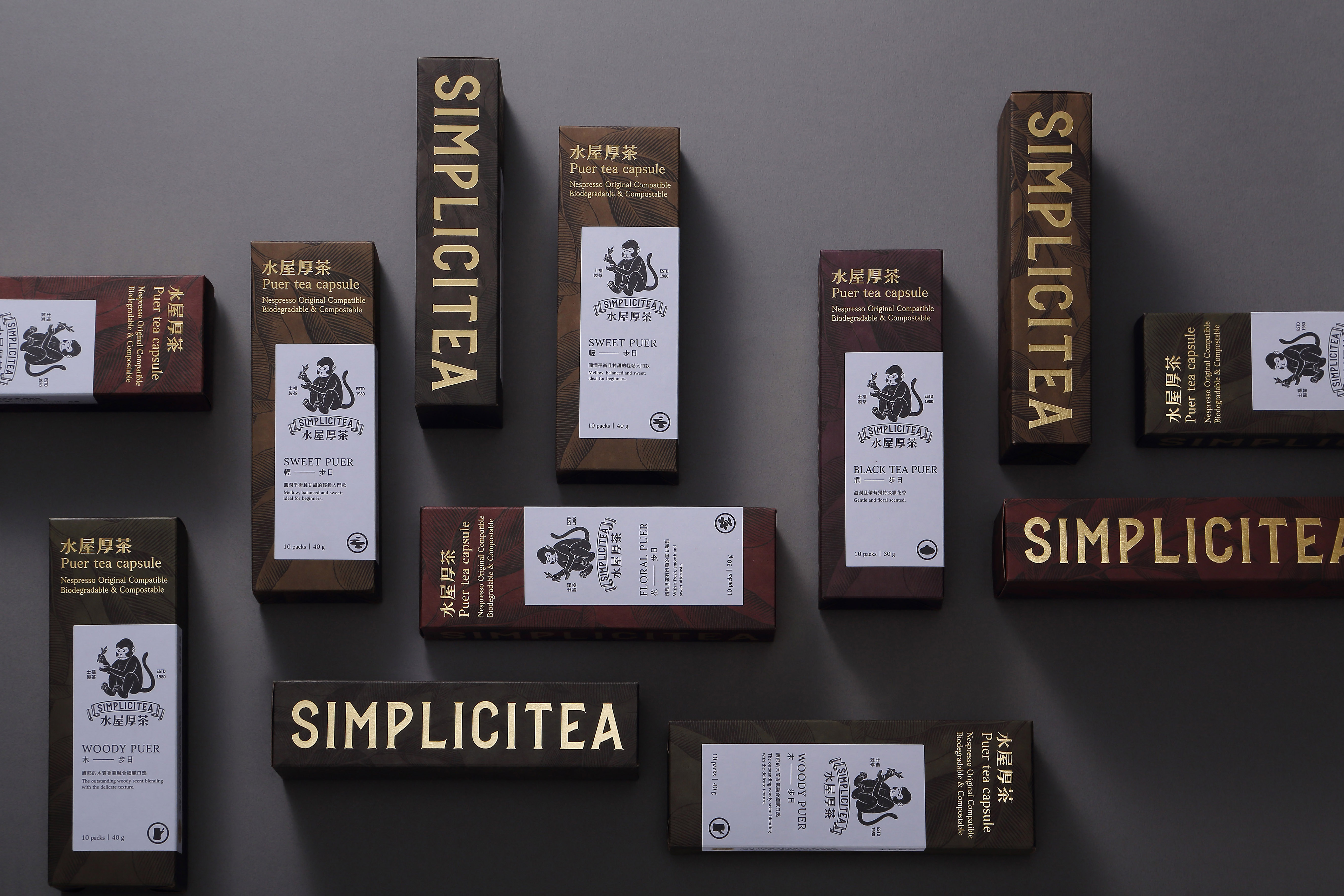
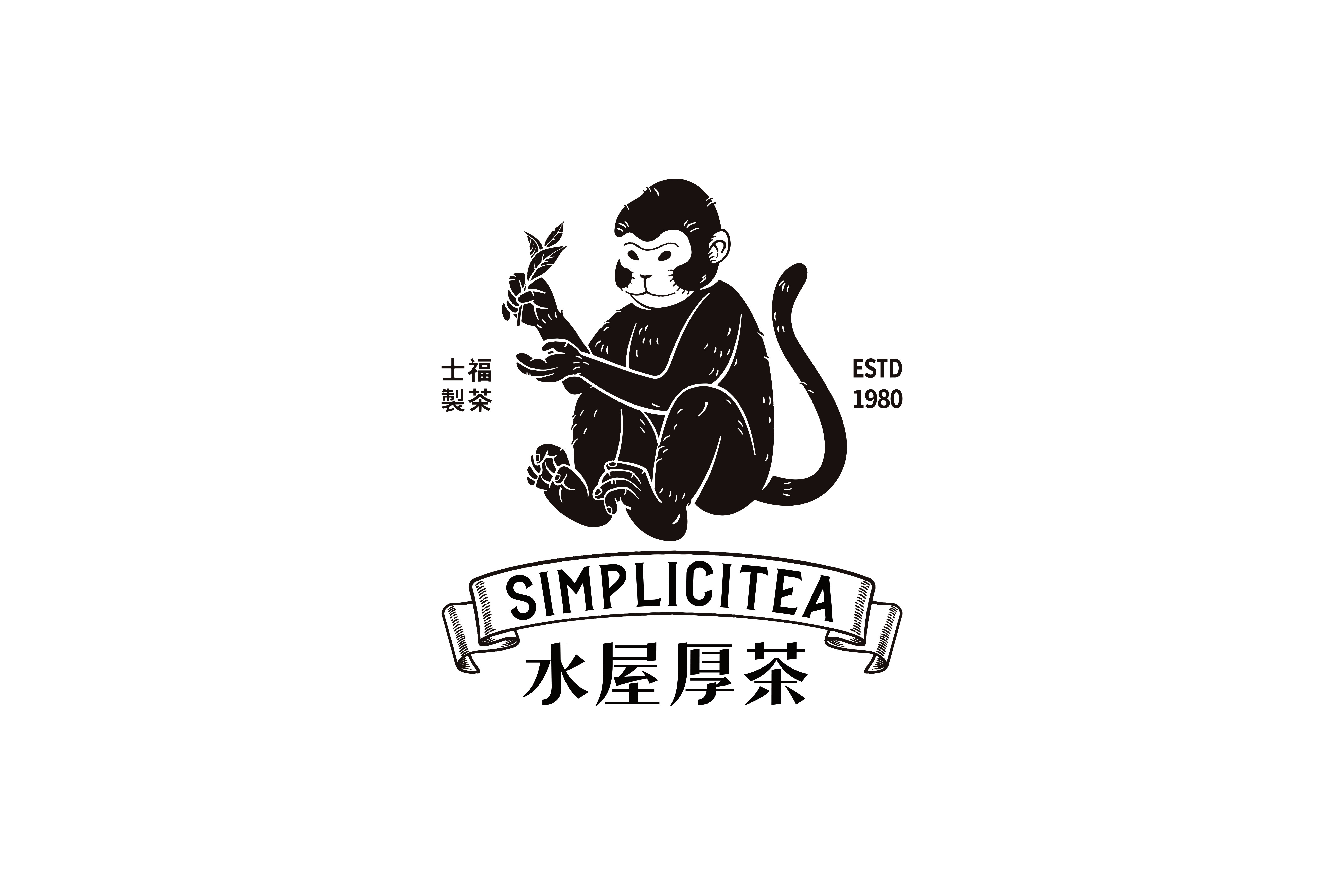
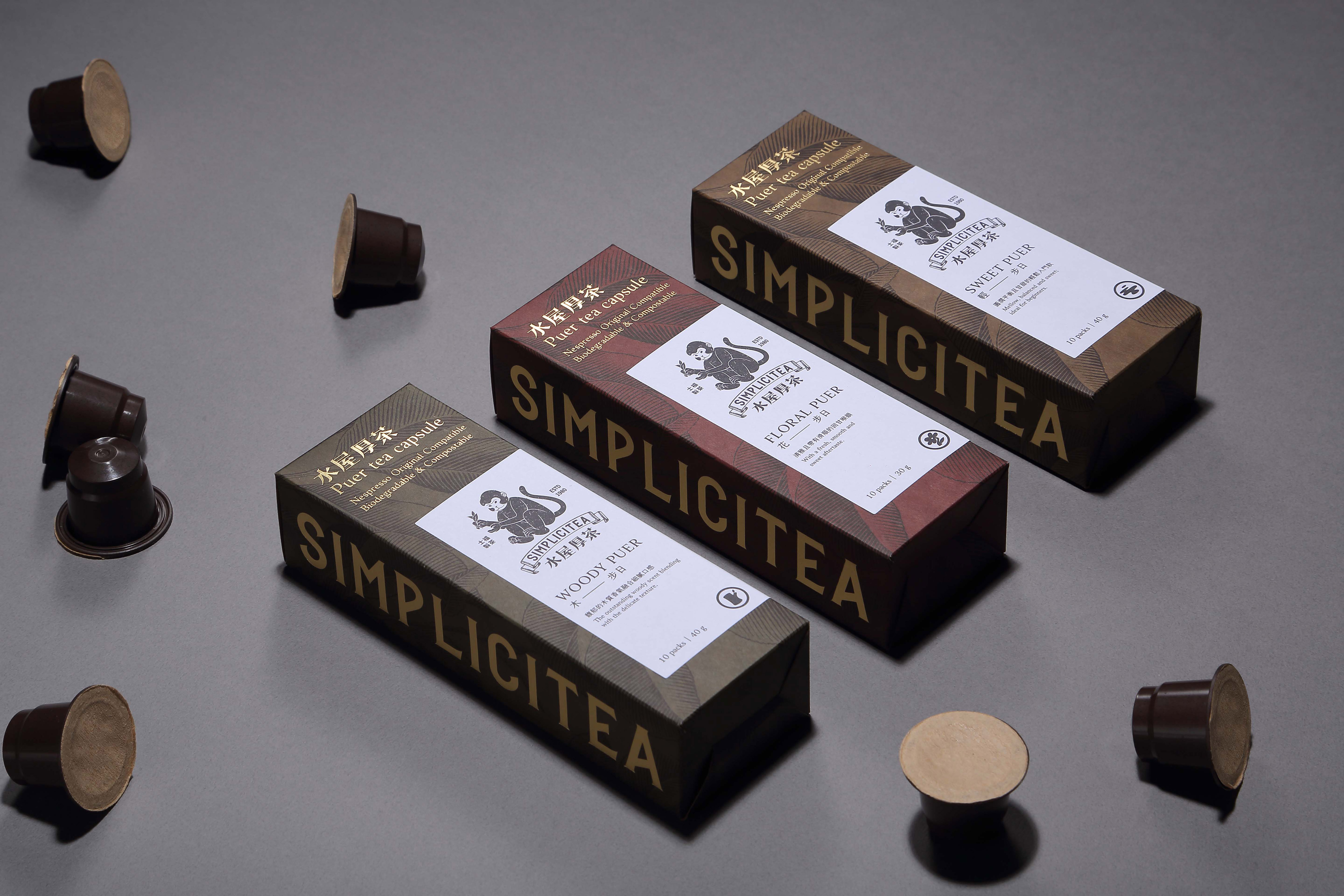
We believe "less is more." There’s no need for excessive packaging design to meet the requirements. By using different colors to represent flavors, we make it easy for both owners and consumers to identify the products they need. For the owner, simple packaging doesn't require a large budget to produce; for the consumer, it prevents unnecessary waste when taking the product home. Kraft paper is printed in five colors to distinguish flavors, with a Pu-erh tea tree totem as the background, gold foil for the brand name, and embossed paper stickers for added texture. The overall style reflects cultural depth and tea-drinking history.
Judging Comments
The design follows the "less is more" philosophy, using minimalistic packaging to meet requirements without excess. Different colors represent flavors, making it easy for both owners and consumers to identify products. Kraft paper, printed in five colors, distinguishes flavors, while the Pu-erh tea tree totem, gold foil branding, and embossed stickers add texture and cultural depth. This simple yet thoughtful packaging reduces waste and reflects the rich history of tea drinking.
Positive Comments


Serene Brand Identity and Packaging Design
B for Brand
Korea
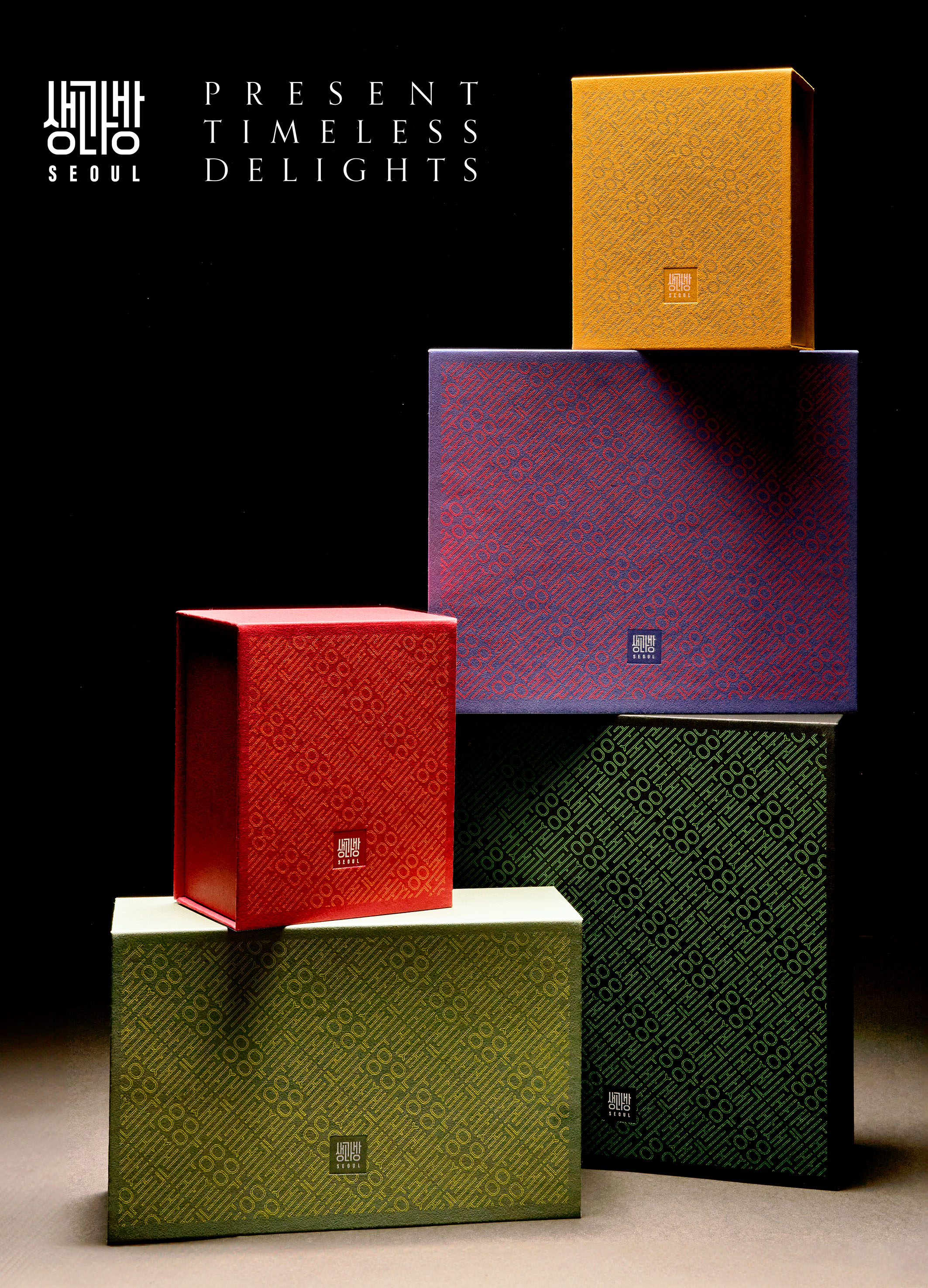
SaengGwaBang Yakgwa Rebranding
Youngha Park Studio Inc.
Korea
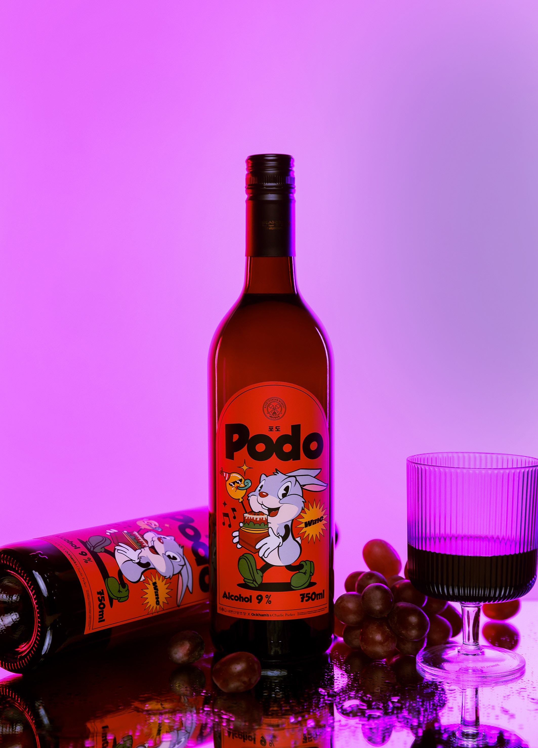
PODO wine
OCKHAMS BRANDING Co., Ltd.
Korea
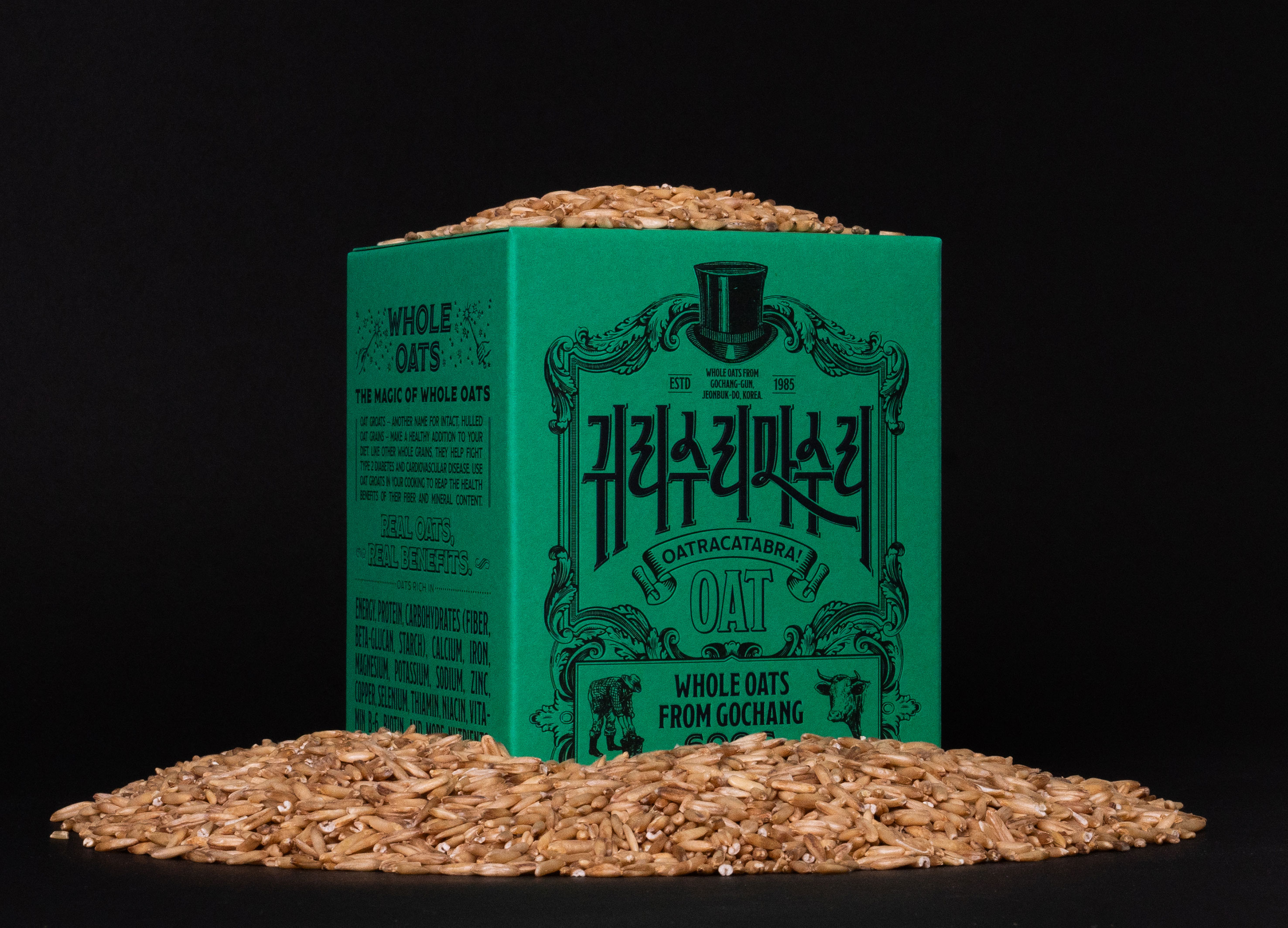
Oatracatabra
tedo inc Inc.
Korea
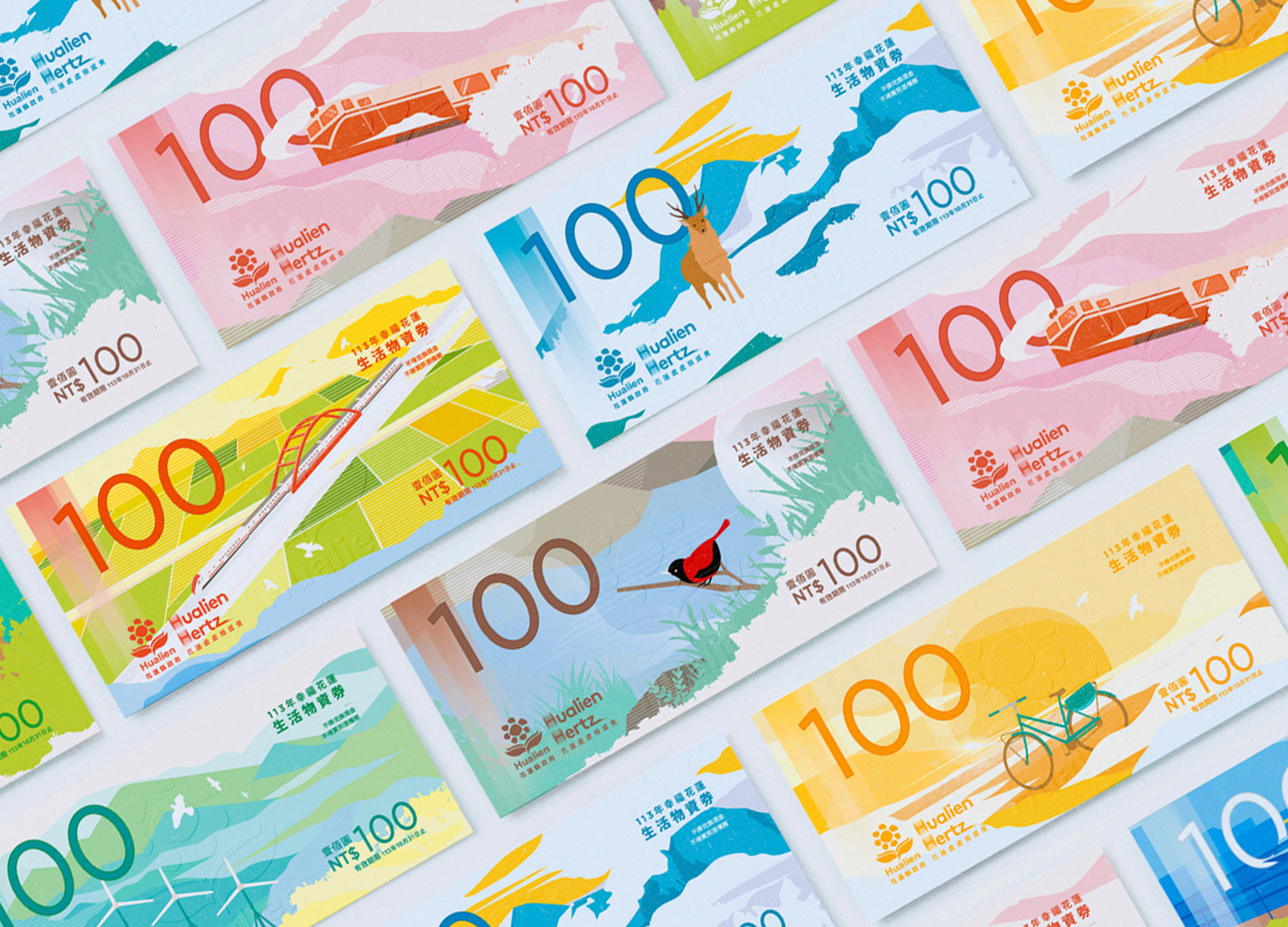
Happy Hualien Living Supplies Voucher
BENZHI Design Consultant Co., Ltd.
Chinese Taipei
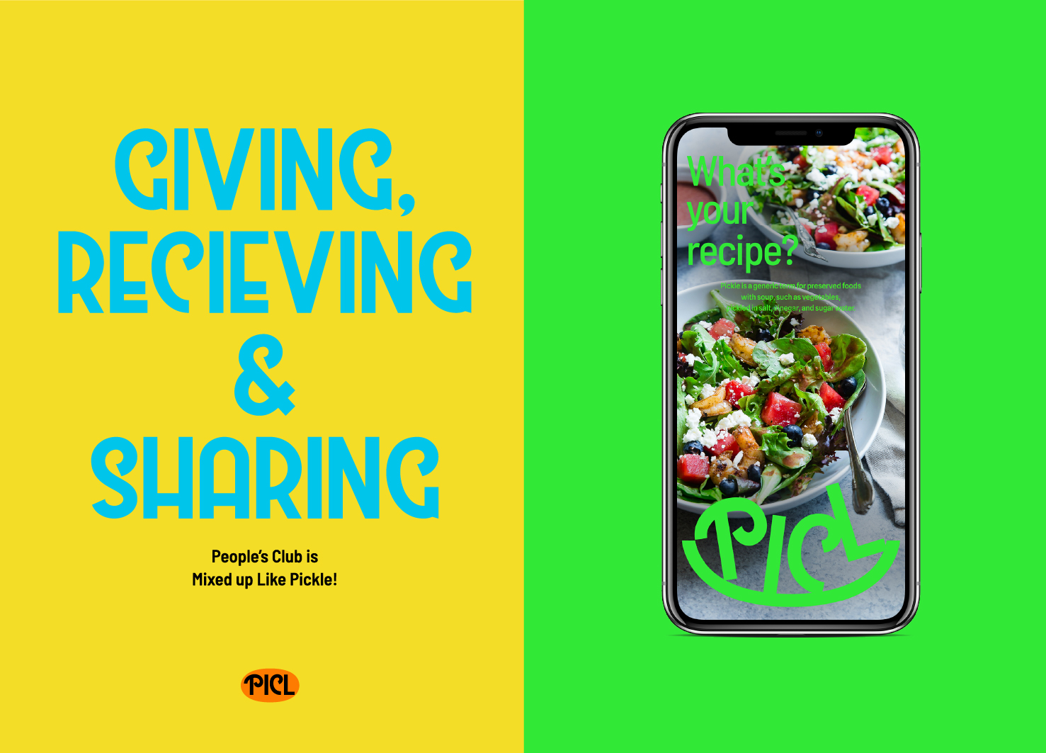
PICL Brand Identity Design
ist Studio
Korea
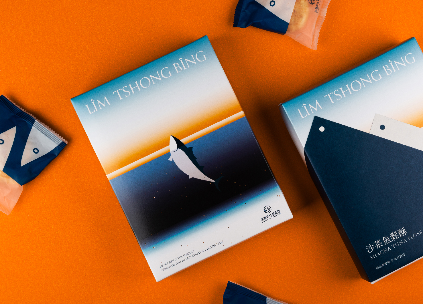
Smart Fish Shacha Tuna Floss Cake
Union Atelier
Chinese Taipei
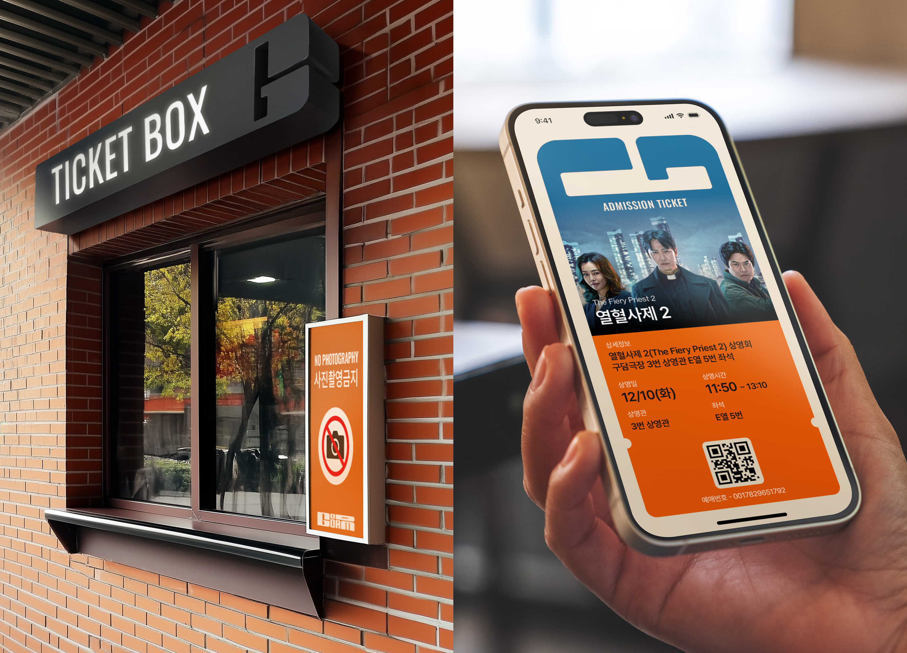
GOODAM Brand Identity Design
B for Brand
Korea
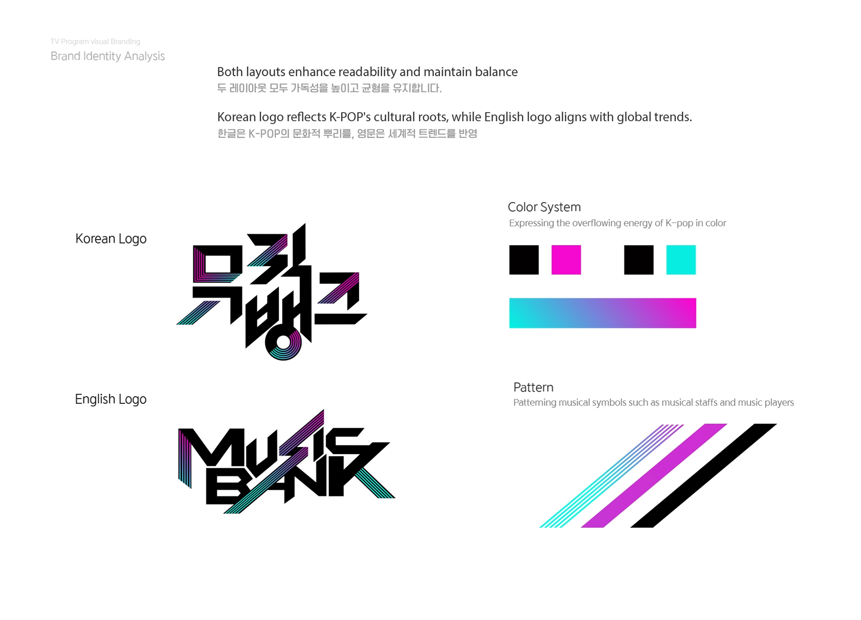
KBS2 MUSIC BANK Visual Branding
KBS ArtVision Design team Graphic Dept
Korea
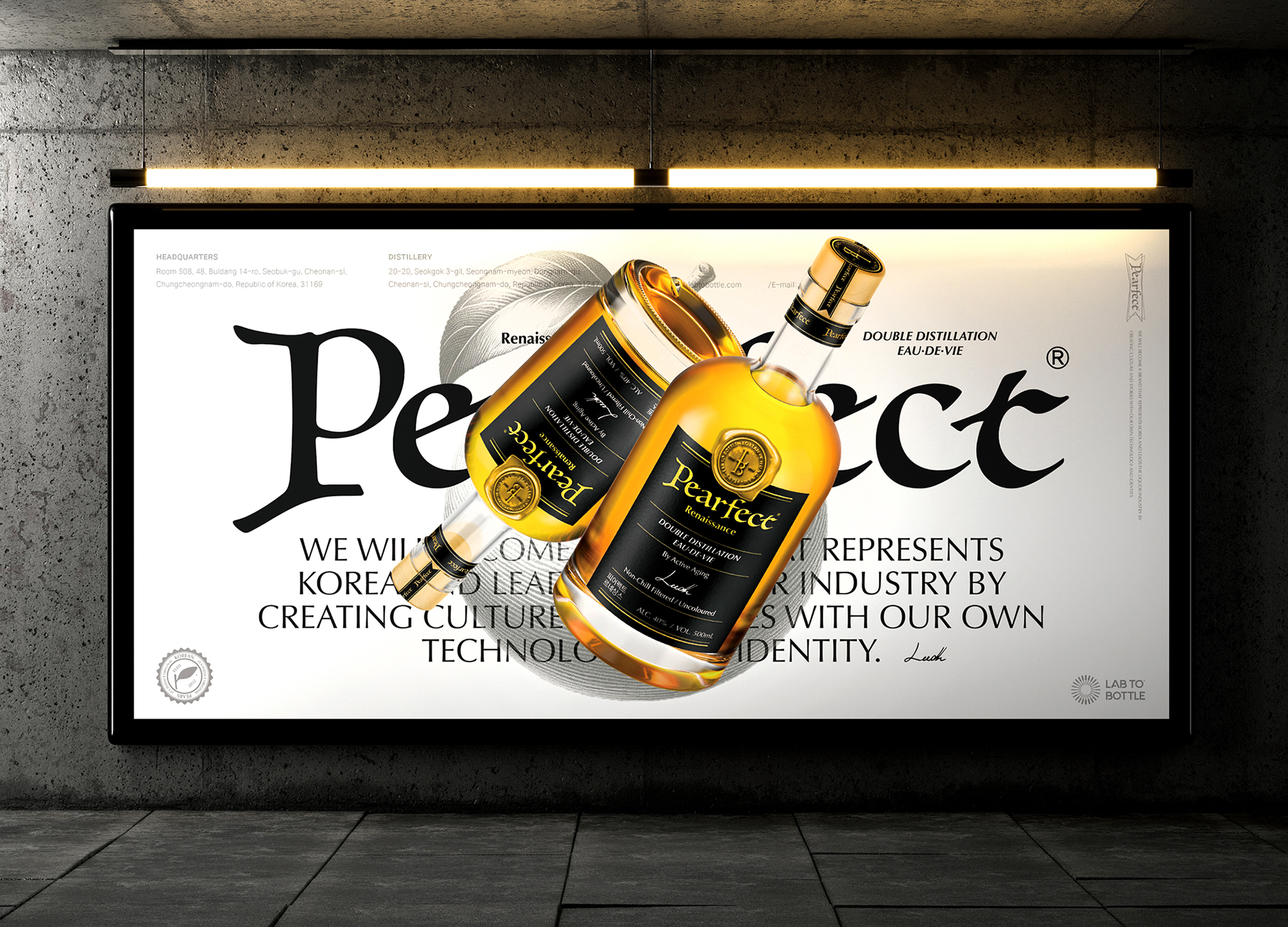
Pearfect
Design Astrein & Lab to Bottle Corp.
Korea
SIMPLICITEA
Cool Mai Design
Chinese Taipei
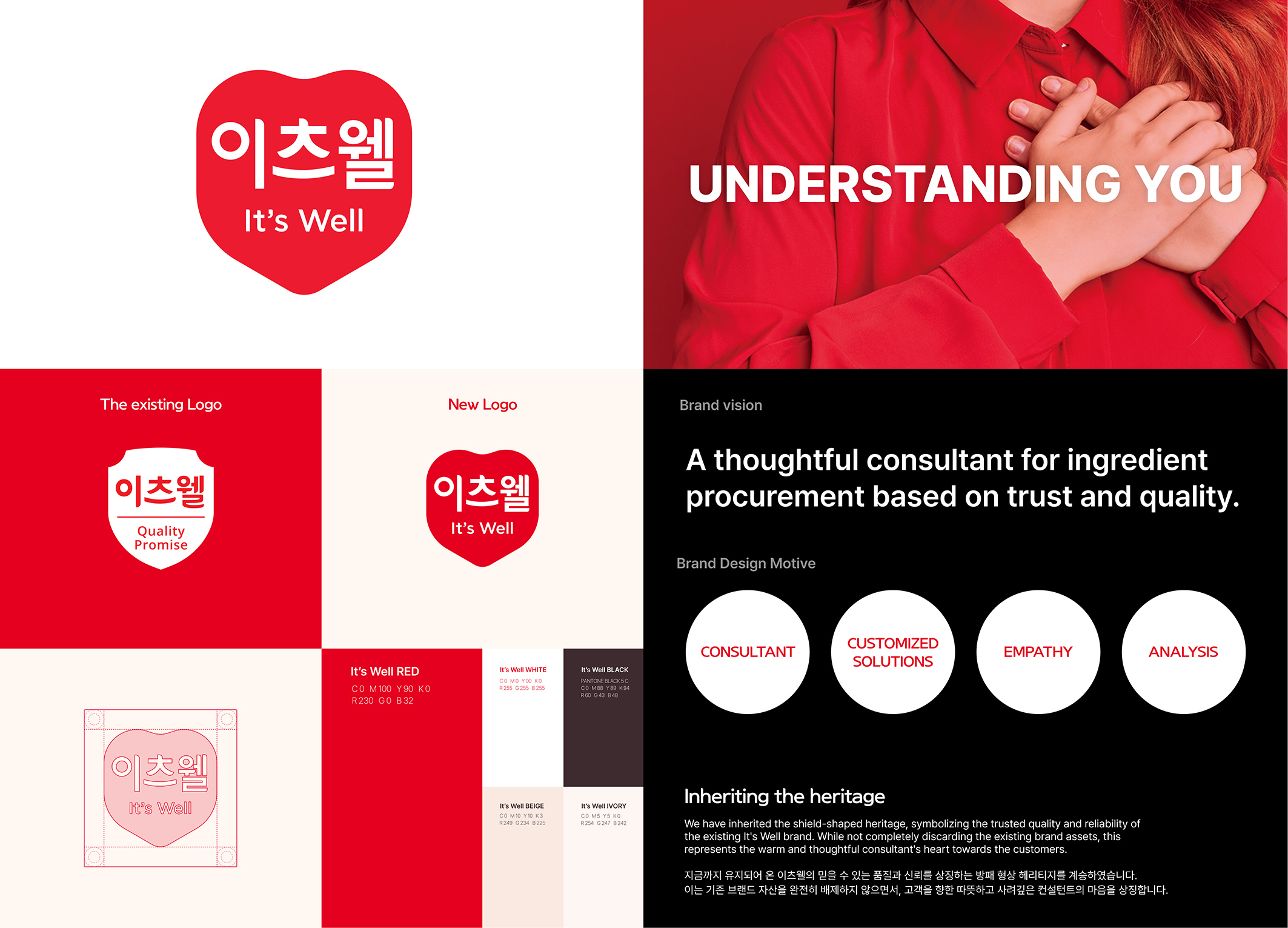
itsWell brand design
ohSeven design Co., Ltd.
Korea

OPENPATH Brand design
Duotone Co., Ltd.
Korea
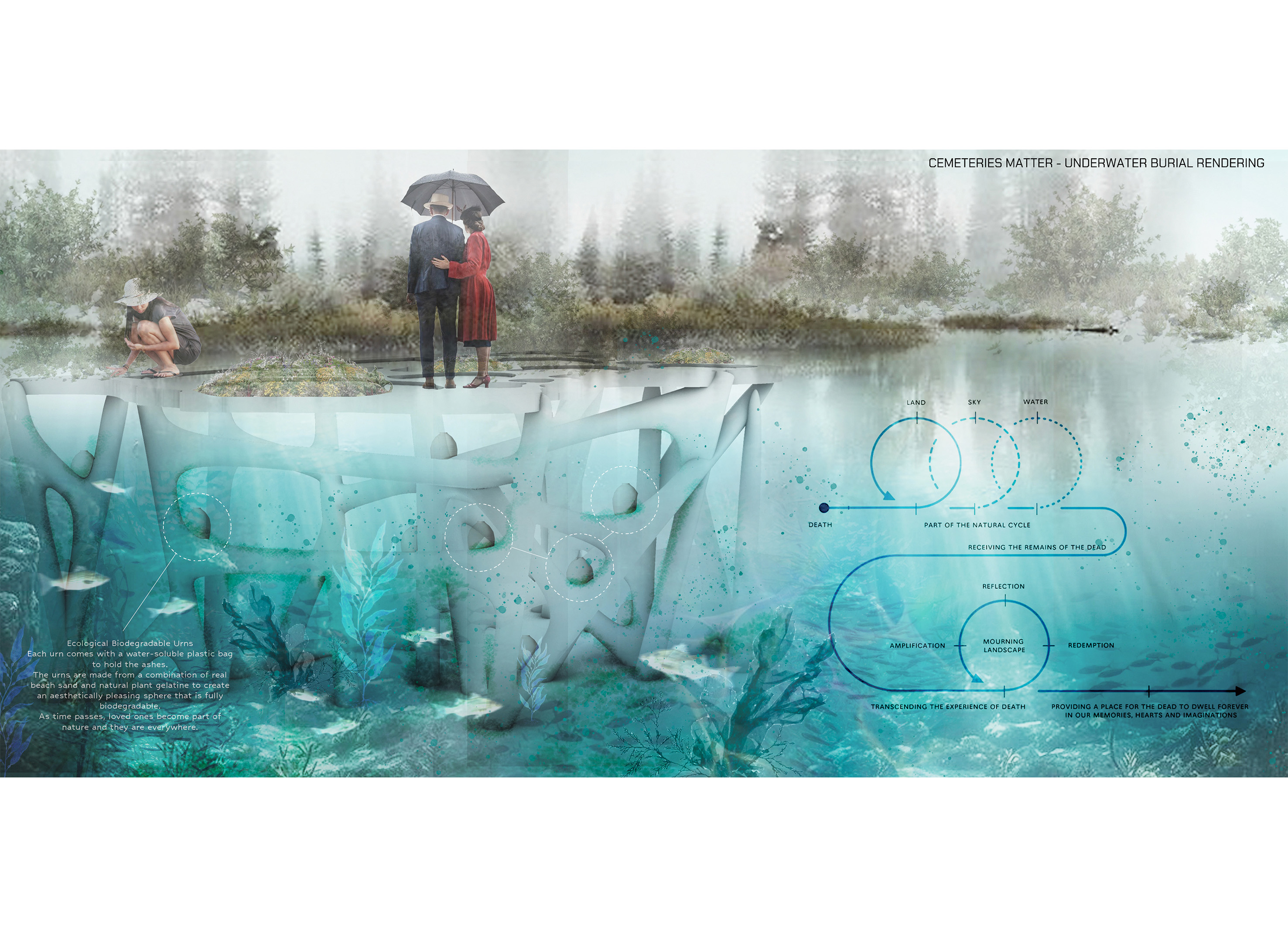
Cemeteries Matter
USA
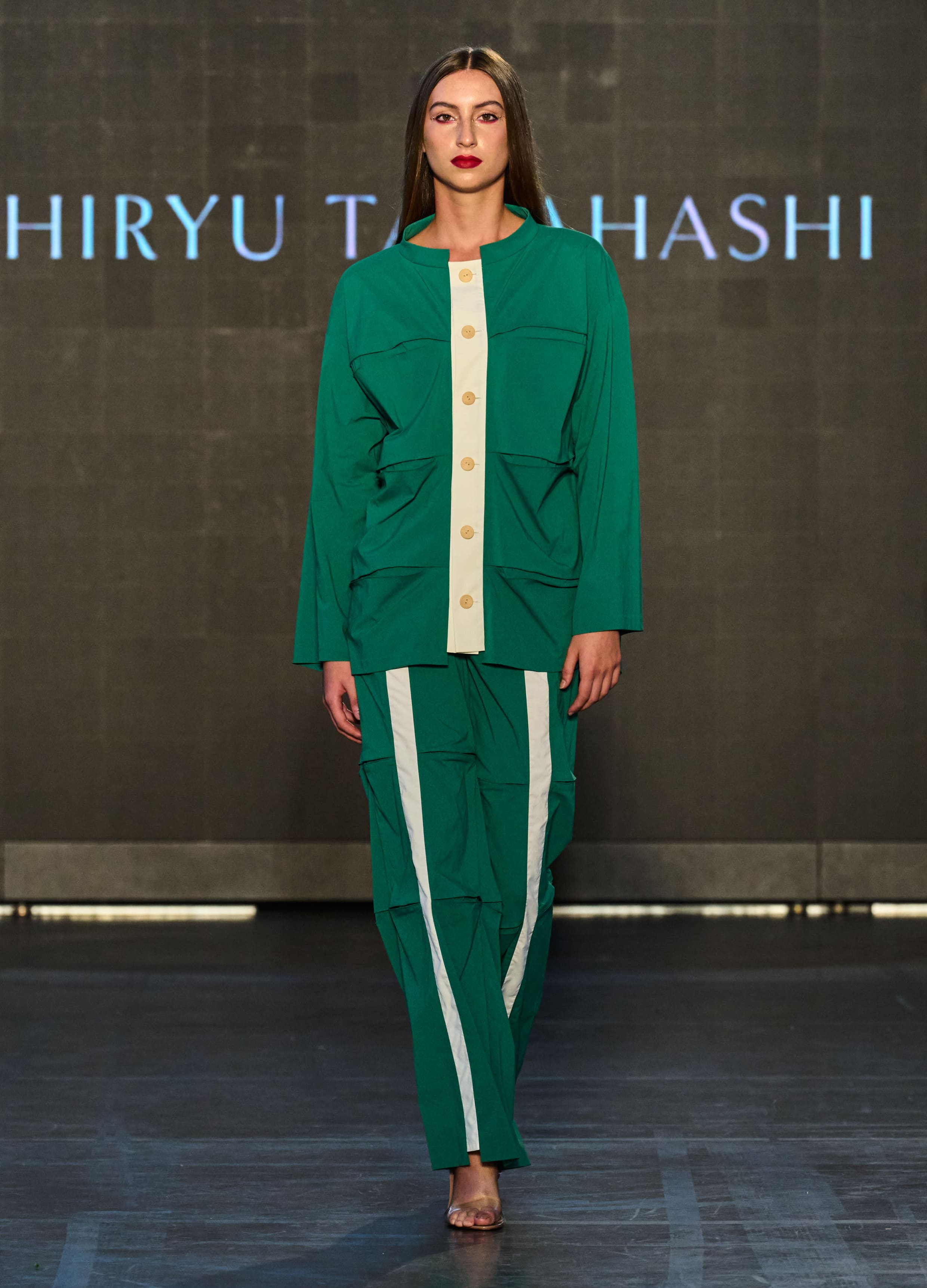
Bamboo
SHIRYU TAKAHASHI
Japan
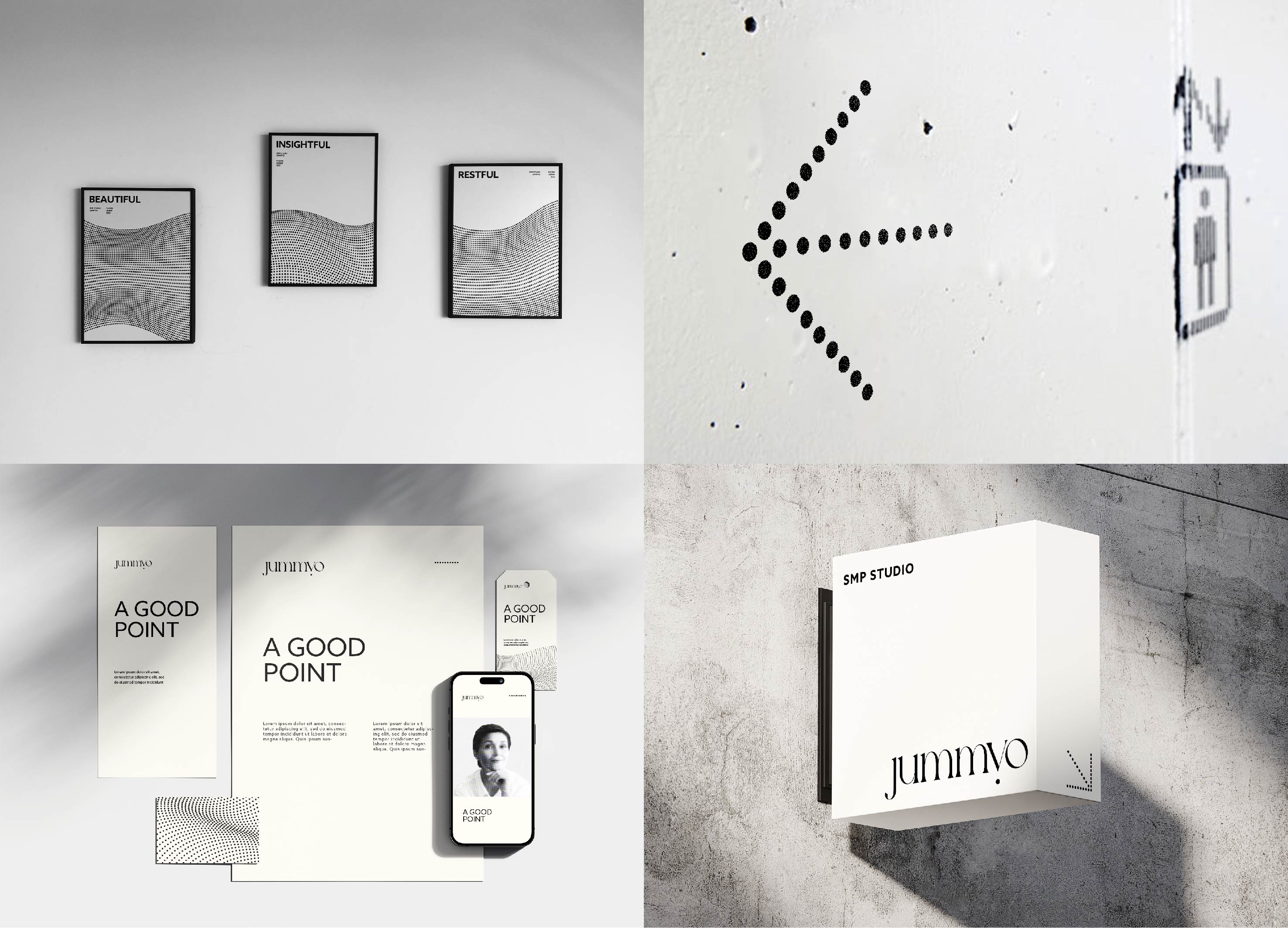
Jummyo Brand Identity design
JDNS Design
Korea
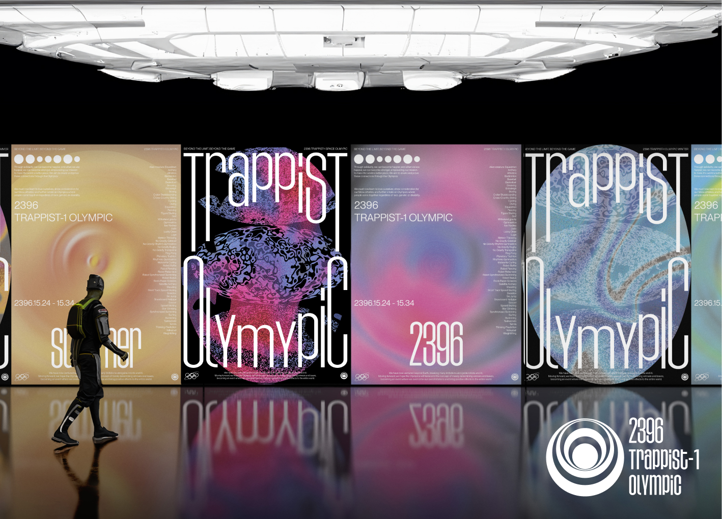
Space Olympics Brand Identity Design
Sungshin Womens University
Korea
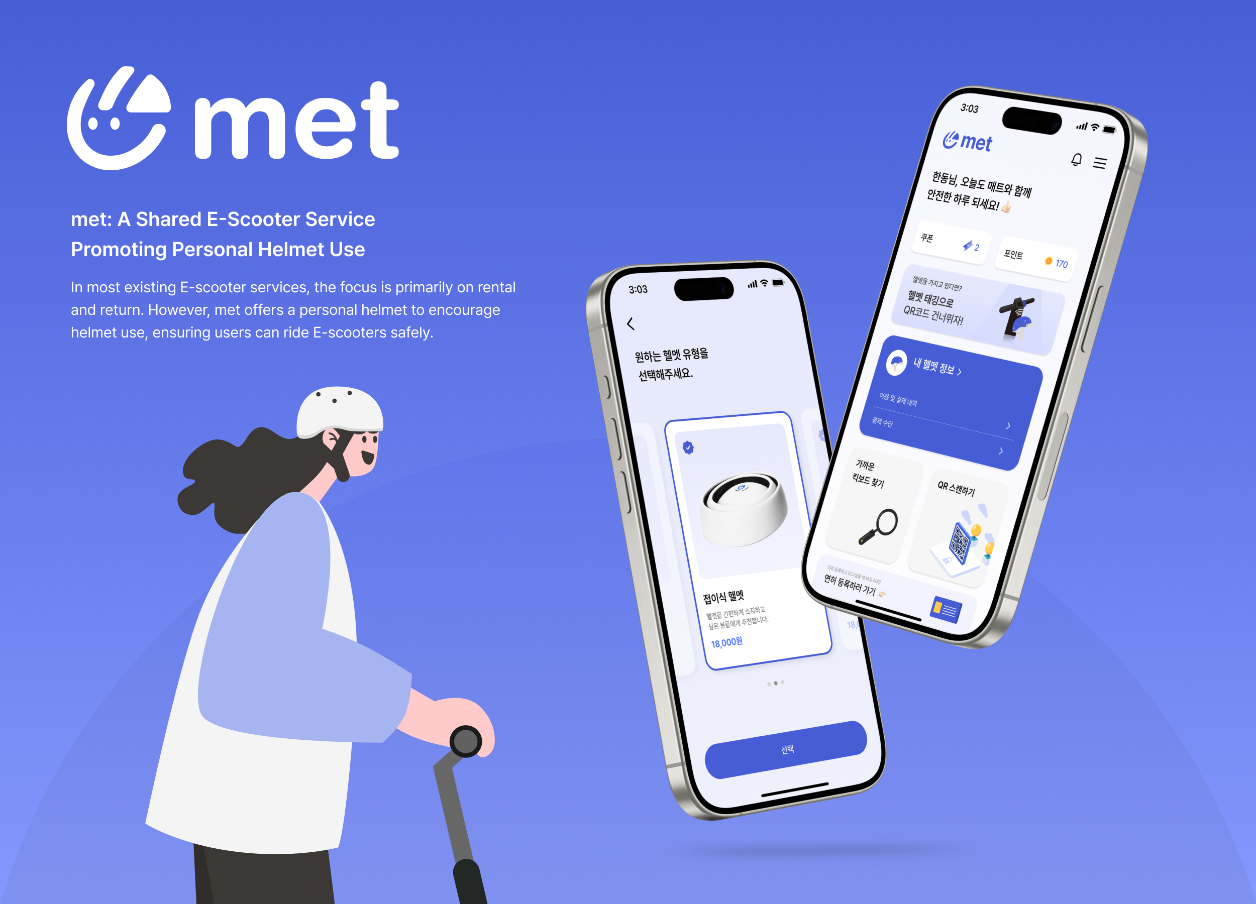
met
4met
Korea


Partner & Sponsor
More


info@asiadesignprize.com
#14057, 905 49, Beolmal-ro 102beon-gil,
Dongan-gu, Anyang-si, Gyeonggi-do, Korea
#14057, 905 49, Beolmal-ro 102beon-gil,
Dongan-gu, Anyang-si, Gyeonggi-do, Korea
Founder: Doyoung Kim
Business Registration Number: 454-86-01044
Online Sales License No.: 2021-Anyang Dongan-1081
Copyright © DESIGNSORI Co., Ltd.
Business Registration Number: 454-86-01044
Online Sales License No.: 2021-Anyang Dongan-1081
Copyright © DESIGNSORI Co., Ltd.
