VIVI Cocktail
Communication
Area
China
Year
2025
Award
WINNER
Affiliation
EASTROC BEVERAGE GROUP Co., Ltd.
Designer
EASTROC
English
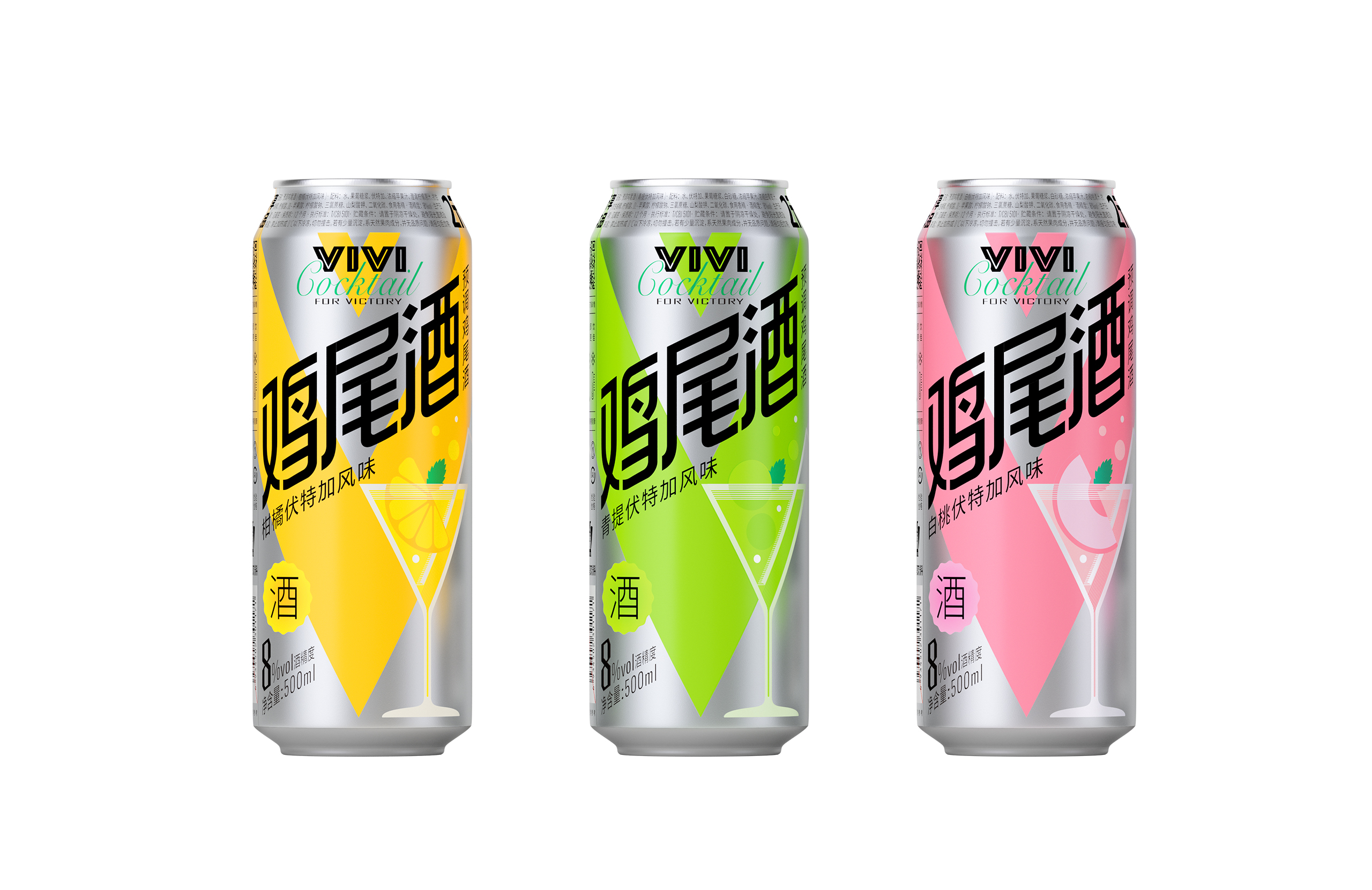
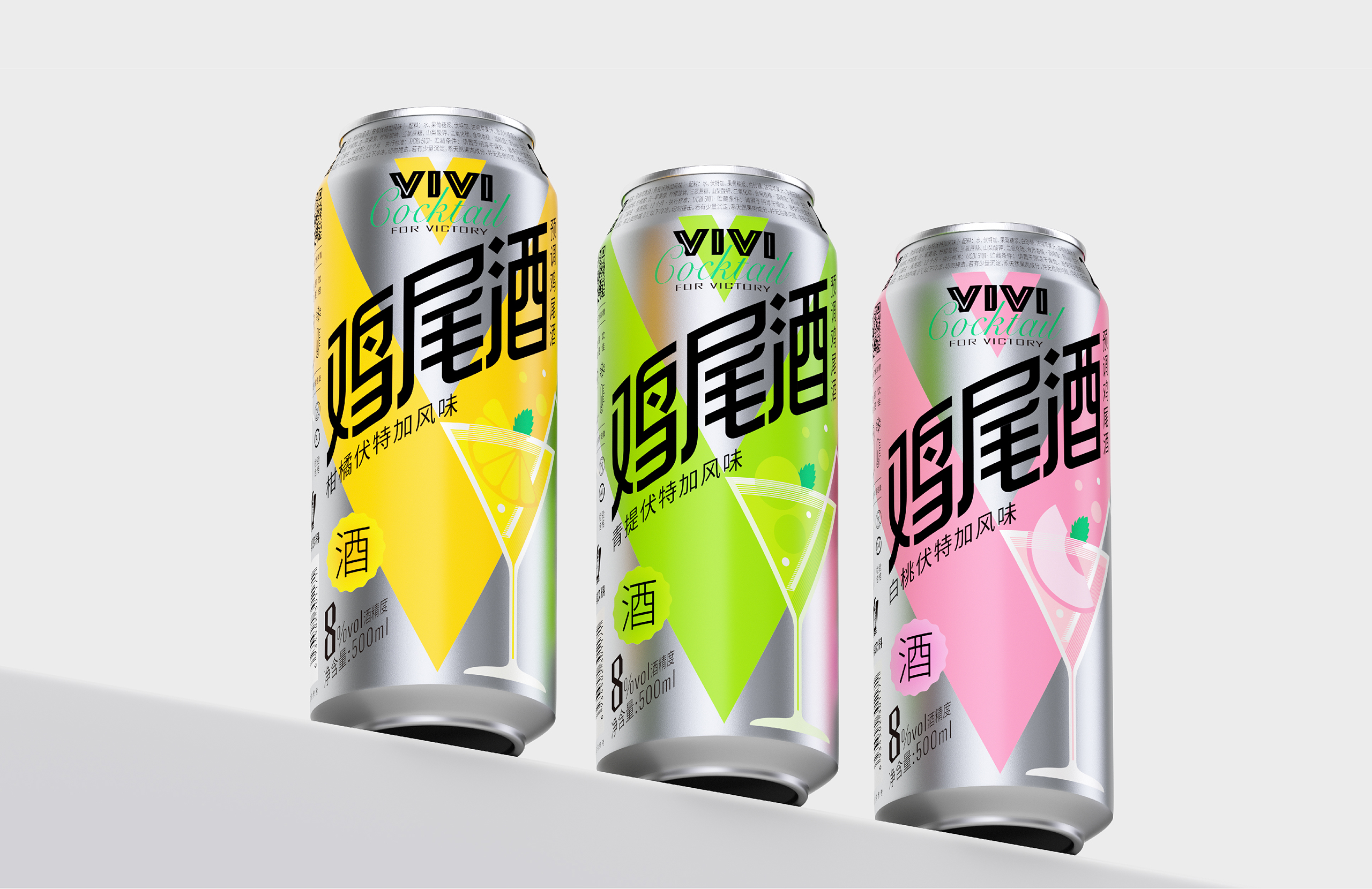
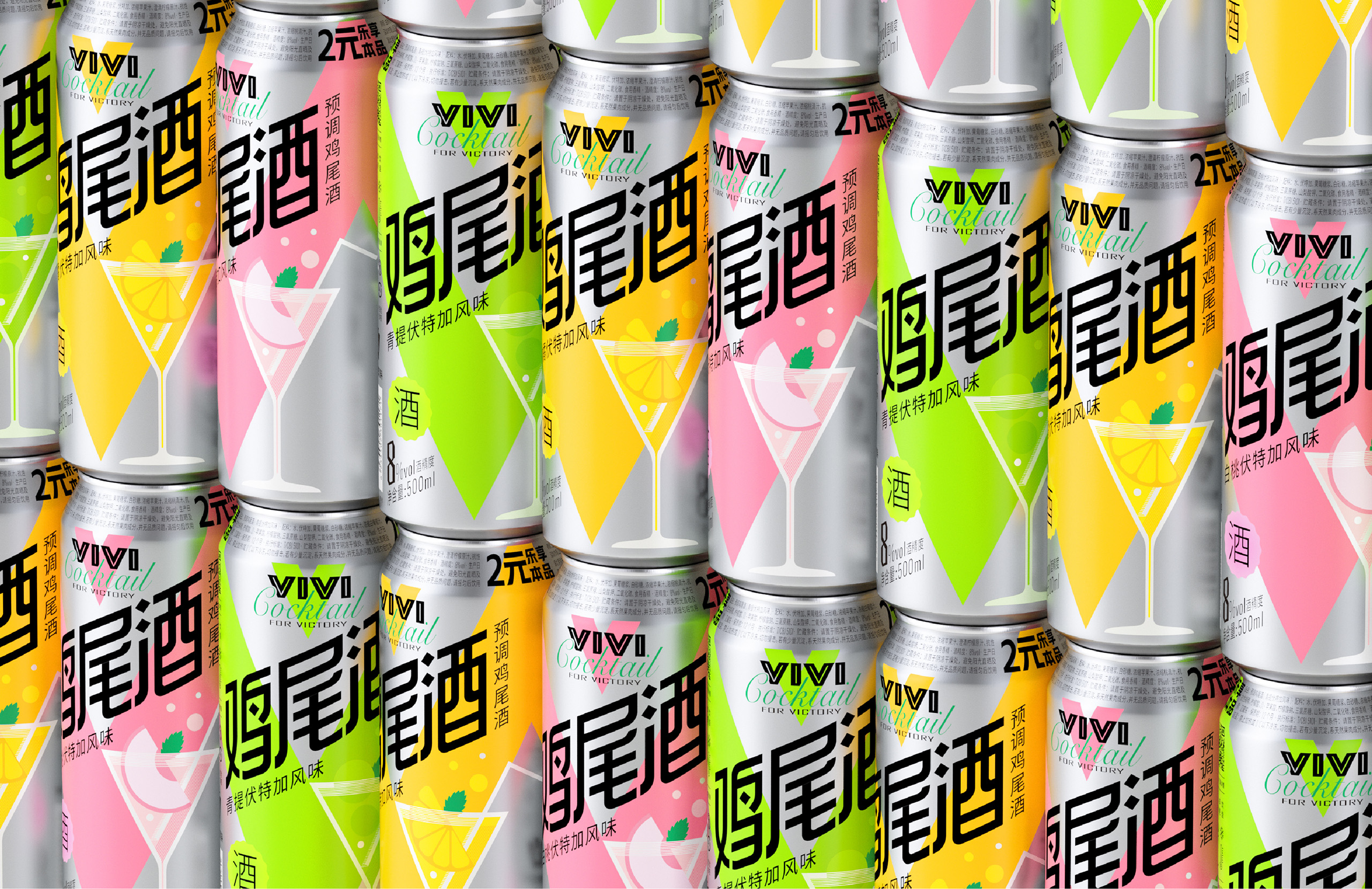
VIVI Cocktail employs flat design and spectrum-style color blocks to reduce visual clutter, constructing a clear category perception. Even when simply displayed on shelves, this packaging design effectively conveys a modern and stylish aesthetic.
It features a 25° tilted modern black font for the word "Cocktail" on the cylindrical bottle, fully presenting the main information and maximizing the frontal display area. The enlarged and bold black font delivers a striking visual impact, drawing consumer attention and clearly conveying its selling points.
The design uses space ingenuity to maximize the visual transmission of its information.
Native
VIVI鸡尾酒以极简主义为设计语言,外观去除多余元素,仅保留基本形式与功能,突显每个组成部分强调的核心信息。通过扁平化风格与波谱风格色块的运用,本包装设计减少了视觉负担,构建了清晰的品类认知,即使在货架上简单陈列,也能有极为有效地传递现代感与时尚美。
本设计以空间巧思实现最大程度的视觉信息传递,于圆柱瓶体上采用25°倾斜设计的现代黑体“鸡尾酒”汉字,完整呈现产品主要信息,且最大化正面展示面积。放大的加粗黑体字样以醒目的视觉冲击力,吸引消费者视线且清晰传递产品的卖点,提升整体关注度。
VIVI鸡尾酒包装采用明快缤纷的色彩,唤起消费者的愉悦情绪,同时展现各款鸡尾酒的独特个性。鲜明的橙色、青色与粉色对应柑橘、青提、白桃三种口味,通过视觉效果激发味觉共鸣,清新果味尽在舌尖。此外,亮色的“V”与金属色铝罐形成鲜明对比,更能突显出果味鸡尾酒的清爽与活力。
此设计专注于用户体验,通过简洁的版面布局,以及策略性分区排列的文字信息,确保了整体设计的清晰和谐。并且创新地将配料表置于罐颈,更易于阅读,从而优化了消费者的决策过程,使得购买和使用体验更为便捷舒适。
此包装主要由铝材制作而成,表面经磨砂光油处理,赋予细腻触感。视觉上通过铝金属原色与鲜艳的产品色形成鲜明对比,强化质感的同时,凸显现代美感。饮用完毕后,可将铝罐回收进行再利用,完美契合绿色可持续发展的设计理念。
Judging Comments
VIVI Cocktail’s packaging has been praised for its modern and impactful visual identity. The flat design and spectrum-style color blocks create a clean and organized aesthetic, enhancing category recognition at a glance. The 25° tilted bold typography on the cylindrical bottle maximizes visibility, ensuring key product information stands out. This design effectively balances simplicity with striking visual impact, making it a standout on retail shelves and reinforcing the brand’s contemporary and stylish appeal.
Positive Comments


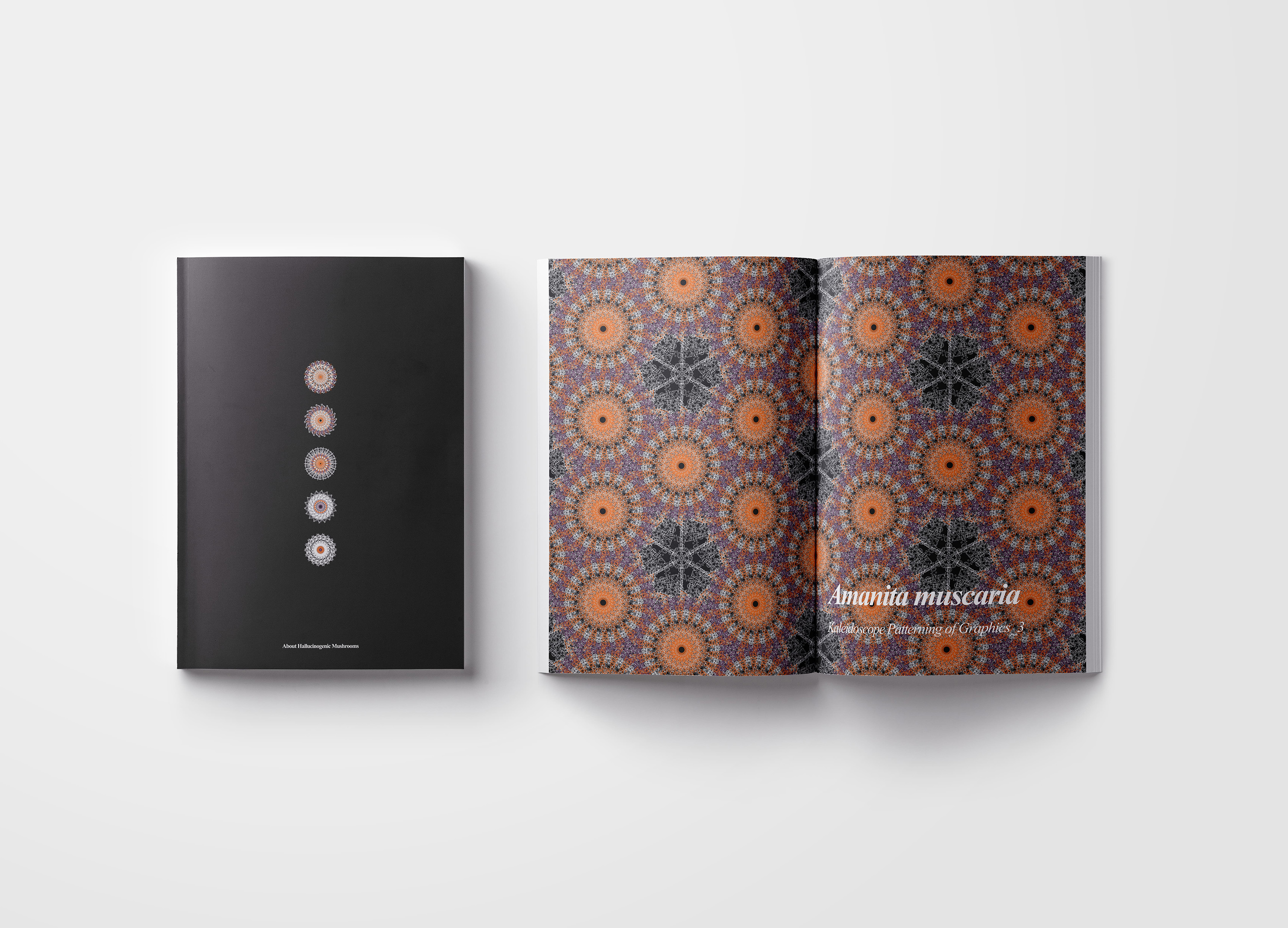
Hallucinogenic Mushrooms
Sejong University
Korea
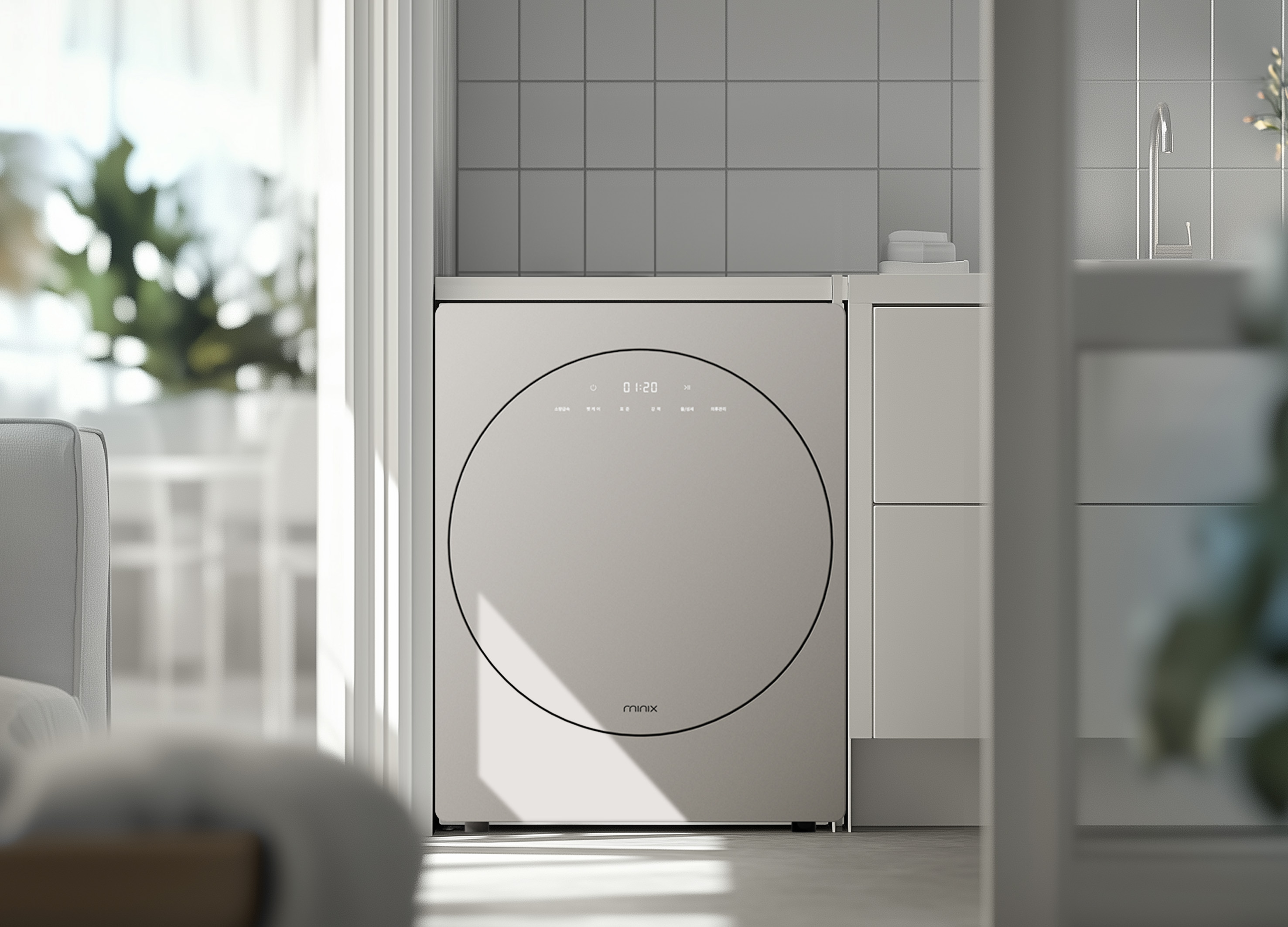
minix clothes dryer
Athome Corp.
Korea
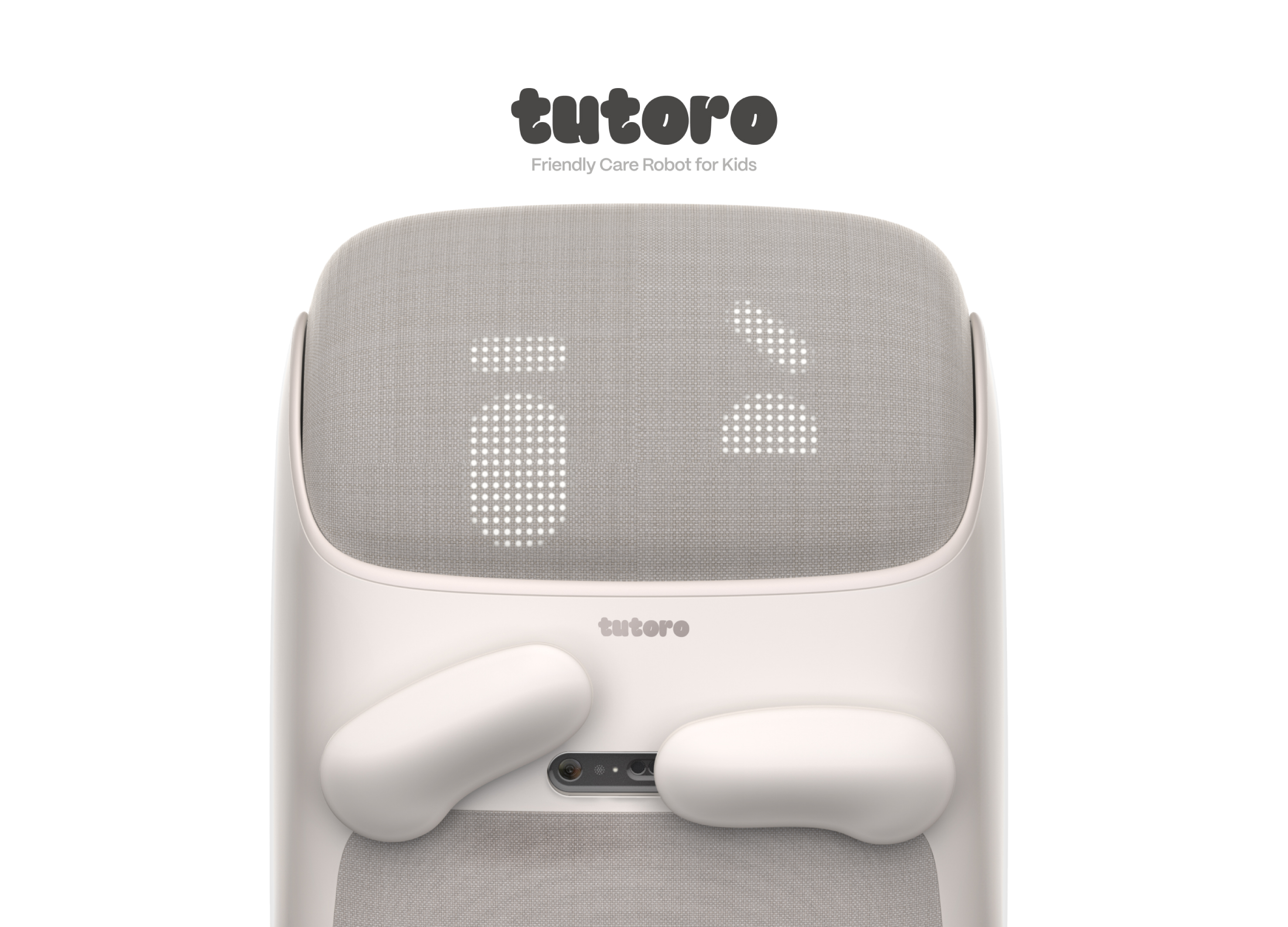
Tutoro
Hongik University
Korea
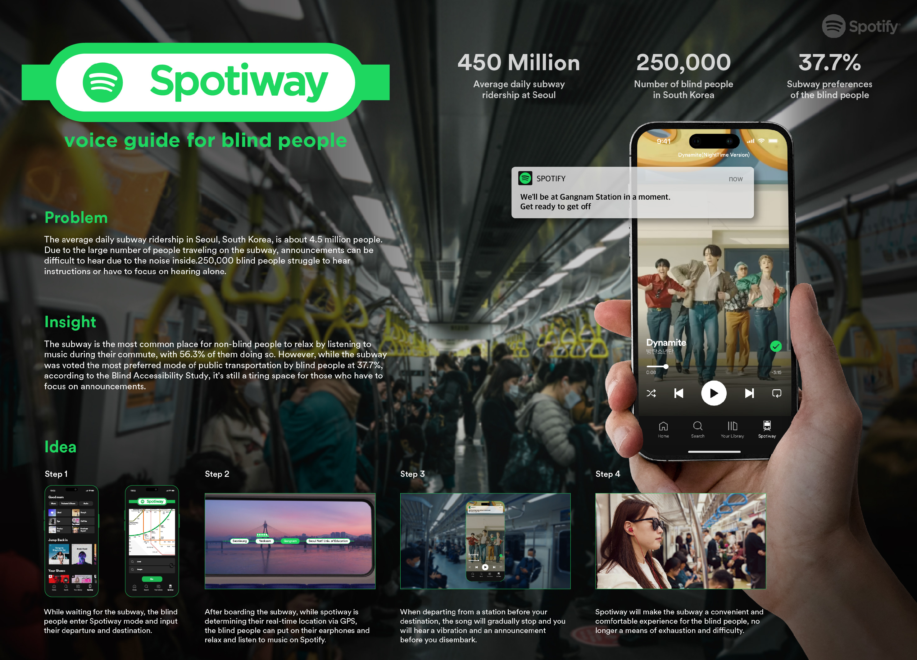
Spotiway.voice guide for blind people
Dongseo University
Korea
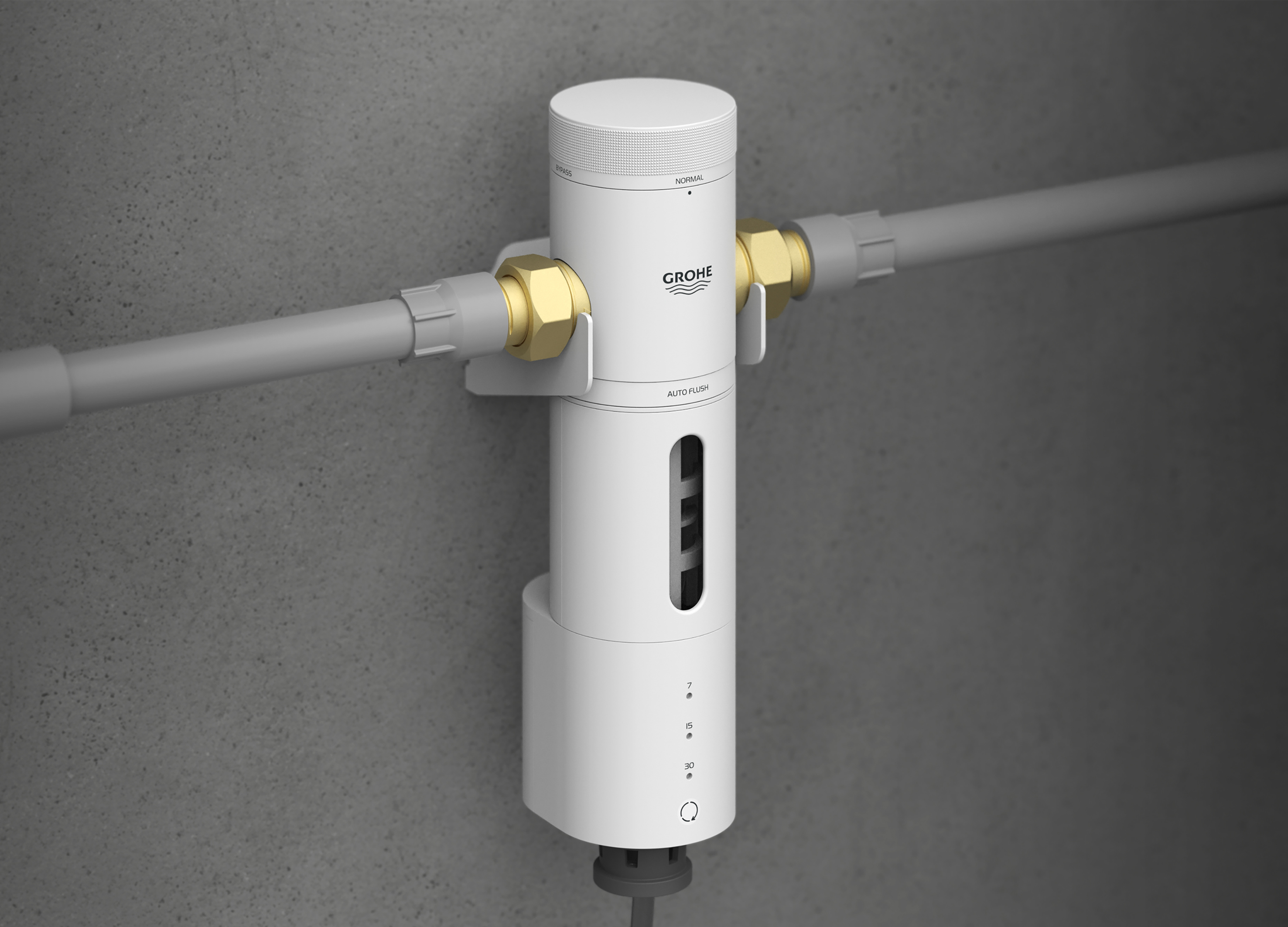
Grohe PreFilter
GROHE
Singapore
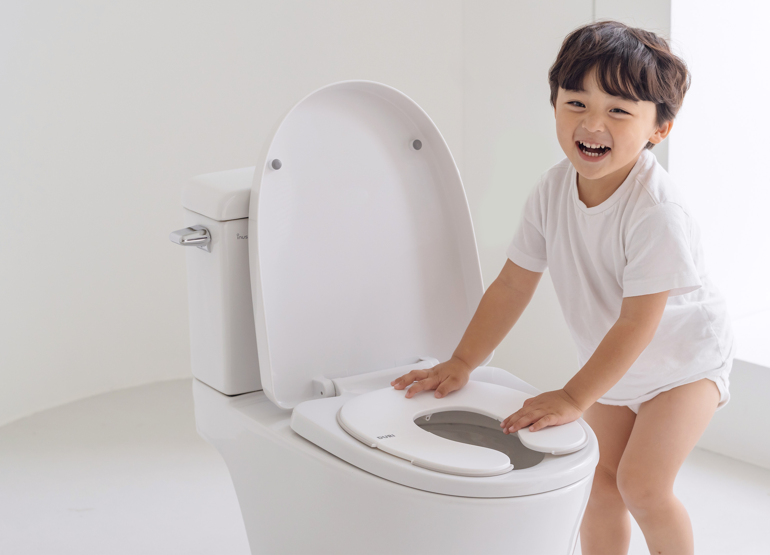
DURI portable folding potty
PRESENT
Korea
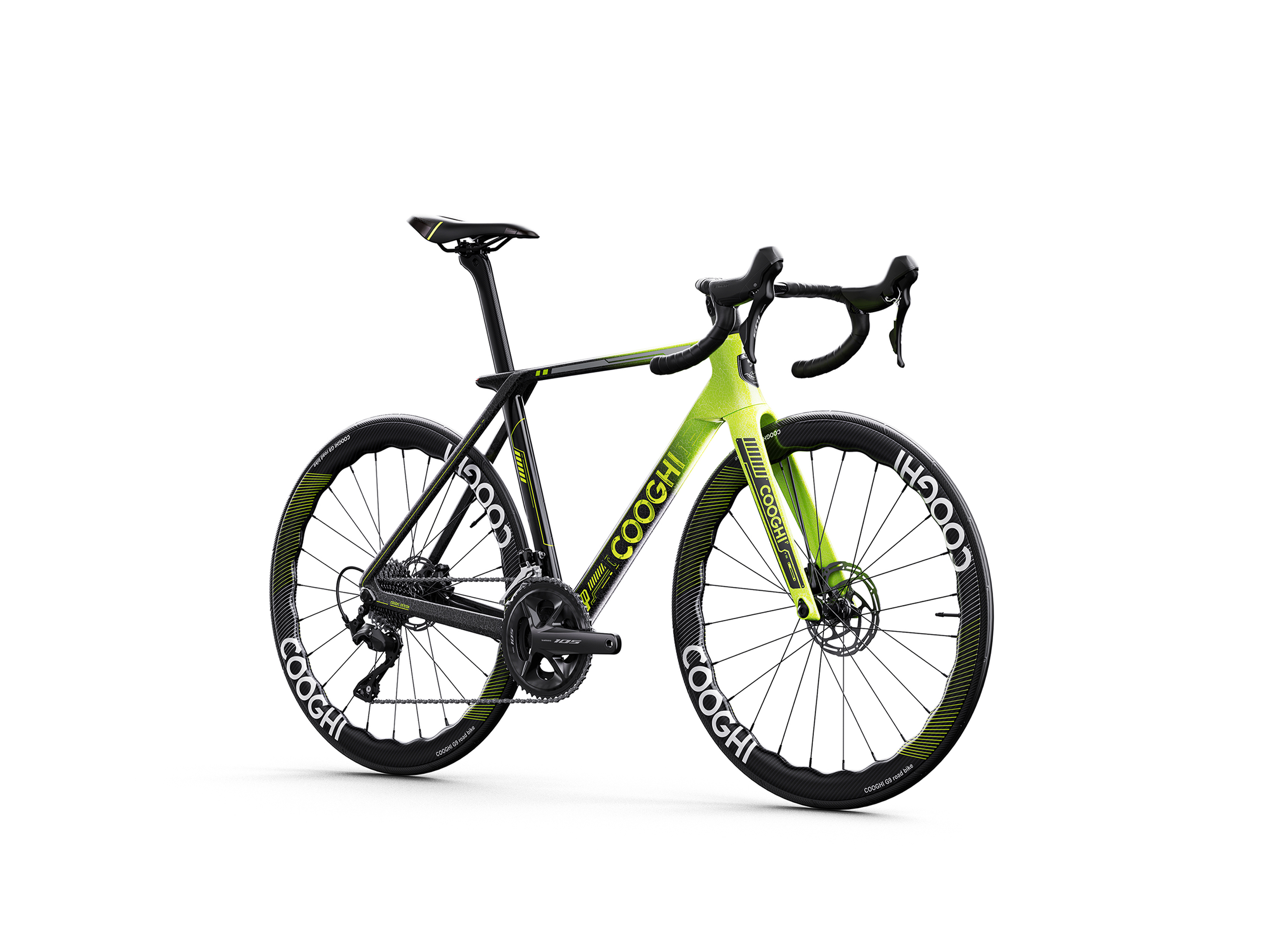
COOGHI G9 Green Mamba road bike
Shenzhen COOGHI Funkids Technology Co., Ltd.
China
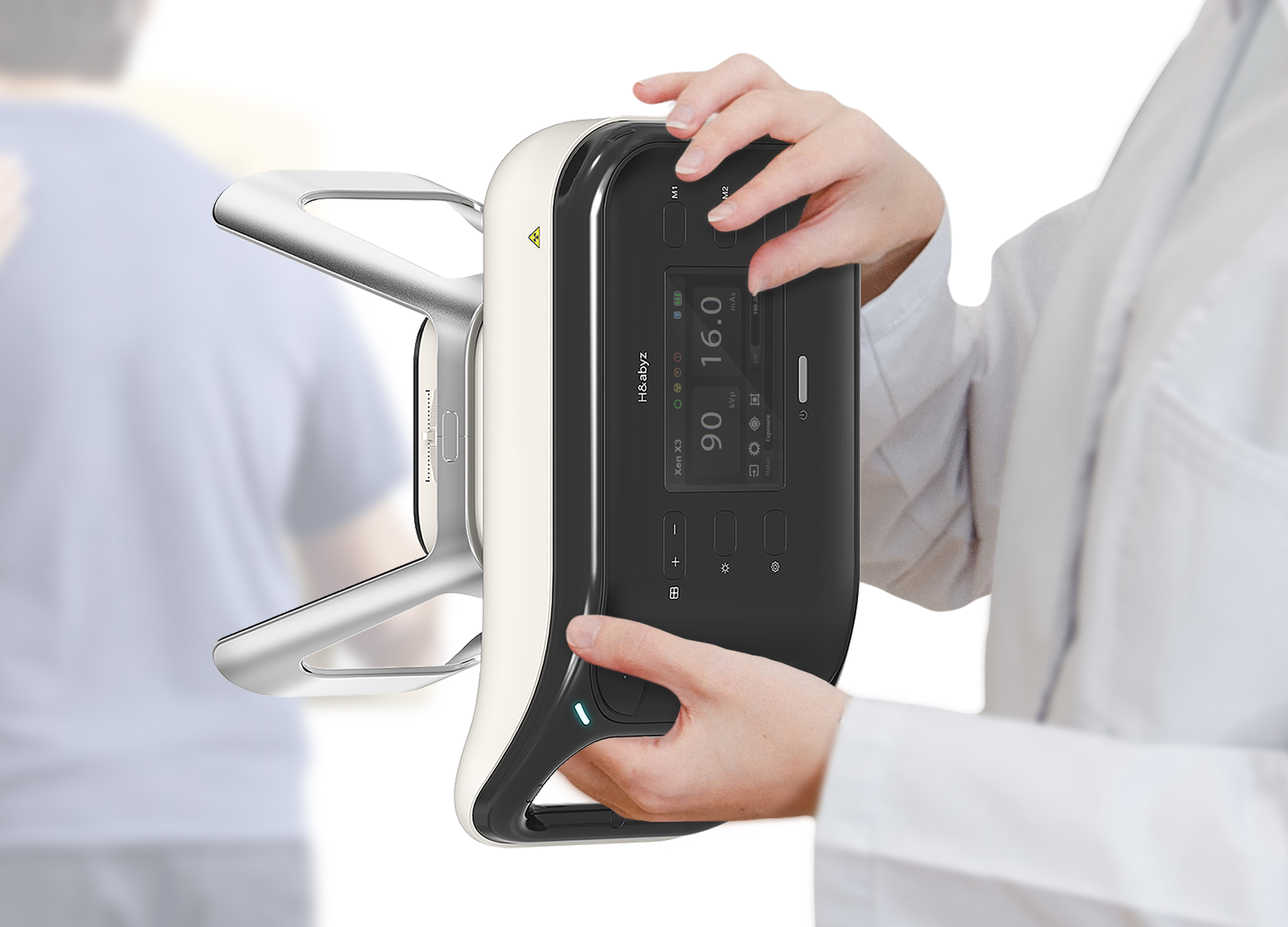
H n abyz HnX 1 Portable X Ray
GODESIGN
Korea
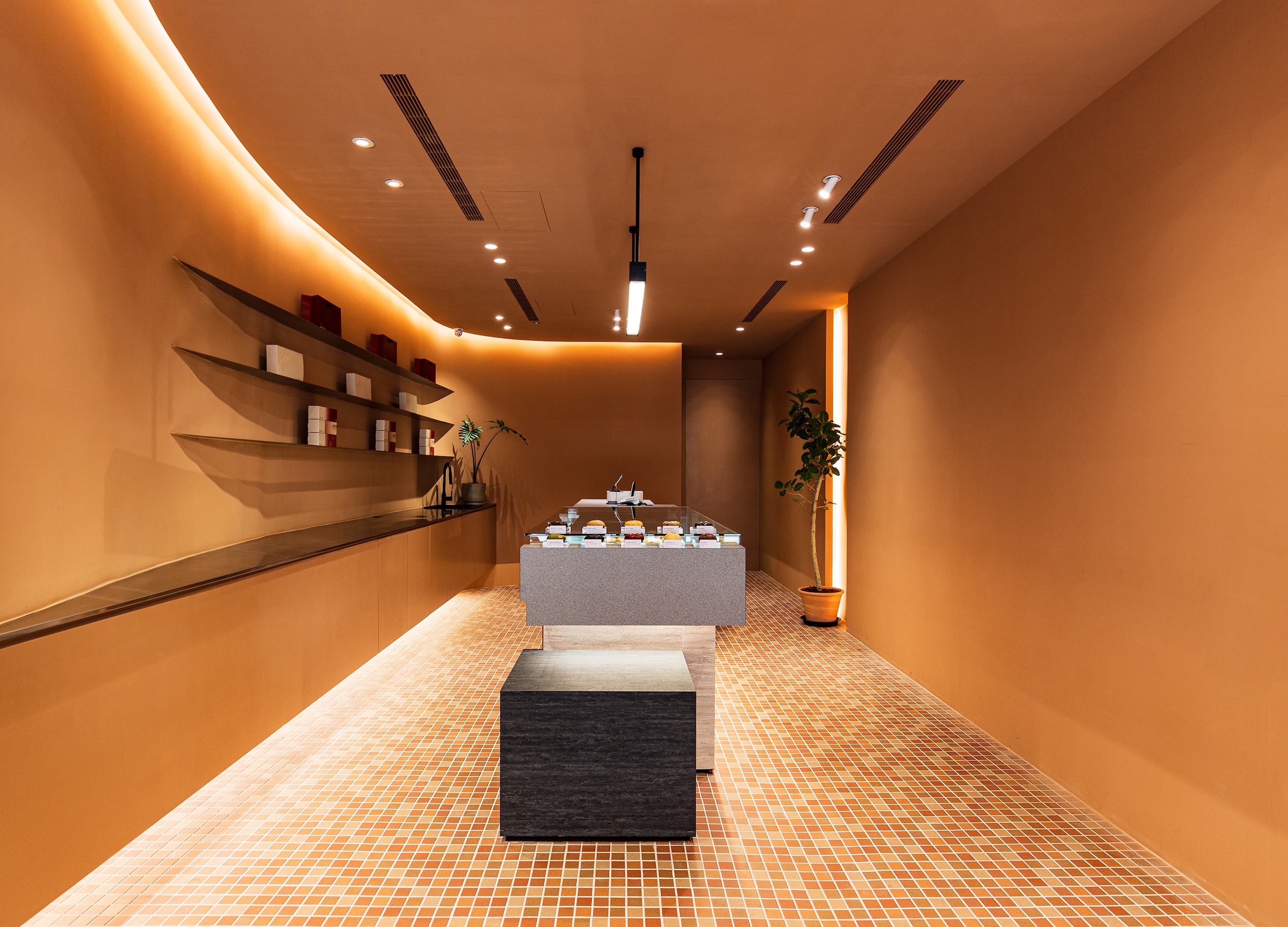
SWEETFULL
Union Atelier
Chinese Taipei
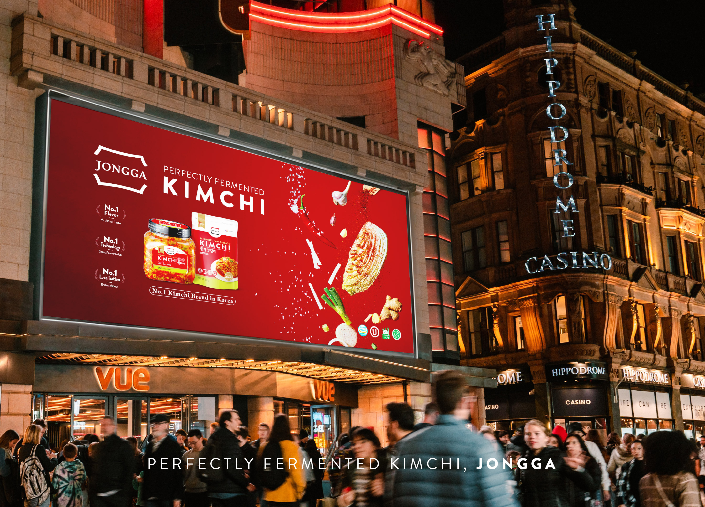
Global JONGGA Kimchi Design
Daesang Corporation Co., Ltd.
Korea
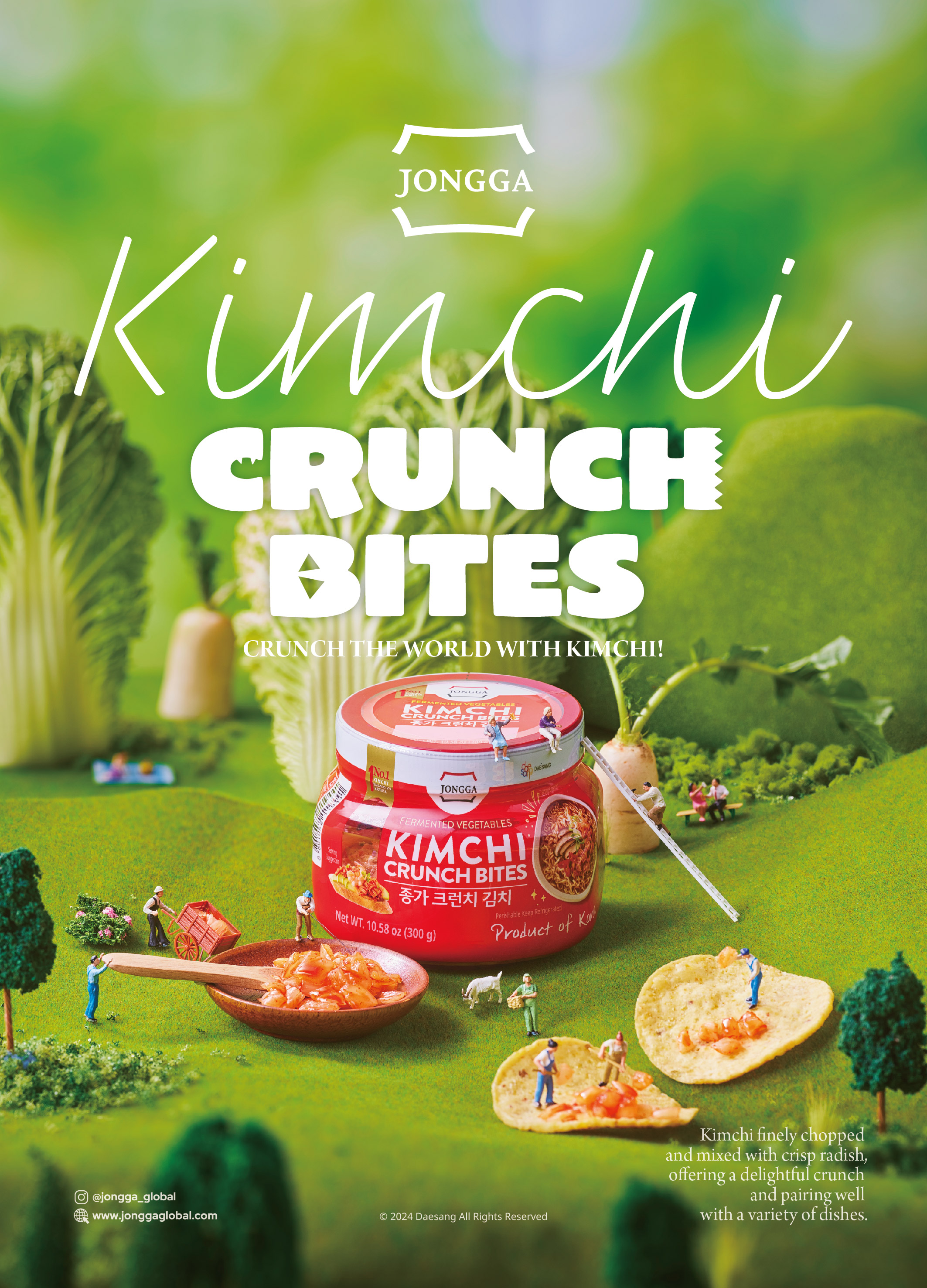
KIMCHI CRUNCH BITES CRUNCH THE WORLD
Daesang Corporation Co., Ltd.
Korea
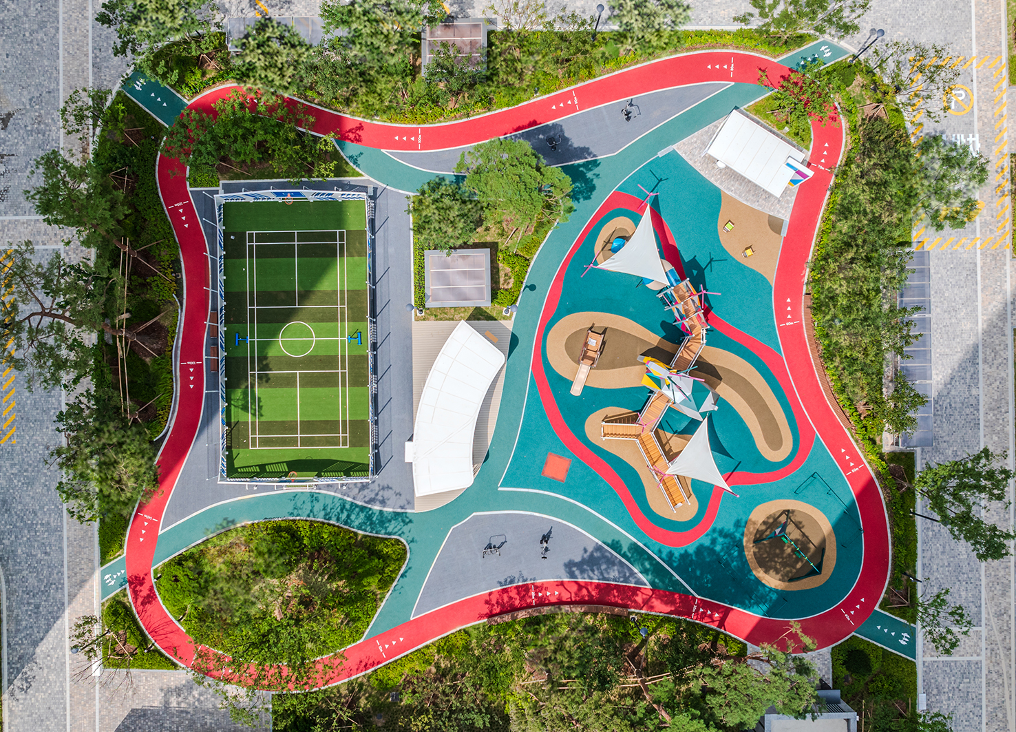
Healthy Pleasure Park
HYNUDAI ENGINEERING Co., Ltd.
Korea


Partner & Sponsor
More


info@asiadesignprize.com
#14057, 905 49, Beolmal-ro 102beon-gil,
Dongan-gu, Anyang-si, Gyeonggi-do, Korea
#14057, 905 49, Beolmal-ro 102beon-gil,
Dongan-gu, Anyang-si, Gyeonggi-do, Korea
Founder: Doyoung Kim
Business Registration Number: 454-86-01044
Online Sales License No.: 2021-Anyang Dongan-1081
Copyright © DESIGNSORI Co., Ltd.
Business Registration Number: 454-86-01044
Online Sales License No.: 2021-Anyang Dongan-1081
Copyright © DESIGNSORI Co., Ltd.
