
When talking about Starbucks, most people tend to start with what is visible. The green siren logo, the limited edition tumblers that change each season, the photogenic colors of drinks shared on Instagram, and the consistent interior atmosphere across different locations all come to mind. Even many design analyses of Starbucks remain within this visible layer, discussing brand identity or evaluating the visual completeness of packaging and space. Of course, these elements matter, and Starbucks’ visual consistency is worthy of study in itself. However, the real design that makes Starbucks truly “Starbucks” operates quietly behind these visible aspects. It is precisely in this invisible layer that design moves beyond form and enters the realm of strategy.

The Problem a Café Without Buzzers Had to Solve
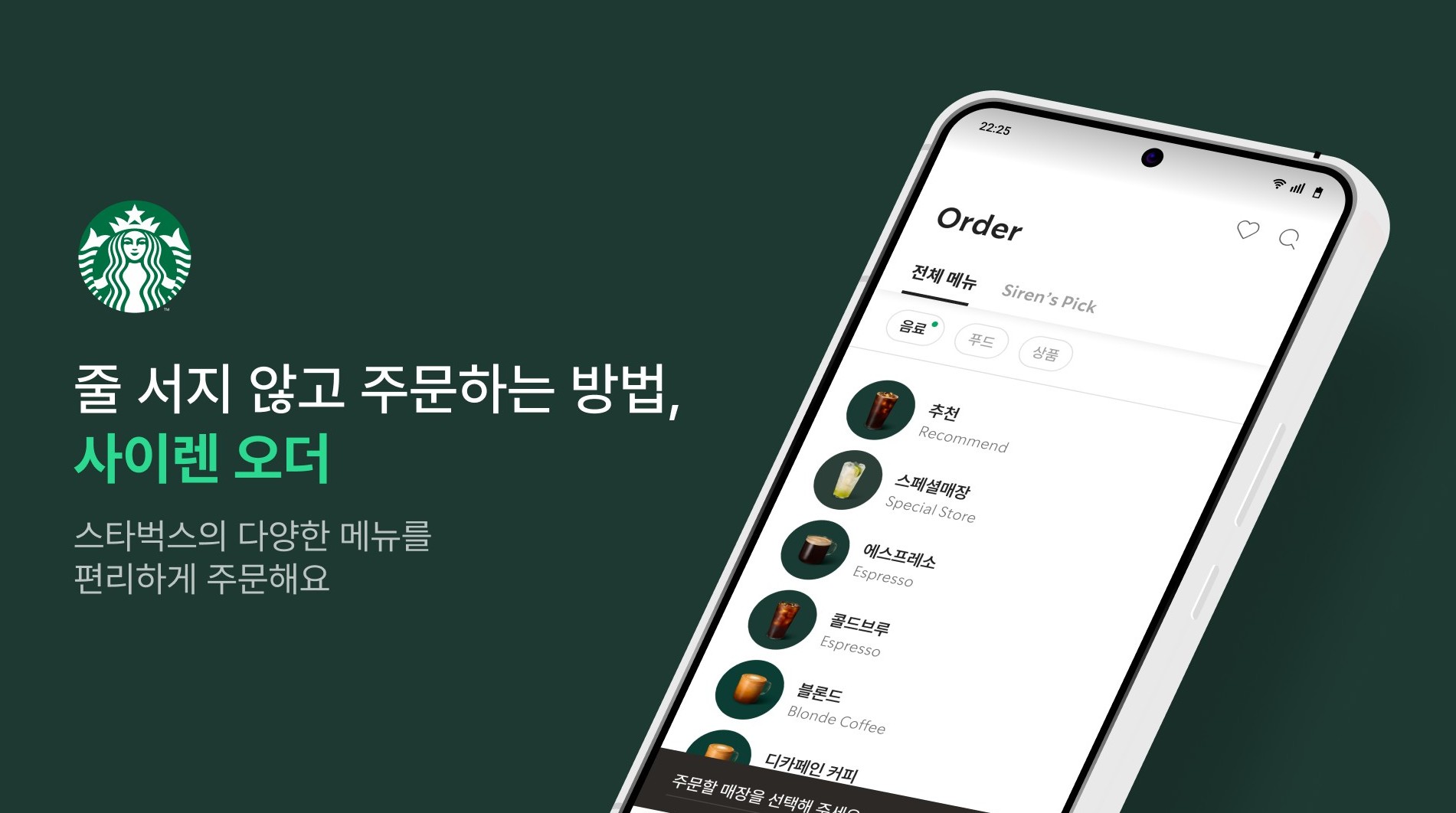
Starbucks does not use buzzers. This is true anywhere in the world. It may seem like a minor detail, but it is in fact a highly intentional decision. Buzzers are efficient operational tools. They allow customers to sit comfortably while waiting and enable stores to manage order sequences mechanically. Yet Starbucks has consistently upheld the principle that baristas call out customers’ names or nicknames directly. Behind this is a philosophy of not allowing machines to replace human interaction. However, this principle also creates a very real problem. During peak hours, such as lunch or morning rush, the counter area quickly becomes crowded and waiting times increase. Without buzzers, how can this be solved? This is not merely an operational issue, but a structural challenge, preserving the brand’s core value while responding to business realities.
Starbucks’ answer was Siren Order. First introduced globally in Korea in 2014, this mobile ordering system allows customers to complete their order and payment before arriving at the store. On the surface, it appears to be just another app. In reality, what it solves is not simply removing the line. It addresses a deeper structural problem, maintaining the core experience of a barista calling your name while also achieving operational efficiency during peak times, two values that inherently conflict. Since its introduction, approximately one third of all orders have shifted to mobile, and cumulative orders have surpassed 500 million. This is not just the success of an app. It demonstrates that an invisible structure is firmly supporting a visible experience.
How the Invisible Wheel Turns
Siren Order is only the tip of the iceberg. Beneath it operates what Starbucks calls the Digital Flywheel, an invisible cycle that quietly reinforces itself. The flow is simple. When customers join the membership program, their purchase history and behavioral data accumulate. Based on this data, personalized recommendations are made. Those recommendations lead to purchases, generating more data. Siren Order streamlines the ordering process, while the payment system completes the cycle seamlessly. Membership, recommendation, ordering, and payment, these four elements interlock like gears and continuously strengthen one another.
This structure extends directly into the customer experience. When opening the Starbucks app, frequently ordered drinks appear on the main screen, recently visited stores are automatically set, and recommendations change based on time and weather. To the customer, it simply feels convenient. However, this convenience is not the result of interface design alone. It exists because data circulates, algorithms learn, and systems adjust in real time behind the scenes. Even more interesting is what happens beyond the customer’s view. Starbucks uses this data to identify peak hours for each store and dynamically allocate staff accordingly. The operational cost savings achieved through this system have even supported price stability. While other coffee brands raised prices due to increasing labor and material costs, Starbucks was able to maintain its pricing, thanks to the power of this invisible structure.
Those Who Create the Visible, Those Who Design the Invisible
The reason for examining Starbucks in detail is not to explain digital transformation in the coffee industry. It is to highlight the gap between creating what is visible and designing what is invisible within the field of design. There are designers who create store interiors, others who design tumbler forms and patterns, and others who build app interfaces. Their work is visible, tangible, and relatively easy to evaluate. However, there are also designers who created Siren Order as a structure capable of resolving conflicting goals, brand experience and operational efficiency. There are those who designed the cycle linking membership, recommendation, ordering, and payment. There are those who built systems where data influences not only the interface, but also store operations and pricing strategies. Their work is not easily seen, because what they create is not a screen or a product, but a structure.
The Design Behind Naturalness
Throughout this series, we have explored designing perspective, designing structure, and the conditions under which design becomes strategy. What Starbucks adds to this discussion is a fundamental question underlying all of it. Are you creating what is visible, or designing what is invisible? Both are necessary. Without the visible, there is no point of contact with users. Without the invisible, that connection cannot be sustained. However, if design has long been weighted toward the visible, the ability to design the invisible will increasingly define the difference in the future.
When a barista calls your name at Starbucks, the moment feels warm and natural. Yet for that naturalness to exist, data, systems, and structures must be quietly operating behind the scenes. The more natural an experience appears, the more precise the design behind it tends to be. The value created by those who design the invisible resides precisely in that sense of naturalness.


#14057, 905 49, Beolmal-ro 102beon-gil,
Dongan-gu, Anyang-si, Gyeonggi-do, Korea
Business Registration Number: 454-86-01044
Online Sales License No.: 2021-Anyang Dongan-1081
Copyright © DESIGNSORI Co., Ltd.
