We encounter an enormous amount of information every day. The climate crisis, food waste, causes of death, social conflict, and standardized ideas of beauty are not new issues to most of us. There is already no shortage of statistics and news reports about them. Yet getting people to understand these problems and take action remains difficult. The problem is not a lack of information. It is that the information does not feel personally relevant. Numbers communicate facts accurately, but numbers alone rarely hold people’s attention for long. Statistics can show how much food is wasted each year, but they do not necessarily help people feel how the issue connects to their own lives. Data on cosmetic surgery can reveal the scale of a trend, but it cannot fully explain how individual identity may disappear within it.
This is where design begins to play an important role. Design is not limited to organizing information in an attractive way. It transforms complex information into structures people can understand and makes distant problems feel tangible. Among the winning projects of the Asia Design Prize 2026, planet code EArTh, THE LIGHT OF REINCARNATION THROUGH DEATH, MIMIC GIMMICK, and VS: Science, Religion, and Us demonstrate this role clearly. What these projects have in common is that they do not present data in its original form. Each project selects symbols, narratives, and interactions appropriate to its subject, encouraging audiences to see, touch, and interpret the information. Through design, information becomes an experience rather than remaining abstract knowledge.
Turning Food Waste into a Fictional World
< planet code EArTh, ASIA DESIGN PRIZE 2026 GOLD WINNER >
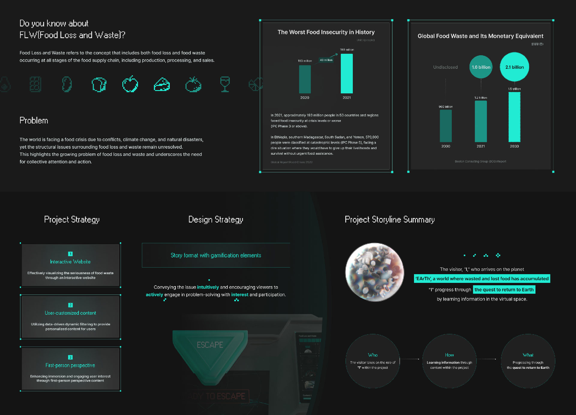
planet code EArTh addresses the structural problem of food waste. Food is wasted throughout production, distribution, consumption, and disposal. Because many stakeholders are involved, the issue cannot be explained through a single cause or solved with one simple answer. Conventional campaigns usually present statistics on the amount of food discarded or describe the environmental damage it causes. They then ask people to waste less. The problem is that audiences have encountered this approach many times before. Familiar warnings are easily ignored. Instead of providing more information, planet code EArTh changes how people receive it. The project draws inspiration from a Korean folktale suggesting that those who leave food uneaten must consume their leftovers in hell. From this idea, the designers created a fictional planet called EArTh. Visitors explore visualized data within this world and examine the structural causes of food waste.
The fictional world is not merely decorative. It functions as an interface that connects complex pieces of information. Visitors are no longer passive readers of statistics. They become participants exploring a problem. By translating a serious environmental issue into a fictional planet and a narrative structure, the project lowers the barrier to engagement and makes discovering information more interesting. The lesson is clear. If people continue to ignore a problem, repeating the same information is unlikely to change their behavior. Designers must reconsider the environment in which that information is encountered. The same data can produce a very different response depending on the story and setting in which it appears.
Giving Mortality Data a Memorable Form
< THE LIGHT OF REINCARNATION THROUGH DEATH, ASIA DESIGN PRIZE 2026 GOLD WINNER >
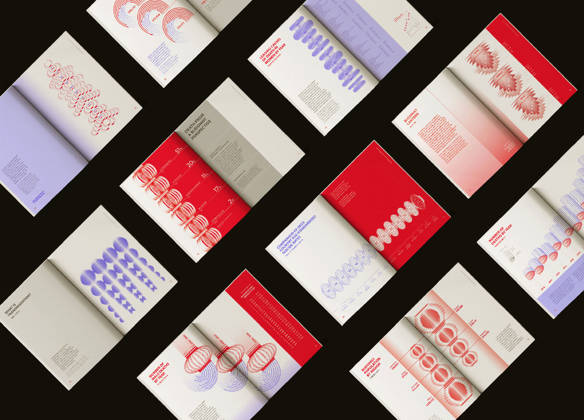
THE LIGHT OF REINCARNATION THROUGH DEATH visualizes causes of death and mortality rates in South Korea from 1998 to 2023 through the form of lotus lanterns. Mortality statistics may be precise, but they remain abstract. We can compare the size of the numbers, yet it is difficult to understand the meaning of the individual lives behind them. The project combines statistical data with lotus lanterns from Buddhist tradition. In Buddhism, lotus lanterns are not simply symbols of mourning. They represent the light of enlightenment and virtue. The project uses the layers, colors, and density of the lanterns to communicate differences among causes of death and their corresponding data. Instead of reading numbers, viewers understand the relationship between life and death through changes in light and form.
The important point is that the data has not simply been wrapped in an emotional image. The structure of the data is connected directly to the meaning of the symbol. The layered forms of the lotus lanterns represent the cycle of life and death, while color contrast and visual density communicate statistical differences. Form explains meaning, and meaning makes the data easier to remember. Beauty is not the final purpose of information design. It is a tool that helps people distinguish, understand, and remember information. This project avoids treating death as a sensational subject while preserving the emotional weight of the statistics.
Turning Statistics into Physical Interaction
< MIMIC GIMMICK, ASIA DESIGN PRIZE 2026 GOLD WINNER >
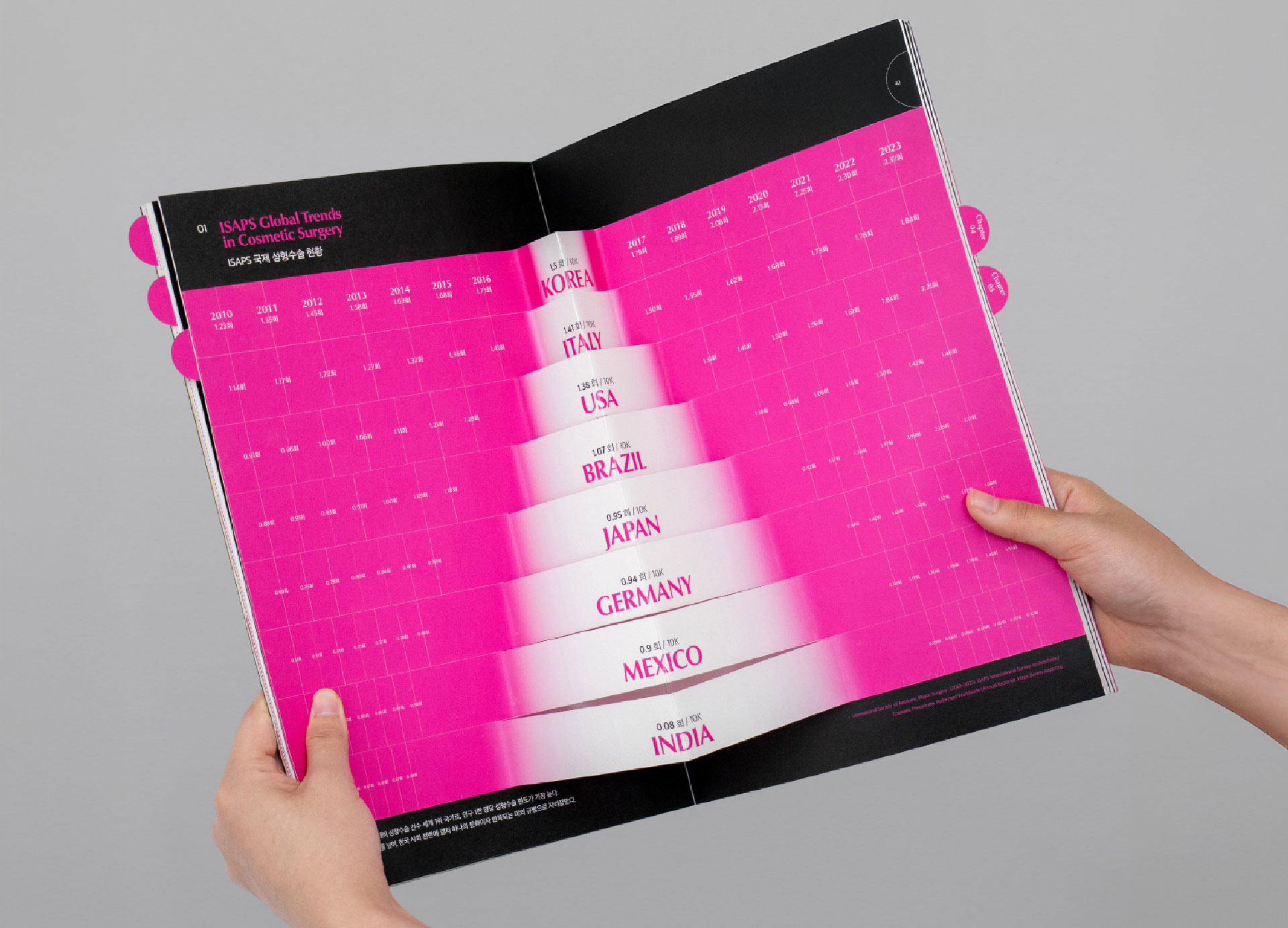
MIMIC GIMMICK examines the global trend of imitation-driven cosmetic surgery through the metaphor of the mimic octopus. The mimic octopus imitates other sea creatures to survive. The project connects this biological behavior with the tendency of people in appearance-focused societies to imitate the looks of others. When explained verbally, the loss of individuality through cosmetic surgery can easily sound like a moral argument. The message that people should respect their own beauty may be valid, but it is also familiar. Rather than beginning with this familiar statement, MIMIC GIMMICK translates cosmetic surgery data from eight countries into tentacle-inspired graphics. The project presents the data through an interactive pop-up book. Viewers physically manipulate die-cut pages and moving charts to examine the information. Reading becomes a process of opening, pulling, moving, and comparing. The information changes as the viewer’s hands move.
This physical interaction is more than an entertaining feature. People can recognize structures and differences more clearly when they manipulate information directly instead of observing it passively. MIMIC GIMMICK presents cosmetic surgery statistics while allowing viewers to discover the relationship between imitation and the loss of identity for themselves. The design does not begin by announcing its conclusion. It creates a sequence through which viewers explore the data and arrive at that conclusion independently. Rather than forcing a message on the audience, it designs the process through which understanding occurs.
Compressing Social Conflict into a Single Scene
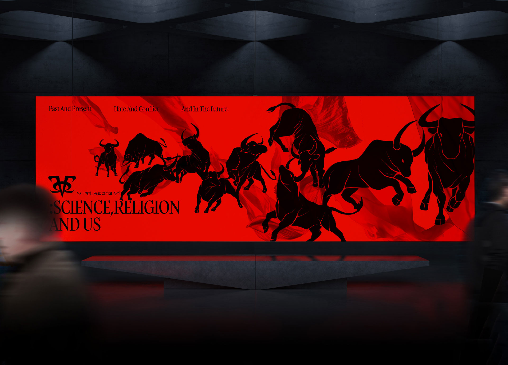
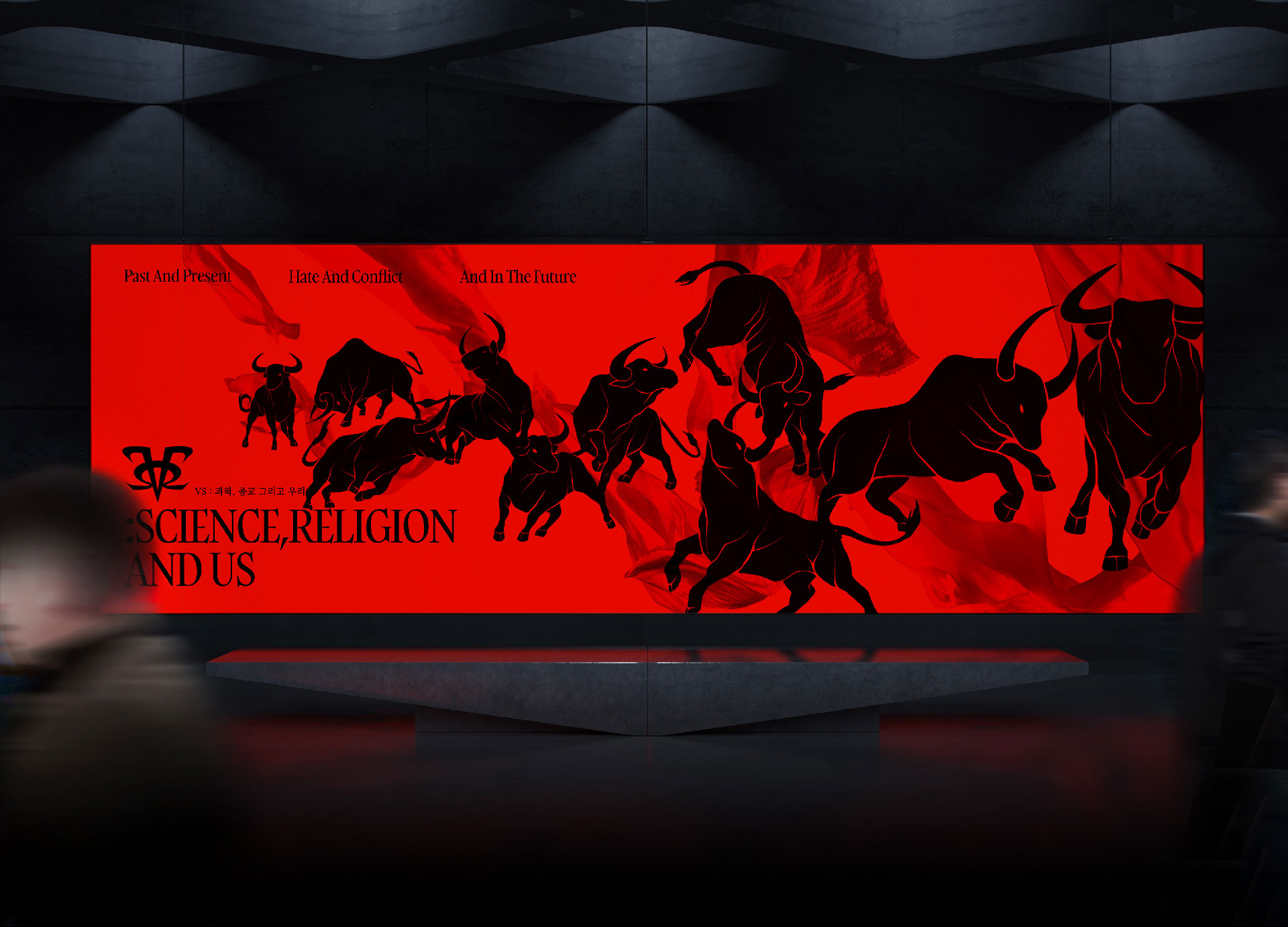
< VS Science Religion and Us, ASIA DESIGN PRIZE 2026 GOLD WINNER >
VS: Science, Religion, and Us examines contemporary social conflict and its risks through the historical relationship between science and religion. This relationship is too complex to be explained simply as opposition. Its history includes not only confrontation but also negotiation, adjustment, and coexistence. The project compresses this complex relationship into the scene of a bullfight. Science is represented as the bull, symbolizing its influence on social perceptions and established systems. Religion is represented as the matador, whose cape expresses different responses to change.
The bullfight metaphor allows viewers to understand tension and interaction within a single scene. The bull and the matador stand in opposition, but the scene cannot exist without both of them. Each participant continuously changes its movements in response to the other. This structure effectively demonstrates that the relationship between science and religion is not a simple contest with one winner. It is an ongoing process of conflict and adjustment. A good metaphor makes a complex concept easier to understand without reducing it too far. In this project, the bullfight does not merely define science and religion as enemies. It operates as a visual model that shows conflict as a process of relationship and negotiation.
People Remember Structures, Not Explanations
The four projects address different issues, but they share a common method of communicating information. First, each project selects a symbol capable of representing an abstract problem. Food waste becomes a fictional planet. Mortality data becomes lotus lanterns. Imitation-driven cosmetic surgery becomes a mimic octopus. The relationship between science and religion becomes a bullfight. The projects then design the order in which audiences encounter information. Viewers follow a story, compare light and form, manipulate a pop-up book, or interpret a metaphor. The meaning of the information is revealed gradually through the experience rather than presented as a completed answer.
This approach can also be explained through dual coding theory. Paivio proposed that people process verbal and visual information through two interconnected systems (Paivio, 1986). Information communicated through both language and imagery may therefore be easier to understand and remember than information presented only through words and numbers. These four projects go beyond simply adding images to information. They use fictional worlds, light, symbolism, and physical interaction to build relationships between audiences and data. Viewers do not stop at seeing the information. They explore and interpret it.
The Competitive Value of Design Begins with Editing
In an age of information overload, producing more information is less important than deciding what to select and how to connect it. Showing every available piece of data does not necessarily help people understand a subject. Designers must identify the essential information, organize its relationships, and give it an appropriate symbolic form. This process resembles editing. Designers determine the hierarchy of information, remove unnecessary elements, and decide where people should become interested and in what order they should understand the message. The quality of information design, therefore, cannot be judged solely by the visual refinement of its graphics. What matters more is whether the designer has interpreted the problem accurately and translated that interpretation into an experience people can understand.
planet code EArTh transforms a structural environmental problem into a fictional world. THE LIGHT OF REINCARNATION THROUGH DEATH translates mortality statistics into light and symbolism. MIMIC GIMMICK turns data into a physical interaction. VS: Science, Religion, and Us compresses a complex social relationship into a powerful metaphor. Together, these projects point toward a clear direction. Contemporary design is not simply about decorating information. It is about designing the way information reaches people. Good design does not always say more. It helps people discover, understand, and remember what matters. Ultimately, design changes more than the form of information. It changes the audience’s attitude toward it. When numbers become scenes, statistics become stories, and social problems become personal experiences, information gains the power to inspire action.












#14057, 905 49, Beolmal-ro 102beon-gil,
Dongan-gu, Anyang-si, Gyeonggi-do, Korea
Business Registration Number: 454-86-01044
Online Sales License No.: 2021-Anyang Dongan-1081
Copyright © DESIGNSORI Co., Ltd.