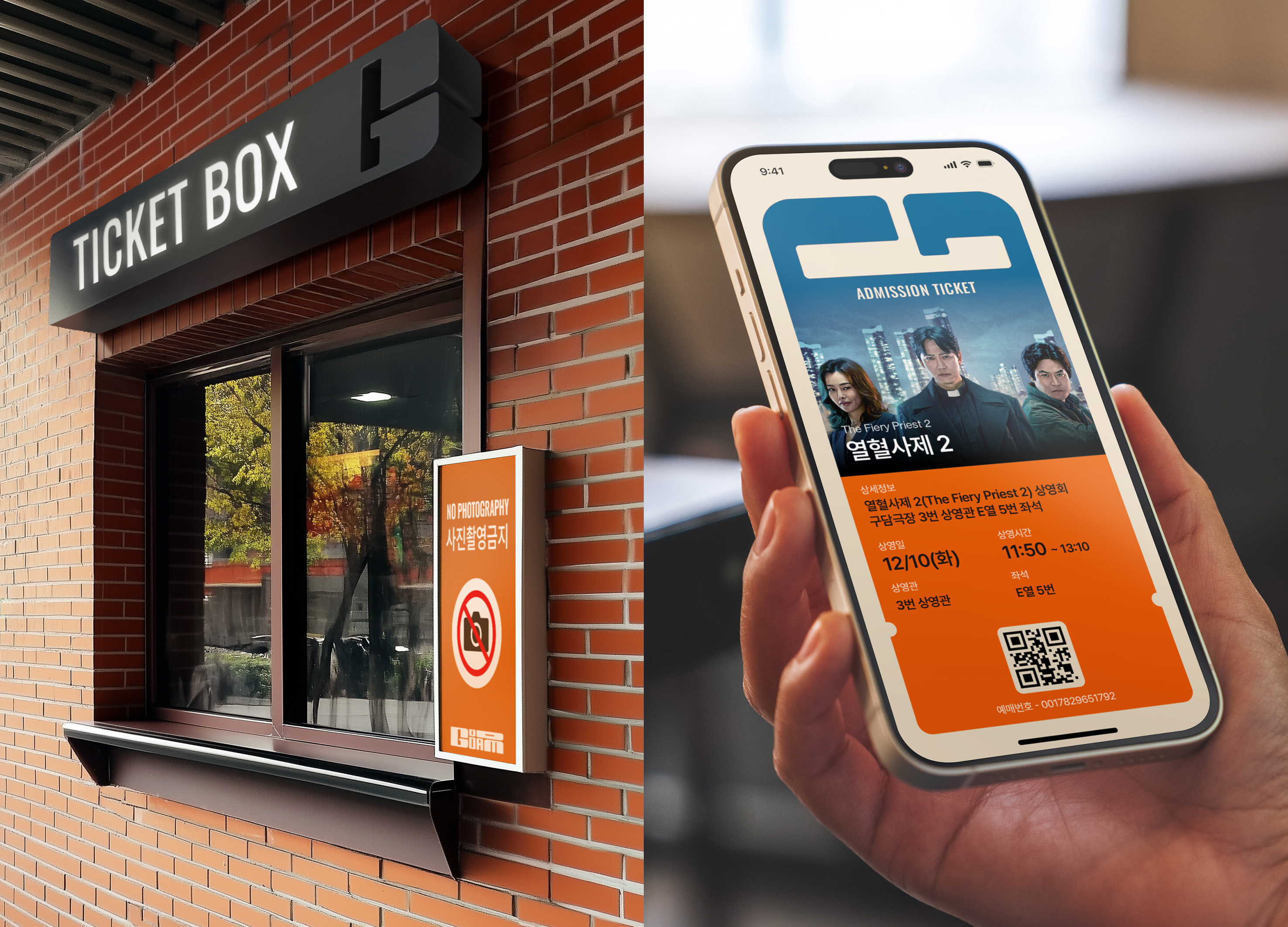
KBS2 MUSIC BANK Visual Branding
Communication
Regions
Korea
Year
2025
Award
WINNER
Affiliation
KBS ArtVision Design team Graphic Dept
Designer
KIM JI HYE, LIM JIN KOO, NA YAE JIN, LEE SUN HYE
English
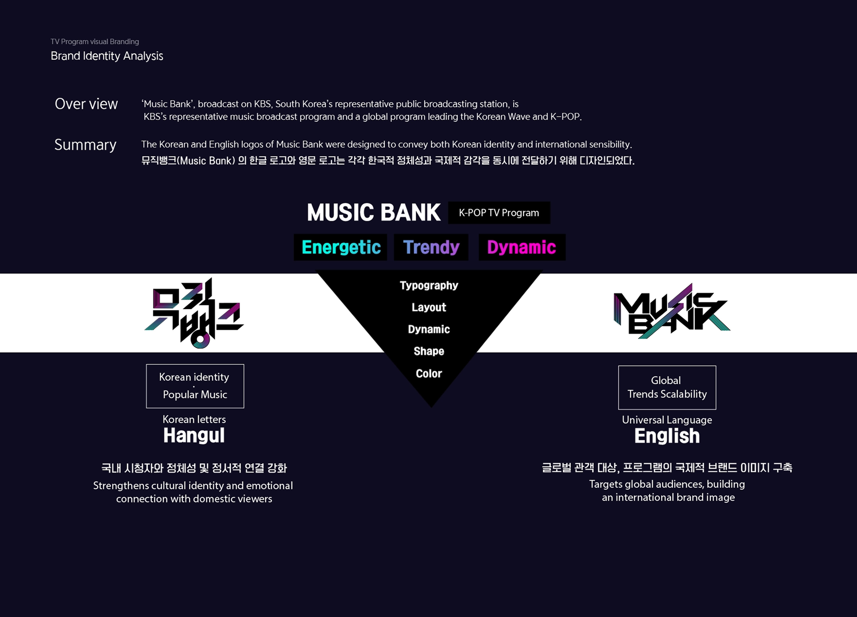
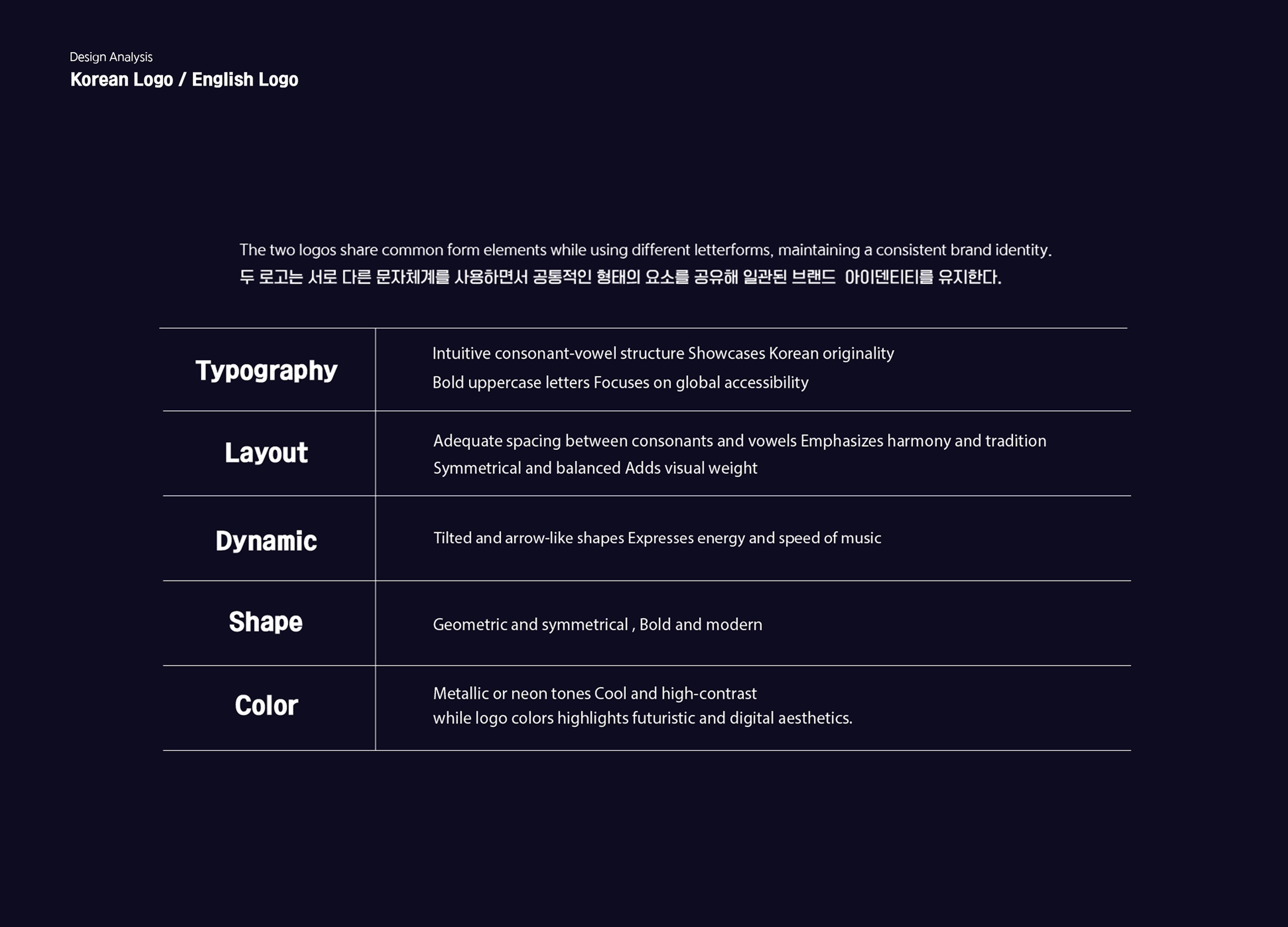
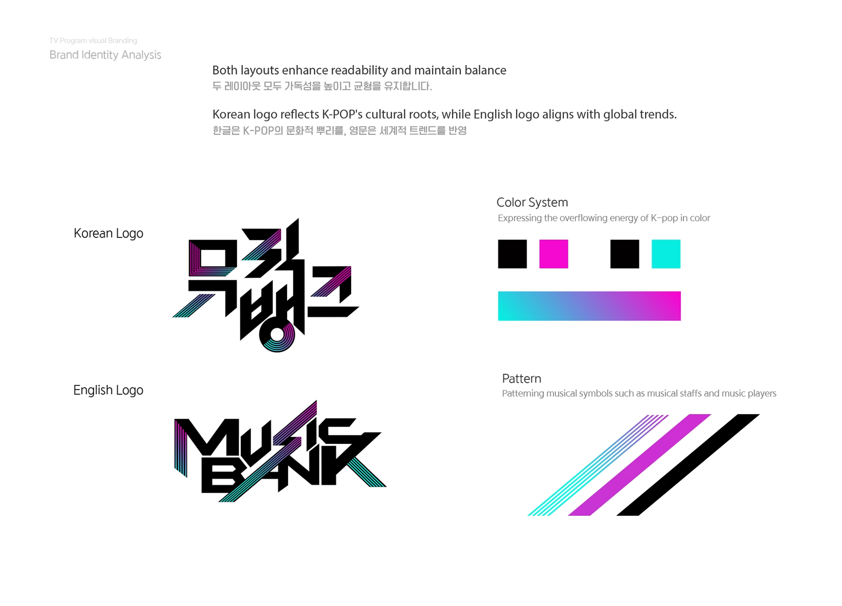
Music Bank is a flagship music program produced by a leading Korean broadcaster. Its English and Korean logos incorporate their respective writing systems while maintaining consistent character proportions to achieve a balanced and effective design. Both logos feature bold typefaces with geometric elements, creating a sleek and impactful look that effectively conveys the identity of Music Bank.
Design elements derived from the logo are seamlessly integrated into stage sets, promotional materials, TV visuals, and other broadcast-related items, ensuring a cohesive and consistent brand experience.
Native
뮤직뱅크는 한국의 대표 방송사의 음악 프로그램이다. 영문 로고와 한글 로고 각각의 문자 체계를 활용한다. 각 문자들 간의 일정한 비율을 지켜 아름답고 균형 잡힌 인상을 통해 효율적인 디자인을 나타낸다. 두 로고의 전체적인 형태는 볼드한 서체를 기반으로 기하학적 디자인을 사용하였다. 대칭성과 균형을 강조하여 강인한 이미지를 준다. 직선적인 형태와 기울어진 요소는 K-pop의 역동성을 시각적으로 표현했다. 또한, 디지털 환경에서 가독성을 고려하여 최적화된 간격과 크기를 적용해 시청자가 쉽게 인지하고 기억할 수 있도록 디자인되었다. 색상은 메탈릭, 네온 계열 색상을 사용해 젊고 에너지 넘치는 이미지를 강조하였다. 뮤직뱅크의 정체성을 한눈에 알아볼 수 있도록 세련되고 강렬한 로고와 그래픽을 사용한다. 로고에서 파생한 디자인은 무대 세트, 홍보물, TV영상과 방송과 관련된 여러 물품들에 통합 반영하여, 일관된 인상과 가치를 경험할 수 있도록 한다.
Website
Judging Comments
The design of the Music Bank logo masterfully combines both English and Korean writing systems, ensuring a harmonious balance while maintaining consistent proportions. The bold typefaces and geometric elements create a modern and striking aesthetic that reflects the dynamic nature of the program. By integrating these design elements into various platforms such as stage sets, promotional materials, and TV visuals, the brand maintains a cohesive and recognizable identity across all touchpoints, enhancing the viewer experience.
Positive Comments


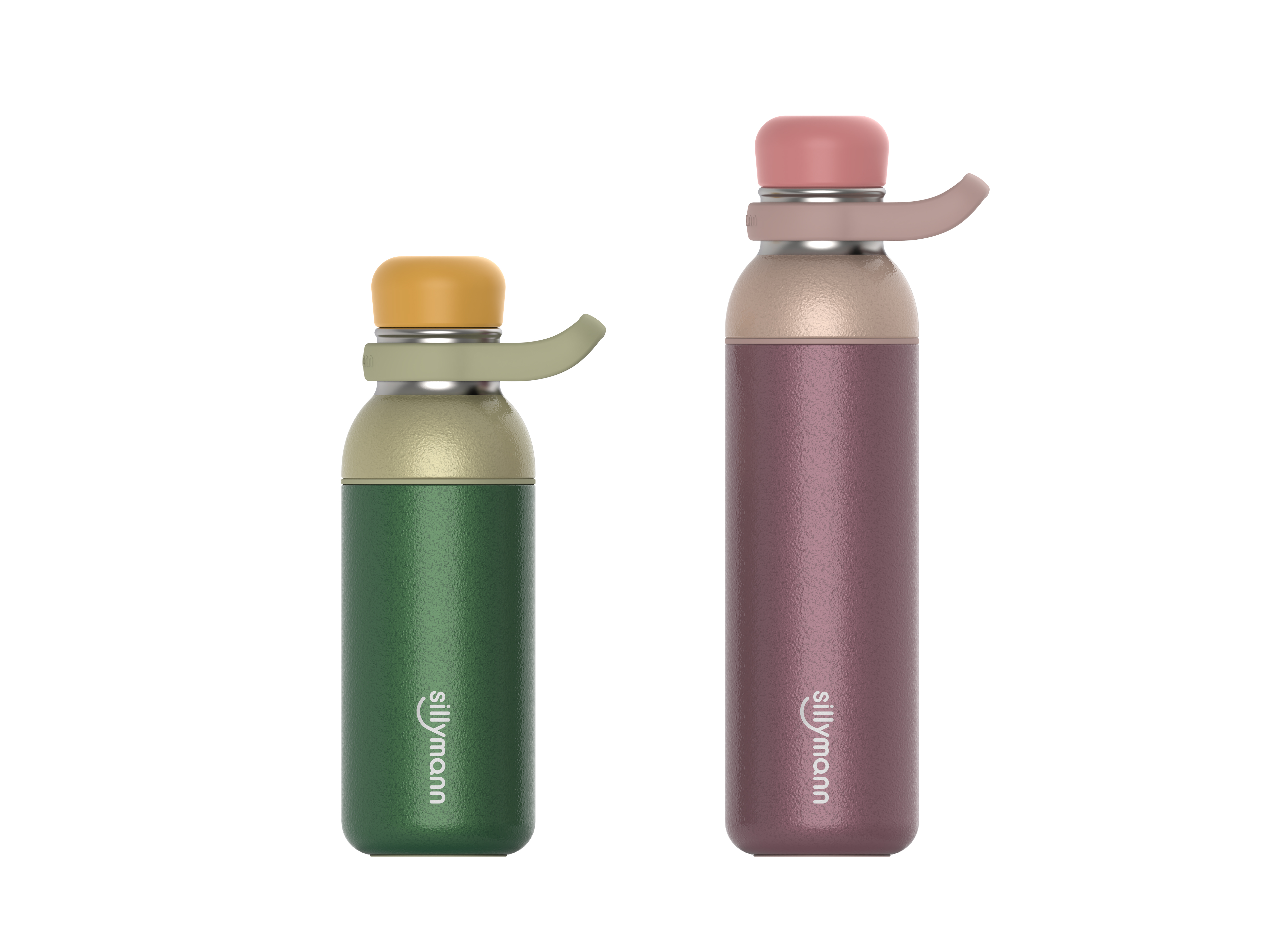
Straw Bottle
SILLYMANN Co., Ltd.
Korea
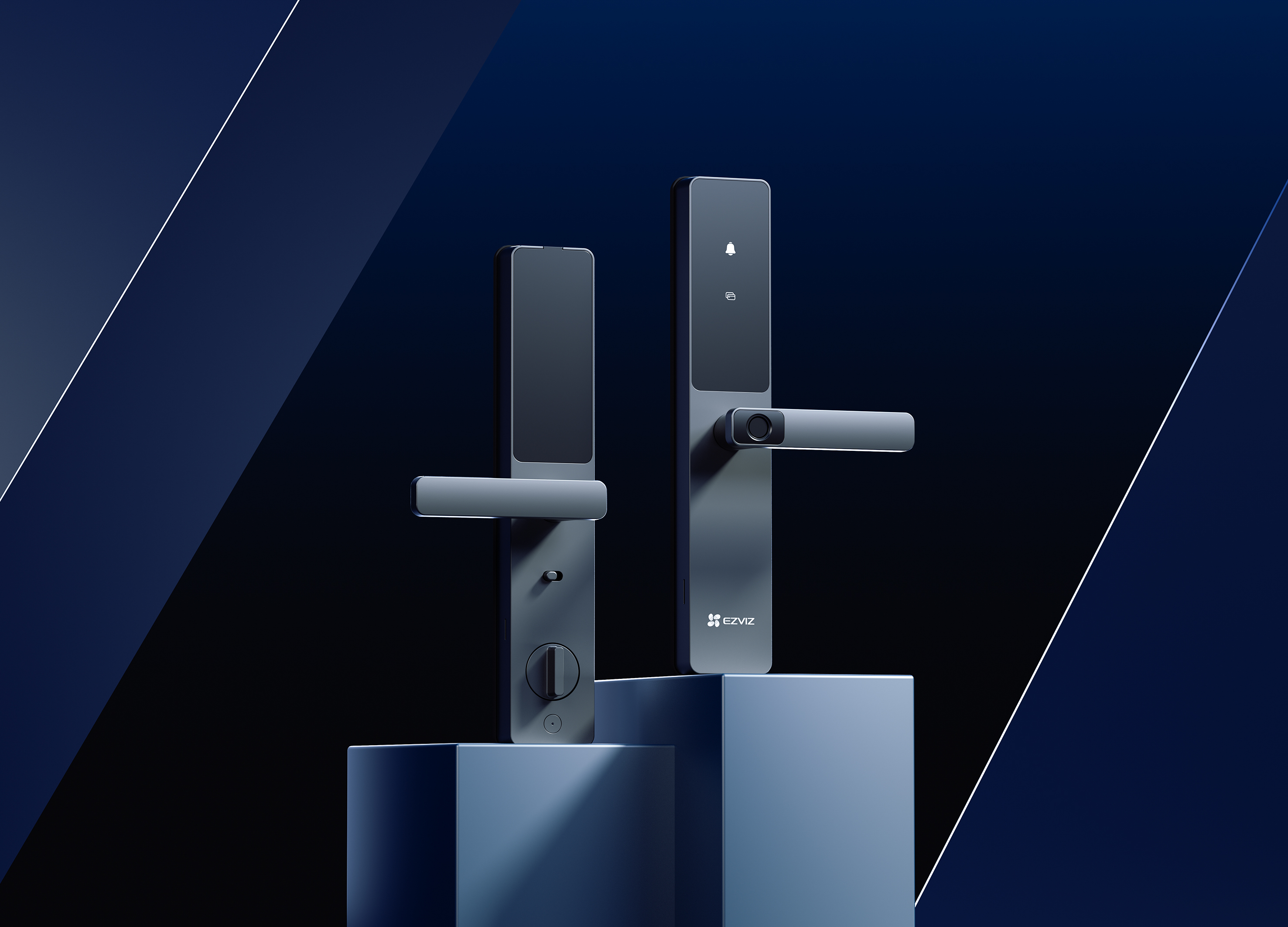
EZVIZ DL05 Smart Fingerprint Lock
Hangzhou EZVIZ Network Co., Ltd.
China
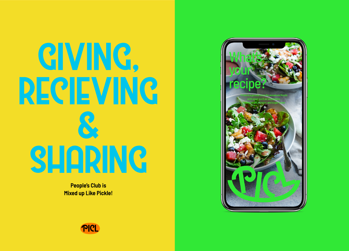
PICL Brand Identity Design
ist Studio
Korea
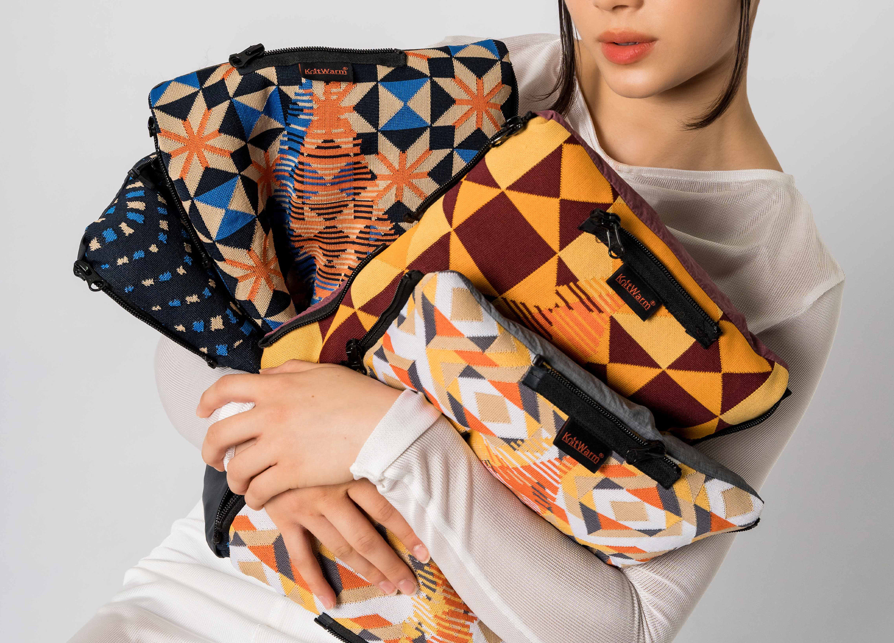
4 in 1 Warmer Blanket Cushion
Fab2care Co., Ltd.
China Hong Kong
The Periodic Table
Diffusion Architecture Inc.
Korea
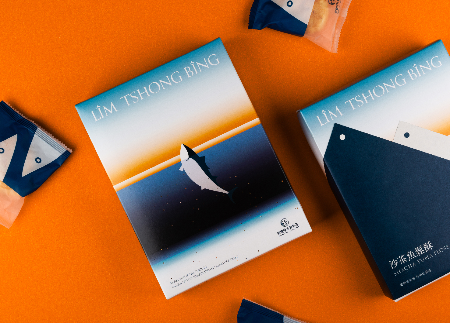
Smart Fish Shacha Tuna Floss Cake
Union Atelier
Chinese Taipei
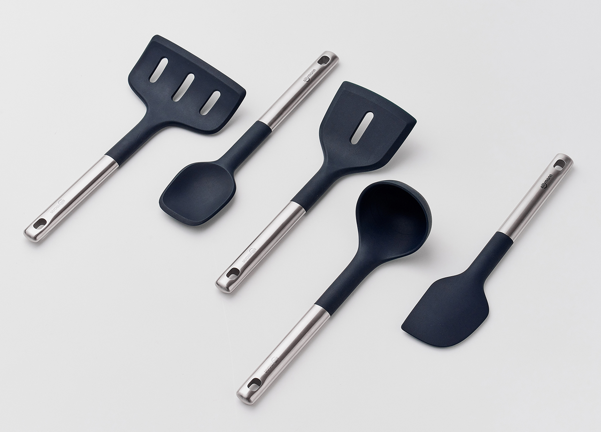
THE BOLD Cooking Utensils
SILLYMANN Co., Ltd.
Korea
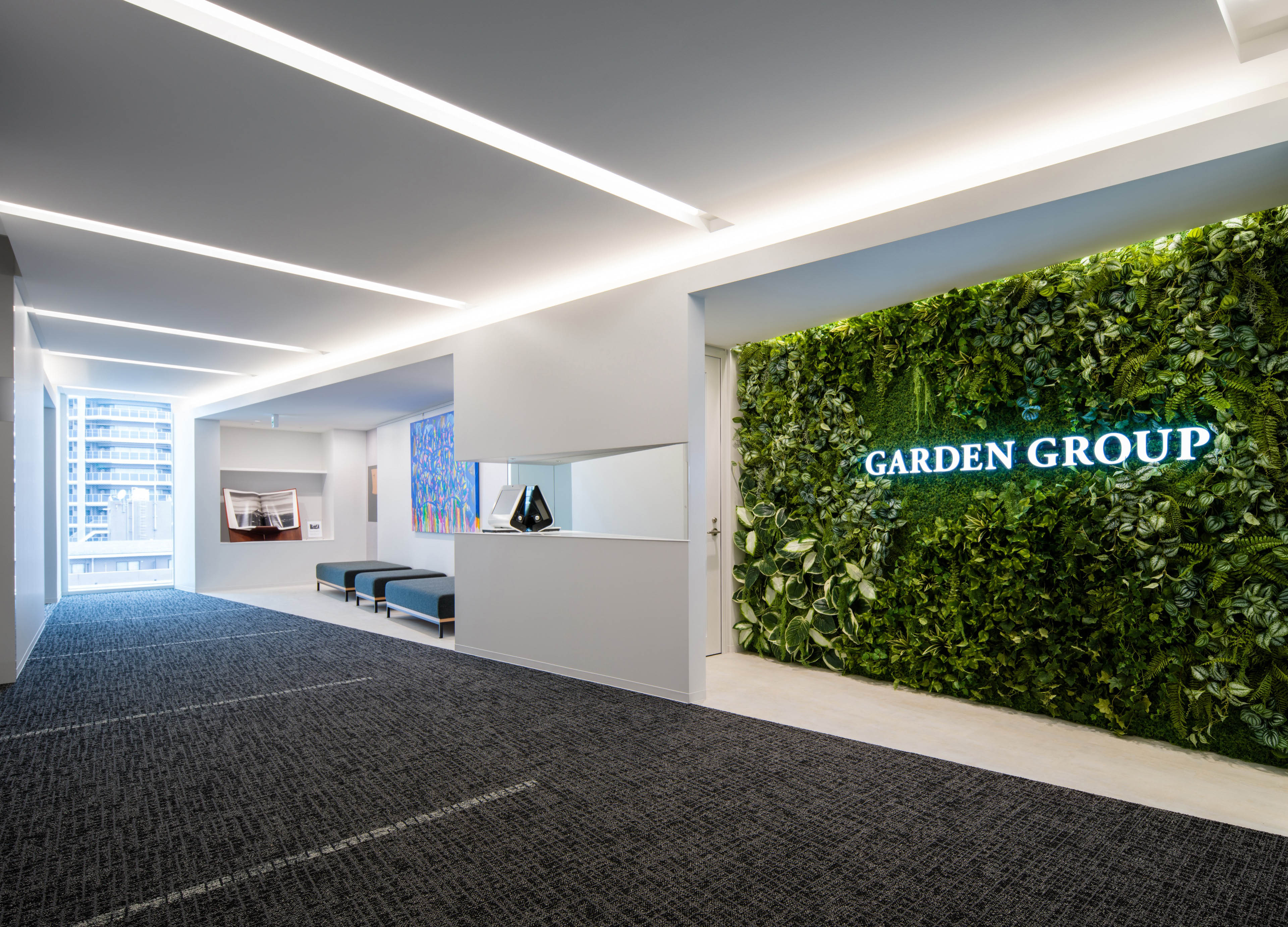
Garden Group Headquarters
MR STUDIO Co., Ltd.
Japan
GOODAM Brand Identity Design
B for Brand
Korea
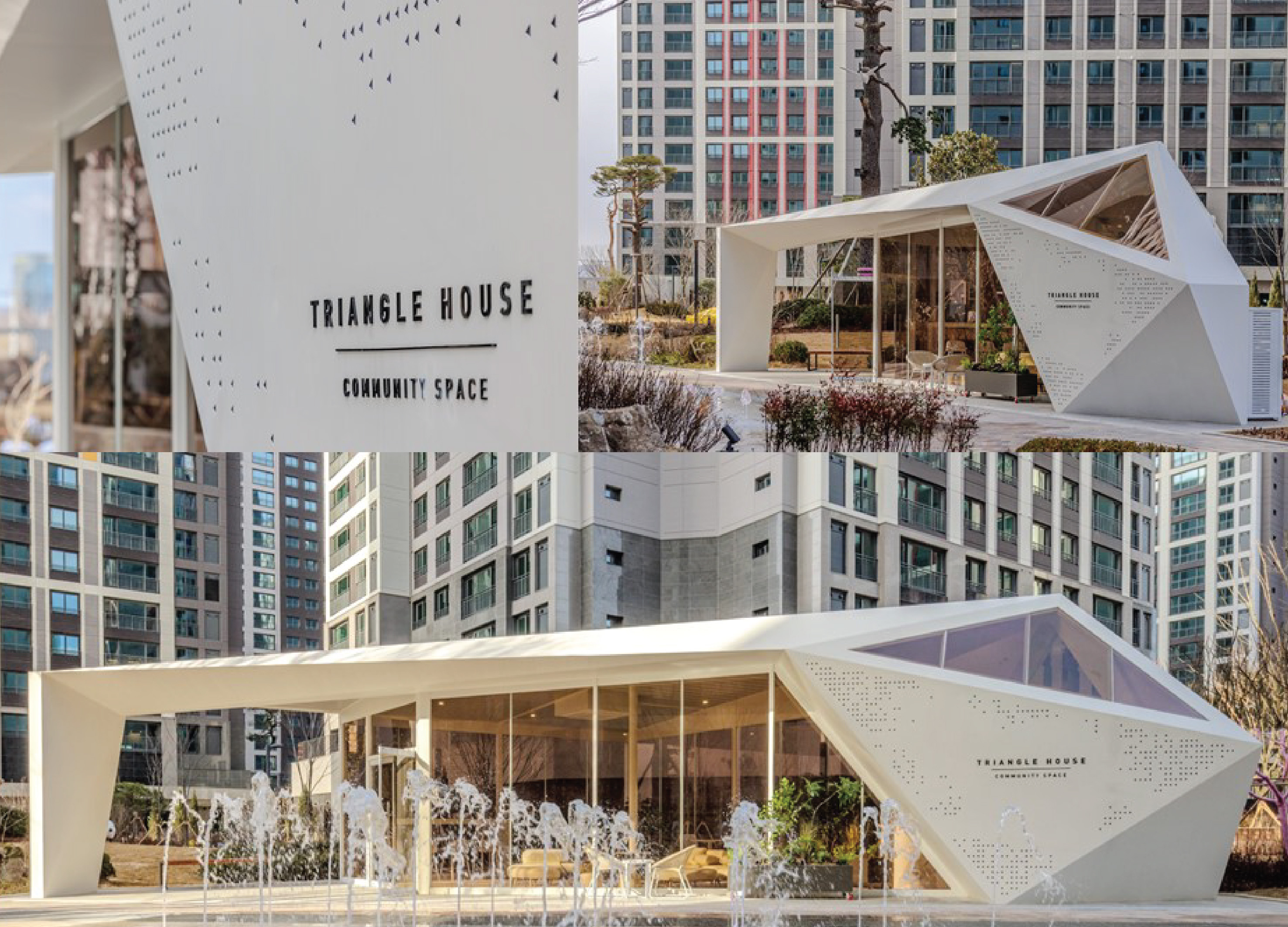
TRIANGLE HOUSE
hdec Co., Ltd.
Korea
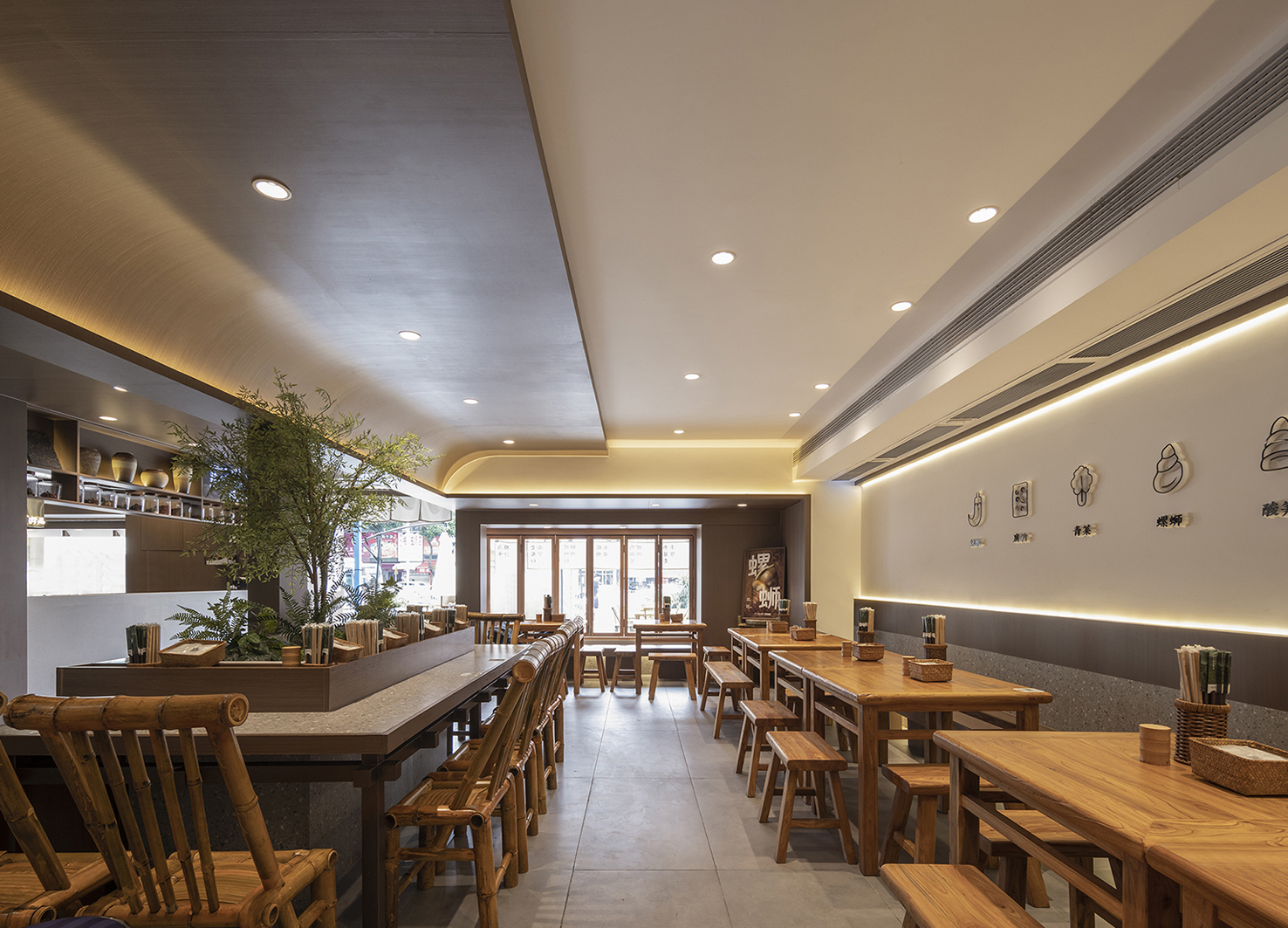
HIPPO PINK GUANG XI RICE NOODLE RESTAURANT
Seee Design Studio
China
KBS2 MUSIC BANK Visual Branding
KBS ArtVision Design team Graphic Dept
Korea
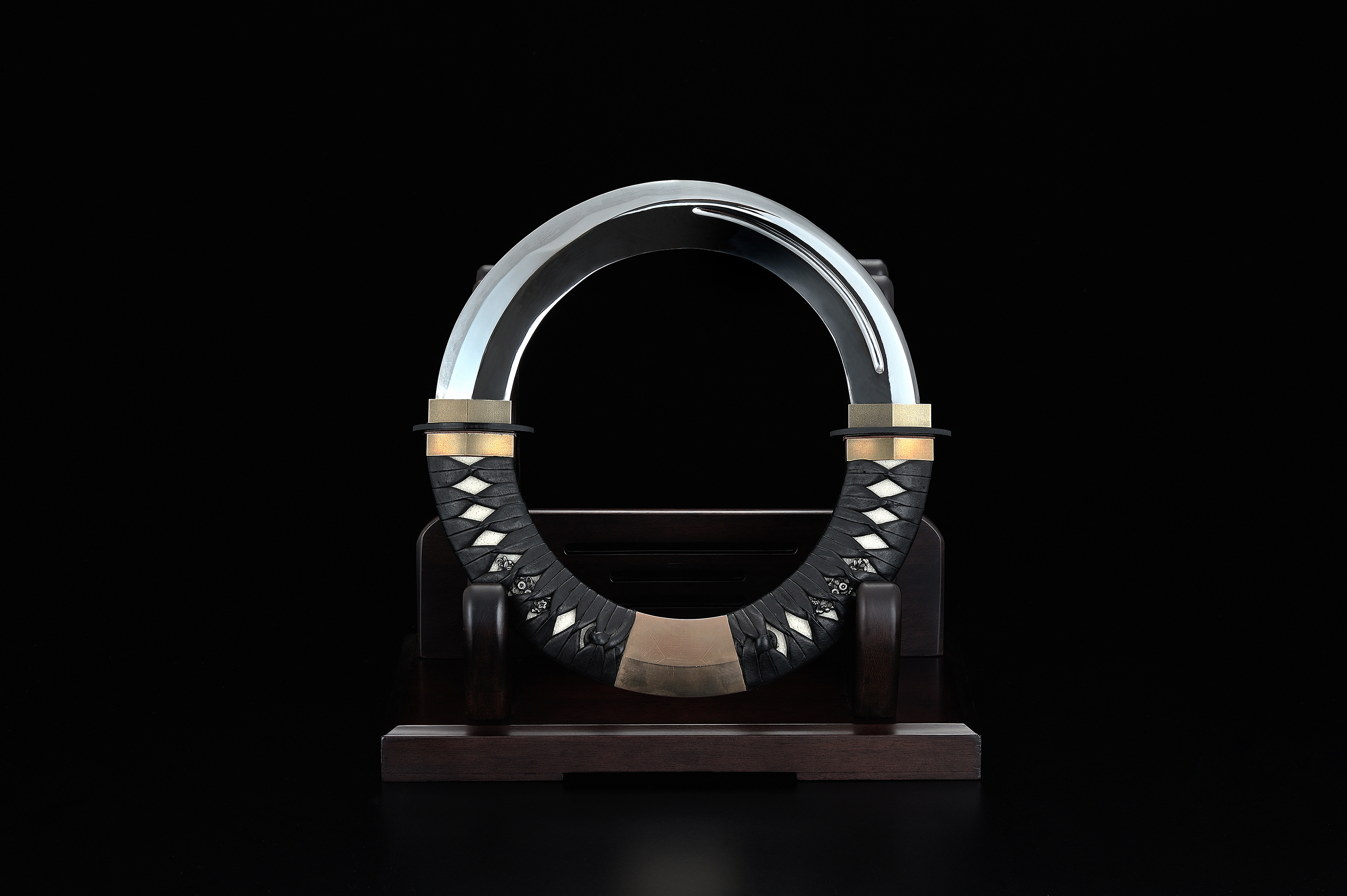
Nihonto Noshudo Zero
D WEBER Inc.
Japan
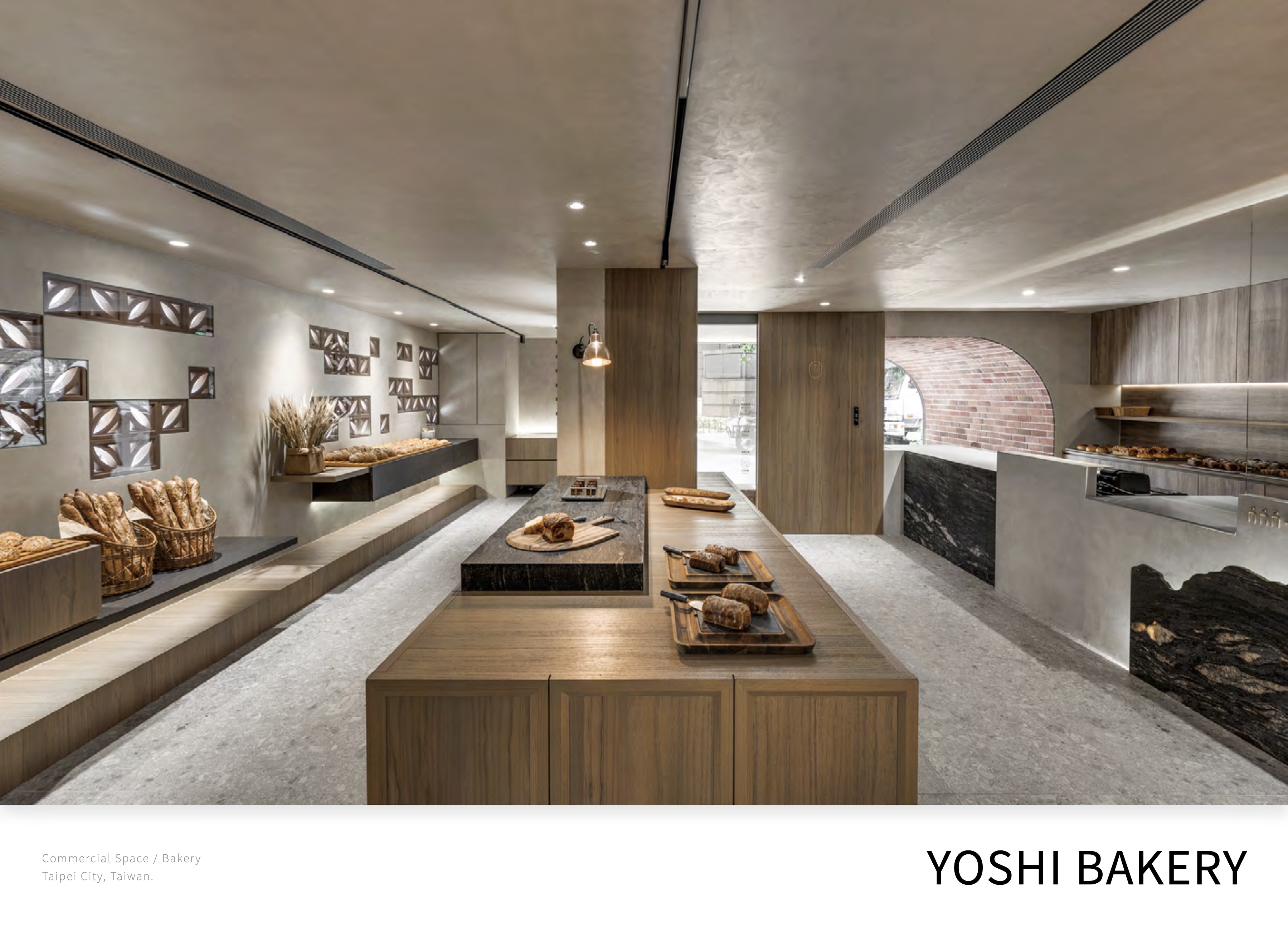
YOSHI BAKERY
Concentric production
Chinese Taipei
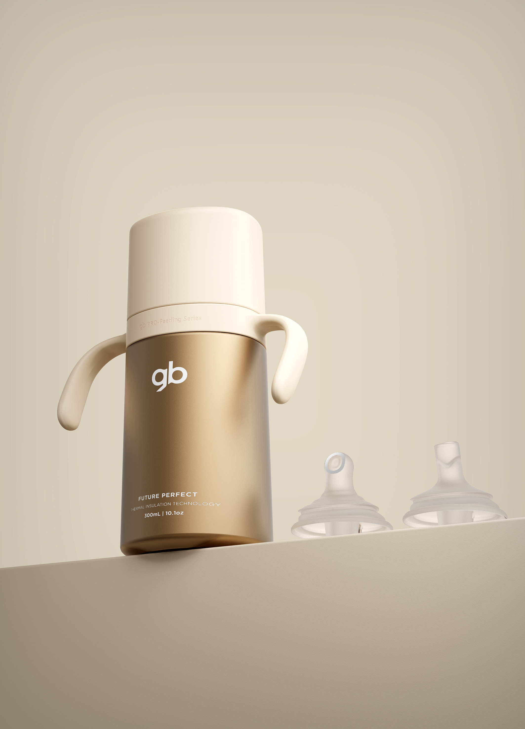
INFANT THERMOS FLASK
Goodbaby Child Products Co., Ltd.
China
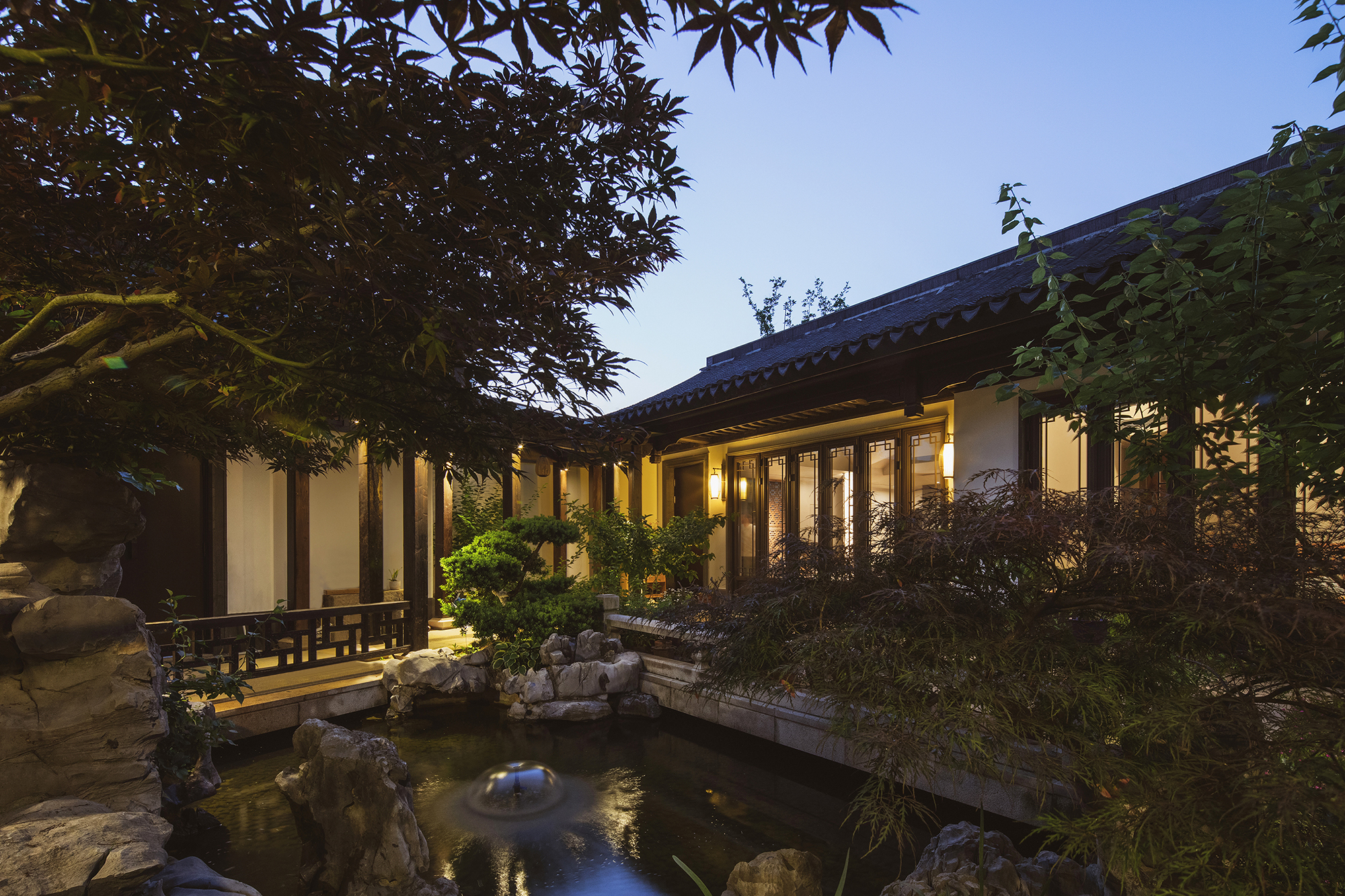
Anji Peach Blossom Spring
Converge Love Design Co., Ltd.
China
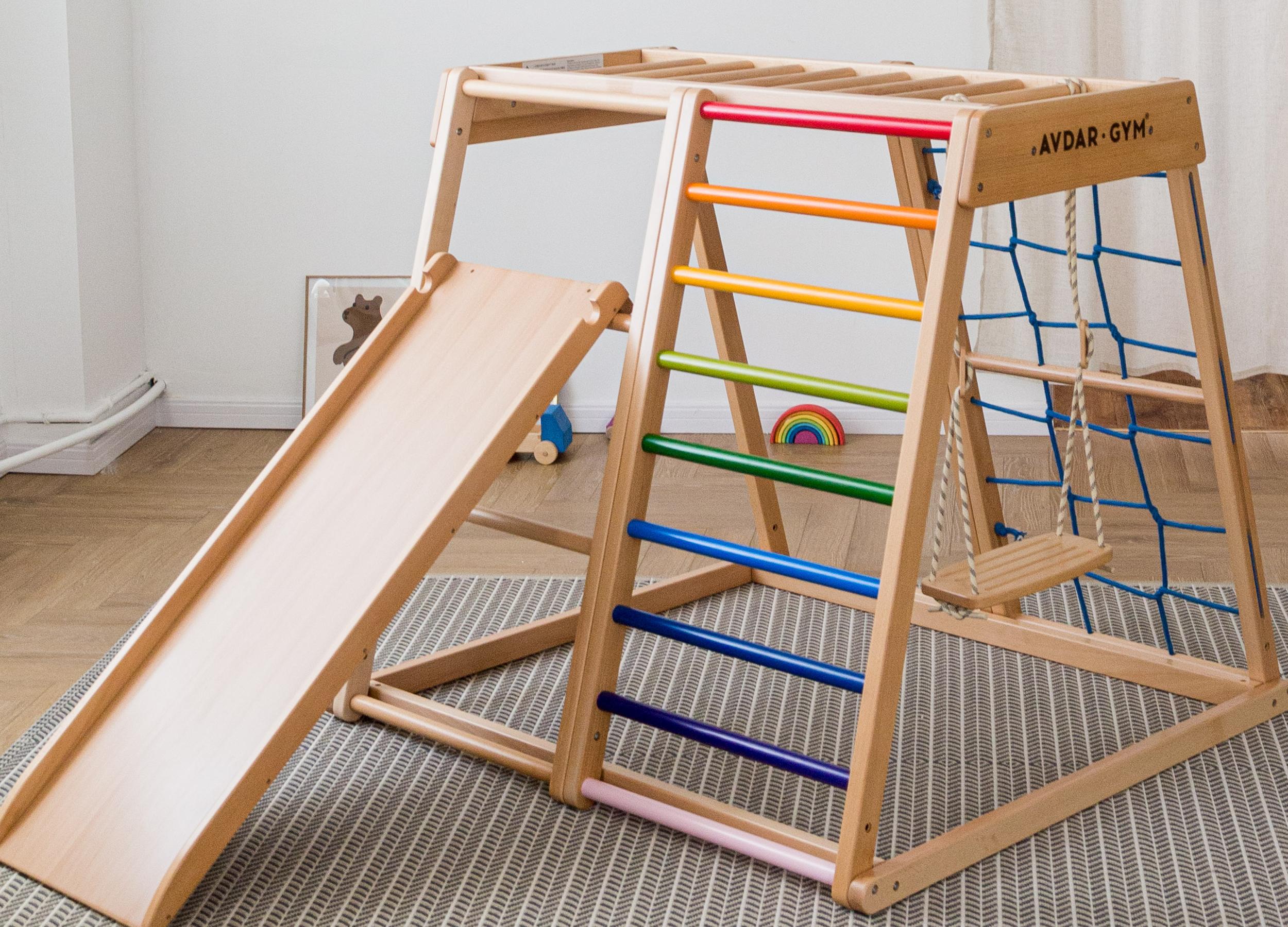
Rainbow Climber Set
AVDAR TOYS Co., Ltd.
China

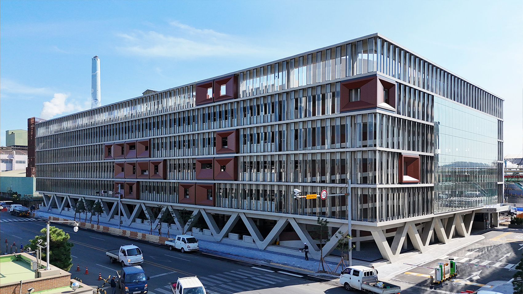
EFETE WIDE PILOTI DESIGN
HL D&I Halla & DESIGN GRU A&I Corp.
Korea


Partner & Sponsor
More


info@asiadesignprize.com
#14057, 905 49, Beolmal-ro 102beon-gil,
Dongan-gu, Anyang-si, Gyeonggi-do, Korea
#14057, 905 49, Beolmal-ro 102beon-gil,
Dongan-gu, Anyang-si, Gyeonggi-do, Korea
Founder: Doyoung Kim
Business Registration Number: 454-86-01044
Online Sales License No.: 2021-Anyang Dongan-1081
Copyright © DESIGNSORI Co., Ltd.
Business Registration Number: 454-86-01044
Online Sales License No.: 2021-Anyang Dongan-1081
Copyright © DESIGNSORI Co., Ltd.
