COUCOU Rebranding
Space
Regions
China
Year
2022
Award
WINNER
Client
COUCOU Co., Ltd.
Affiliation
workingimages Co., Ltd.
Designer
Tori Wu
English
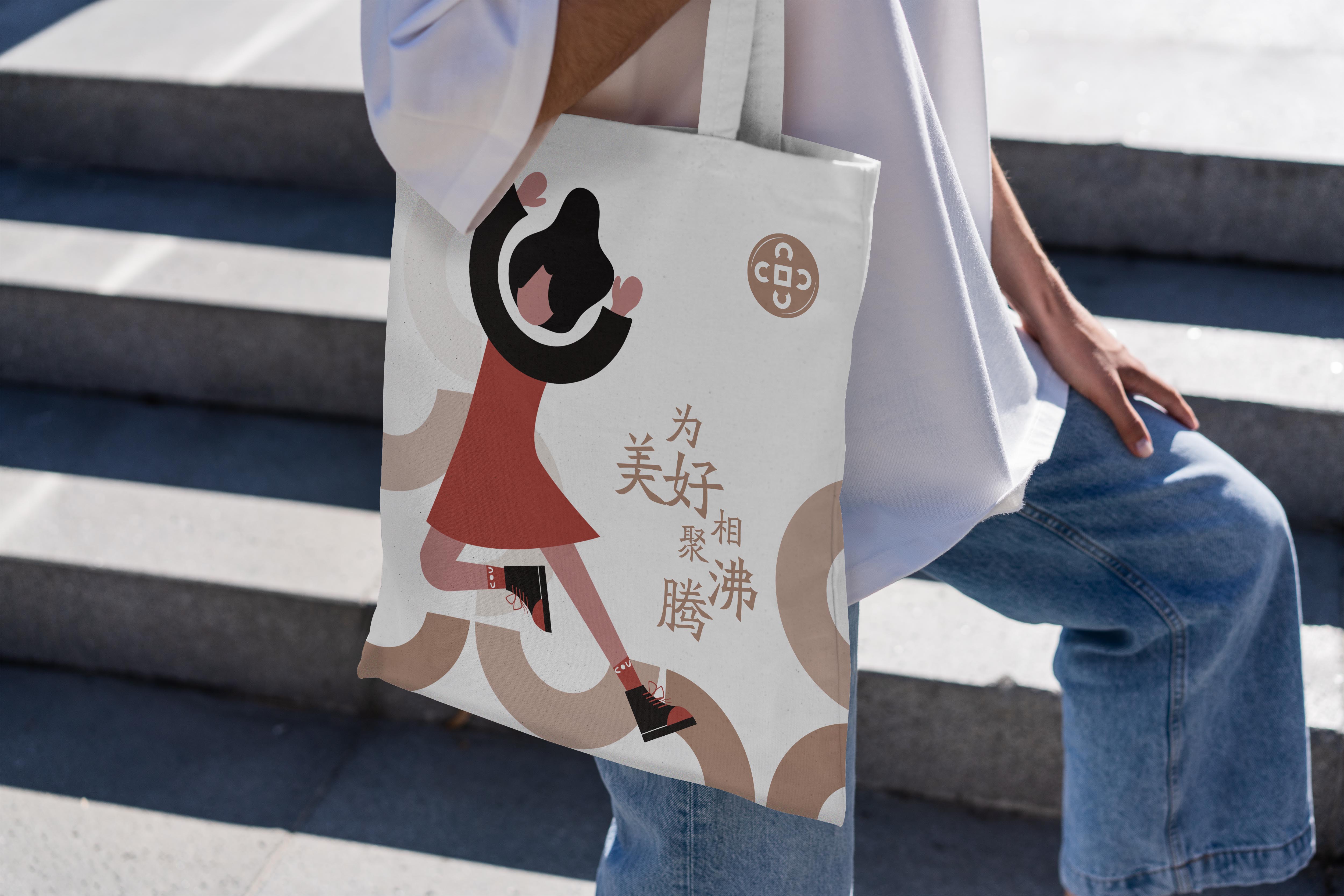
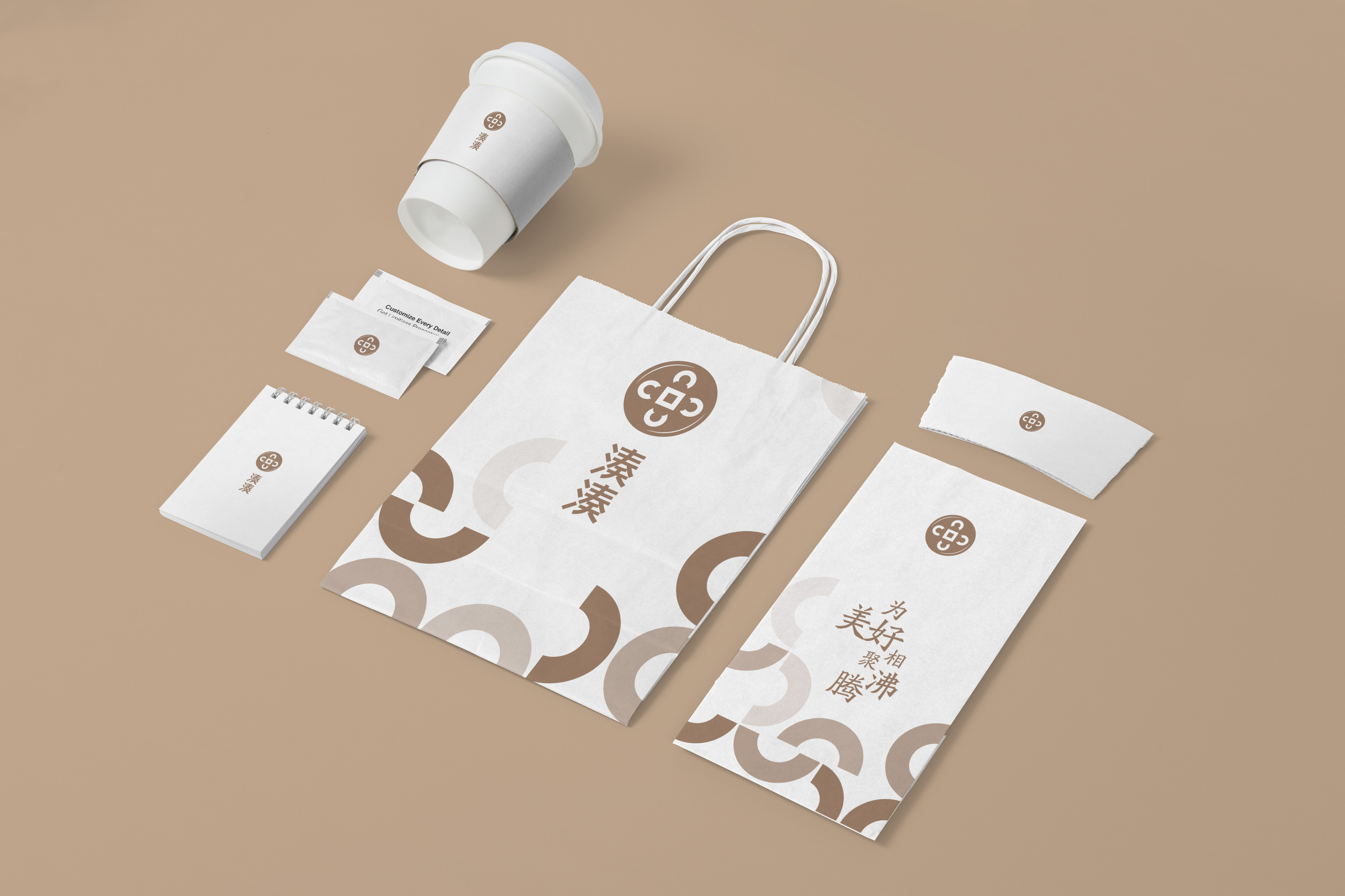
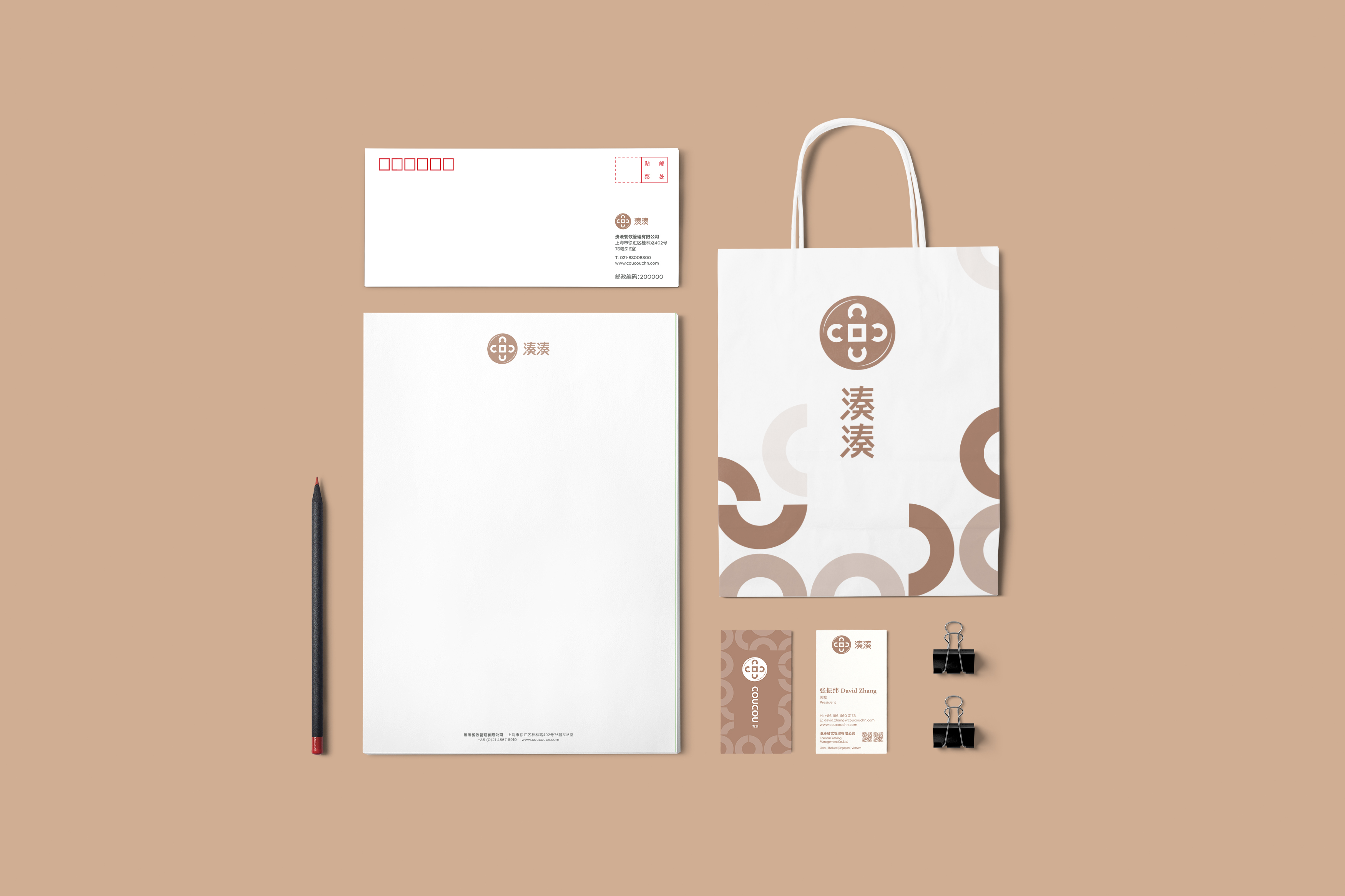
The meaning behind the word “cou” in Coucou is “people gathered by the water". The three letters C, O, U used within the logo stands for the celebration and welcoming of people with opened arms, alluding to the traditional Chinese philosophy of hemispherical dome. The logo uses the letter U as the basic element and develops a series of supplementary graphics around it, representing the idea that Coucou puts importance on every reunion with “U”. Based on this idea, Coucou develops its series of illustrations, different bodies gathered together, spreading the feeling of happiness in reunion.
Native
作为近年来火锅界的网红品牌,湊湊以“火锅+茶憩”的创新业态模式,目前已迅速成为餐饮火锅品类的头部品牌。湊湊希望带给消费者的不仅是良好的餐饮体验,更希望提供给消费者一种欢聚的生活方式。正如湊湊的品牌使命所言“促进情感交流,创造快乐生活”,为消费者创造 “幸福感” 是品牌坚持的价值主张。湊湊的湊字原意是指人们相聚于水边,Logo图形元素取自C、O、U三个字母,寓意张开双臂欢呼聚会的人们,并巧妙融入中国天圆地方的传统哲学以及代表湊湊火锅的动感线条。在设计上向国际品牌看齐,线条趋向简洁以提升现代感。在色彩上选择使用时尚感的玫瑰金,让人联想到美好的事物和时尚的温柔。从Logo中提取U作为基本元素,延伸出一系列的辅助图形,代表着湊湊重视跟你 "U" 的每一次相聚,使用于品牌沟通中的所有触点及应用物中,进一步强调品牌特征,保持视觉形象上的关联性和统一性。“U”型图案除了可作为辅助图形,亦可看做欢呼的手臂图形,基于此概念发展除了湊湊系列人物插画,不同的个体湊在一起,传达出相聚的幸福感。
Positive Comments


Turn and Look
Yu Kun Shih
Chinese Taipei
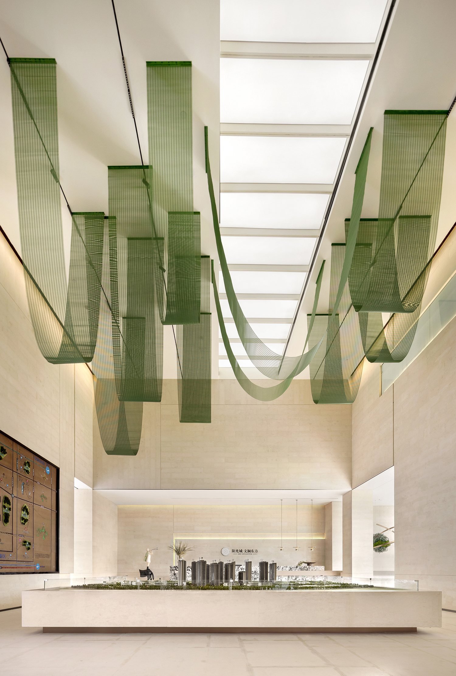
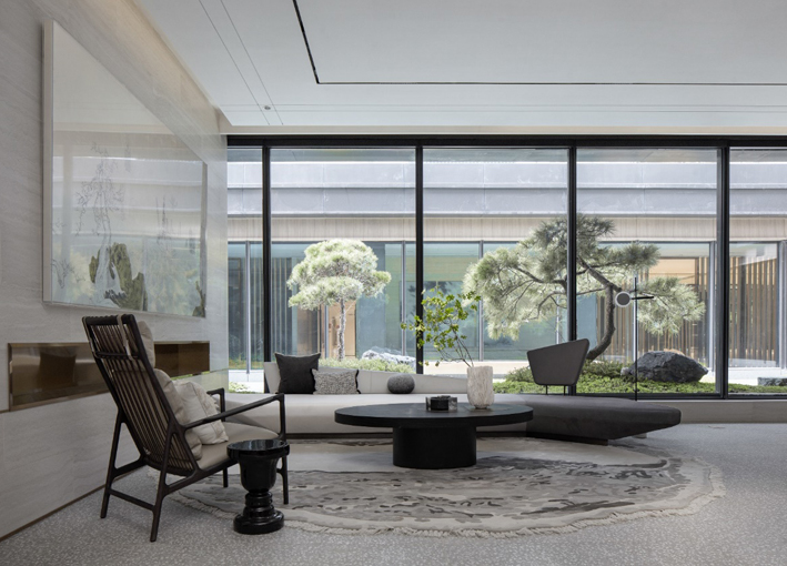
Yango Kunming Wenlan Dongfang Sales Center
Sunhouse Decoration Engineering Co., Ltd.
China
ARC X ART
HYGGE Interior Design
Chinese Taipei
COUCOU Rebranding
workingimages Co., Ltd.
China
The Lavishness
calm arts design
Taiwan
Realm of Eastern Literati
G DESIGN
Chinese Taipei
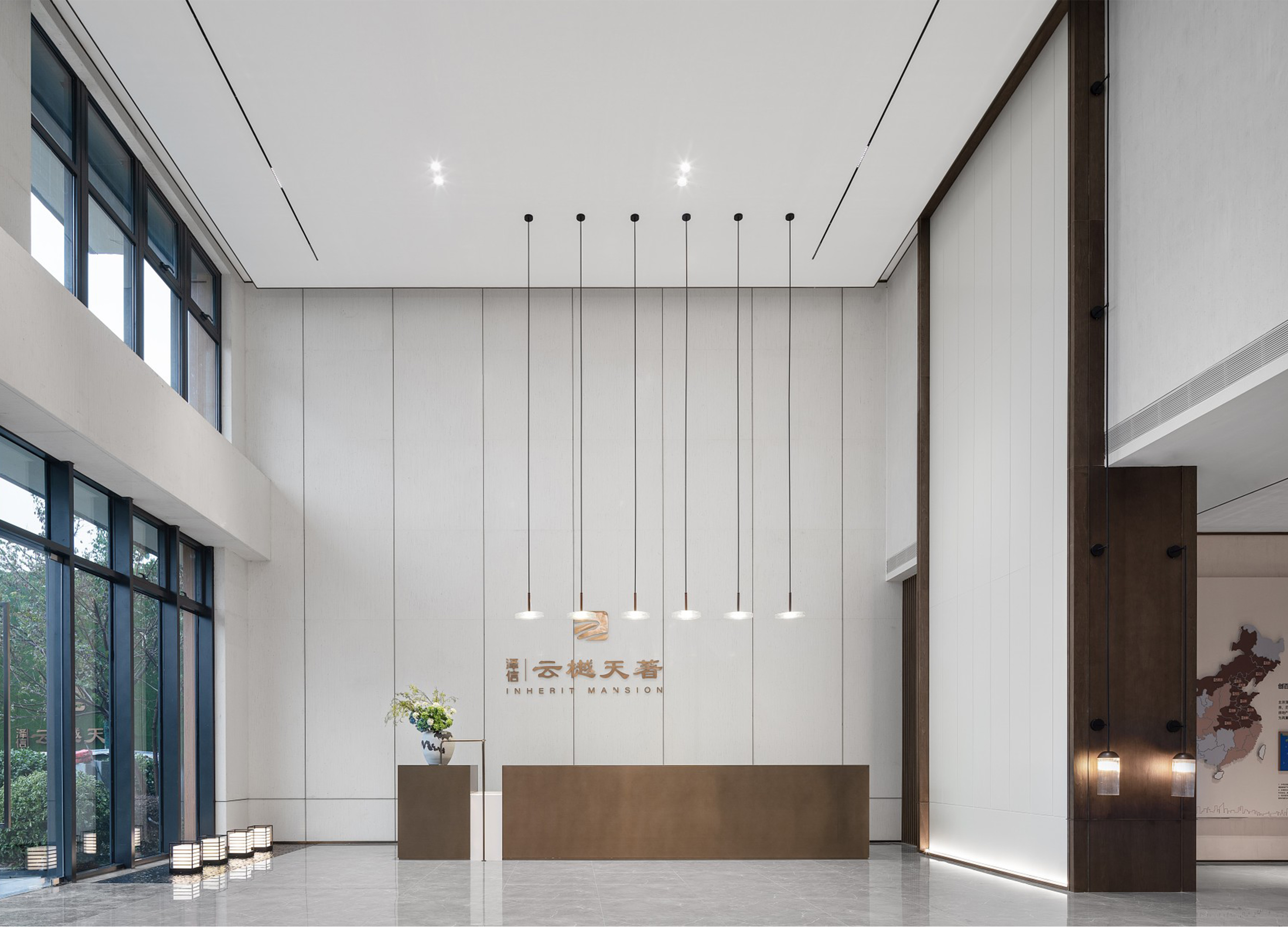
ZEXIN LUOYANG YUNYUE TIANZHU
BEIJING WEILA SPACE DESIGN Co., Ltd.
China
Aureole Sky Castle
feeling design
Chinese Taipei
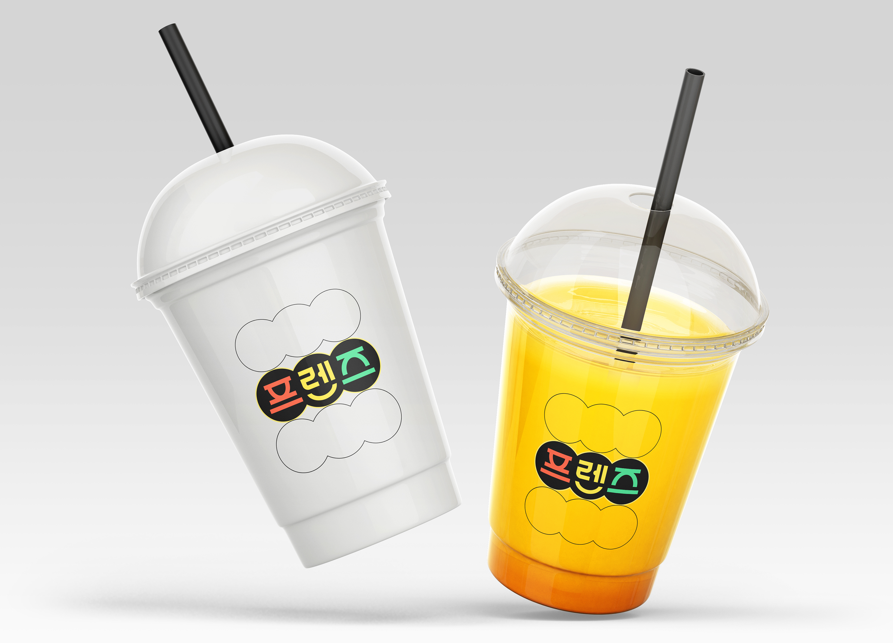
Friends Visual Branding
CHANNEL A BNC
Korea
Pure Series Packaging
Laika Inc
China
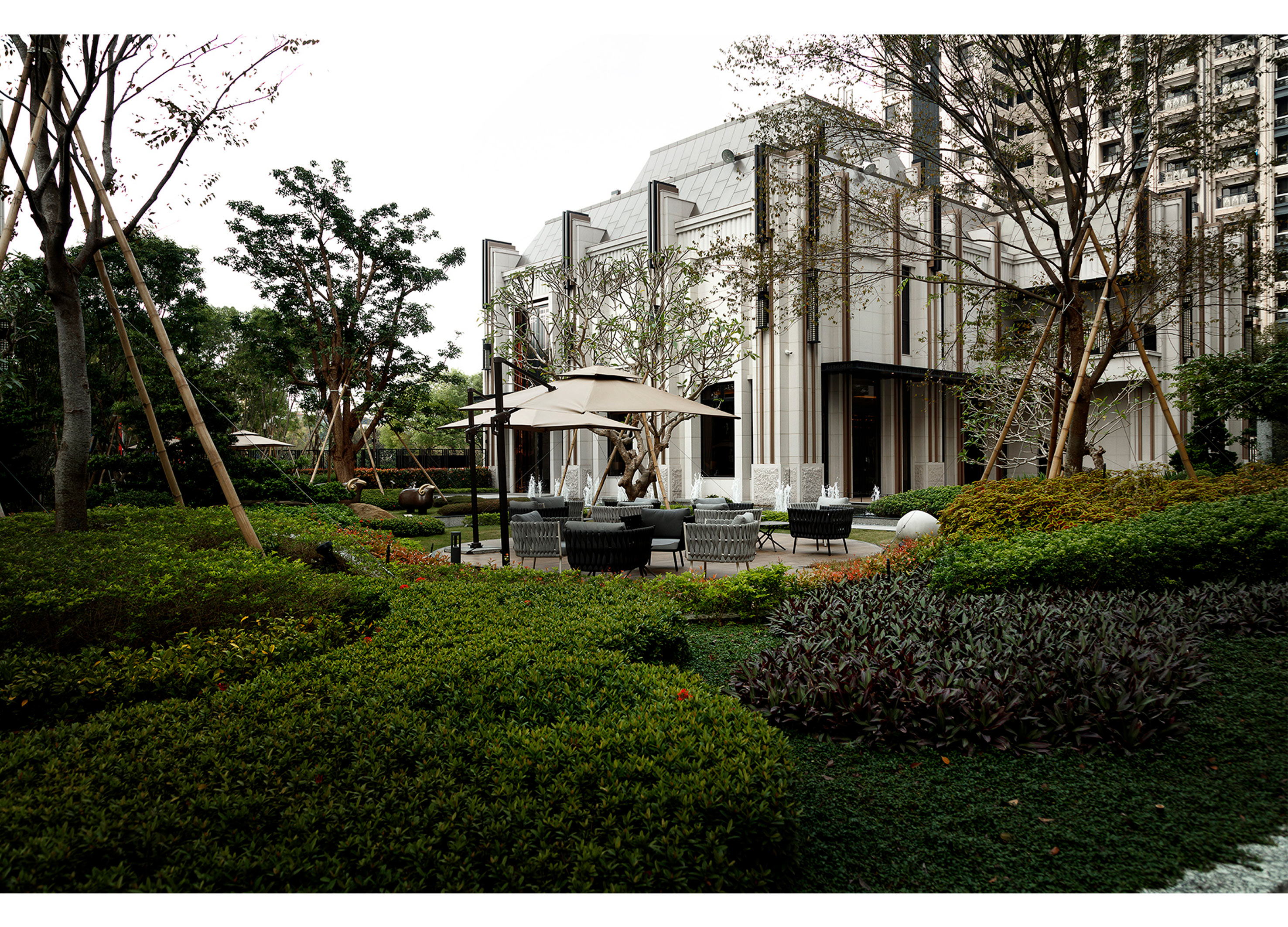
Yango Jiaxing Sales Center
Puhui Design
China
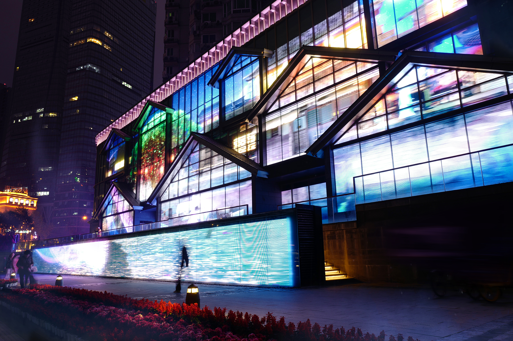
Transformation of Dongmen Wharf Chengdu
VERGE Creative Design
China
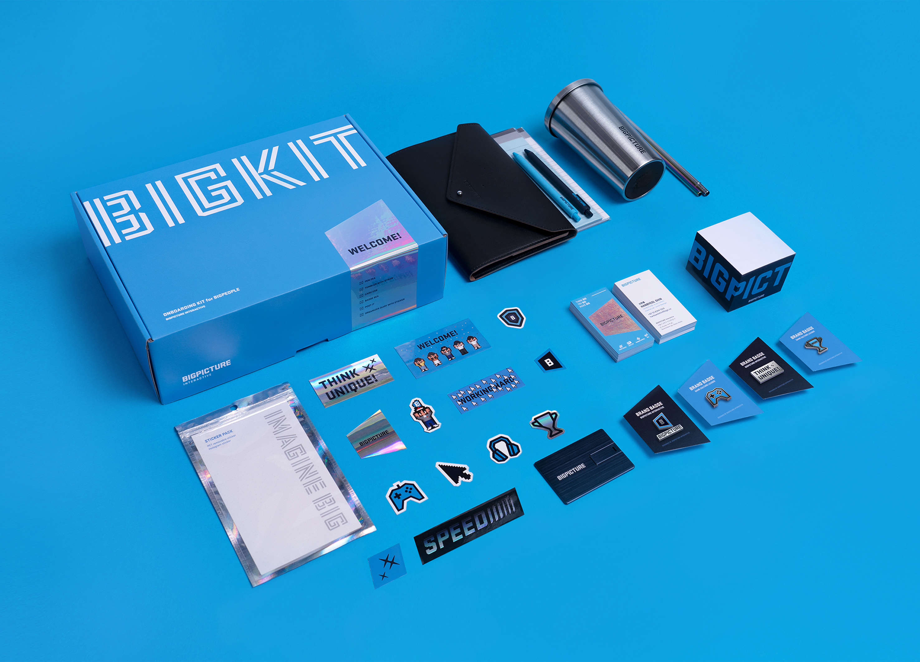
BIGKIT Onboarding kit of BIGPICTURE
BIGPICTURE Interative
Korea
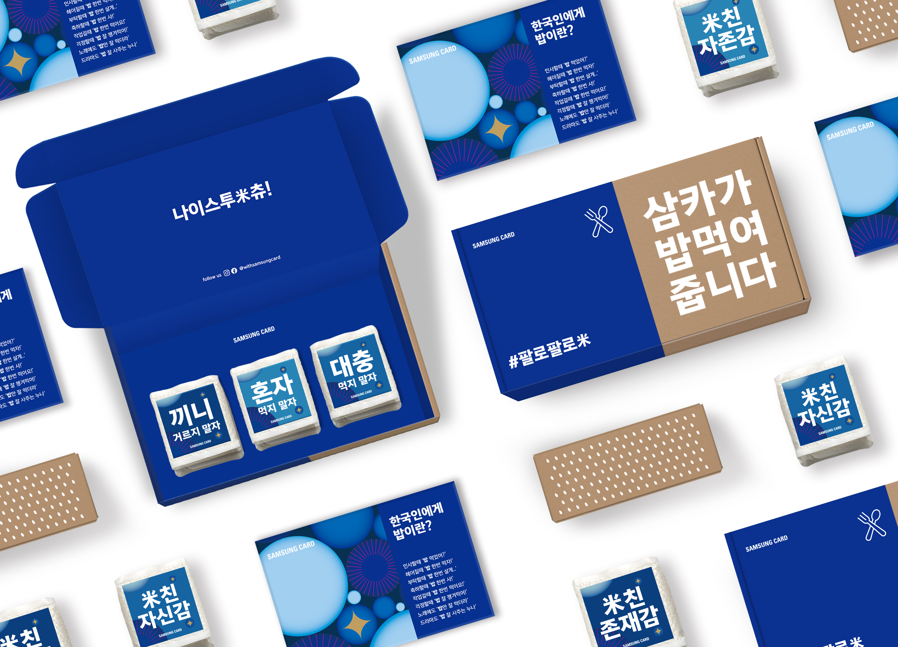
Follow follow 米 - Samsung Card SNS Event
SAMSUNG CARD
Korea
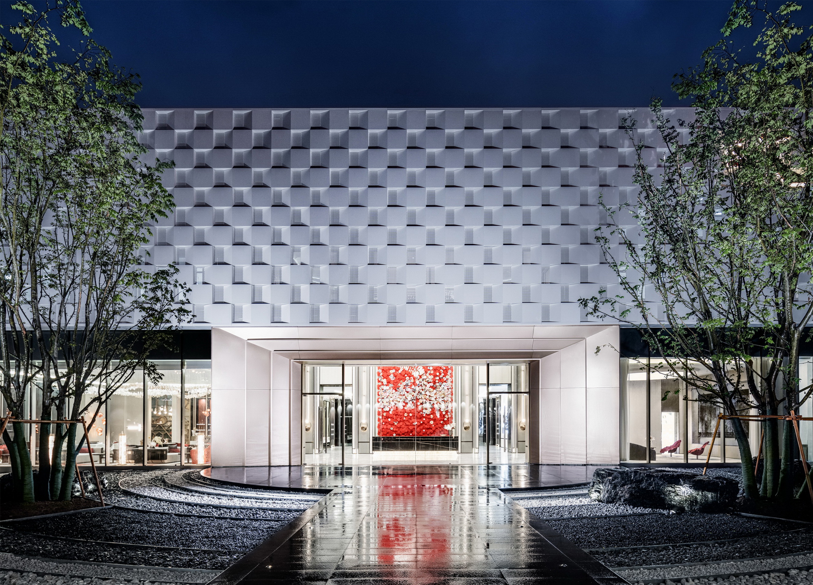
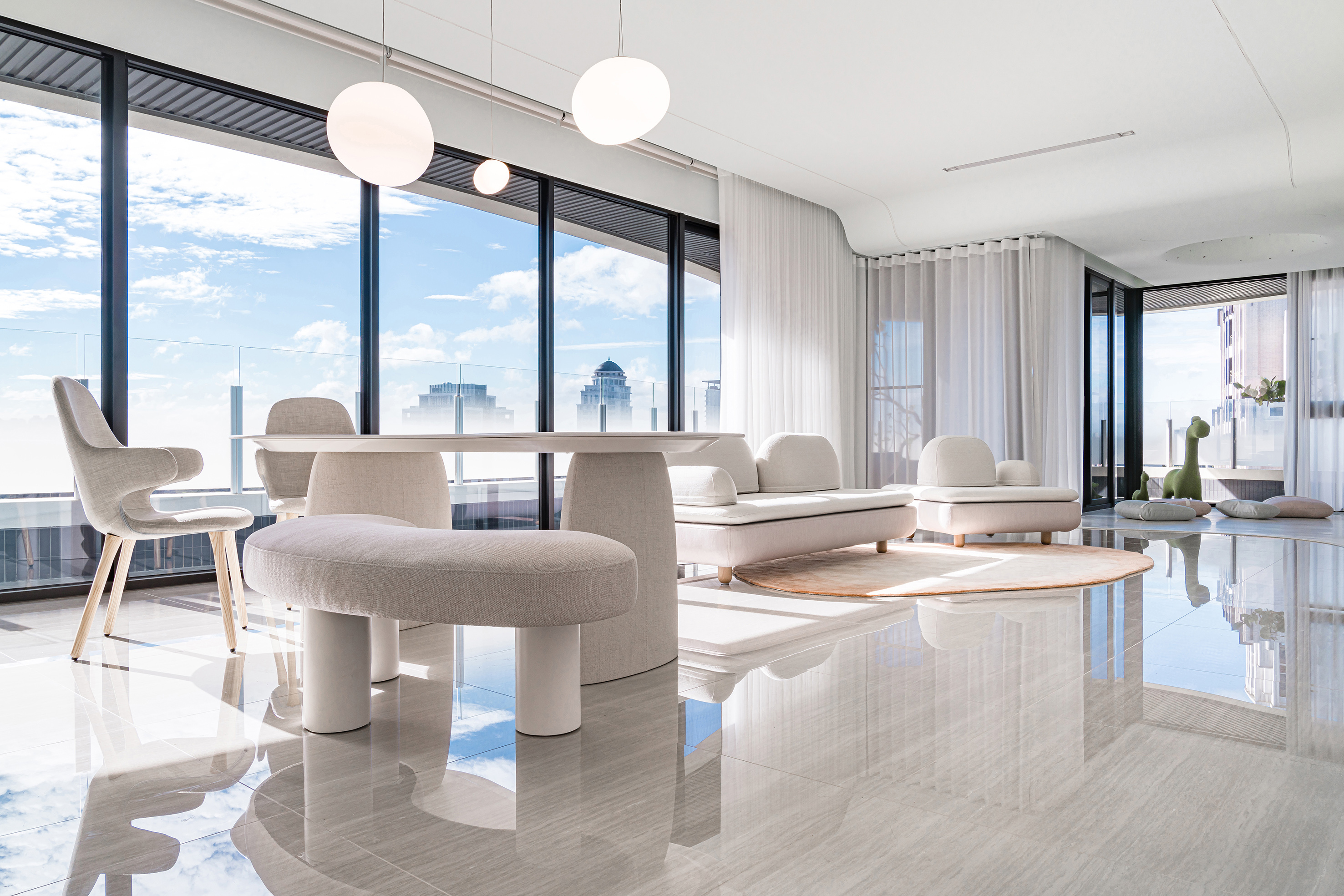
Xi'an 'SKY MANSION' Marketing Center
JSP ARCHITECTS LTD
China
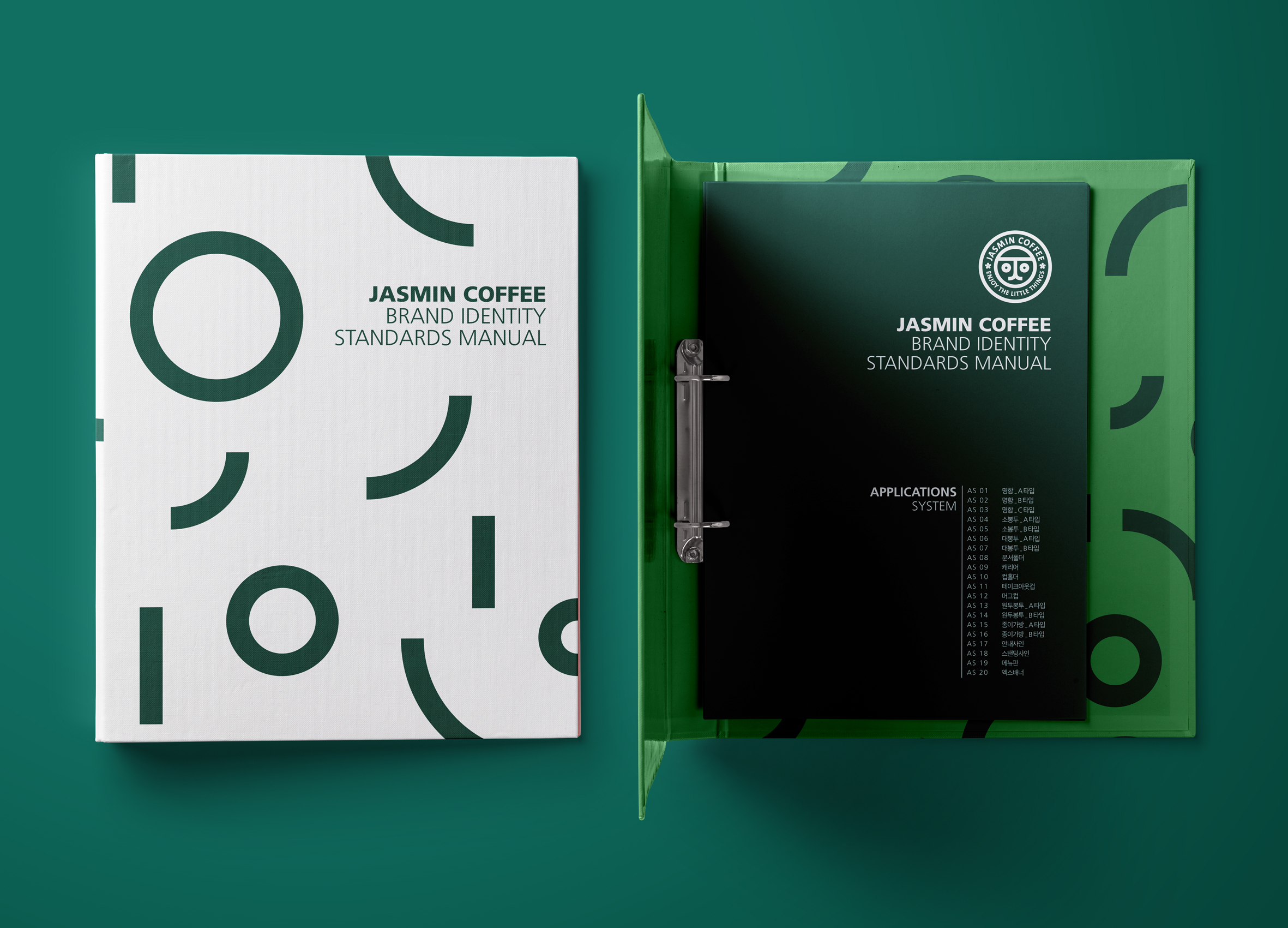
Jasmin Coffee Brand Identity
BREEZE PARTNERS
Korea
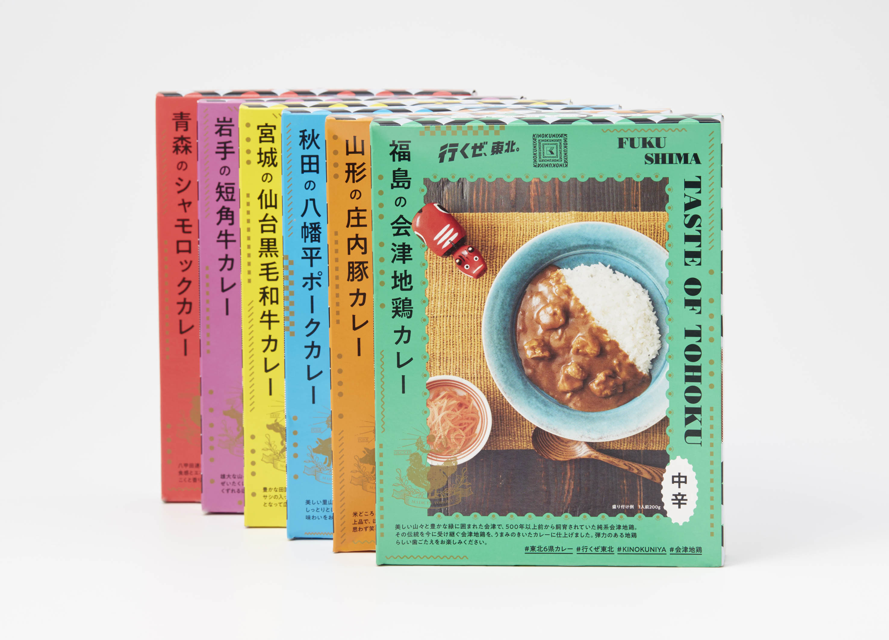
東北 6 県レトルトカレー
DODO DESIGN
Japan
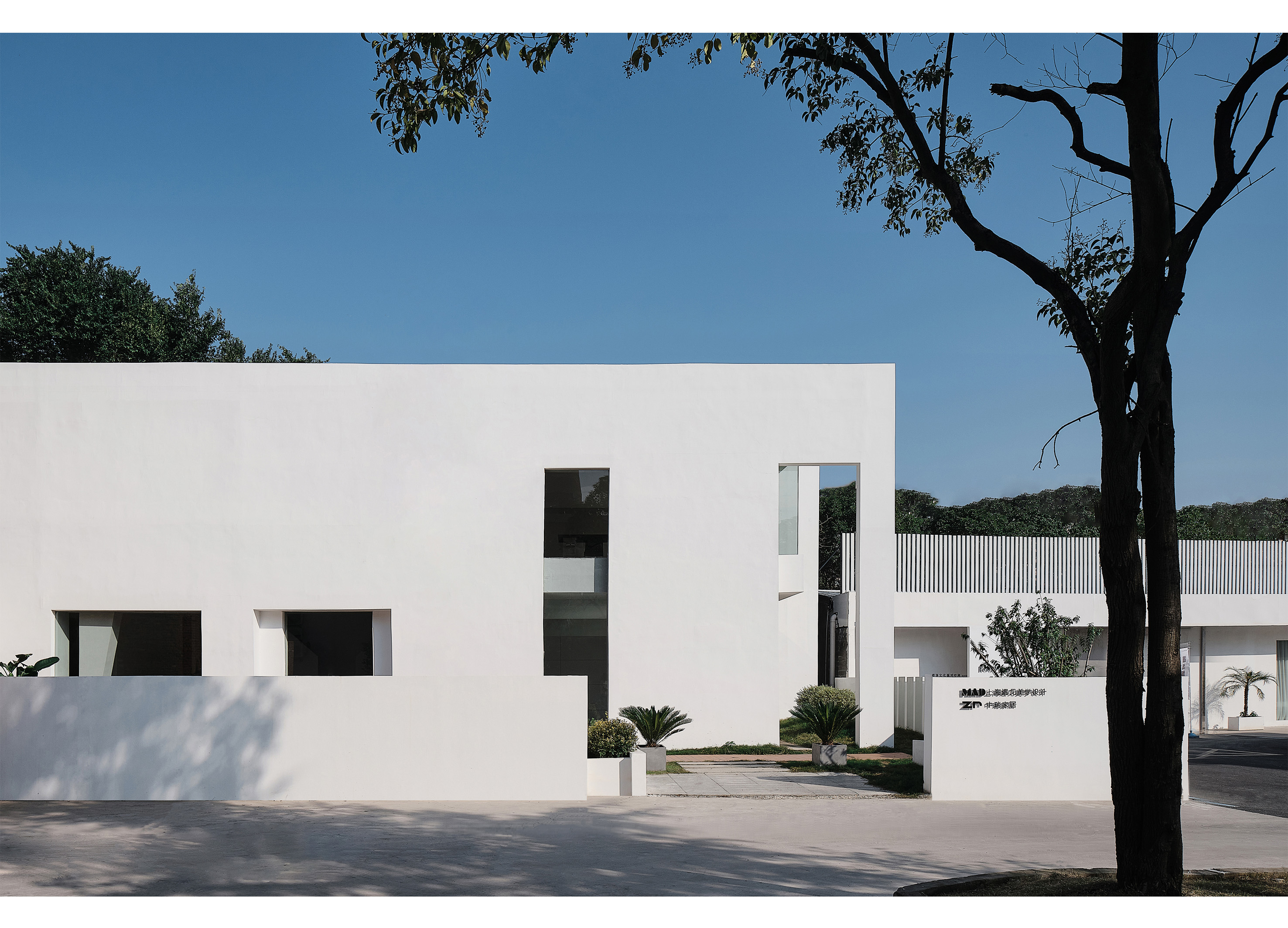
Erran
Shanghai Meet Aesthetic Design Co., Ltd.
China


Partner & Sponsor
More


info@asiadesignprize.com
#14057, 905 49, Beolmal-ro 102beon-gil,
Dongan-gu, Anyang-si, Gyeonggi-do, Korea
#14057, 905 49, Beolmal-ro 102beon-gil,
Dongan-gu, Anyang-si, Gyeonggi-do, Korea
Founder: Doyoung Kim
Business Registration Number: 454-86-01044
Online Sales License No.: 2021-Anyang Dongan-1081
Copyright © DESIGNSORI Co., Ltd.
Business Registration Number: 454-86-01044
Online Sales License No.: 2021-Anyang Dongan-1081
Copyright © DESIGNSORI Co., Ltd.
