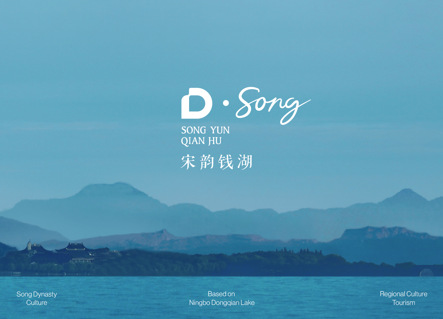
The Song rhythm of Dongqian Lake
Communication
Regions
China
Year
2023
Award
WINNER
Client
Dongqian Lake Economic Tourism and Lake Development Bureau
Affiliation
Yan Wu Yan Visual Design Co., Ltd.
Designer
Mao Ming, Yao Dabin, Yang Zhe
https://www.youtube.com/watch?v=L4s-_zAKWZs
English
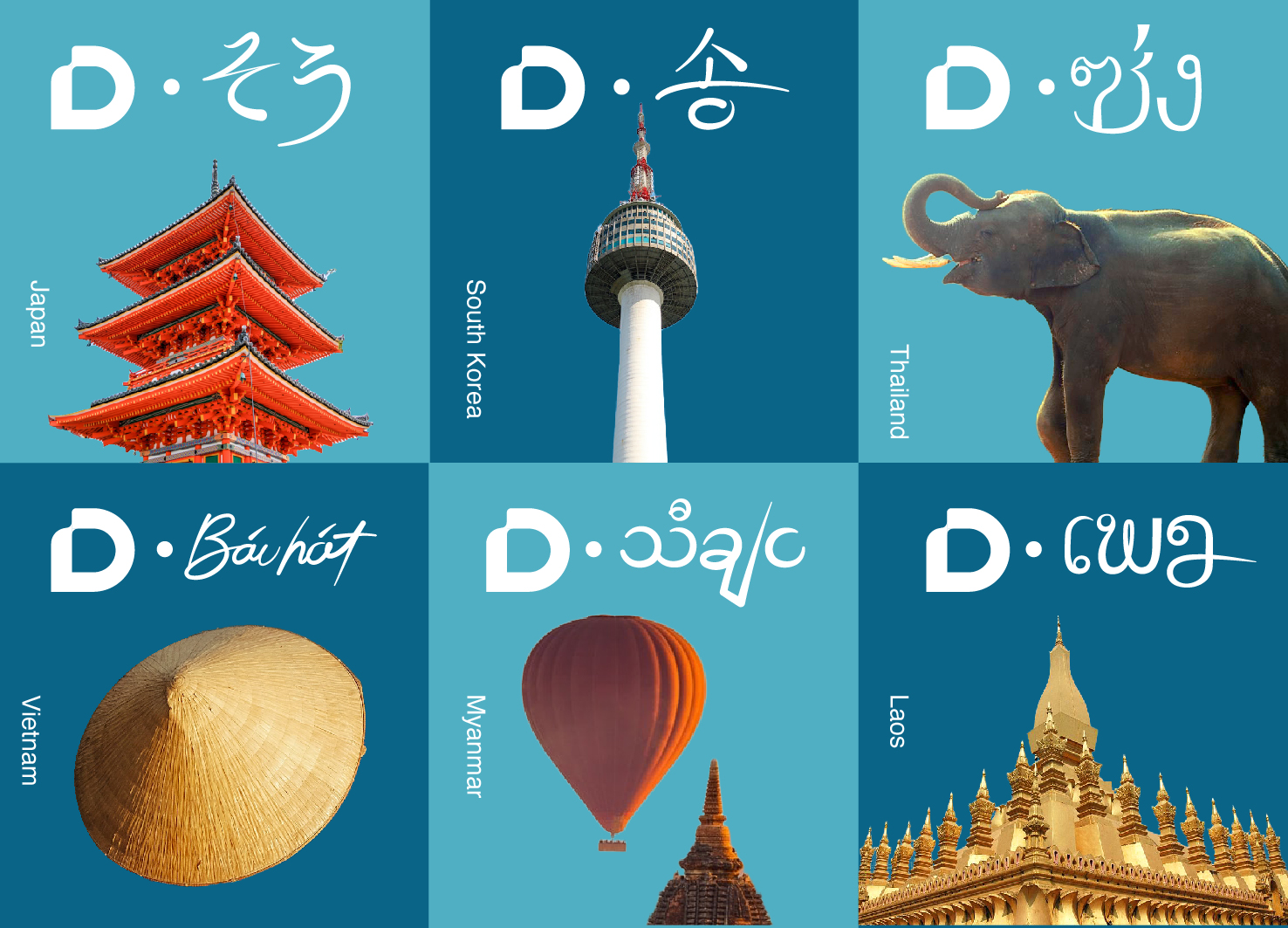
The "D" in the logo is taken from the initial letter of Dongqian Lake. The design of the upper left corner of D not only reflects the flow of water, but also conforms to the aesthetics of the Song Dynasty. Another part of logo is "Song" in handwritten English, which can be changed into different languages, implying the radiation and influence of Song culture on East and South Asia.
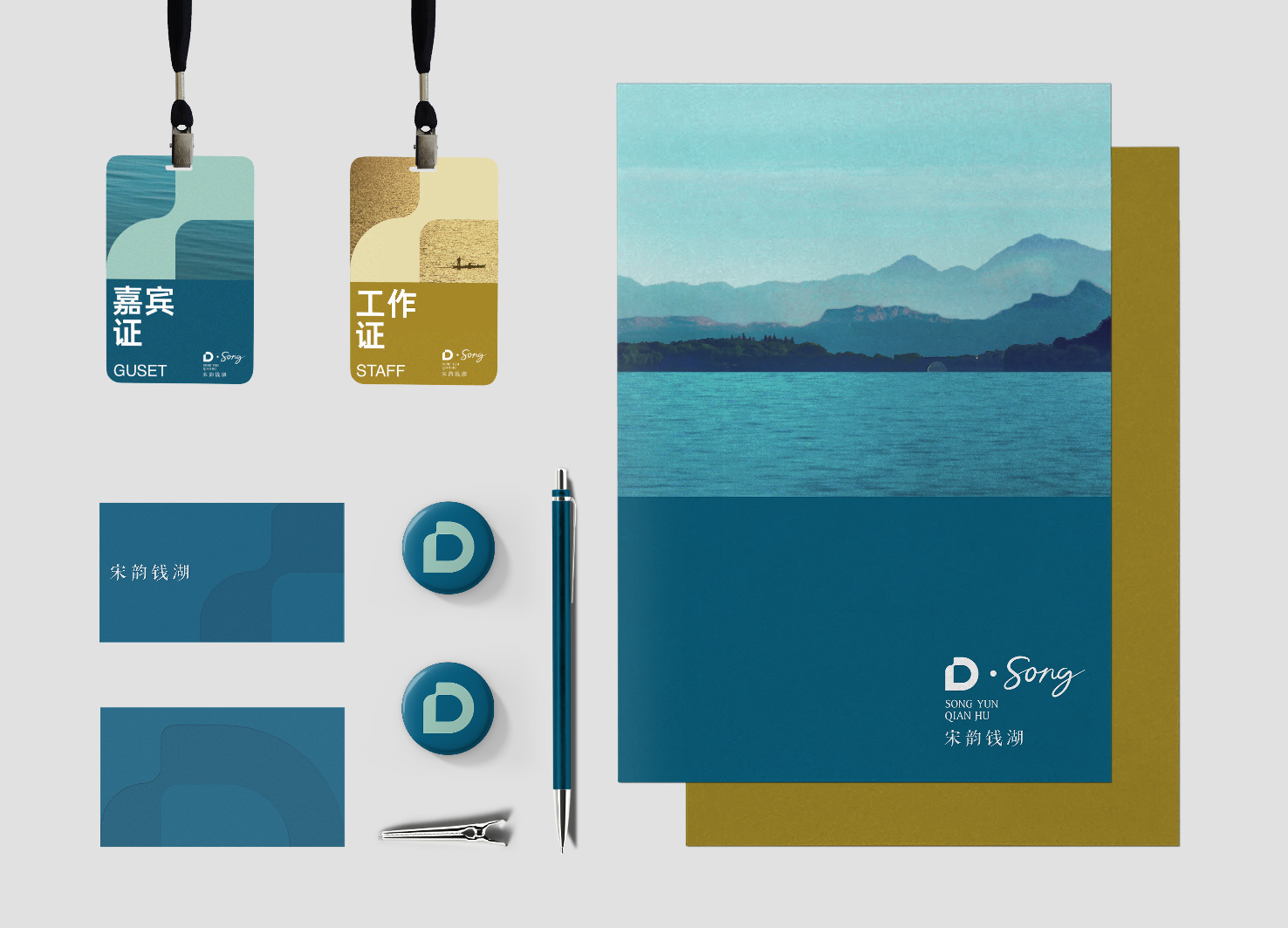
The whole visual system uses the "D" element as the brand symbol, which is flexibly applied to different products such as posters. In addition, the exclusive brand visual pattern is formed by arranging "D" continuously.
Native
宋韵钱湖品牌形象设计旨在传播在地宋韵文化的同时,扩容东钱湖文化旅游形象,打造新的文旅品牌IP。
标志中的“D”取自于东钱湖英文里的首字母。字母左上角的特殊处理既体现了水的流动感,也符合宋代美学中的曲线感。标致另一部分为手写体英文的“宋”,文字可变化为不同国家语言的“宋”,寓意着宋文化对东亚南亚的辐射与影响。 标志的中文设计参考宋版书《梦溪笔谈》里的笔画结构,做了更符合宋韵主题的处理。
品牌主色取自于东钱湖蓝与宋代山水画纸上的暗金,辅助色则采用了一抹朱红来使整体色调更活跃。
整套视觉系统以标志里的“D”元素为品牌符号,灵活运用于海报/办公产品等不同周边上。此外,通过连续排列“D”组成专属品牌视觉纹样,应用于口罩/帆布包等物品。
除传统周边物料外,宋韵钱湖还推出了以字母“D”为基础的多款专属NFT,旨在为人们带来全新的钱湖印象。
Positive Comments


One piece anti theft backpack
Kingsons Bags Technology Co., Ltd.
China
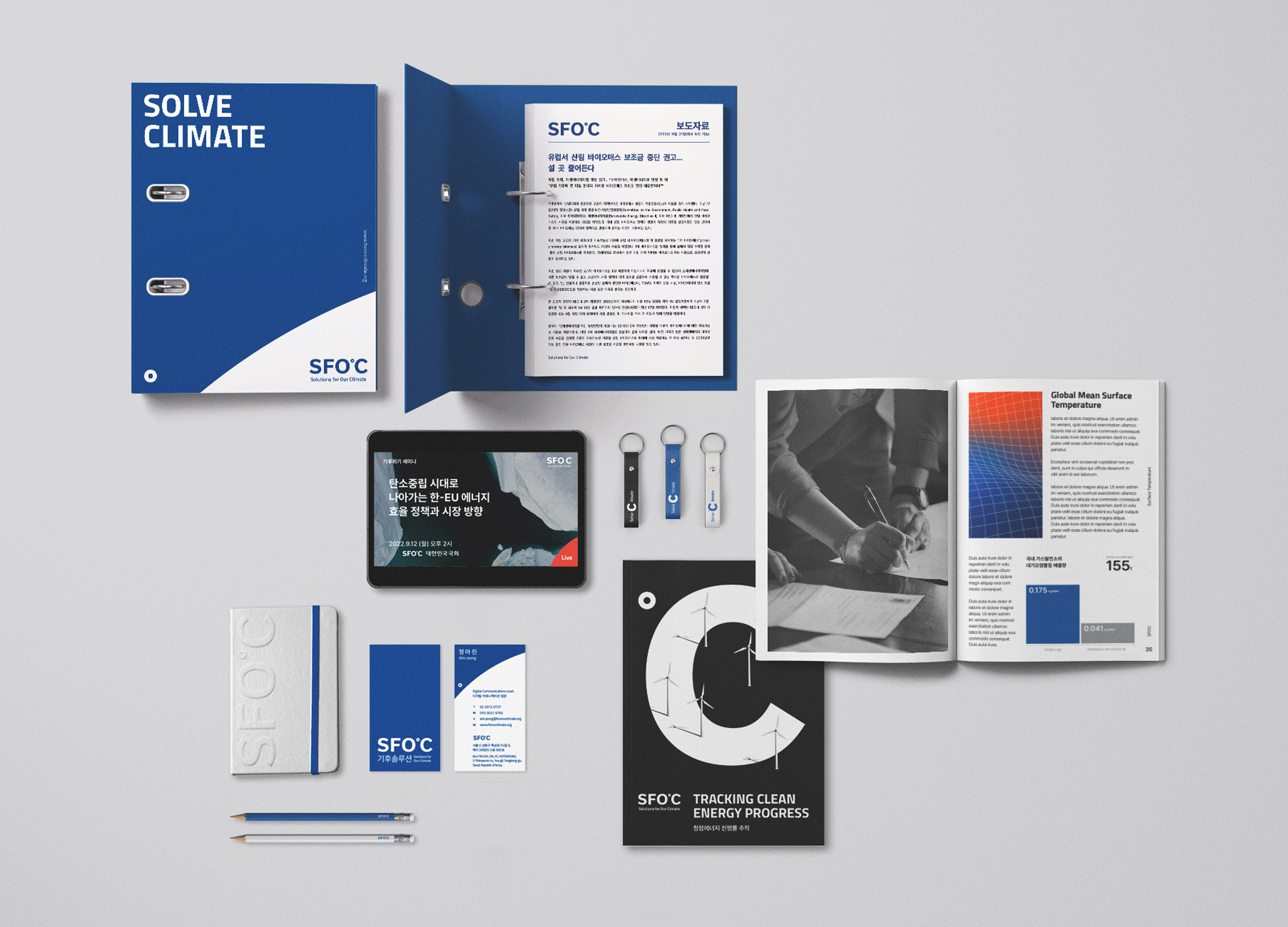
SFOC Visual Identity
Bspokr Studio
Korea
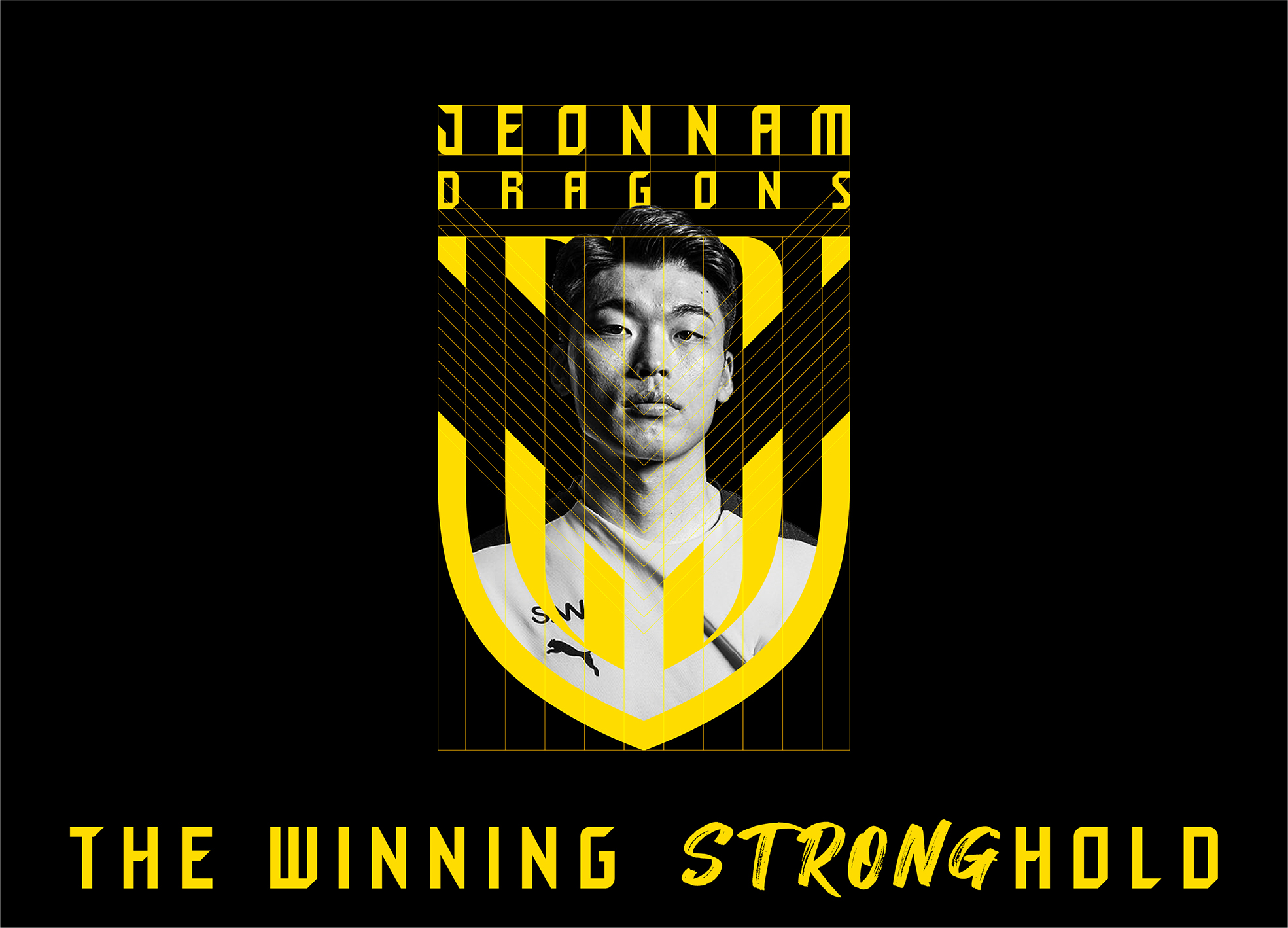
Jeonnam Dragons Football Club Rebranding
Moravian Co., Ltd.
Korea
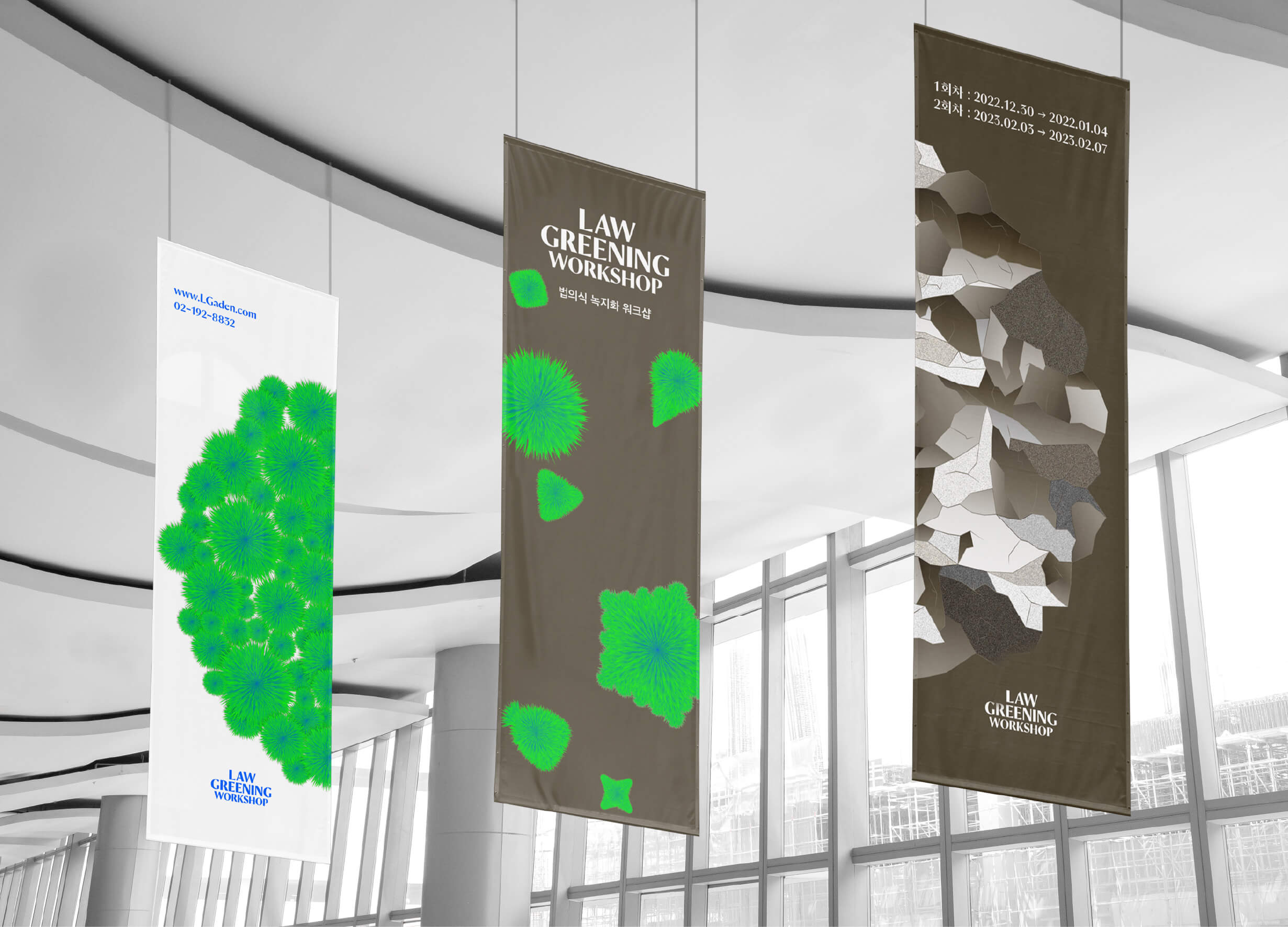
Law Greening Workshop
Sejong University
Korea
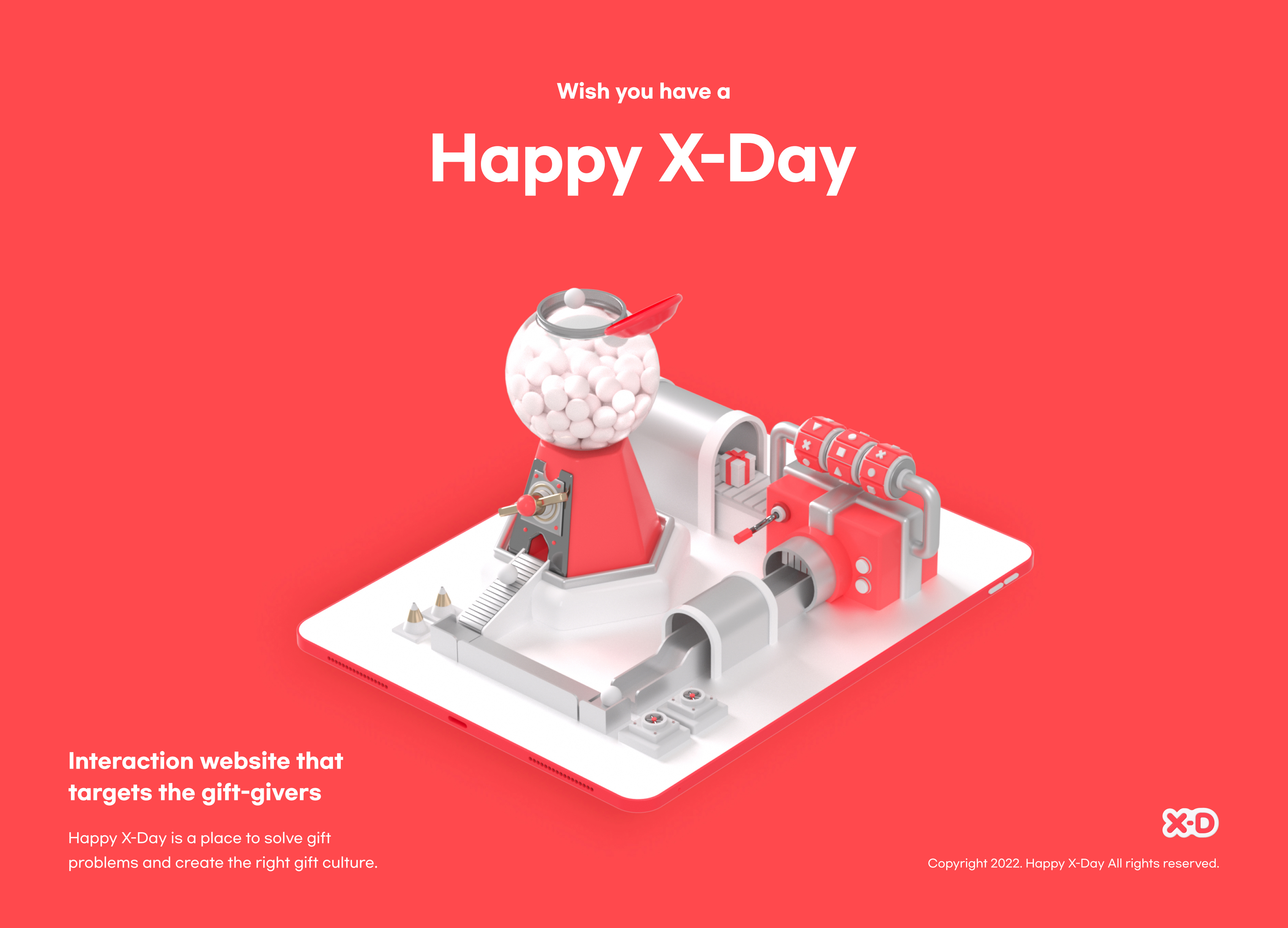
Happy X Day
Sungshin Womens University
Korea
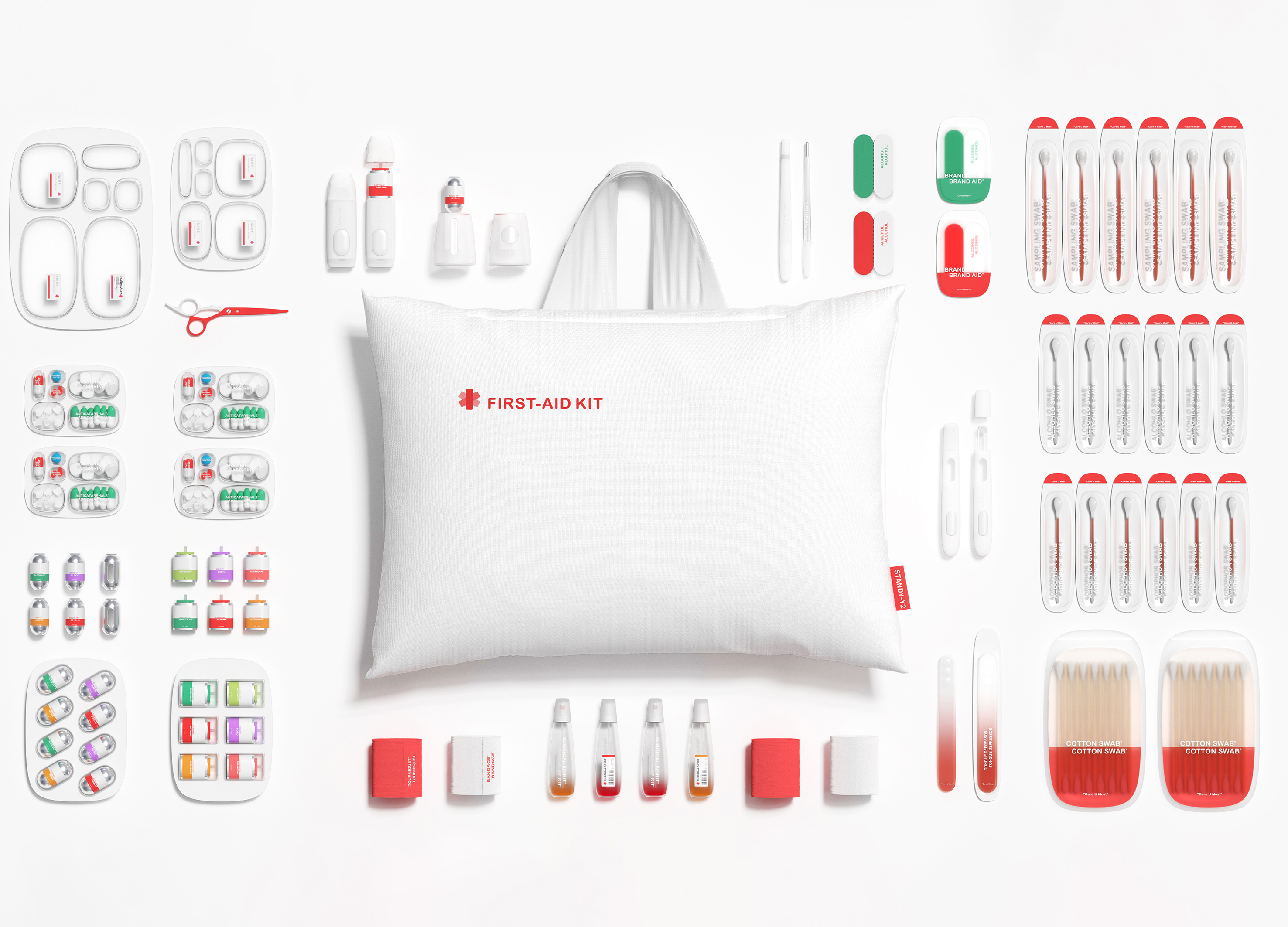
Care U Most
None
China
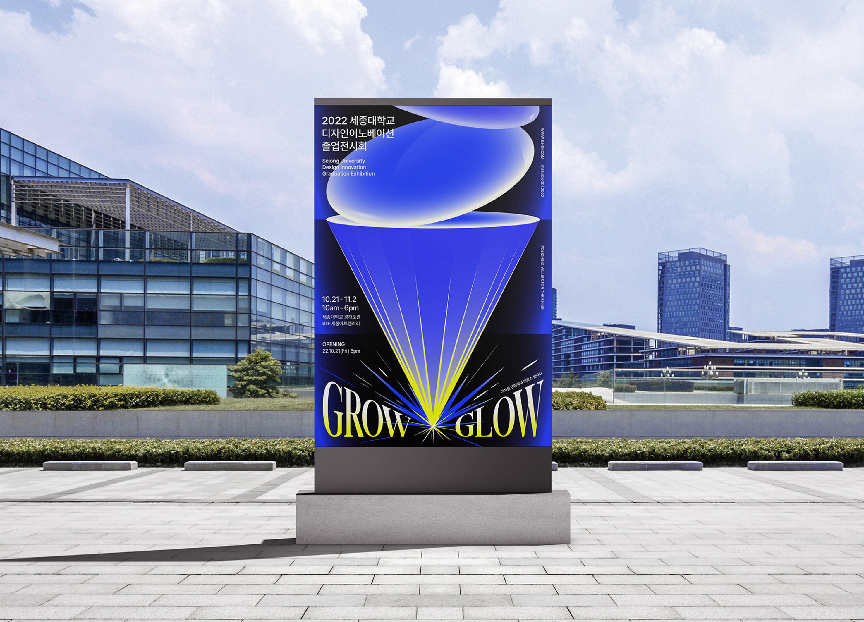
2022 Graduation exhibition GROW GLOW
Sejong University
Korea
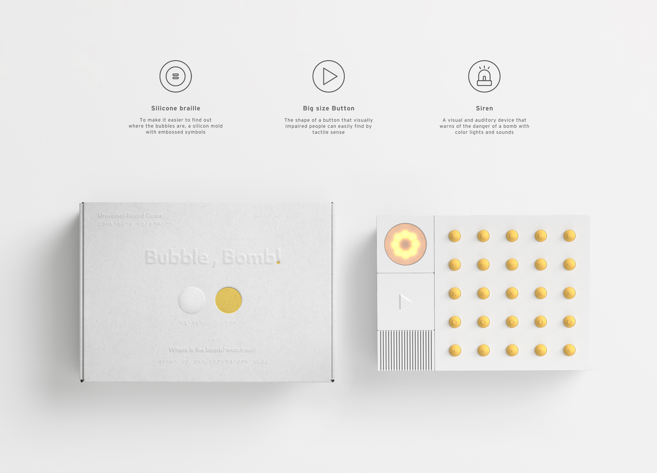
Bubble Bomb
Sejong University
Korea
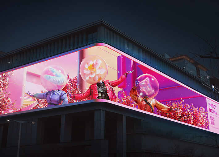
Energy Utopia
CUZ Inc
Korea
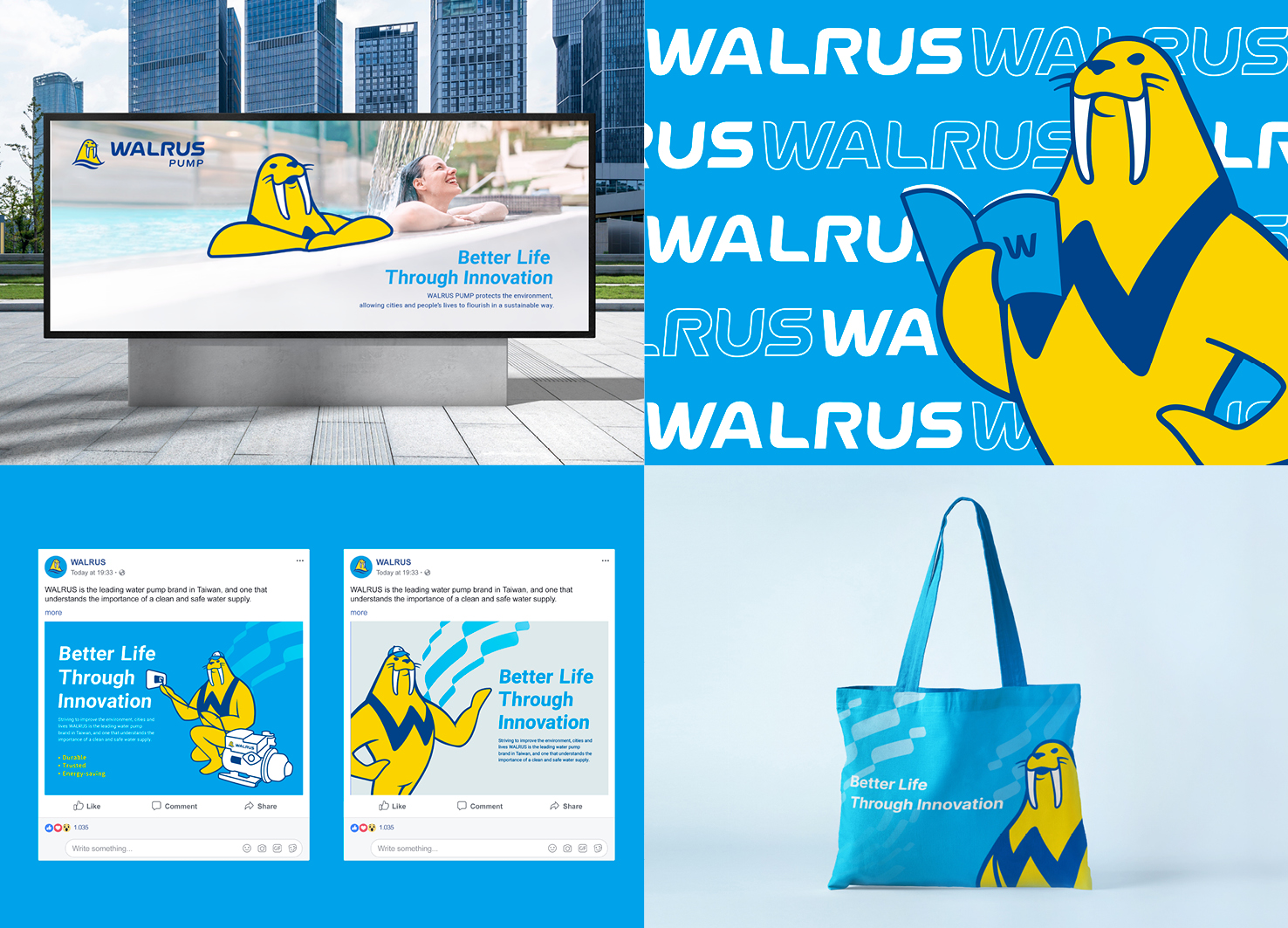
WALRUS PUMP Brand Design
Process Group
Taiwan
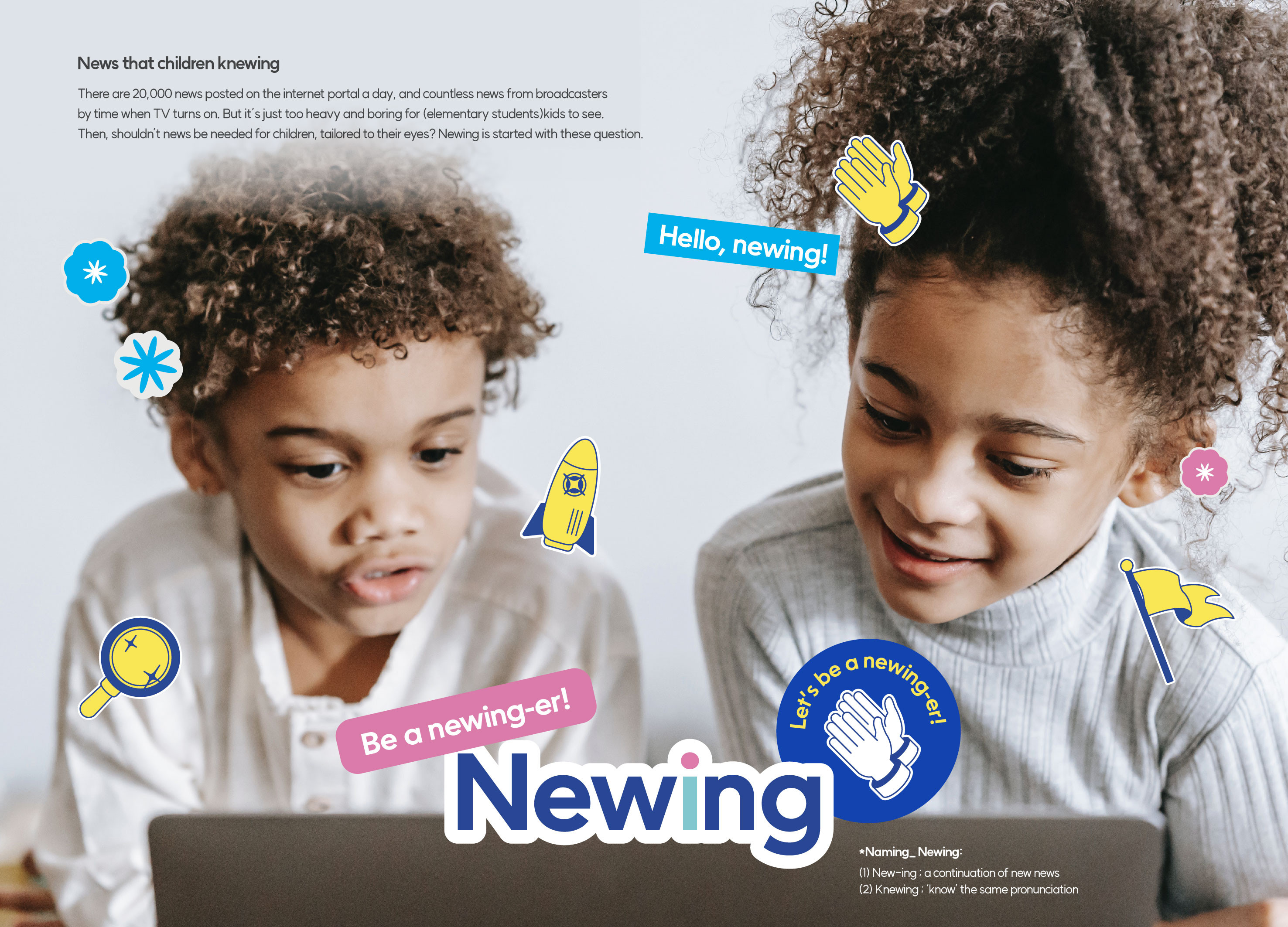
Newing
Seoul National University of science and technology
Korea
The Song rhythm of Dongqian Lake
Yan Wu Yan Visual Design Co., Ltd.
China
Weaving Haifu
SPACE 127 Design and Architecture
Chinese Taipei

Jangin Myeongye Surok
Sejong University
Korea
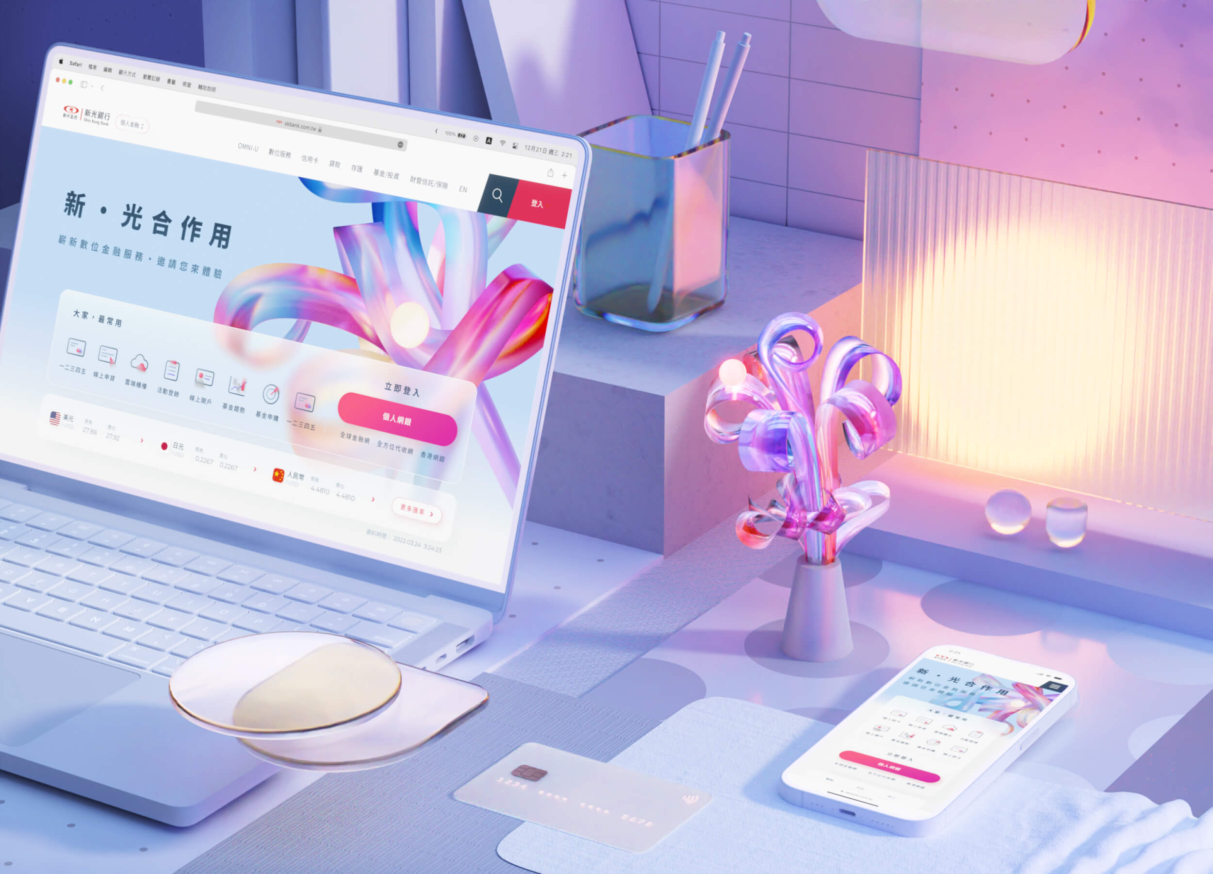
SHIN KONG Bank Light Evolution
TAIWAN SHIN KONG COMMERCIAL BANK Co., Ltd.
Chinese Taipei
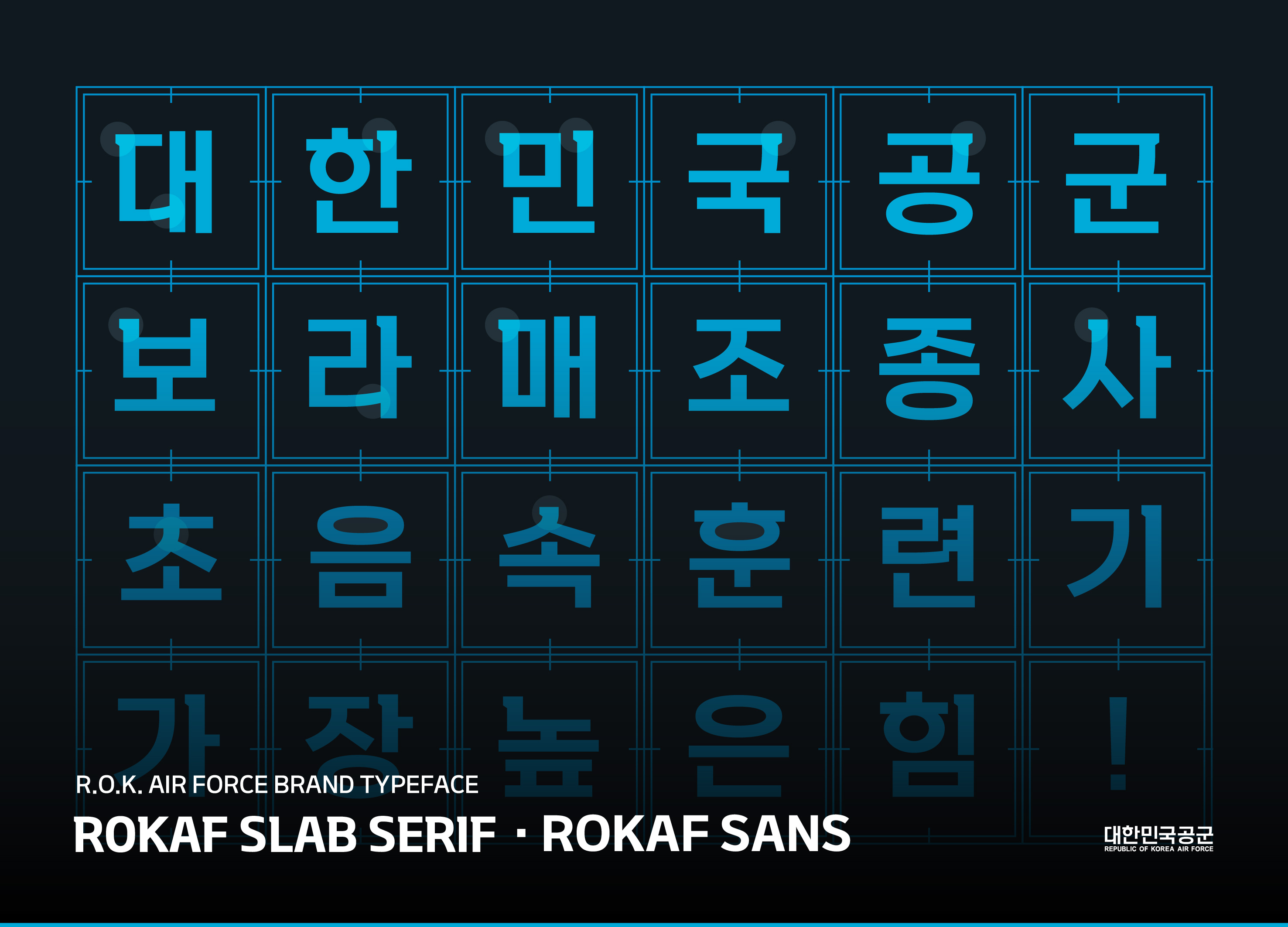
ROKAF Typeface
Republic of Korea Air Force
Korea
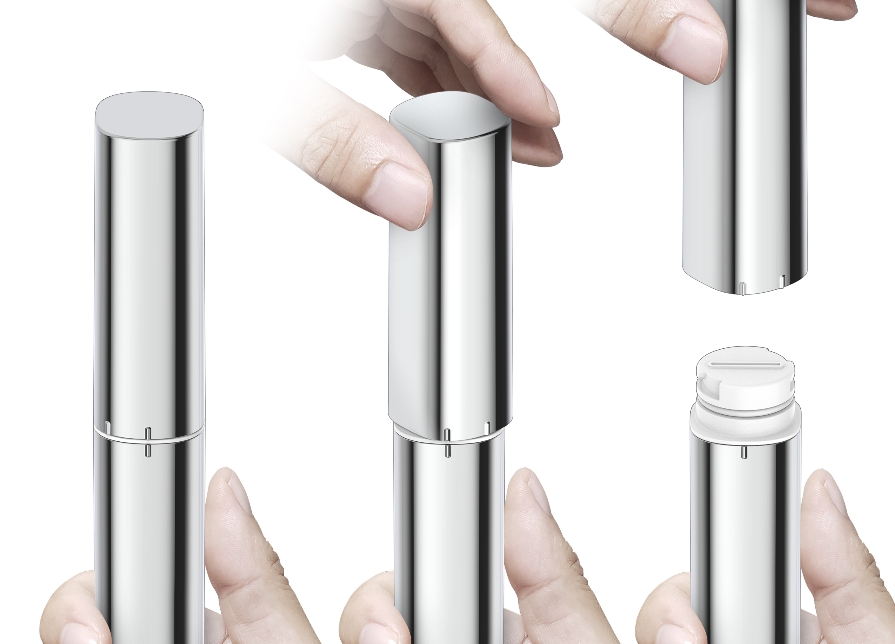
DuoSTiX Hand Shower
American Standard
Singapore
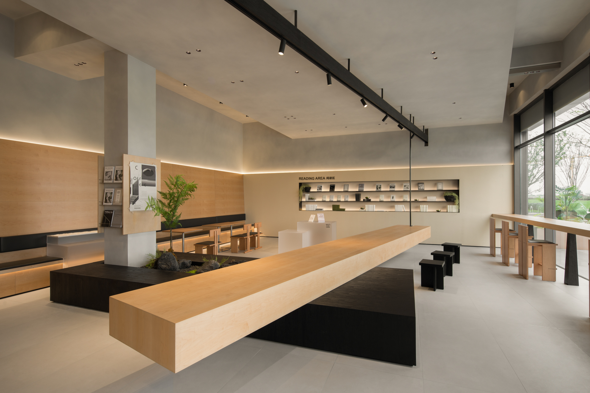
YU SHAN COFFEE BOOKBAR
DAS LAB
China


Partner & Sponsor
More


info@asiadesignprize.com
#14057, 905 49, Beolmal-ro 102beon-gil,
Dongan-gu, Anyang-si, Gyeonggi-do, Korea
#14057, 905 49, Beolmal-ro 102beon-gil,
Dongan-gu, Anyang-si, Gyeonggi-do, Korea
Founder: Doyoung Kim
Business Registration Number: 454-86-01044
Online Sales License No.: 2021-Anyang Dongan-1081
Copyright © DESIGNSORI Co., Ltd.
Business Registration Number: 454-86-01044
Online Sales License No.: 2021-Anyang Dongan-1081
Copyright © DESIGNSORI Co., Ltd.
