EARTHNIQ
Communication
Regions
Japan
Year
2020
Award
WINNER
Client
N2CELL Japan
Affiliation
N2CELL Japan
Designer
Hasegawa Yuri, arlie Jay, kim tae woong
https://youtu.be/KQckGEFZipc
English
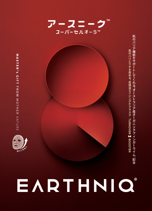
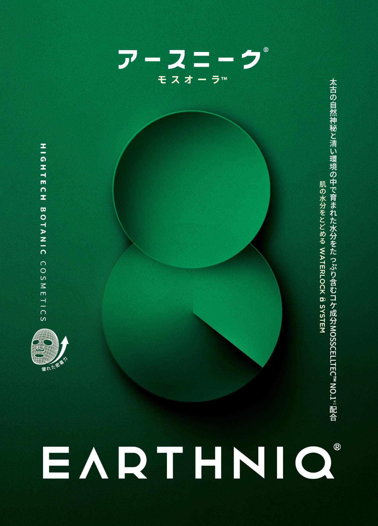
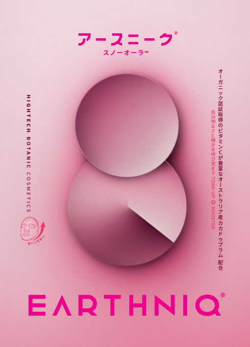
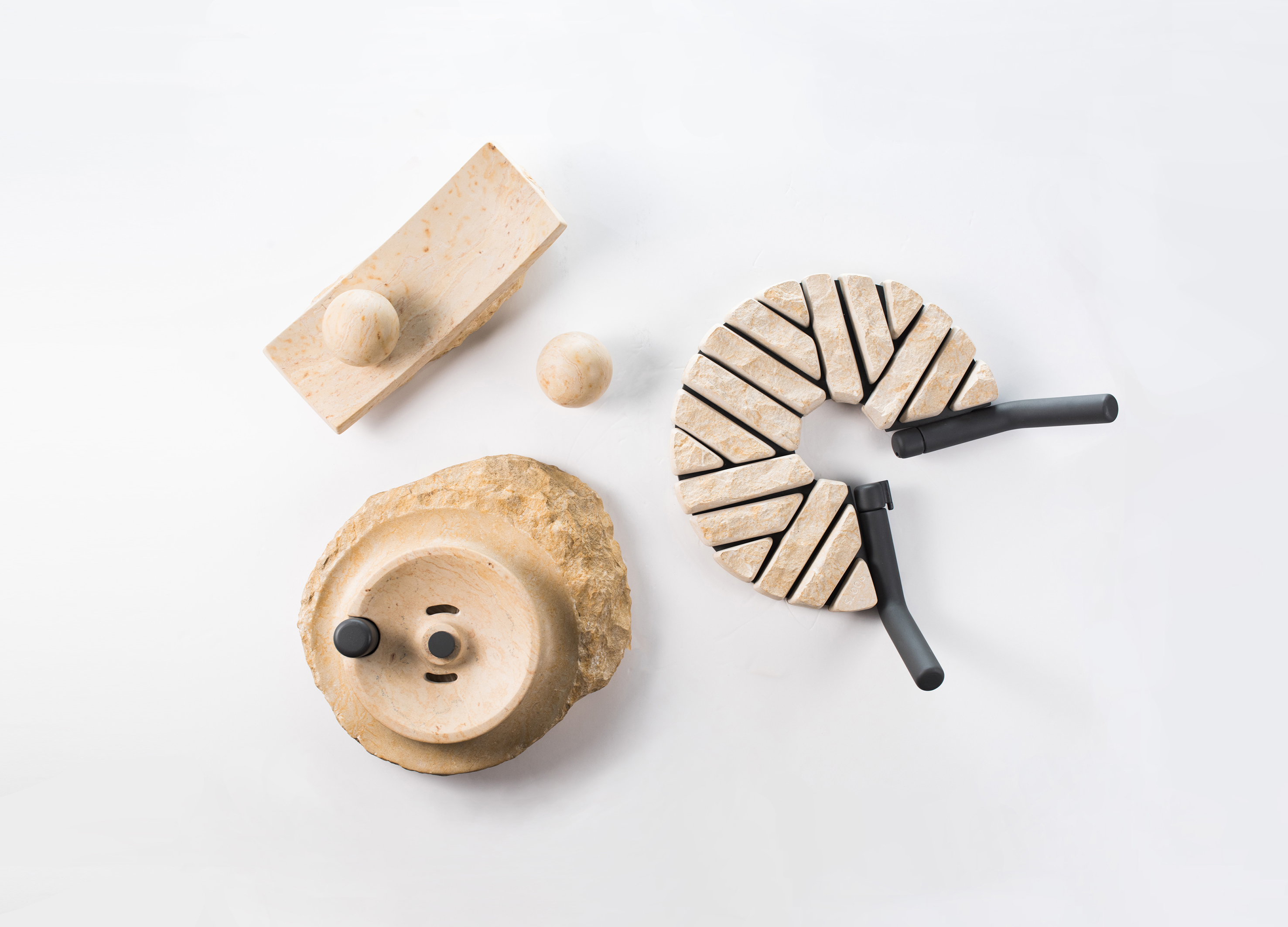
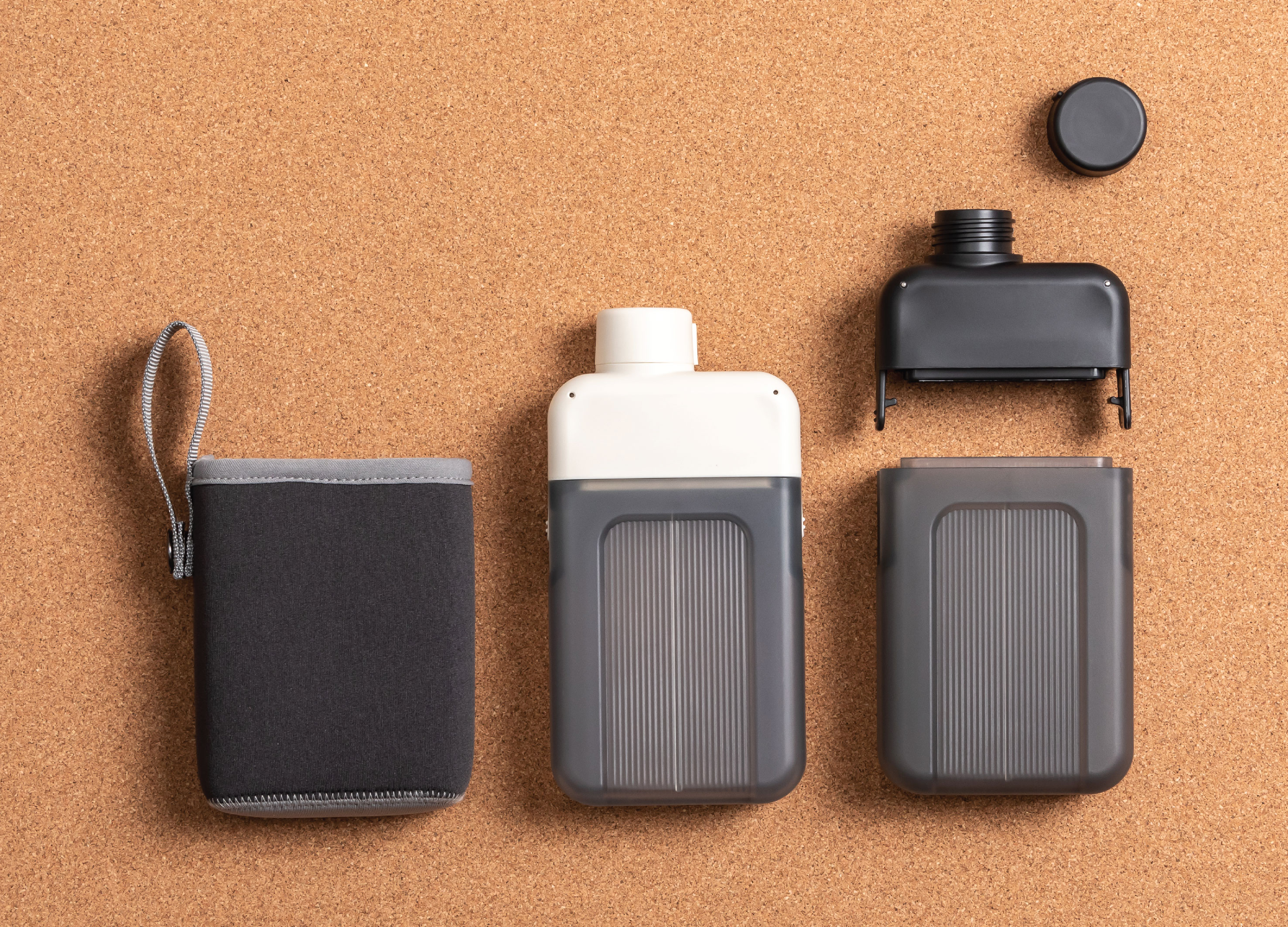
EARTHNIQ's main symbol stands for 'High-Tech Botanic Cosmetics'. The two circular shapes visualize the identity of EARTHNIQ, the first circle is "clean earth" that EARTHNIQ is aiming for, the second circle is technology, botanique and Unique. Based on the story that EARTHNIQ's philosophy of making a clean earth with its own technology by using plant natural ingredients and designed in a sensuous form with a clean mood and a bold form to feel the formative beauty. As a trend toward seeking specialty, the matte surface was designed with unique texture and brand identity that sincerity and agony to complete everything with small detail.
Native
アースニークのメインシンボルは「ハイテクボタニックコスメ」を象徴します。 二つの丸はアースニークのアイデンティティを可視化したもので、一番目の丸はアースニークが目指す「清い地球」を、二番目の丸は技術力(Technique)、植物由来成分(Botanique)、特別さ(Unique)を意味します。 自然と植物由来成分に基づいた独自の技術力で、清い地球を作っていくというアースニークの哲学が盛り込まれているストーリーに着目し、清い感じを感覚的な形で、全体的に大胆な形が造形的な美しさを感じられるようにデザインしました。 また、特別さを追求するトレンドを反映し、独特な質感でマットな表面をデザインしました。このように細かいところまで、すべてを完成する瞬間までに真心と悩みを込めたブランドのアイデンティティが込められています
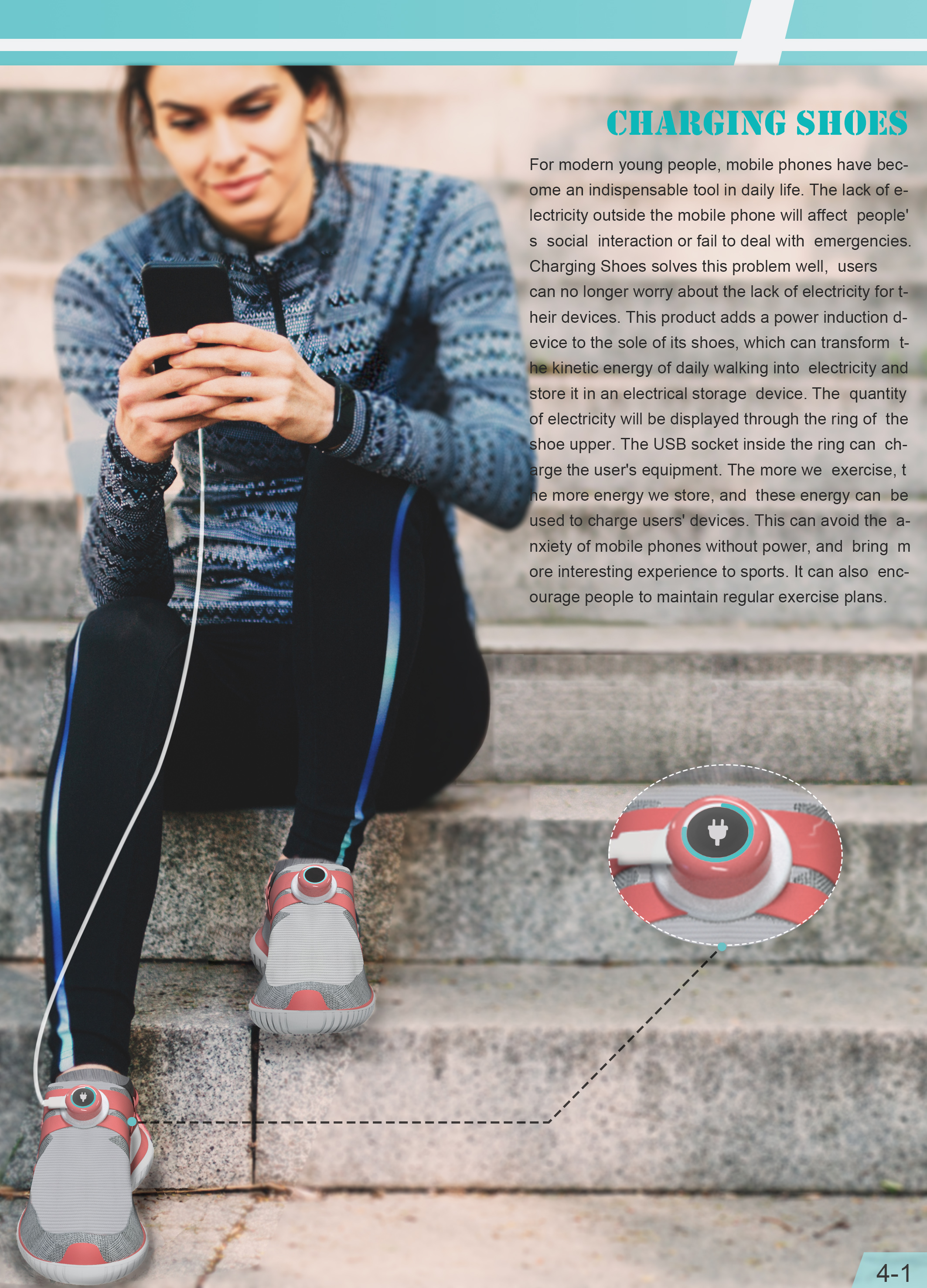
Charging Shoes
Dalian Minzu University
China
Product design
Shenkar College of Engineering and Design
Israel
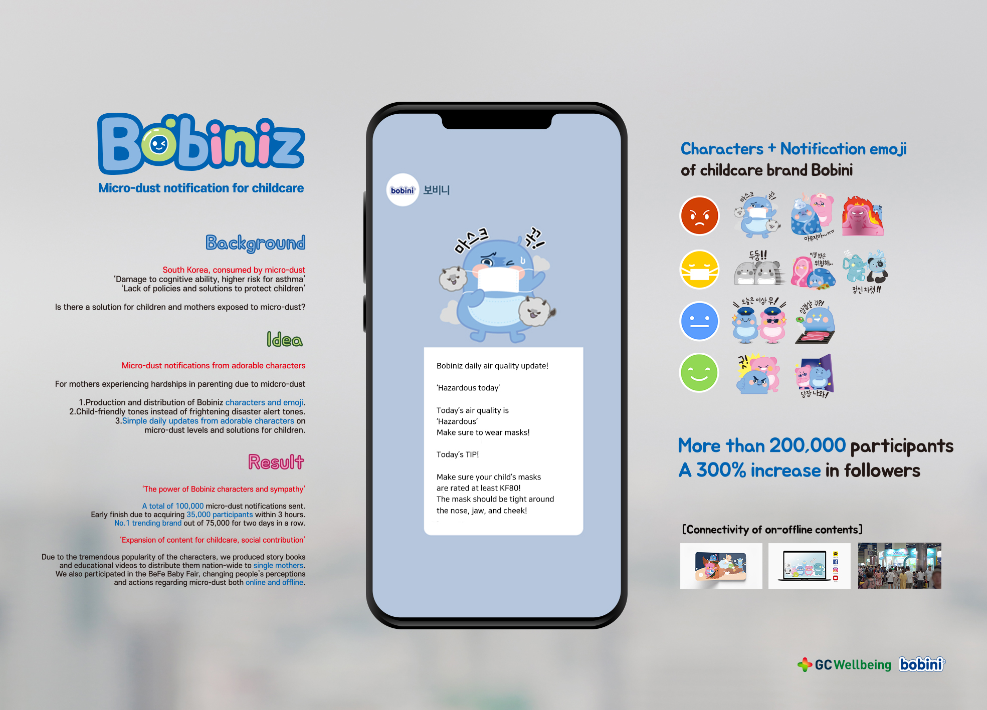
Bobiniz, AQmoji
DIN
Korea
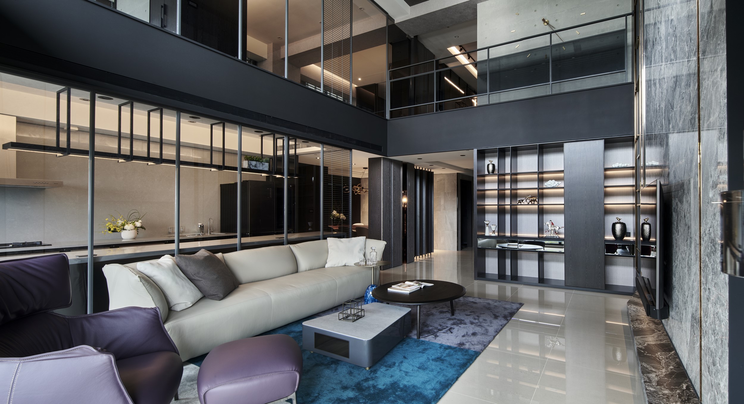
Jialangyuan Sales Center
DAS DESIGN
China
Museum Shop of GMOMA
USD DESIGN GROUP
Korea
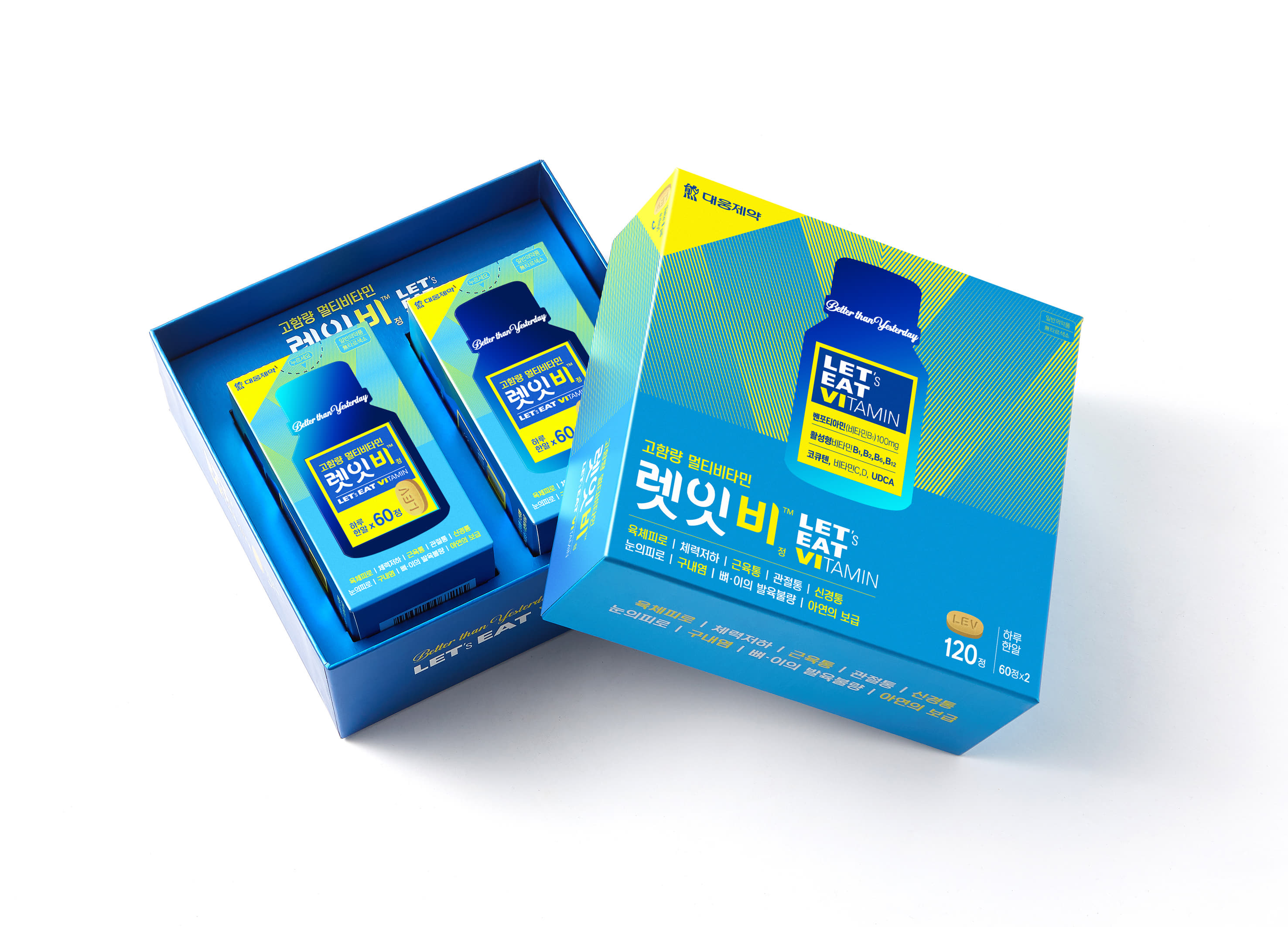
Vitamin Package Design
Daewoong Pharmaceutical
Korea
EARTHNIQ
N2CELL Japan
Japan
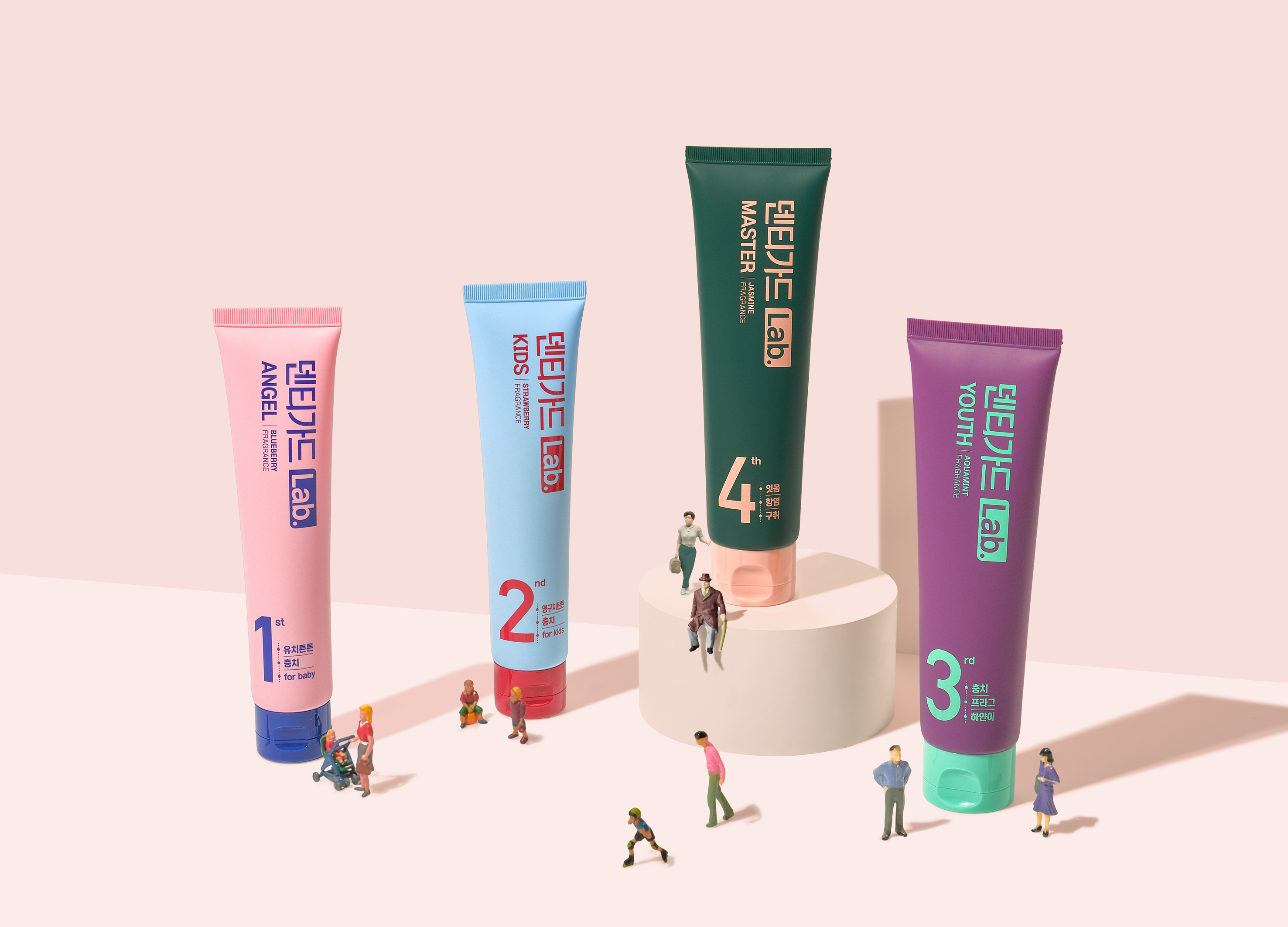
Toothpaste package design
Daewoong pharmaceutical
Korea
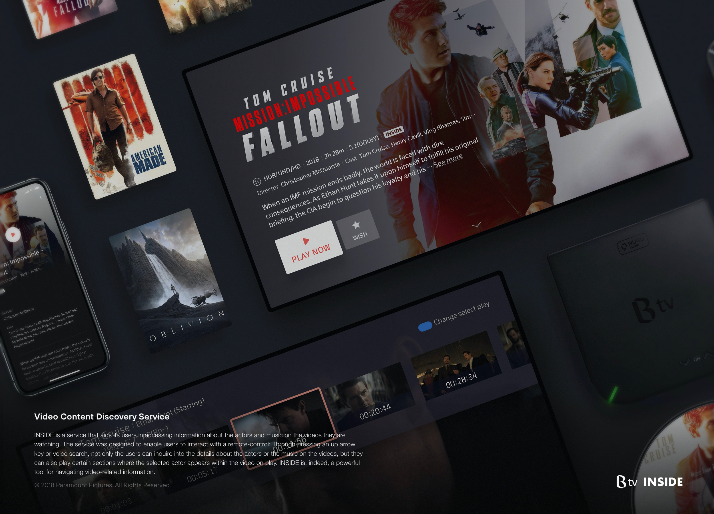
INSIDE
SK broadband
Korea
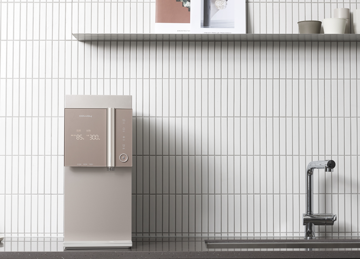
CHP-8300R
COWAY
Korea
FLAT BOTTLE 500ML
SILLYMANN
Korea
Art Movement
YUN CAI
Chinese Taipei
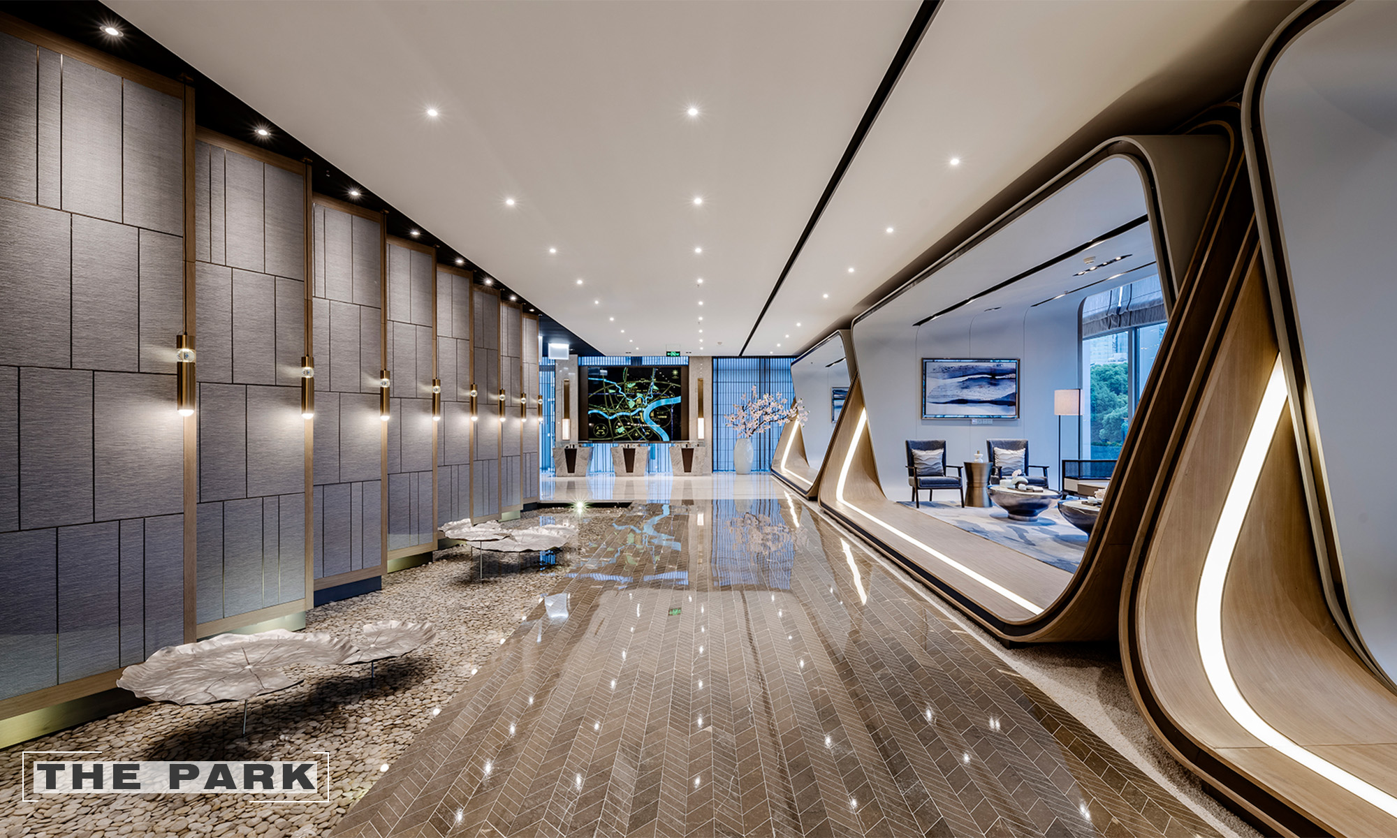
THE PARK
Kris Lin International Design
China
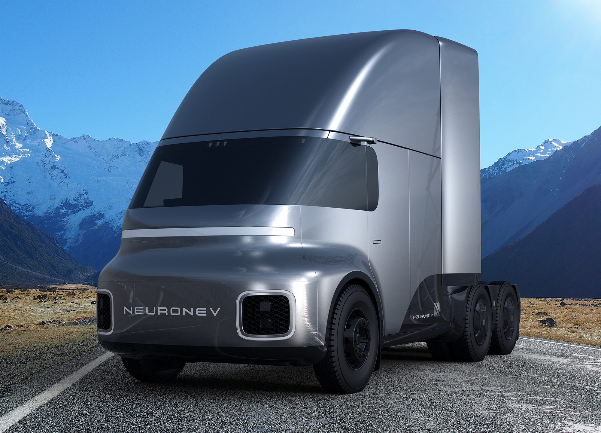
Neuron TORQ
Neuron EV
United States America
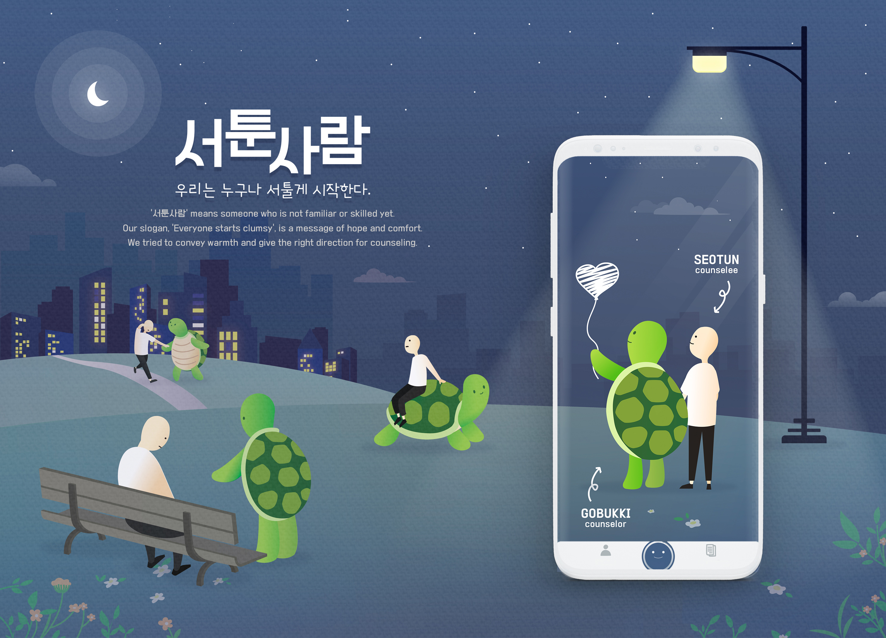
Seotun Saram Brand Identity
Coreintive
Korea
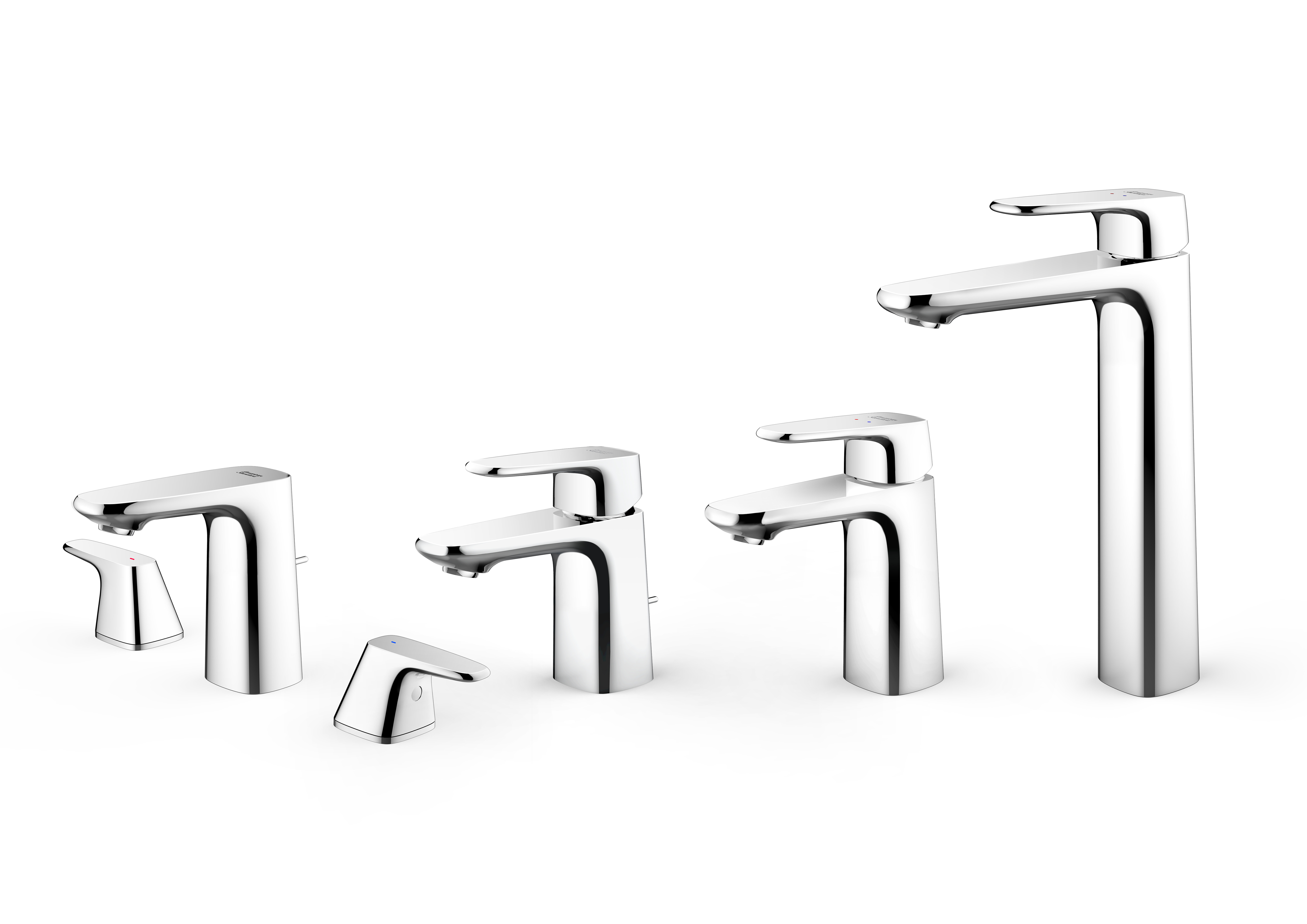
Signature Collection
American Standard
Singapore
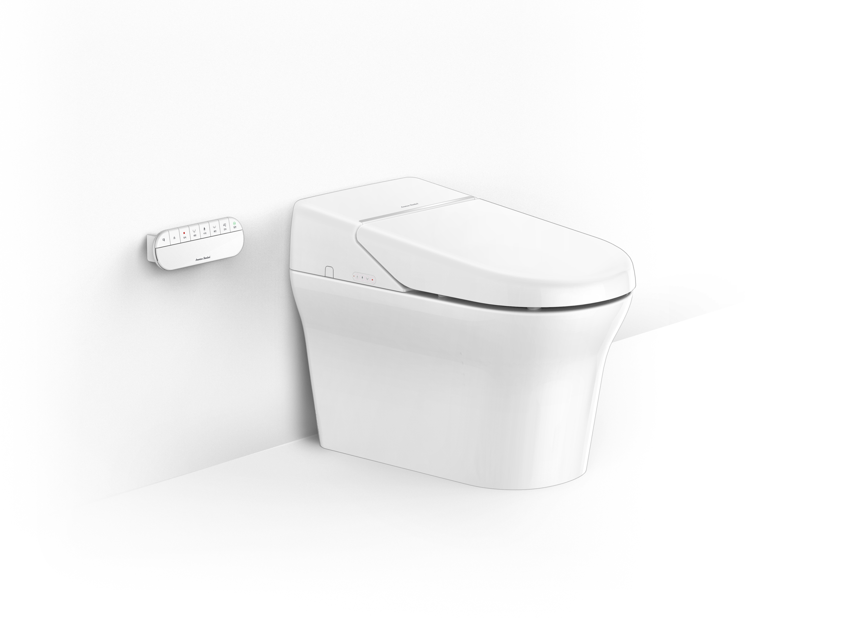
PLAT Natural Shower Toilet
American Standard
Singapore
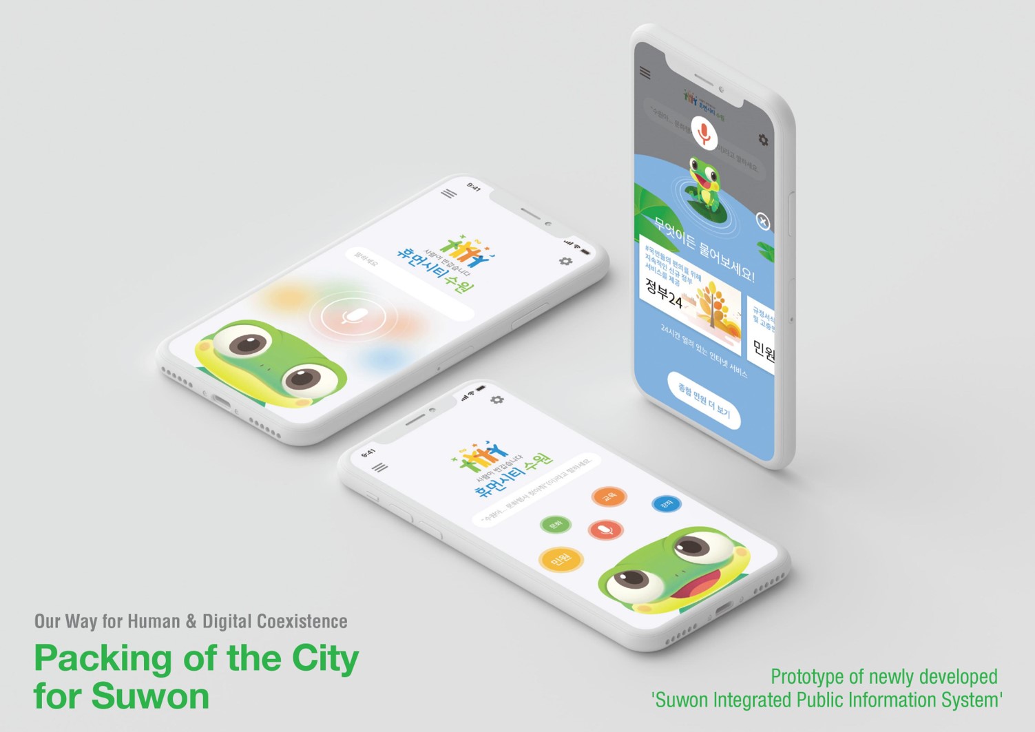
Packing of the city
DANKOOK UNIVERSITY / SW·DESIGN CONVERGENT CENTER
Korea


Partner & Sponsor
More


info@asiadesignprize.com
#14057, 905 49, Beolmal-ro 102beon-gil,
Dongan-gu, Anyang-si, Gyeonggi-do, Korea
#14057, 905 49, Beolmal-ro 102beon-gil,
Dongan-gu, Anyang-si, Gyeonggi-do, Korea
Founder: Doyoung Kim
Business Registration Number: 454-86-01044
Online Sales License No.: 2021-Anyang Dongan-1081
Copyright © DESIGNSORI Co., Ltd.
Business Registration Number: 454-86-01044
Online Sales License No.: 2021-Anyang Dongan-1081
Copyright © DESIGNSORI Co., Ltd.
