Brand advertisement for OGISHI TADASHI SHOTEN
Communication

Area
Japan
Year
2025
Award
WINNER
Client
OGISHI TADASHI SHOTEN Co., Ltd.
Affiliation
M.graphics Co., Ltd.
Designer
FUMIHIRO MORIAI & RICO HONDA
English
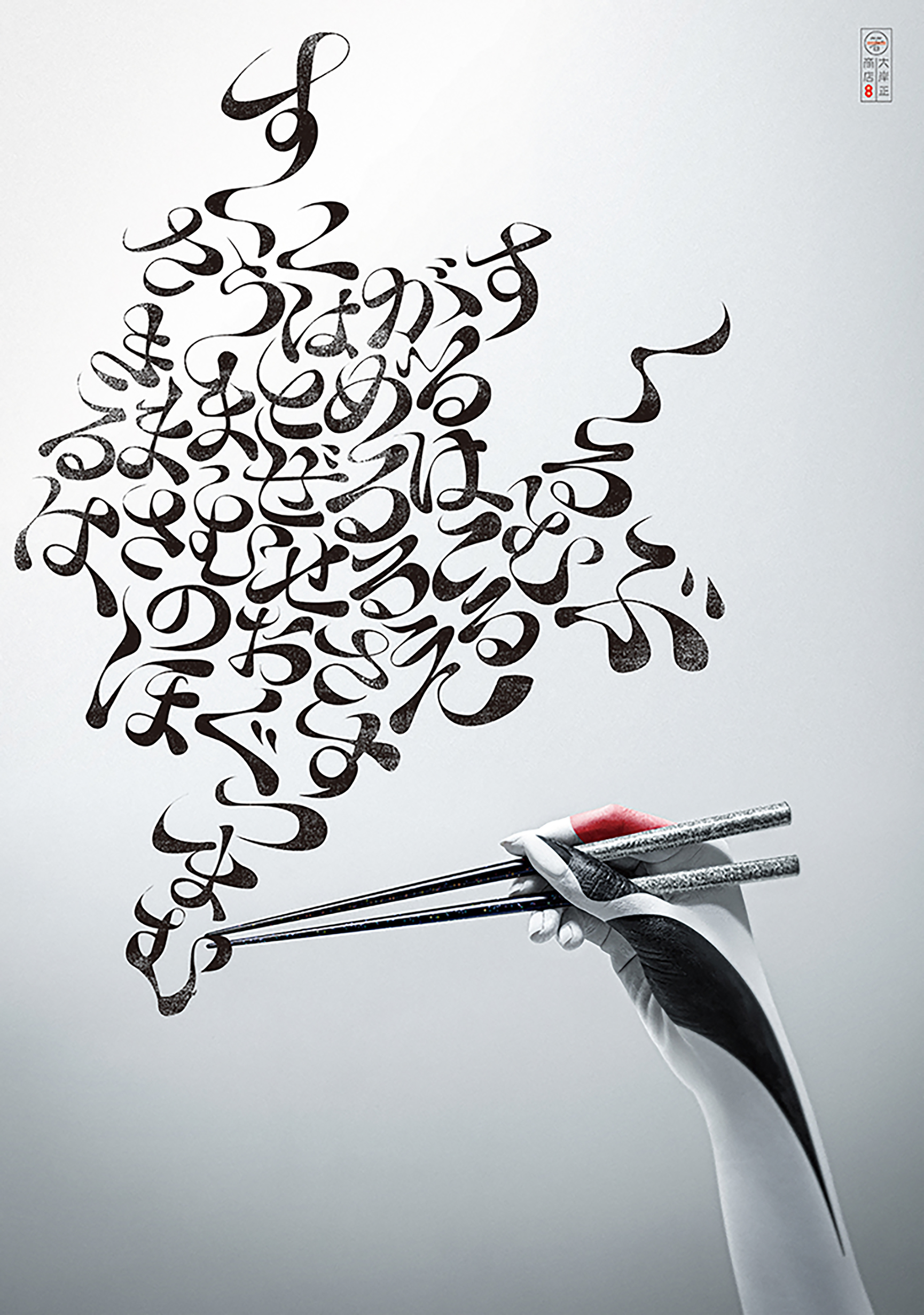
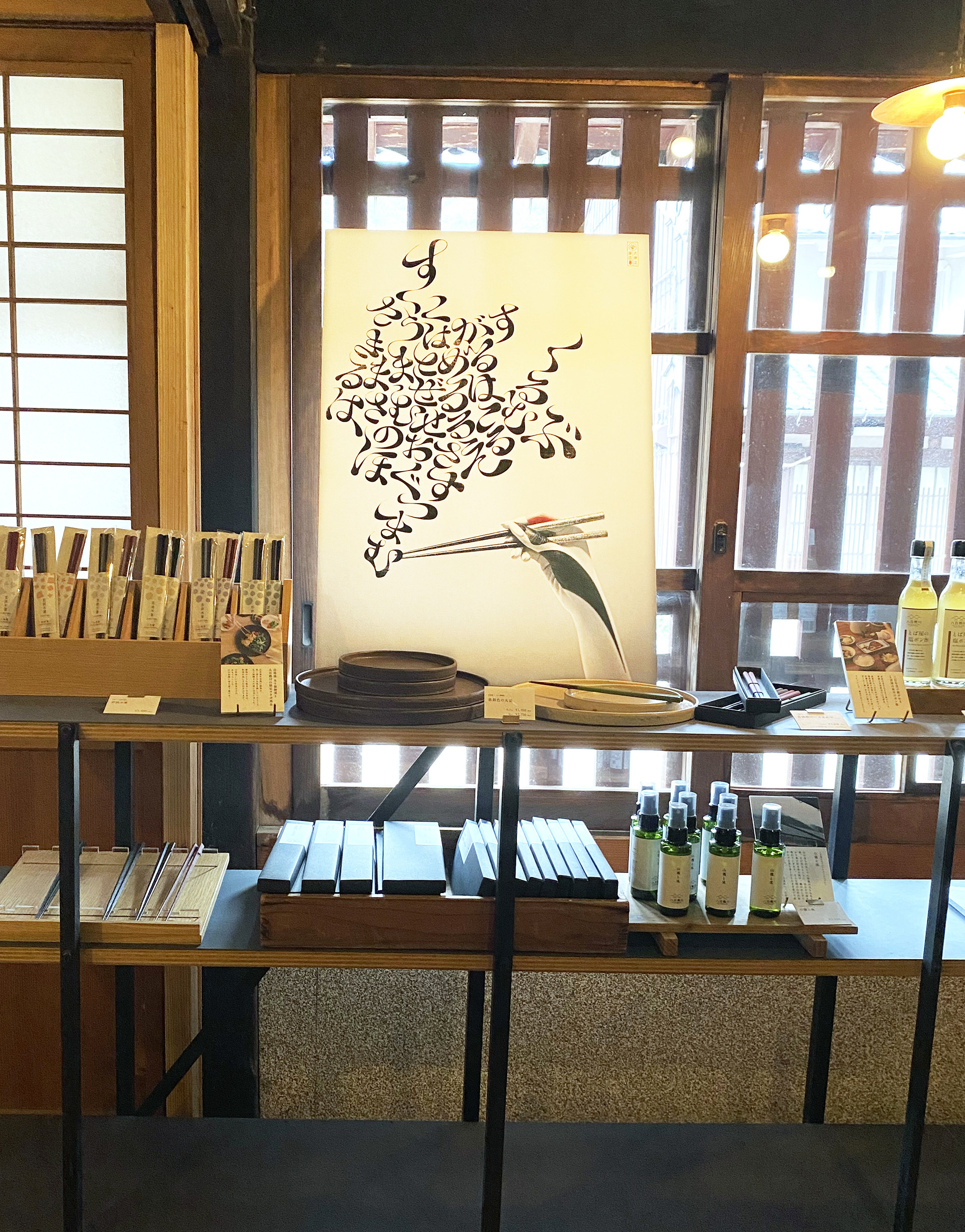
One of the sources of the word chopsticks is the beak of a bird.As the etymology suggests,
chopsticks are cutlery that can be used to handle food with precision,
as if they were an extension of the human body.The gimmick, which is easy to handle
when using chopsticks and looks like a crane's beak, was expressed in Kabuki style makeup.
In addition, typography with chopsticks stuck in it includes words such as "pinch" "mix" " scoop"
These are hiragana characters that represent the nine functions of chopsticks.
Native
箸の語源の一つは、鳥の嘴です。
語源のとおりに、箸は、まるで身体機能の延長のように精緻に食物を扱うことが出来る世界でも珍しい機能的なカトラリーです。
また、鶴は日本を象徴する生き物です。箸を器用に扱う手が、そんな鶴の嘴に見えるように
日本の伝統的な歌舞伎メイクの手法を用いて表現しました。
また、箸がつまんでいる文字は、「つまむ」「混ぜる」「掬う」「挟む」など、箸の9つの機能を表すひらがなです。
伝統的な歌舞伎メイクを用いたアーティスティックな写真と、先進的で、挑戦的なタイポグラフィとのコラボレーションにより、
株式会社大岸正商店の、伝統を守りつつ、常にイノベーションしていくブランドの姿勢を表現しました。
Website
Judging Comments
This chopstick design has been highly acclaimed for its fusion of cultural heritage and functional precision. Inspired by the beak of a bird, it reflects the delicate control and dexterity chopsticks offer, making them an extension of the human body. The Kabuki-inspired aesthetics add a theatrical touch, visually capturing the elegance of movement. Additionally, the typography incorporating chopstick actions—such as "pinch," "mix," and "scoop"—brilliantly conveys their versatility. This innovative approach celebrates tradition while enhancing usability, making it a standout design in both form and function.
Positive Comments


VOYEUR EXHIBITION Uncomfortable Gaze
Sejong University
Korea
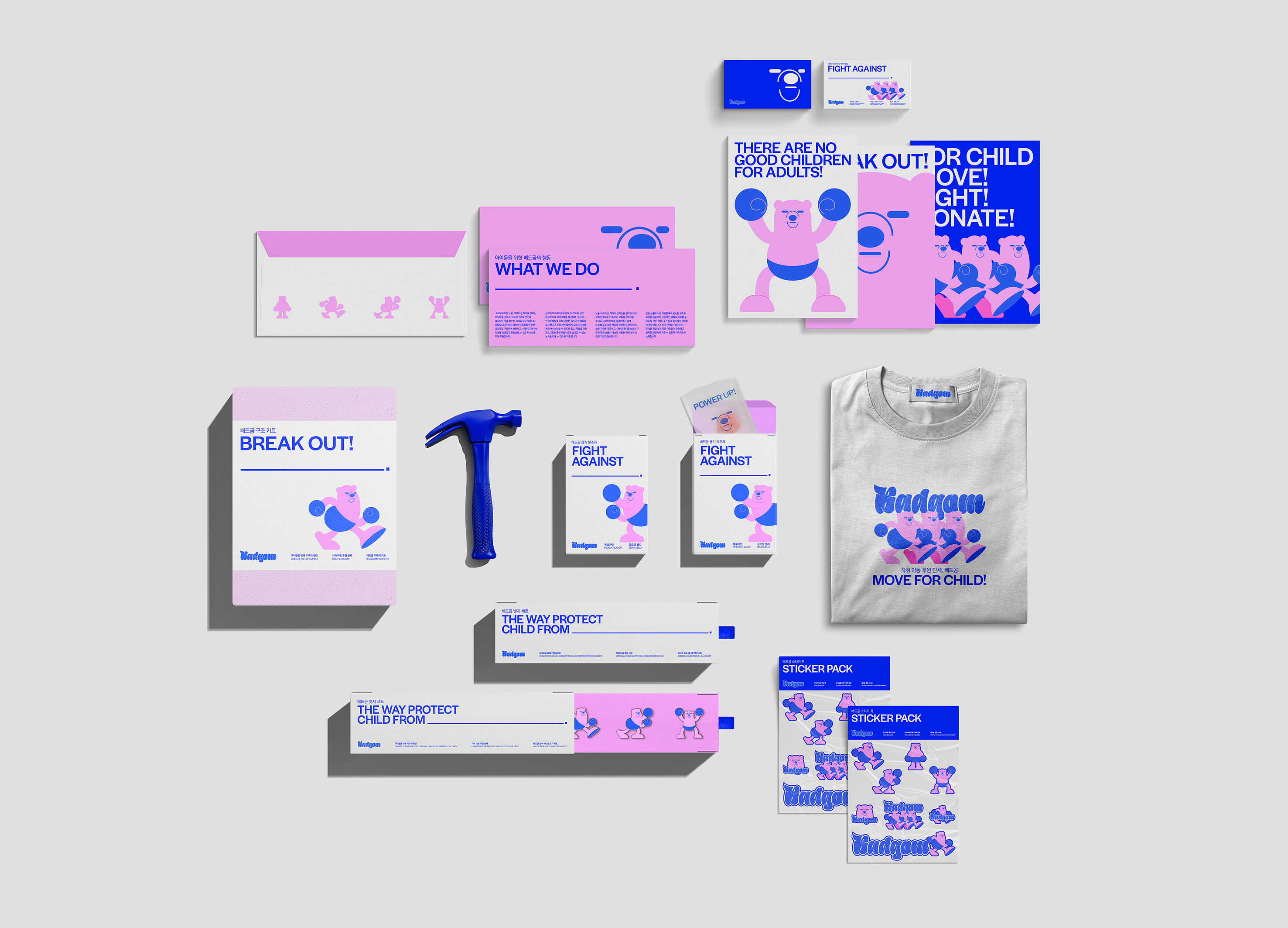
BADGOM Sponsorship Branding
Sejong University
Korea
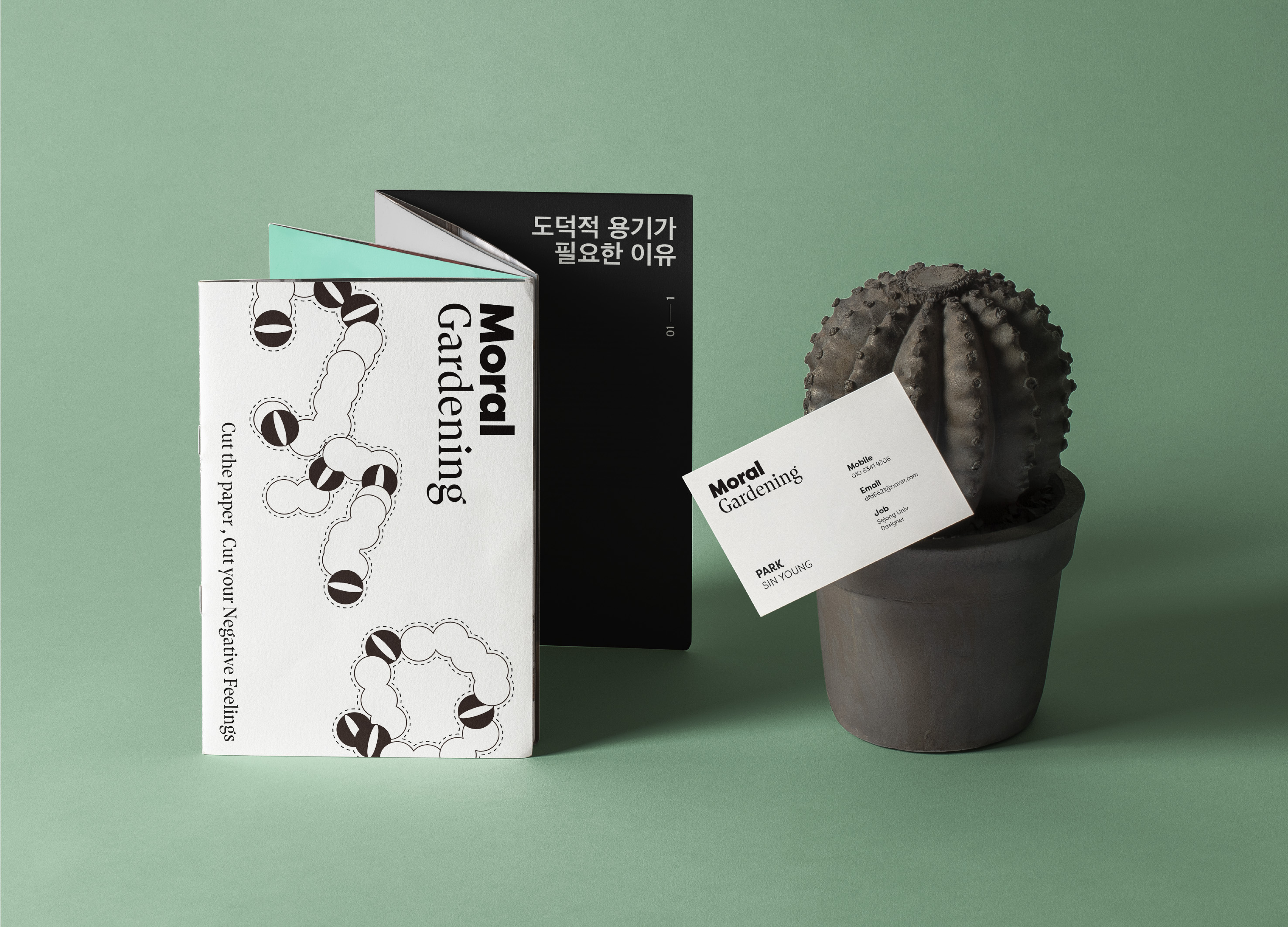
MORAL GARDENING
Sejong University
Korea
Suburb
Samsung Design Membership
Korea
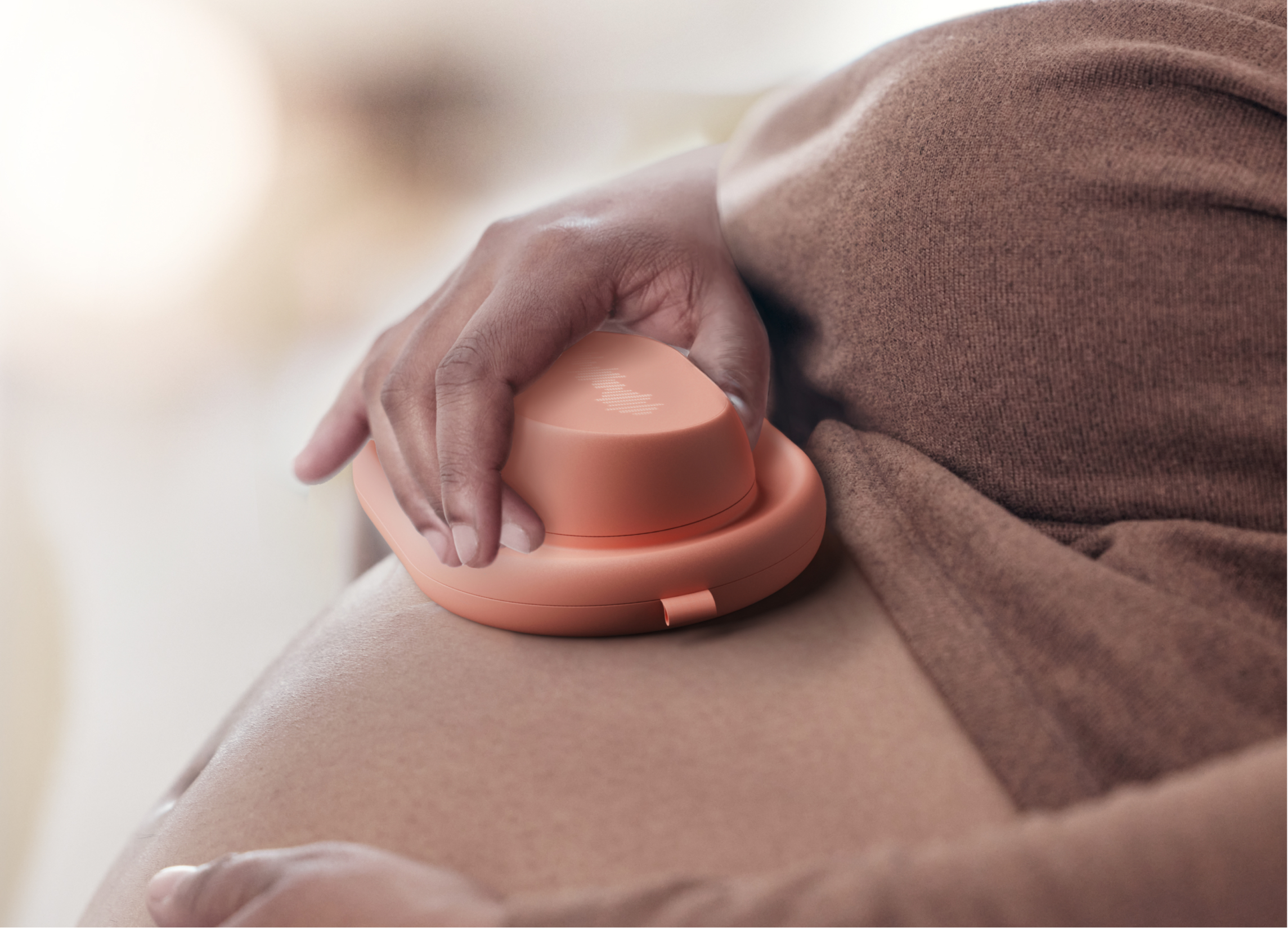
Symbiotic Candlesticks
BNU School of Future Design
China

LEGIT
Hongik university
Korea
Knock Knock
Samsung Design Membership
Korea
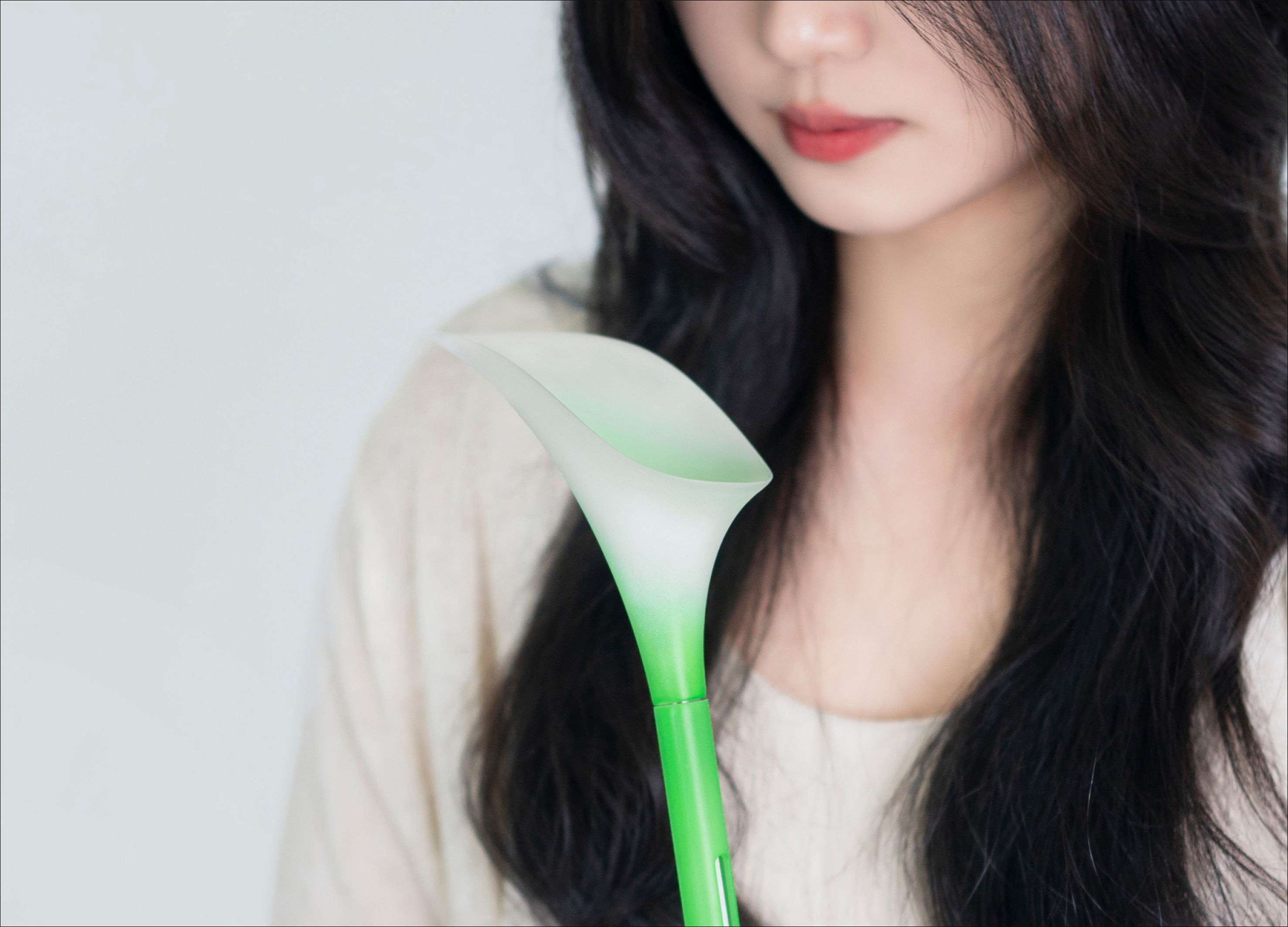
Petrichor
Morecho Design
China
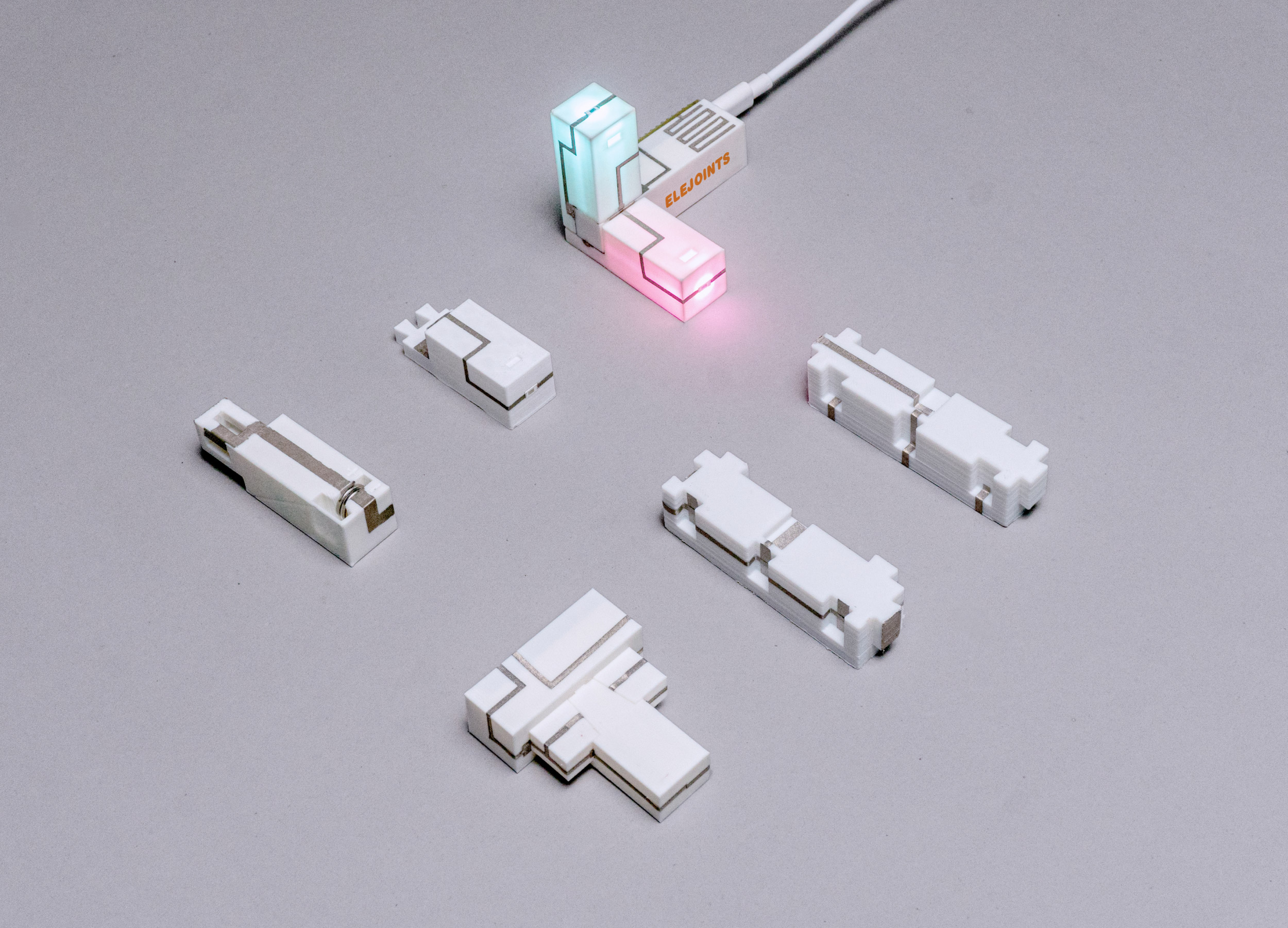
ELEJOINTS Electronic mortise and tenon toys
Zhejiang University
China
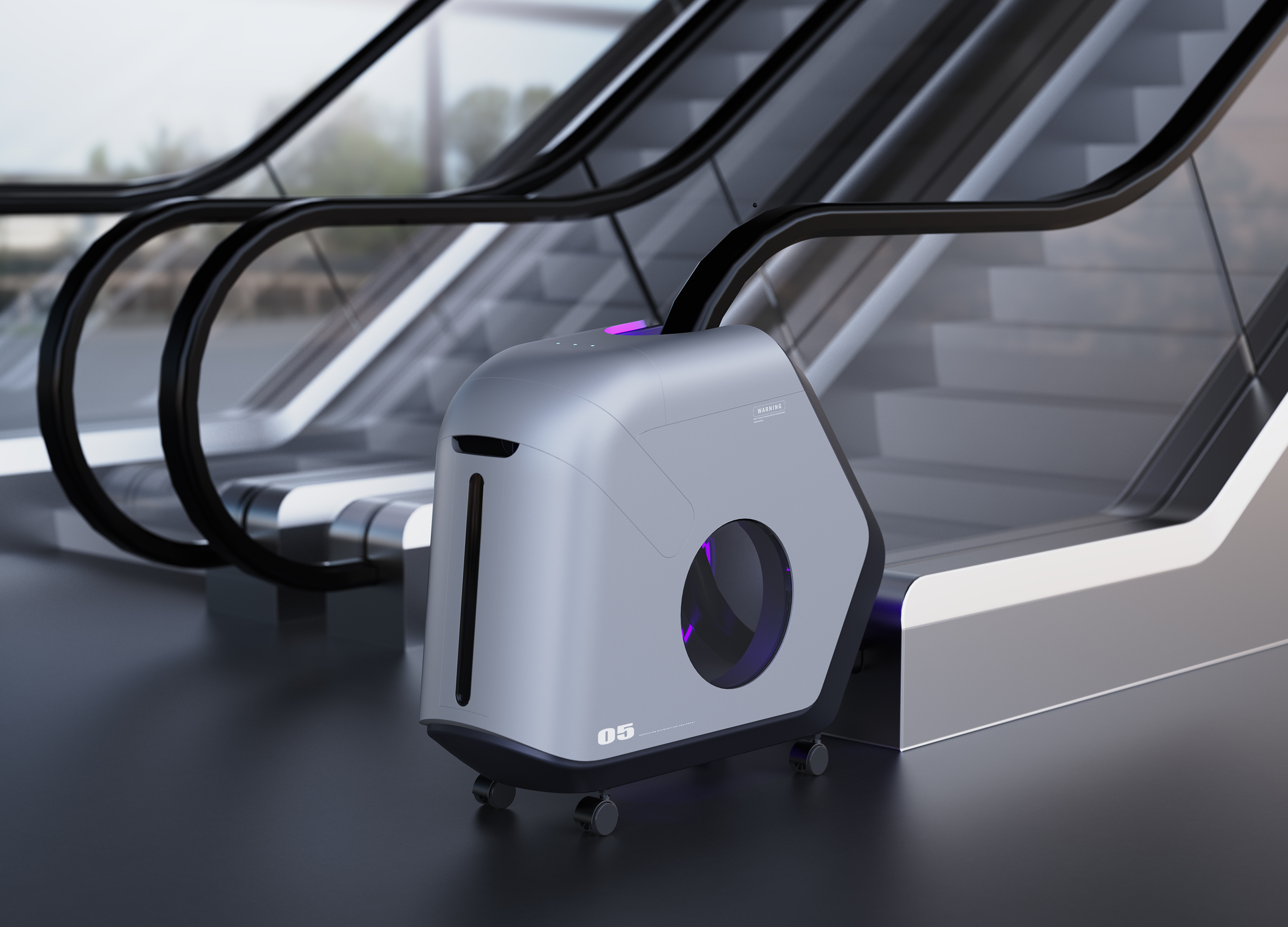
Escalator Sterilizer
Hubei University of Technology
China
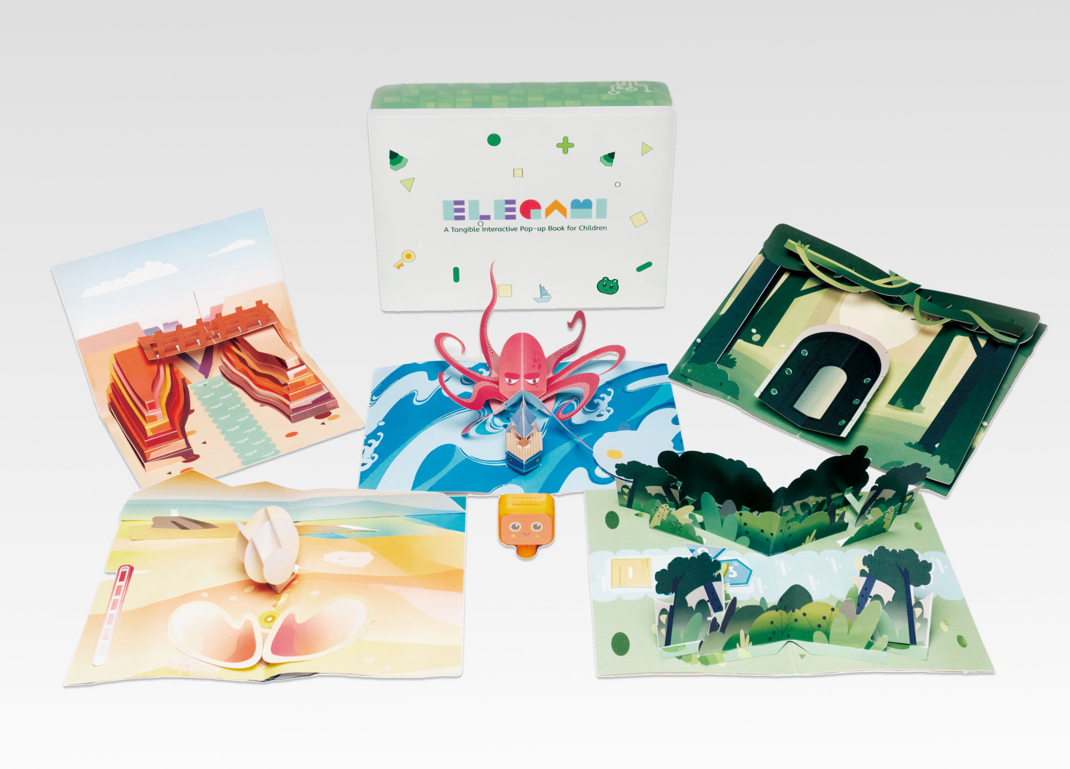
Elegami
Zhejiang University
China
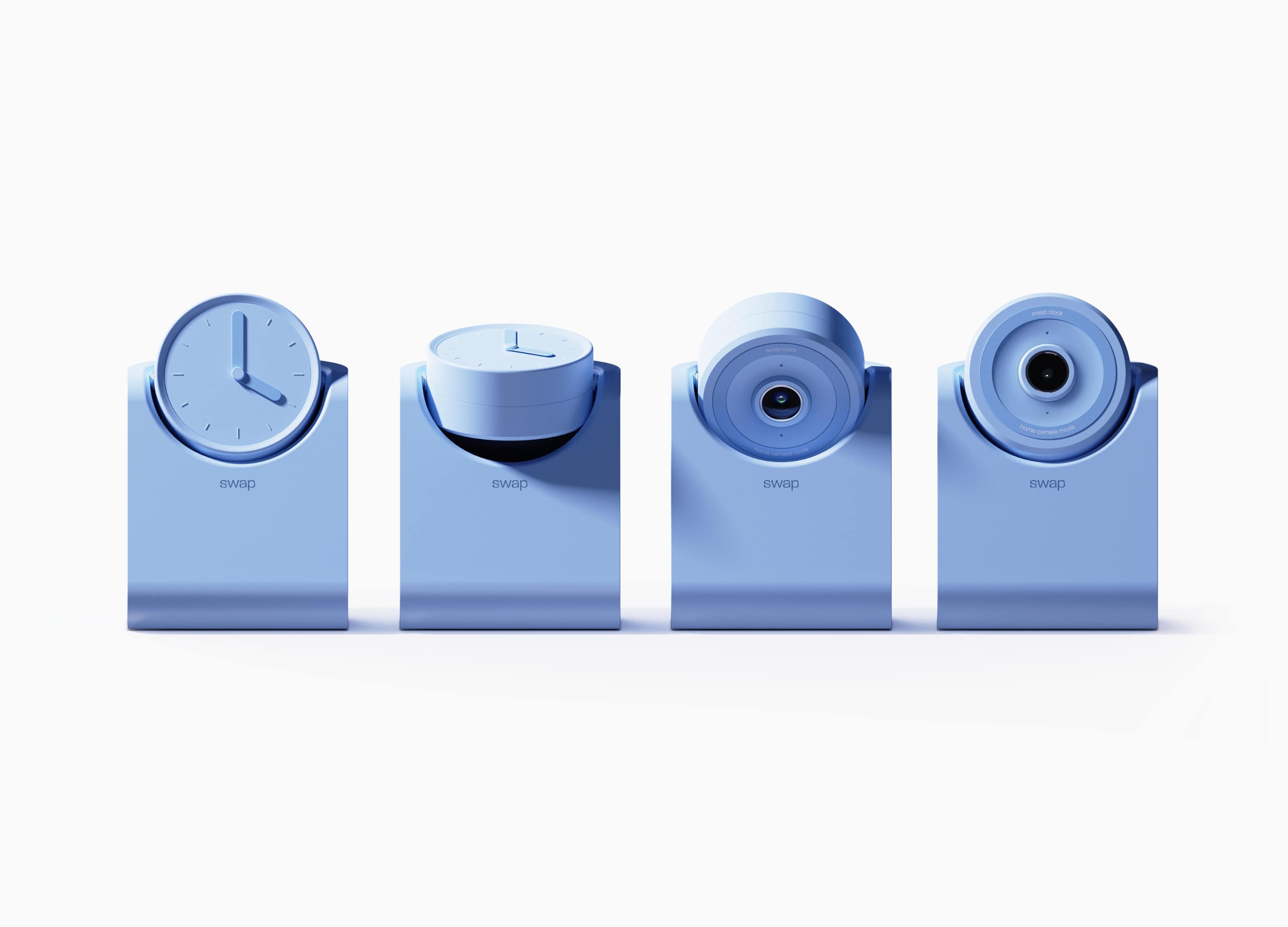
swap
Hongik University
Korea


Partner & Sponsor
More


info@asiadesignprize.com
#14057, 905 49, Beolmal-ro 102beon-gil,
Dongan-gu, Anyang-si, Gyeonggi-do, Korea
#14057, 905 49, Beolmal-ro 102beon-gil,
Dongan-gu, Anyang-si, Gyeonggi-do, Korea
Founder: Doyoung Kim
Business Registration Number: 454-86-01044
Online Sales License No.: 2021-Anyang Dongan-1081
Copyright © DESIGNSORI Co., Ltd.
Business Registration Number: 454-86-01044
Online Sales License No.: 2021-Anyang Dongan-1081
Copyright © DESIGNSORI Co., Ltd.
