When you think of Heinz, you probably picture the iconic red ketchup. But Heinz is more than a ketchup brand. With limited releases like a vegan mayo and “Barbiecue” sauce celebrating Barbie’s 64th anniversary, the company has shown a sharp feel for culture, timing, and wit. In a recent Heinz project, our internal creative team dug into the interplay between color, taste, and the unconscious choices that drive purchase. The takeaway was clear, in branding, color exerts outsized influence. Research on human perception is straightforward, vision accounts for roughly 70% of how we take in the world, hearing 20%, and smell, touch, taste the remaining 10%. Within vision, more than half of what we register is color. That means over 35% of our everyday decisions are shaped, directly or indirectly, by color.
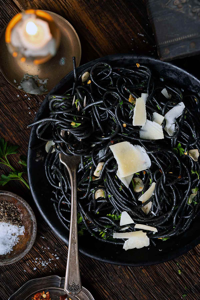
People often say first impressions form within three seconds. In that window, visual information can approach 99% of the judgment being made. Color, in other words, quietly governs many of life’s decisive moments. Food makes this even more visible. Imagine two identical fried chicken dishes: one tossed in a vivid red glaze, the other in a jet-black sauce. Most of us will reach for the red without hesitation. Evolutionary neurobiology and cognitive psychology help explain why: black in food can signal spoilage or toxins, prompting instinctive avoidance. A decade ago, green and black were widely avoided in food packaging. Green suggested moss or mold; black suggested rot or poison. Anything that dampens appetite depresses sales—an outcome brands will not accept. But design codes evolve. As organic products rose, green was recontextualized as the language of health and diet. Black, when used with intention, began to telegraph premium quality and rigor within certain brand identities.

<Image source: foodandwine>
Equally interesting: dissonance can be retrained. As dishes like squid-ink pasta and black garlic went mainstream, what once triggered aversion converted into curiosity and even desire. For this Heinz project, we chose to lead with warm colors. Our target in the new category is clear: energize existing Heinz fans and attract competitor users—an intentional strategy of customer poaching. Competitive audits revealed obvious weaknesses in their color systems. We set out to occupy that gap with packaging that cues appetite at a glance. There is sound science behind impulse. Neuromarketing studies show reds and oranges stimulate the limbic system, elevating dopamine and priming immediate want. In food, reds are also associated with increased secretion of ghrelin, the appetite hormone, nudging a physiological response alongside an emotional one.
<Image source: www.aqomi.com>
Consumer behavior work at MIT has likewise quantified how packaging color shapes purchase. Food packs using warm hues showed an average 23% higher impulse-buy rate than those using cool hues, and shelf “dwell time” increased by a factor of 1.7. Our objective is simple: when a shopper arrives intending to buy a rival product, the Heinz visual should be compelling enough to reroute the hand, in that moment, to our pack. That is not wishful thinking; it applies a mechanism that is well documented in neuroscience. Happily, the product fundamentals deliver. In our own testing, taste exceeded expectations. When initial interest sparked by visual cues flows into a gratifying product experience, true brand loyalty forms.
Applying color psychology in branding is not a cosmetic choice. It is a strategic intervention in the consumer’s unconscious and a core lever for market positioning. Strong branding emerges where analytical rigor meets creative instinct. Through this Heinz project, we aim to demonstrate again that color is not merely a tool for making things look beautiful. It is a business instrument that acts directly on the brain, converting attention into appetite and appetite into action.

Creative Director Yena Choi
Founder of B for Brand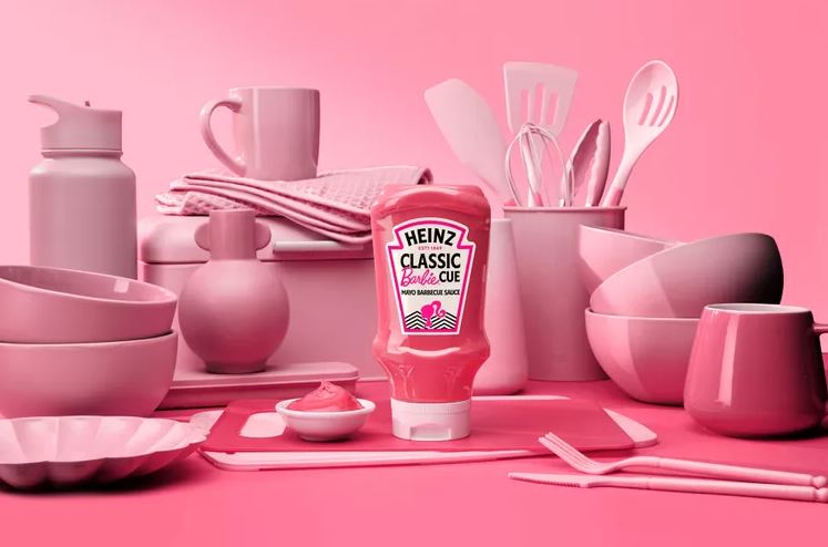


#14057, 905 49, Beolmal-ro 102beon-gil,
Dongan-gu, Anyang-si, Gyeonggi-do, Korea
Business Registration Number: 454-86-01044
Online Sales License No.: 2021-Anyang Dongan-1081
Copyright © DESIGNSORI Co., Ltd.
