SIMPLICITEA
Communication
Regions
Chinese Taipei
Year
2025
Award
WINNER
Affiliation
Cool Mai Design
Designer
Patrick Cheng, Clyde Lai
English
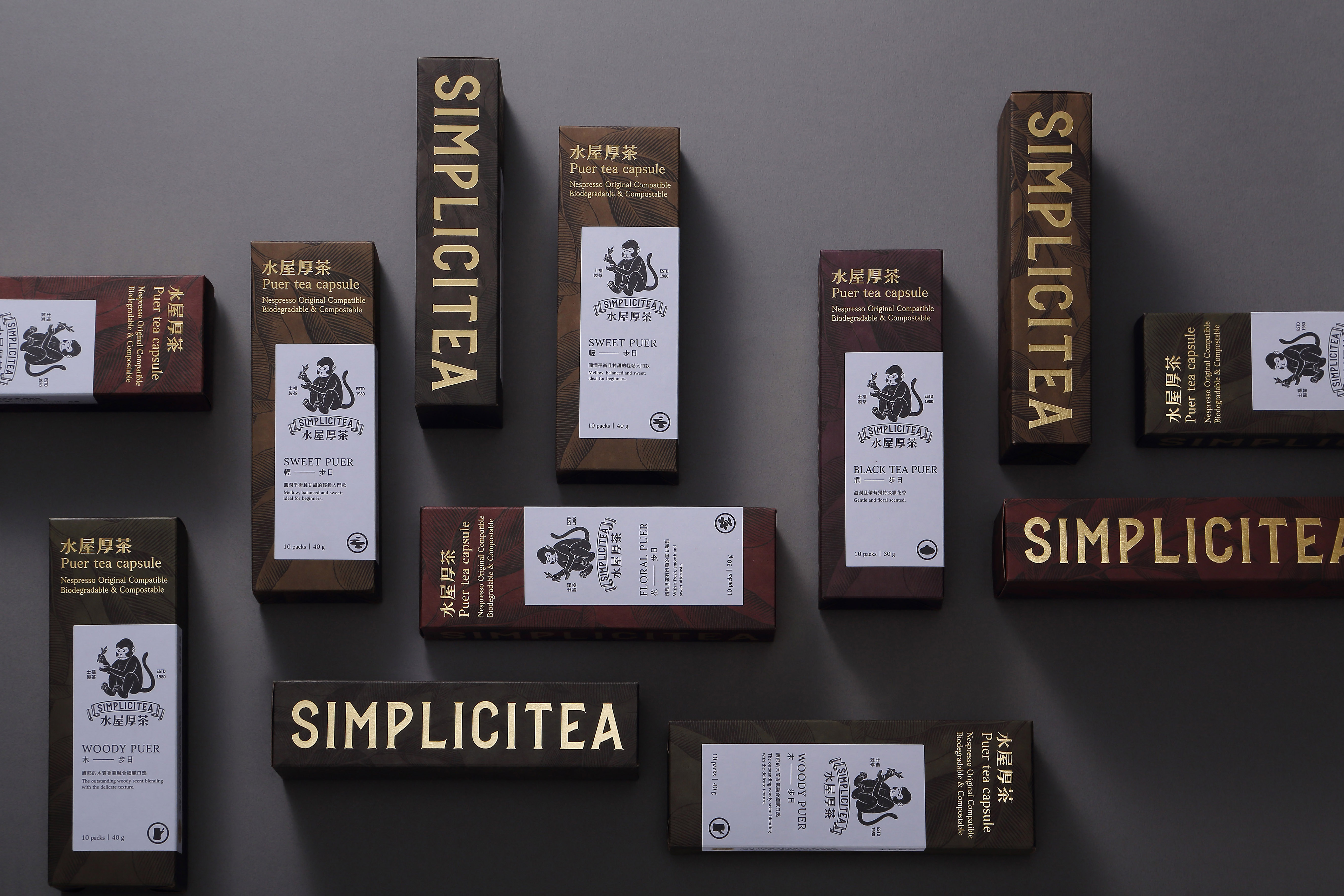
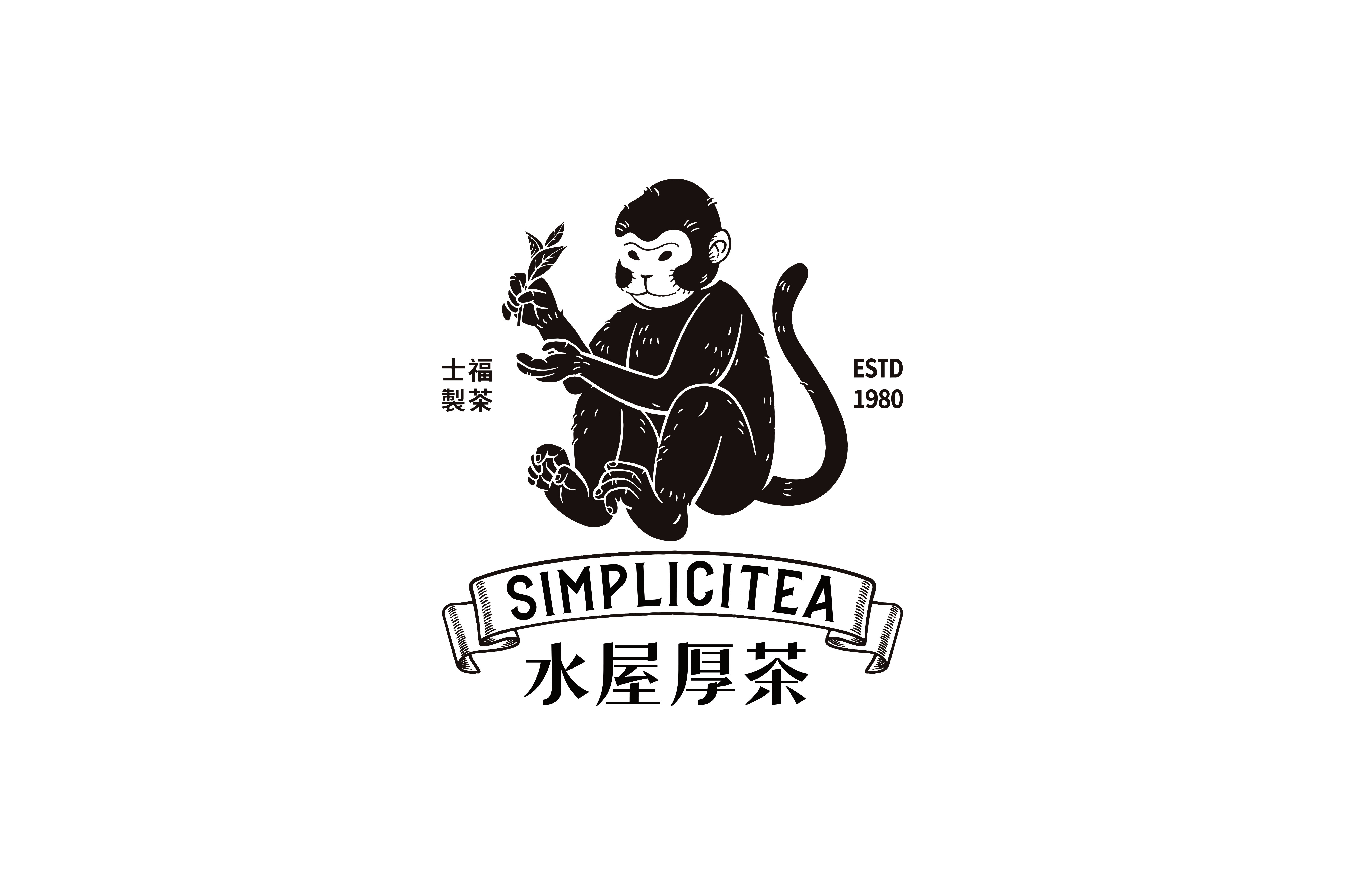
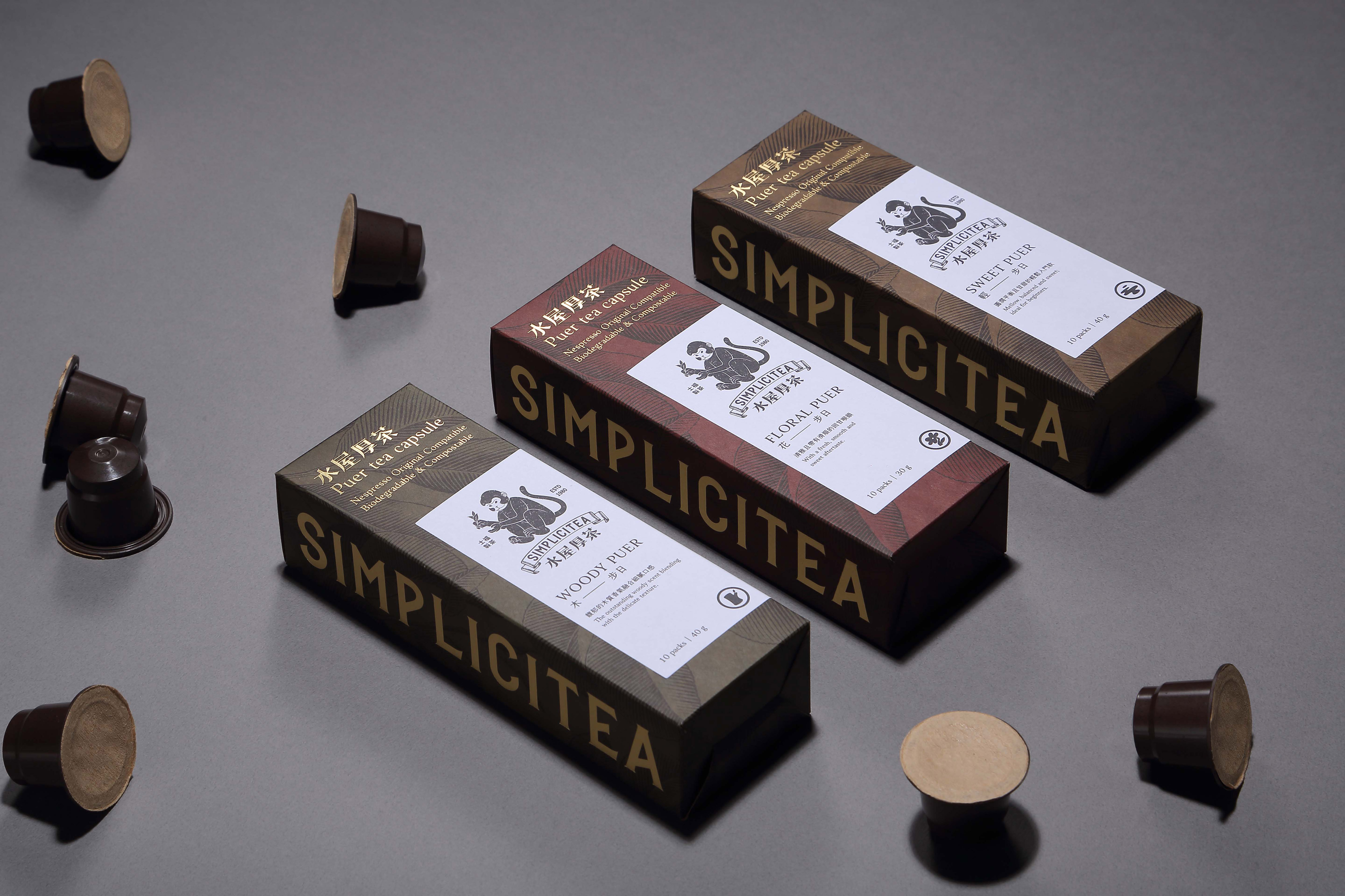
We believe "less is more." There’s no need for excessive packaging design to meet the requirements. By using different colors to represent flavors, we make it easy for both owners and consumers to identify the products they need. For the owner, simple packaging doesn't require a large budget to produce; for the consumer, it prevents unnecessary waste when taking the product home. Kraft paper is printed in five colors to distinguish flavors, with a Pu-erh tea tree totem as the background, gold foil for the brand name, and embossed paper stickers for added texture. The overall style reflects cultural depth and tea-drinking history.
Judging Comments
The design follows the "less is more" philosophy, using minimalistic packaging to meet requirements without excess. Different colors represent flavors, making it easy for both owners and consumers to identify products. Kraft paper, printed in five colors, distinguishes flavors, while the Pu-erh tea tree totem, gold foil branding, and embossed stickers add texture and cultural depth. This simple yet thoughtful packaging reduces waste and reflects the rich history of tea drinking.
Positive Comments


CLUB EFETE GATE DESIGN
HL D&I Halla & DESIGN GRU A&I Corp.
Korea
Shenyang Shengjing Longcheng Renovation
East China Architecture Design & Research Institute Co., Ltd.
China
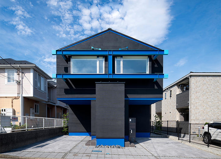
SKY MISSION series YOKOHAMA TSUZUKI HOUSE
PRINCIPAL HOME Co., Ltd.
Japan
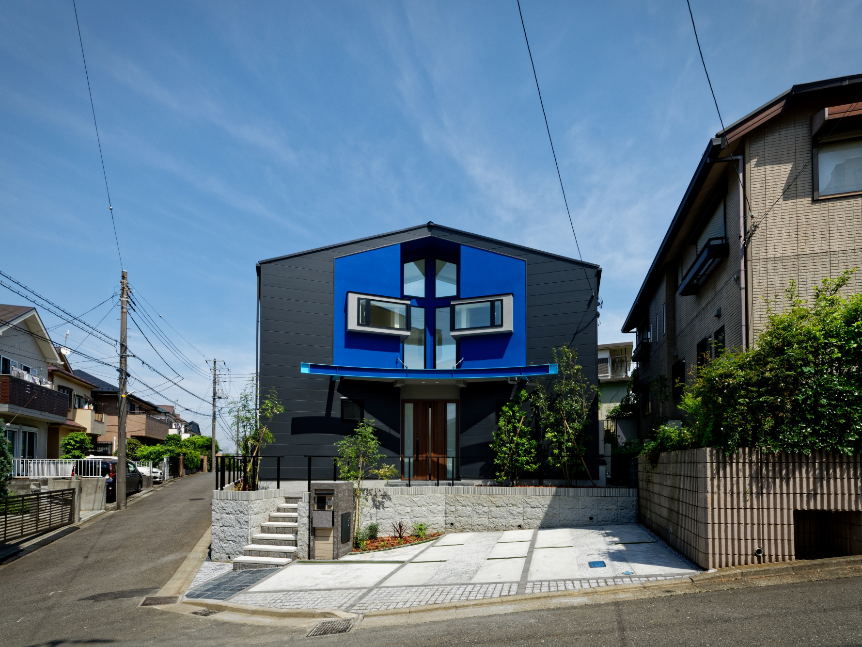
SKY MISSION series YOKOHAMA AOBA HOUSE
PRINCIPAL HOME Co., Ltd.
Japan
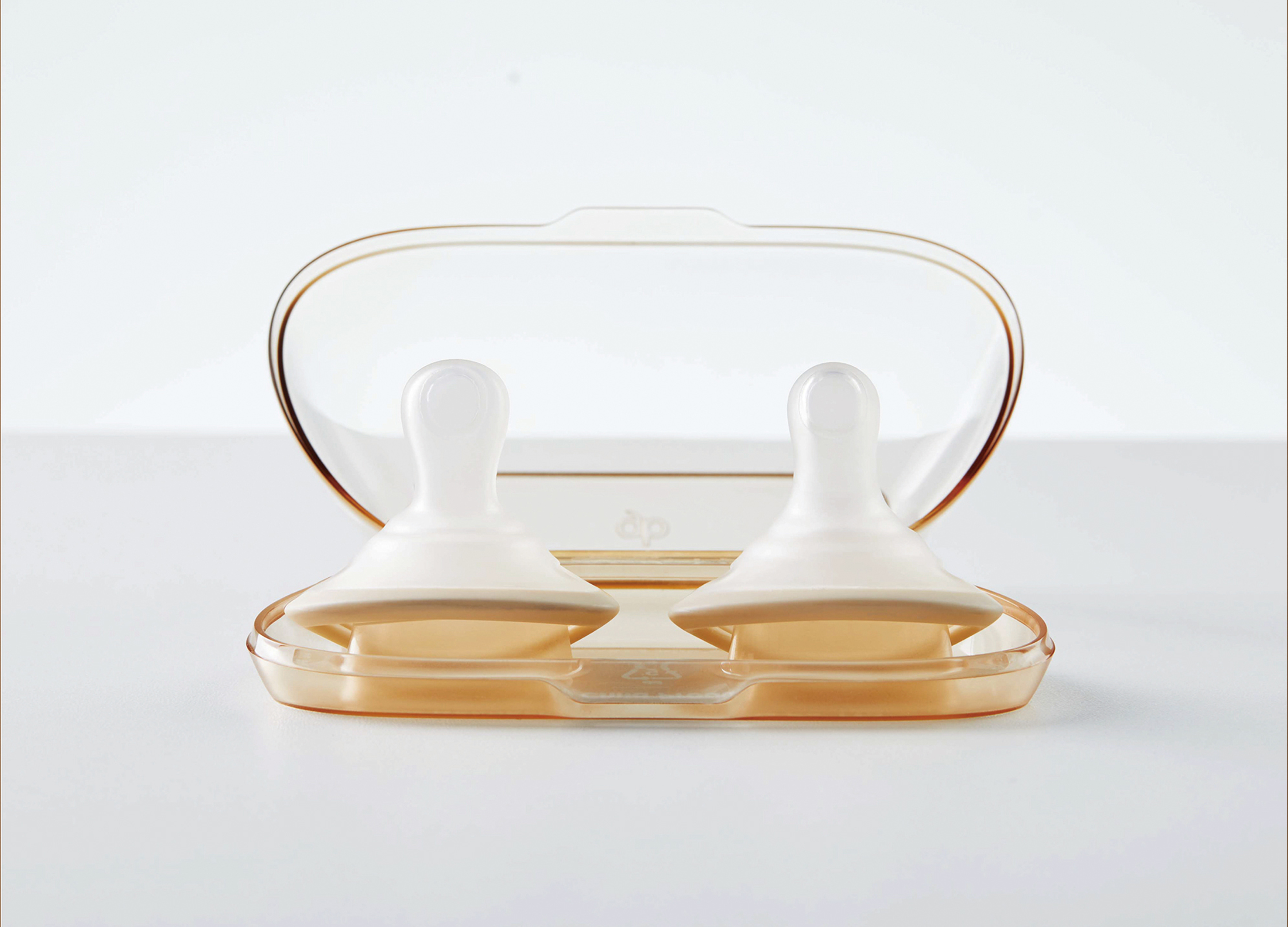
Ultra Light Pacifier
Goodbaby Child Products Co., Ltd.
China
Wave Whisper
Powerlong Real Estate Holdings Limited Co., Ltd.
China
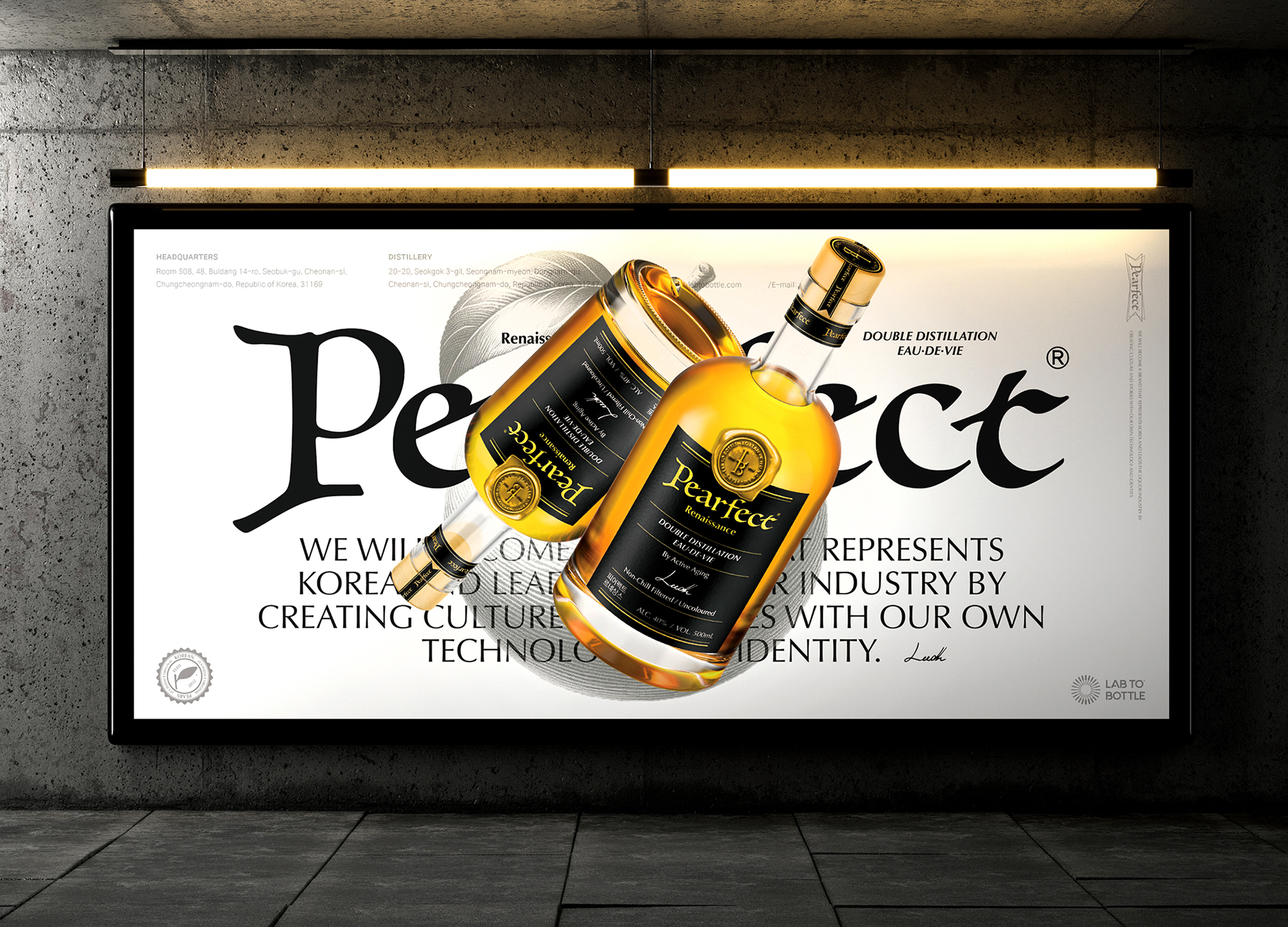
Pearfect
Design Astrein & Lab to Bottle Corp.
Korea
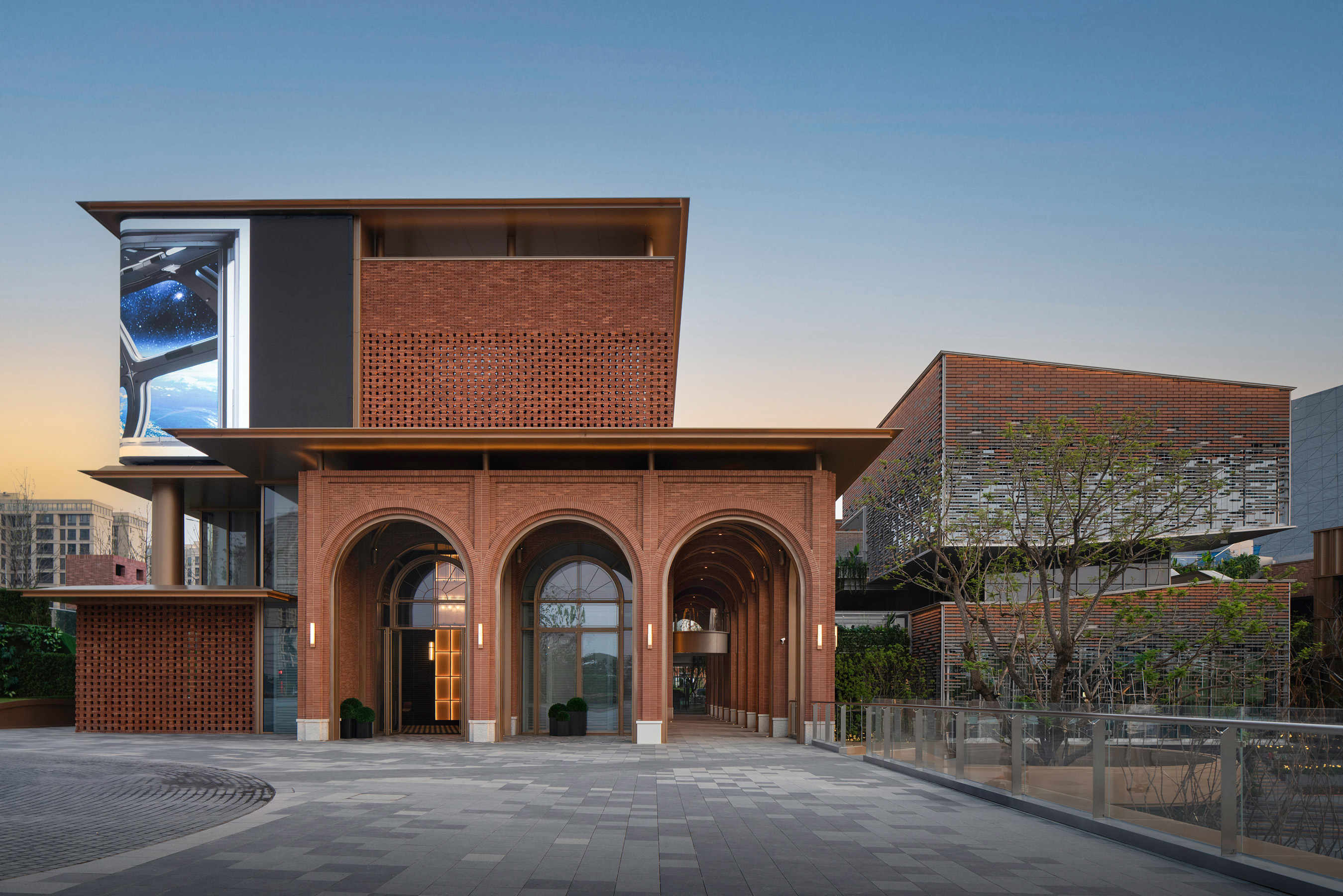
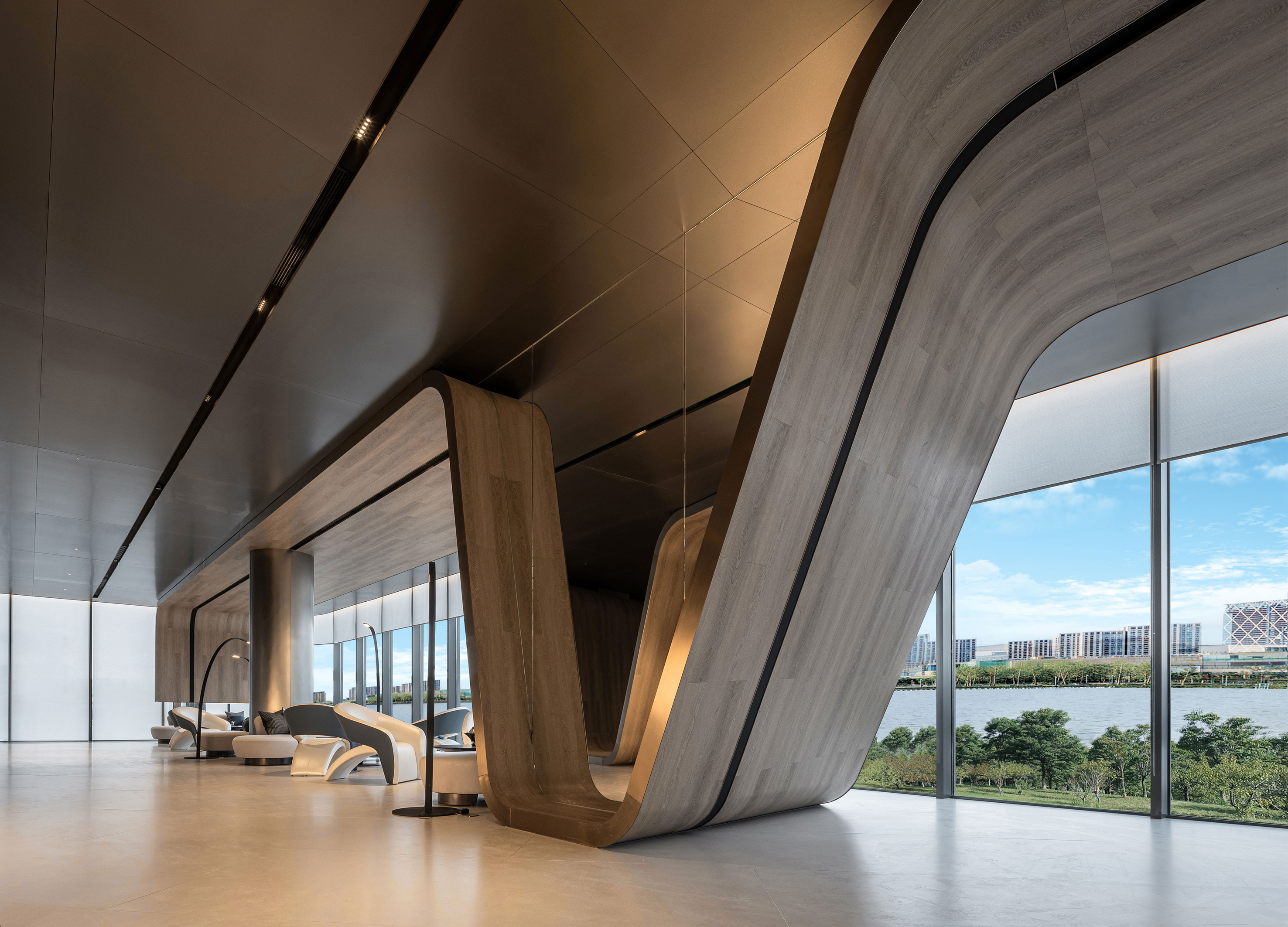
PowerChina City of Inspiration Sales Center
DESMOOD
China
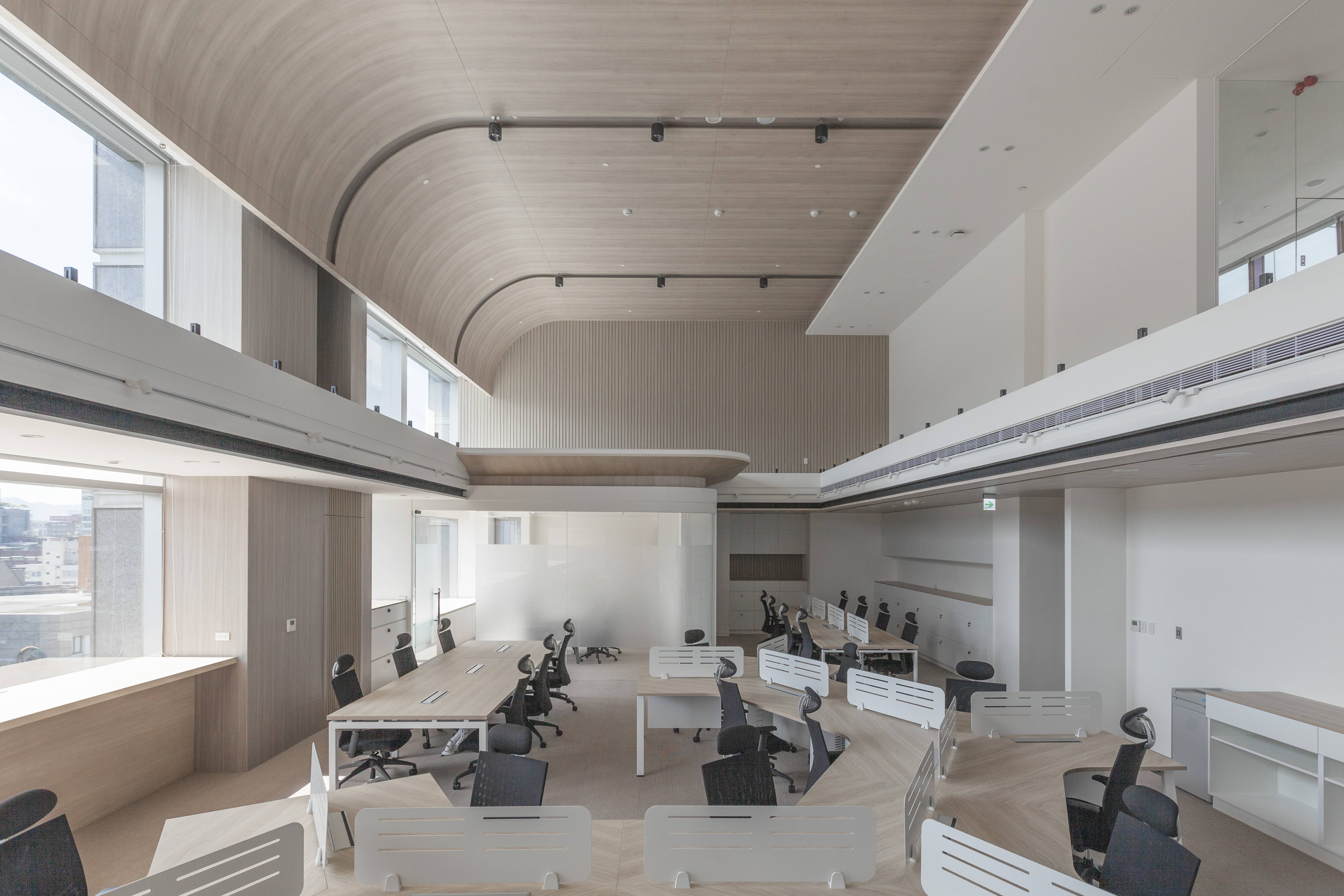
Taiwan Ajinomoto Office
Daking interior architecture
Chinese Taipei
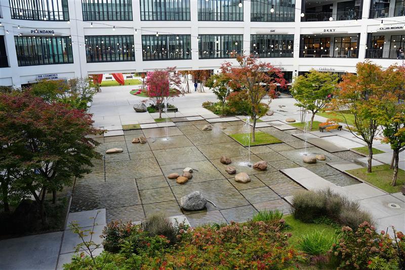
SQUARE GARDEN
HL D and I HALLA Designallee Co., Ltd.
Korea
SIMPLICITEA
Cool Mai Design
Chinese Taipei
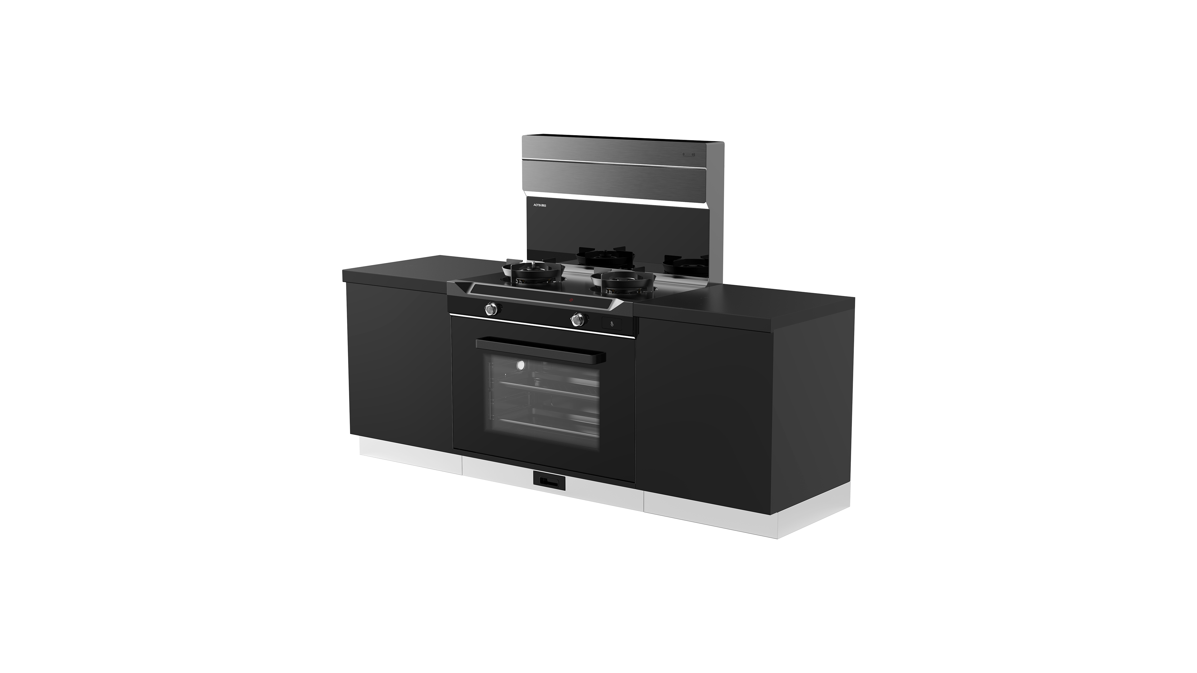
ZKT9 AI
ZHE JIANG AOTIN ELECTRIC APPLIANCES Co., Ltd.
China
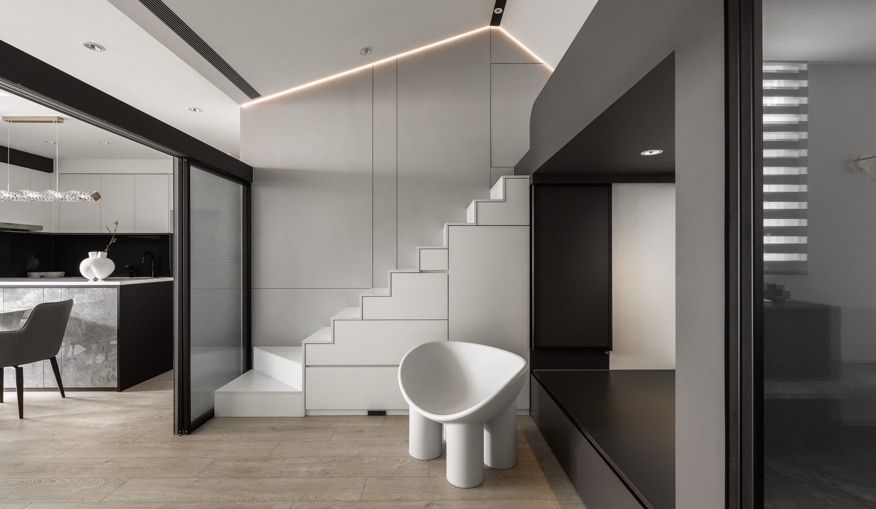
Residence Q
HSID studio
Chinese Taipei
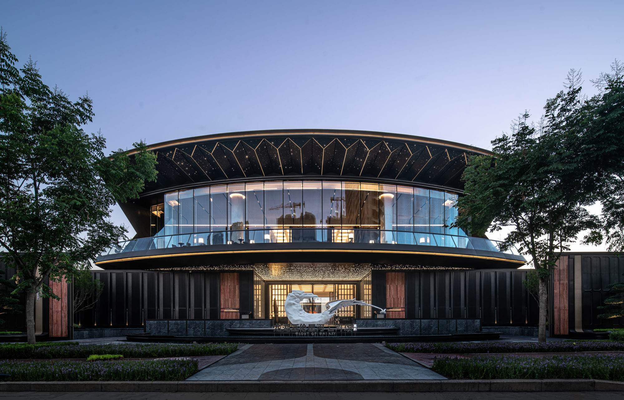
LONGFOR XIAN GLORY OF GALAXY EXHIBITIONCENTER
Das Design
China

Hillstate e Pyeonhansesang Munjeong Gateway
HYUNDAI ENGINEERING CO LTD & DL E&C
Korea
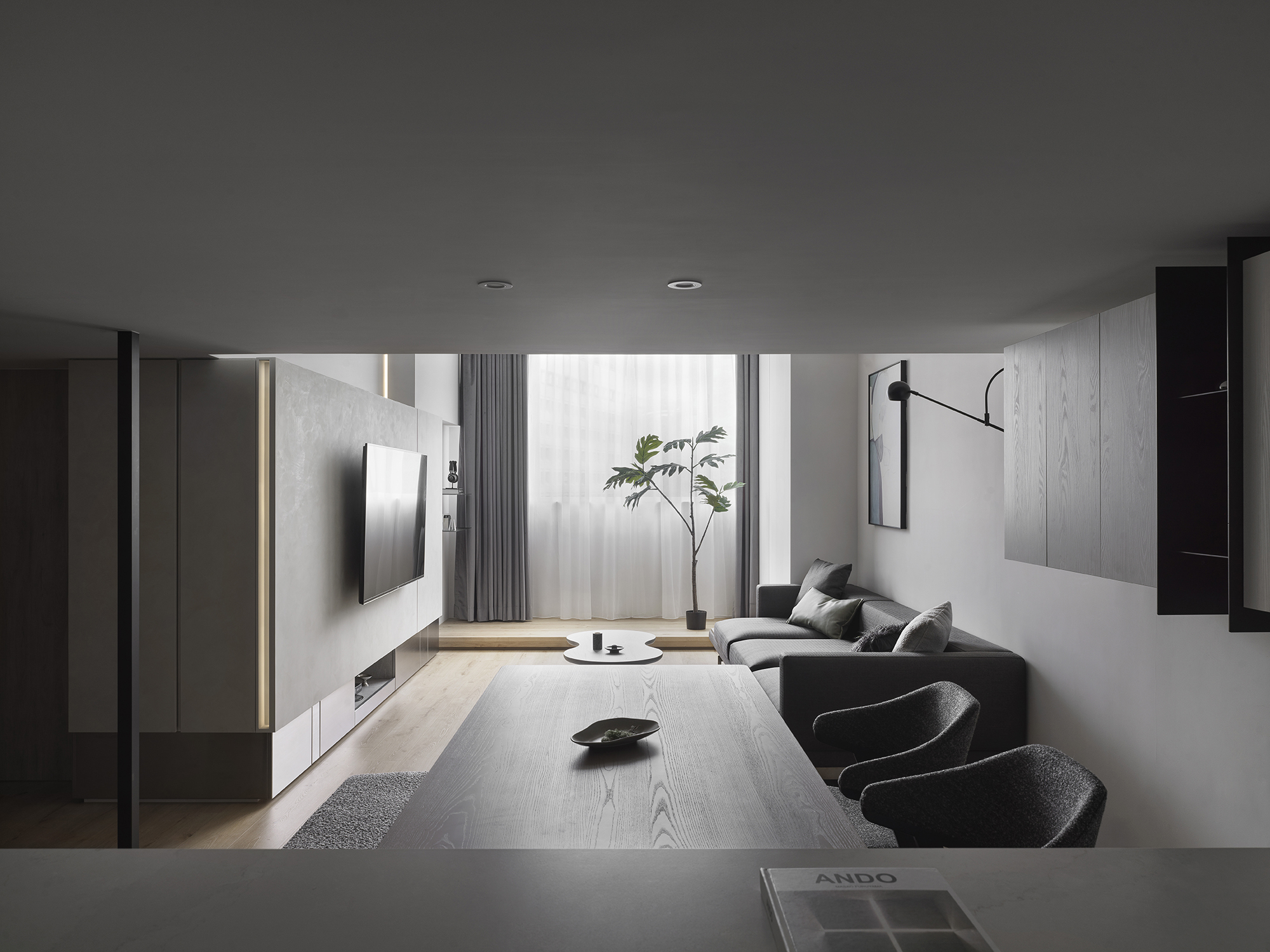
The Heart Warming Glow
Muyi Creation
Chinese Taipei
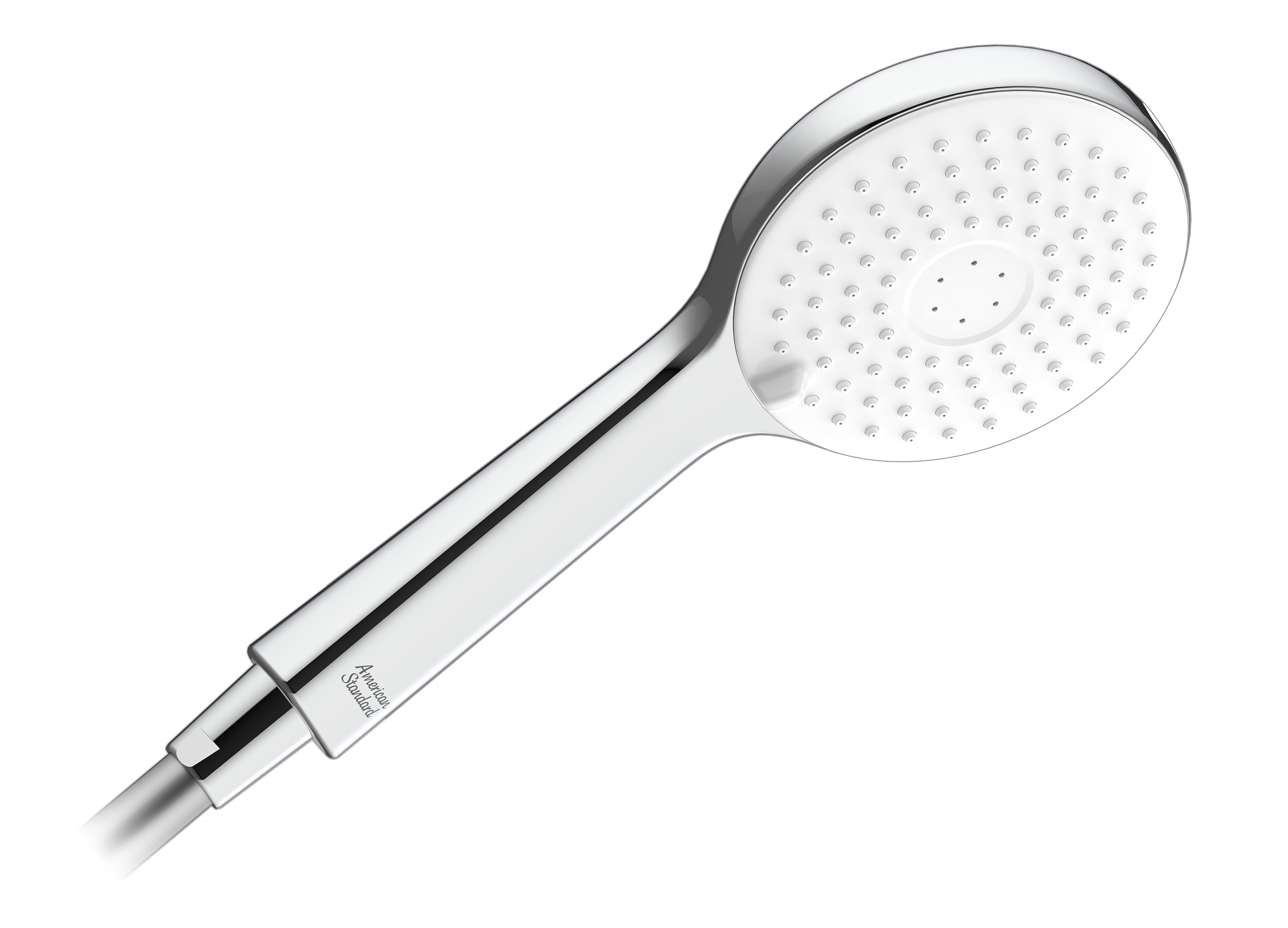
RainSwitch Power Jet Hand Shower
American Standard
Singapore

Kubota Glass
Kubota Pharmaceutical Holdings Co., Ltd.
Japan


Partner & Sponsor
More


info@asiadesignprize.com
#14057, 905 49, Beolmal-ro 102beon-gil,
Dongan-gu, Anyang-si, Gyeonggi-do, Korea
#14057, 905 49, Beolmal-ro 102beon-gil,
Dongan-gu, Anyang-si, Gyeonggi-do, Korea
Founder: Doyoung Kim
Business Registration Number: 454-86-01044
Online Sales License No.: 2021-Anyang Dongan-1081
Copyright © DESIGNSORI Co., Ltd.
Business Registration Number: 454-86-01044
Online Sales License No.: 2021-Anyang Dongan-1081
Copyright © DESIGNSORI Co., Ltd.
