Korea Developer Association Rebranding
Communication
Regions
Korea
Year
2026
Award
WINNER
Client
Korea Developer Association
Affiliation
YounghaPark Studio
Designer
Youngha Park
https://www.youtube.com/watch?v=vif5tw6lZFI
English
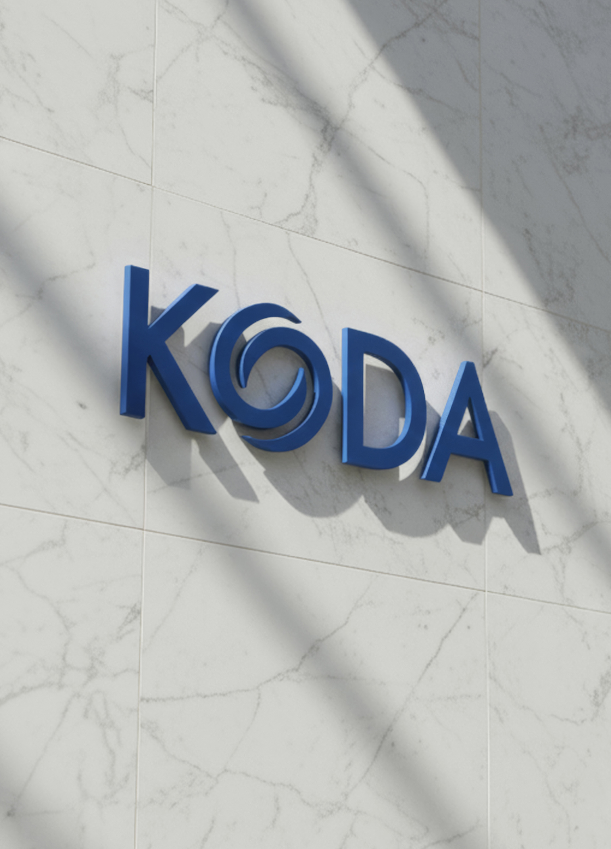
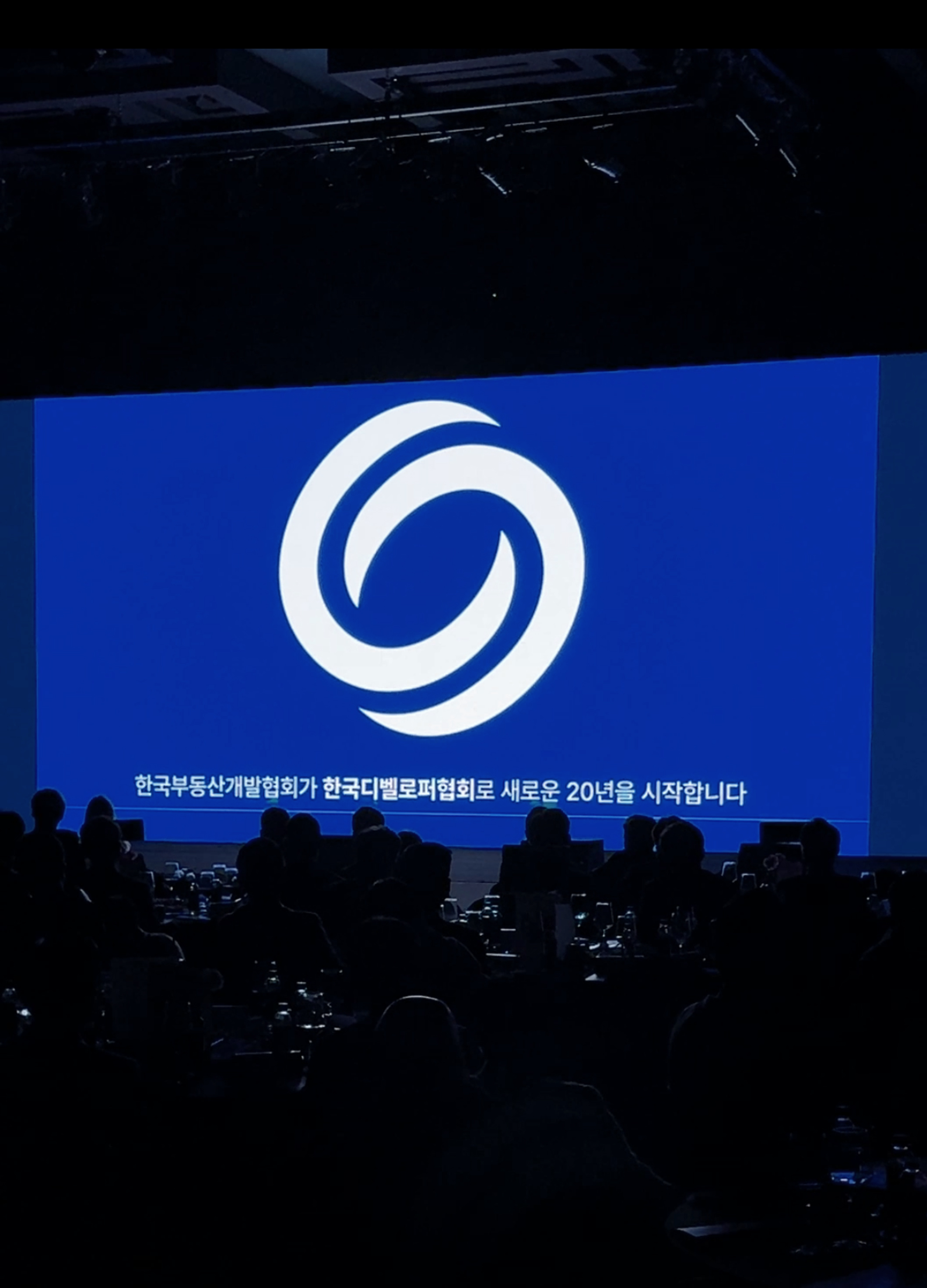
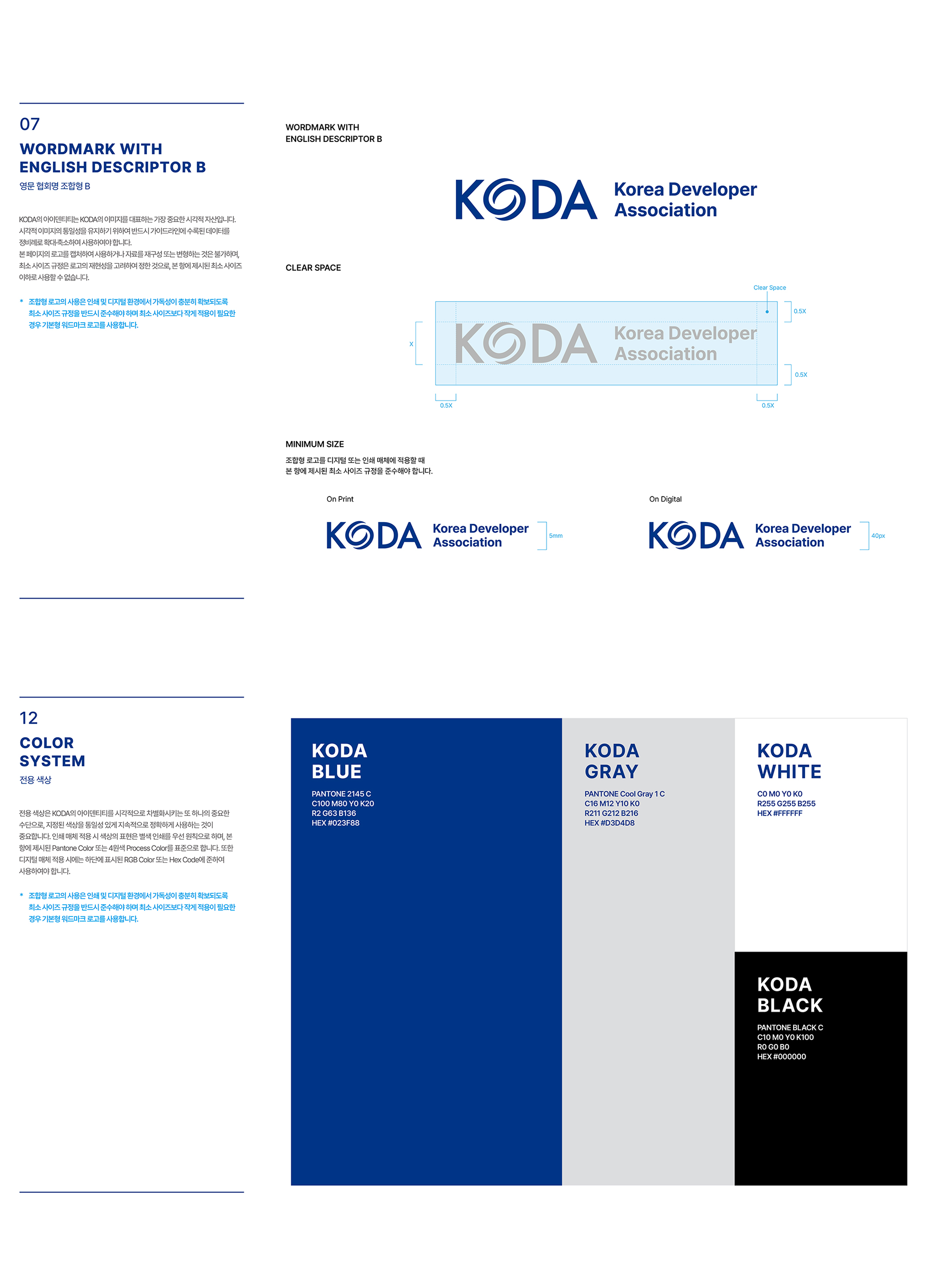
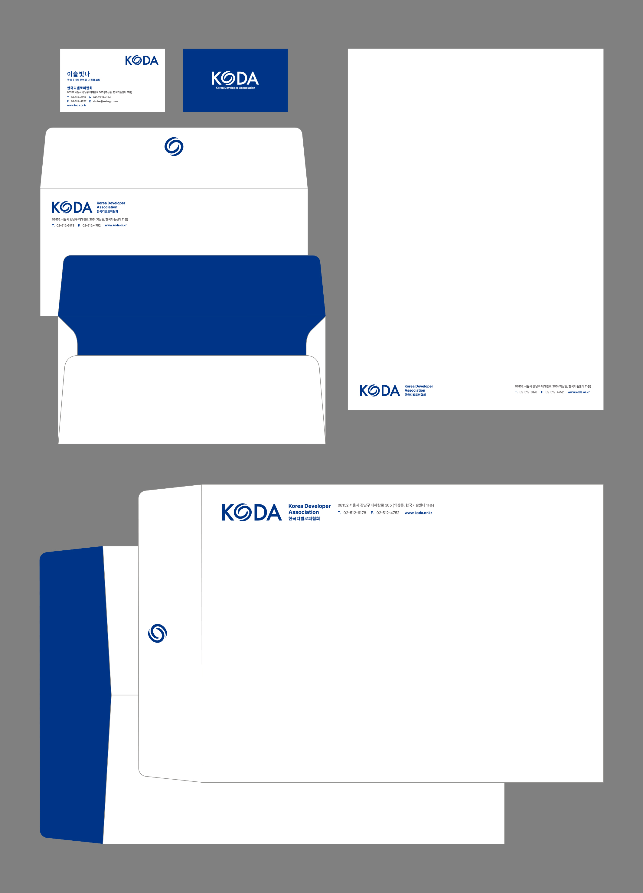
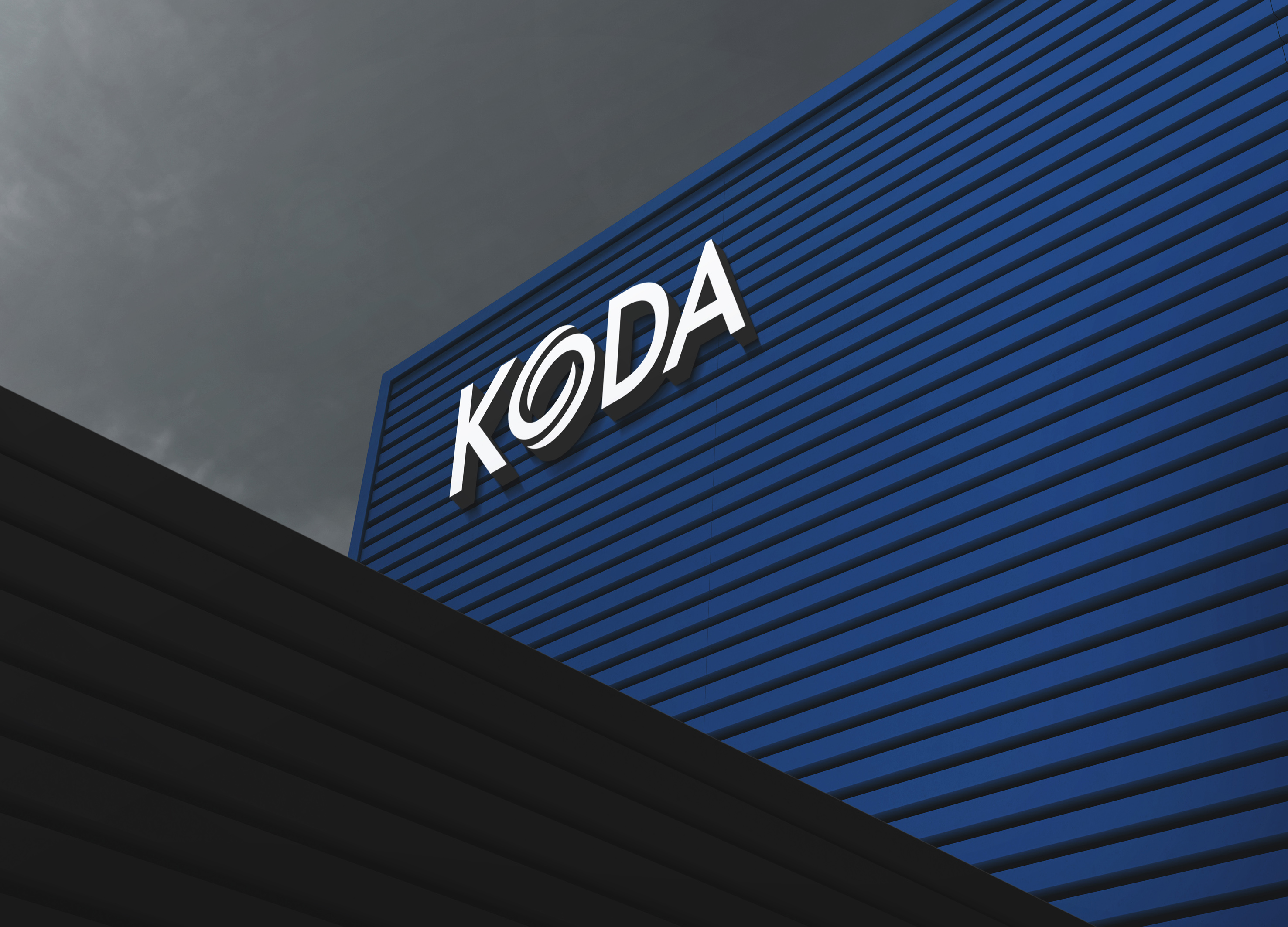
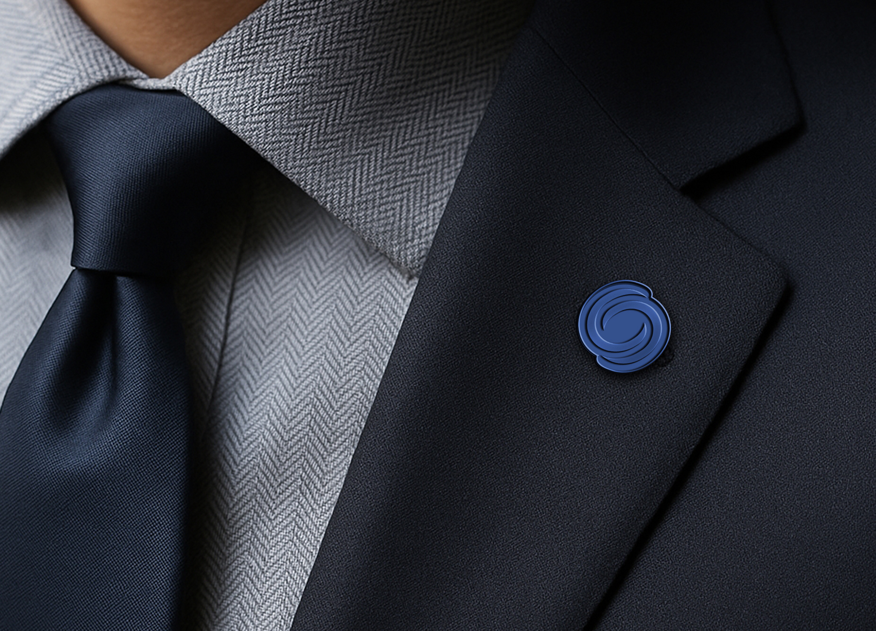
To mark its 20th anniversary this year, we renewed the corporate identity (CI) and visual system for the Korea Developer Association. The symbol—derived from the “O” in the wordmark and also usable independently—embodies the identity of Korean developers, drawing on the form of the Taegeuk symbol. The symmetrical union of two elements, reminiscent of yin and yang, represents architecture and people, as well as the cycle, coexistence, and mutual prosperity of nature. Along with the CI development, various applications—including stationery, signage, and badges—were designed, and comprehensive brand guidelines were established.
Native
한국부동산개발협회가 올해 창립 20주년을 맞아 앞으로의 새로운 20년을 맞이하기 위한 미래버젼을 선포하며 협회명을 '한국디벨로퍼협회'로 변경하는 동시에 협회 CI를 리뉴얼했습니다. 우선 워드마크의 'O'이면서 동시에 단독으로 사용이 가능한 심볼은 대한민국 디벨로퍼를 대표한다는 상징성을 담아 태극 문양의 형태에 기반하며 음양처럼 두개의 요소가 대칭적으로 결합된 형상은 건축과 사람, 자연의 순환, 공존, 상생 등을 의미합니다. 워드마크 역시 기존의 다소 무겁고 딱딱한 형태의 서체에서 벗어나 젊음과 변화의 느낌을 전달할 수 있는 모던한 서체를 차용했습니다. CI 개발과 더불어 서식류, 사이니지, 뱃지 등 어플리케이션과 브랜드 가이드라인을 정립했습니다.
Positive Comments


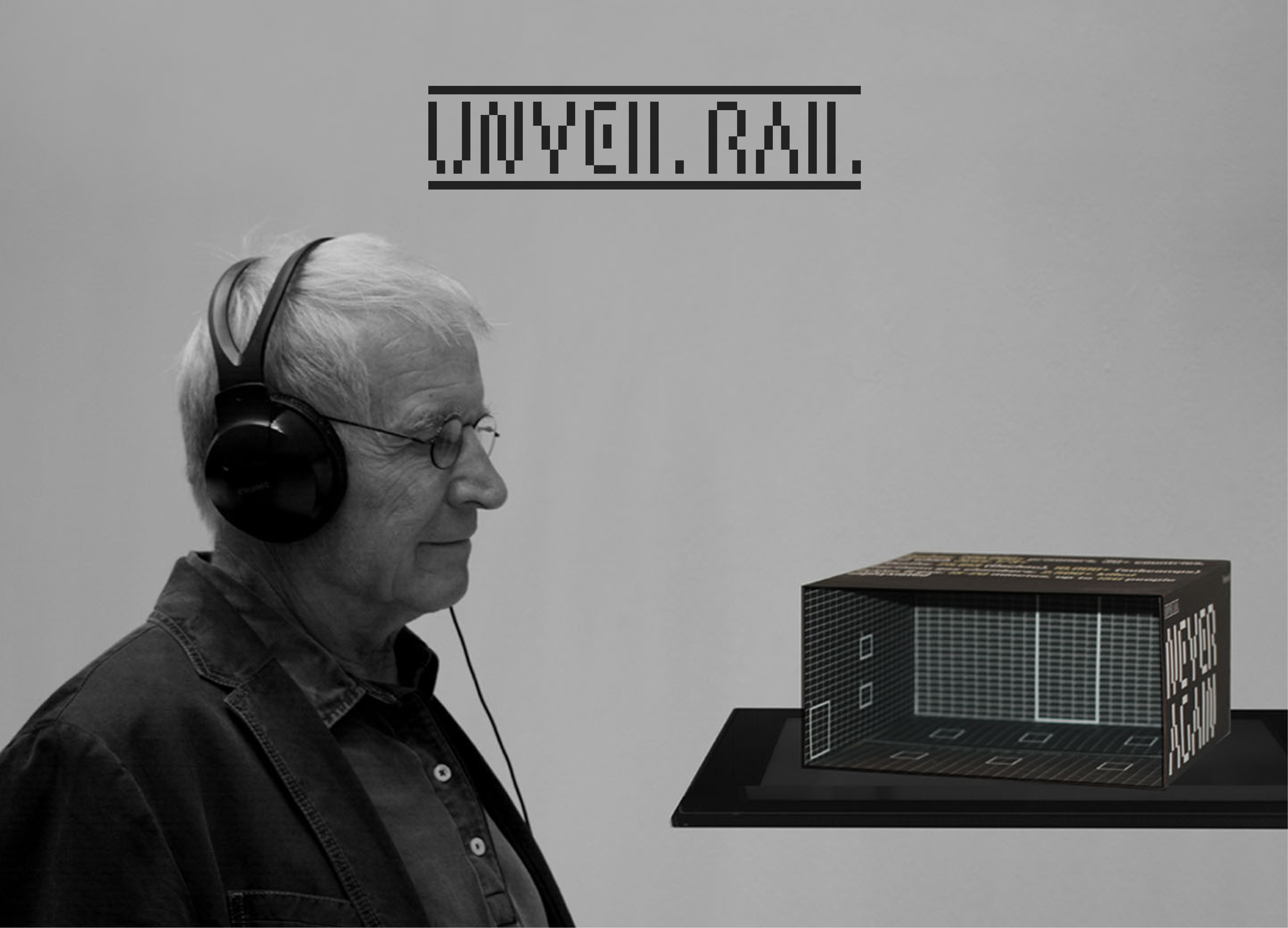
UNVEIL RAIL
Sejong University
Korea
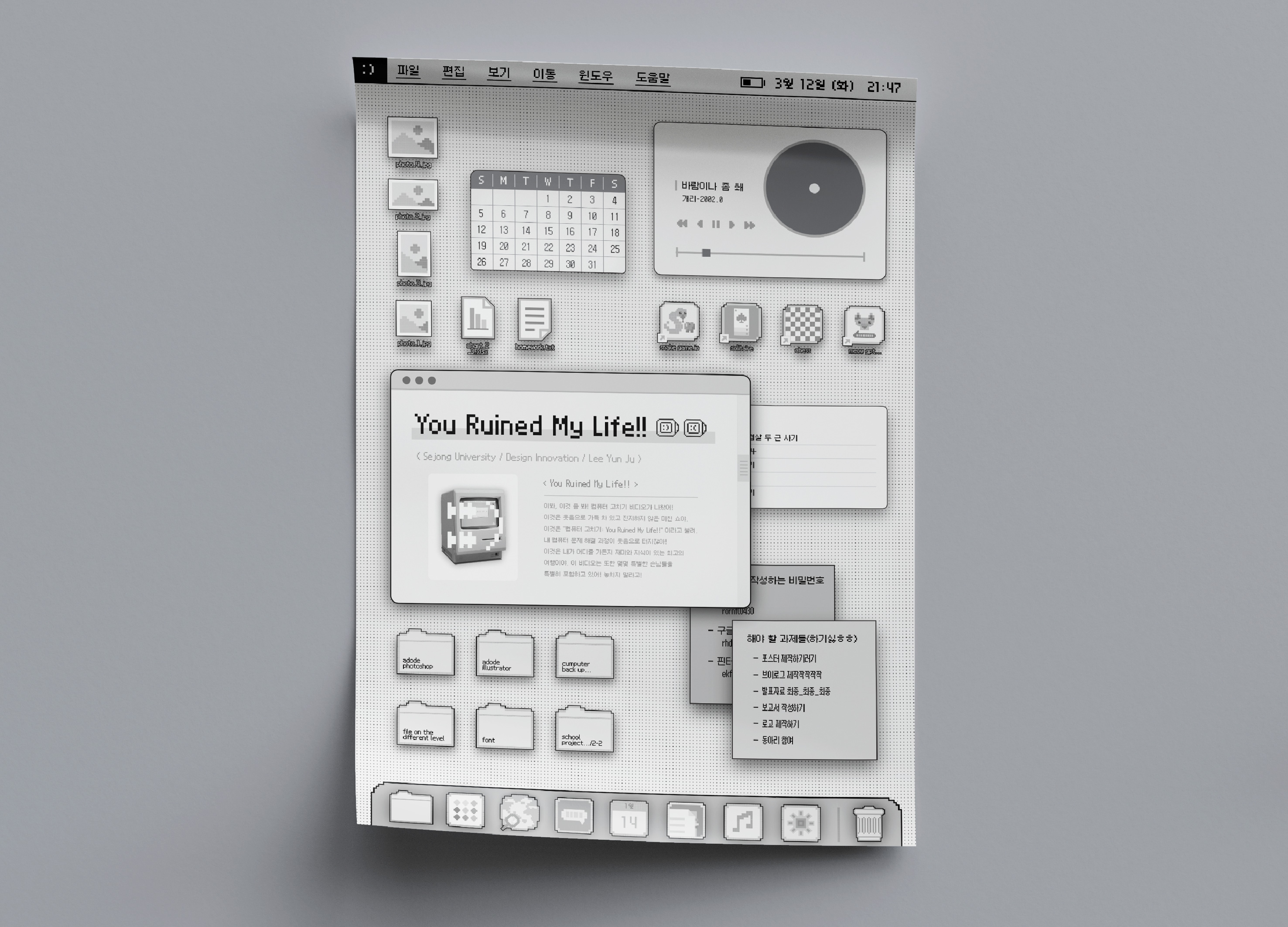
You Ruined My Life
Sejong University
Korea
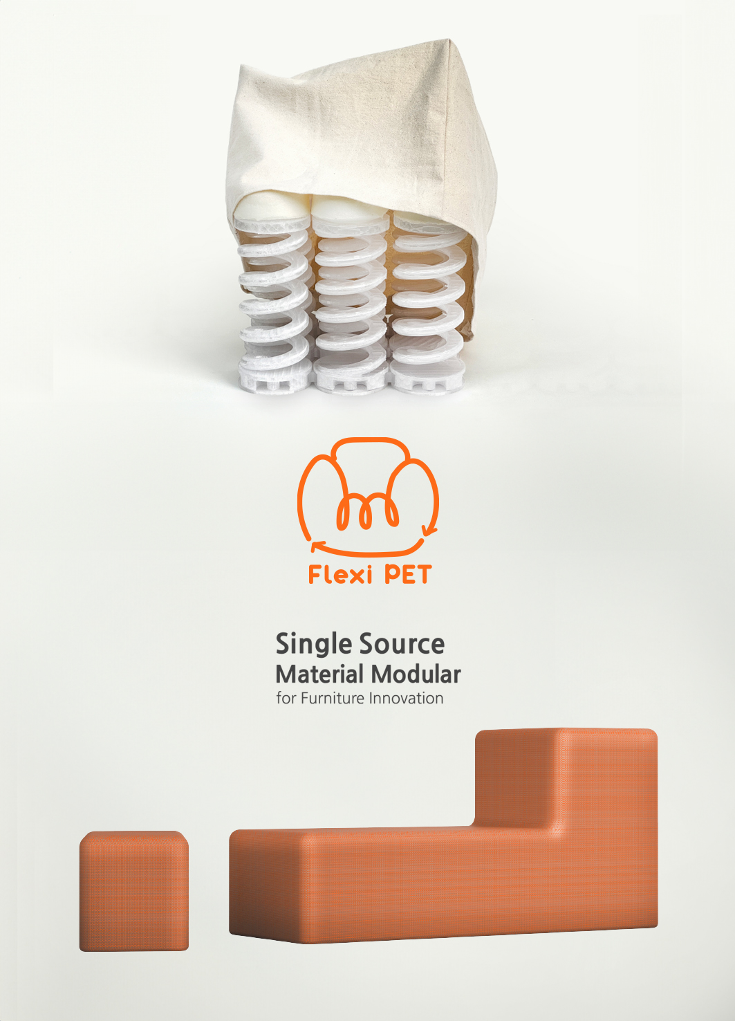
Flexi PET Single Source Material Furniture
Imperial College London Royal College of Art
Korea
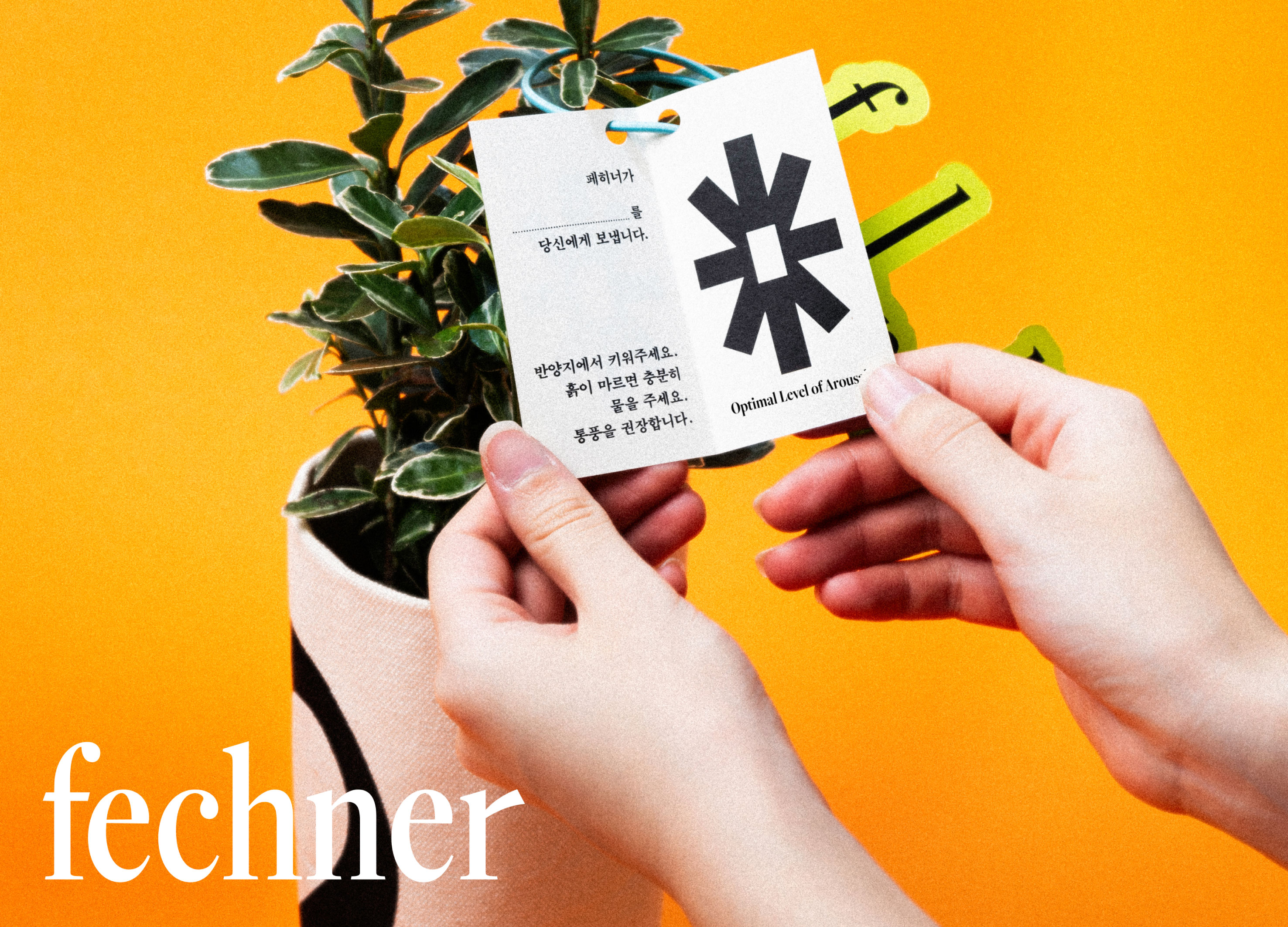
Fechner
Ewha Womans University
Korea
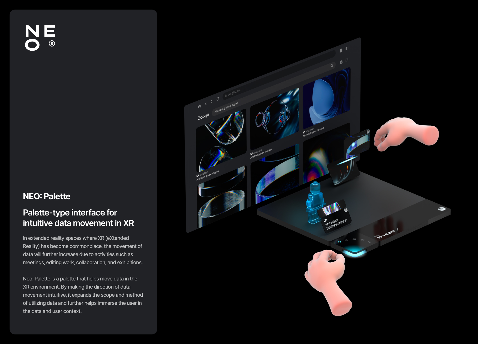
NEO Palette
Hongik University
Korea
GRIP
Samsung Design Membership
Korea
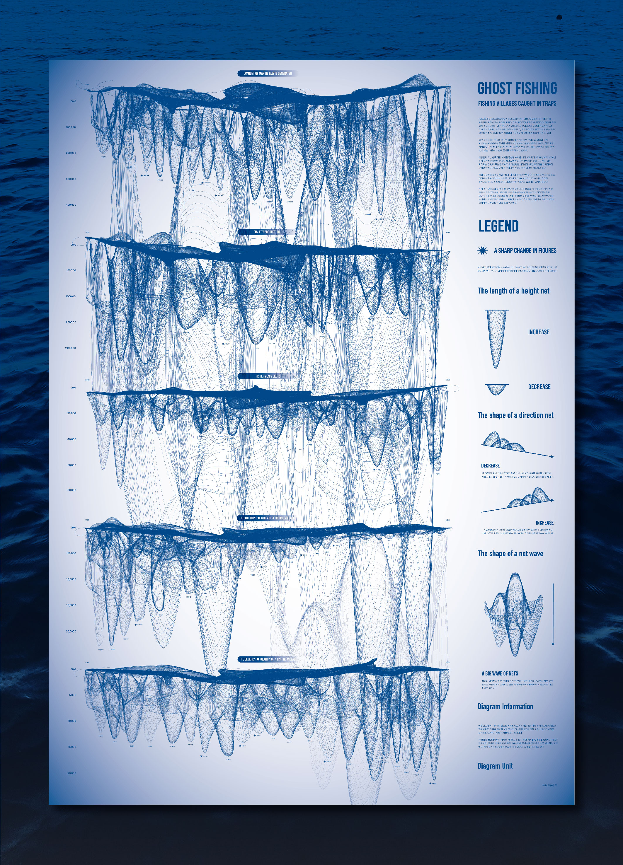
GHOST FISHING
Sejong University
Korea
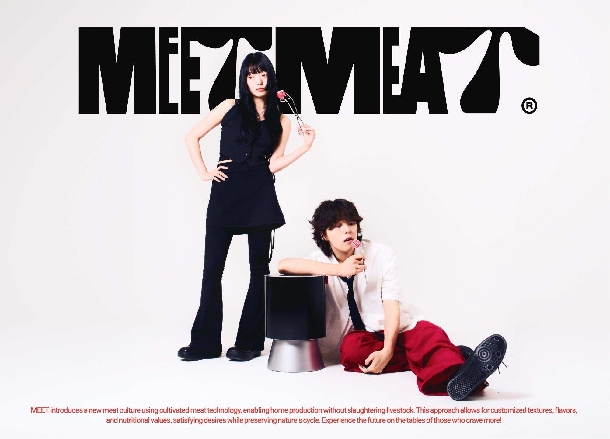
MEET
Samsung design membership
Korea
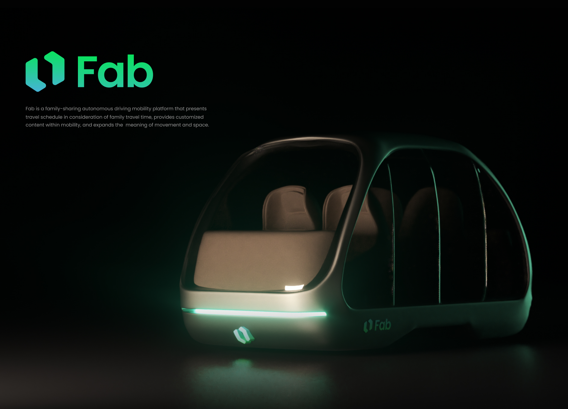
Fab
Hongik University
Korea
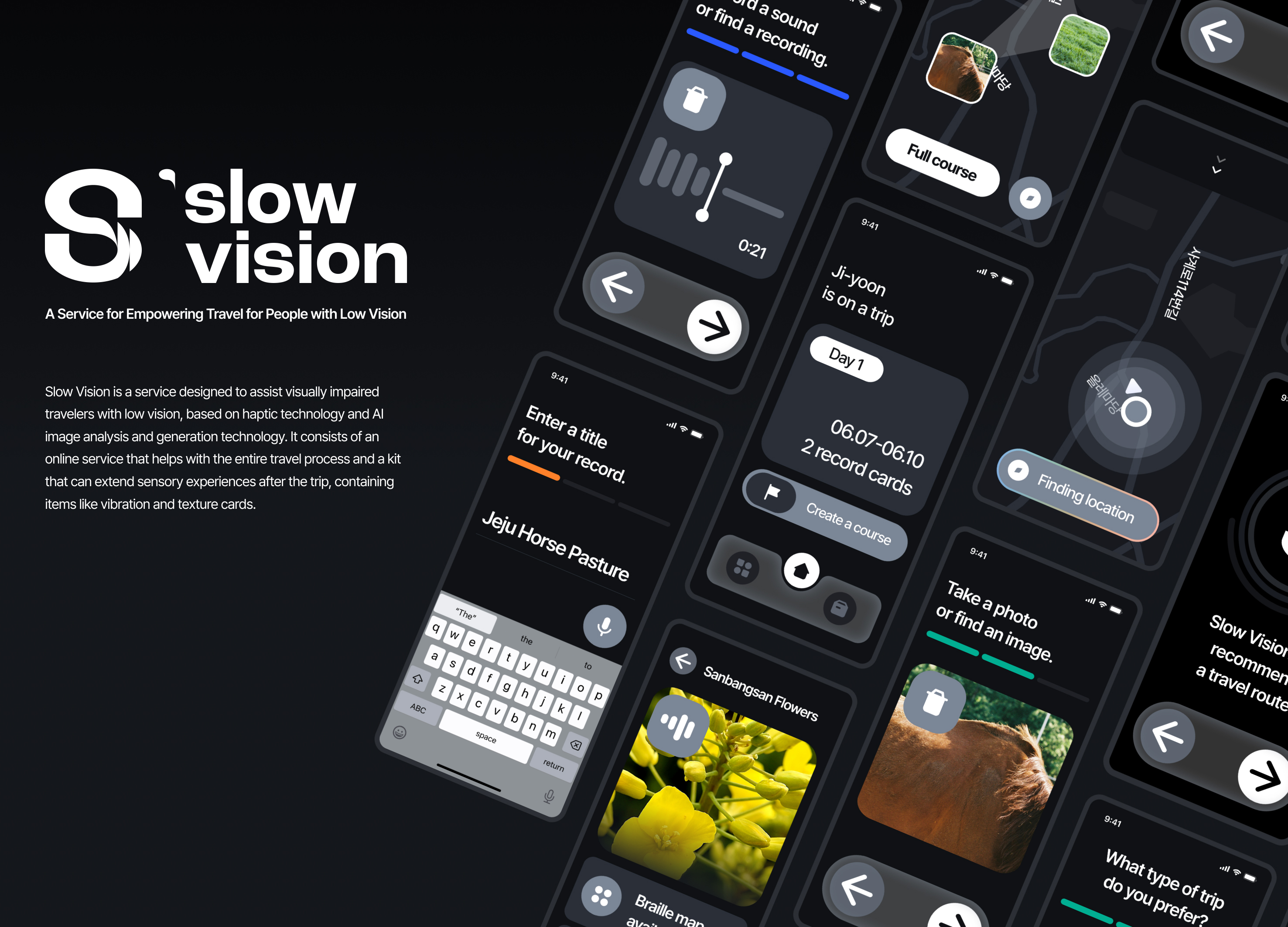
Slow Vision
Seoul National University of Science and Technology
Korea
Korea Developer Association Rebranding
YounghaPark Studio
Korea
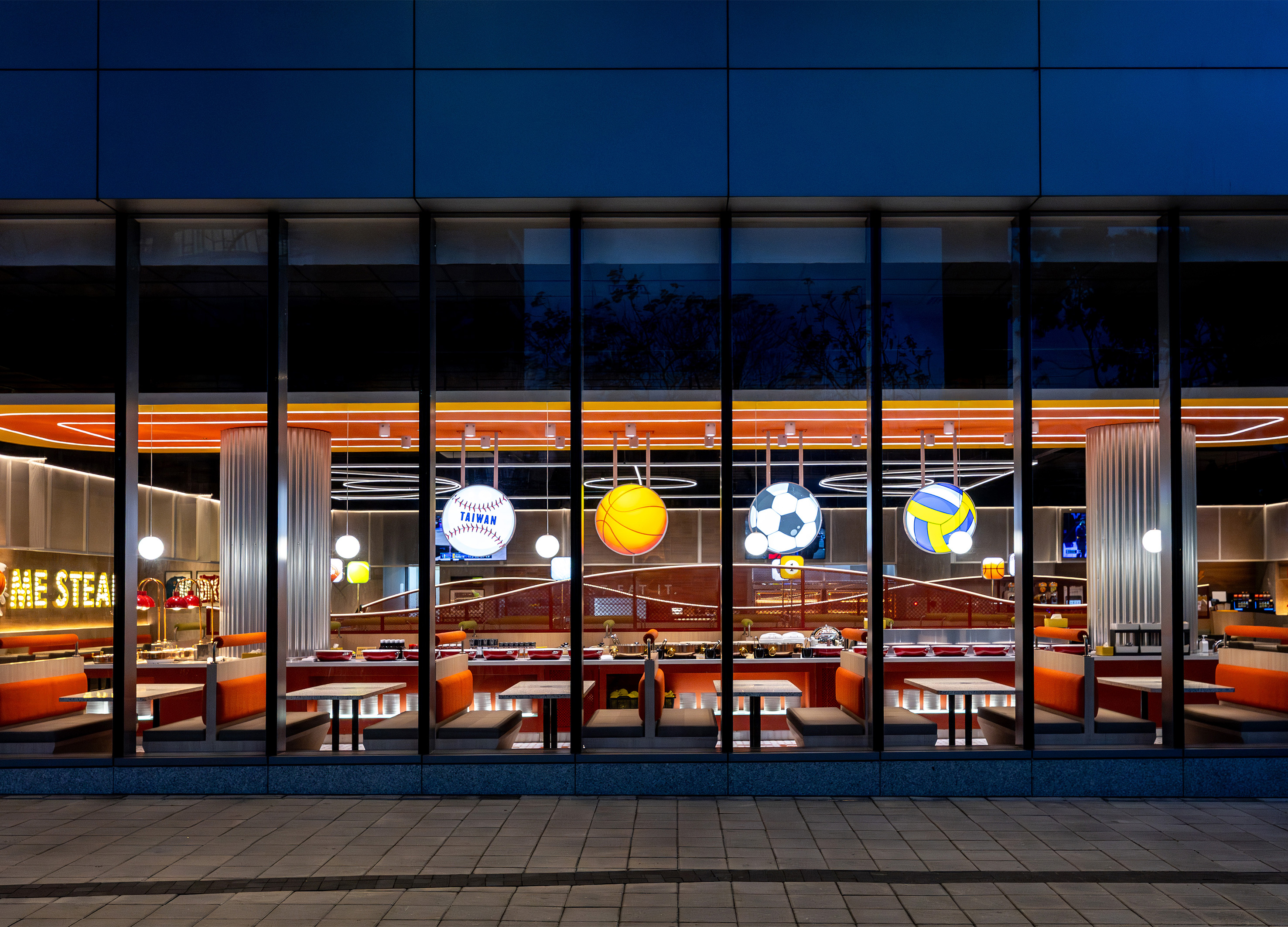
My Home Steak
Home Young Interior Design Co., Ltd.
Taiwan
SOOMGOAL A Place to Pause
SAMSUNG C&T RESORT DIVISION Corp.
Korea
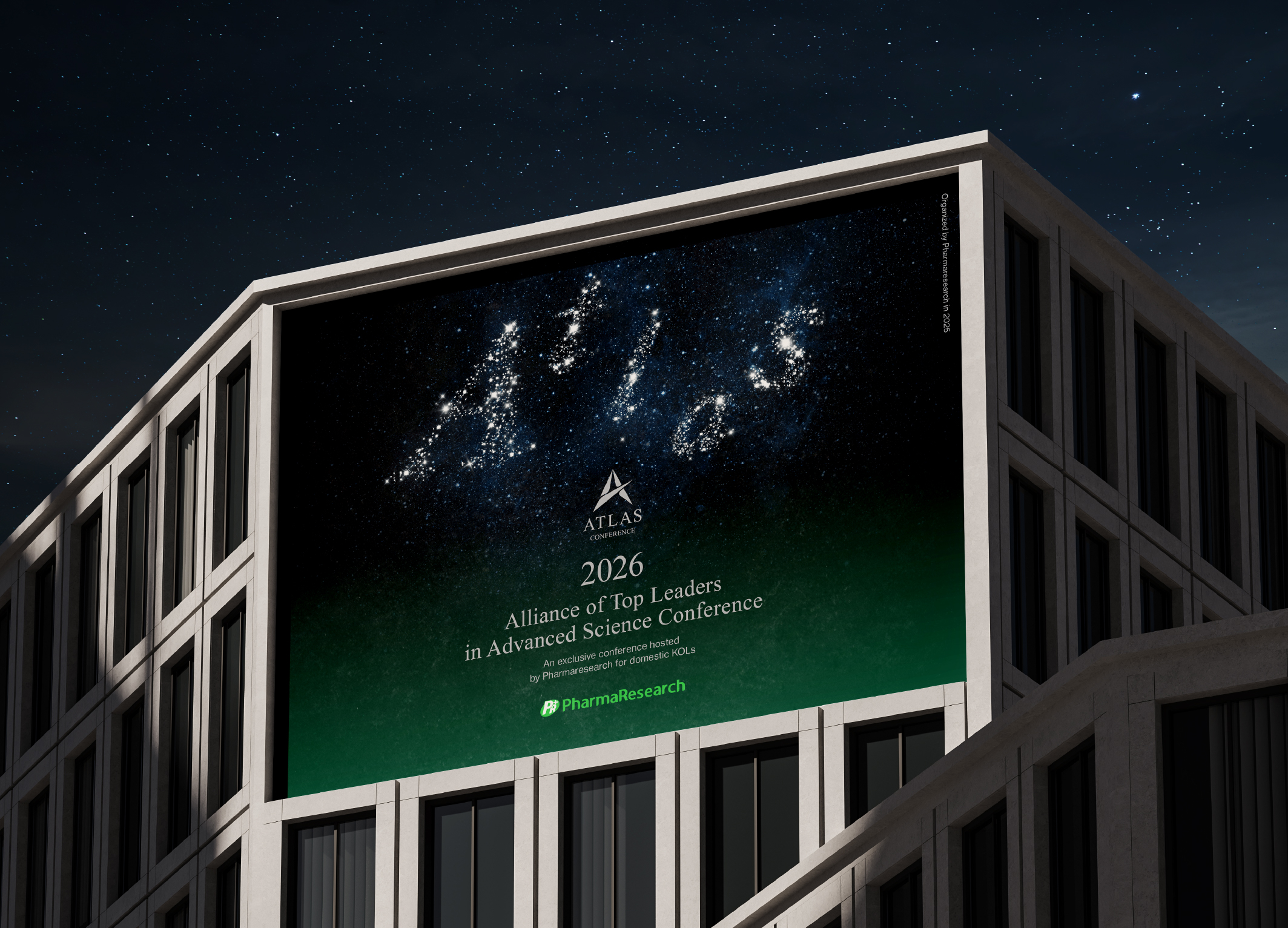
ATLAS Conference BI & Key Visual Design
B for Brand
Korea
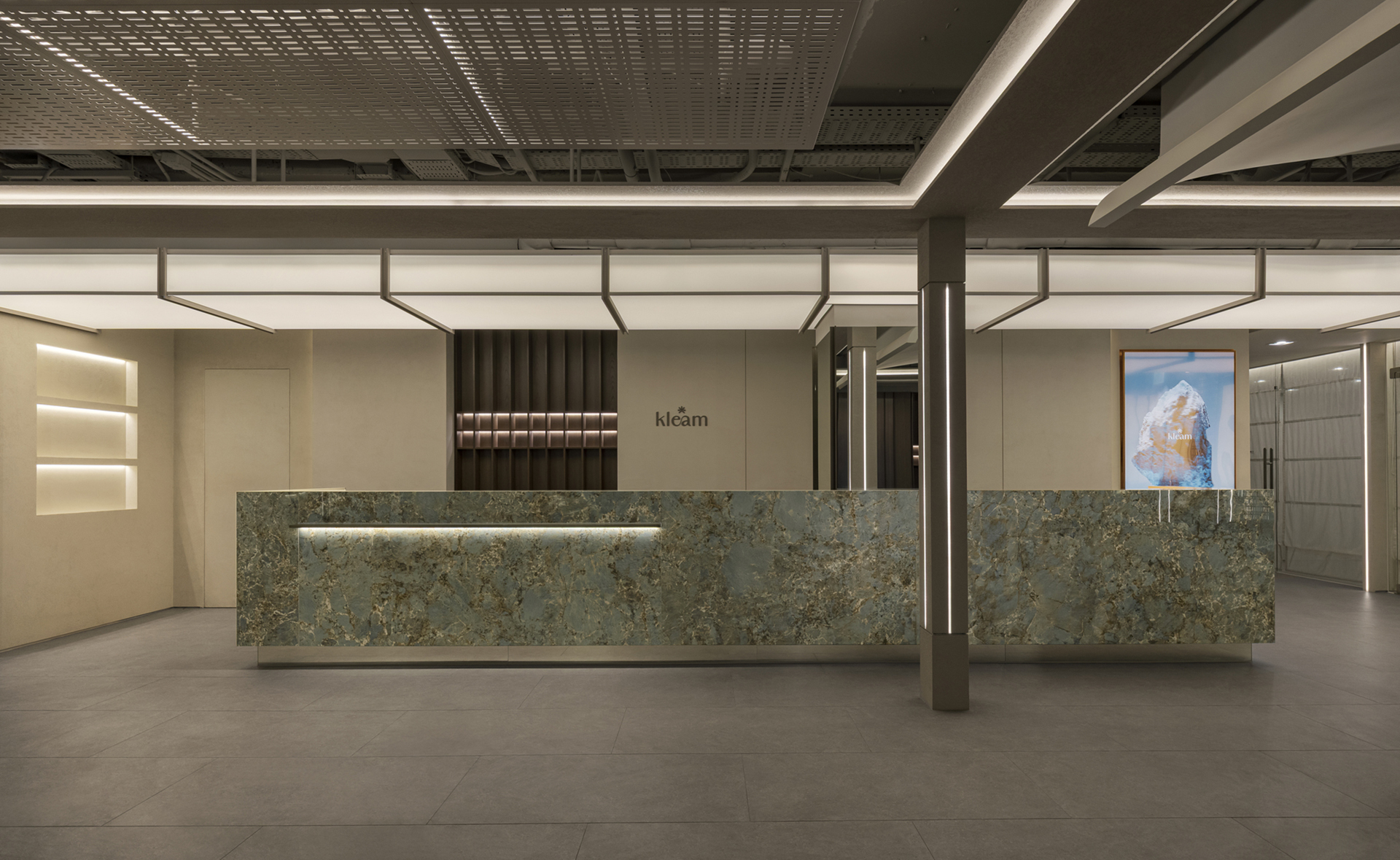
Myeongdong KLEAM CLINIC
intoexdesign
Korea
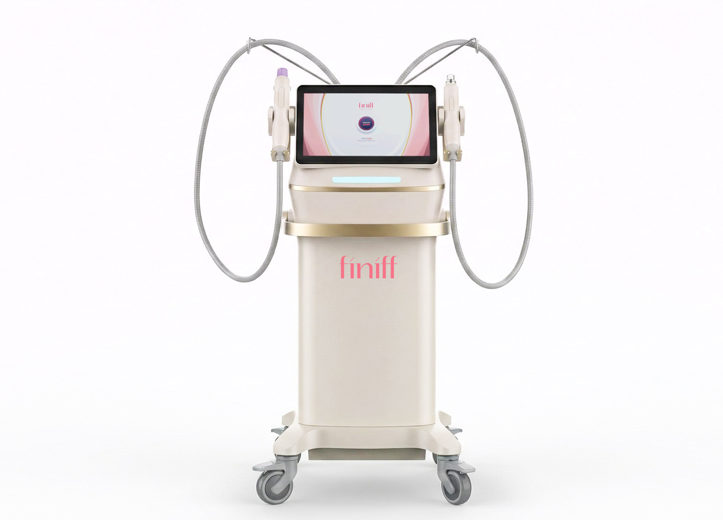
SKIN GRAB finiff
GODESIGN
Korea
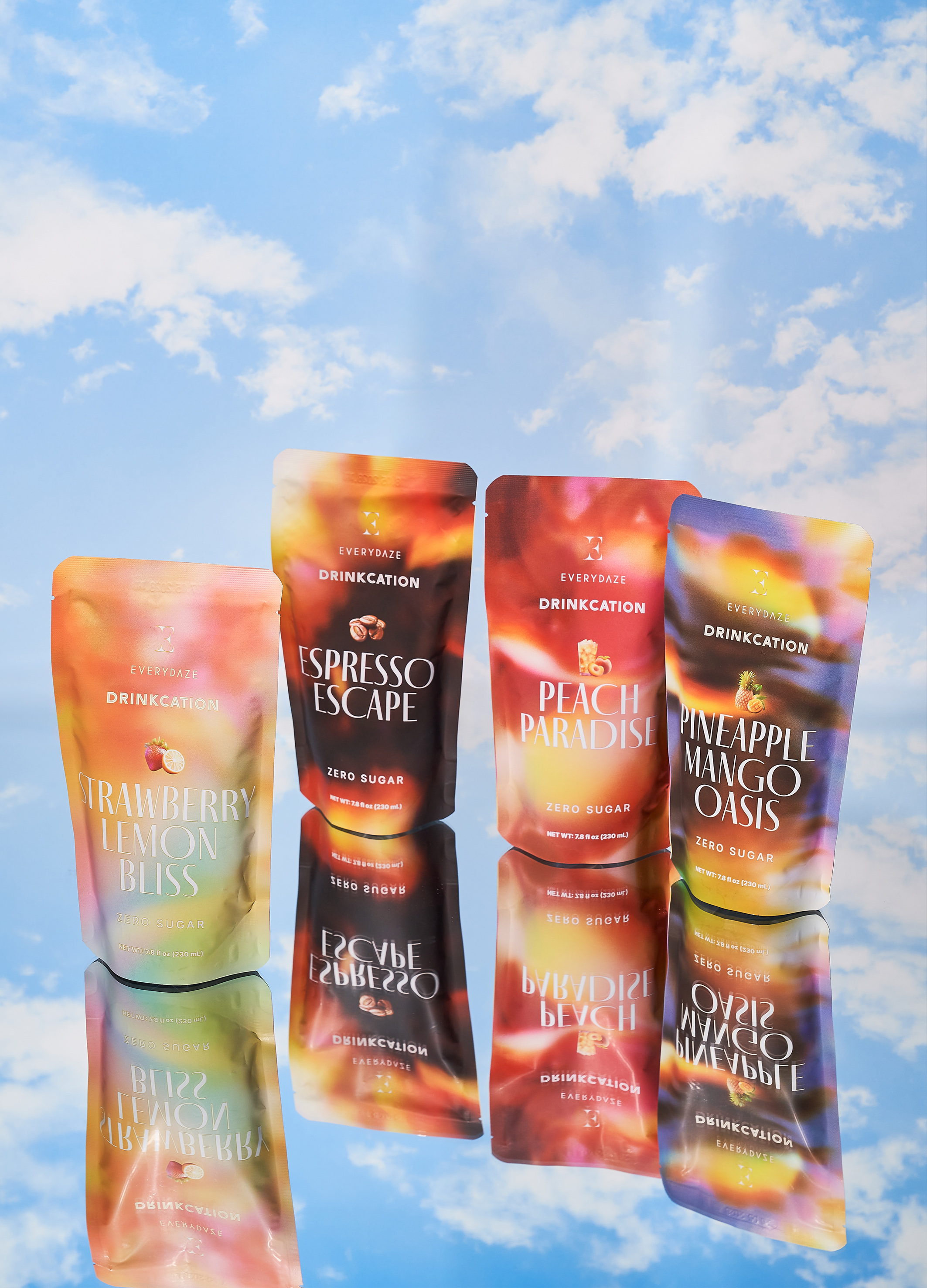
Everydaze Drinkcation
YounghaPark Studio
USA
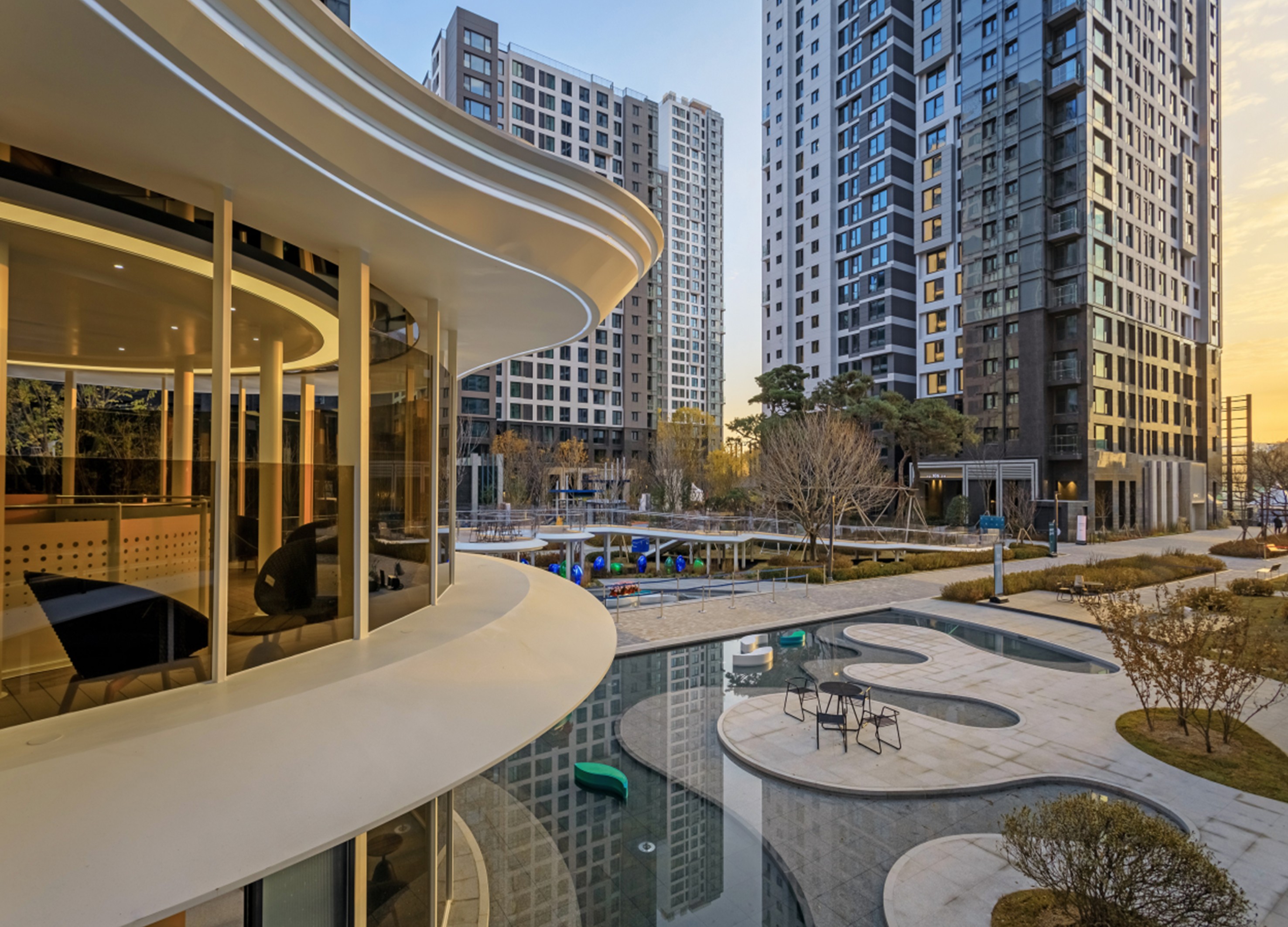
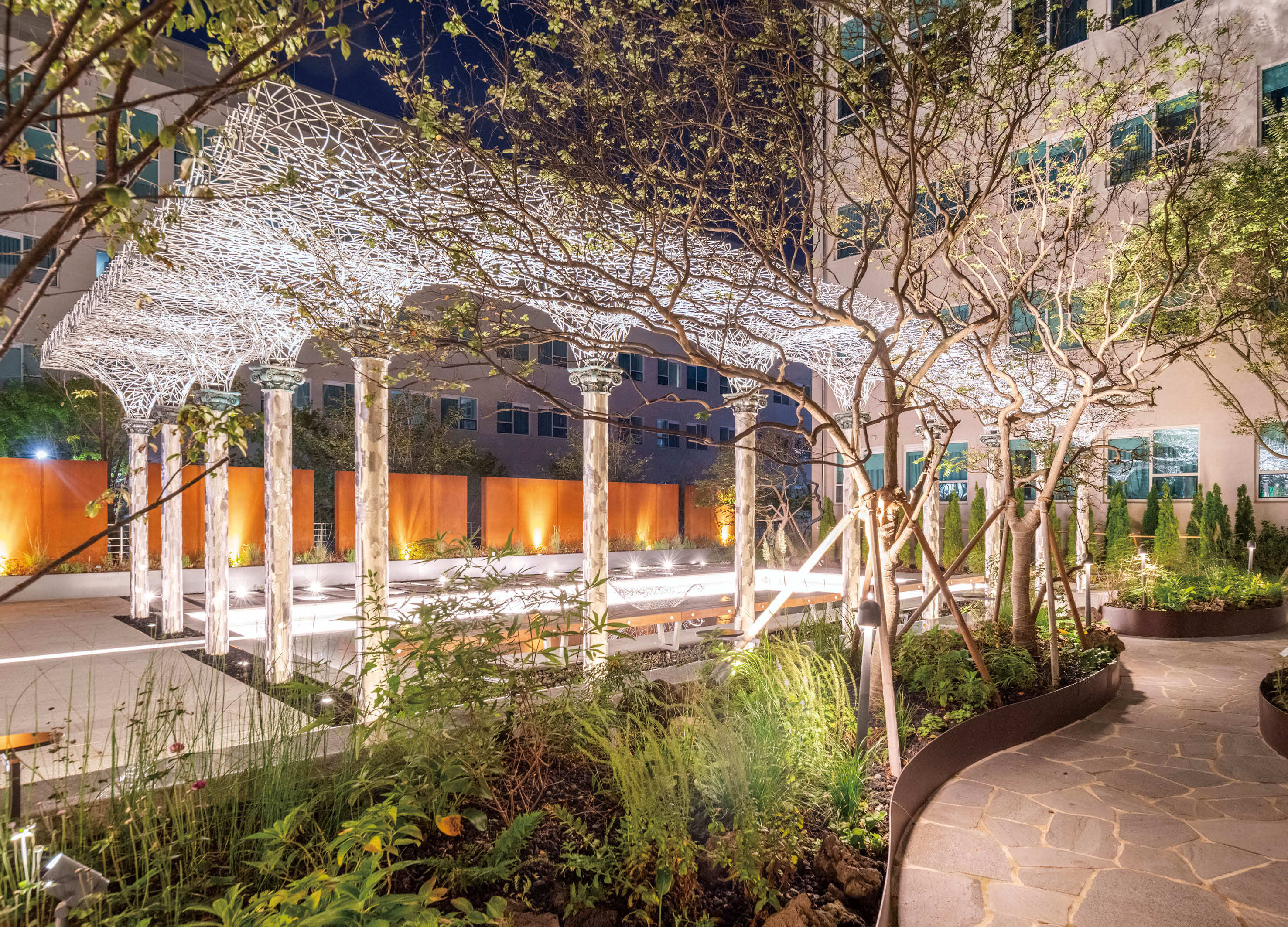
Blue Forest Garden
Samsung C&T Co., Ltd.
Korea


Partner & Sponsor
More


info@asiadesignprize.com
#14057, 905 49, Beolmal-ro 102beon-gil,
Dongan-gu, Anyang-si, Gyeonggi-do, Korea
#14057, 905 49, Beolmal-ro 102beon-gil,
Dongan-gu, Anyang-si, Gyeonggi-do, Korea
Founder: Doyoung Kim
Business Registration Number: 454-86-01044
Online Sales License No.: 2021-Anyang Dongan-1081
Copyright © DESIGNSORI Co., Ltd.
Business Registration Number: 454-86-01044
Online Sales License No.: 2021-Anyang Dongan-1081
Copyright © DESIGNSORI Co., Ltd.
