SaengGwaBang Yakgwa Rebranding
Communication
Regions
Korea
Year
2025
Award
WINNER
Client
SaengGwaBang Co., Ltd.
Affiliation
Youngha Park Studio Inc.
Designer
Youngha Park
English
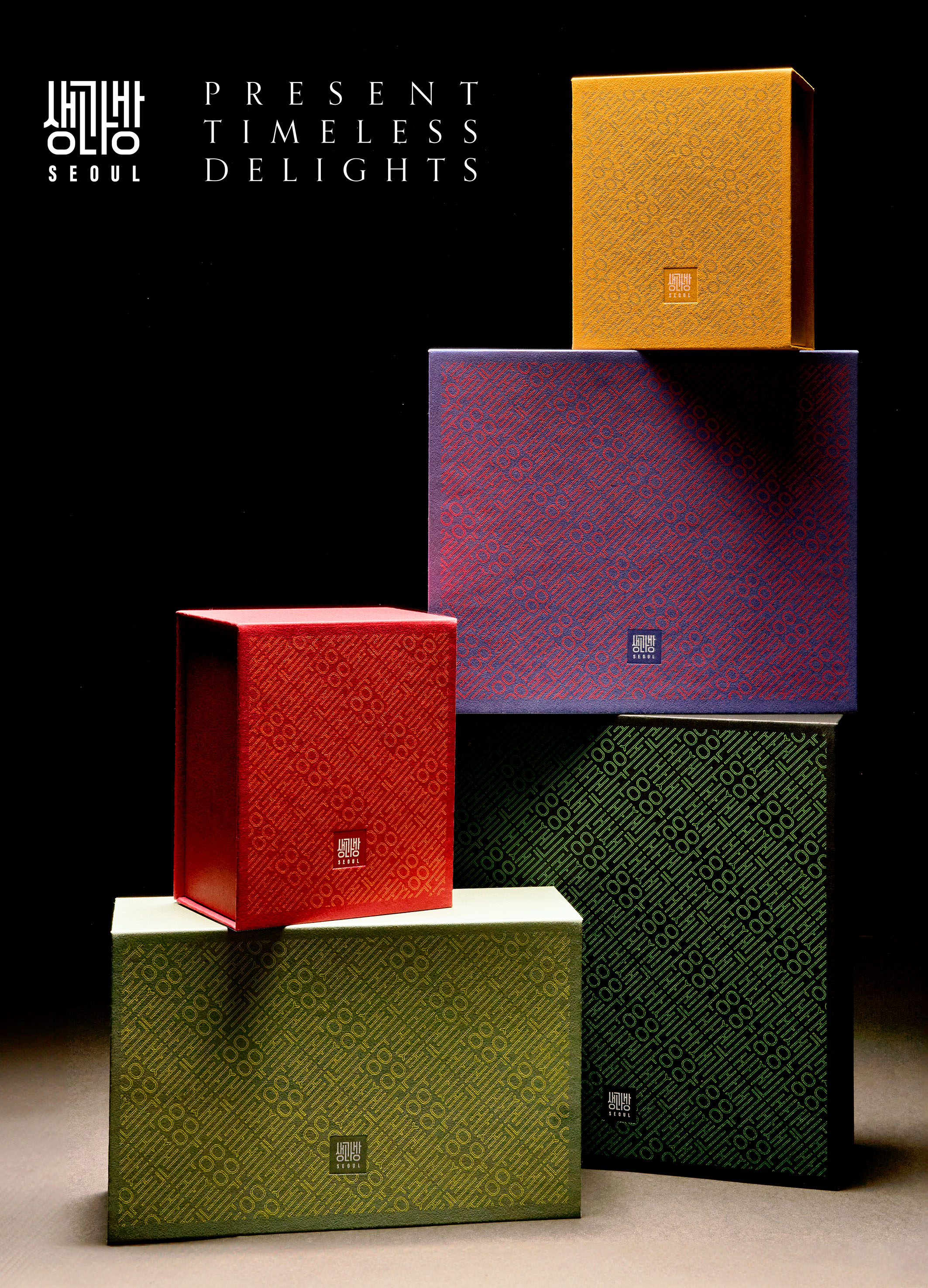
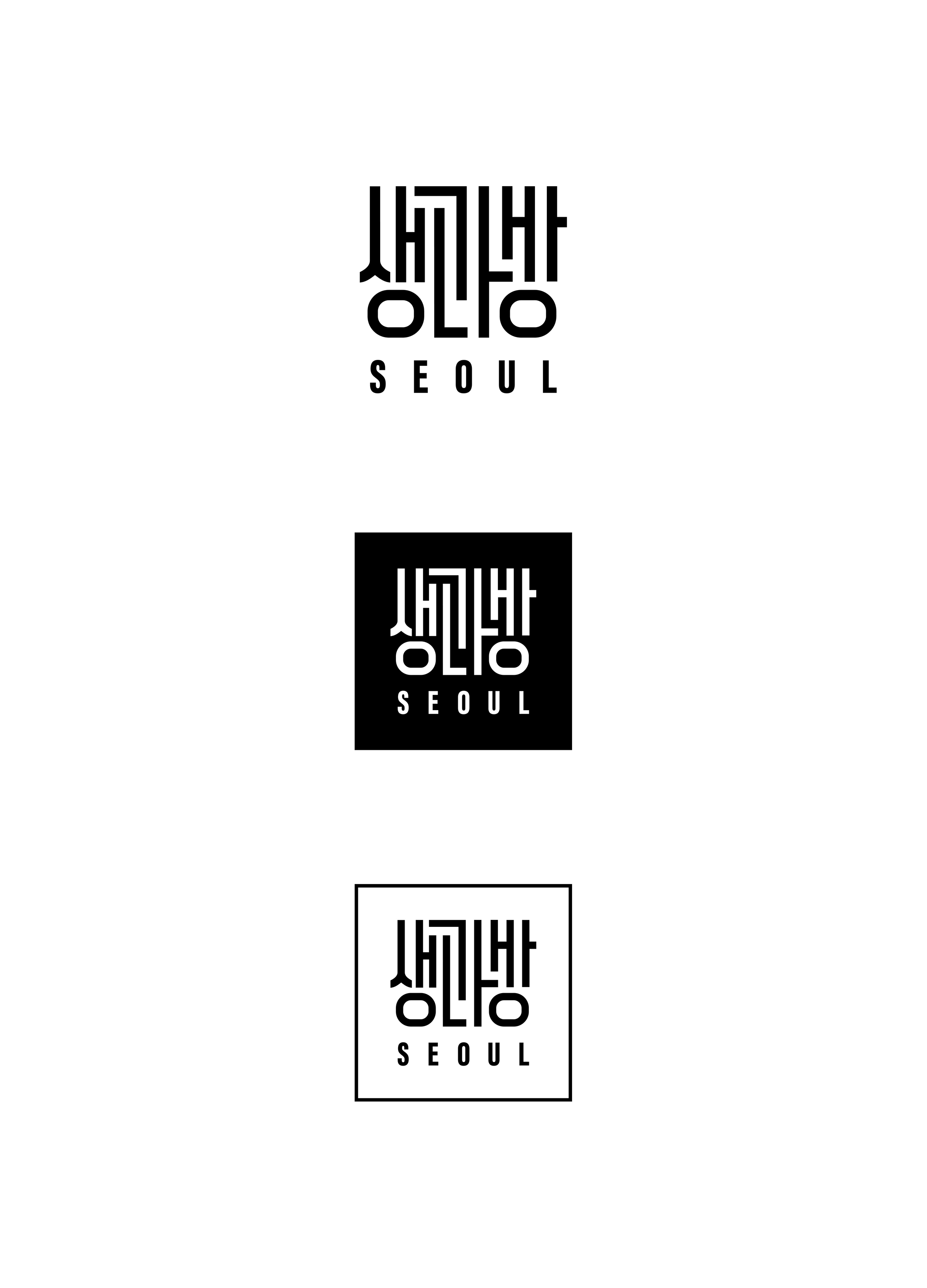
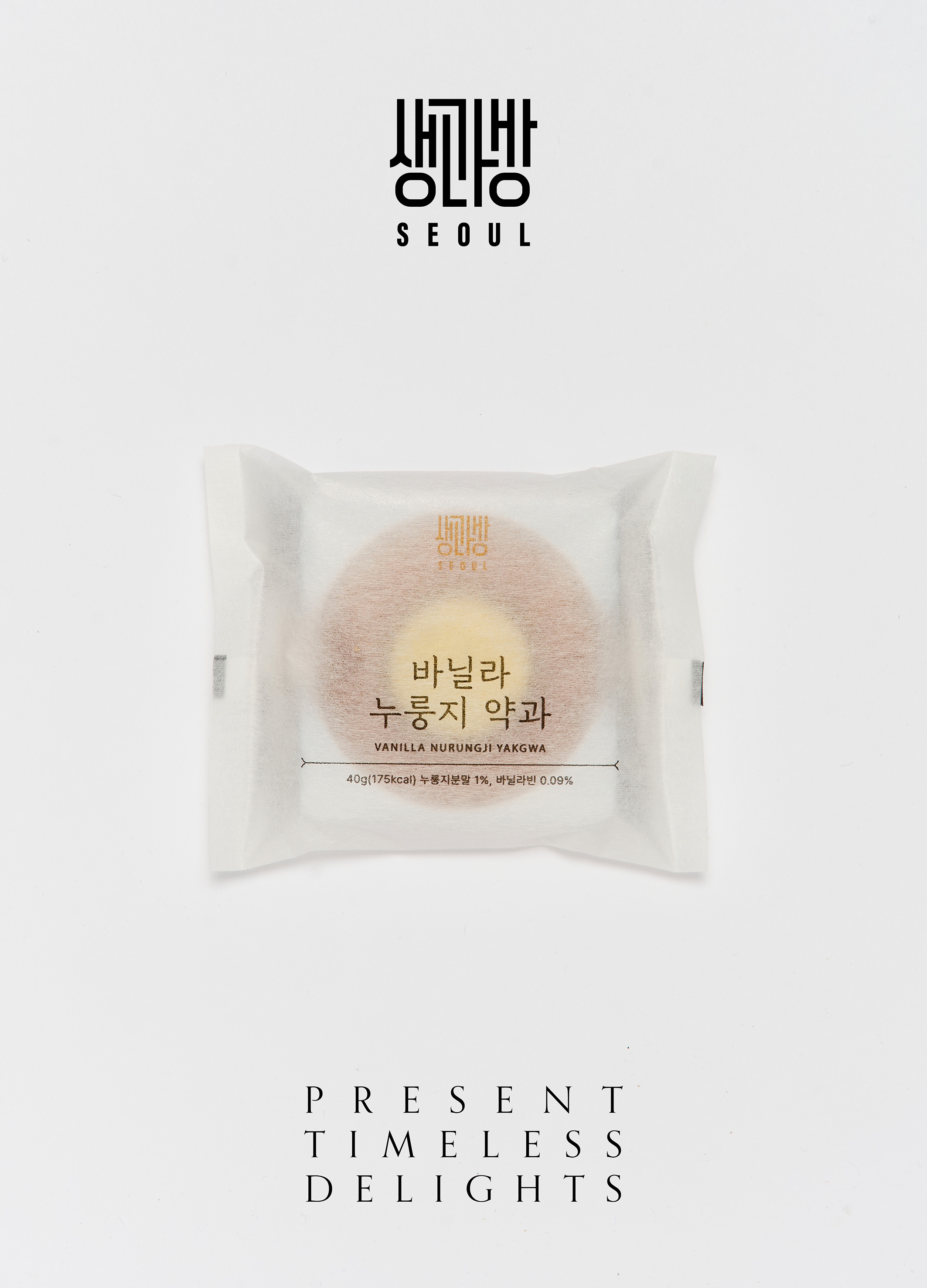
In this era of K-food, it was especially important to create a brand identity and package design that would first meet consumers and showcase the value of Yakgwa as a medium that connects Korea and the world. Inspired by the SaengGwaBang, a hall that used to make desert for the Joseon royal family, the logo of the brand name formed a signature, which can be said to be a symbol of traditional oriental painting, and patterns based on the logo were developed, and each type of product was made luxuriously and sturdily like a gift box that does not require a separate wrapper, based on the traditional Korean color system of five colors.
Native
K-food가 각광을 받는 이 시대에 한국과 세계를 연결하는 매개체로써 약과의 가치를 새롭게 선보이려면 1차적으로 소비자와 만나는 브랜드 아이덴티티와 패키지 디자인이 특히 중요했습니다. 조선 왕실의 별식을 만들던 전각 ‘생과방’에서 영감을 받은 브랜드명의 로고는 전통적인 동양화의 상징이라고 할 수 있는 낙관을 형상화했고 그 로고를 기반으로 한 패턴을 개발하고 종류별로 한국의 전통색상체계인 오방정색/오방간색을 바탕으로 하는, 포장지가 별도로 필요없는 선물박스처럼 고급스럽고 견고하게 제작되었습니다. 박스는 뻔한 라미네이팅 재질을 피하기 위해 바탕색 인쇄 대신 고급 색지를 사용하여 종이질감을 살리고 견고하게 제작한 박스는 버려지는 패키지가 아닌, 수납함으로 활용할 수 있도록 했습니다.
Judging Comments
This brand identity and packaging design is highly praised for blending traditional Korean elements with a modern touch. Inspired by the SaengGwaBang, the signature logo reflects oriental painting, and the use of five traditional colors adds luxury. The packaging, designed as a gift box, combines elegance and functionality, effectively showcasing the value of Yakgwa while connecting Korea with the world.
Positive Comments


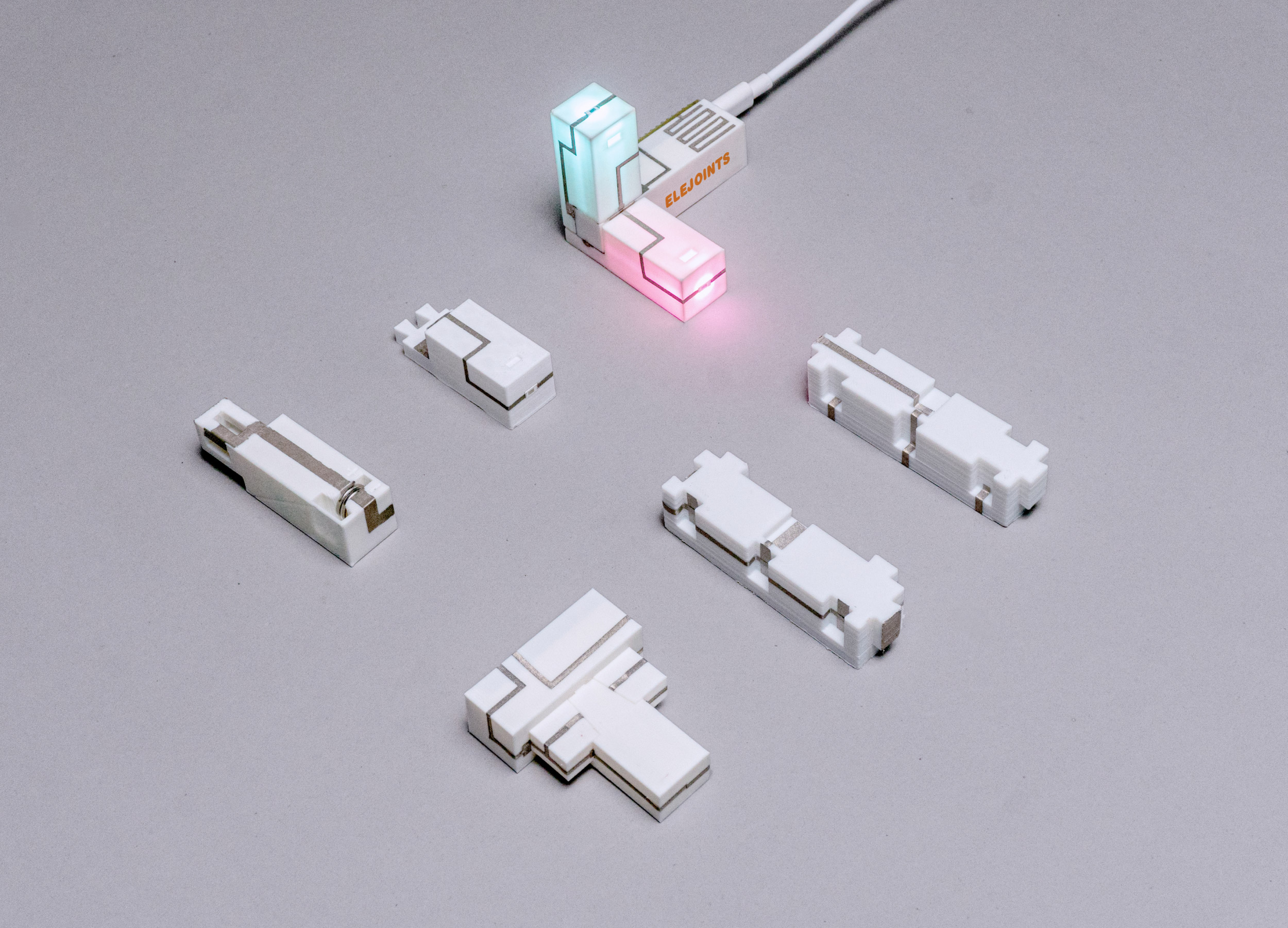
ELEJOINTS Electronic mortise and tenon toys
Zhejiang University
China
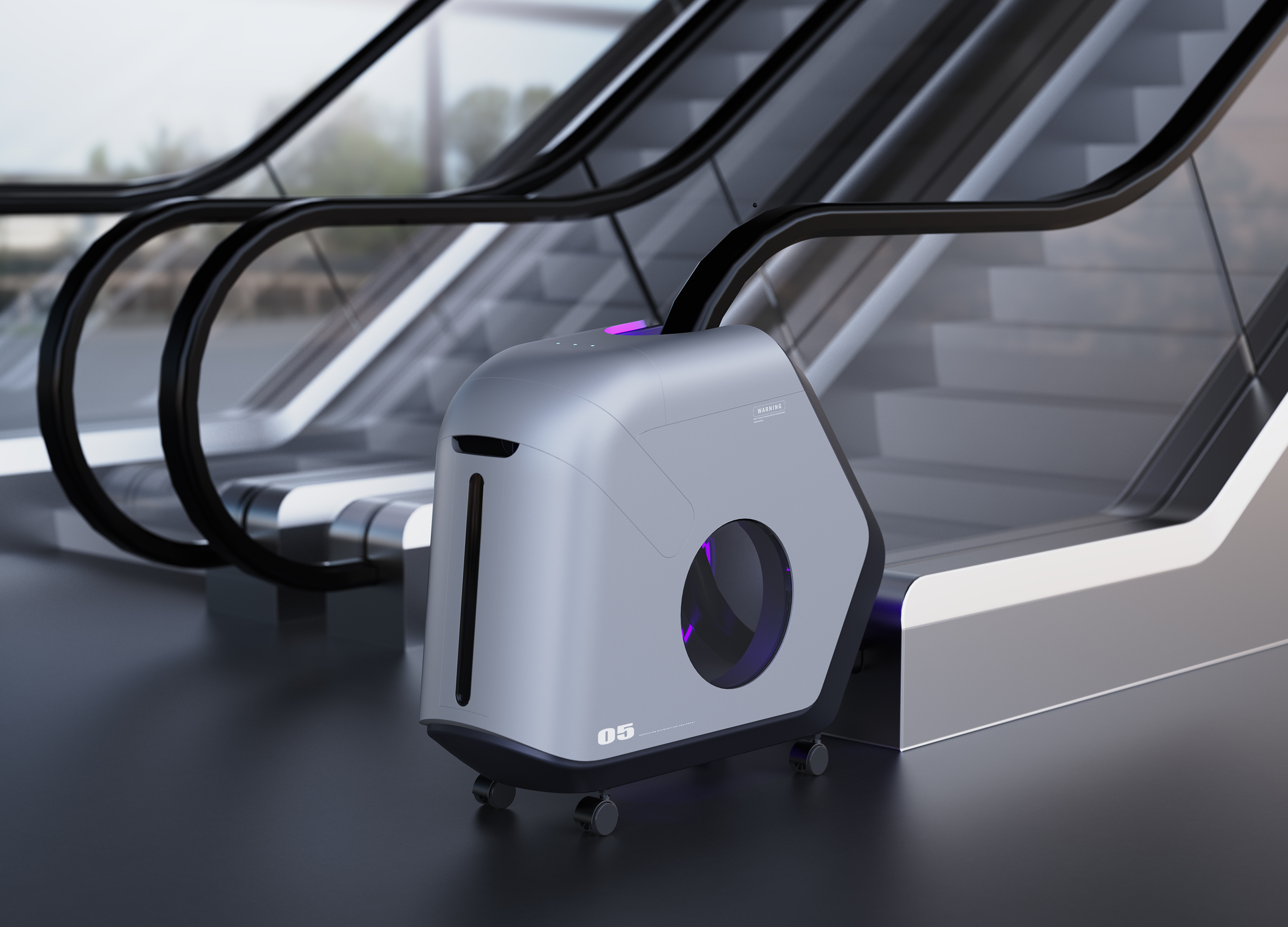
Escalator Sterilizer
Hubei University of Technology
China
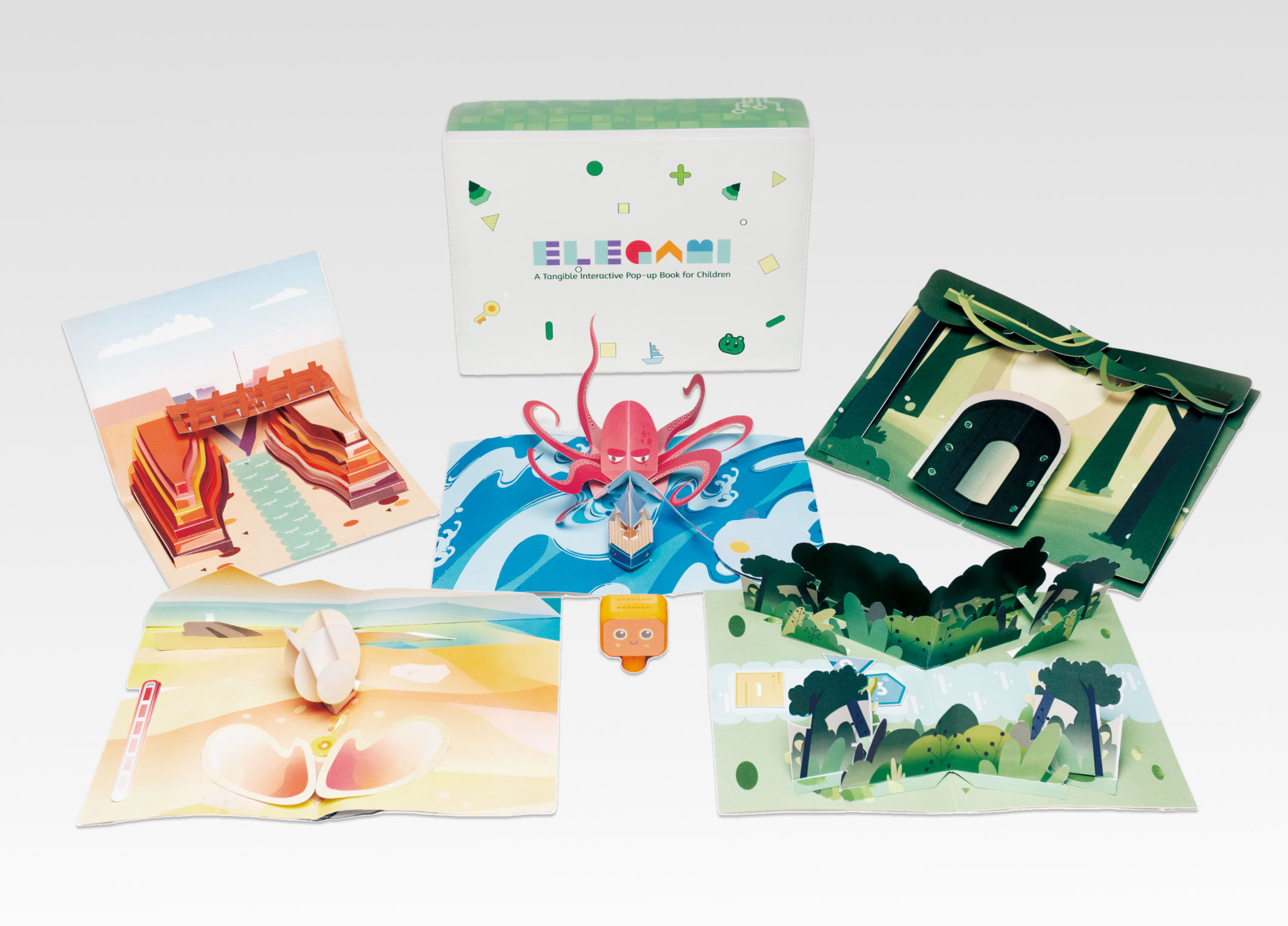
Elegami
Zhejiang University
China
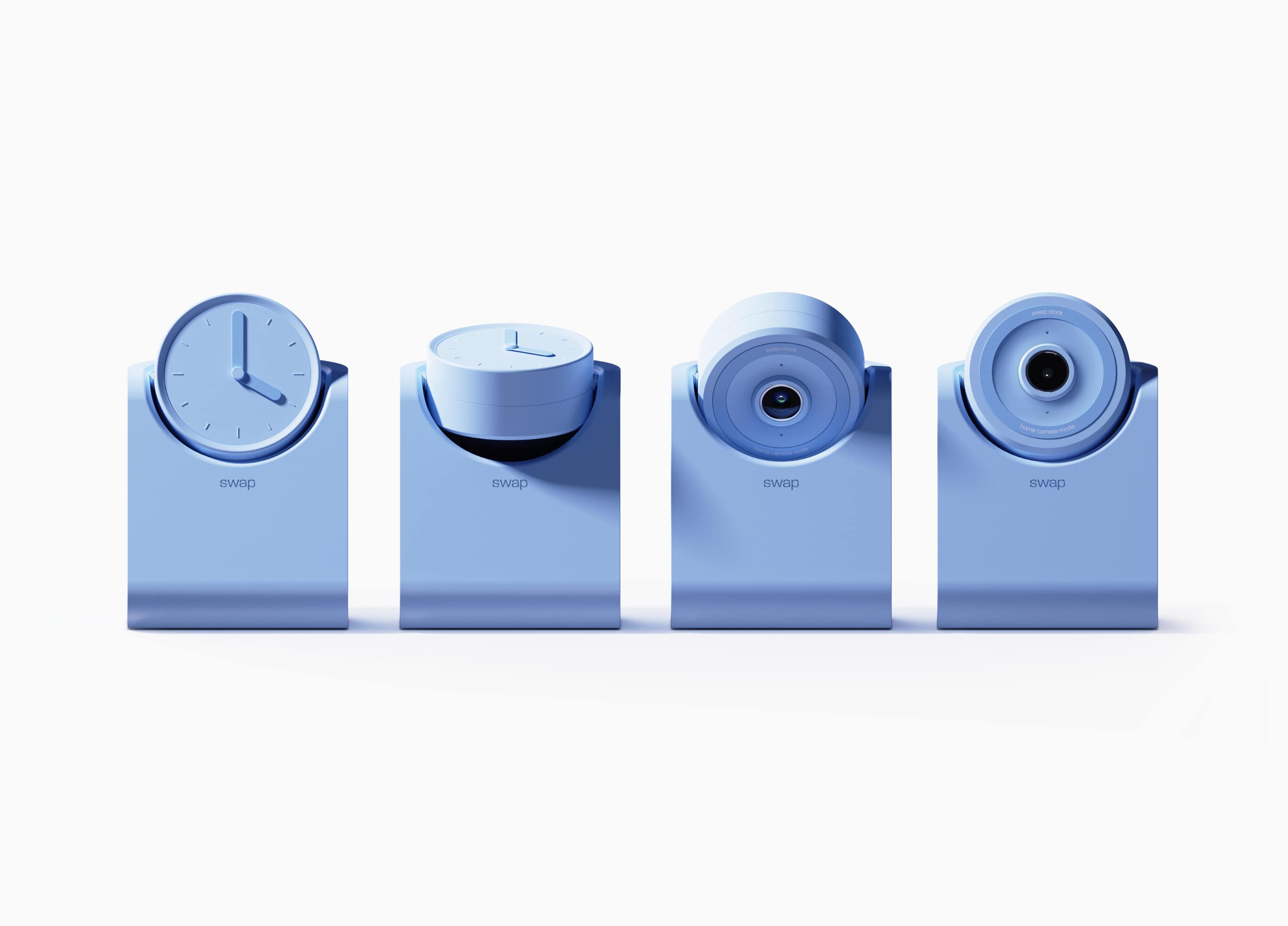
swap
Hongik University
Korea
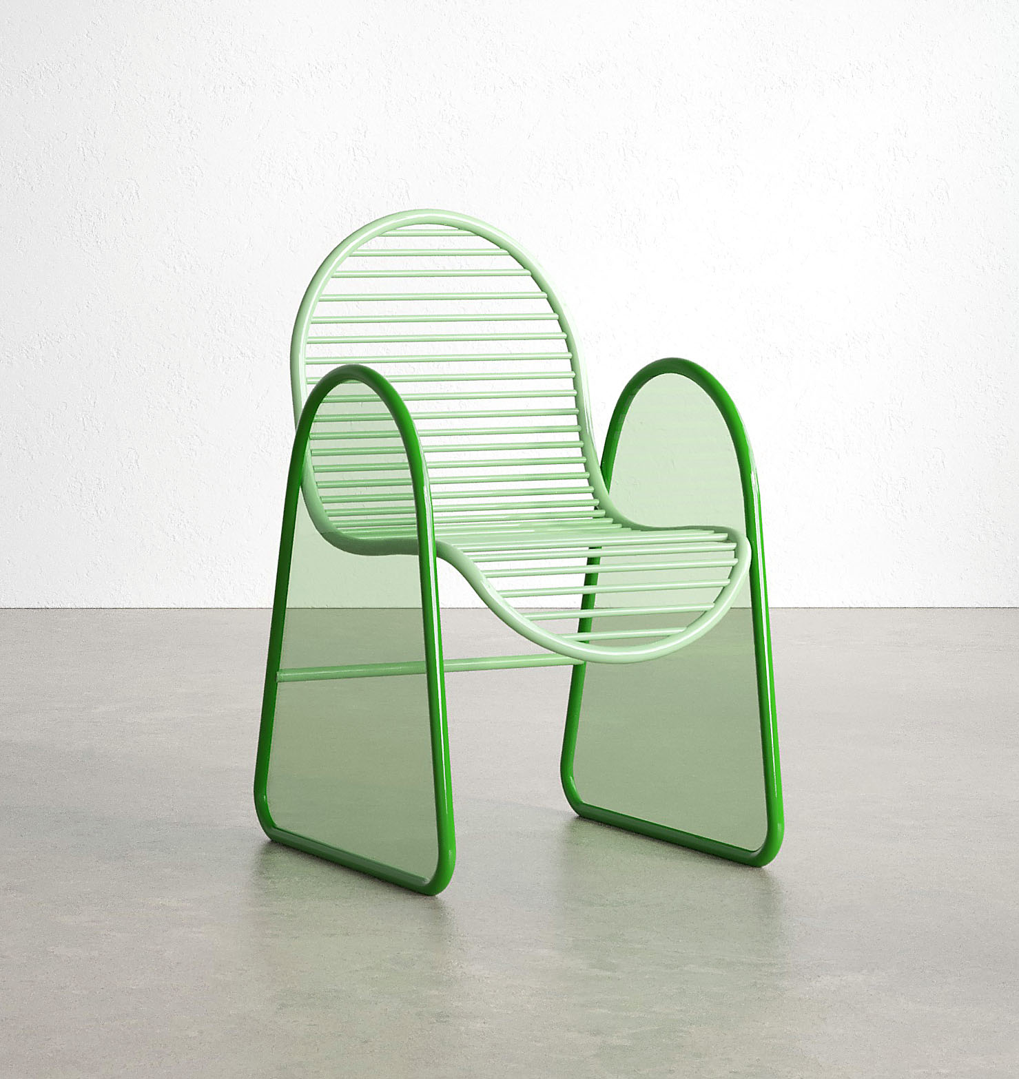
Flip Chair
Inner Mongolia Normal University
China
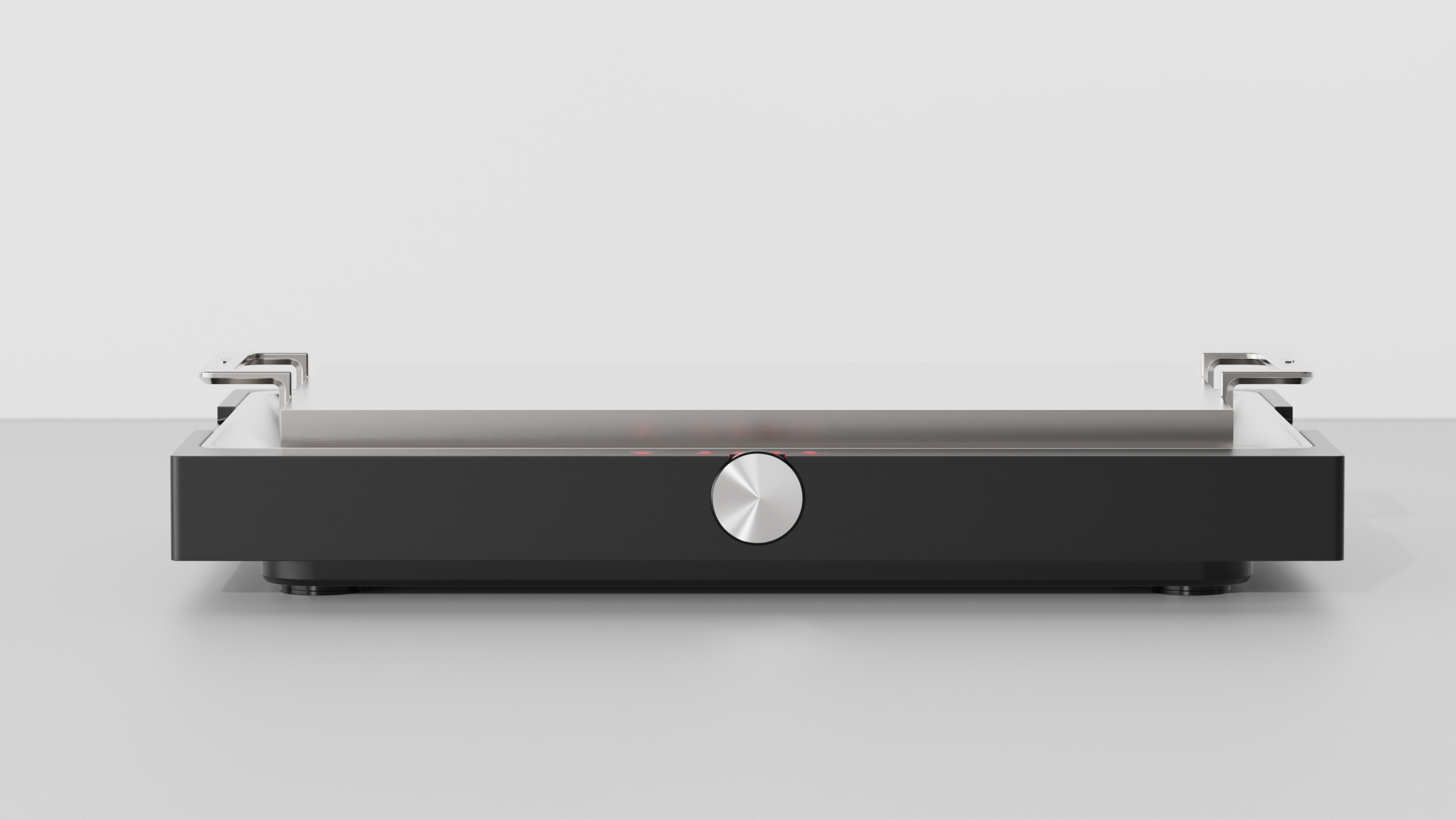
The Table
Coozin & 250 Design
Korea
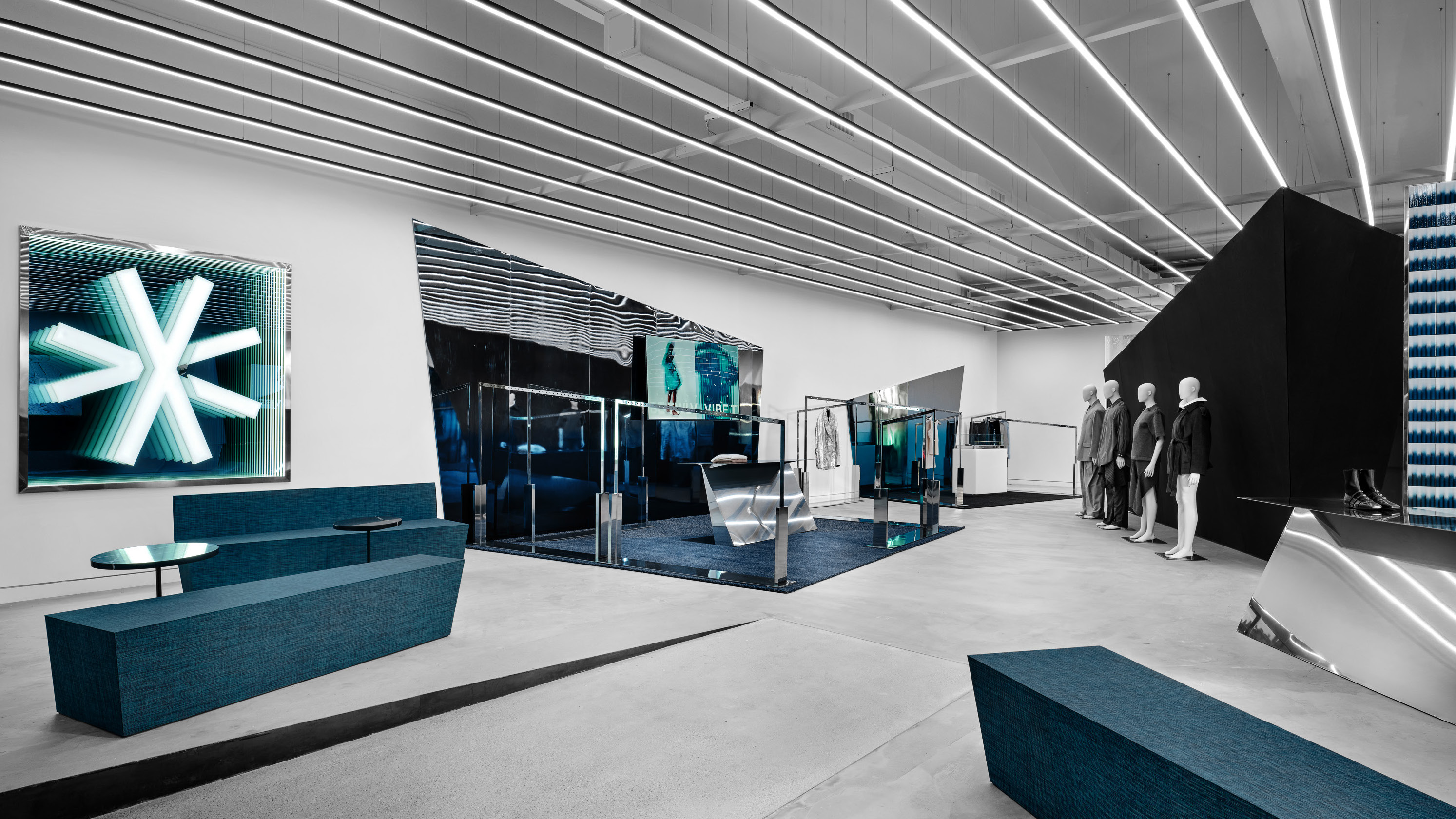
VIBE TWLV NEW YORK
STUDIO XYJ LLC
Korea
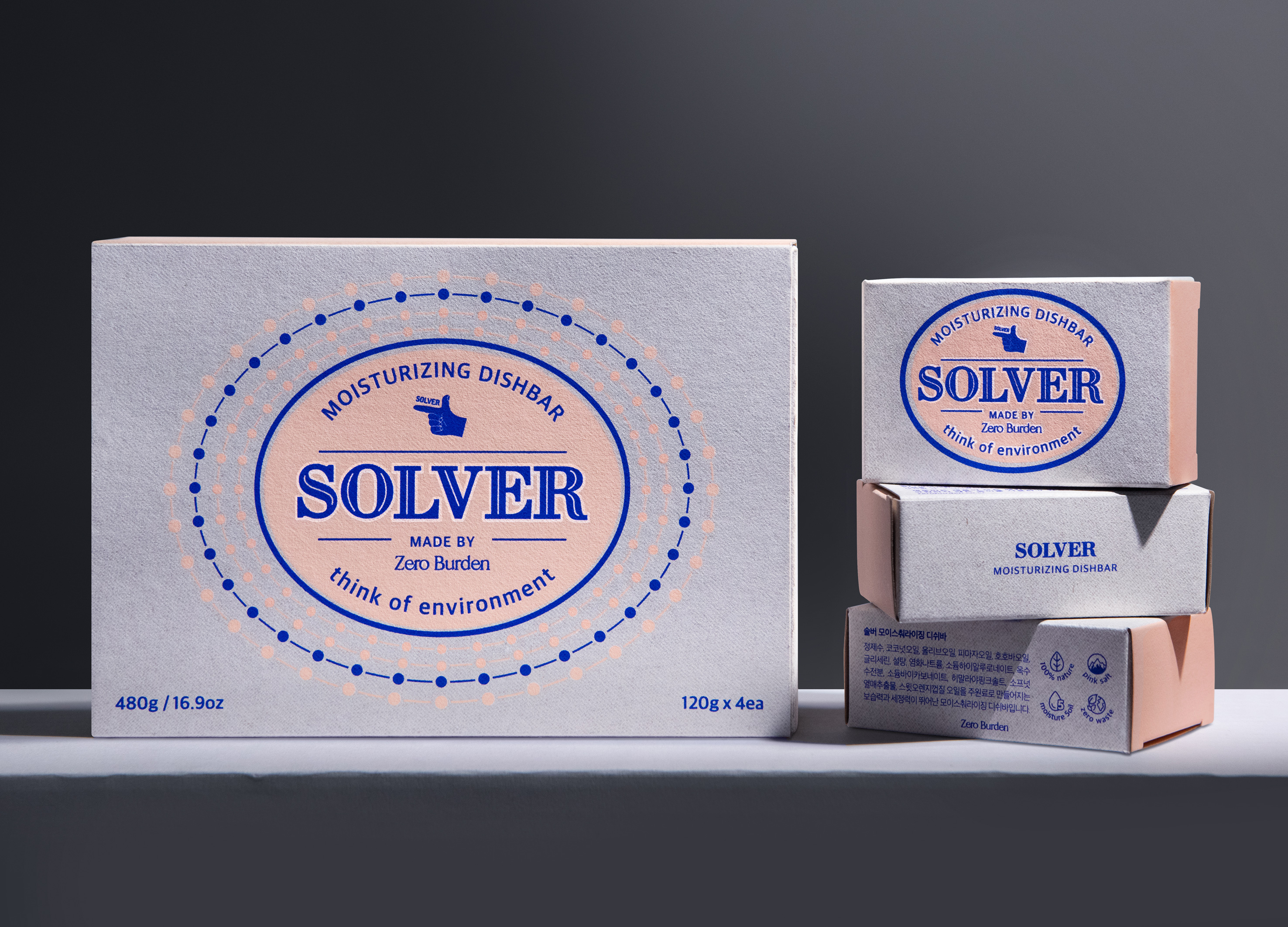
Solver Dish Bar Eco Friendly Soap Packaging
hidesign
Korea
Villa KB
PLUSOUT DESIGN STUDIO Co., Ltd.
Thailand
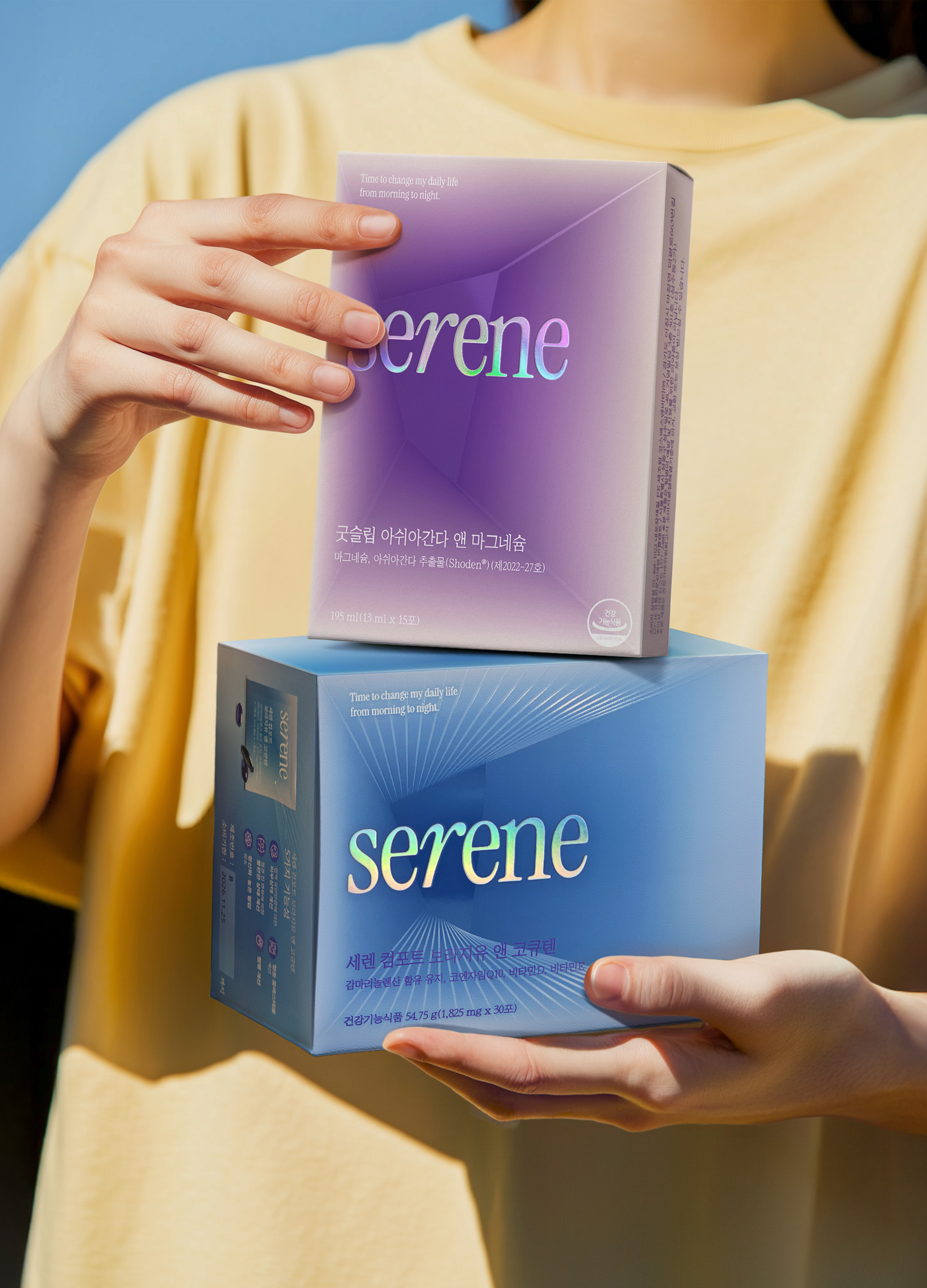
Serene Brand Identity and Packaging Design
B for Brand
Korea
SaengGwaBang Yakgwa Rebranding
Youngha Park Studio Inc.
Korea
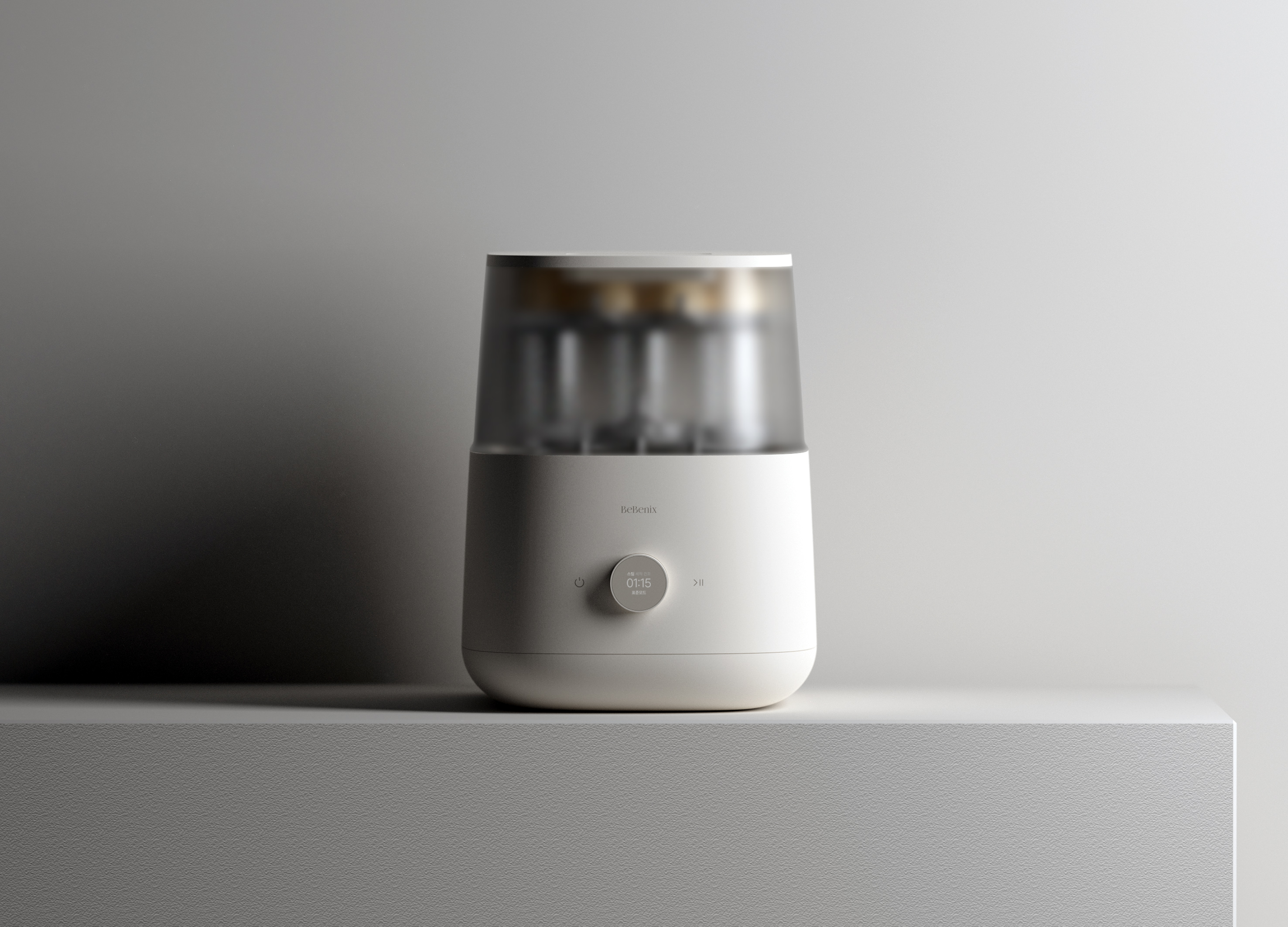
Bebenix All In One Baby Bottle Washer
Athome Corp.
Korea
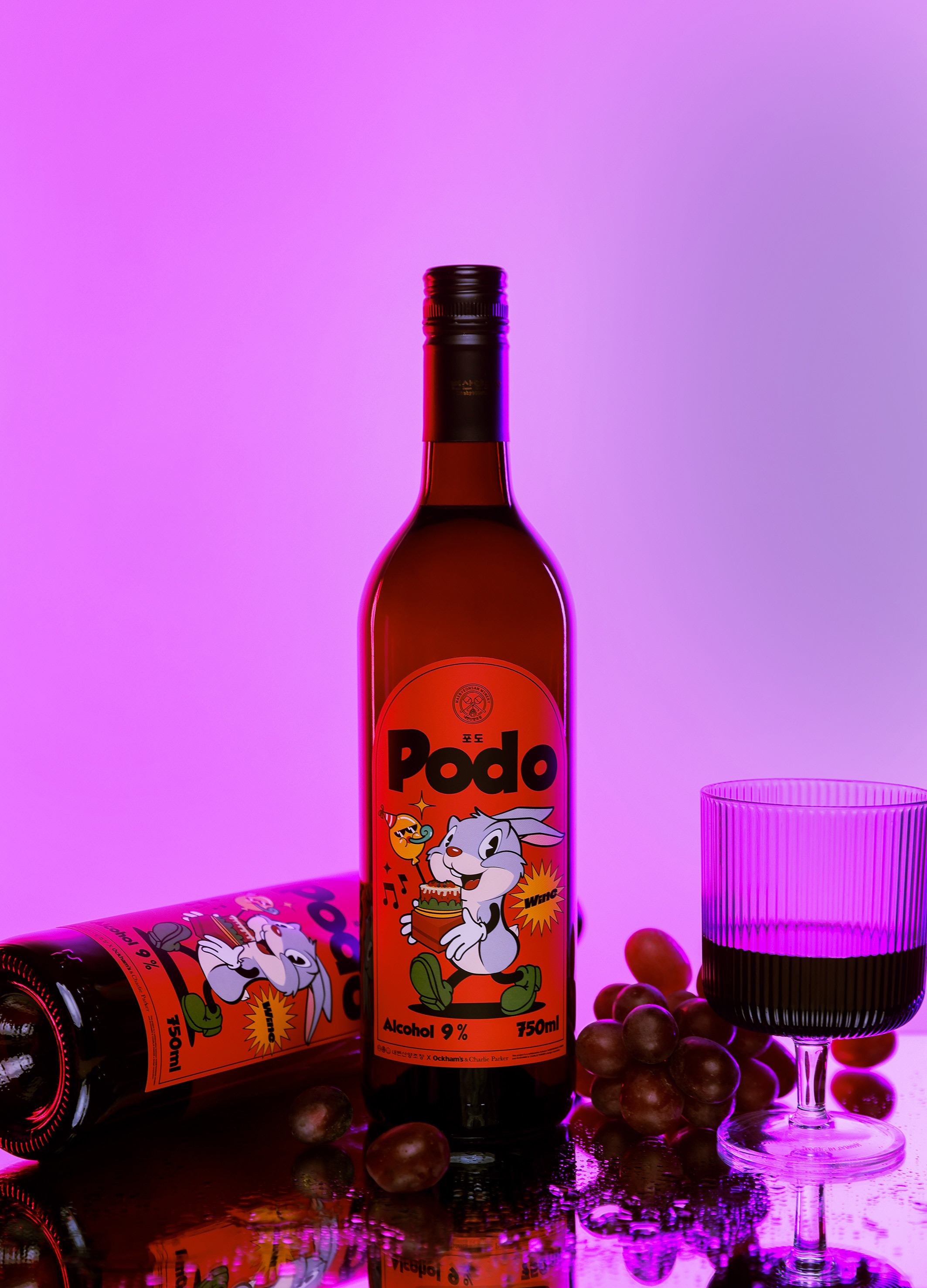
PODO wine
OCKHAMS BRANDING Co., Ltd.
Korea
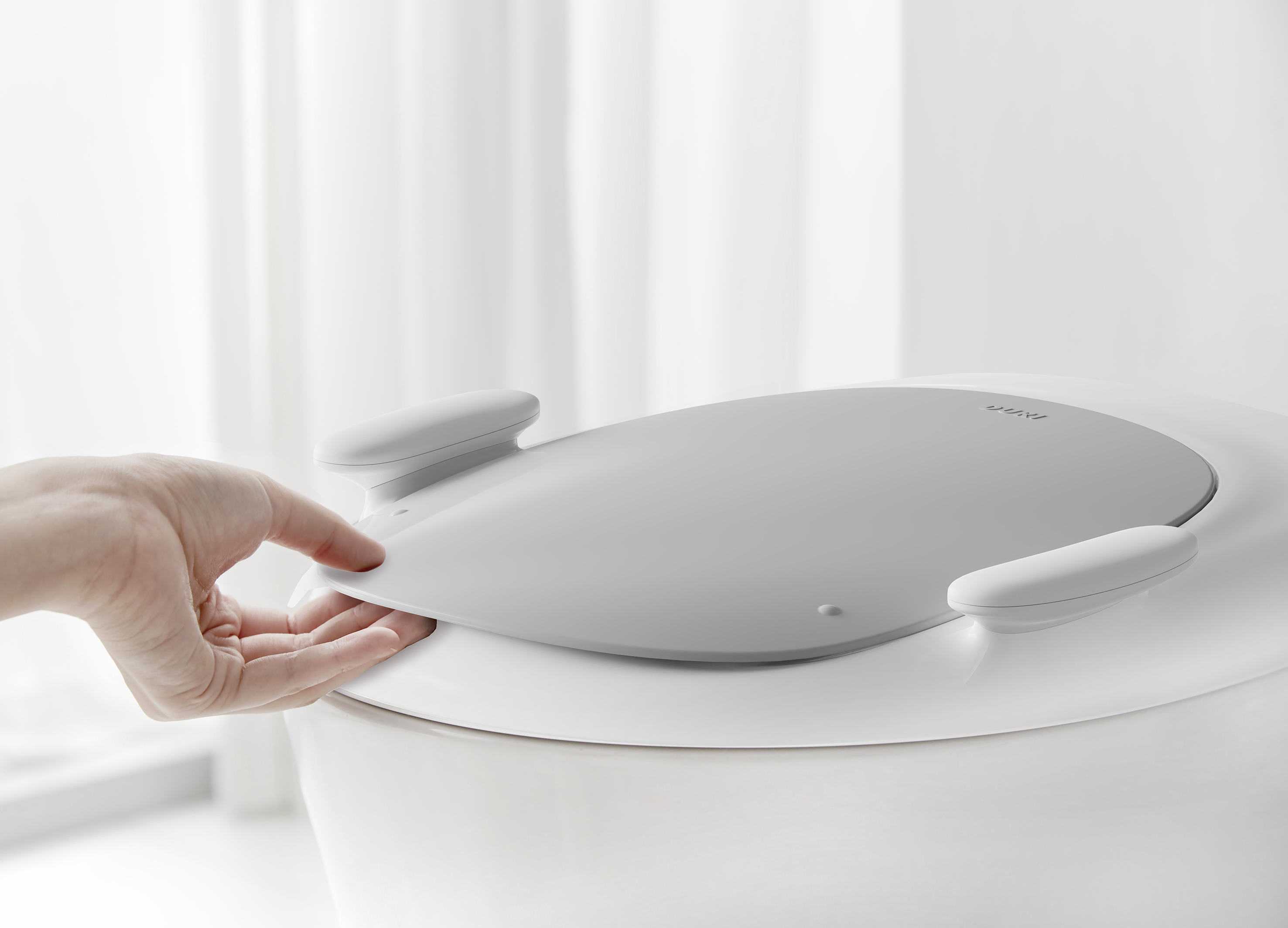
DURI handle noise free toilet seat
PRESENT
Korea
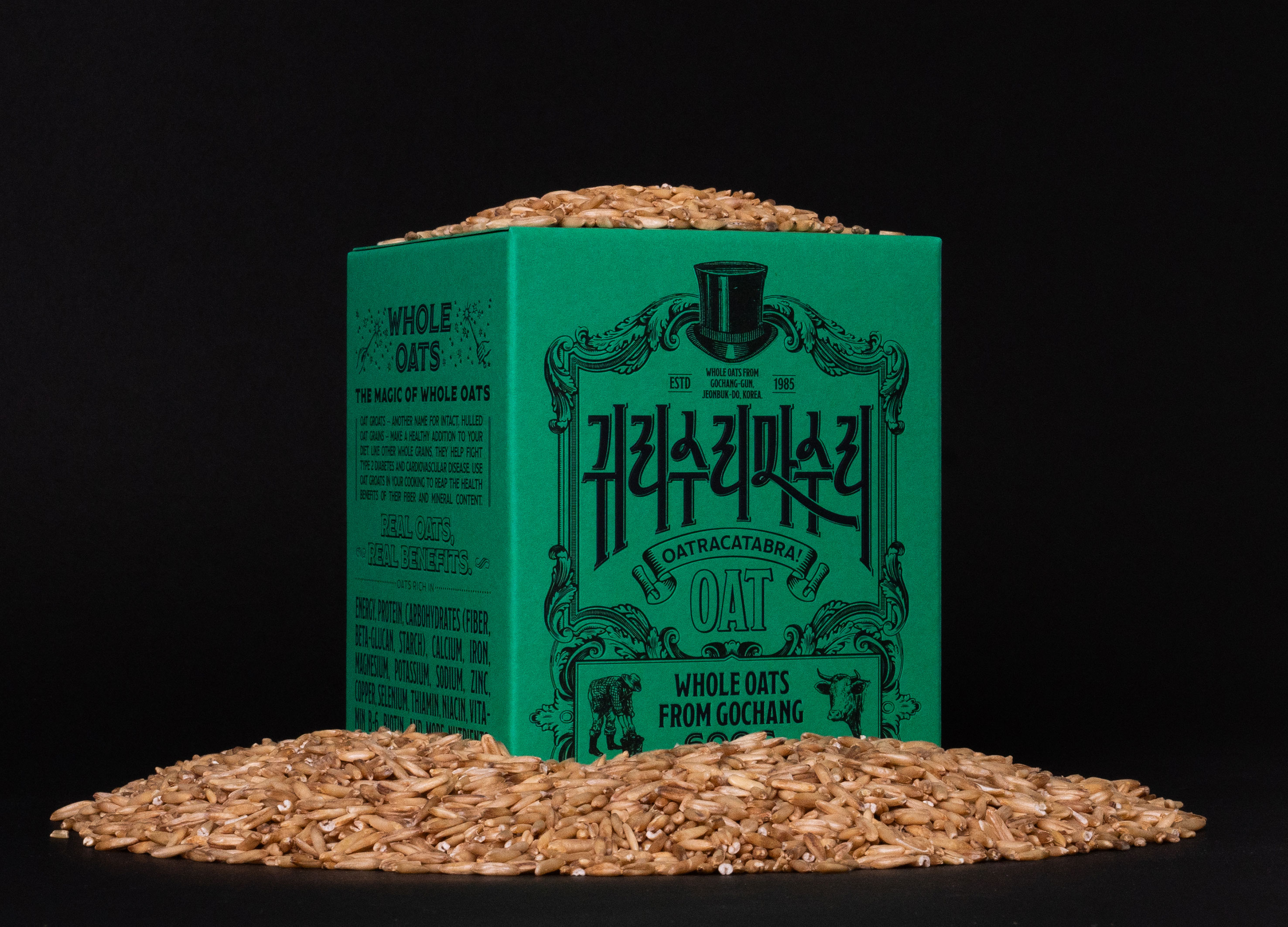
Oatracatabra
tedo inc Inc.
Korea
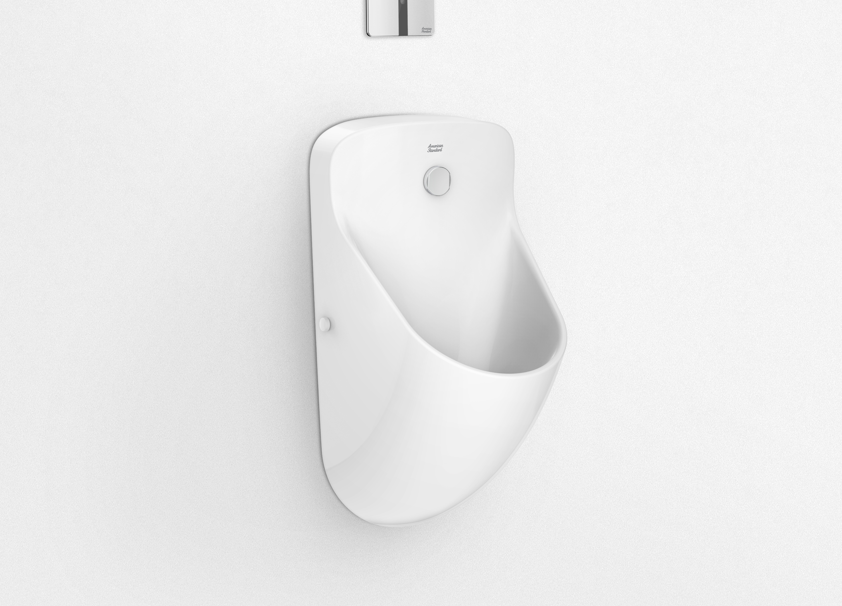
Ecobrook
American Standard
Singapore
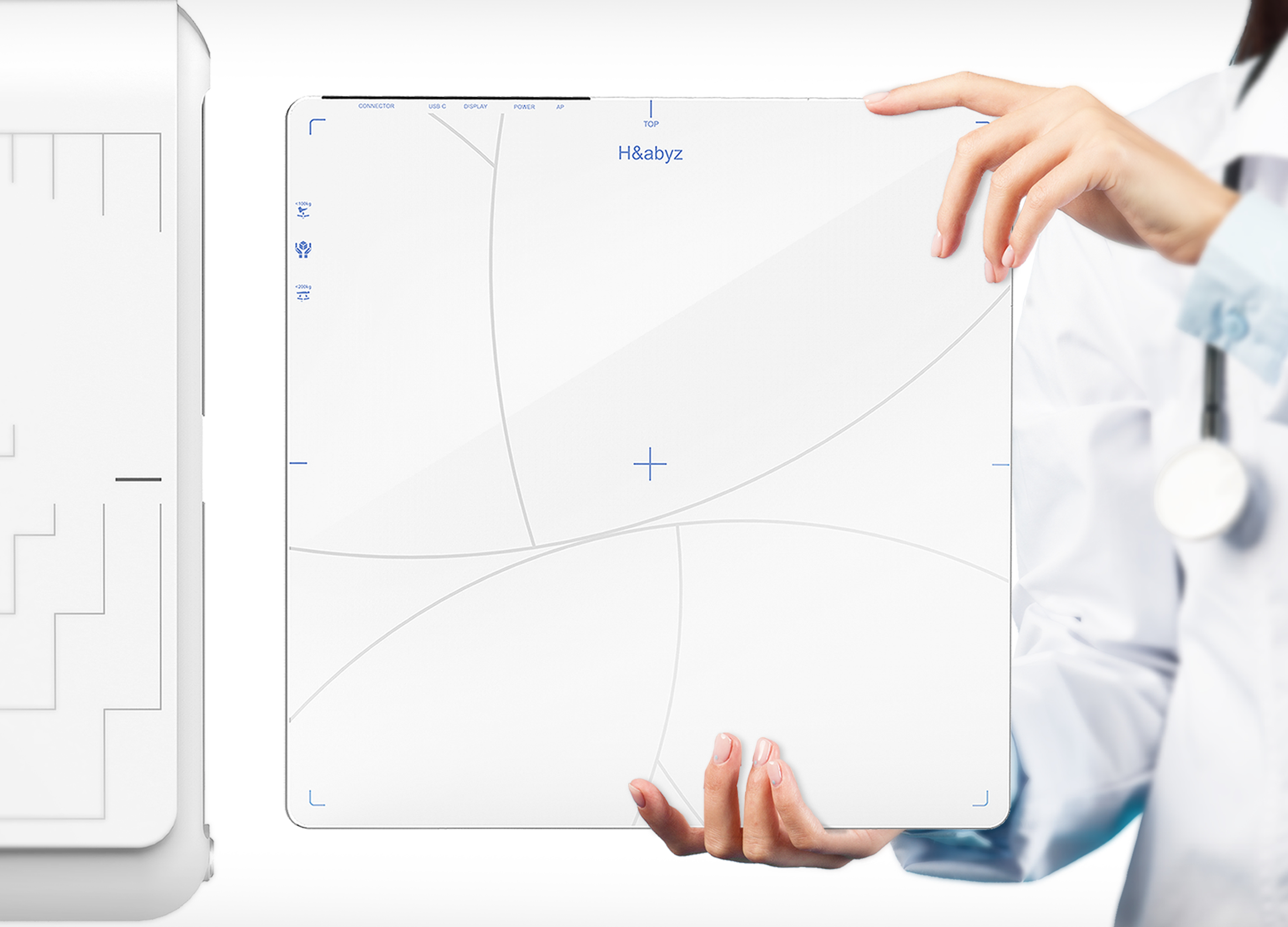
H n abyz Gen2 X ray Detector
GODESIGN
Korea
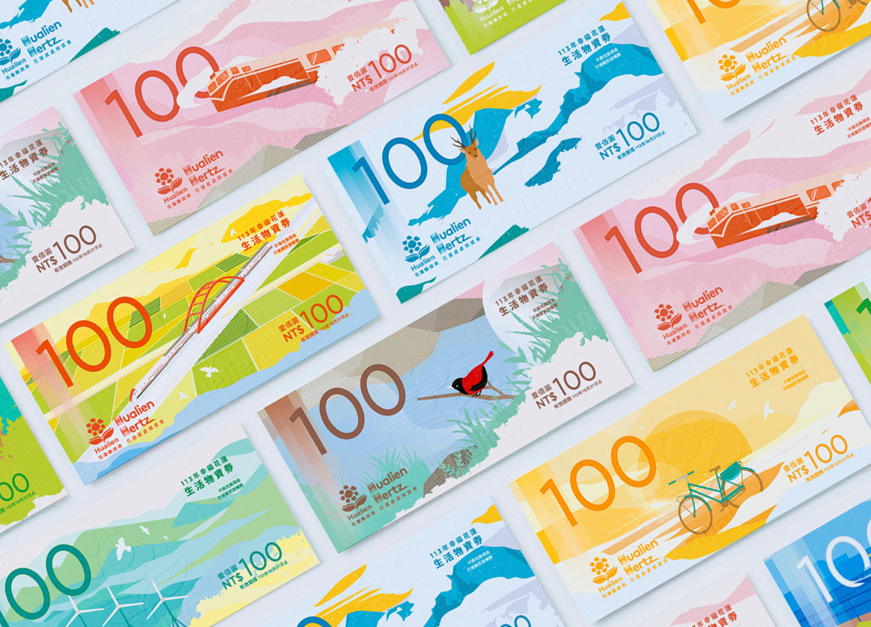
Happy Hualien Living Supplies Voucher
BENZHI Design Consultant Co., Ltd.
Chinese Taipei


Partner & Sponsor
More


info@asiadesignprize.com
#14057, 905 49, Beolmal-ro 102beon-gil,
Dongan-gu, Anyang-si, Gyeonggi-do, Korea
#14057, 905 49, Beolmal-ro 102beon-gil,
Dongan-gu, Anyang-si, Gyeonggi-do, Korea
Founder: Doyoung Kim
Business Registration Number: 454-86-01044
Online Sales License No.: 2021-Anyang Dongan-1081
Copyright © DESIGNSORI Co., Ltd.
Business Registration Number: 454-86-01044
Online Sales License No.: 2021-Anyang Dongan-1081
Copyright © DESIGNSORI Co., Ltd.
