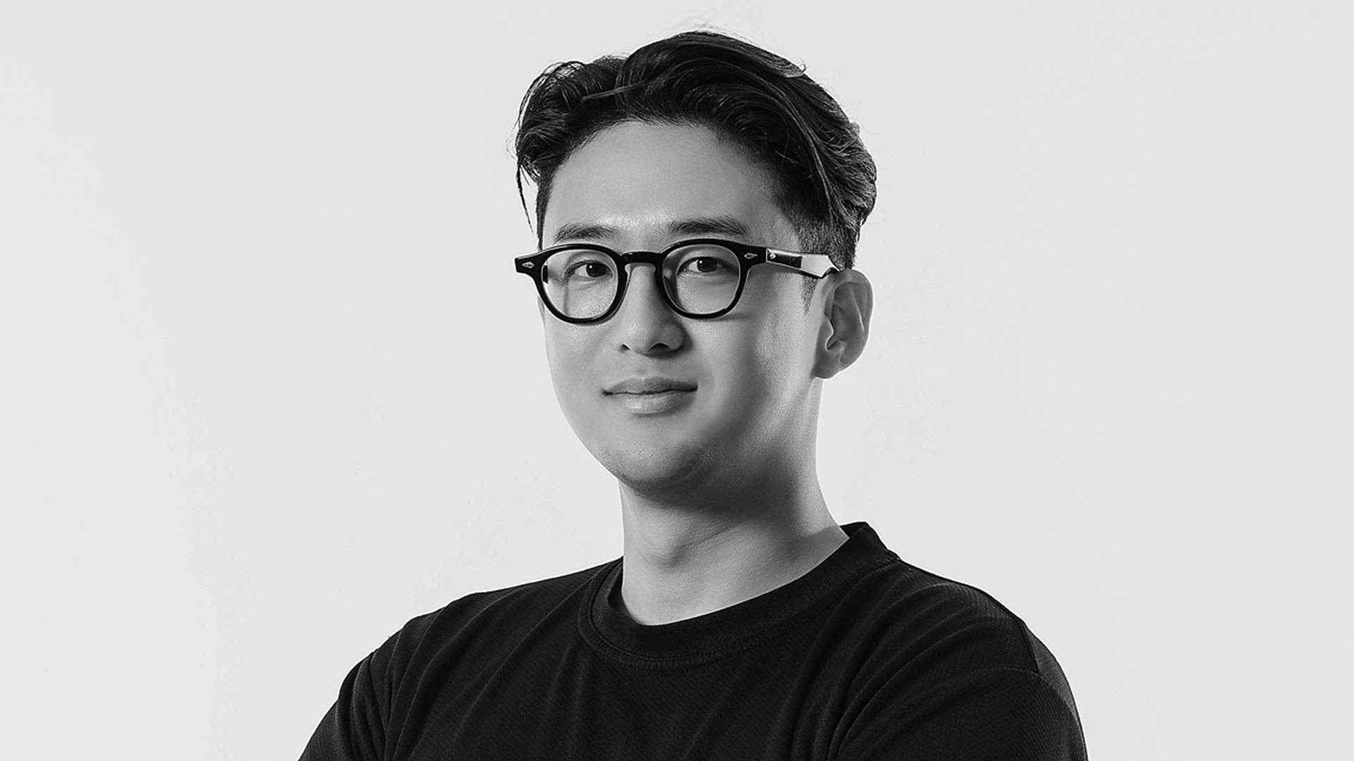
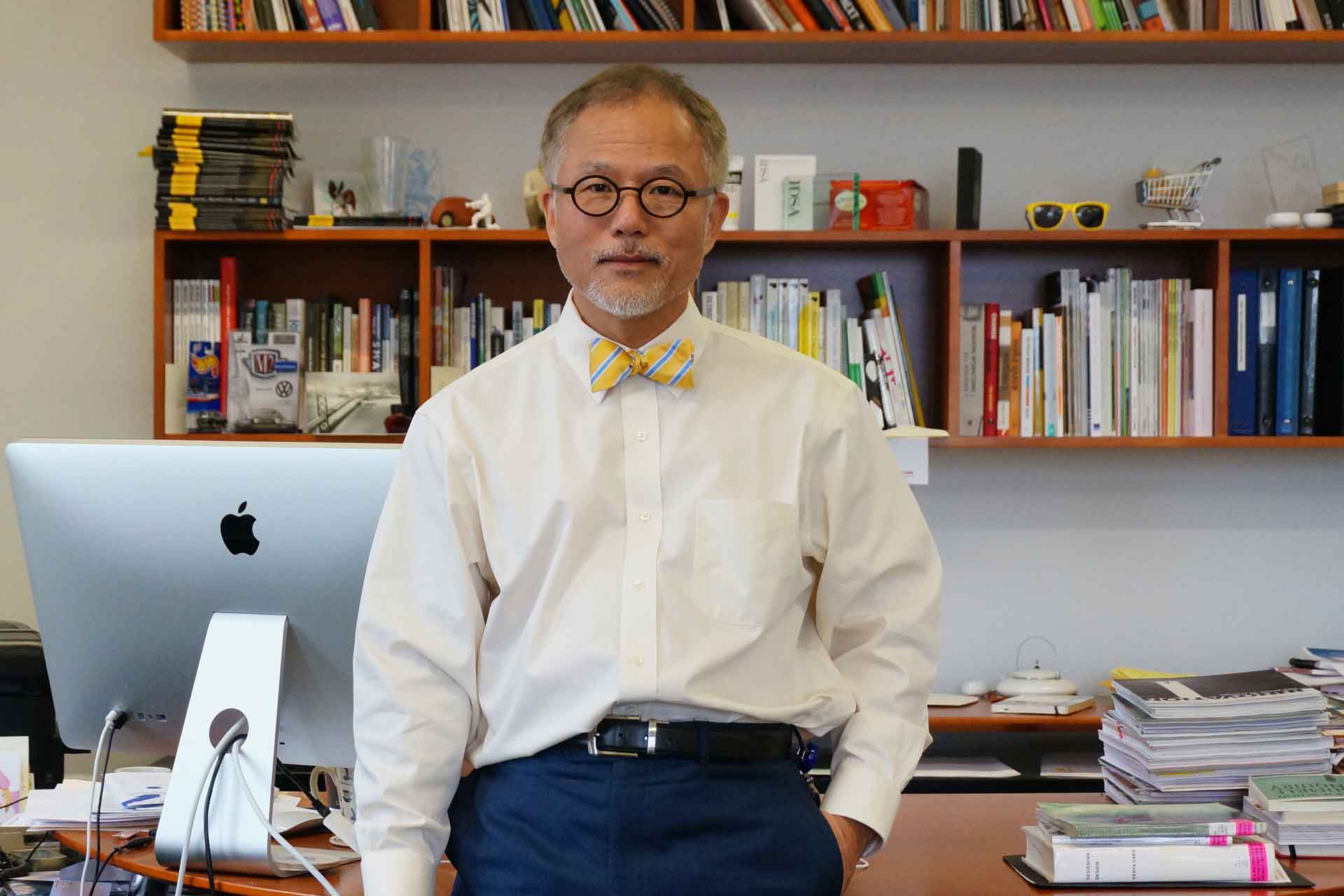
Director Marina Khodak Design Leader of TypeType
Before we begin, we would love to learn more about your design studio. Could you briefly introduce the studio’s background—where you are based, when it was established, and some of the major type or branding projects you have worked on? We’d also be interested in hearing about your team’s design philosophy or what drives your creative direction.
The company grew out of the friendship between Ivan Gladkikh (CTO) and Aleksandr Kudryavtsev (CEO). Ivan was fascinated by fonts and taught himself how to create them, simultaneously launching a free fonts project called Jovanny Lemonad. The first type designers at TypeType were trained by Ivan; it was he who instilled in each of them a love and respect for the profession. Today, TypeType is an international type design studio and one of the largest in the world, with more than 90 team members from around the globe working on our projects. We design typefaces and provide customization, mastering, and other services. Our fonts are used by companies all over the globe, such as Tom Tailor, Uniqlo, Cartoon Network, Doordash, Telefonica, CBSN, Vogue, Mattel, and Intercom. We are committed to supporting and growing the field of type design, which is why we actively engage in educational activities. This includes publishing articles, podcasts, and videos; hosting webinars; collaborating with educational projects and universities; and providing internship opportunities for students. Our mission is to design cutting-edge, aesthetic, multifunctional, and user-friendly fonts and to share our expertise in type design. We are constantly refining our approach and staying on top of trends to craft high-potential new projects and enhance our existing ones.
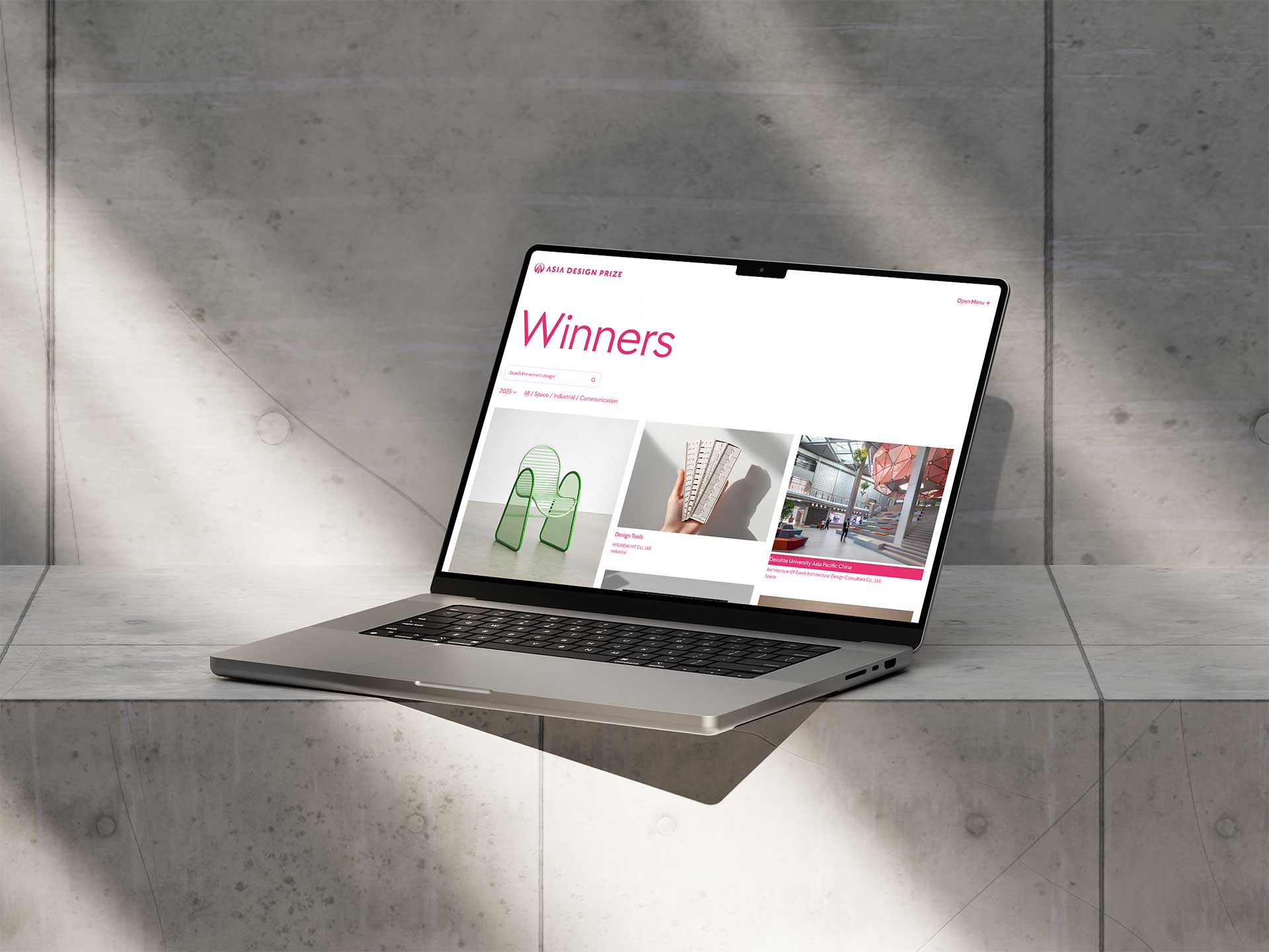
TT Chocolates is currently used as the primary brand typeface of the Asia Design Prize. Could you share the original design concept and intention behind the font? What kind of visual or emotional tone were you aiming to achieve?
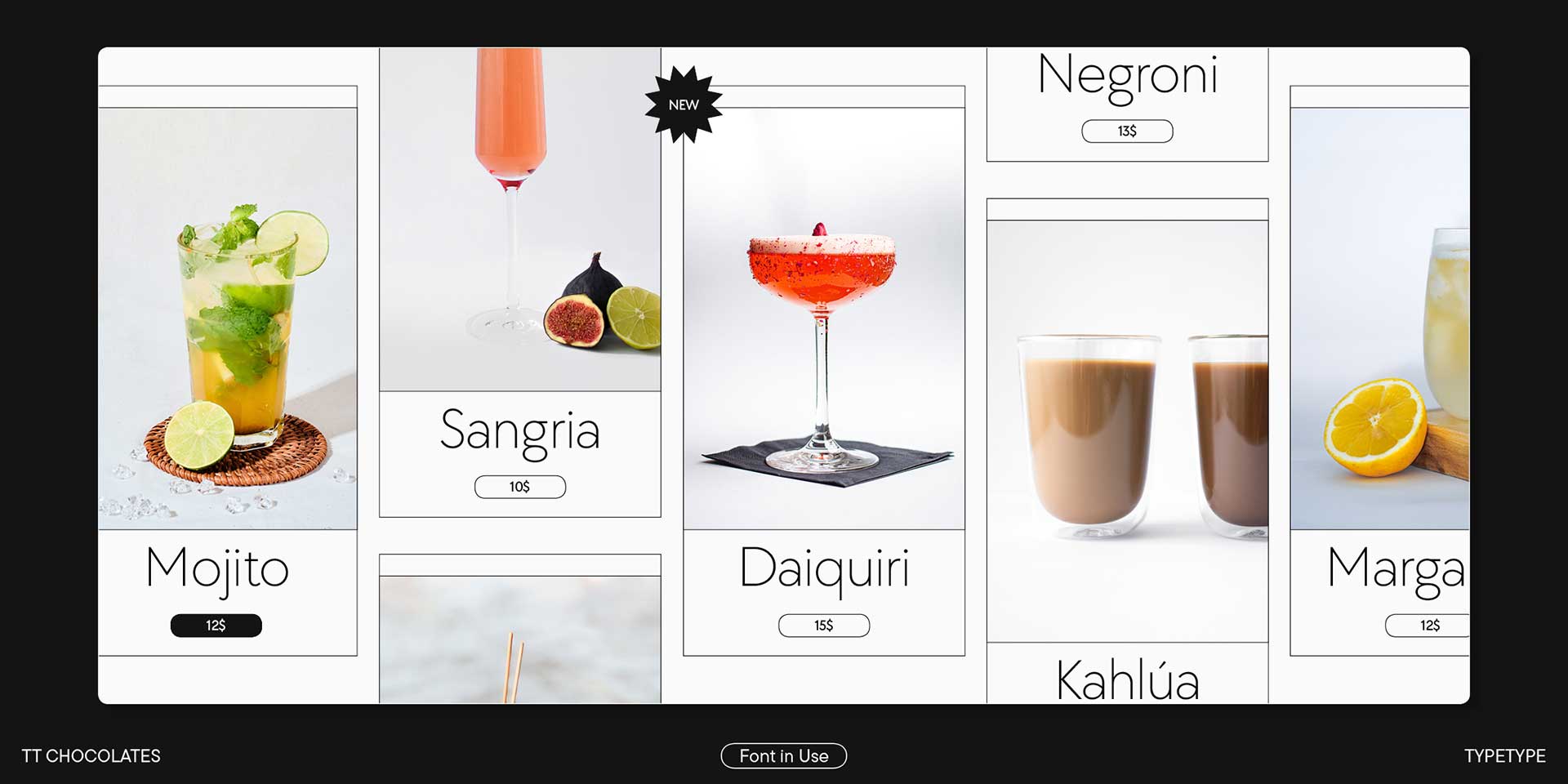
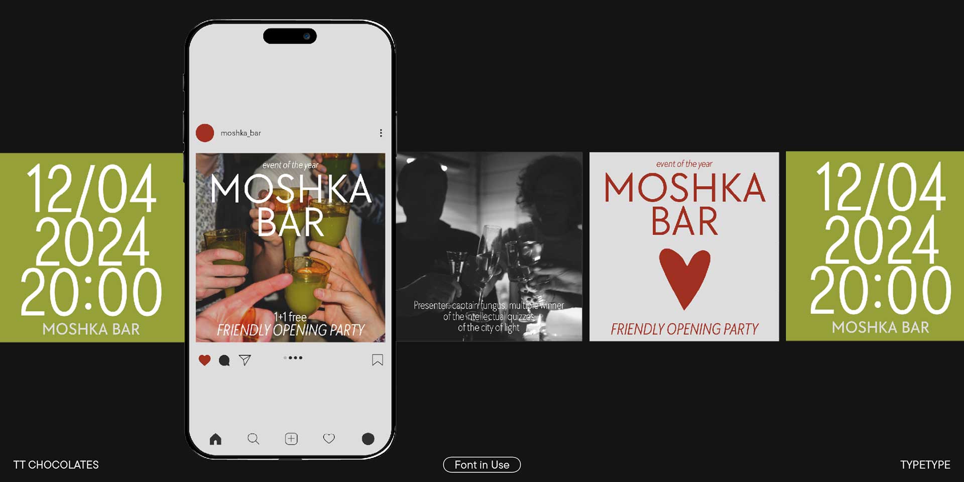
The first version of TT Chocolates was released in 2015. The studio was just starting, and it was important for us to build a strong typographic foundation by developing several flagship fonts that could solve different problems and become popular. TT Chocolates was initially conceived as a typeface for confectionery packaging, chocolates, and other similar beautiful things. Hence the descriptive name. We planned to develop an alternative to geometric sans serifs like Futura. At the same time, we wanted to make the font not entirely neutral but to add more softness and elegance. The font was meant to have a certain openness and gentleness. At that time, Neutraface by House Industries was trending, and we really liked its balance of openness and geometry.
TT Chocolates is often described as sharing several qualities with Helvetica—it’s universal, efficient, and clean in its appearance. As a variable font, it also offers users a high degree of flexibility, much like Helvetica has done in countless branding systems around the world. From your perspective, what are the key structural or stylistic differences between TT Chocolates and Helvetica? In addition, how do you see TT Chocolates responding to or engaging with the legacy of Swiss modernism? Would you say it continues that tradition, subtly challenges it, or reinterprets it for a more contemporary visual culture?
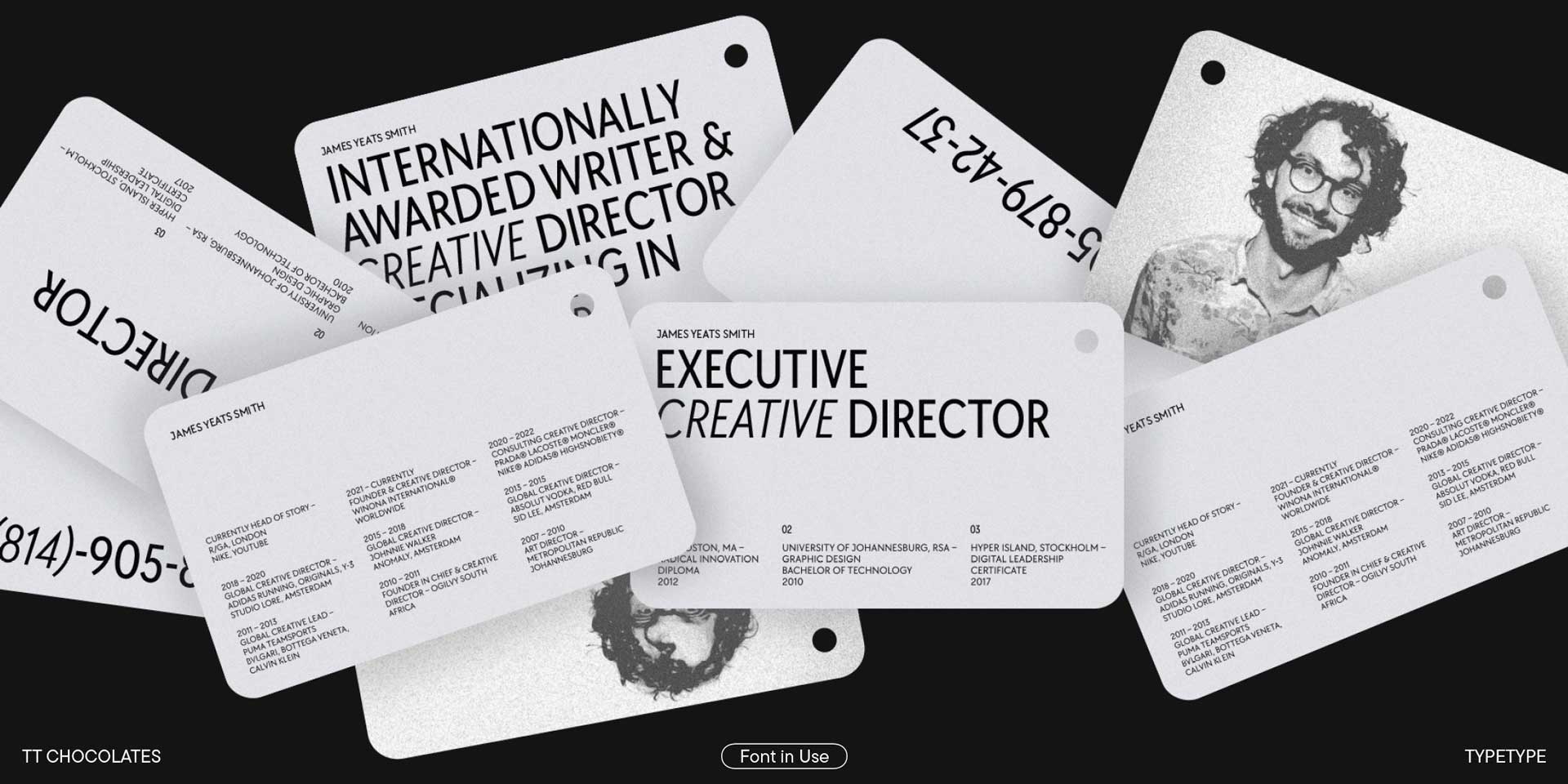
It's very interesting that you compare TT Chocolates with Helvetica. They are actually fonts from different categories. Formally speaking, Helvetica is a Neo-Grotesque. It has specific vertical proportions and a static rhythm created by its monospaced characters. It features a semi-open aperture and horizontal terminal cuts. The font lacks dynamism and conquered the world with its restraint. TT Chocolates, on the other hand, is a geometric sans serif. This is primarily due to its rounded characters (O, C, e), which strive for perfect geometric circularity, and its triangular characters (A, V, W), which are further emphasised by sharp, significantly overhanging apexes. The font is also proportional and very dynamic. It has a deep humanistic character embedded in it. From a formal perspective, it's quite difficult to compare these fonts visually. However, as you rightly point out, they have very similar functionality in terms of versatility. It was a revelation for us to discover that despite its friendly character and rather active forms, TT Chocolates is more of a universal font than a display or distinctive one. In 2021 we conducted a major study of the sans serif market. We analysed best-selling fonts based on specific parameters and surveyed our font users. The data revealed that Neo-Grotesques are in the highest demand, followed by geometric fonts with parameters similar to those of TT Chocolates. This means the font fits the definition of a universal sans serif. Based on our research findings, we made TT Chocolates even more versatile by slightly toning down certain aspects and emphasising its multifunctionality over its distinctiveness.
In designing TT Chocolates, what were some of the key considerations you focused on to ensure it met the demands of contemporary typography? Are there specific design elements—such as proportions, terminal shapes, or spacing—that you feel best reflect a modern visual language within the typeface?
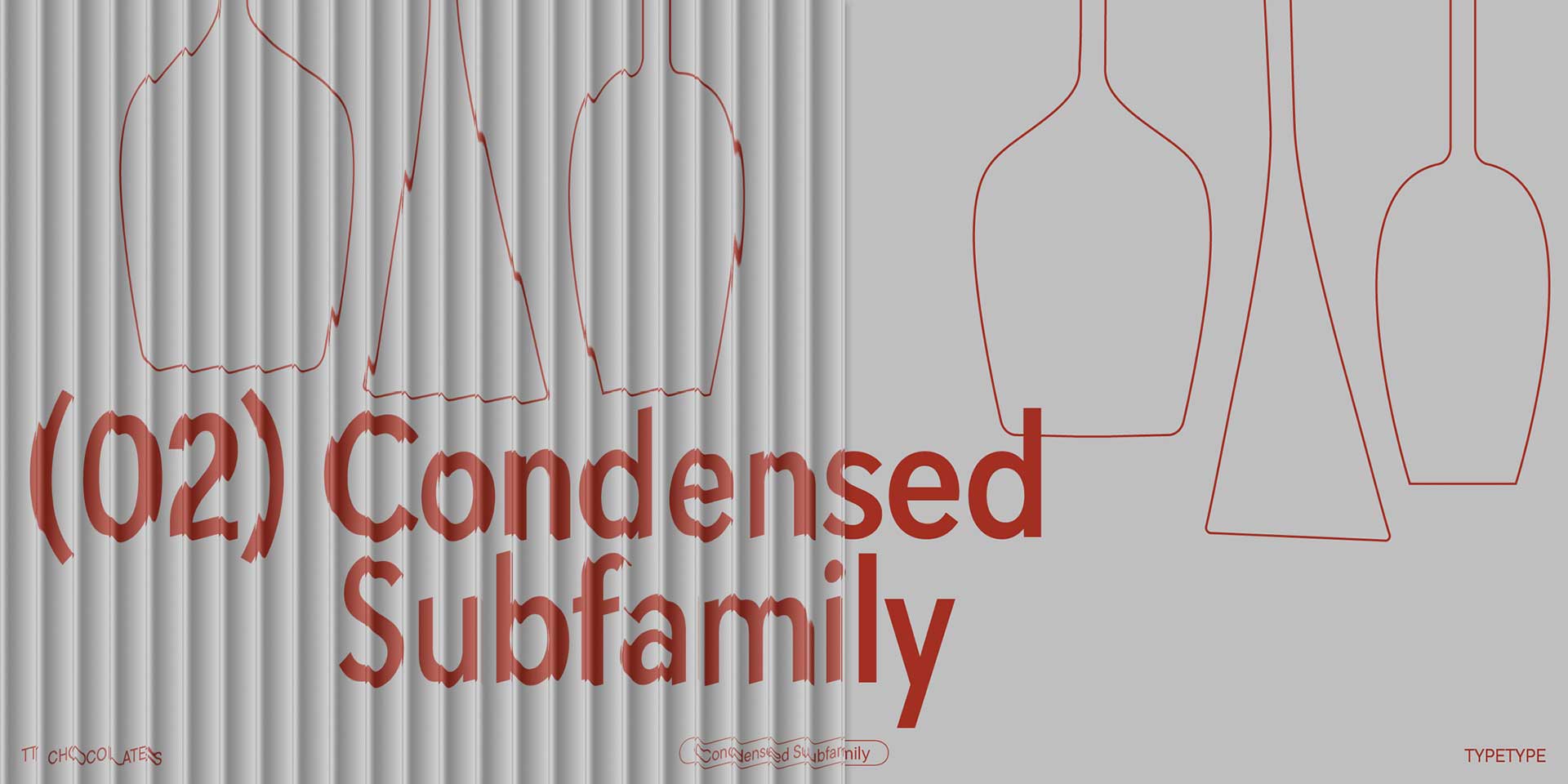
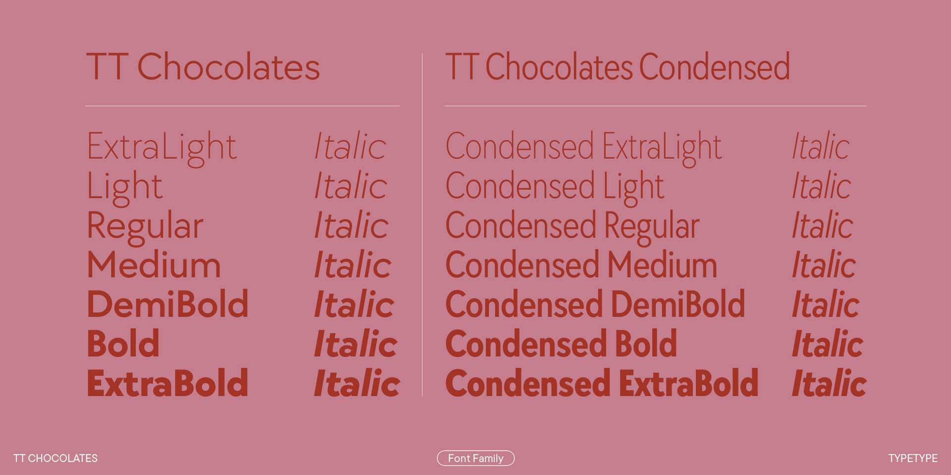
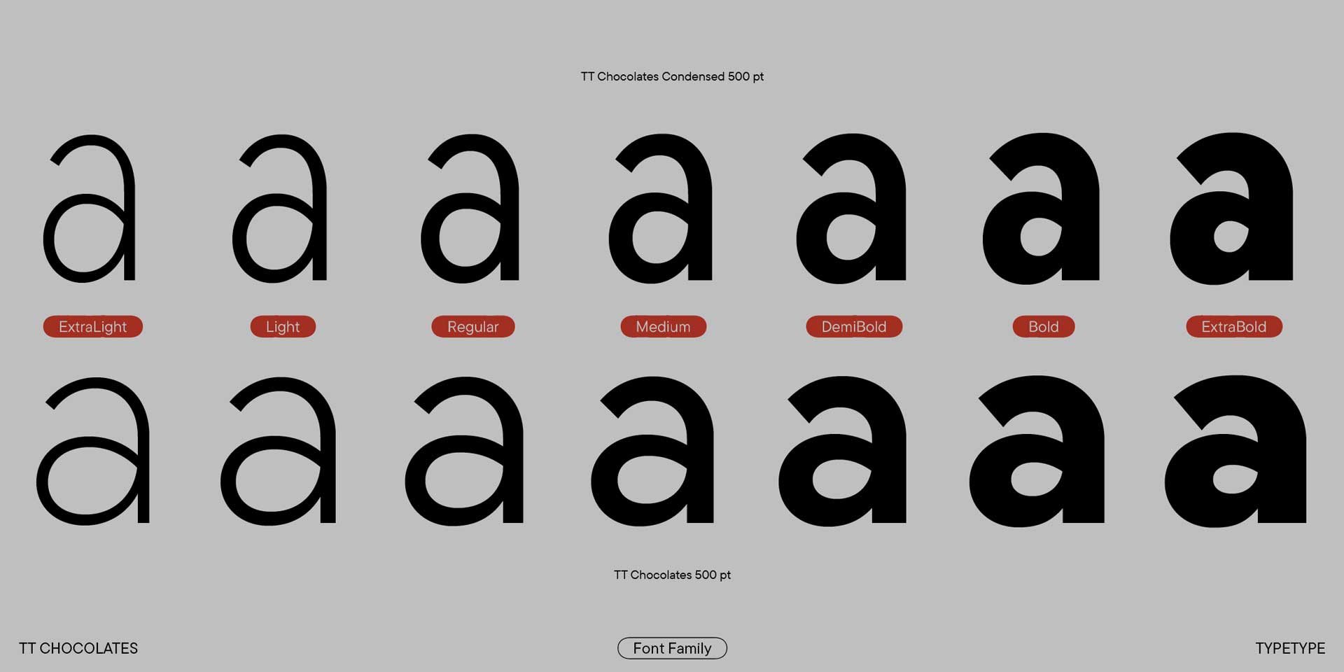
Over its 10 years of existence, TT Chocolates has changed significantly twice. While it was initially more of a display font, it has now become more neutral and multifunctional, while still retaining its open and gentle character. The graphics have been simplified. For example, the triangular characters became less decorative; their sharp apexes became wider and lower but did not lose their expressiveness. The lowercase letters became taller, which is more typical for modern fonts, especially sans serifs. The spacing, including the line spacing, became tighter. The font increasingly evolved into a universal tool, moving away from its more original and specific graphics. And regarding leading, I can share a secret. In almost all our fonts, the leading is standardized (unless the font's design requires a different approach). We arrived at the right parameters through years of practice, and feedback from our users also helped us decide.
The current parameters are a perfect fit for most tasks and can be considered standardized. If you need to make the text set tighter or looser, you can adjust the parameters directly during layout. The weights in our fonts are also predictable, which simplifies the user's work. When developing a new font family, we research the fonts available on the market. We know the approximate thickness each weight should fall into. For example, a good thickness range for the Regular style would be around 80–90 points. If the stem thickness is 75 points, the font might appear lighter than expected when replaced in a layout. This can be an unpleasant surprise for the user. An unexpected result will always reduce the font's functionality and demand, especially for workhorse typefaces.
TT Chocolates is currently used across multiple aspects of ADP’s identity, including branding, web, and editorial content. When developing the typeface, how did you envision its functionality across such a wide range of platforms? Was it a conscious part of your design process to ensure consistent performance in both print and digital environments?
We've been designing fonts for over 10 years, and it still amazes us how the world sees a font, how users apply it, and what they find in it — whether it's concepts we embedded or new meanings users uncover based on their own experiences. The fact that TT Chocolates evolved from a "confectionery" font into the voice of the ADP beautifully illustrates the development and value system of TypeType. Beyond conceptual richness, it's important for us to create high-quality fonts that are technically close to perfect. We have a team of top-tier specialists who handle font mastering, kerning, and hinting. The font is tested by type designers during the drawing phase for evenness of set and graphic consistency. After the drawing is complete, font engineers refine its technical components and test it on various systems and software. So, you could say that reliable performance is a core characteristic of all our fonts, and TT Chocolates is no exception.
Helvetica has long been the default typeface in global branding systems, including throughout Asia, where its neutrality and modernist legacy have made it a popular choice. However, ADP has intentionally selected TT Chocolates as a more contemporary alternative. From your perspective, what aesthetic or cultural gaps do you think TT Chocolates addresses—particularly within the Asian design context where Helvetica has traditionally dominated?
That's a complex question, but I can speculate. From my experience working with fonts in a branding context, I can say that it's crucial to find a balance between standing out from competitors and not looking like a complete outsider. Many clients come to us with similar requests: they want a font like their competitor's, but different. This is where the extensive and complex work of a type designer begins. We need to create something that is the same, yet different. The client sees graphics they like in reference fonts and wants the same, but there's no value in copies. There's no value for the client because they will just blend in with their competitors. And there's no value for us as type designers, as we always want to bring something new to the world, advance the field of typography, and grow ourselves. In such cases, we try to understand what exactly about the graphics appealed to the client, but we approach it from an emotional and functional perspective.
We aim to offer a metaphorical solution, not a literal one. When you start using a fundamentally different sans serif against the backdrop of Helvetica, you're making a statement—a big step towards novelty and openness. But because TT Chocolates is still conceptually a restrained and functional sans serif, similar to Helvetica in terms of perception, you don't fall out of the general system. Instead, you begin to stand out favorably against it. I believe that through its humanistic component, TT Chocolates conveys a new emotional state: openness, friendliness, and dynamism.
While TT Chocolates maintains a clear and structured design, it also conveys a noticeably softer, more humanist quality compared to Helvetica. Was this emotional nuance something you intentionally aimed to express during the design process? How would you personally describe the emotional tone or conceptual personality that defines TT Chocolates?
Yes, I've probably already partially answered this question. Initially, when we were developing the font, we purposefully steered it toward a more friendly, soft, and "sweet" character. But as we gained experience, expanded our font library, conducted research, and received feedback from our users, we were able to balance the font. On one hand, it remains distinctive, but on the other, it has become more stable and restrained. It can be used in almost any layout without drawing too much attention to itself, yet it still shows that it was chosen deliberately.
The Asia Design Prize embraces the philosophy of “Legacy Beyond Asia,” with the goal of elevating Asian creativity within a global context. In your view, how does TT Chocolates align with this vision? Are there specific visual or conceptual qualities within the typeface that you feel naturally resonate with the language of design awards, global communication, or creative branding on an international stage?
The "Legacy Beyond Asia" philosophy is very inspiring and largely reflects the values that are important in our work. We often think of a font as the voice of a brand, and it's crucial for us to find a relevant sound and contemporary motifs within it. Besides its functional aspect and graphic purity, a font should have an idea, a story, a living spark that brings it to life and makes it speak. In this sense, the story of TT Chocolates is in its development. A local typeface for candy wrappers was elevated over 10 years by the hands of many designers and font engineers to a level where the ADP can speak through it, moving away from the traditional Helvetica. It's an endless process of development and a search for perfection. This is inspiring and deeply moving.
As type designers operating in a global context, how do you approach the growing trend of typographic localization? Do you anticipate that we’ll see more reinterpretations of modernist typefaces—such as TT Chocolates—adapted to reflect regional or cultural identities, particularly as global brands seek more localized expressions?
I would divide our fonts into two broad categories. The first is "workhorses"—more neutral fonts that can be used for a variety of tasks. The second is more "display-oriented" fonts with a strong, pronounced character. These are used more selectively but are bright and recognizable. When it comes to graphic localization and reinterpreting fonts, you have to be very careful with fonts from the first category. By making them more local and specific, we reduce their functionality because the range of tasks they can be used for narrows.
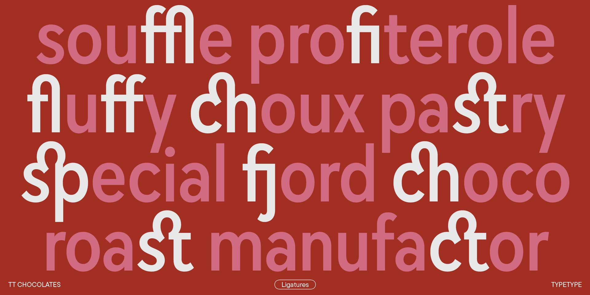
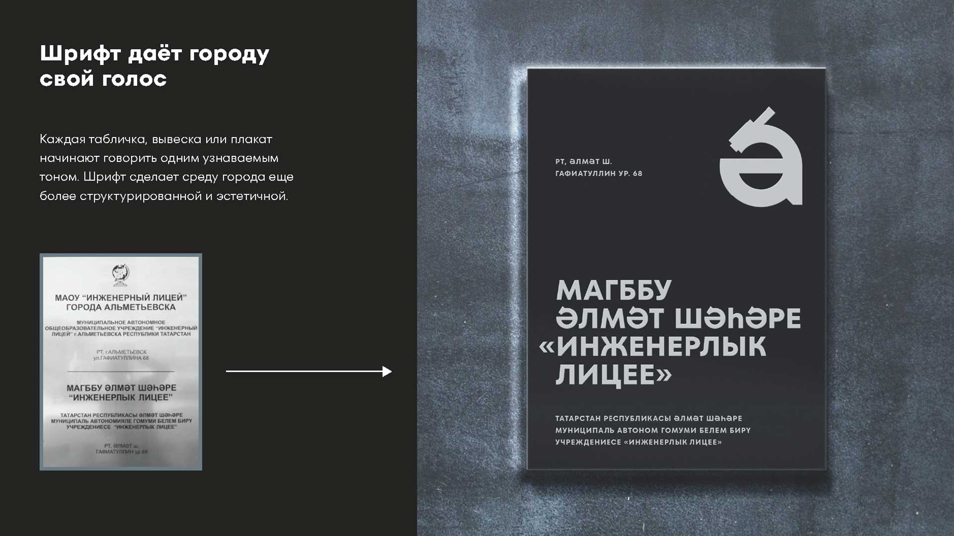
However, sometimes even in these types of fonts, we add special stylistic sets with more decorative graphics. I'd like to mention TT Neoris as an example—a Neo-Grotesque with a unique character and restrained glyphs. We added a set with Cyrillic forms from the early 18th century. They are adapted to look modern and not archaic, but they represent history and our traditions. As for graphic localization, we often customize our fonts. This is quite common for grotesques in general and modernist fonts in particular. These are fonts with a more neutral character, and clients often come to us with a request to make a font more special and recognizable for a specific brand. For example, we created a corporate font for Almetyevsk, a city in the Republic of Tatarstan, Russia. It was a customization of the TT Fors font, another geometric grotesque, but more neutral than TT Chocolates.
We integrated additional serifs developed as part of the city's brand identity into the font's characters, as well as some elements that rhyme with local patterns. Separately, I'll mention that we are constantly expanding the language support for all our typefaces. We have extensive support for Latin- and Cyrillic-based languages, Greek, and Vietnamese. Soon, Arabic, Georgian, and Armenian languages will be added to two of our typefaces.
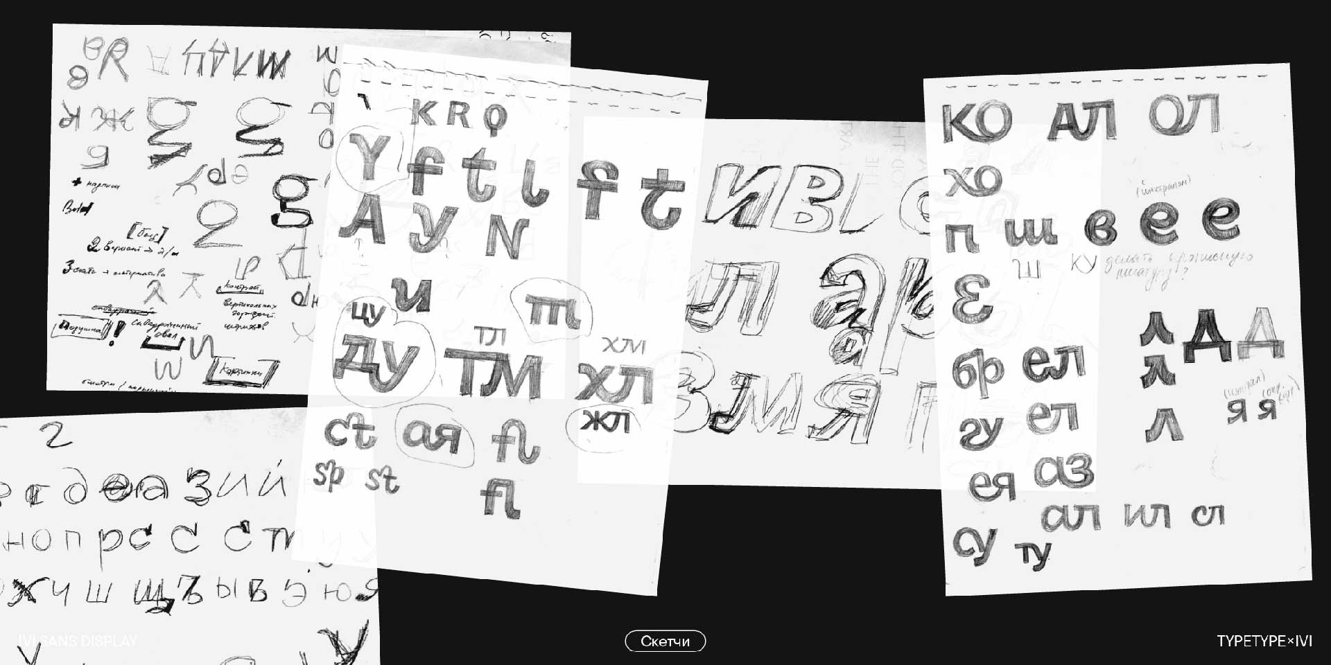
Could you walk us through the overall design process behind TT Chocolates—from the initial concept or sketch phase to its final release and distribution? Were there any notable challenges, turning points, or creative breakthroughs during development that significantly shaped the way the typeface ultimately came together?
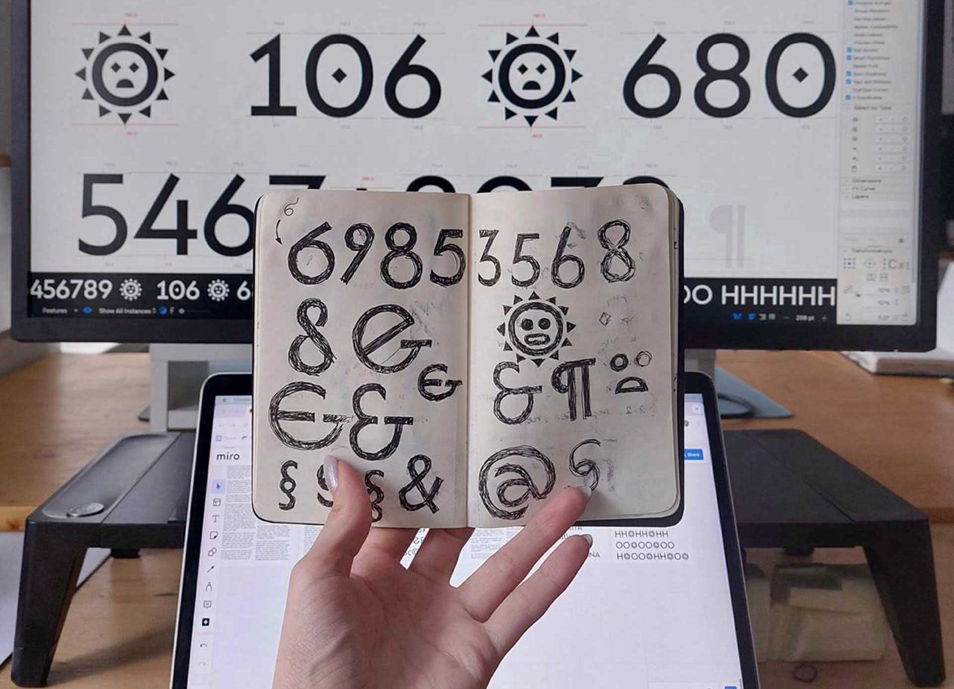
It was very interesting to trace the font's development from its initial concept to how it looks now—the journey from a font with a more display-oriented character to one where the character is still noticeable, yet the font has become more neutral. We often work in this context now. We are gradually "calming down" the fonts we developed 10 years ago. If there are excessively decorative graphics that might look out of place or even outdated for a modern sans serif, we tone them down a bit. Another example is TT Neoris, which has a large number of stylistic sets. We created them based on our extensive research and user surveys, trying to anticipate all possible needs and incorporating a maximum variety of forms through these sets.
What kind of message or emotional tone do you hope designers—especially those working in Asia—will be able to convey when using TT Chocolates in their work? Finally, what advice would you offer to aspiring type designers who aim to create typefaces that are both timeless in their design and culturally meaningful in their impact?
We are very pleased that you saw in TT Chocolates the openness that we once embedded in it. And it's great that after many transformations, the font has found its pure voice. The graphics now look exceptionally clean and aesthetic, yet they carry a certain context that has been beautifully revealed on the ADP's platforms. My advice to aspiring type designers is to work more and show their fonts more. Young designers, perhaps under pressure from their senior colleagues, try to perfect a font for years—revising it, expanding the character set, cleaning up contours, trying to achieve perfect kerning. But perfection is unattainable; it's always just over the horizon. Fonts need to be shown and given the opportunity to be used. Then, the work will be interesting, and development will surely follow.

editor@asiadesignprize.com


#14057, 905 49, Beolmal-ro 102beon-gil,
Dongan-gu, Anyang-si, Gyeonggi-do, Korea
Business Registration Number: 454-86-01044
Online Sales License No.: 2021-Anyang Dongan-1081
Copyright © DESIGNSORI Co., Ltd.
