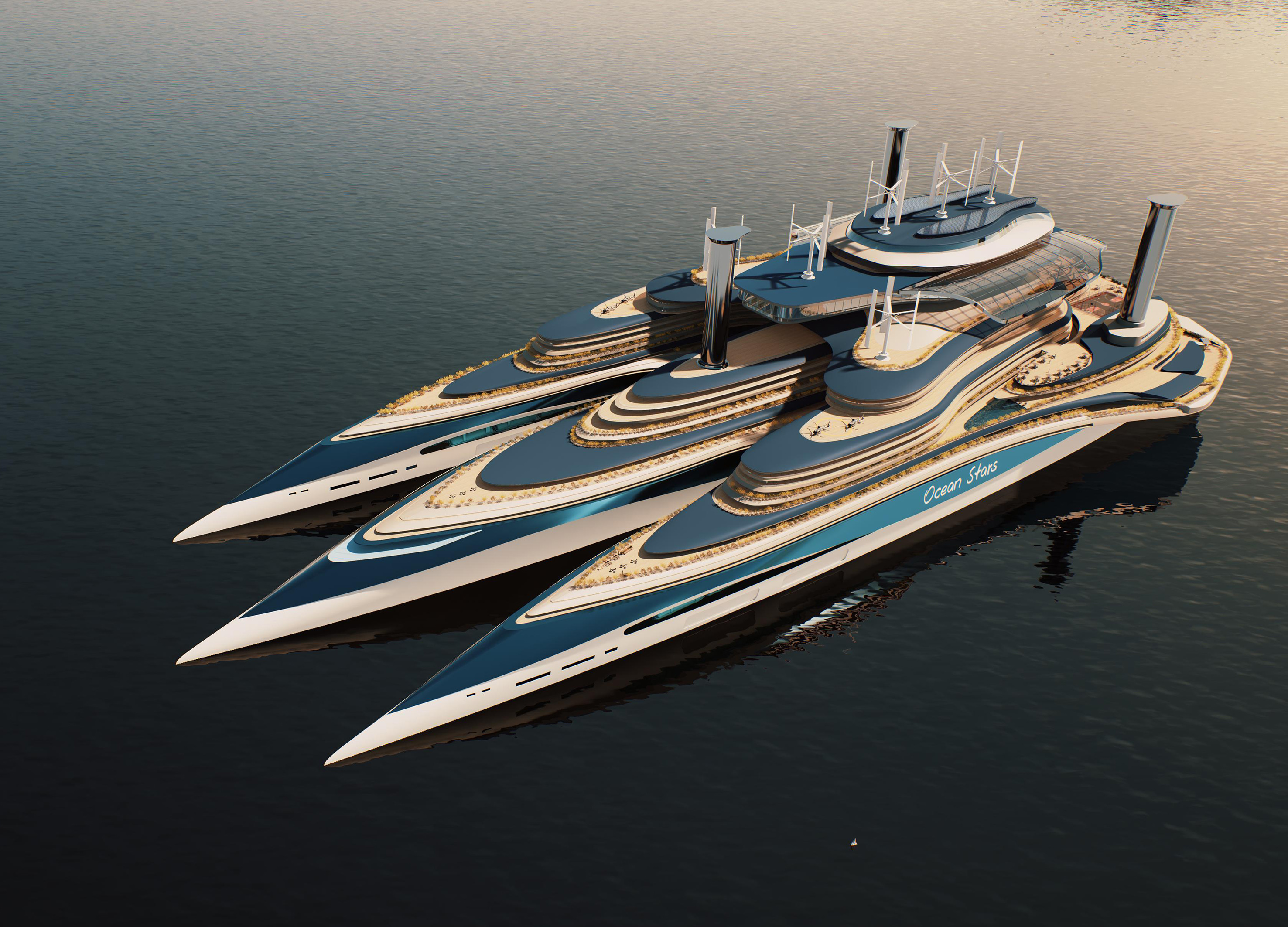
Sauna Morak
Communication
Regions
Korea
Year
2026
Award
WINNER
Affiliation
Korea National University of Arts
Designer
Sung Yeon Kim, Hyesoo Lee, Yubin Jeong
English
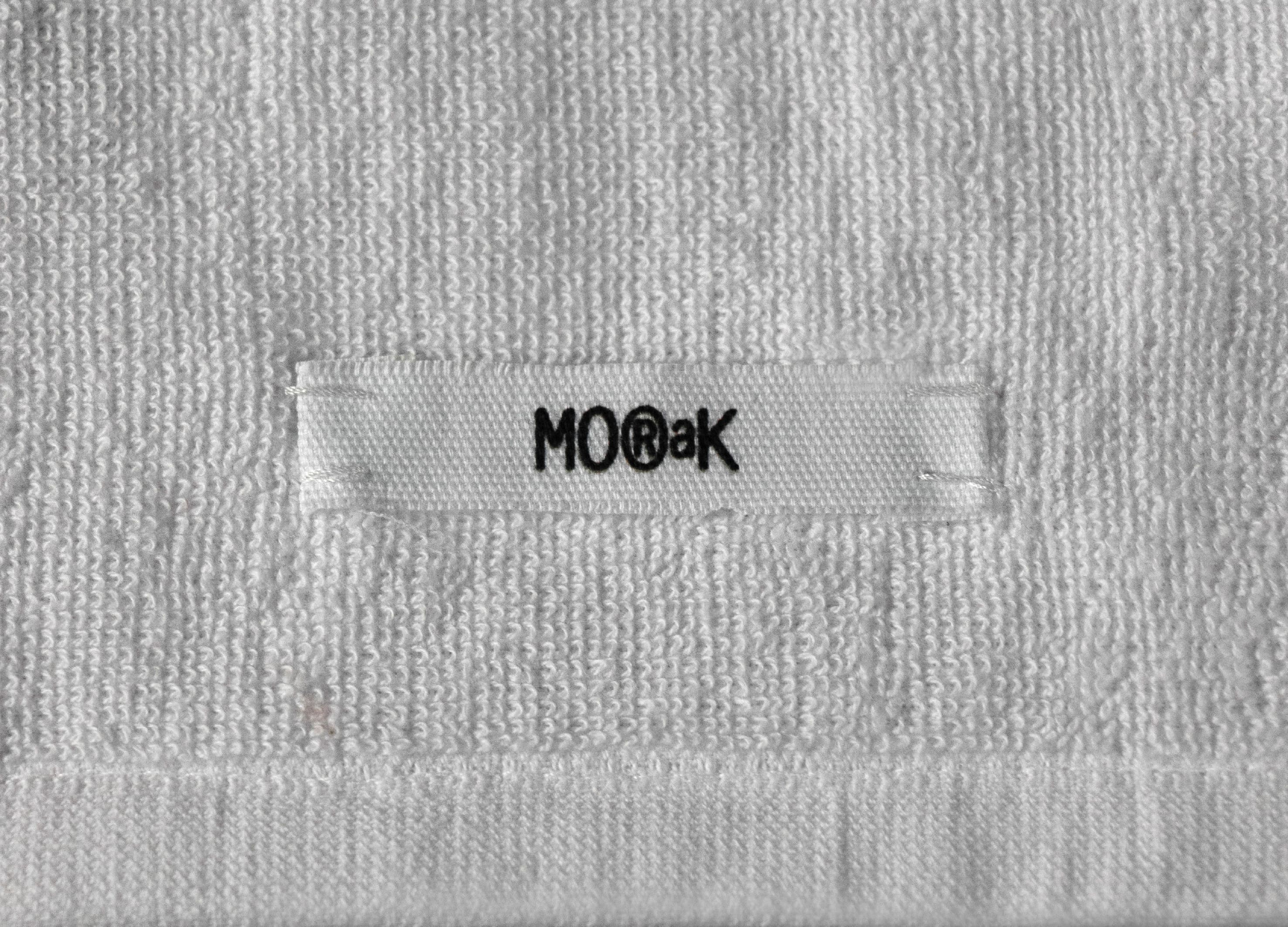
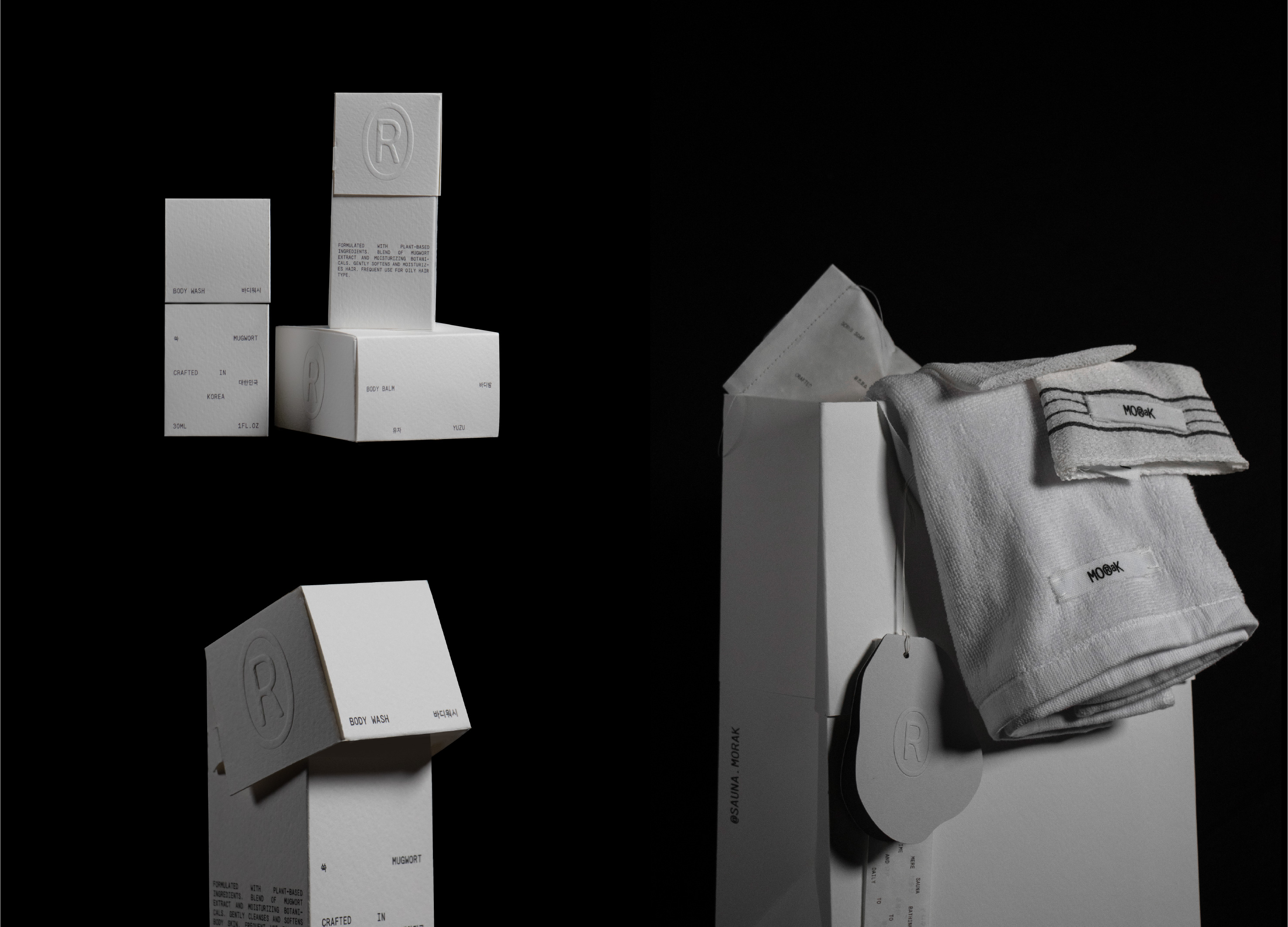
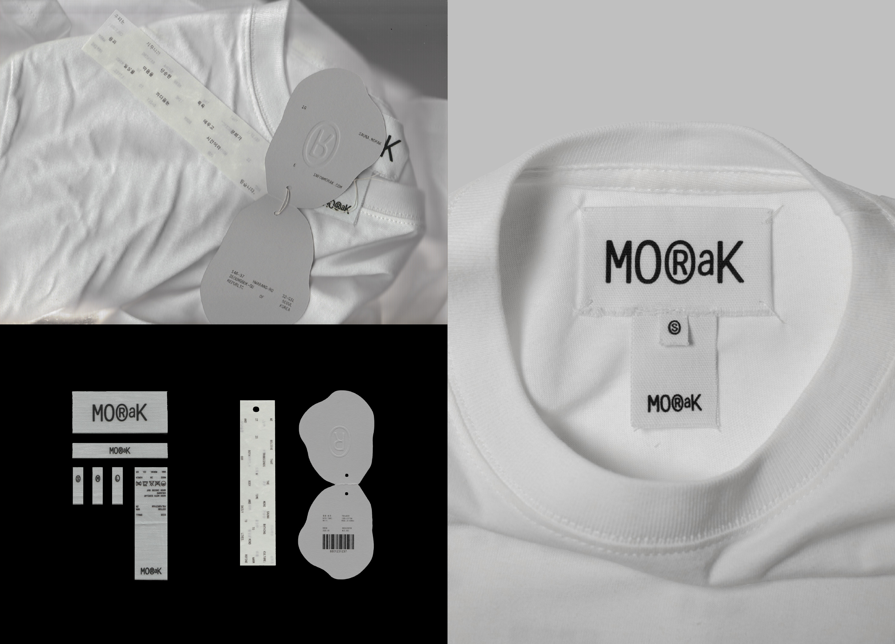
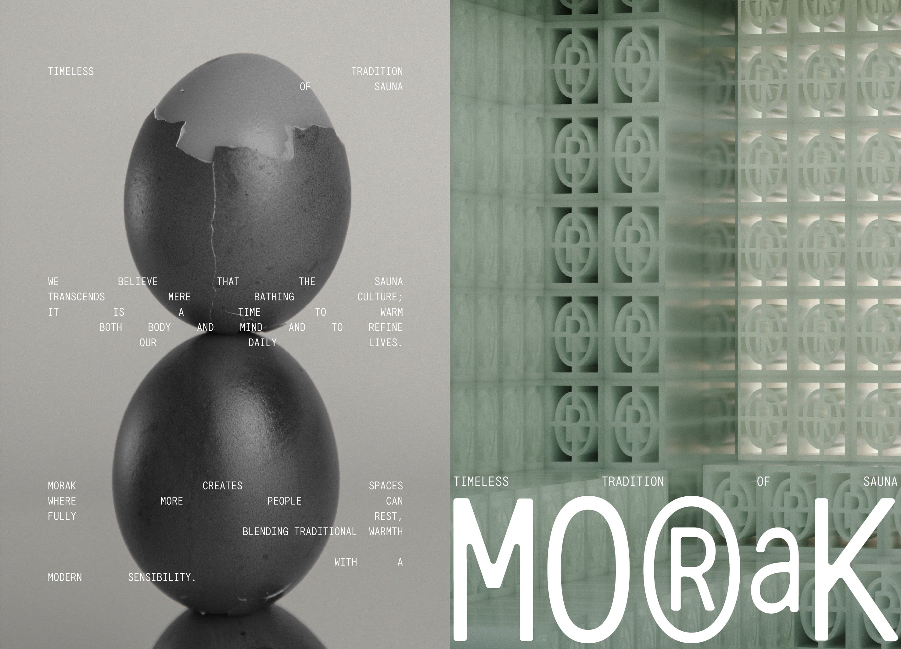
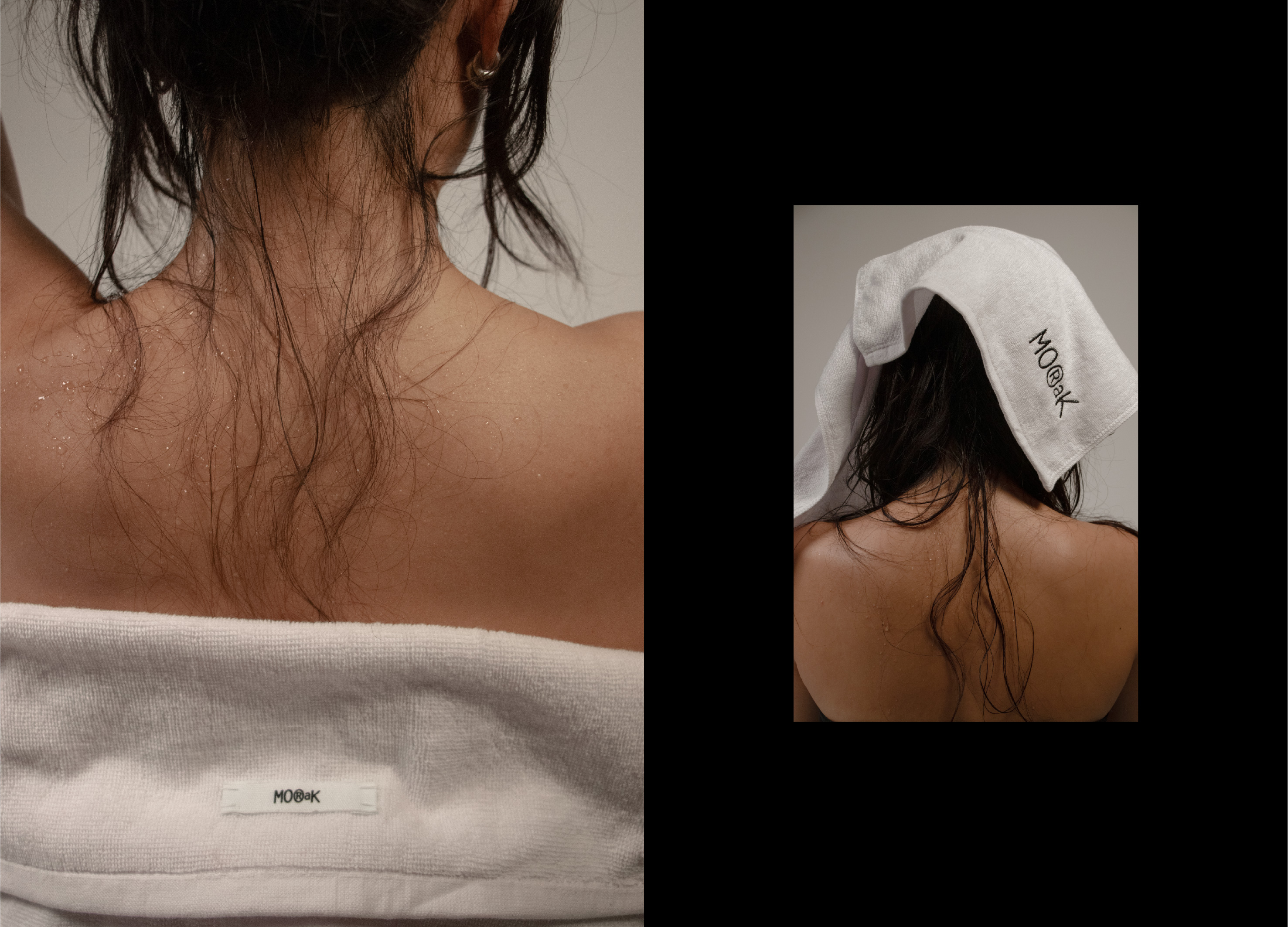
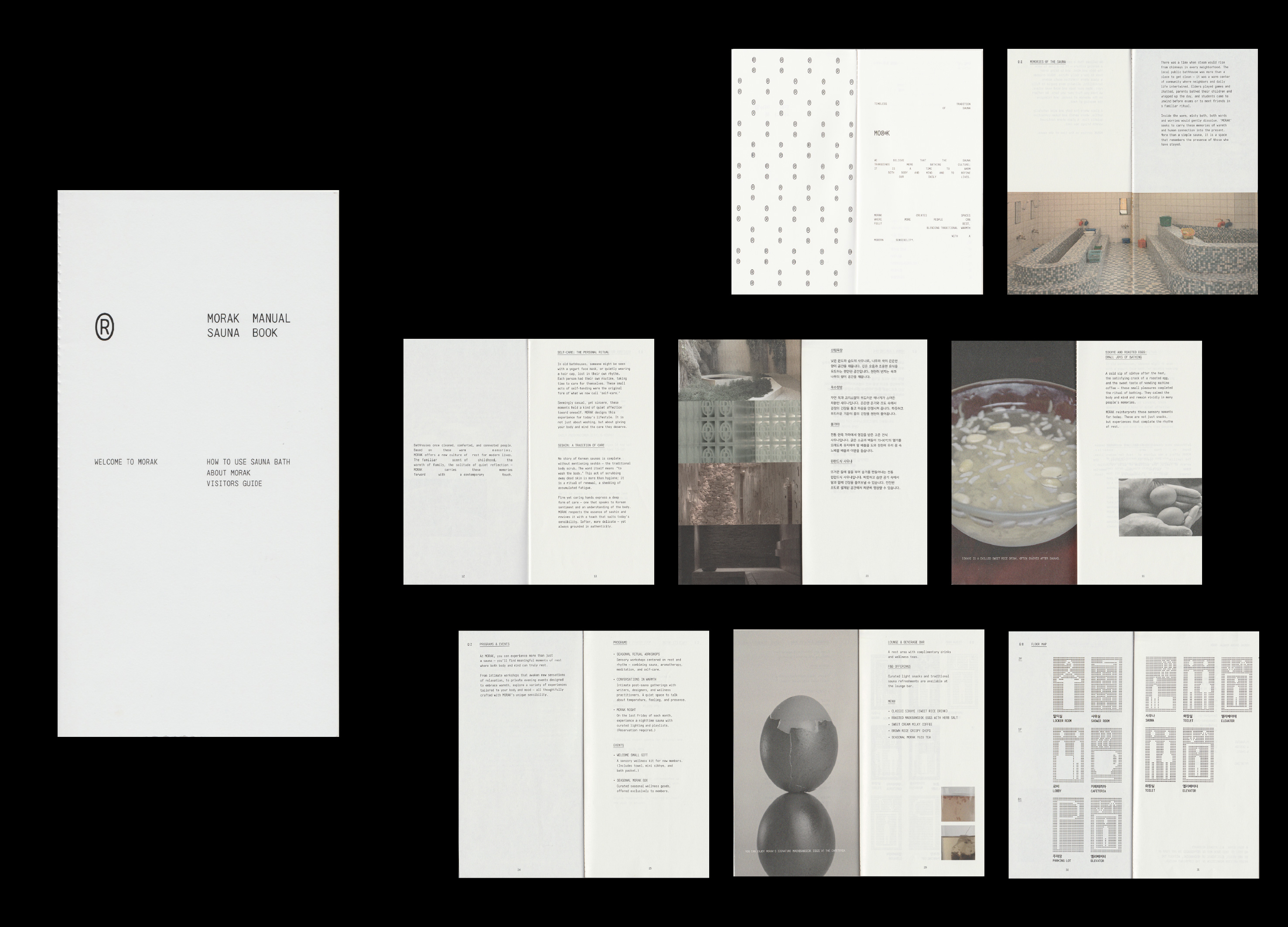
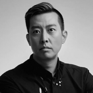
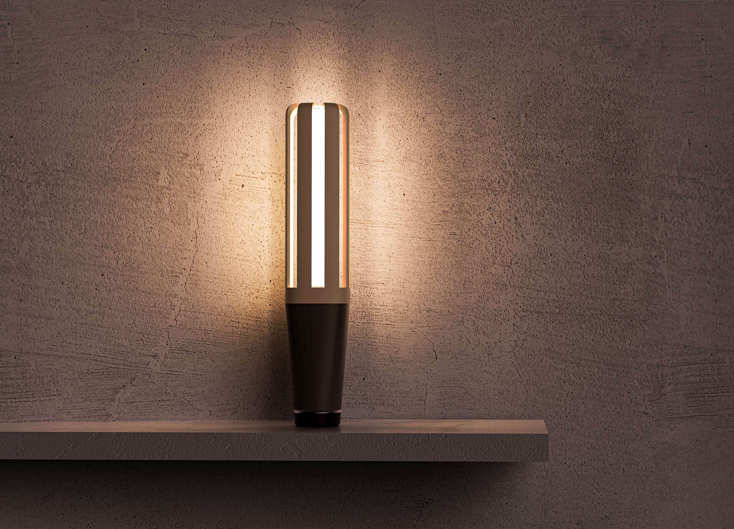
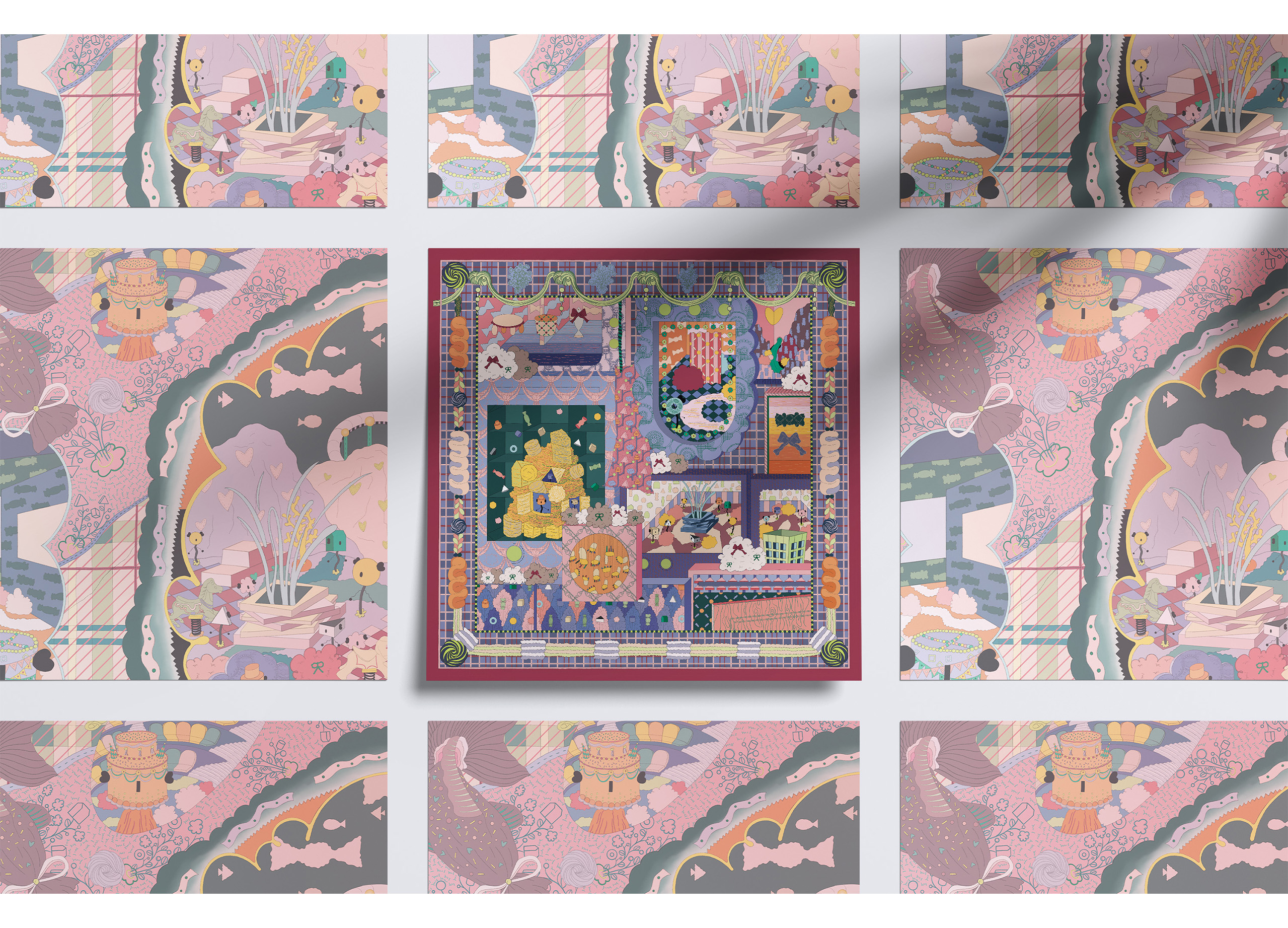
In Korea, public bathhouses were more than places to wash — they were local hubs where neighbors gathered and daily life intertwined. After the pandemic, this culture declined, widening the gap between generations. MORAK is a sauna branding project that reimagines this lost warmth through contemporary design. MORAK, meaning the gentle rise of steam in Korean, captures the calm atmosphere of bathing culture. Using vapor and water droplets as key motifs, the identity extends across logo, visuals, and packaging. Soft ivory tones and tactile textures inspired by traditional bathhouses express a balance of craft sensibility and modern simplicity.
Native
한국의 대중목욕탕은 단순히 몸을 씻는 장소를 넘어, 이웃과 일상이 교류하던 로컬 커뮤니티의 중심이었습니다. 뜨거운 물에 몸을 담그면 낯선 이들도 금세 이웃이 되었고, 잔잔한 웃음과 대화 속에서 하루의 피로가 천천히 녹아내렸습니다. 그러나 팬데믹 이후 대중목욕탕 이용이 감소하며 세대 간의 이용 격차가 두드러졌습니다.
모락은 이러한 단절된 경험을 회복하고, 한국의 대중목욕탕 문화를 현대의 라이프스타일 감각으로 재해석한 사우나 브랜딩 프로젝트입니다.
모락이라는 이름은 탕에서 김이 피어오르는 모습을 형상화한 한국어 의태어로, 한글과 영문 모두에서 부드럽고 따뜻한 발음을 지닌 이름입니다. 브랜드 아이덴티티는 수증기와 물방울의 모티프를 중심으로 전개되며, 로고타입·키비주얼·패키지·편집디자인 전반에 통일된 시각 언어를 구축했습니다. 컬러와 조형 모티프는 한국 대중목욕탕의 정서와 공예적 미학에서 영감을 받았으며, 이태리 타월의 질감, 미백색의 은은한 톤, 러프하고 자연스러운 재질감 등을 통해 아날로그적 온기와 현대적 간결함이 공존하는 비주얼 아이덴티티를 완성했습니다.
모락은 사라져가는 한국의 대중 목욕 문화를 현대적 감성으로 되살려, 온기를 잇는 새로운 로컬 브랜드 경험을 제안합니다.
Positive Comments


Sauna Morak
Korea National University of Arts
Korea
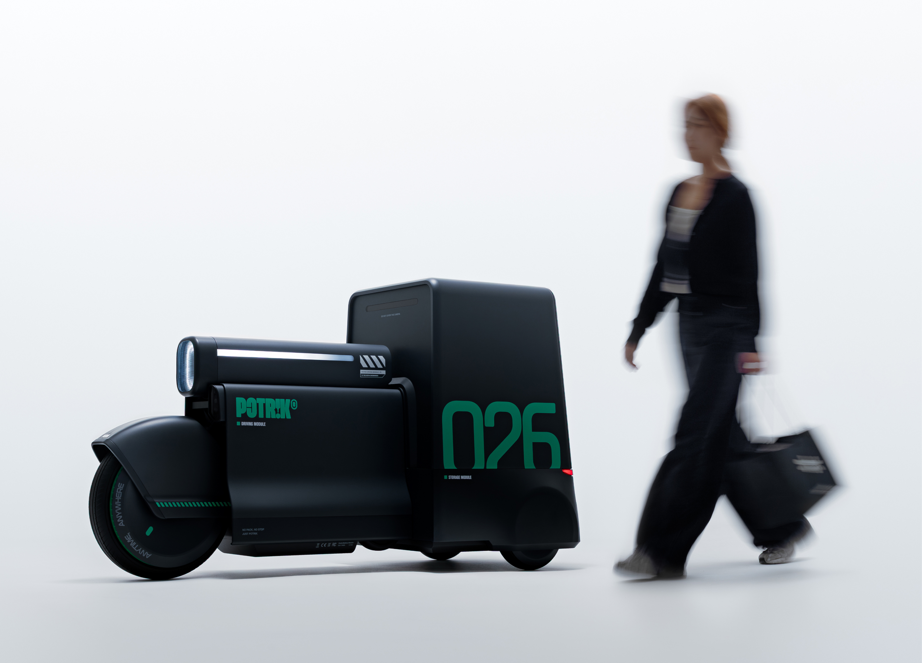
POTRIK
Samsung Design Membership
Korea
INTERVAL
SANGMYUNG UNIVERSITY
Korea
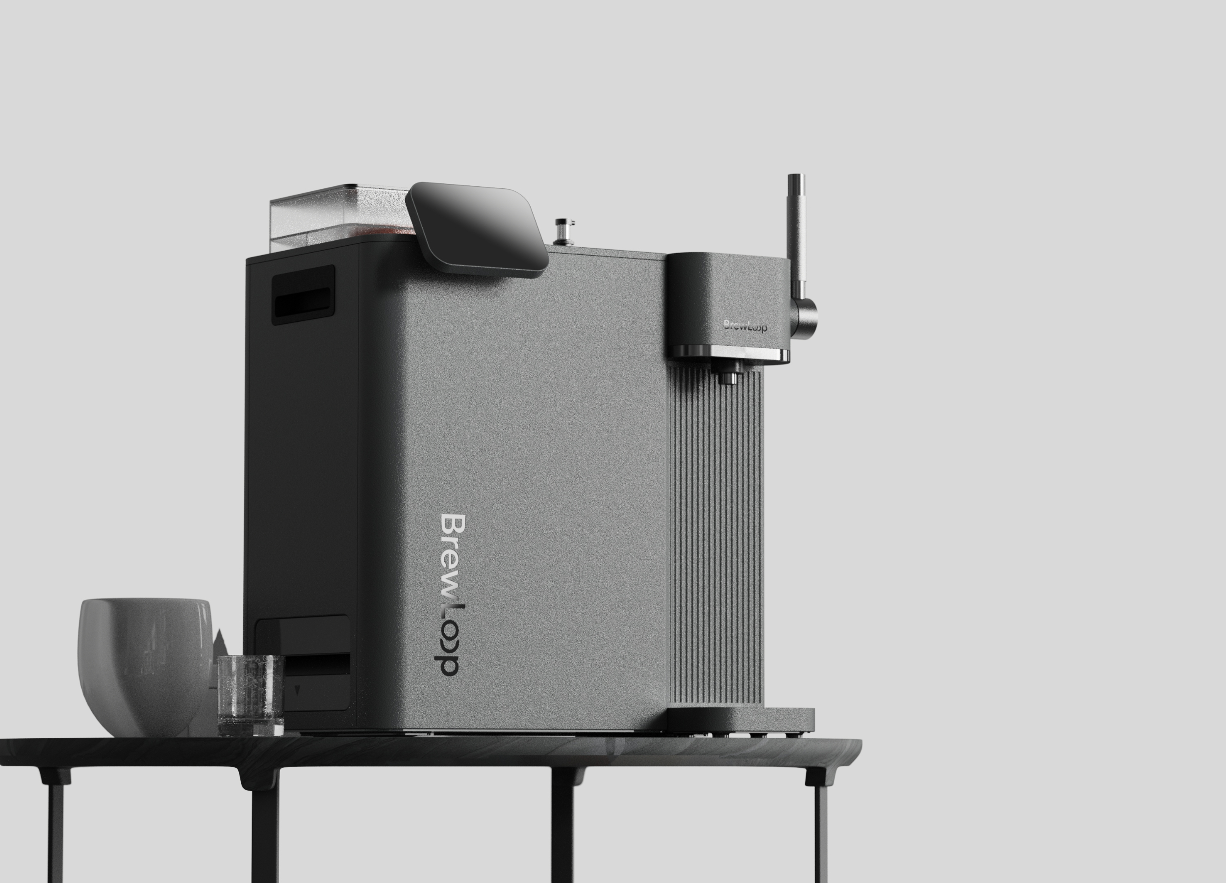
Brew Loop Household Homebrew Beer Machine
Zhengzhou Business UniversityBeijing Institute of Technology
China
Akdongz
Sookmyung Womens University
Korea
SALAMANDER
Hanseo University
Korea
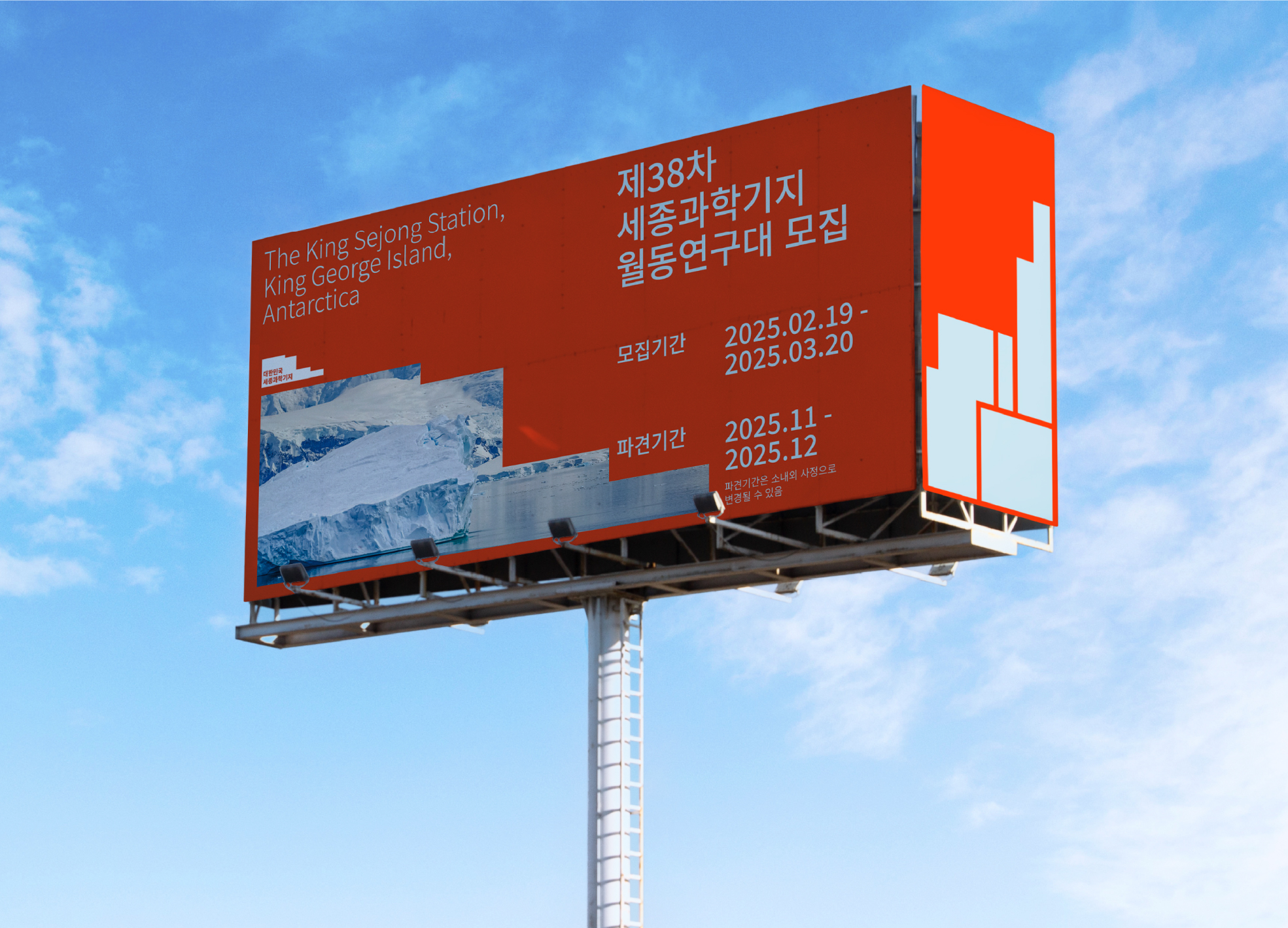
THE KING SEJONG STATION Identity Design
Sungshin Womens University
Korea
Cooperative House
Hyupsung University
Korea
Torchlight
Hubei Business College & Burapha University
China
ZIZAI Growing Freely Here
Tsinghua University
China
FABAT
SADI
Korea
NOOQ
Hongik University Industrial design
Korea
Stolen Moments
Beijing Jiaotong University
China
Piano Stickers for the Visually Impaired
Sapporo City University
Japan
LLOT sleep assistant for flexible lifestyle
Hongik University
Korea
Spacing VISION
Hongik University
Korea
Hydrogen Energy Ark Design
Macau University of Science and Technology
China
Moderate Sauce Dish
Jiangsu Vocational Institute of Architectural Technology
China


Partner & Sponsor
More


info@asiadesignprize.com
#14057, 905 49, Beolmal-ro 102beon-gil,
Dongan-gu, Anyang-si, Gyeonggi-do, Korea
#14057, 905 49, Beolmal-ro 102beon-gil,
Dongan-gu, Anyang-si, Gyeonggi-do, Korea
Founder: Doyoung Kim
Business Registration Number: 454-86-01044
Online Sales License No.: 2021-Anyang Dongan-1081
Copyright © DESIGNSORI Co., Ltd.
Business Registration Number: 454-86-01044
Online Sales License No.: 2021-Anyang Dongan-1081
Copyright © DESIGNSORI Co., Ltd.
