
Tradition is an important resource from which a brand can begin telling its own story. Ingredients and production methods used over generations, patterns preserved in a region, and customs surrounding the sharing of food carry a background that other brands cannot easily claim. Connecting these resources to products and design helps explain where a brand comes from. Yet a long history alone does not persuade consumers to choose a product. People buy things that meet the needs of their lives today. Even when they appreciate the value of tradition, they may hesitate to purchase something that is difficult to use or does not suit their taste. Brands must connect the meaning of the past with the needs of the present.
Design determines what to preserve and what to change in this process. It retains distinctive ingredients and cultural backgrounds while shaping names, graphics, packaging, and methods of use in ways that contemporary consumers can understand. It creates the conditions for products rooted in tradition to be used and purchased again. Four Asia Design Prize 2025 winners demonstrate this approach in different ways: MIIN SILOK BRAND IDENTITY, Baekje Soju Branding, SaengGwaBang Yakgwa Rebranding, and KIMCHI CRUNCH BITES CRUNCH THE WORLD. Drawing on traditional ingredients, history, gift culture, and eating habits, each project develops an experience suited to its brand.
A Brand’s Distinctiveness Begins with Its Origins
When working with tradition, designers must carefully choose what to draw upon. Before selecting patterns and colors, they should be able to explain how those elements relate to the product. Traditional elements acquire specific meaning when they connect to a brand’s ingredients, place of production, or manufacturing methods. For example, applying the shapes and colors of rice grains to a product made with rice allows consumers to understand the relationship between its ingredients and its design. When a brand named after a place uses patterns drawn from that culture, its name and appearance become part of one story. The clearer the origins of its visual elements, the clearer the language used to explain the brand. This connection also matters when a product range expands. Establishing principles for names, colors, and graphics around a shared source helps new products remain recognizable as part of the same brand. Tradition develops into a framework that organizes the entire brand.
Translating an Ingredient’s Story into Brand Language
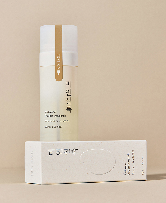
< MIIN SILOK BRAND IDENTITY, ASIA DESIGN PRIZE 2025 WINNER >
MIIN SILOK is a beauty brand whose key ingredient is rice lees, a by-product of making makgeolli, a traditional Korean rice wine. Its name combines “miin,” meaning beauty, with “silok,” meaning historical records, introducing the idea of documenting beauty. The slogan “Beauty Archive” extends this concept. The ingredient’s background and the brand name follow a consistent direction. The design maintains this relationship. A vertical Hangul logotype inspired by traditional writing conveys the idea of records and documentation. Soft ivory, dark brown, and rice grain graphics evoke the ingredient, while packaging incorporating the texture of hanji paper, fabric, and knots gives its Korean origins a tactile presence.
The strength of this project lies in the way its traditional elements tell the same story. Rice lees, the name SILOK, the arrangement of the lettering, and the texture of the paper are connected. Consumers can recognize the brand’s intended atmosphere and origins before reading a lengthy explanation. In the beauty market, ingredients communicate function while also providing a basis for differentiation. MIIN SILOK develops the cultural background of its ingredient into a name and a visual system. Tradition provides a connection between what the product contains and how the brand expresses itself.
Turning Local History into a Repeatable Visual System
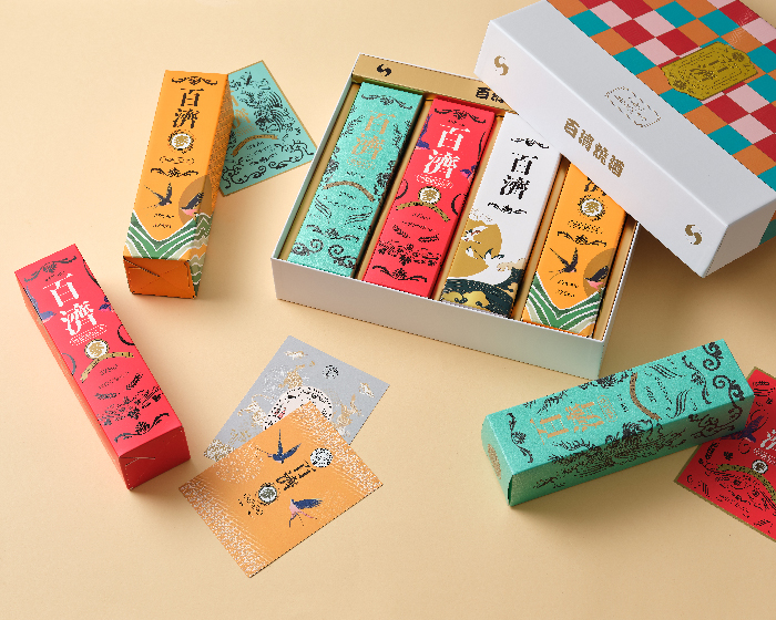
< Baekje Soju Branding, ASIA DESIGN PRIZE 2025 WINNER >
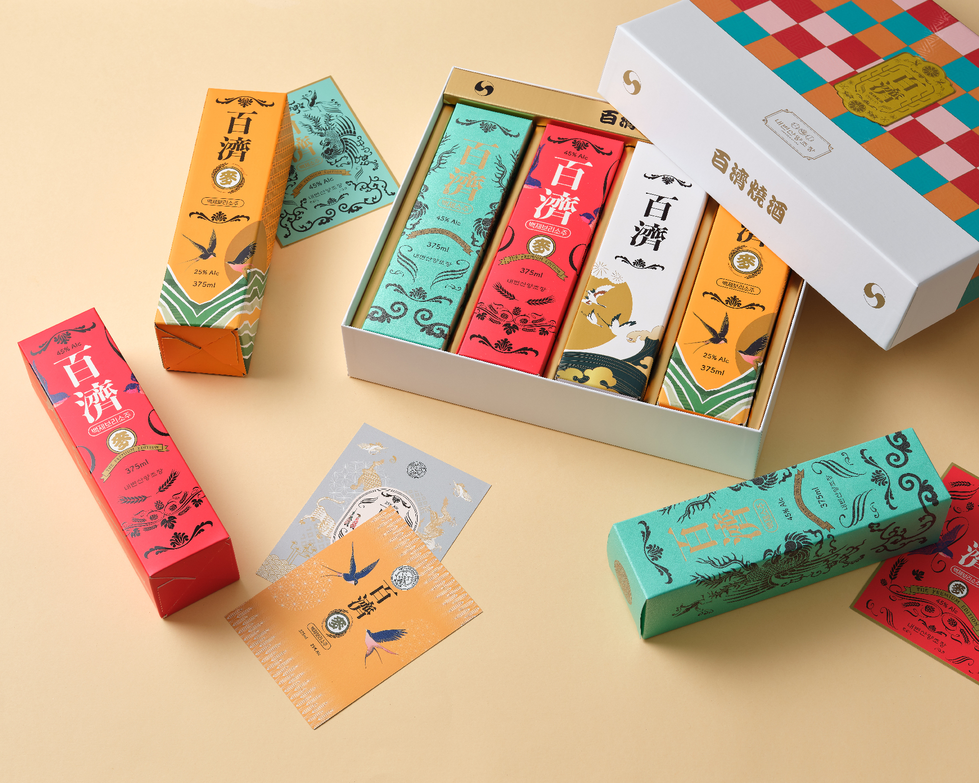
Baekje Soju was developed by Naebyeonsan Distillery in Buan, Jeonbuk Province, South Korea. Building on the background of a distillery now in its second generation, the brand adopts the name Baekje and reinterprets imagery, murals, and motifs from the historic kingdom through contemporary graphics and patterns. The historical associations introduced by the name continue into the product’s appearance. Consumers encounter alcoholic beverages through bottles, labels, and boxes before they taste them. Among the many products on display, the design must communicate something about the producer and the character of the drink. When the name and packaging tell different stories, the brand becomes harder to understand.
Baekje Soju’s patterns give repeated visual expression to the background contained in its name. Translating historical motifs into contemporary graphics makes them applicable to different surfaces, including labels and boxes. Together, they form a system that helps consumers recognize multiple products as belonging to the same brand. This approach allows traditional imagery to be applied consistently across a product range. As new products are added, the design can accommodate differences while retaining a shared graphic language. The region and its history explain the brand’s starting point, while the design system allows that story to continue.

















#14057, 905 49, Beolmal-ro 102beon-gil,
Dongan-gu, Anyang-si, Gyeonggi-do, Korea
Business Registration Number: 454-86-01044
Online Sales License No.: 2021-Anyang Dongan-1081
Copyright © DESIGNSORI Co., Ltd.