
Creative Director Yena Choi
Founder of B for Brand

<Image source: Burberry>
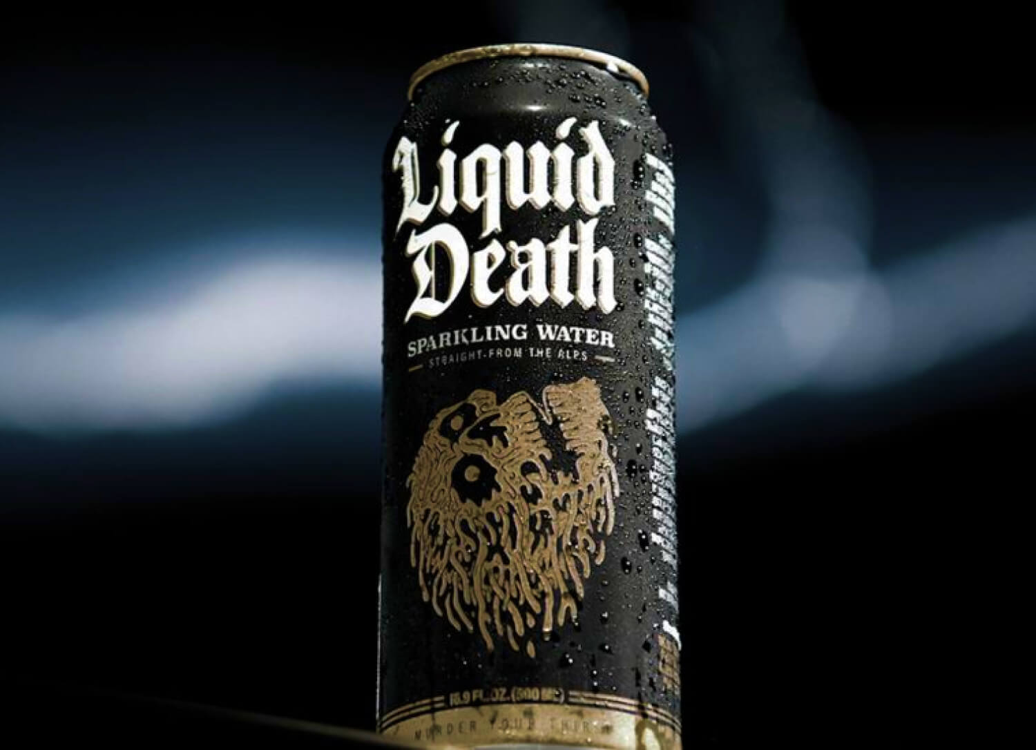
In 2018, the fashion world was caught off guard when Burberry, the iconic British brand with a 163-year heritage, unveiled a completely redesigned logo. Gone was the elegant serif typography. In its place stood a bold, all caps sans serif: BURBERRY. The brand’s rationale was straightforward — to optimize for digital environments. But by 2024, Burberry reversed course and returned to a serif-based identity. What happened? This six-year journey serves as a case study in why typography is never just about legibility. The initial shift to sans serif had logical grounding. On small mobile screens, it offered clarity. It felt modern. It seemed more approachable to Gen Z. Burberry followed a path well taken by others like Google, Apple, and Calvin Klein. But the response from consumers told a different story. Critics mocked the trend as the age of “lazy minimalist sans serifs,” and many complained that “Burberry no longer feels like Burberry.” Sales stagnated. Brand perception weakened. The move may have been digitally savvy, but it diluted the brand’s core essence.
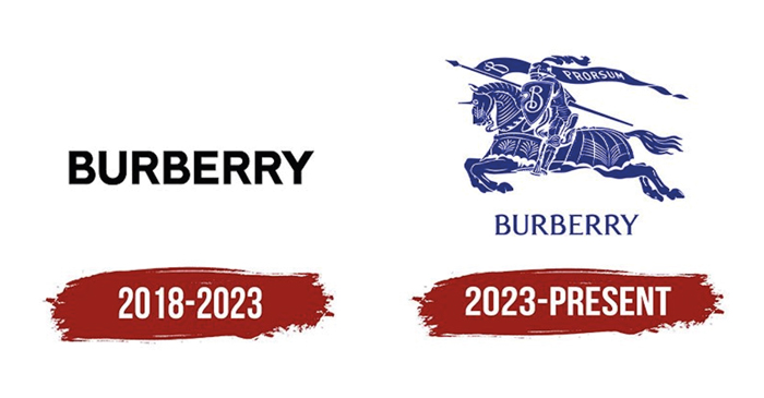
<Image source: Burberry>
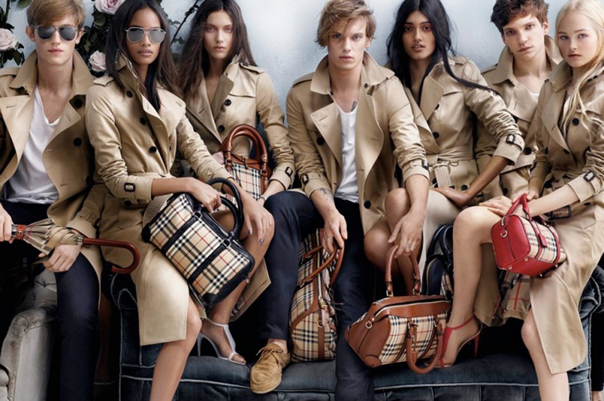
The return to serif in 2024 was not mere nostalgia. It was a reckoning. Burberry realized its typographic heritage condensed more than design — it captured 163 years of brand equity. Every tiny flourish of the serif communicated “Royal Warrant,” “British craftsmanship,” and “timeless value” without a single word. This is the power of typography. The same word, in different typefaces, evokes different emotions and levels of trust. And this judgment happens faster than we realize.
Typography Is Processed in 0.05 Seconds Faster Than Meaning
In a recent branding project for a legal advisory platform, we had a similar epiphany. The client wanted a youthful and friendly tone. We initially proposed a rounded sans serif typeface. Despite identical content, this version was perceived as lightweight and untrustworthy. When we switched to a more geometric and restrained sans serif, the feedback instantly shifted to professional and credible. This is not subjective opinion. It is neurological. Our brains perceive shape before they comprehend meaning. According to cognitive studies, font recognition occurs in less than 0.05 seconds — faster than semantic processing. In other words, we respond to how something looks before we process what it says.
Serif vs Sans Serif: More Than Style
Serifs convey tradition, authority, and trust. That is why The New York Times, Vogue, and Tiffany and Company remain loyal to serif fonts. The subtle extensions signal that they are brands with heritage. Sans serifs, in contrast, symbolize clarity, modernity, and accessibility. Google and Apple use them to project ease of use. The typography alone says that their products are made for everyone. Interestingly, this visual identity even influences how people perceive products. In a study involving identical wines with serif and sans serif labels, the serif version was rated as more aged and complex, while the sans serif version was described as light and fruity. Same product, different typeface, different experience. This mirrors Burberry’s misstep. While the sans serif improved accessibility, it weakened perceptions of exclusivity. And for luxury brands, greater accessibility can undermine perceived scarcity, a key value.
The Psychological Weight of Typeface Weight
Look closely at luxury brand logos. Louis Vuitton, Chanel, Hermès — all use thin, refined serif fonts. These delicate strokes imply rarity, craftsmanship, and exclusivity. They reinforce the idea that the brand is for the select few. Now compare that to Burberry’s 2018 choice: a bold and heavy sans serif. Perfect for a slogan like “Just Do It,” but mismatched for a British heritage brand. The boldness and assertiveness of that typeface clashed with Burberry’s values of grace, refinement, and timelessness. Typography is not just letterform. It is also spacing, rhythm, and visual silence. Consider Apple’s product pages. Text is minimal, with generous letter spacing and line height. This design says that their products speak for themselves. On the other hand, discount flyers with crowded text and tight spacing scream urgency and information overload. Spacious kerning and airy layout offer a more premium and reflective experience.
The Dual Meaning of All Caps
Luxury brands often use all caps strategically — DIOR, PRADA, GUCCI. The capital letters elevate the brand to monumental status. Burberry followed suit in 2018. But pairing all caps with a bold sans serif created an overly aggressive look. It skewed toward sportswear or streetwear, not legacy luxury. The real lesson? There is no such thing as a good or bad typeface. Context determines everything. Burberry’s sans serif was not the problem. It just was not right for Burberry. The brand’s 2024 return to serif was not a step back. It was a return to consistency. The typographic DNA accumulated over 163 years proved far more potent than any short lived digital experiment.
Typography Is Silent Yet Always Speaking
Typography builds trust. It evokes emotion. It shapes purchase decisions. Burberry’s journey reminds us of a critical truth — successful branding balances innovation with identity. Optimization should not come at the cost of visual language built over decades. From business cards to product labels to website titles — every touchpoint uses typography to answer the question: who is this brand?
Effective branding begins when the right message meets the right typeface. And in just 0.05 seconds, a first impression is made that may determine a brand’s fate. Next time you see a logo, do not just read the word. Look at the form. Listen to the curve, the weight, the spacing. That is where the true identity lives.


#14057, 905 49, Beolmal-ro 102beon-gil,
Dongan-gu, Anyang-si, Gyeonggi-do, Korea
Business Registration Number: 454-86-01044
Online Sales License No.: 2021-Anyang Dongan-1081
Copyright © DESIGNSORI Co., Ltd.
