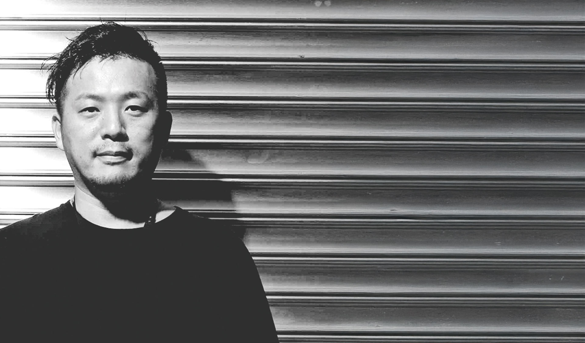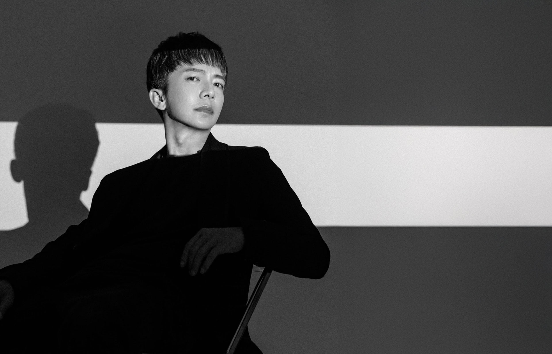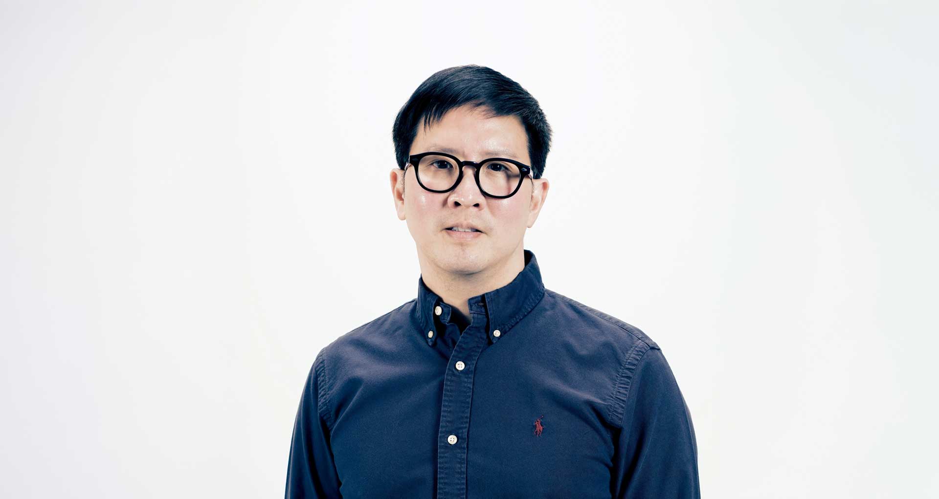
Director Anuthin Wongsunkakon Cofounder of Cadson Demak
"Based in Bangkok, Cadson Demak is one of Thailand’s leading design studios, recognized for its pioneering role in modernizing Thai typography. Since its founding in 2002, the studio has worked across diverse domains including custom font development, typography education, and digital media experimentation, contributing significantly to shaping the visual identity of Thai scripts on a global stage. In this ADP interview, we speak with Anuthin Wongsunkakon, co-founder and director of Cadson Demak, to explore the studio’s philosophy and design approach that goes far beyond letterforms. Rather than merely replicating tradition, Cadson Demak focuses on reinterpreting its underlying principles to reflect the present. Their work exemplifies how design can construct new visual languages rooted in cultural context. This conversation offers timely reflection for Asian designers navigating their own linguistic and regional identities, encouraging a thoughtful approach to building distinctive visual standards in a fast-moving global design landscape."
Could you briefly introduce Cadson Demak? We would love to hear about your studio’s vision, background, and design philosophy. What makes Cadson Demak unique in the context of Thai and Asian design?
We would love to hear about your studio’s vision, background, and design philosophy. What makes Cadson Demak unique in the context of Thai and Asian design? The story behind our name, Cadson Demak, is one of the most fun parts of our history. We were originally brainstorming names for a client’s new home décor store when we came up with it. It was one of the names in the list that got rejected. Although they didn't choose it, we loved the name so much we kept it for ourselves. 'Cadson Demak' is Thai for 'best selection'. We recognize that 'best selection' is a huge commitment and a very hard standard to live up to. However, that expectation is actually the energy that drives us every single day; it’s a constant reminder that we must deliver excellence in everything we do. This commitment is deeply tied to our goal of making Thai type design fun again and bringing public awareness back to typography. About three decades ago, using Thai type creatively was highly unusual. Type play in general was mostly practiced using English, and you rarely saw a Thai font used larger than 24 to 32 points in a magazine spread. That's one of the things we addressed early on. Thai type was often an afterthought, partly due to the lack of typefaces capable of doing the job. Since we design our own fonts, we’re essentially making the ingredients to fit the precise art direction we want to see, which has a huge impact on the final 'menu.'
When was Cadson Demak founded, and what inspired its beginning? We’d like to learn about the origin story of the studio and how it has evolved over the years.
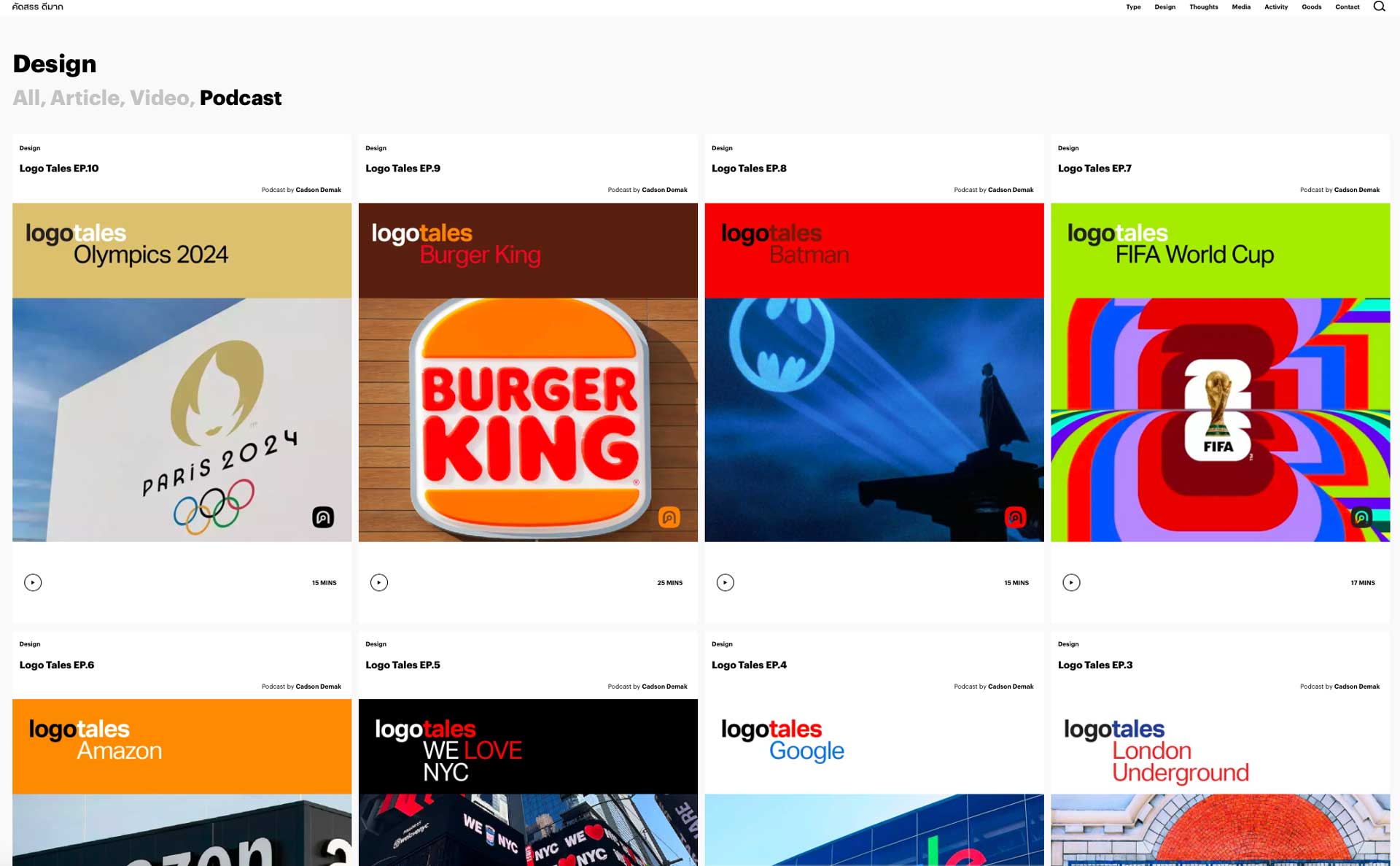
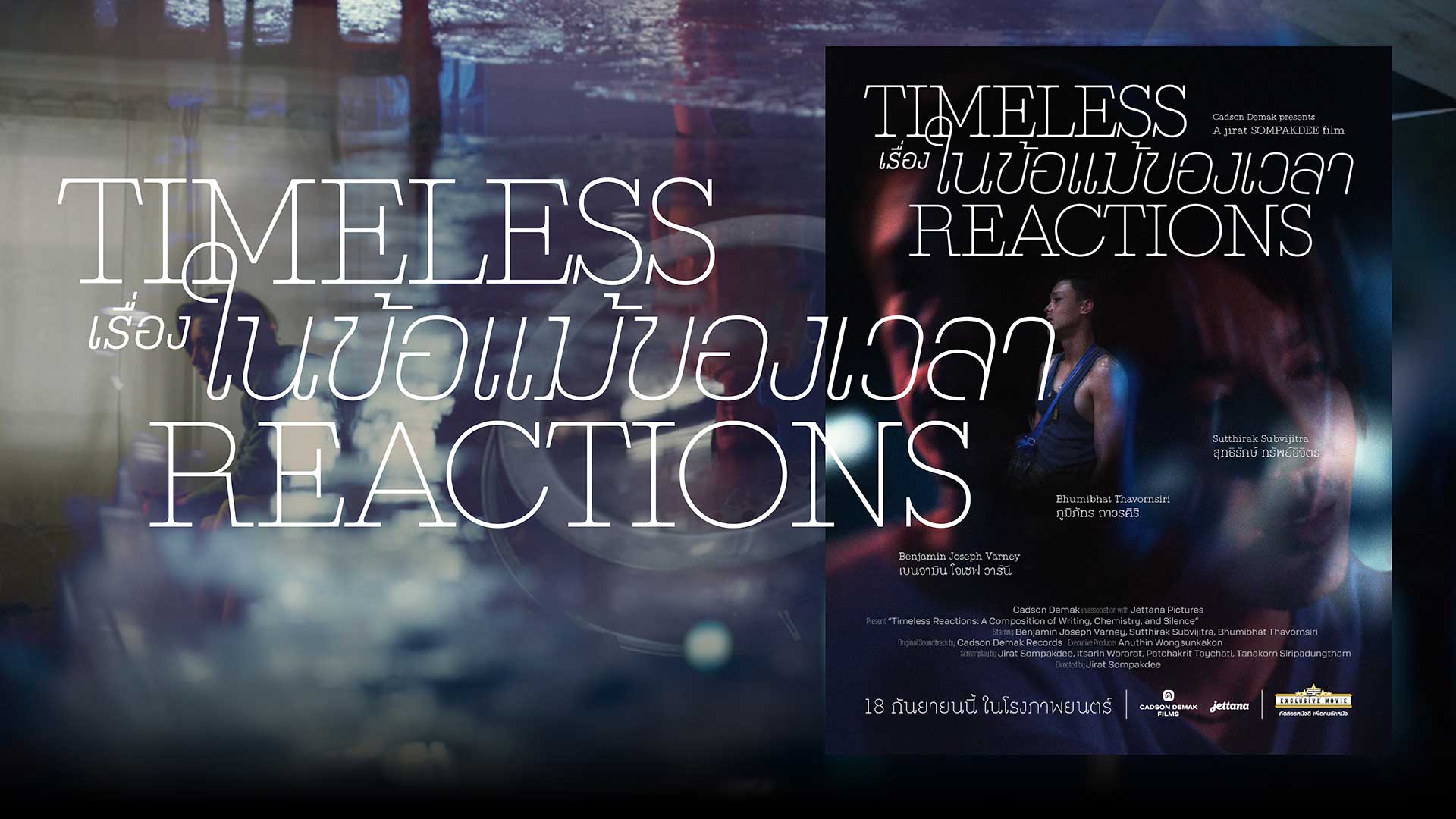
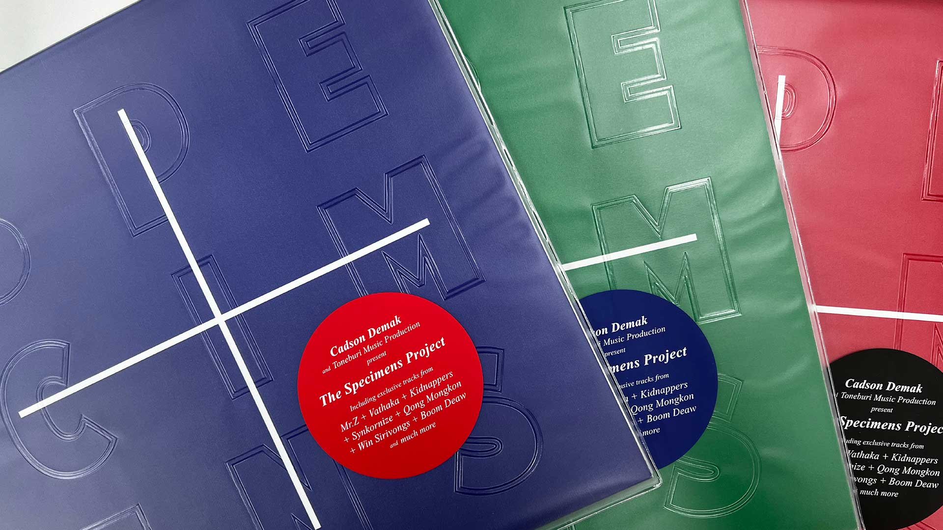
While we officially registered Cadson Demak in 2002, our creative journey began a few years earlier, driven by the core belief that we are a firm not defined by a single medium. We started as a graphic design studio and quickly moved into type design, establishing one of Thailand's first active digital type foundries. This was a necessity, as the design landscape was chaotic; to run a viable type business, we had to confront the lack of education and infrastructure ourselves. Crucially, we were able to do this because of the many opportunities given to us by trusted clients in our early years. Our constant goal was to go beyond their expectations, a practice that remains a core value of our studio today. Our fundamental philosophy is to see what we lack as an opportunity instead of simply complaining about a problem. This mindset is why we are so active in building infrastructure: for instance, we tackle the lack of good typography education by creating content. Our lecture tours lead to articles, which become books, and those books turn into podcasts—that is what we mean by building the road as we go. We helped the public rediscover the custom font as a powerful branding product, and our ultimate aim is to show the immense possibilities of using Thai fonts in typography work across all media by putting them in action. This pioneering spirit means we actively synthesize our disciplines—for example, we recently produced a feature film where our team handled everything from music and sound design, and we often combine our custom type with the film, music, and sound that we create. We will continue to build, ensuring every project is executed with integrity and purpose.
What kinds of projects and activities are you currently focusing on? From commercial commissions to cultural or educational initiatives, please share some recent or ongoing areas of work.
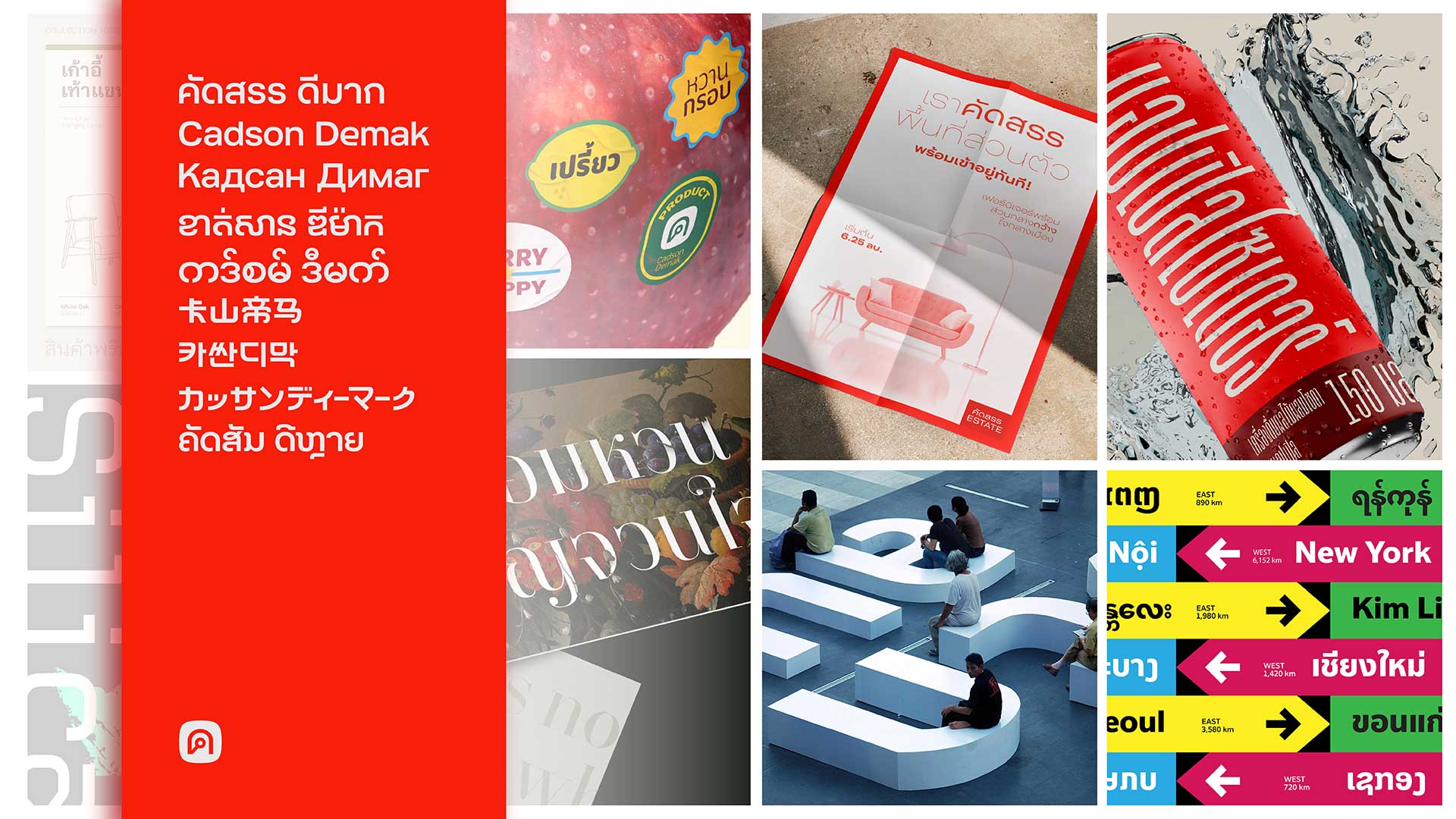
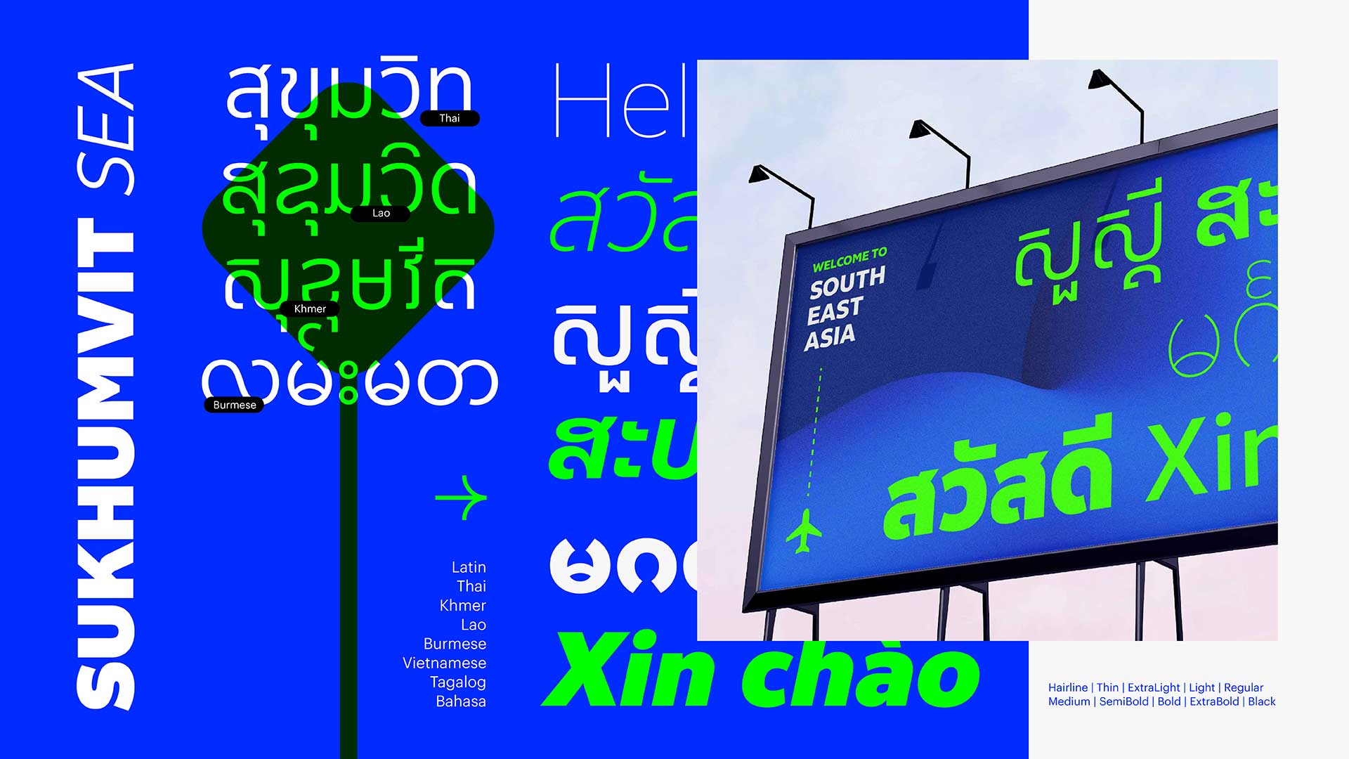
One of the larger undertakings we are currently focused on is the development of a broad Southeast Asian font system. This effort is a direct extension of our company's goal to help strengthen typographic infrastructure in the region. Looking back to our beginnings, we were fortunate to play a part in establishing the groundwork for digital type in Thailand. Now, after more than a decade of running our type design conference, BITS, we have noticed a similar challenge across the wider region: a limited understanding of type and the lack of an established type business. This challenge makes multi-script font development more difficult, even though the need from the branding and design industry is clearly there. We are now trying to address this for a broader range of Southeast Asian countries. There is still a very real shortage of high-quality font families that comprehensively cover all major Southeast Asian scripts. Because of this gap, many large corporations often have to commission custom fonts—not just for unique branding, but simply because there are not enough complete, well-designed options readily available. The fact that many brands rely on general solutions like Noto really underscores how much room there is for improvement in this specialized area.
Could you introduce some of your main clients or collaborators? We’re also curious about any memorable partnerships — either in Thailand or internationally.
We were fortunate early on to have the trust of major organizations, which helped us demonstrate the unique value of custom typography in Thailand. Our journey began when AIS, the nation's largest mobile phone operator, gave us the opportunity to create a custom font. At a time when many competitors relied only on color or graphics, this project helped them distinctly stand out and captured the public's attention. This early success showed the business community that custom type was a powerful tool for differentiation. This initial chapter, centered on brand distinction in the booming telecommunications sector, paved the way for other businesses to see the potential of investing in unique typographic solutions. We also had the good timing to contribute to the final era of major print media in Thailand. In those years, we were fortunate to design custom typefaces for respected publications like the Thai editions of Vogue, GQ, and Wallpaper*, to name just a few. This work allowed us to bridge the craft of classic typography with modern design needs, providing a valuable foundation as the industry transitioned almost entirely to digital platforms. Our focus has naturally shifted over time from simple brand differentiation toward providing complex typographic infrastructure.
We recognize that our work today isn't just about creating a bespoke font; it’s about balancing the client's investment, ensuring a measurable financial benefit, and creating a typeface that truly fits their diverse ecosystem—from print to modern digital platforms. This commitment has led us to work with major institutions like Bangkok Bank, Krungthai Bank, and Kasikornbank, where the demand is for fonts to be seamlessly integrated into their technical workflows. This involves answering specific, practical challenges within complex environments like mobile banking and trading applications. Furthermore, we've had the privilege of collaborating on both campaign and fundamental type development projects with global tech leaders, including Google, YouTube, Apple, Microsoft, Grab, and LINE. In all these partnerships, our modest but constant goal is to contribute to a better, more robust, and more reliable digital typographic experience for Thai users.
From a designer’s perspective, what are the key typographic or visual characteristics of the Thai script? How would you describe the uniqueness of Thai typography in relation to other Asian scripts, such as Hangul, Kanji, or Chinese characters?
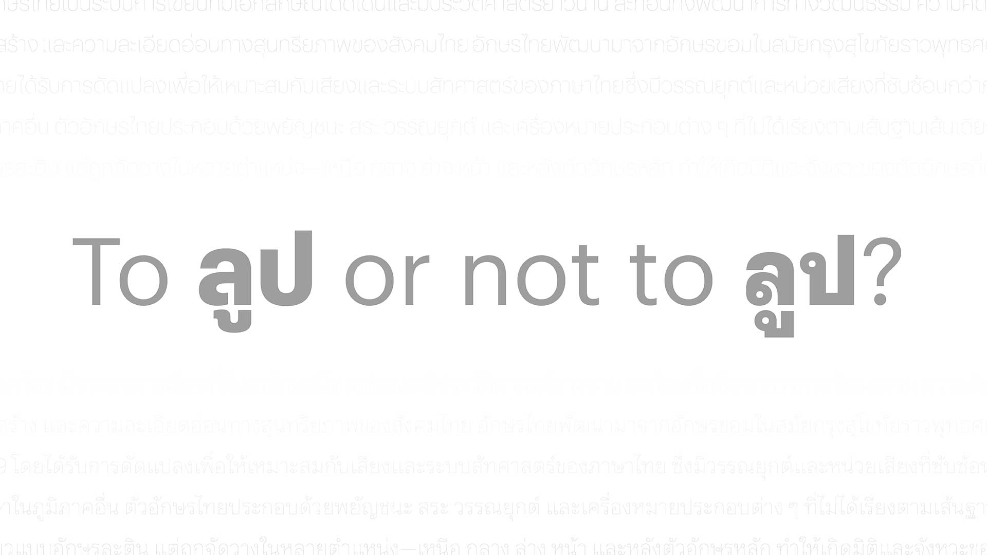
The first and most important thing to understand is which Thai font classification you need for your project: Looped or Loopless. These two styles give off completely different vibes and, in many cases, speak to different audiences. The Looped style, with its rounded "heads," is considered the traditional or idealized form. It's the style everyone, including foreigners, recognizes as uniquely Thai. The circular, winding strokes are a long-standing visual identity, which is why we call it traditional. The Loopless style is a simplified form that you see everywhere, often more frequently in public spaces. You could say its simplification represents a contemporary development or influence. The debate over whether it's "Latinized" is a very long one and a separate topic entirely. There are many arguments, and you have to set aside biases to look at it objectively. Writing tools, speed, and convenience all influence the script style of each era. I want to address a common stereotype right away: the idea that looped fonts are always 'traditional' in an old, dusty way, and that loopless fonts are always 'modern.' That's simply not true, or perhaps it is only true to a certain extent. A looped font can be incredibly contemporary. If you choose the right typeface and the design is done well, it can feel fresh, elegant, and perfectly suited for a modern brand. At the same time, a poorly designed loopless font can look cheap, lazy, and completely out of date.
Now, for a simple rule of thumb on pairing. While it's a bit of an oversimplification, it can help with basic type pairing. You can successfully pair a Looped Thai font with either a sans-serif or a serif Latin font. However, you should not pair a Loopless Thai font with a serif Latin font. The visual clash is just too strong... unless that is your design objective. Otherwise, Loopless can only be paired with a sans-serif. This reality helps to debunk the common but misleading notion that Looped Thai equals Serif and Loopless Thai equals Sans-serif. What I'm saying is, it's not about the loops; it's all about the design. The right choice depends on the specific project and the audience you're trying to reach. And that's where the trained eye of a local type designer becomes so valuable—they can help you make the right choice and choose a typeface that truly does the job. Lately, we’ve been seeing more and more requests for typeface families that support both Looped and Loopless styles. This is a very good development. It means people are starting to realize that both styles are equally important and have different purposes. You don’t need to look across different font families to find a match; you can find a perfect pairing right within the same family." This is another critical element that makes Thai challenging for non-Thais. Beyond simply learning the language, you must also master the skill of mentally separating words within a continuous line of text. This also creates a challenge in typographic arrangement for Thai graphic designers: when composing display or "type-play" typography, there's a high risk of visually interrupting the reading flow and breaking the correct word order. Furthermore, designers must skillfully manage the space between the lines (leading), which must accommodate the stacked tone and vowel marks that vary depending on the text and desired layout.
From a type designer perspective, since Thai sentences only use a space at the end of a phrase or sentence, managing the spacing between characters is crucial. This means we can't just use the same spacing formulas as Latin scripts. We have to manually adjust the characters so that the overall "air" on the page looks balanced. This problem also applies to Lao and Khmer scripts. Since Thai shares a similar typographic history and structure with these scripts, they naturally encounter somewhat similar challenges. This connection suggests a valuable opportunity: designers working with these scripts can learn from and share solutions with each other.
How do Thai cultural identity and visual language influence your studio's design process? In what ways do you think Cadson Demak’s design approach reflects the broader cultural and social context of Thailand?
We do not view Thai cultural identity and visual language as a checkbox to tick but rather recognize that our studio's output is already a distillation of those cultural forces. Instead of literally translating traditional elements, a formula we reject, we see ourselves as a filter for the continuous development of the culture. We believe modern design shouldn't just paste old elements onto new forms; instead, it must embrace the present, giving equal weight to pop culture, as that is the living visual language being created now. For a visual language to become a true cultural identity, it requires repetition, which can be achieved through contemporary creation without having to constantly revert to traditional practices. While we may occasionally revisit the past, the objective is not to merely copy and paste historical aesthetic elements into the present to shape the future. The challenge is to instead figure out how to make the well-designed principles of the past relevant in today's context. In a globalized world where design is becoming highly homogenized and moves at a fast pace, we find that the language and script are critical for defining local flavor. While elements like color and visual image style still somewhat offer local differentiation, we believe type design is an even more important tool for making that identity pop.
Please tell us about one representative project from Cadson Demak. We’d love to know the concept behind it, your design methodology, and how it impacted either the Thai design landscape or global design discourse.
I'll use Thonglor as an example. It was created specifically for screen-based reading. This was part of the initial design brief. We tried to solve problems and use the lessons we learned, such as using a modular system to make Looped Thai characters more compact. This means increasing the white space inside the character, making it more open. This allows for easier weight expansion, which is important for the diverse weights and styles required today. We have polished the character structure by increasing the internal whitespace, giving it a more open feel. This design decision is directly informed by the modern proportions of Thai handwriting, specifically the prevalent "big head loops" observed in today's student scripts. Crucially, we precisely calibrated the loops' size to perfectly accommodate the stem's weight gain throughout the progression. This allows for smoother, easier weight expansion, a vital feature for meeting the demand for diverse weights and styles in modern typography. The initial version of this typeface also served as a test model for how to successfully modernize the weight progression for Thai Looped fonts. Its release challenges user expectations, demonstrating that Thai Looped can offer much more than just Light, Regular, and Bold options.
We also experiment on proportion as well by returning to a more squarish proportion like what was found on the inscription stone for the letters, rather than the rectangular shape that became common later on when pen ink and paper arrived and was reinforced into the preferable modern proportion by hot metal type. Rectangular shapes were a result of converting a cursive handwriting style to an upright form and the need to save on printing materials like paper. These factors combined to make narrow, condensed characters the norm. Today, however, we need our type to work well with other languages, and the narrow proportions don't align with this, which also affects weight progression. By designing for screen first, we freed ourselves from the constraints of limited print space, which allowed us to make the letters wider. The result is that it might seem like you're reading a bit slower because the text isn't cramped, but at the end the readers actually read faster overall because you don't need to go back and reread anything. This gives you more time to understand the content. On the other hand, Thonglor shows that looped typefaces aren't only for body text. They can be used for headlines as well. But in modern Thai design, designers often stick to the habit of using Loopless for headlines and Looped for body text. Thonglor is a large font family we have today that opens up more possibilities for what we can use for different jobs. We also offer the slightly condensed version to satisfy the familiarity of Thai consumers who are not willing to try. Of course variable fonts could also be a good way to put all those needs together.
Lastly, Cadson Demak is known for engaging internationally. What message would you like to share with the broader Asian design community? We’re especially interested in how you view design collaboration across Asia — including Korea, China, Japan, Taiwan, and Hong Kong — and your thoughts on future possibilities for regional exchange.
Our message to the broader Asian design community is an invitation to embrace our creative journey and build together. Cadson Demak has been fortunate to evolve beyond our roots in type design, recently venturing into entirely new creative spaces like experimental film and music production. This exploration has reinforced our core lesson: the best way to build your infrastructure is to put your vision into action, without getting stuck in a traditional business playbook. This mindset naturally creates the need for your service. It will serve you a long way. Believe it or not, in a young industry like digital font foundries, people are still very nice and incredibly collaborative. Perhaps this is because we all share the same pain point of needing other design disciplines to understand why they need us, but ultimately, we all want to see what we love moving forward really fast.
I truly hope this vibe will stay that way as the type industry grows across Asia. When considering collaboration across Asia, this spirit of self-reliance and resourcefulness is what will truly connect us. While collaboration is an excellent idea, being able to collaborate and being open for collaboration is key. We find that people often talk about collaboration rather than discussing how to collaborate effectively. Moreover, to make cross-disciplinary collaboration truly work, you need trust and credibility, especially since locals know best when it is about local context. Keep in mind that collaboration is only good when you collaborate with the right match. The right match is about the right working culture or your value in things being aligned.
Our experience has taught us one fundamental truth. Every design project requires a clear purpose. This principle applies whether we're undertaking a commercial commission or a project purely for design exploration. For our clients, we know that if they hire us based purely on a task, we can easily be replaced by someone faster and cheaper. It is crucial to move beyond vendor and become a partner. By aligning our purpose with their brand purpose, we build lasting value together. For design-related activities, this means a deep commitment to shared design principles. As I mentioned many times, don’t be afraid to make the road as you go, or don’t wait for the infrastructure to be ready. Building the road by yourself is good. Collaboration means we all build our road and then connect at some point. So naturally, building a network of roads together is undeniably better.
