
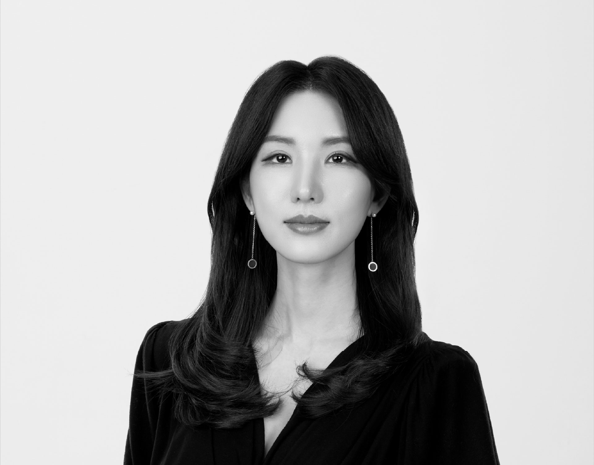
Eunbin Choi CEO, de.blur
"de.blur is a branding design studio that lifts away the haze concealing brands and identities and brings them into vivid clarity. Positioning themselves as a 'value manifestation partner,' they use planning and design as the means through which every company and brand carrying untapped potential can find a distinct voice in the world. Moving fluidly across diverse industries such as F&B, beauty, and public commercial districts, and reflecting deeply on the overall performance of the business alongside their clients, de.blur is led by CEO Eunbin Choi. In this interview, we explored what she defines as an 'irreplaceable brand' and delved into the tenacious and unwavering branding philosophy that de.blur holds firmly at its core."
To begin, could you introduce de.blur to us? What kind of branding design studio is de.blur, and from what perspective do you build brands?
de.blur is a name created by placing 'de' in front of 'blur.' 'Blur' refers to brands and identities that are hidden behind a haze and are not easily visible, while 'de' refers to the act of removing that haze. In other words, our work is the act of turning what is blurred into something clear. What de.blur does is stand alongside every company and brand carrying hidden potential, helping them speak with a more distinct voice in the world and be recognized in the way they truly wish to be. For this reason, we do not stop at simply making a single logo. We accompany, in a closely integrated way, the entire process by which a brand reveals itself to the world. We first design the brand and plan its strategy, and using that strategy as a firm foundation, we design the brand's language and its visual assets. We then design and apply, with no gaps, the necessary experience at every point of contact where a well prepared brand meets its customers.
We define de.blur's reason for being as that of a 'value manifestation partner.' We firmly believe that everyone carries within them a vast potential that has not yet come to the surface, and that our work is to help that potential appear in the world in various compelling ways. Bringing the reason for someone's existence into manifestation through the powerful means of planning and design. That is the true purpose behind the way de.blur works.
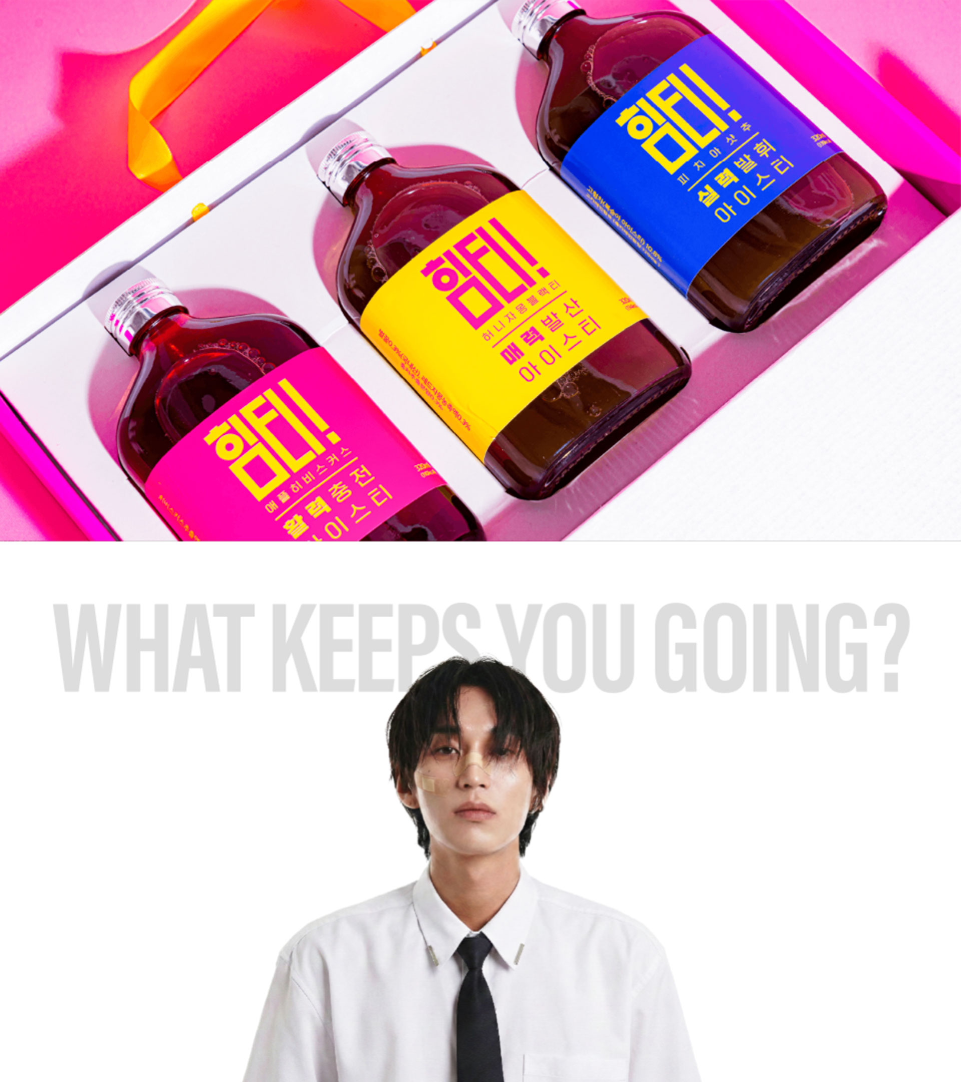

< HIM-TEA Branding, ASIA DESIGN PRIZE 2025 Winner >
de.blur introduces itself as 'a studio that designs irreplaceable brands.' What do you consider to be an 'irreplaceable brand,' and how do you think it differs from a design that is merely pleasant to look at?
To be irreplaceable, I believe, means creating a form of recognition that is possible only because it is 'me.' On the surface, anyone can design something beautifully. Yet being irreplaceable never begins from there. First and foremost, one must tenaciously uncover the reason for one's own existence, that is, the brand's 'Why.' On the basis of that reason, it is essential to clearly define which direction the brand should move in, what it seeks to offer its customers along the way, and then to shape all of this so that customers can actually feel it. For this reason, good design is not simply about parading something 'more beautiful than what others have.' If a competing brand adorns itself with aesthetic design, merely placing a better looking design beside it, or expressing only what happens to look pretty to one's own eye, results in a shallow design that can be replaced at any moment by something else.
Defining fiercely why I do this work, why I therefore exist, and how I intend to reveal this to the world with confidence, and then actually making it so that the public sees and feels the brand that way. It is only when that consistent inevitability accumulates layer by layer that an irreplaceable brand and design, one that no one else can imitate, is truly completed.
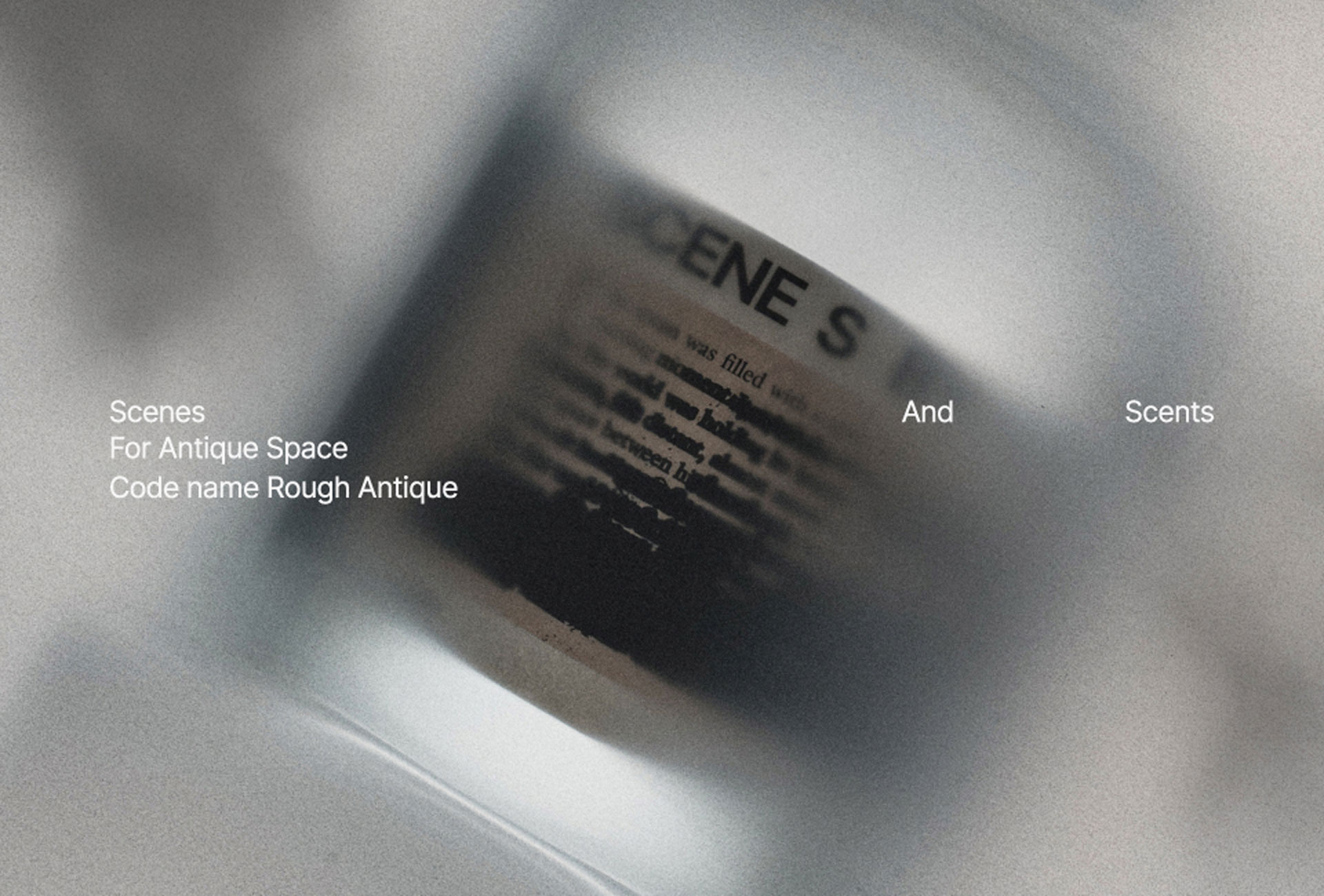
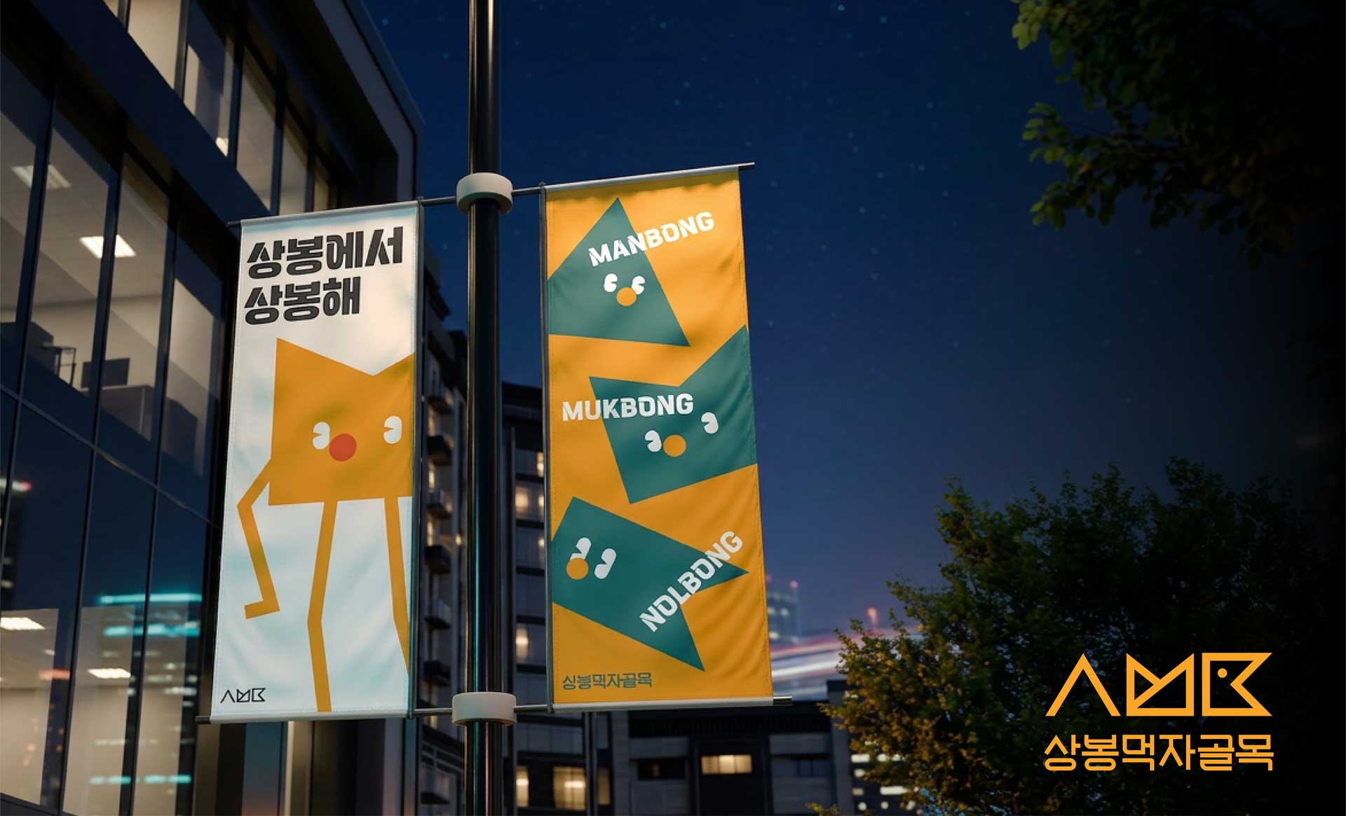
Looking at de.blur's portfolio, you cover a very wide range of areas including F&B, beauty, products, public branding, and local commercial district branding. When you design brands across different industries, what is the common criterion that de.blur examines first?
Even when the industry differs, what we first examine in depth is always the brand's firm mission and vision. This connects closely with the previous answer. Some brands exist for the environment, some to make everyday life happier for individuals, some to protect people's health, and some to gather scattered people back together. Just as de.blur takes as its mission the work of helping countless people and companies with potential come to be properly seen in the world, every brand has its own unique mission that must be resolved and a distinct direction in which it must move forward.
For this reason, no matter how different the industry may be, the starting point of branding is always the same. It is the question, 'What problem is this brand trying to solve, and where ultimately does it wish to head?' Only when these two things become clear does a valid 'foundation' emerge for what to say to the consumer, what character the brand should carry, and what form it should take. de.blur begins its design without wavering, not on momentary taste or sensibility, but firmly on that solid foundation.
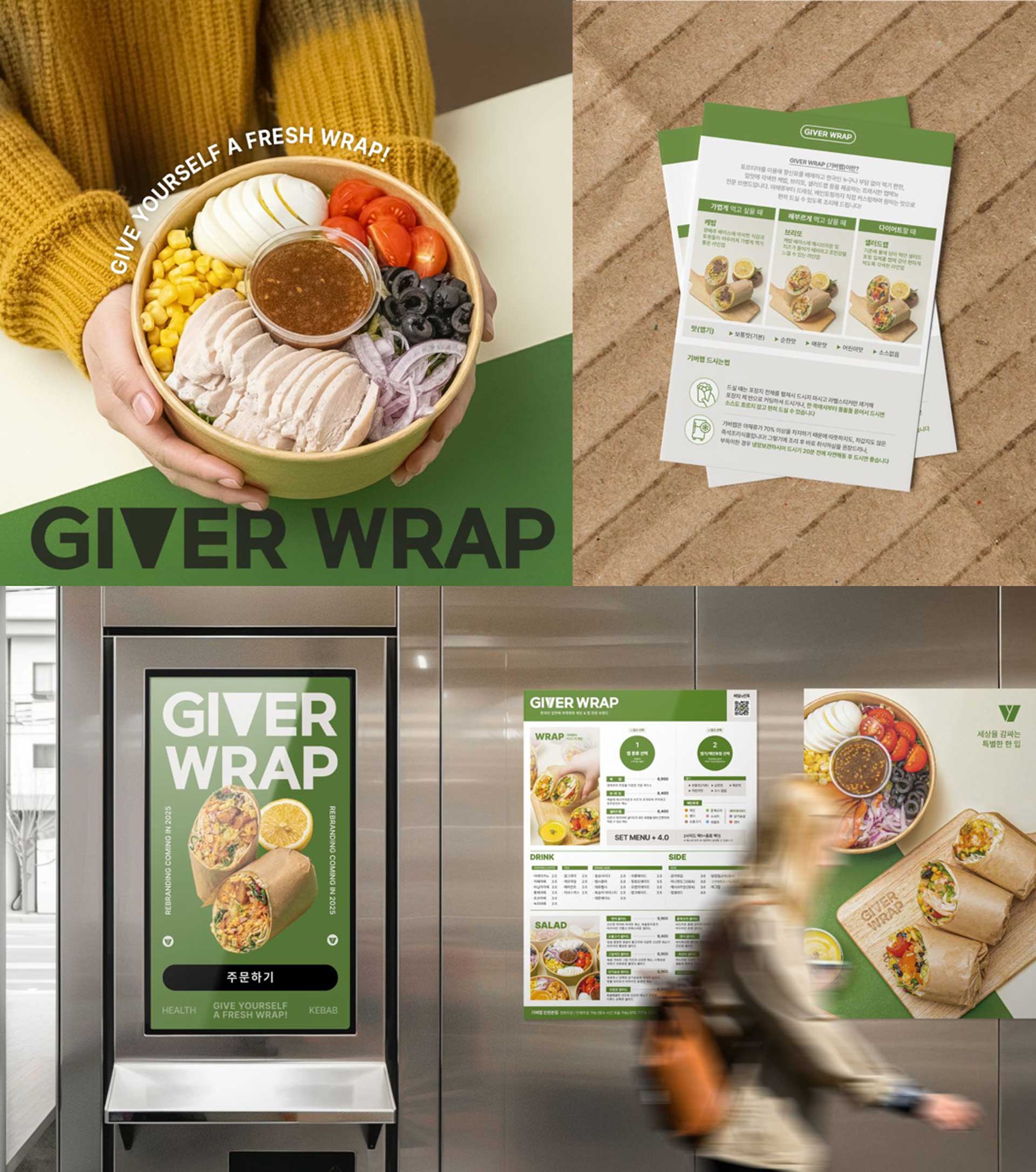
A brand concept begins with language, but is ultimately realized as tangible outcomes such as logos, packaging, spaces, content, and customer experience. What kind of process does de.blur go through when translating a brand concept into visual outcomes?
First and foremost, we gather an enormous and diverse range of information. We thoroughly collect the brand's thoughts and philosophy, its services and products, its past trajectory, its customers, its market, its internal systems, and even the thoughts of the people who make up the brand. It is a dense phase of drawing together enough information to fully embody the brand. Next, we organize this information into refined language. When we gather the scattered fragments in one place and look deeply into them, the brand's own Mission, Vision, and Core Values (MVC) gradually take on a clear form. Only on this sturdy foundation do we define the brand's concept in a single, clear language, and only after we have made it a firm linguistic asset do we move on to the visual phase.
In the visual phase, we bring forth an explosive number of ideas that can express that concept in a compelling way. Among them, we rigorously narrow down the ideas that are most creative, most efficient, and at the same time realistically feasible, and we organize them systematically as a visual strategy before receiving the client's feedback. Reaching a transparent agreement on direction at this stage matters more than anything else in the entire project. After incorporating the feedback, we complete the core identity design that serves as the standard, including the logo, key visual, layout system, color, and typography, and organize these clearly into a BI (Brand Identity) guide. Only when the BI is firmly established can we move on to the next phase of BX (Brand Experience), using it as a consistent standard.
Once the BI is complete, we design each moment where the brand actually meets its customers in careful detail, starting from the most important points of contact. We go through the process of thoroughly designing and applying packaging, web presence, product detail pages, spaces, and other elements according to priority. It is a single flow that begins with language and ends with the customer's experience, completely consistent from start to finish.
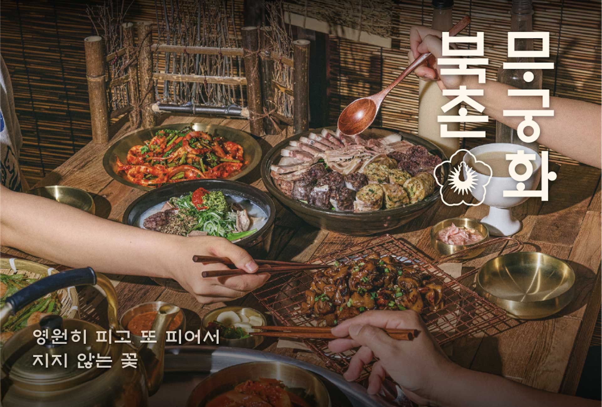
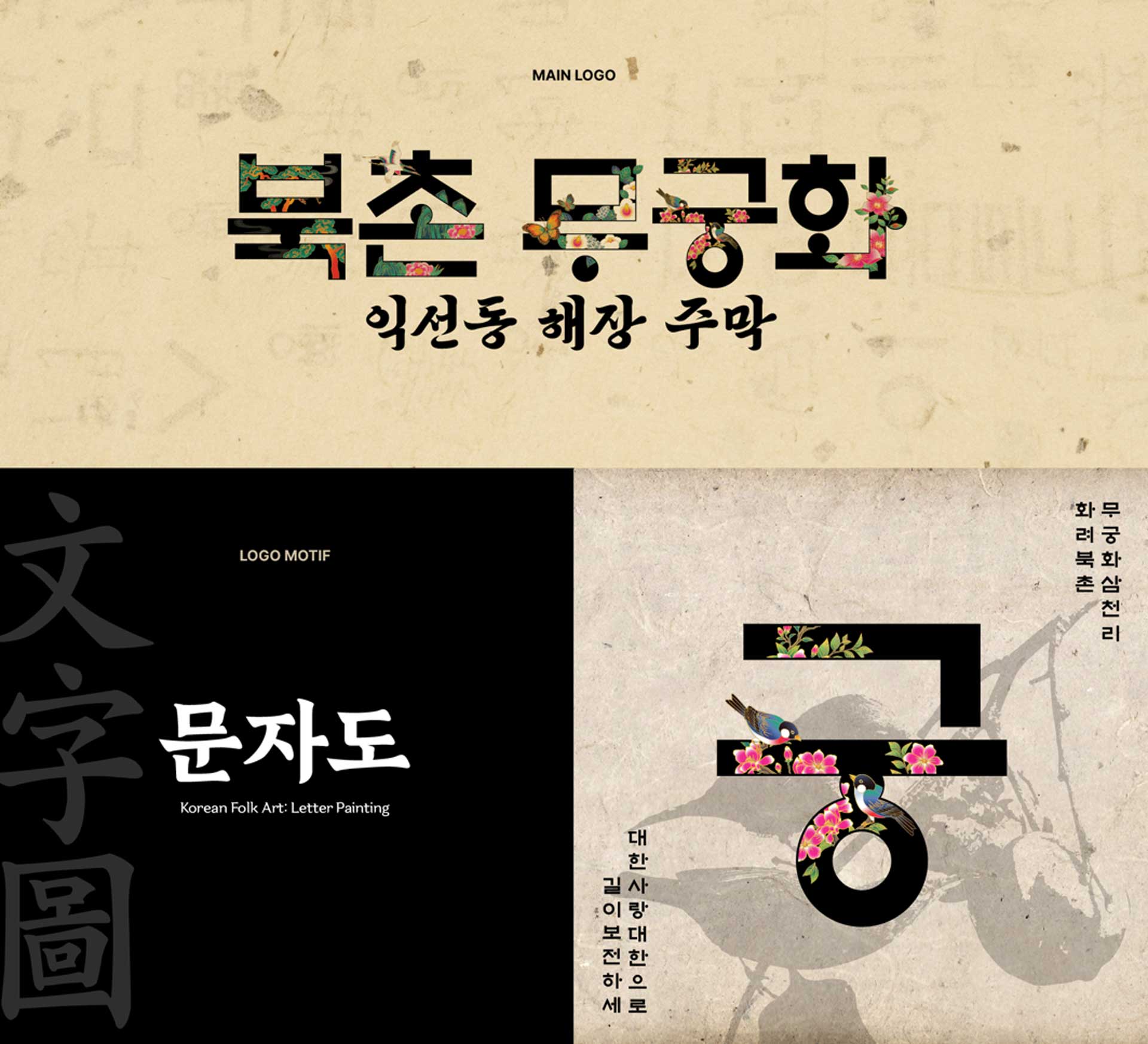
F&B brands like Bokokjeong and Bukchon Mugunghwa are fields where taste, space, regionality, and the customer's emotions all work together. When designing F&B brands, how does de.blur strike the balance between the appeal of the food itself and the sensory experience the brand must convey?
For F&B brands, we firmly believe that the menu and the taste itself is already the design. That is why we do not passively begin with a pen at the desk. We go directly to the site, actually eat the food, and vividly experience firsthand what the taste is like, what the plating is like, and ultimately what the customer feels when facing that single plate. Only after fully understanding the essential sensations the food offers can we propose visuals and spatial experiences that carry that quality into the concept and grain of the brand. The appeal of the food and the visual sensations the brand must convey are not two separate things to be divided but should originally be one organic whole. When the impression that lingers on the tongue, the impression of the space where the customer sits, and the visual language the brand extends all point precisely toward the same place, only then does a successful F&B brand that is clearly imprinted in the customer's memory truly come into being.
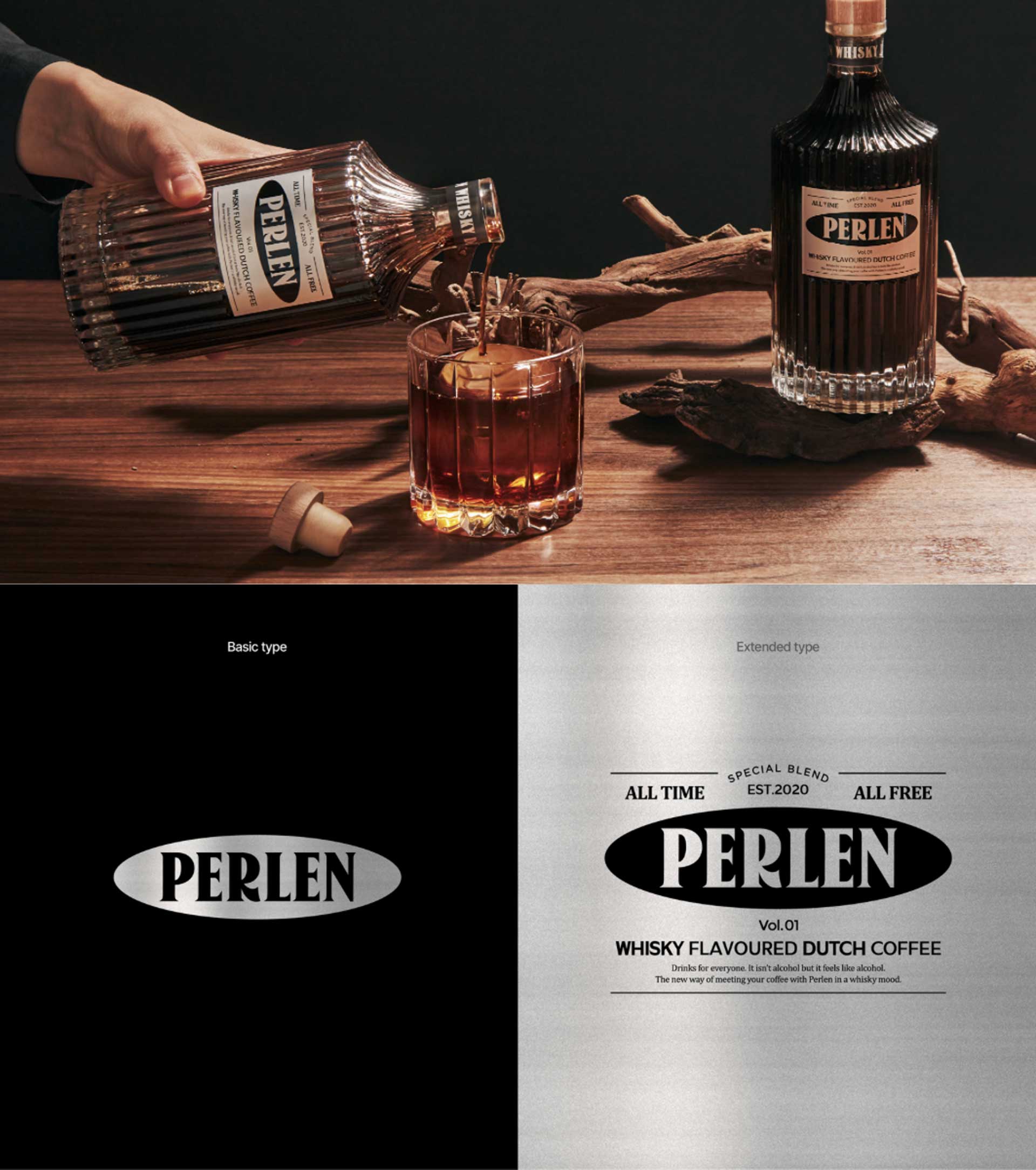
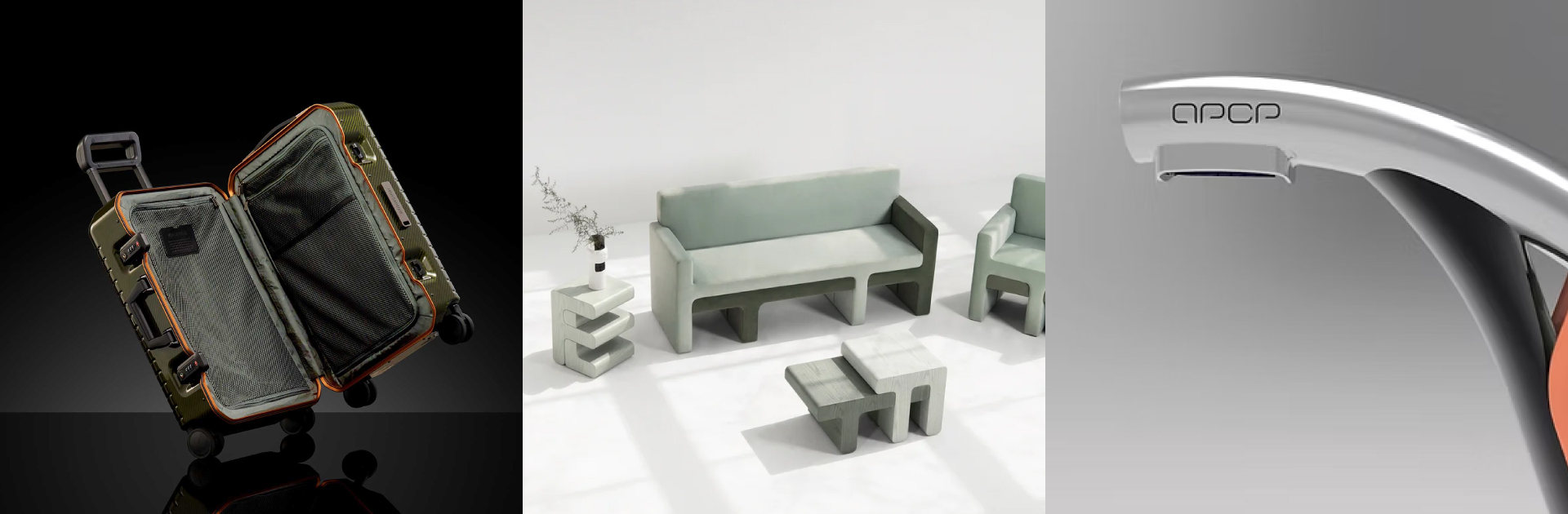
For brands centered on products such as the Peleun project, packaging and product experience determine the consumer's first impression. When designing a product brand, what does de.blur consider the most important 'first scene'?
What determines the first scene is ultimately the unique concept the brand carries. For a brand with a friendly and warm concept, from the moment the consumer opens the packaging to the experience of using the contents, a warm sensation that feels approachable and gentle should thoroughly come through to the user. On the other hand, for a private and premium brand, even if it is somewhat elaborate and demanding, the very act of unwrapping the package must become a special ritual that conveys a deep and dense message. Because of this, the question we focus on when designing the 'first scene' is always the same. It is the reflection, 'In what way will the customer first experience the essence of this brand?' The shape of the packaging, the texture of the paper that touches the hand, and even the sequence in which the box is opened are all, we believe, the first visual sentences that silently prove the concept of the brand, and we approach them with the deepest care.
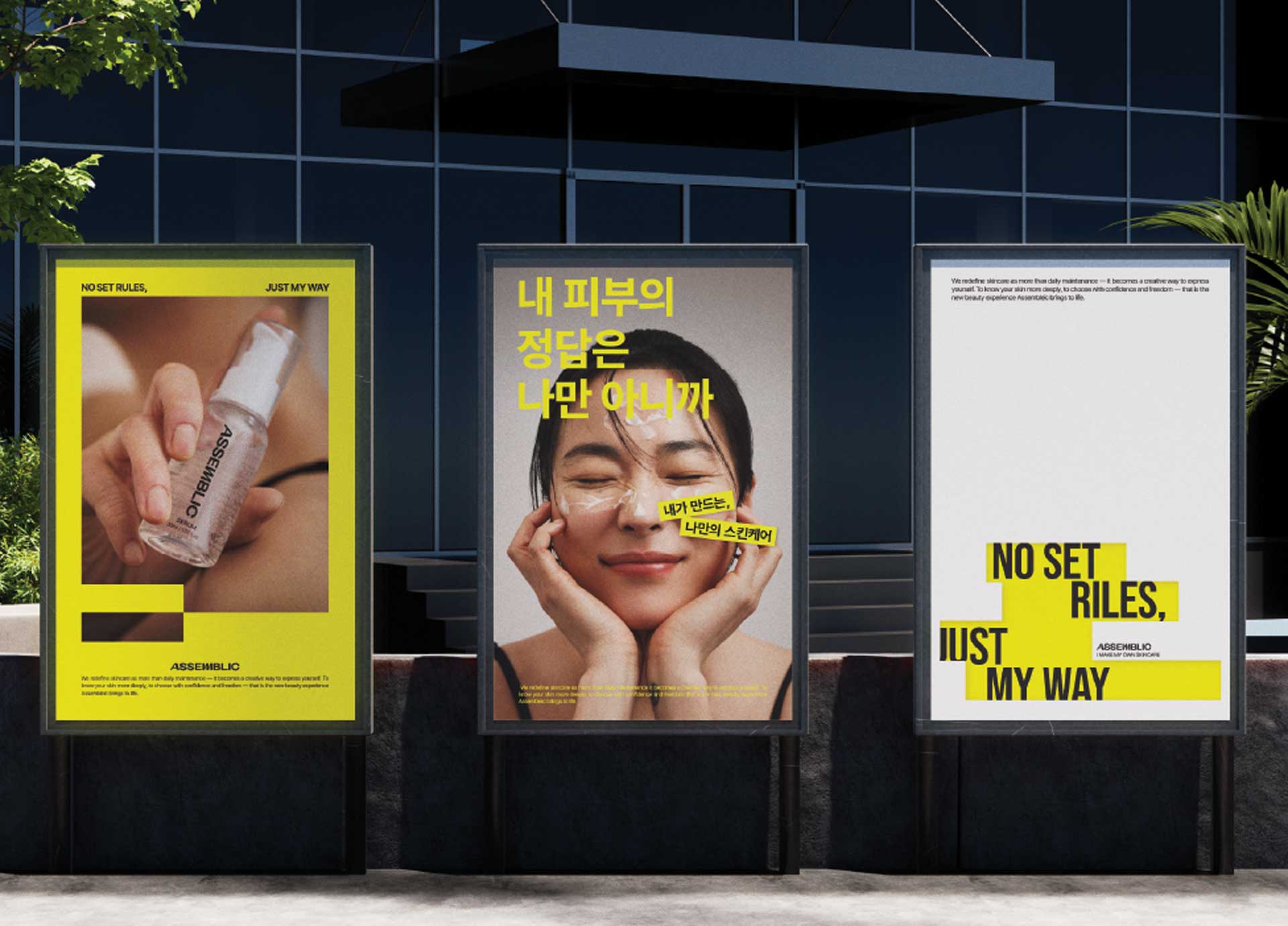
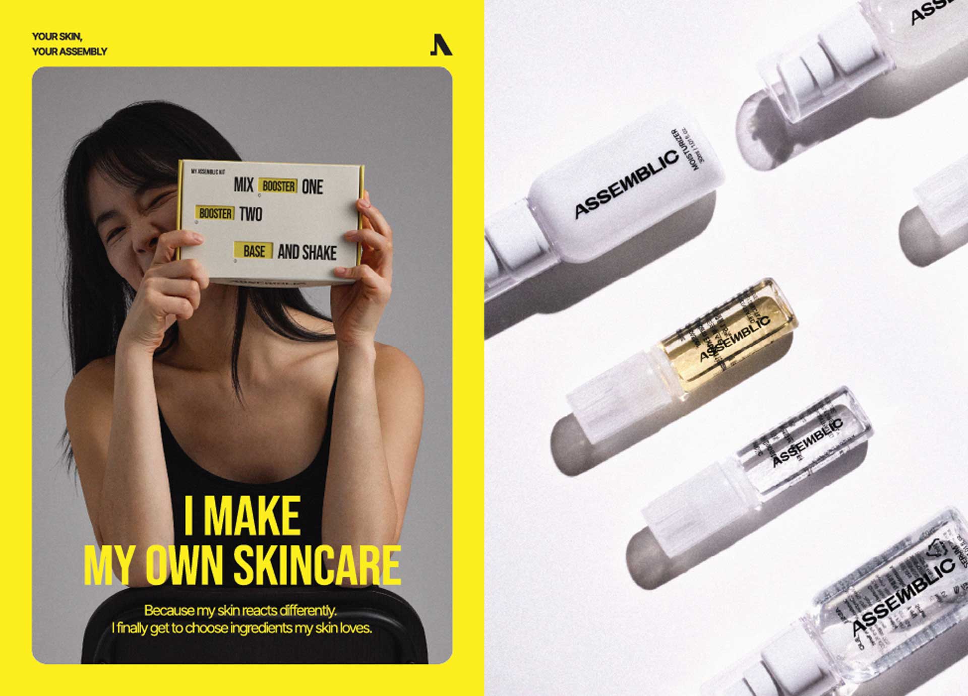
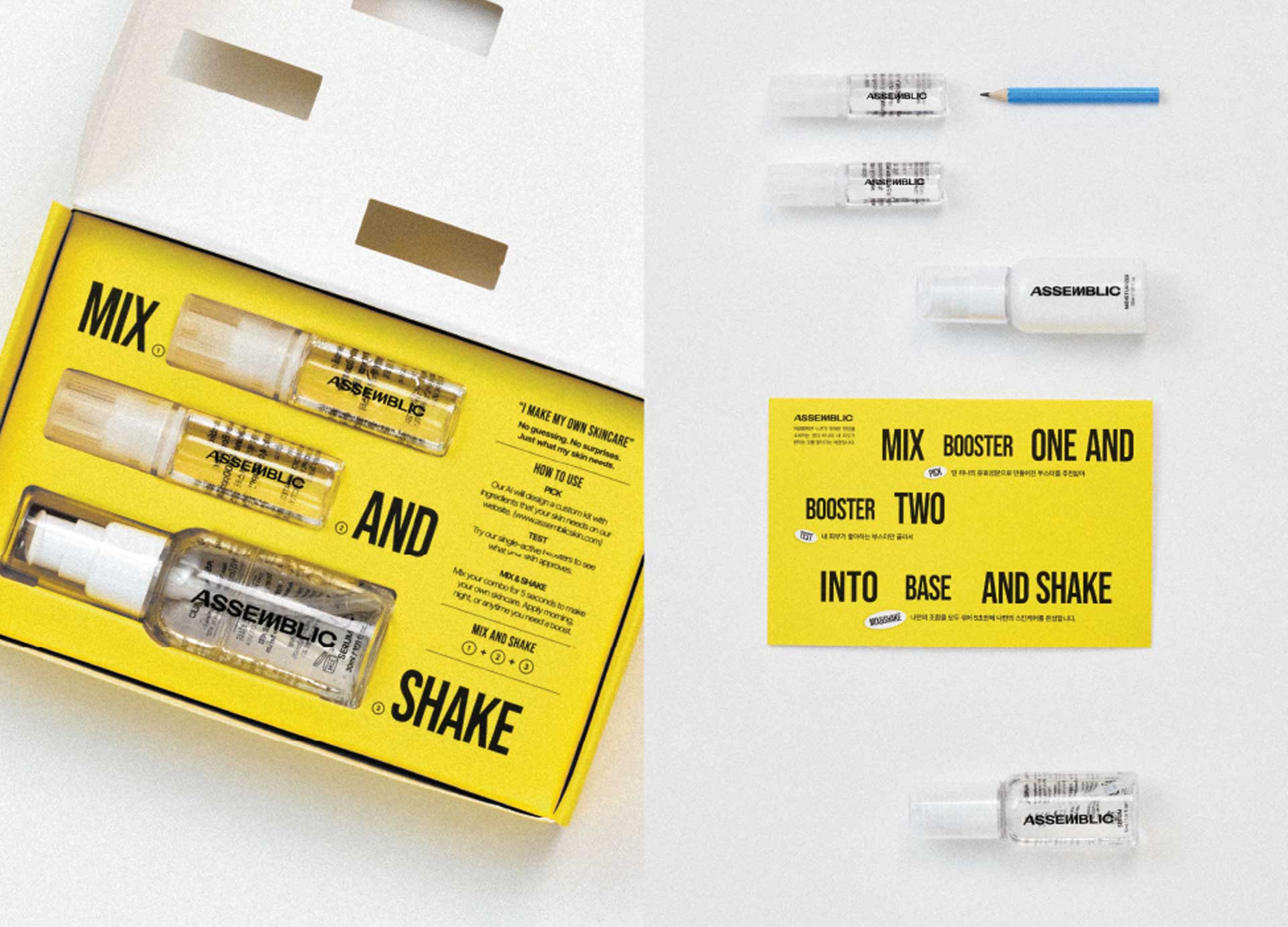
How do you transform the abstract value of 'beauty' in a beauty brand into persuasive brand language and design?
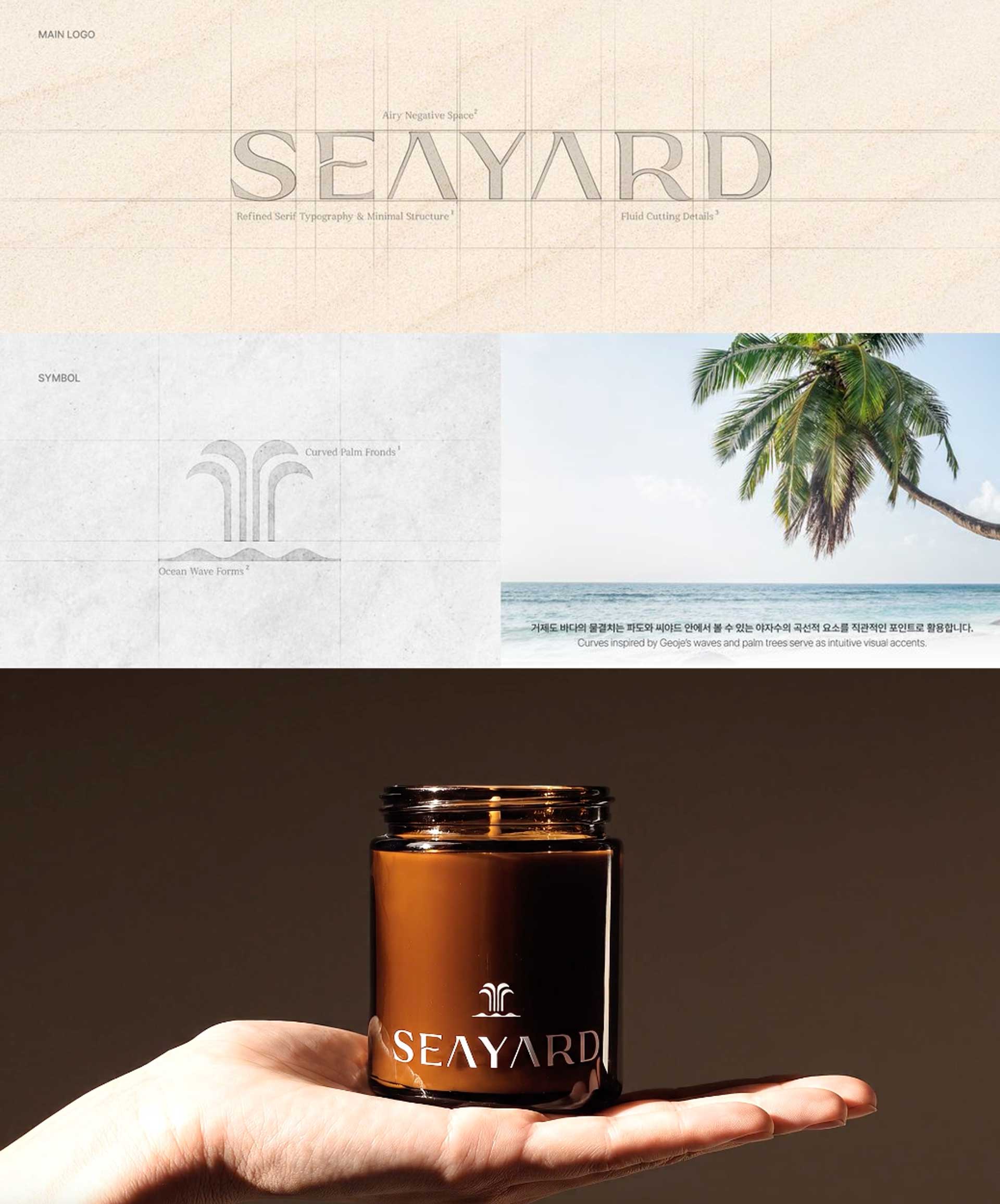
The word 'beautiful' is very abstract and expansive, but its meaning becomes clearly divided depending on the kind of beauty a brand aspires to. In Korean, it is often said that the root of 'beautiful' comes from 'being like oneself.' For this reason, we believe that capturing and showing precisely what is most like oneself, and what is most like the brand, often becomes the shortest path to explaining beauty. Let us take Assemblik as an example. Assemblik is a functional cosmetics brand that helps people cultivate the beauty of their skin. When we looked deeply into what makes Assemblik most like itself, we saw that it enables people to take charge of finding the beauty that suits them, using cosmetics they have made themselves. Because of this, we derived the brand's language as 'I MAKE MY OWN,' and completed the design by focusing on the empowering sense of 'I choose,' emphasizing masking areas within the visuals.
In this way, de.blur does not casually transfer the abstract text of 'beauty' as it is onto visual matter. It is about first sharply defining exactly what kind of beauty this brand wants to show the public, and then converting that into the brand's own original language and visual expression. That tenacious process of making things concrete is what becomes powerful persuasion in the market.

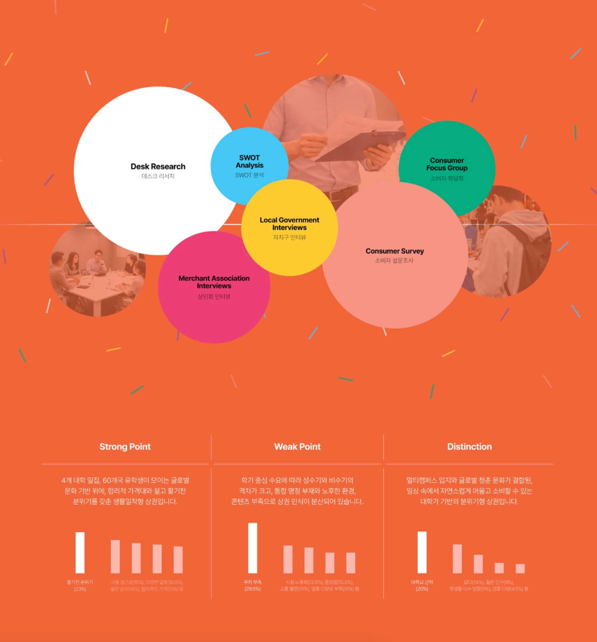
de.blur has also carried out branding work for Seoul's commercial districts and for policy projects. Unlike commercial brands, what must be regarded more carefully in public branding or local commercial district branding?
What must be looked at most carefully in the public sphere is precisely 'relationships.' In public and local commercial district branding, the role of the studio functioning excellently as a facilitator is extremely important. This is because it is not a fragmentary form of branding done for the profit of a single individual or one specific company. The work of coordinating the complex opinions of countless stakeholders whose positions differ sharply from one another, such as consumers, local officials, foundation staff, and merchant associations, and of translating the consumer's language into a realistic form that suppliers can accept, carries far greater weight than the act of doing design itself.
For this reason, in this area, rather than parading aesthetically dazzling and outstanding design, the work of building a firm 'system' in which consumers and suppliers can thrive together and stand on their own over the long term is far more important. And until that system truly takes root in its place, how firmly the branding organization serves as a bridge between differing positions is what, we believe, ultimately decides the success or failure of the project.
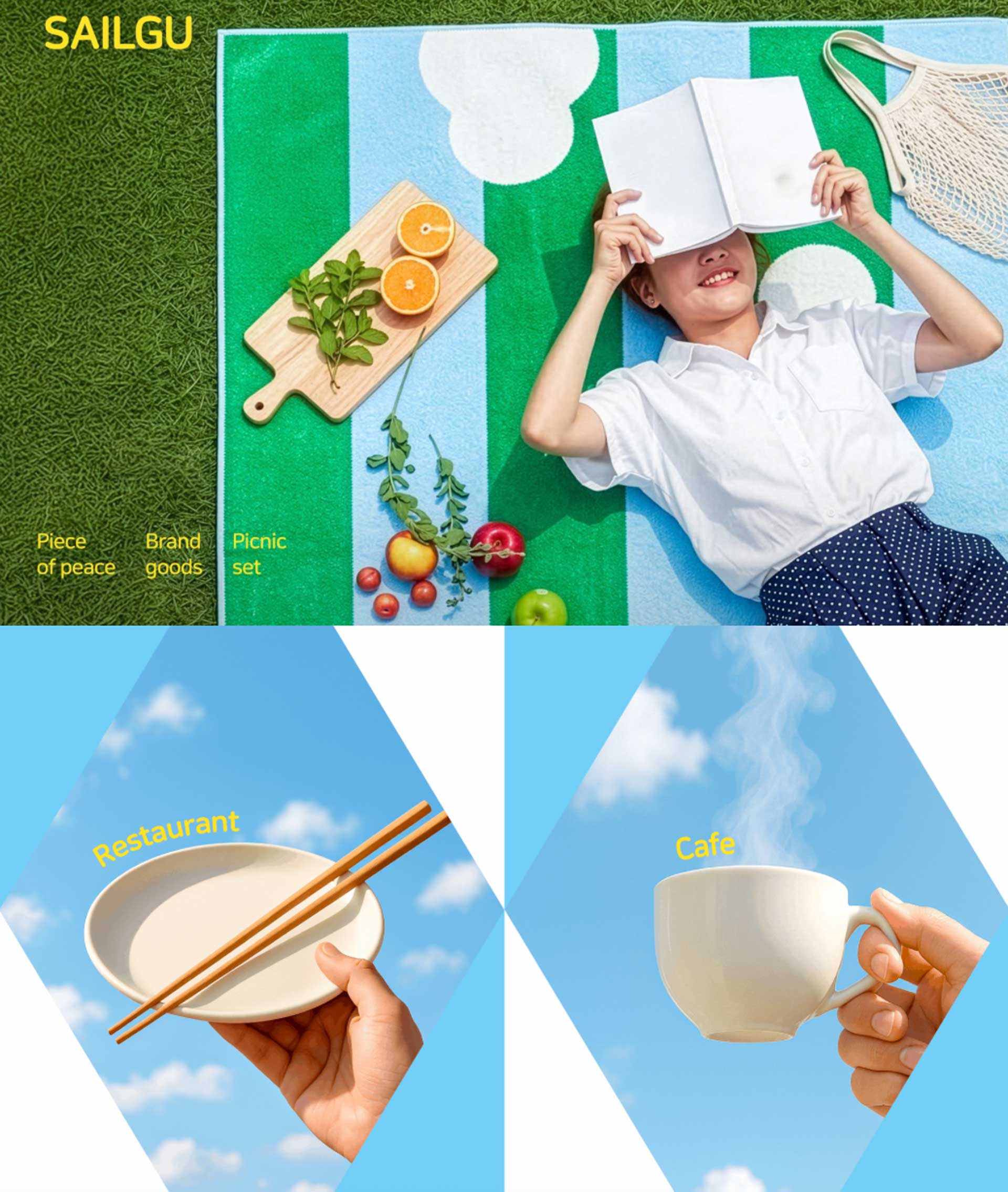
In de.blur's introduction, the phrase 'the tenacity to treat it as our own' is striking. In the actual project process, are there questions or research methods you regard as most important for understanding a client's brand 'as our own'?
At the start of every project, we receive a very detailed and thorough interview questionnaire from the client. Yet among the dynamic things that actually happen inside a brand, there certainly exist hidden contexts that are difficult to embody through written text alone. Because of this, we take one step further beyond simply reviewing the questionnaire. At the kickoff meeting, all team members gather together, not in a rigid formal meeting, but as if in an everyday chat, and we take ample time to freely share the current situation, points of concern, and unresolved worries and questions. We also visit the site in person to interview team members face to face, and by carefully walking through the stores, we often discover small issues that even the client had not noticed and return them as sharp insights.
Understanding a client's brand 'as our own' ultimately means, we believe, that the studio persistently examines even the blind spots that the client themselves may not have seen. Only when there is that degree of tenacity and affection does real branding become possible, one that begins not from the shallow surface but from the weighty essence of the brand.
Korea's branding design market is expected to become more segmented, while at the same time being rapidly reshaped amid changes in AI and the digital environment. Amid such changes, what is the essence of branding that de.blur wishes to continue preserving, and what kinds of brands would you like to build going forward?
The essence we wish to keep upholding going forward is no different from the story we have already shared. Before the flashy outer beauty that meets the eye, clearly revealing why this brand exists uniquely in the world. We want to keep expressing that firm essence through de.blur's own delicate sensitivity and original ideas, all the way through. No matter how the era changes, and no matter how strikingly fast the tools and environment shift, our steadfast posture that begins from the most fundamental question, 'why do you exist,' will never be shaken.
There is one more thing we would like to clearly emphasize. A brand is one very important part of the process of running a business well. For a brand to succeed in the market, the business itself must ultimately do well, and for a business to do well, not only branding but also comprehensive performance must all mesh together and function properly. For this reason, we do not wish to remain only within the narrow definition of 'design.' From initial planning and strategy, to visual design, to marketing, and on to application in the field. We want to reliably support every stage necessary to become a brand truly loved by a wider public and one that survives for a long time. Building a powerful brand in which a single total system runs organically and seamlessly, and staying alongside it all the way to see it function excellently in the actual market. That is the vision de.blur will pursue with steady determination going forward, and it is the direction we are heading.















#14057, 905 49, Beolmal-ro 102beon-gil,
Dongan-gu, Anyang-si, Gyeonggi-do, Korea
Business Registration Number: 454-86-01044
Online Sales License No.: 2021-Anyang Dongan-1081
Copyright © DESIGNSORI Co., Ltd.