THE PENTHOUSE Visual Branding
Communication
Regions
Korea
Year
2023
Award
WINNER
Client
CHANNEL A
Affiliation
CHANNEL A BNC
Designer
Oh Hyejung, Hong Iryeon, Byun Joohee, Kim Miri, Kim Taehyung
https://youtu.be/u38fn4XFxuw
English
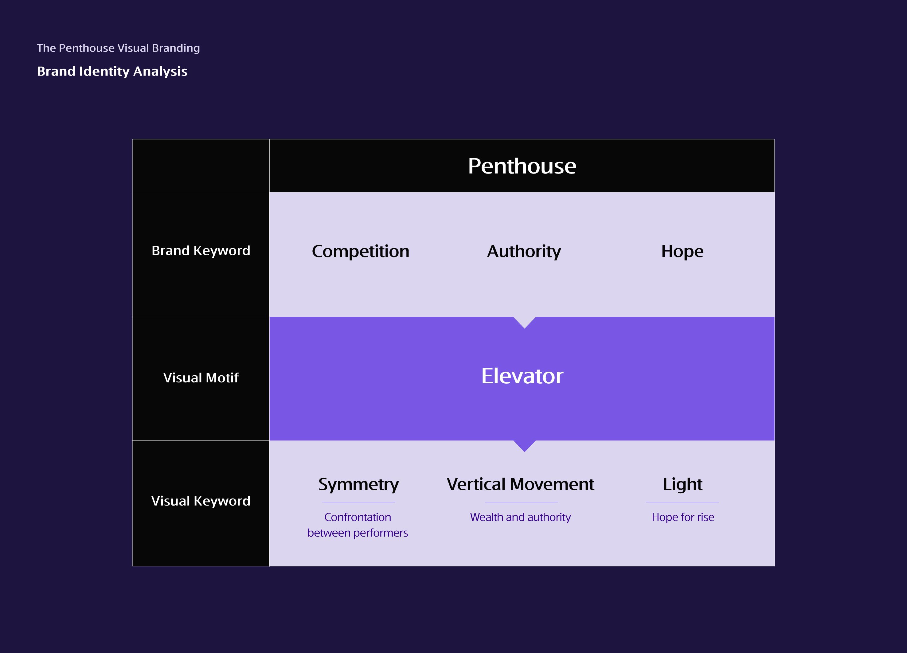
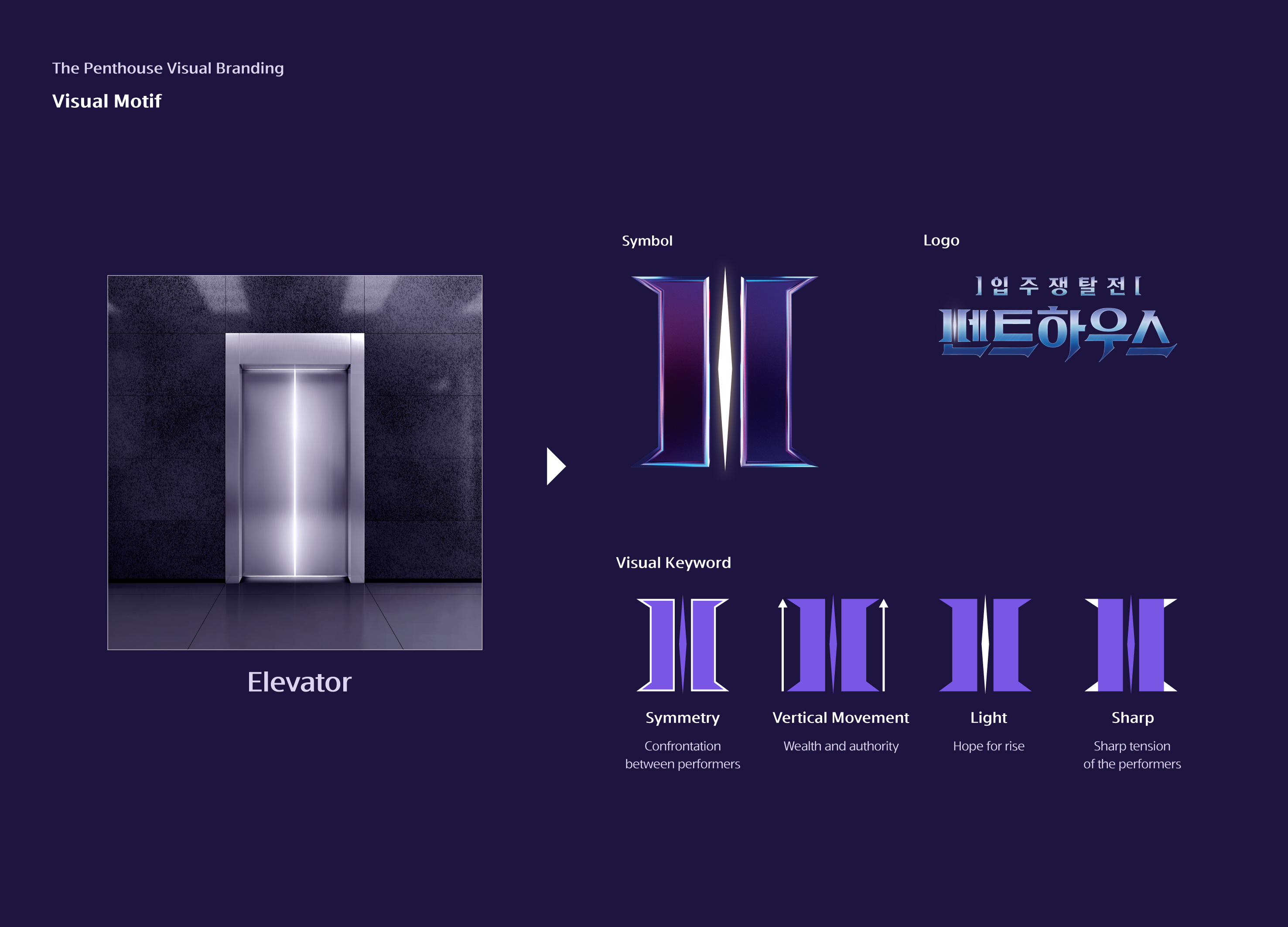
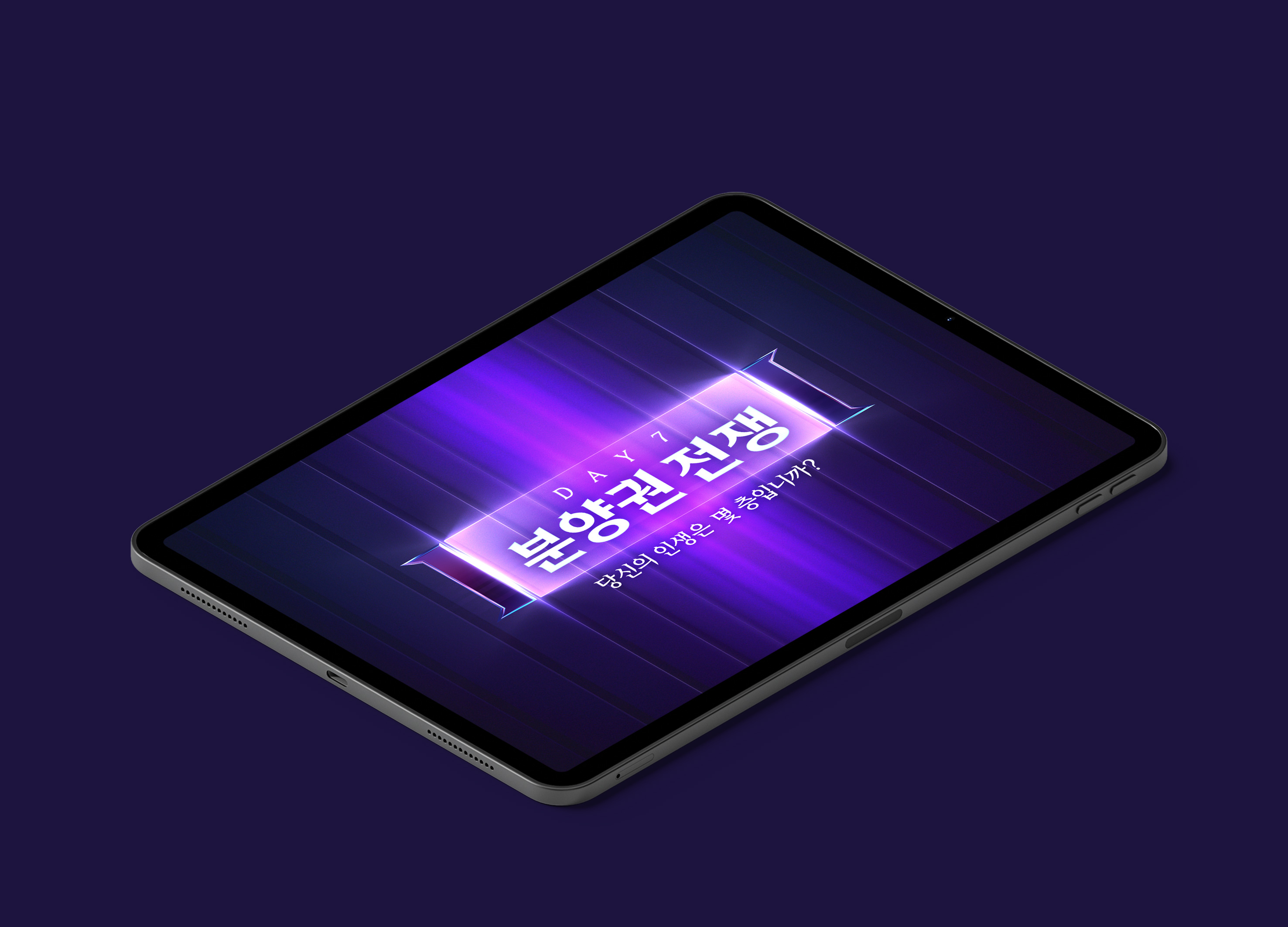
The function and meaning of the elevator which is the main mediator of ‘Penthouse’ was set as a visual motif. We found that the structural characteristics of the elevator which consists of symmetrical doors are suitable for expressing the keyword of this show, ‘competition’. The pointed shape on the four sides expresses the sharp tension of the performers and the light leaking in the center expresses hope. Elevator motion characteristics were developed and applied as moving identities. In this way, unique attributes were applied to various elements to establish a high-level visual brand.
Native
‘펜트하우스’ 콘텐츠의 상징적 형상은 엘리베이터이다. 우리는 형상화 과정에서 엘리베이터 고유의 시각적 특성과 함께 본 쇼의 톤 앤 매너가 선명하게 보여질 수 있도록 고민하였다.
두 개의 대칭된 문으로 구성되어 있는 엘리베이터의 구조적 특성은 본 쇼의 키워드인 ‘경쟁’을 표현하기에 매우 적합한 형상임을 발견하였다. 사방의 뾰족한 형상은 출연자들의 날카로운 긴장감을 표현하였고, 중앙에 있는 다이아몬드 형상에서 새어 나오는 빛은 성공과 희망을 표현하였다.
엘리베이터는 문의 개폐에 의한 좌우 이동과 층간 이동에 의한 수직 이동이라는 고유의 특성을 적용하여 ‘펜트하우스’만의 ‘무빙 아이덴티티’를 개발.적용하였다. 대부분의 시각적 상징물들은 고유의 컬러 아이덴티티와 형상 아이덴티티로 구성되어 있다. 우리는 여기에 무빙 아이덴티티의 개념을 추가하여 차별화와 혁신을 꾀하였다. 이 움직임은 권력의 이동과 상승에 대한 희망이라는 본 쇼의 핵심과도 맞닿아 있다. 우리는 이와 같이 명확한 속성을 다양한 요소들에 적용하여 보다 수준 높은 비주얼브랜딩을 확립했다.
Website
Positive Comments


THE PENTHOUSE Visual Branding
CHANNEL A BNC
Korea
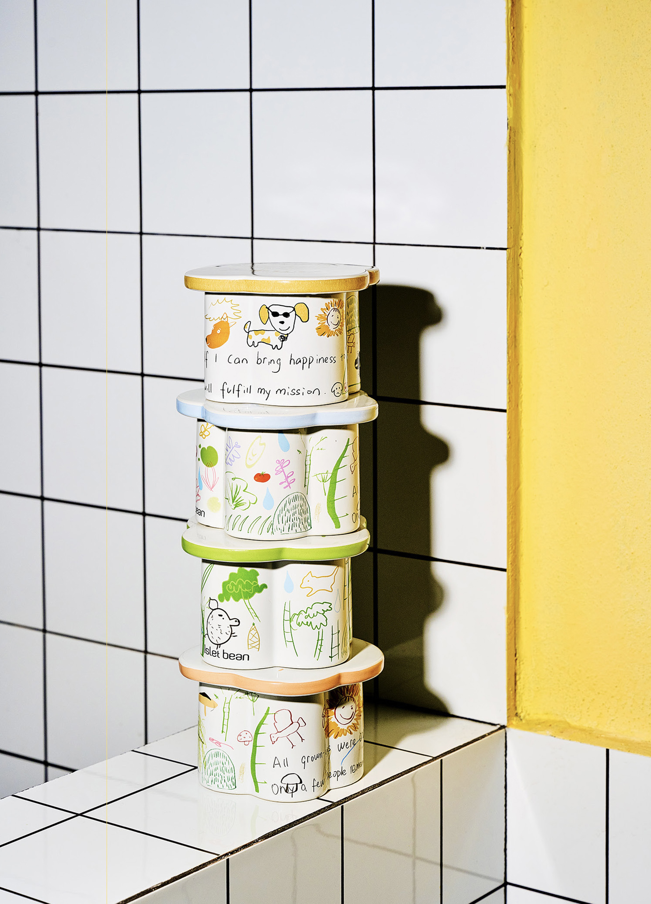
Wild wild child Fragrance Collection
Moneys Studio
China
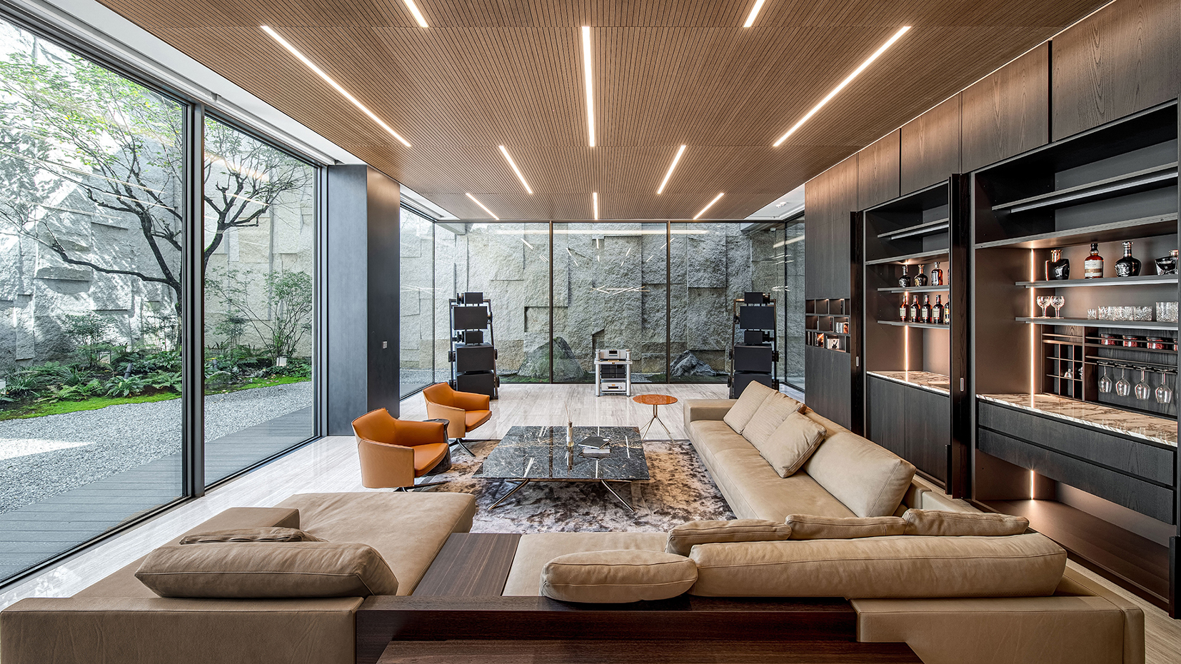
Wave House
AHN&PARTNERS
Korea
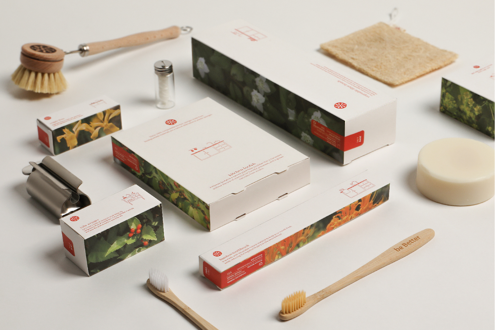
BE BETTER Packaging for the Earth in 2050
be Better
Korea
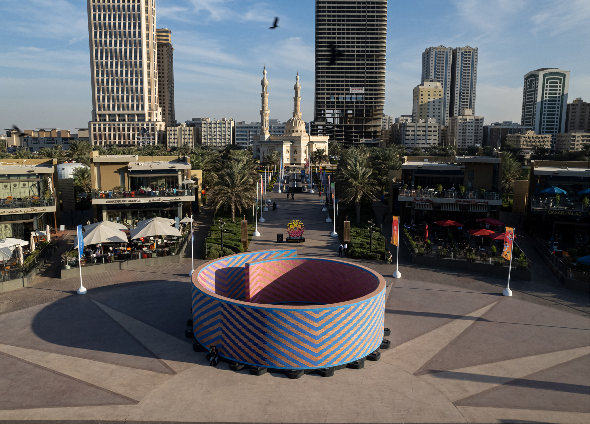
In Between the Red Brick Wall
Daydreamers Design
United Arab Emirates
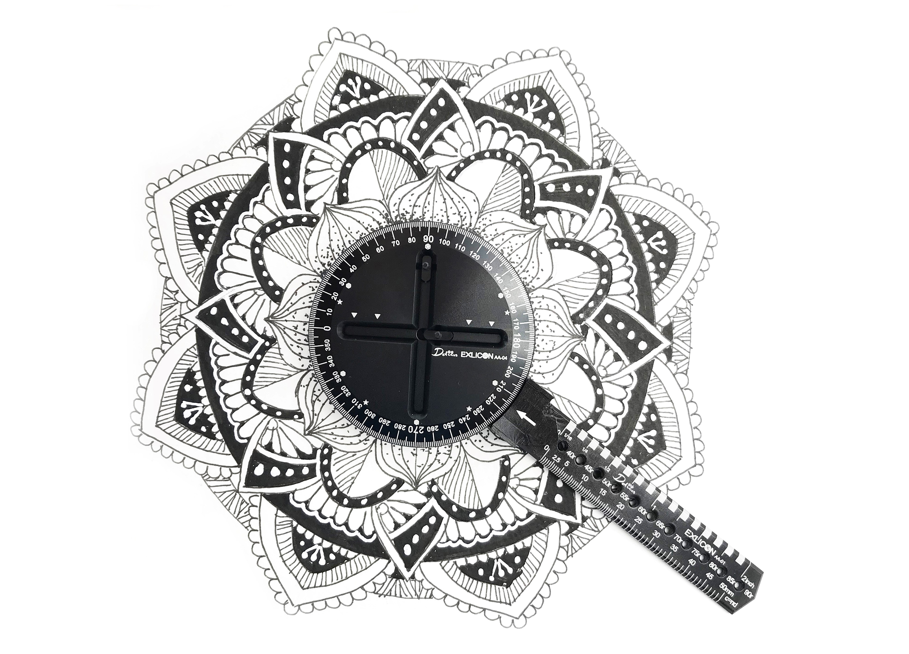
Exlicon Multi shape design tool
Ddiin Concept Limited Co., Ltd.
China Hong Kong
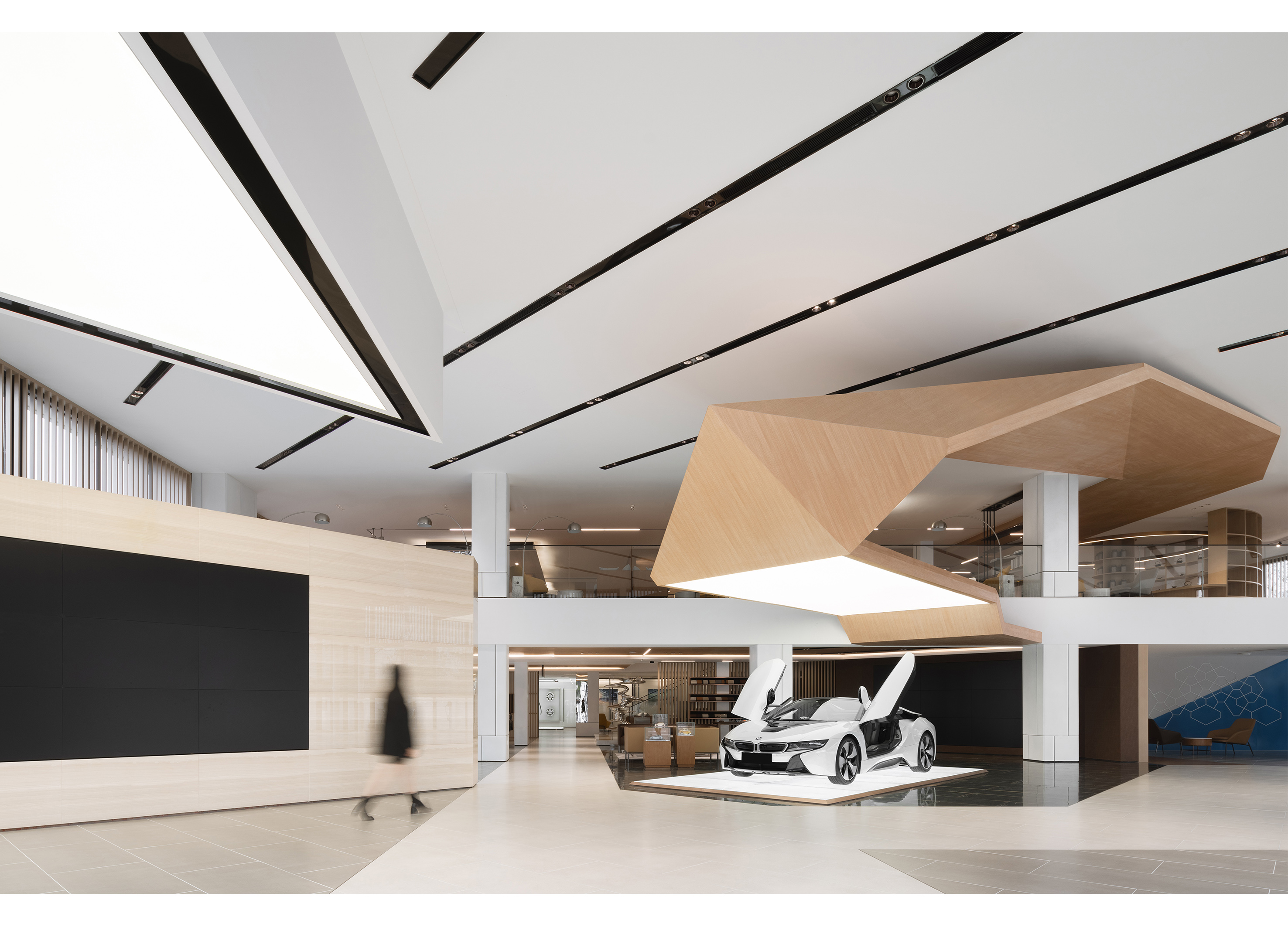
Chengdu BMW Experience Center
ARCHIHOPE Co., Ltd.
China
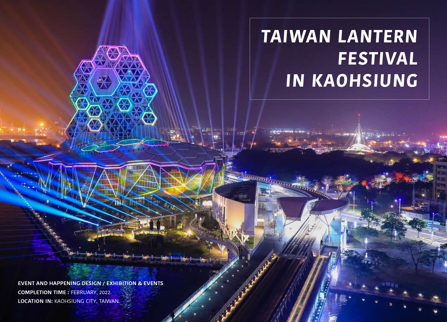
TAIWAN LANTERN FESTIVAL IN KAOHSIUNG
Kaohsiung City Government
Chinese Taipei
QUARK
100A associates
Korea
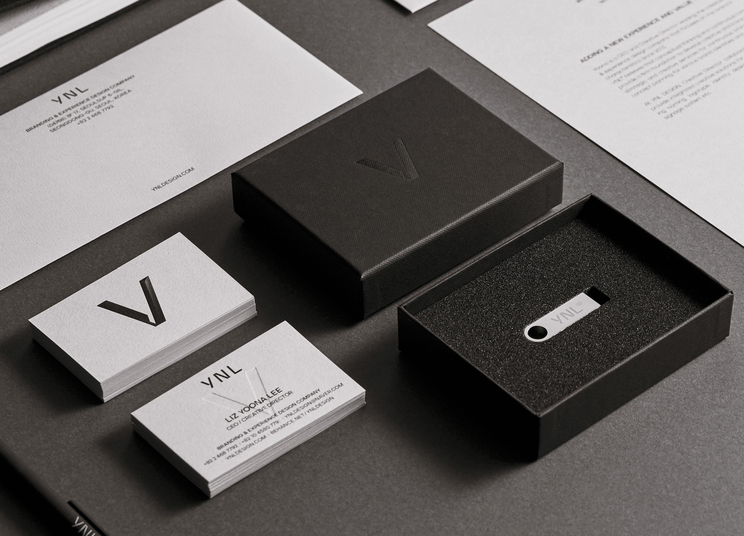
YNL Design CI Renewal
YNL Design
Korea
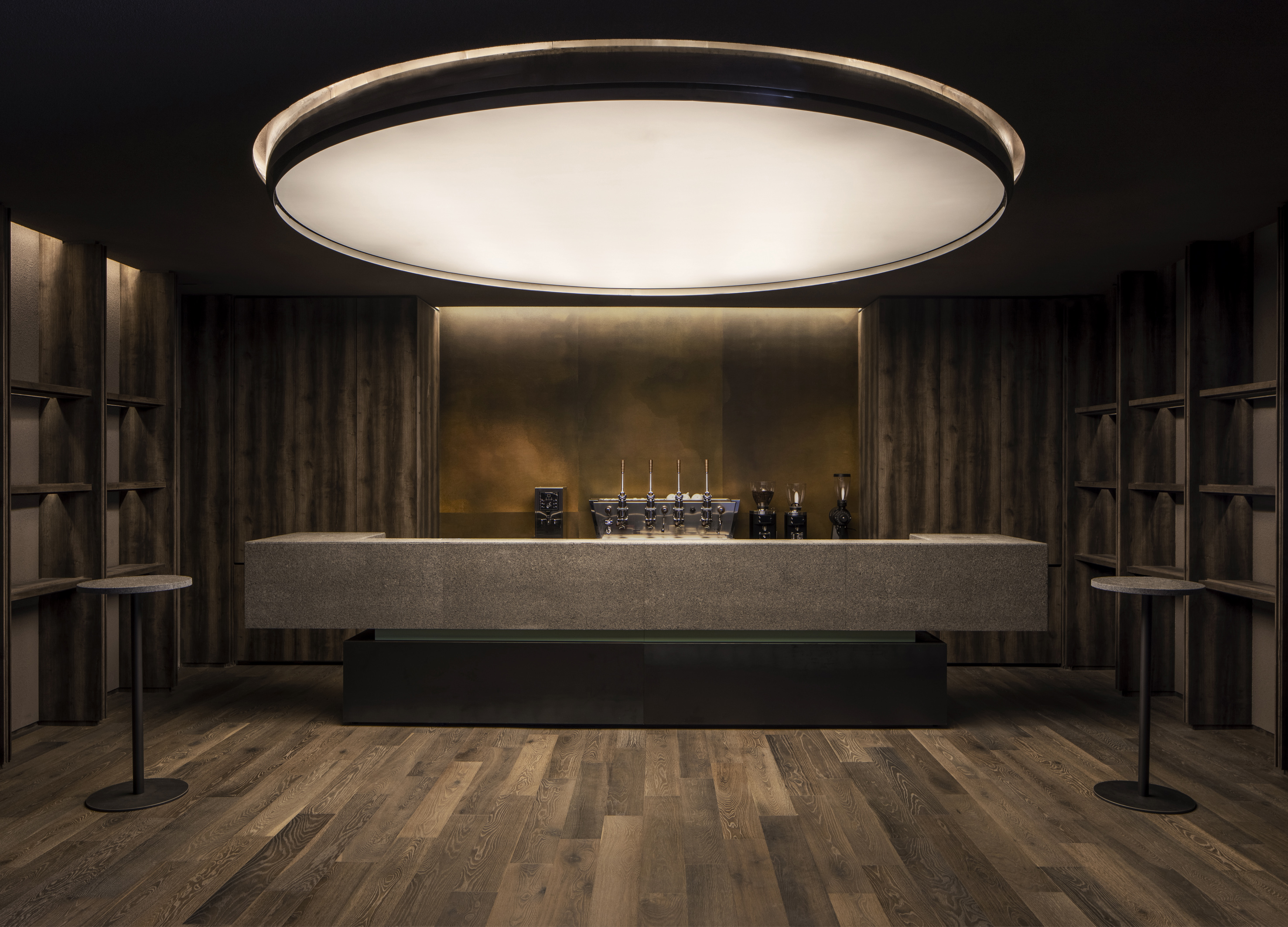
Yung Zing Tung Copper Culture Gallery
SALONE DEL SALON
China
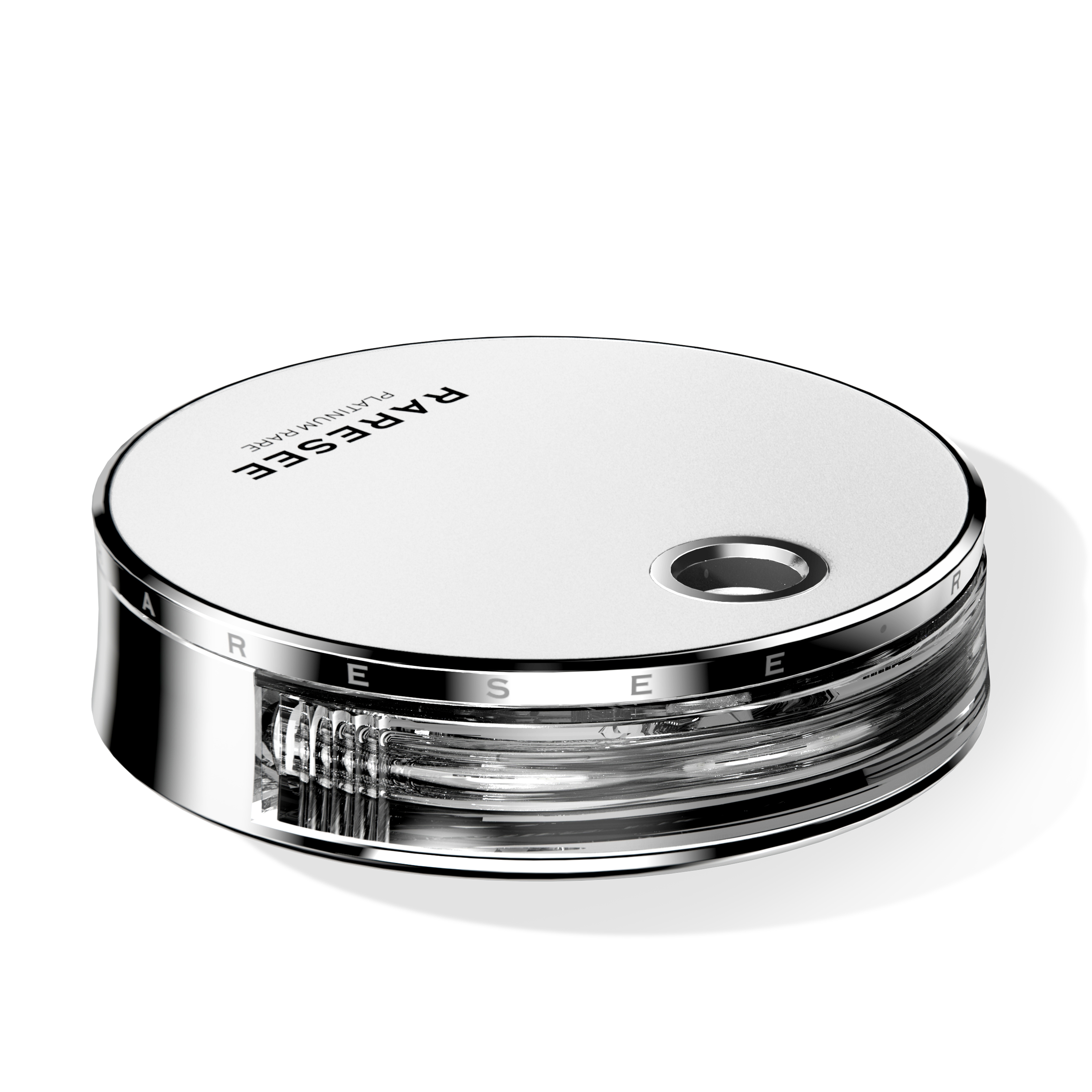
Raresee The Eclipse
Shenzhen Seemore Biotechnology Co., Ltd.
China
Grayscale of Light
IN Xian Design Co., Ltd.
Chinese Taipei
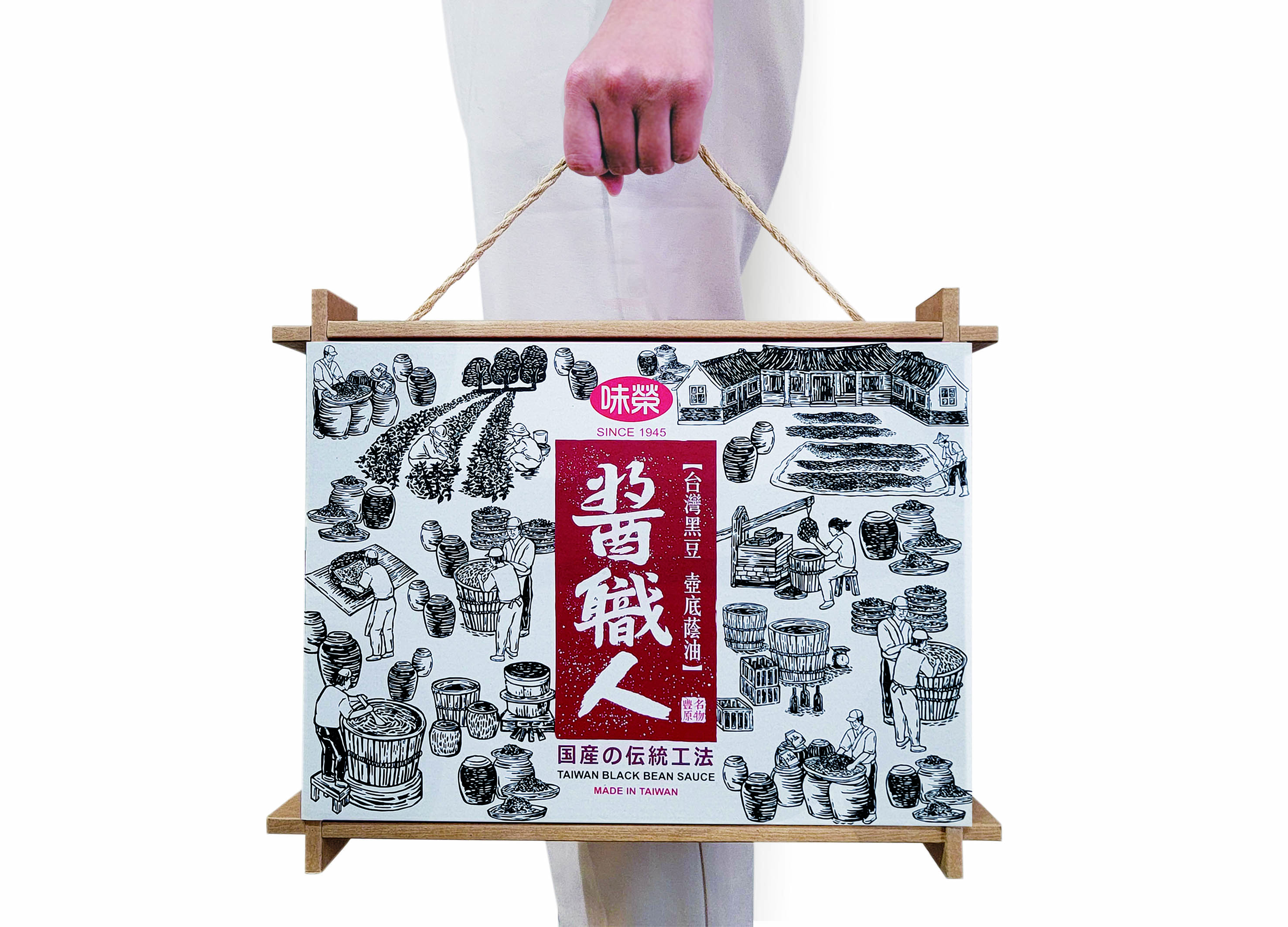
Sauce Expert
IDEAMAX DIGITAL VISUAL DESIGN Co., Ltd.
Chinese Taipei
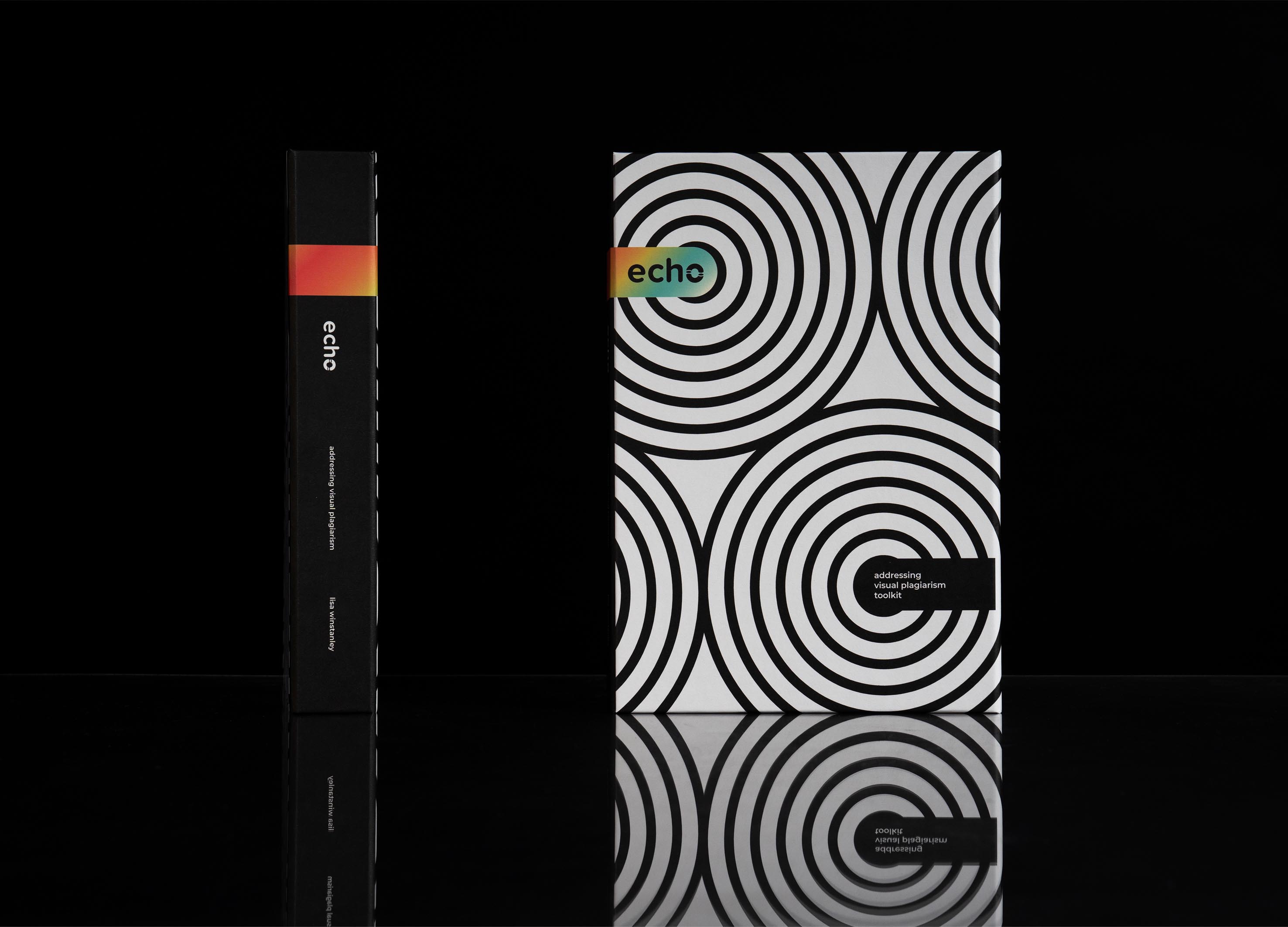
Project Echo
Lisa Winstanley Design
Singapore
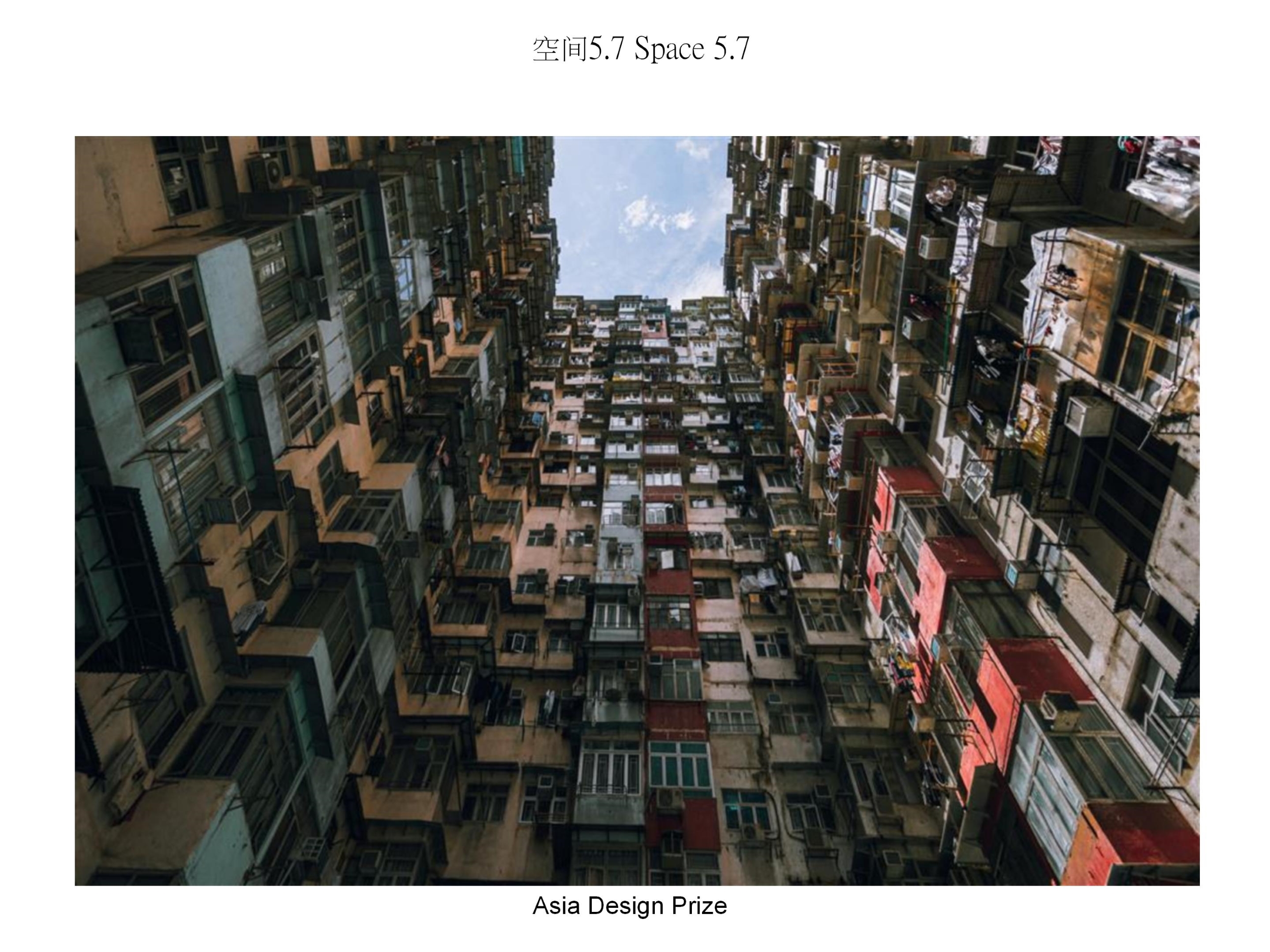
Space 5 point 7
Scar Yuen Chi Hung
China Hong Kong
bibu pet store
bibu Co.,Ltd.
China
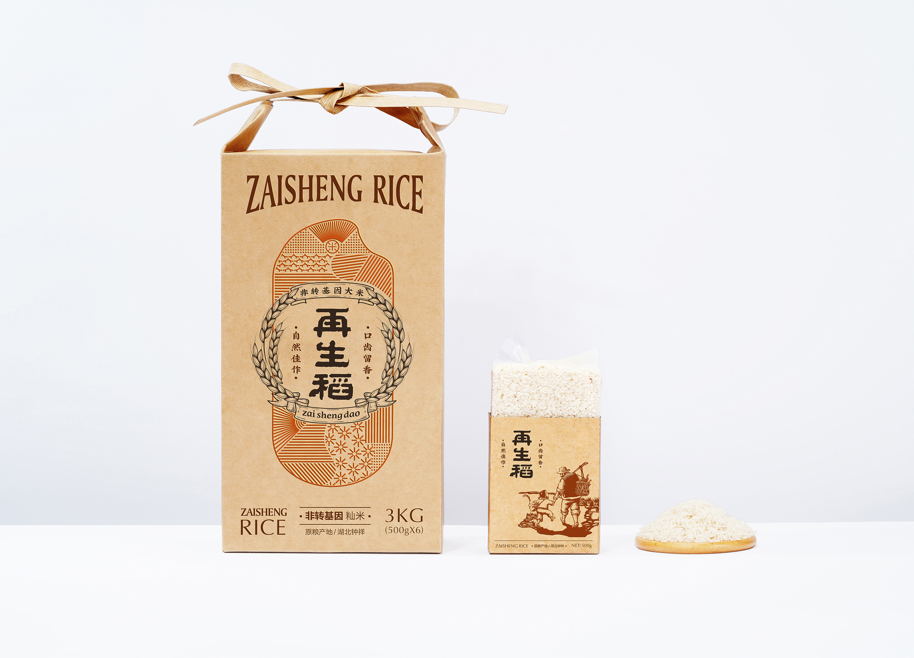
Zaishengdao Rice Packaging Design
Qichao An
China


Partner & Sponsor
More


info@asiadesignprize.com
#14057, 905 49, Beolmal-ro 102beon-gil,
Dongan-gu, Anyang-si, Gyeonggi-do, Korea
#14057, 905 49, Beolmal-ro 102beon-gil,
Dongan-gu, Anyang-si, Gyeonggi-do, Korea
Founder: Doyoung Kim
Business Registration Number: 454-86-01044
Online Sales License No.: 2021-Anyang Dongan-1081
Copyright © DESIGNSORI Co., Ltd.
Business Registration Number: 454-86-01044
Online Sales License No.: 2021-Anyang Dongan-1081
Copyright © DESIGNSORI Co., Ltd.
