OPENPATH Brand design
Communication


Regions
Korea
Year
2025
Award
WINNER
Affiliation
Duotone Co., Ltd.
Designer
Dayoung Jung, Seonhwa lee
https://youtu.be/6jR6EHBJzpo?si=m2nw_c7UplBV7GcW
English
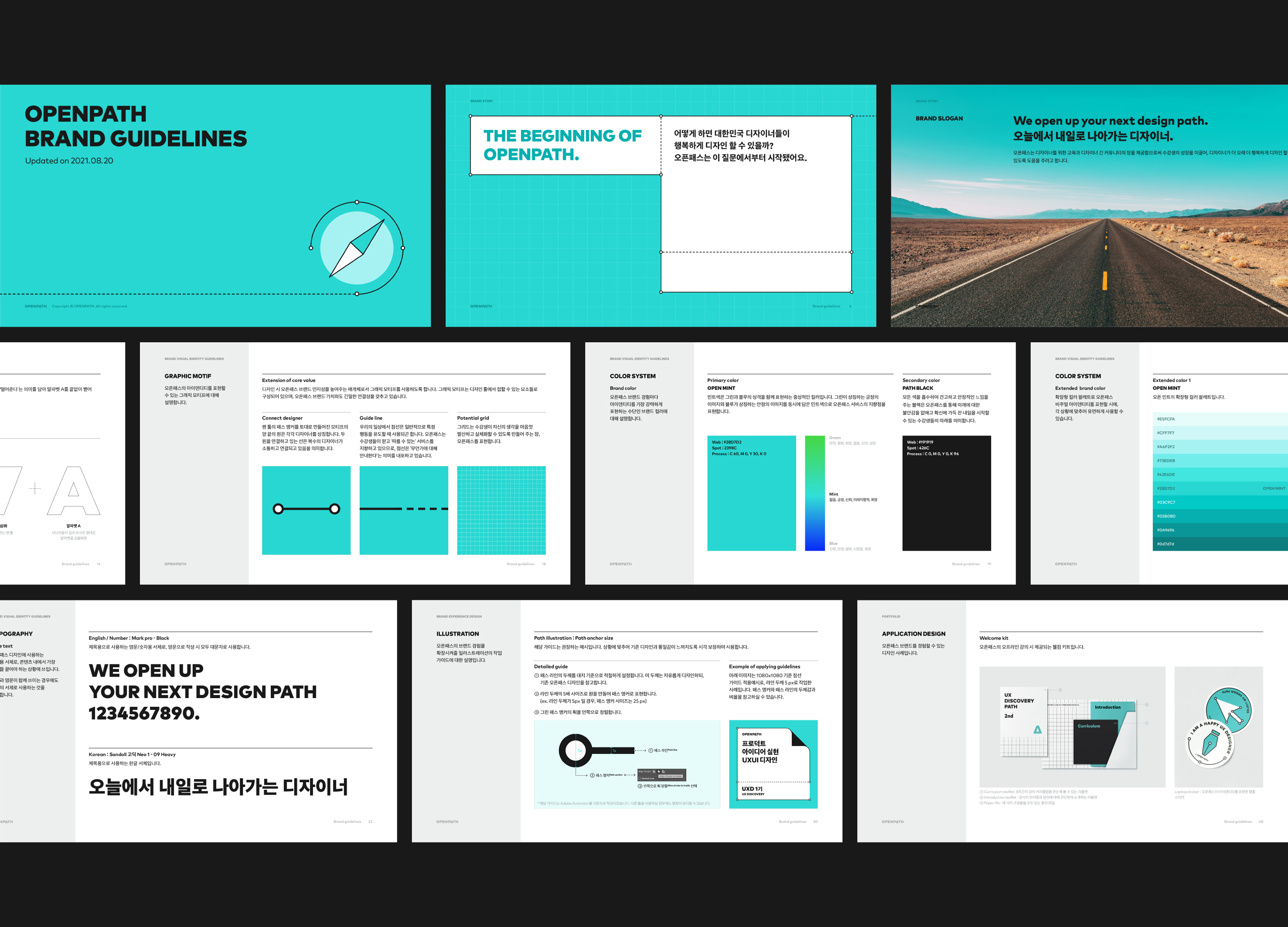
OPENPATH was launched with a mission to make designers happier and enable them to design for longer. The brand name is a compound word, combining 'OPEN,' signifying open possibilities, and 'PATH,' symbolizing a designer's growth journey. The logo type incorporates the graphic form of the most familiar PATH tool for designers and the imagery of an endless highway, representing continuous growth, embedded within the letter 'A.' The mint color used as the brand color implies a forward-looking perspective, and the overall graphic motifs are inspired by the patterns seen in design software, such as Bounding Box, Path, and Grid.
Native
오픈패스는 디자이너가 더 행복하게, 더 오래 디자인할 수 있기를 바라는 미션을 담아 브랜드를 런칭하였습니다. 브랜드 네임은 열린 가능성을 의미하는 ‘OPEN’, 디자이너의 성장 경험을 ‘PATH’로 은유한 합성어입니다. 디자이너에게 가장 익숙한 PATH 도구의 그래픽 형태와 끝 없는 성장을 의미하는 고속도로의 이미지를 모티브로 활용하여 ‘A’ 문자에 담아 로고 타입을 제작했습니다. 브랜드 컬러로 사용되는 민트 색상은 미래지향적인 의미를 내포하며 전반적인 그래픽 모티프는 디자인 소프트웨어에서 볼 수 있는 Bounding Box와 Path, Grid 패턴을 활용합니다.
Judging Comments
OPENPATH's branding is praised for effectively conveying its mission to support designers' growth and happiness. The logo design, inspired by familiar design tools and the concept of an endless path, resonates with the target audience. The mint color adds a modern, forward-thinking vibe, making the brand visually appealing while reinforcing its commitment to long-term designer success.
Positive Comments


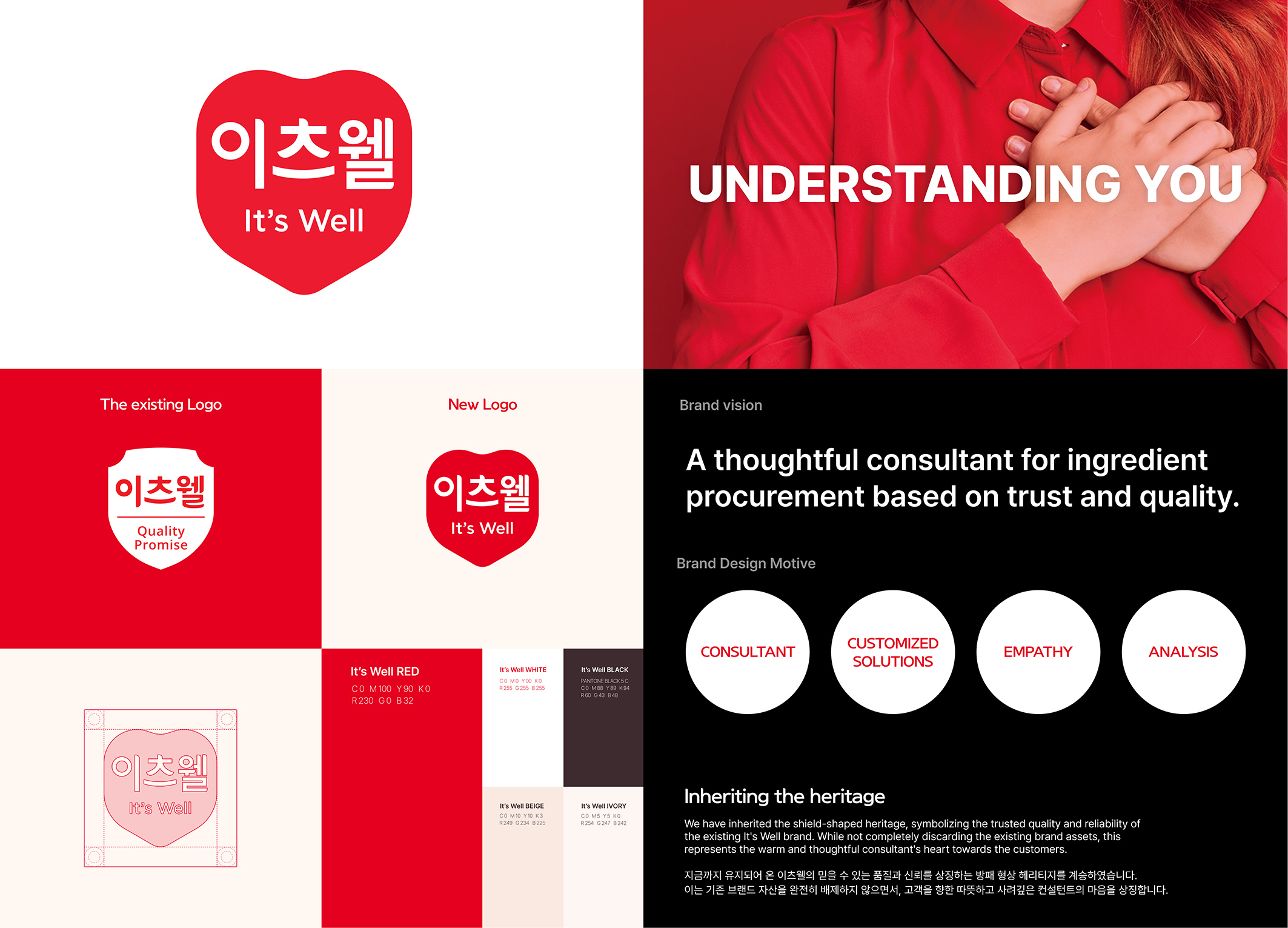
itsWell brand design
ohSeven design Co., Ltd.
Korea
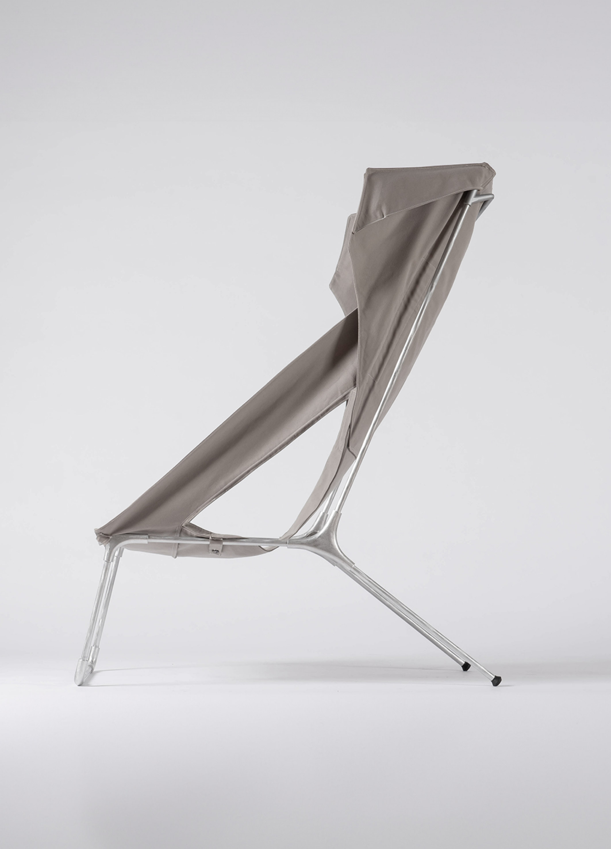
OPENPATH Brand design
Duotone Co., Ltd.
Korea
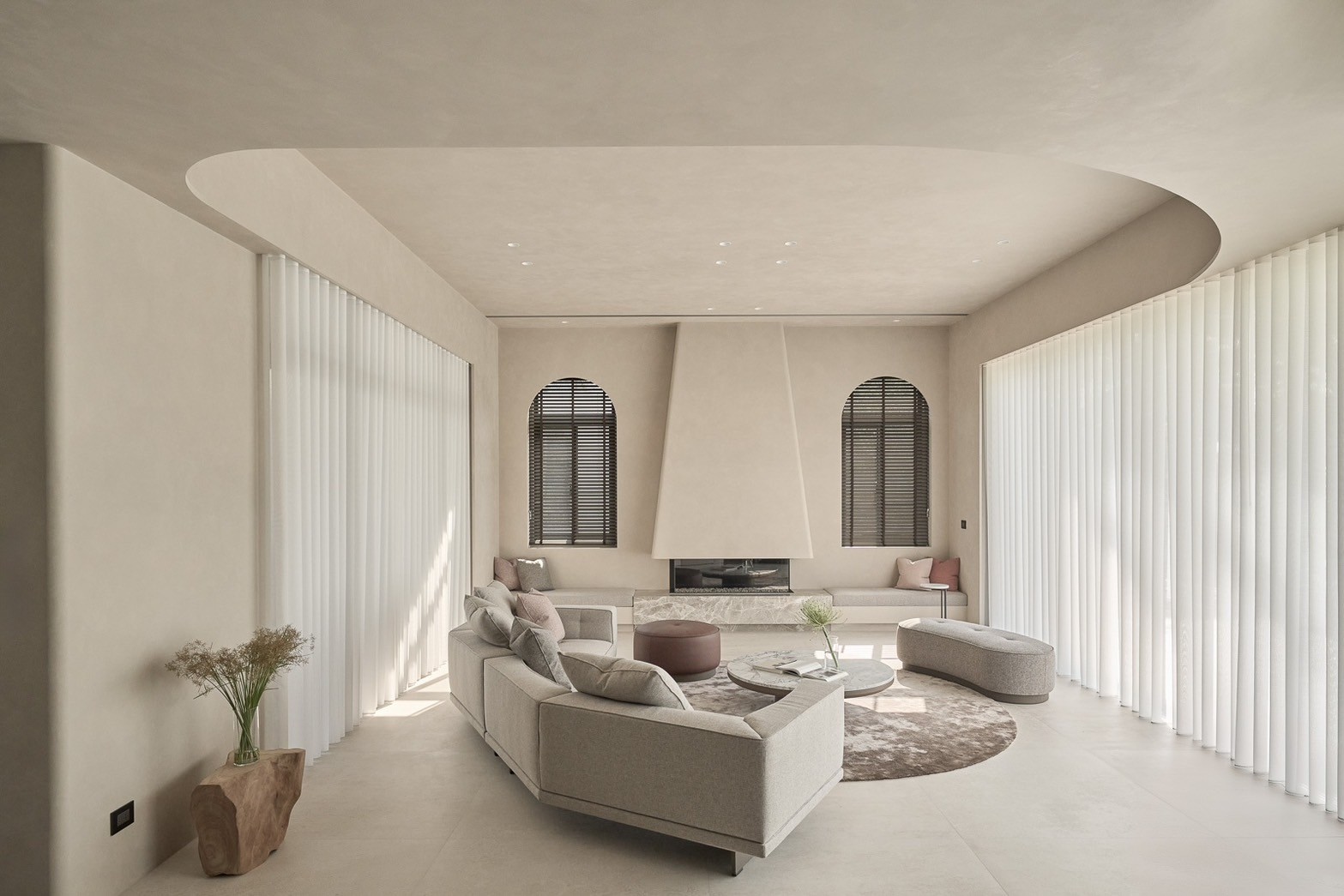
Clarity Satisfaction
E WA Interior Decoration Design Project Co., Ltd.
Chinese Taipei
Tranquility of Provence
Limo Design
Chinese Taipei

AI Blockiverse
Harvard University
China

Cemeteries Matter
USA
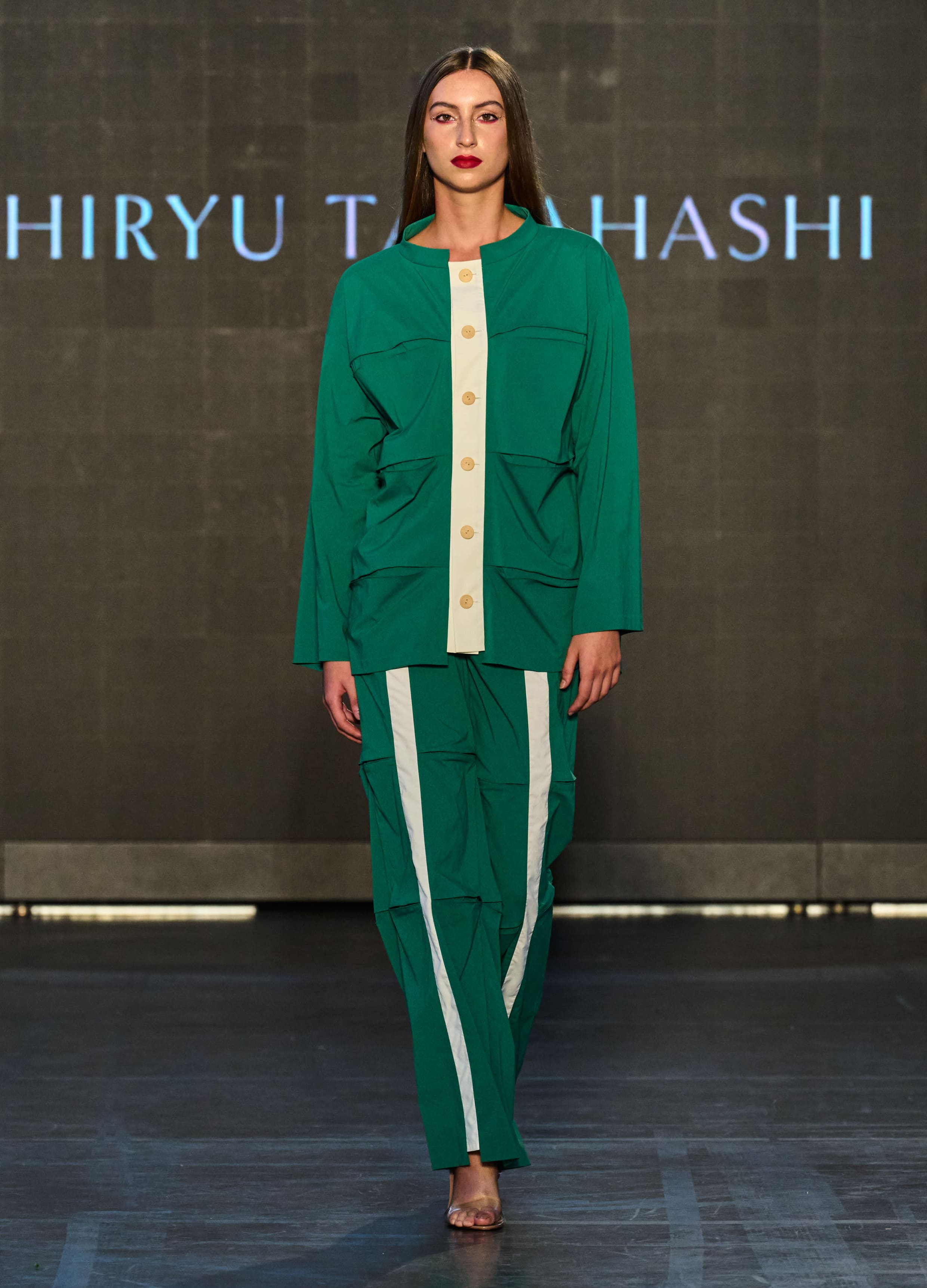
Bamboo
SHIRYU TAKAHASHI
Japan
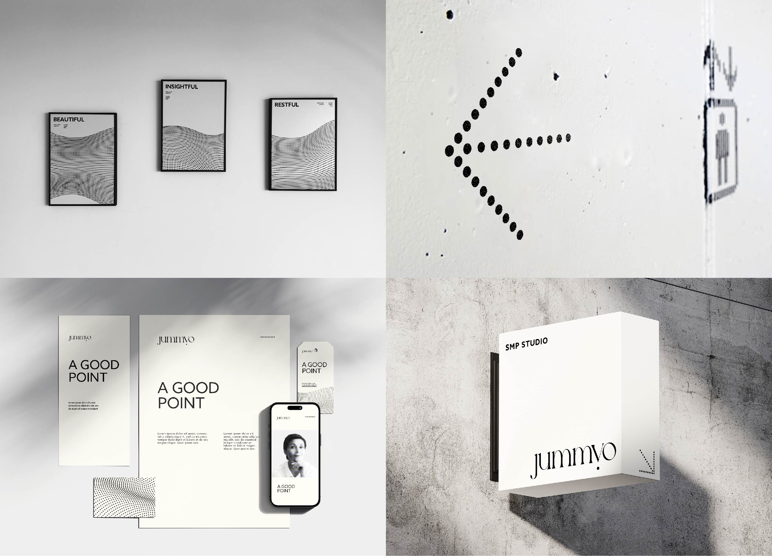
Jummyo Brand Identity design
JDNS Design
Korea

The wave wall shelf
seino takashi design
Japan
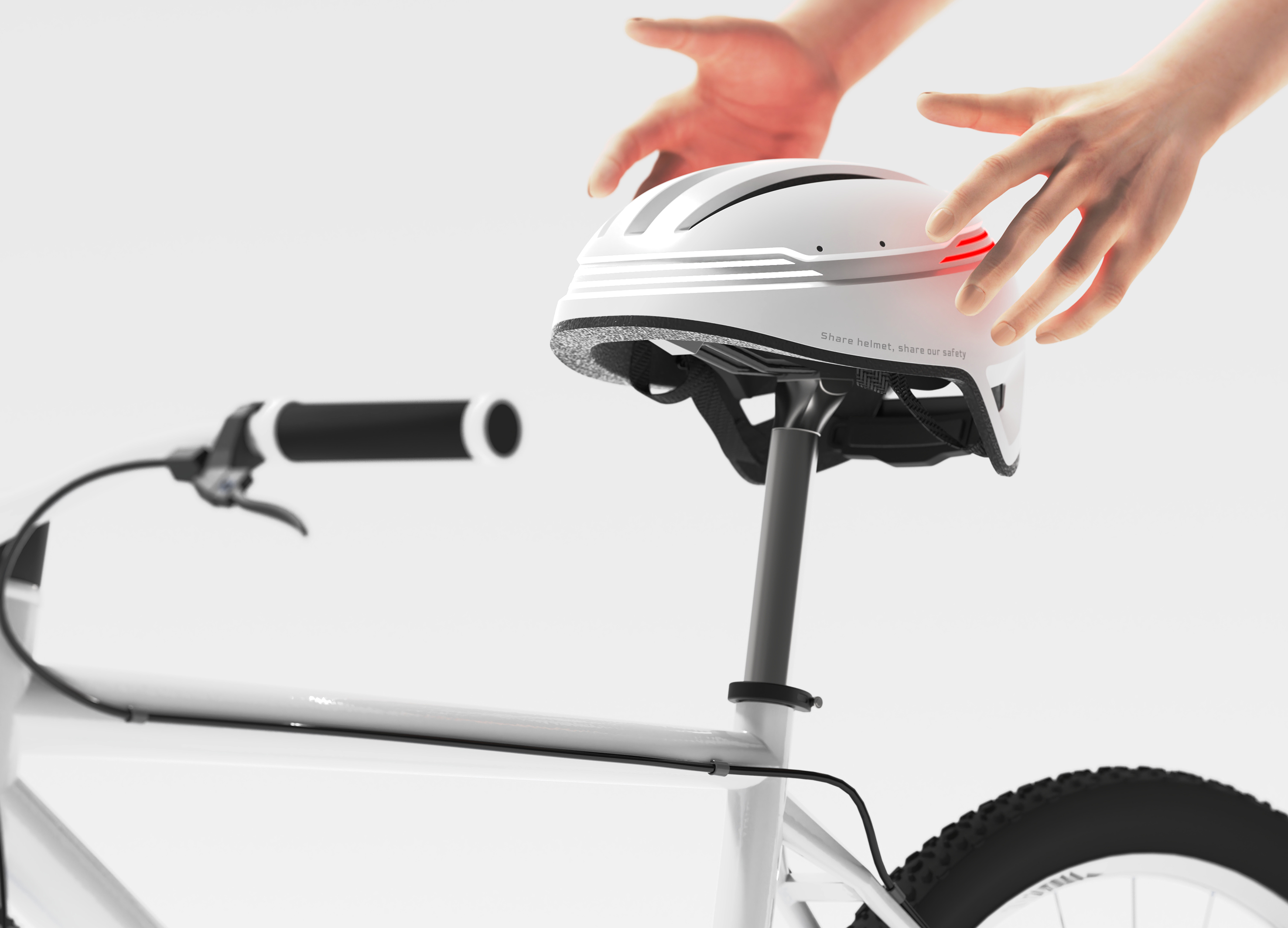
Hellomet
KONKUK University Glocal Campus
Korea
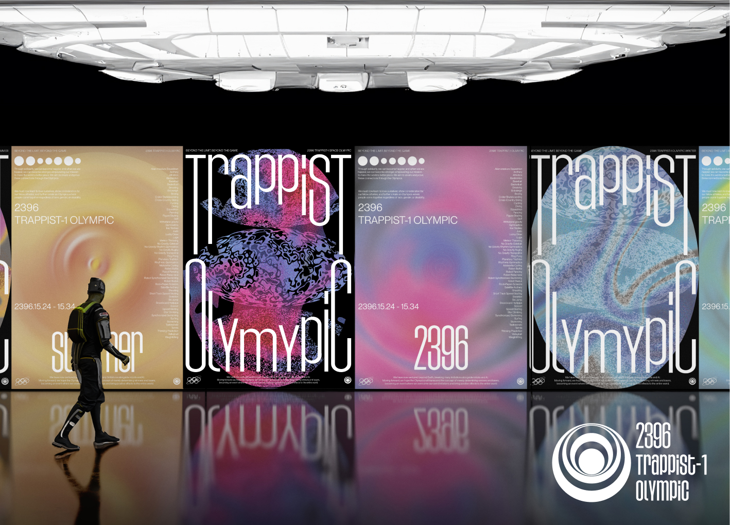
Space Olympics Brand Identity Design
Sungshin Womens University
Korea
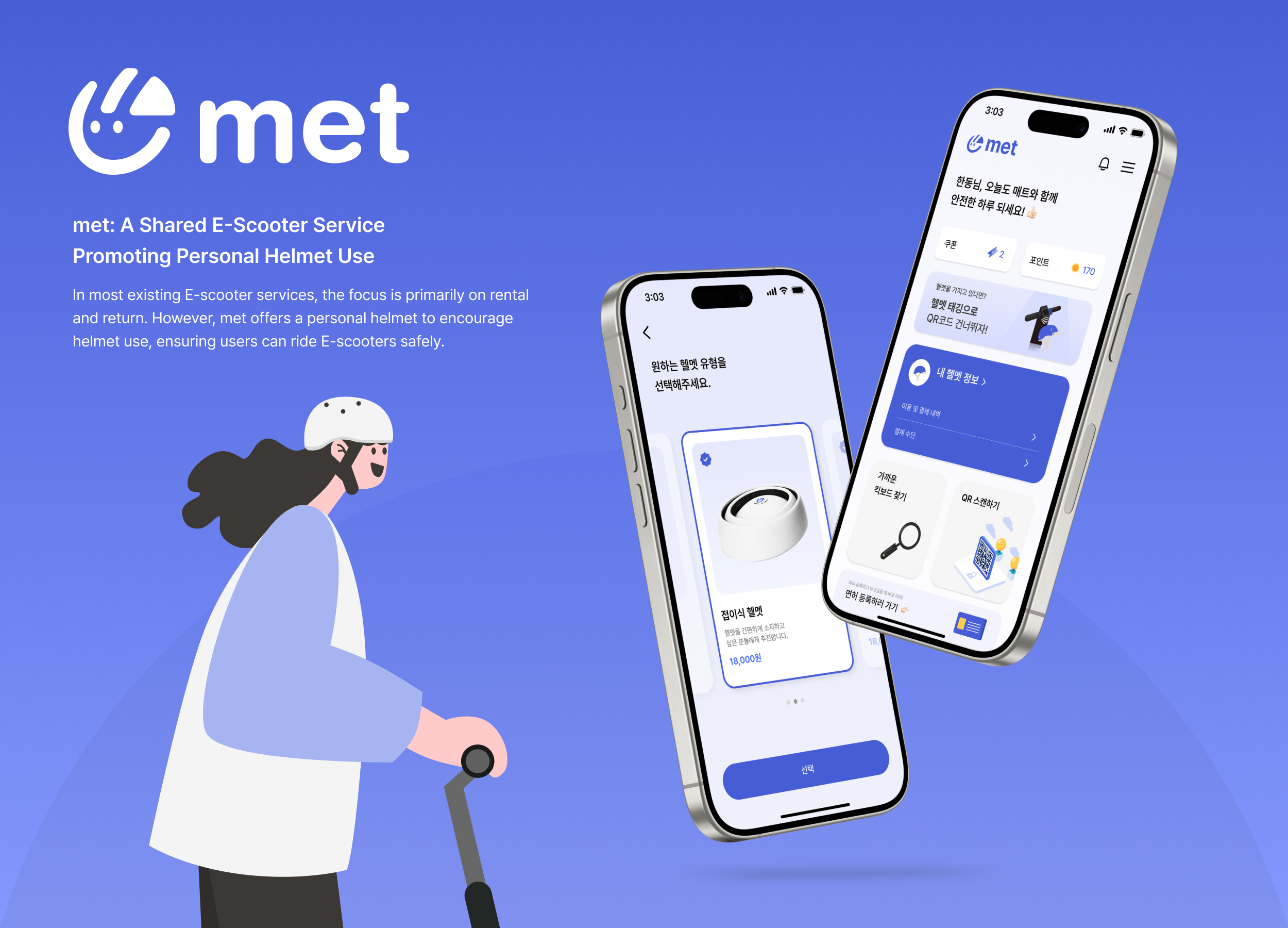
met
4met
Korea
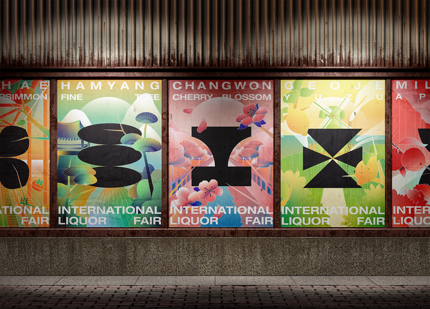
GyeongNam International Liquor Fair
Hongik University and Sangmyung University
Korea
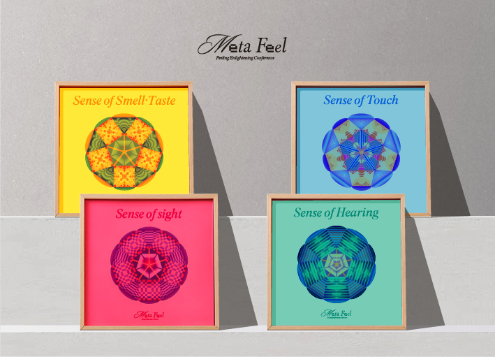
META FEEL
Sejong University
Korea

Trolley Trunk
School of Design Dalian Minzu University
China
Refugium
Sangmyung university
Korea
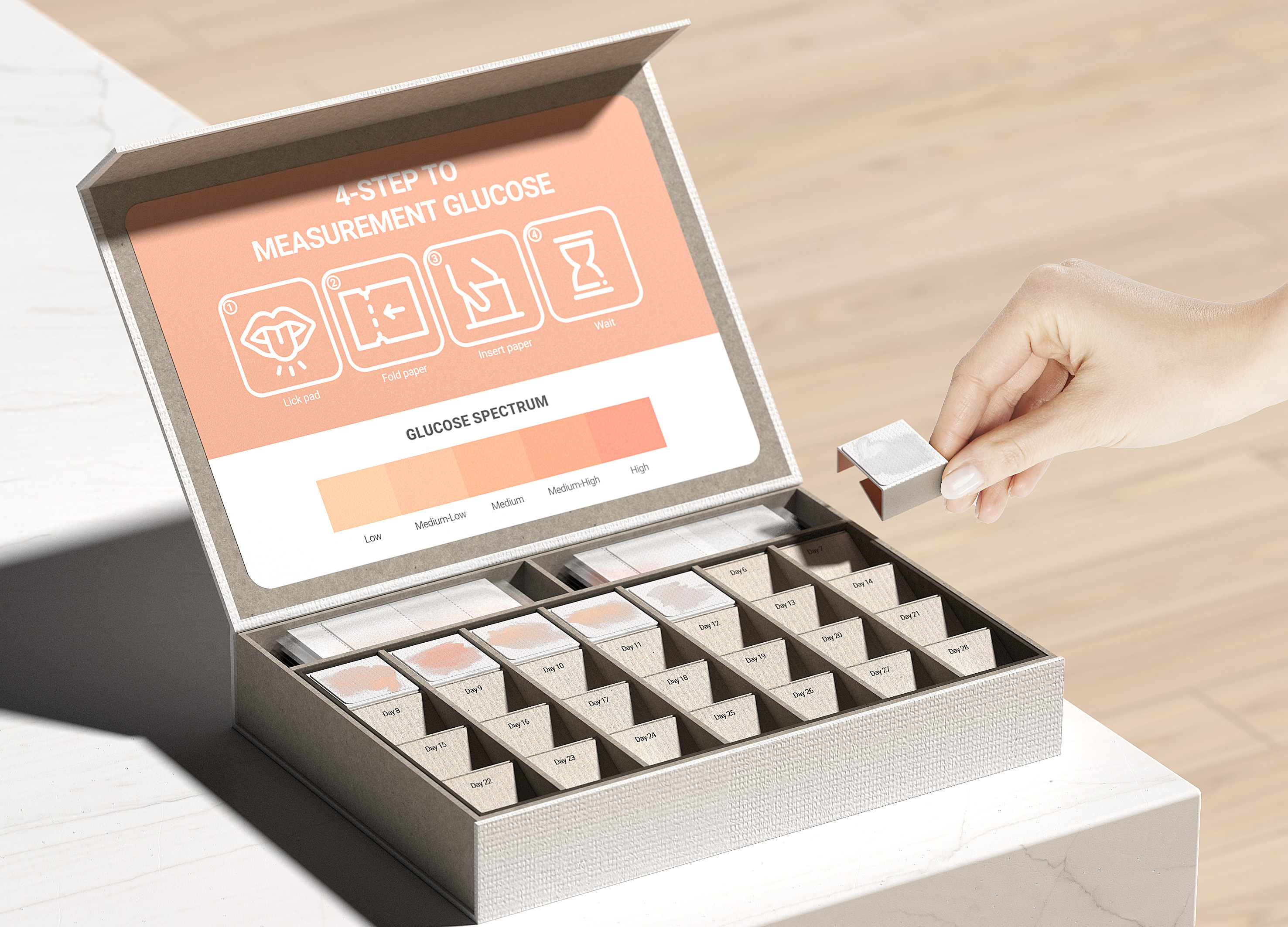
Paper glucometer Kit
Konkuk University Glocal campus
Korea

Warmie
Shih Chien University
Chinese Taipei


Partner & Sponsor
More


info@asiadesignprize.com
#14057, 905 49, Beolmal-ro 102beon-gil,
Dongan-gu, Anyang-si, Gyeonggi-do, Korea
#14057, 905 49, Beolmal-ro 102beon-gil,
Dongan-gu, Anyang-si, Gyeonggi-do, Korea
Founder: Doyoung Kim
Business Registration Number: 454-86-01044
Online Sales License No.: 2021-Anyang Dongan-1081
Copyright © DESIGNSORI Co., Ltd.
Business Registration Number: 454-86-01044
Online Sales License No.: 2021-Anyang Dongan-1081
Copyright © DESIGNSORI Co., Ltd.
