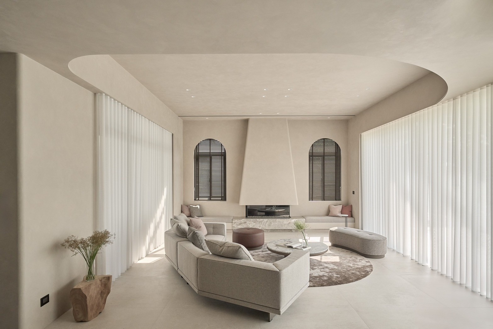
itsWell brand design
Communication
Regions
Korea
Year
2025
Award
WINNER
Client
CJ freshway Co., Ltd.
Affiliation
ohSeven design Co., Ltd.
Designer
Sukyoo Bae, Yunje Park, Boyeon Yeon, Jahee Lee, Chaelin Kim
English
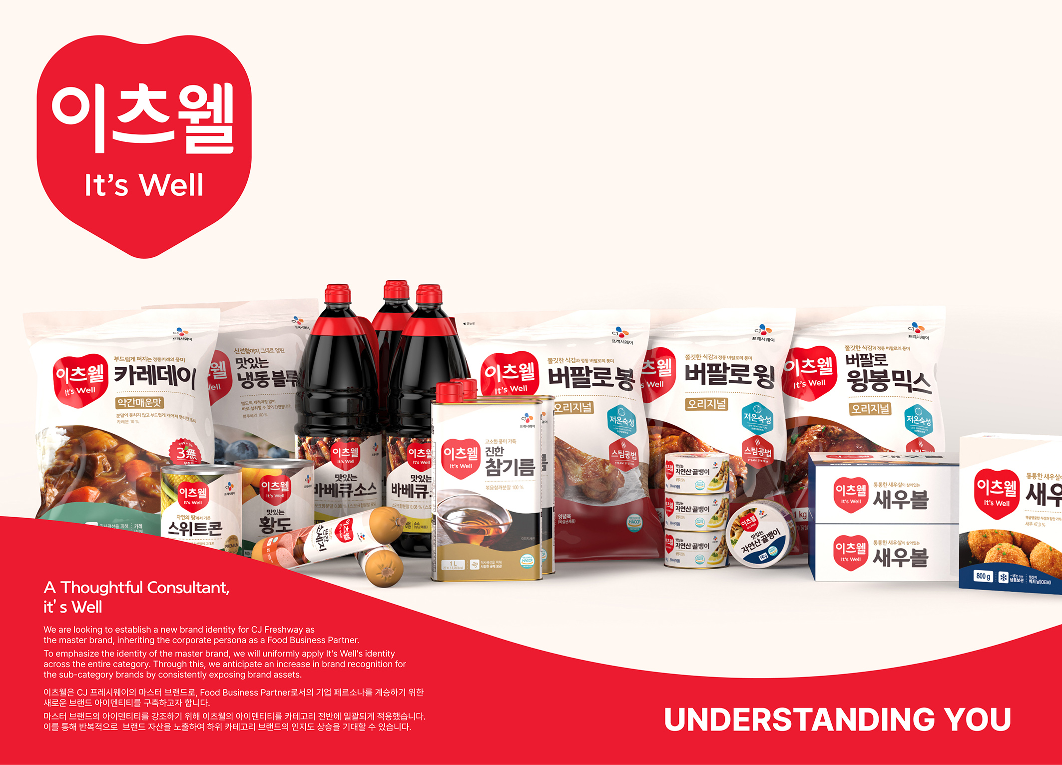
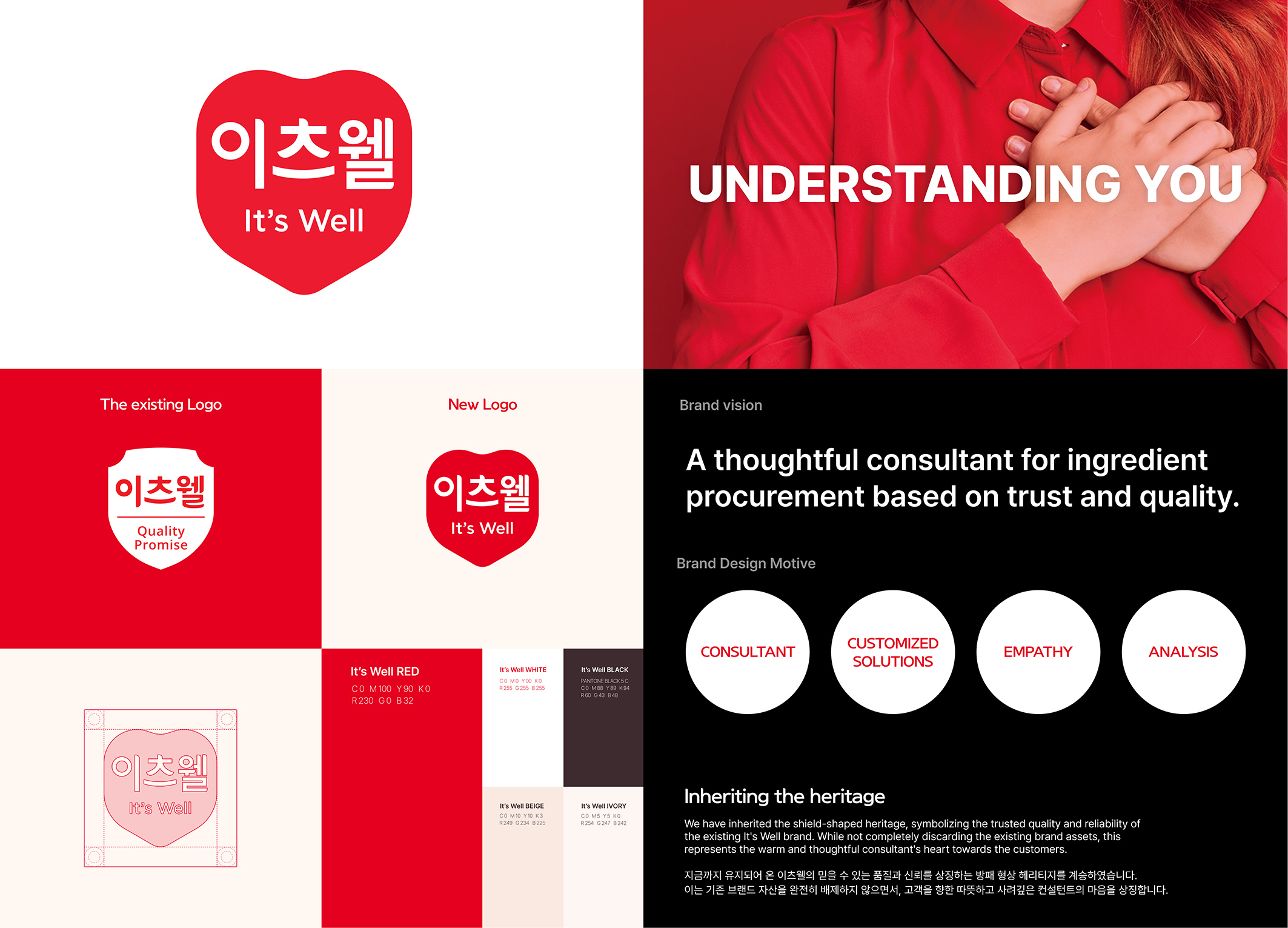
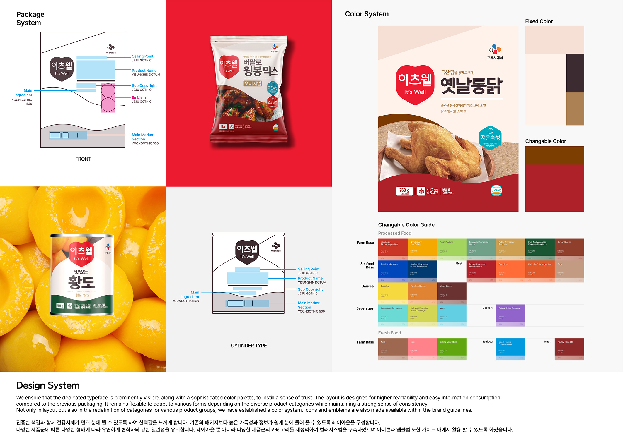
it'well is CJ Freshway’s master brand, specializing in food distribution. Specialized. The branding work inherits the existing persona and establishes a new brand identity. To emphasize the master brand, the new identity is fused into all categories. It is also newly defined by inheriting the existing heritage and brand vision, “think deeply beyond needs and suggest customized solutions.” The graphic design also uses the logo symbol line to be in harmony with the newly defined brand identity. The changes are visible objectively and significantly compared to past by enlarging logo size, contrasting brightness, and changing the font thickness.
Native
이츠웰은 CJ프레시웨이의 마스터 브랜드로, 식품유통 전문 브랜드 입니다. 브랜딩을 통해 기존의 기업 페르소나를 계승하고 새롭게 브랜드 아이덴티티를 구축합니다. 마스터 브랜드를 강조하기 위해 새로운 아이덴티티를 카테고리 전반에 적용합니다. '필요를 넘어 사려깊게 헤아려 맞춤 솔루션을 제안한다' 는 브랜드 비전과 기존의 헤리티지를 계승하여 새롭게 정의합니다.
헤리티지를 이어가되, 맞춤 솔루션을 제안하는 이츠웰이라는 새로운 브랜드 비전을 살리기 위해 단단한 이미지의 기존 심볼을 사려깊음을 느낄 수 있는 조형으로 발전 시켰습니다. 또한 새로운 아이덴티티를 소비자에게 적극적으로 어필하며, 진열 시 노출이 잘 될 수 있어야 한다는 프로젝트의 목적성에 부합하기 위해 로고 사이즈의 확대, 명도 대비, 서체의 굵기등의 변화를 주었습니다.
로고의 형태는 기존 로고의 방패형태가 주는 신뢰와 안정성을 이어가되 새로운 브랜드 슬로건을 내세울 수 있는 아이덴티티의 형태로 발전 시켰습니다. 기존 방패 형상과 비례속 하트의 따뜻함을 함께 느낄 수 있는 형태의 로고가 신뢰와 사려깊은 이츠웰 브랜드의 방향성을 나타냅니다.
기존에 비해 로고는 300%이상 면적이 증가 하였고 제품명의 명도 대비 차이는 평균 5배 이상 증가하도록 하여 식별력을 눈에 띄게 높였습니다.
Judging Comments
it'well, CJ Freshway's master brand specializing in food distribution, has undergone a rebranding to enhance its identity. The new branding maintains the brand's heritage while emphasizing its vision of "thinking deeply beyond needs and suggesting customized solutions." The updated graphic design integrates the logo symbol line to align with the refreshed brand identity, featuring noticeable changes such as a larger logo size, higher contrast brightness, and adjusted font thickness. This evolution strengthens its presence while staying true to its core values.
Positive Comments


itsWell brand design
ohSeven design Co., Ltd.
Korea

OPENPATH Brand design
Duotone Co., Ltd.
Korea
Clarity Satisfaction
E WA Interior Decoration Design Project Co., Ltd.
Chinese Taipei
Tranquility of Provence
Limo Design
Chinese Taipei
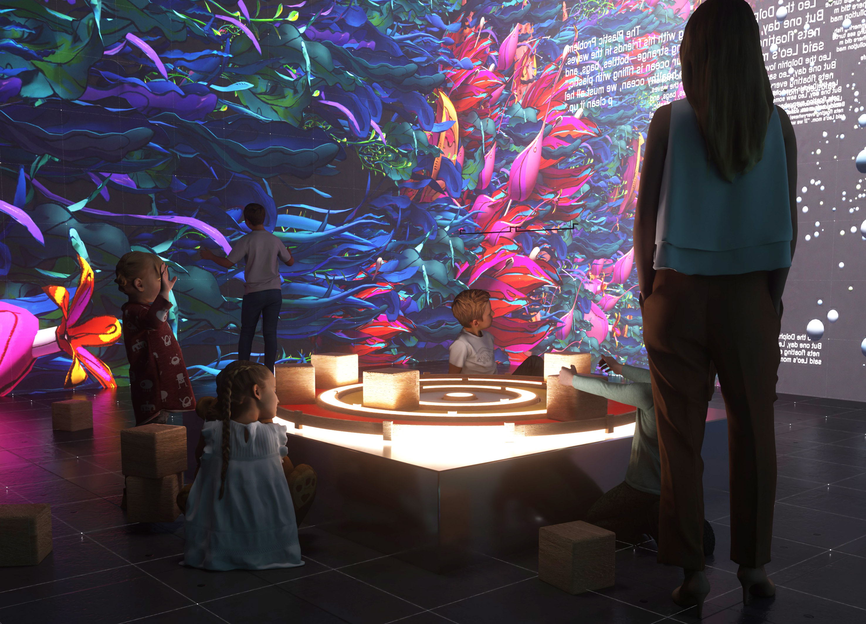
AI Blockiverse
Harvard University
China
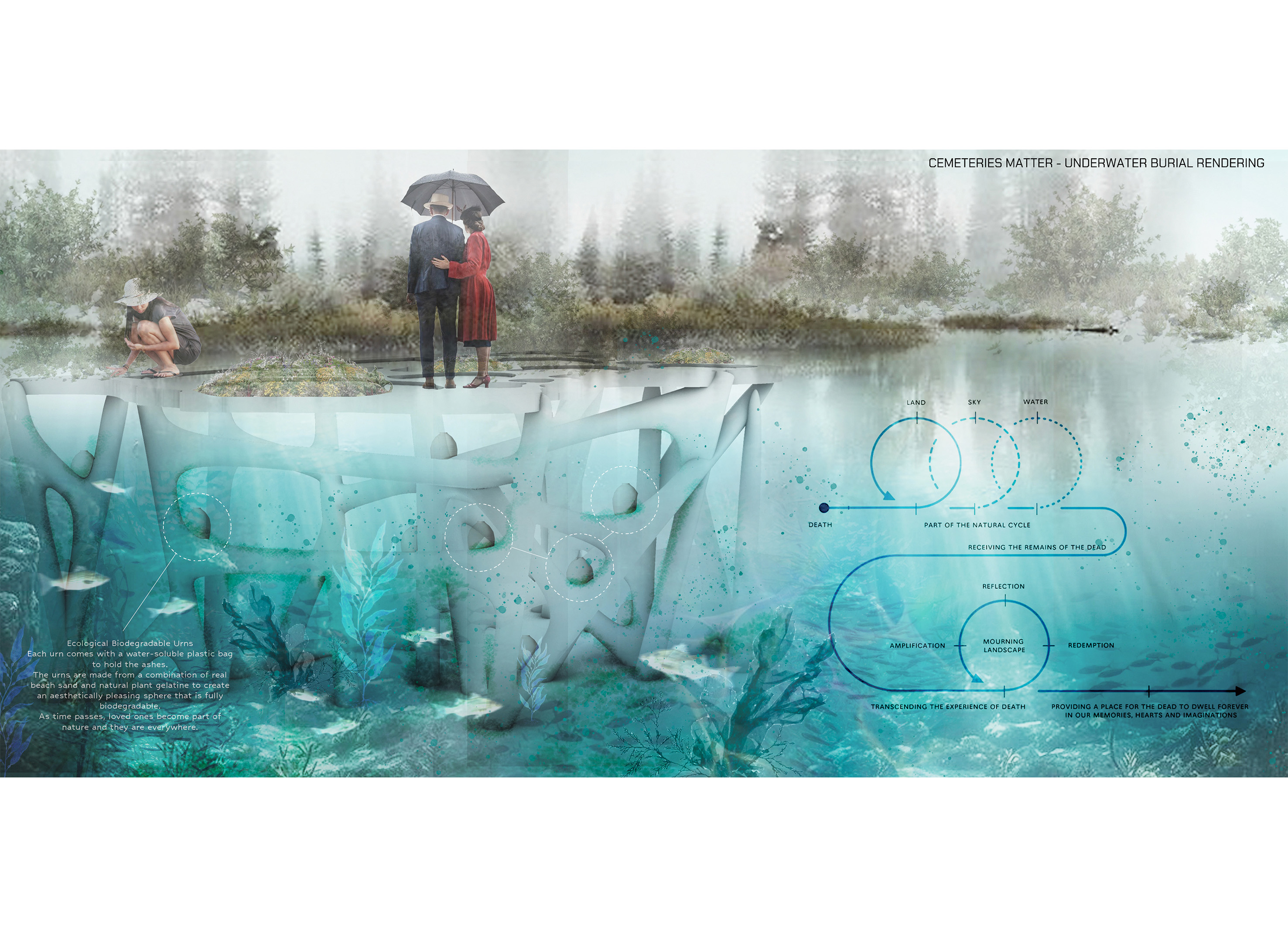
Cemeteries Matter
USA
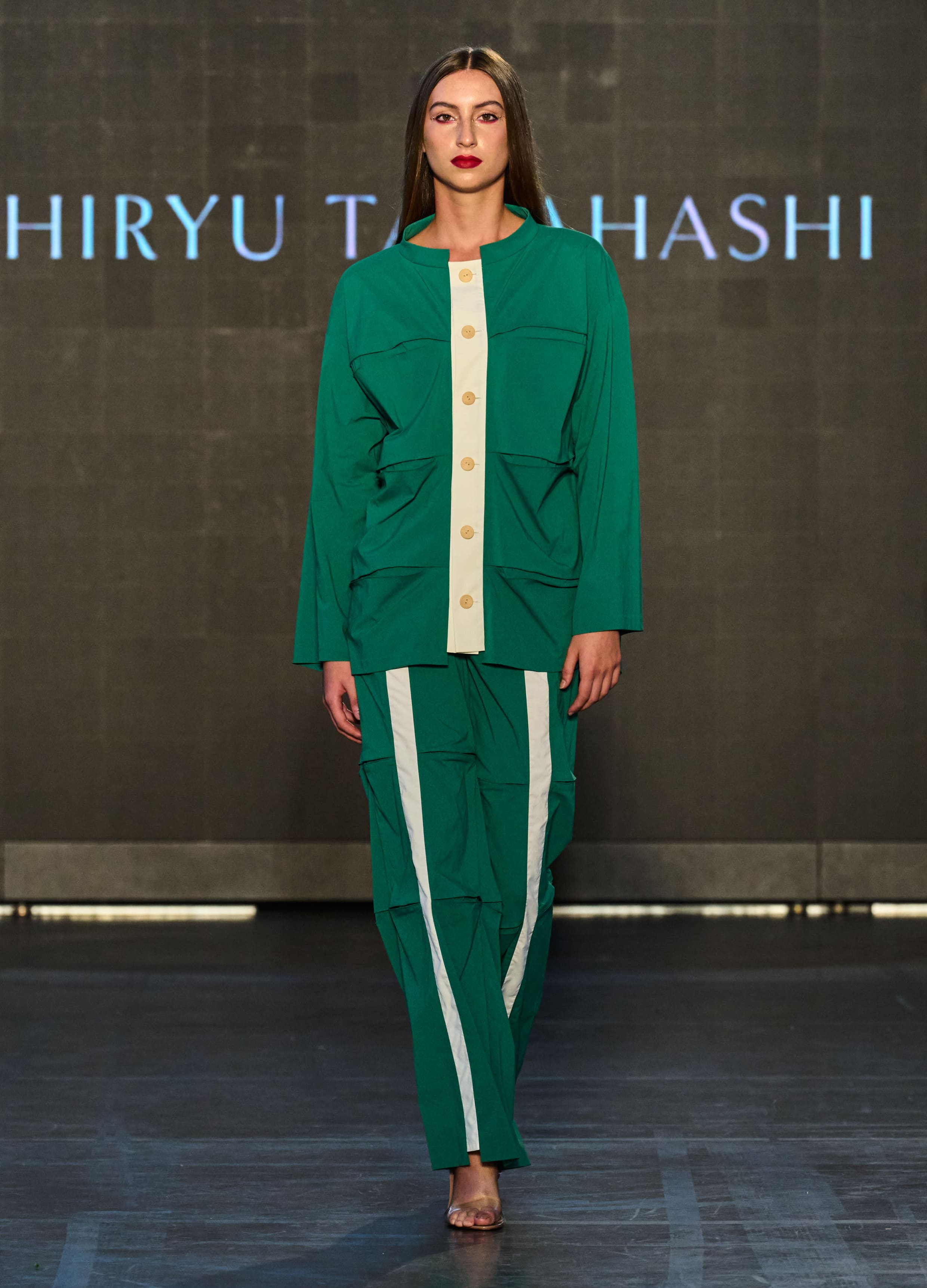
Bamboo
SHIRYU TAKAHASHI
Japan
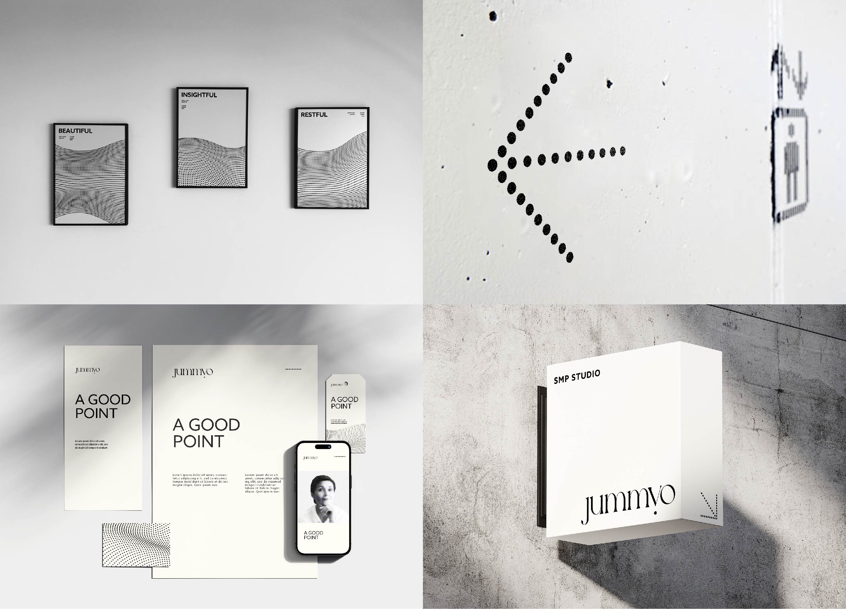
Jummyo Brand Identity design
JDNS Design
Korea
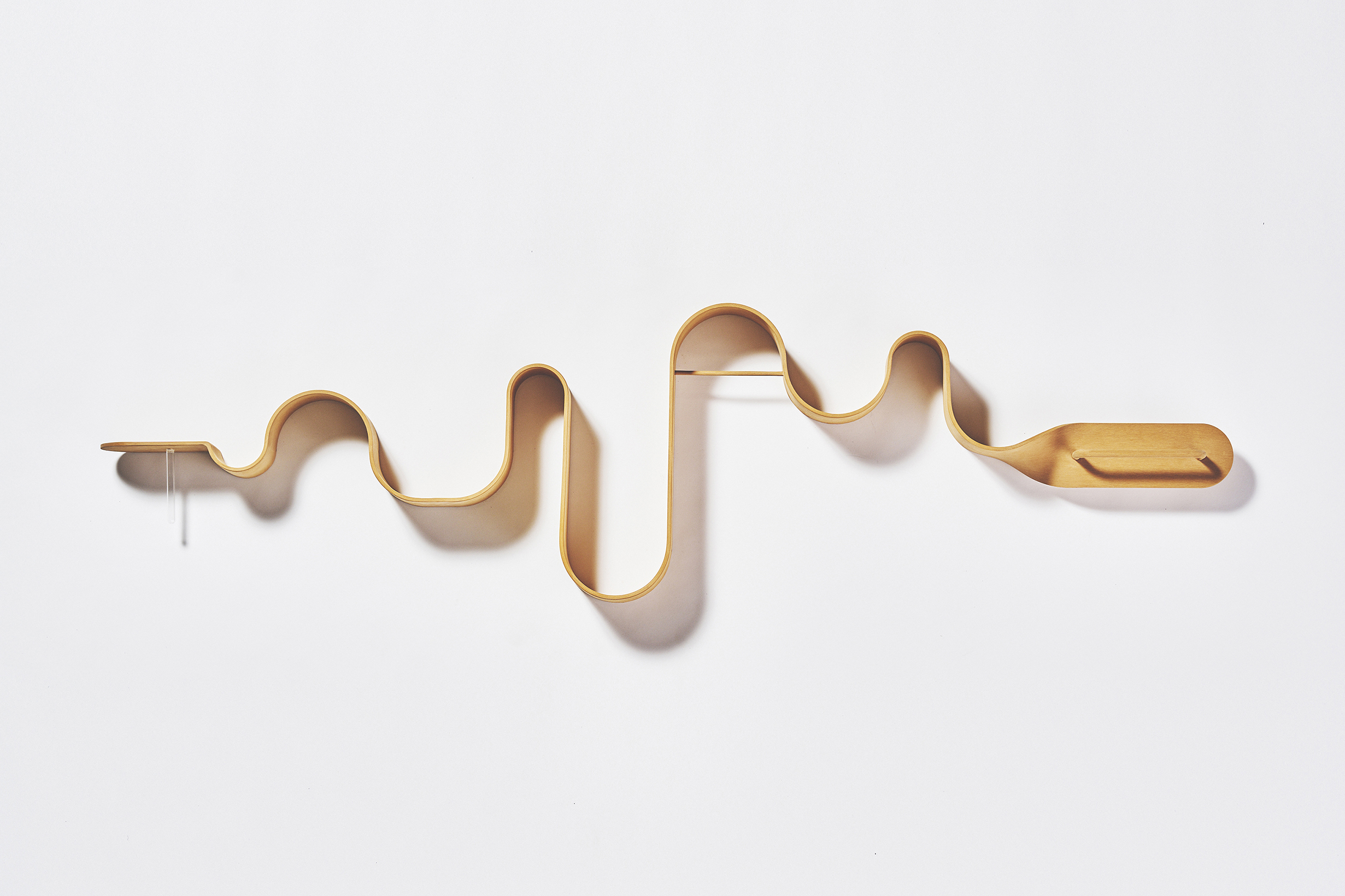
The wave wall shelf
seino takashi design
Japan
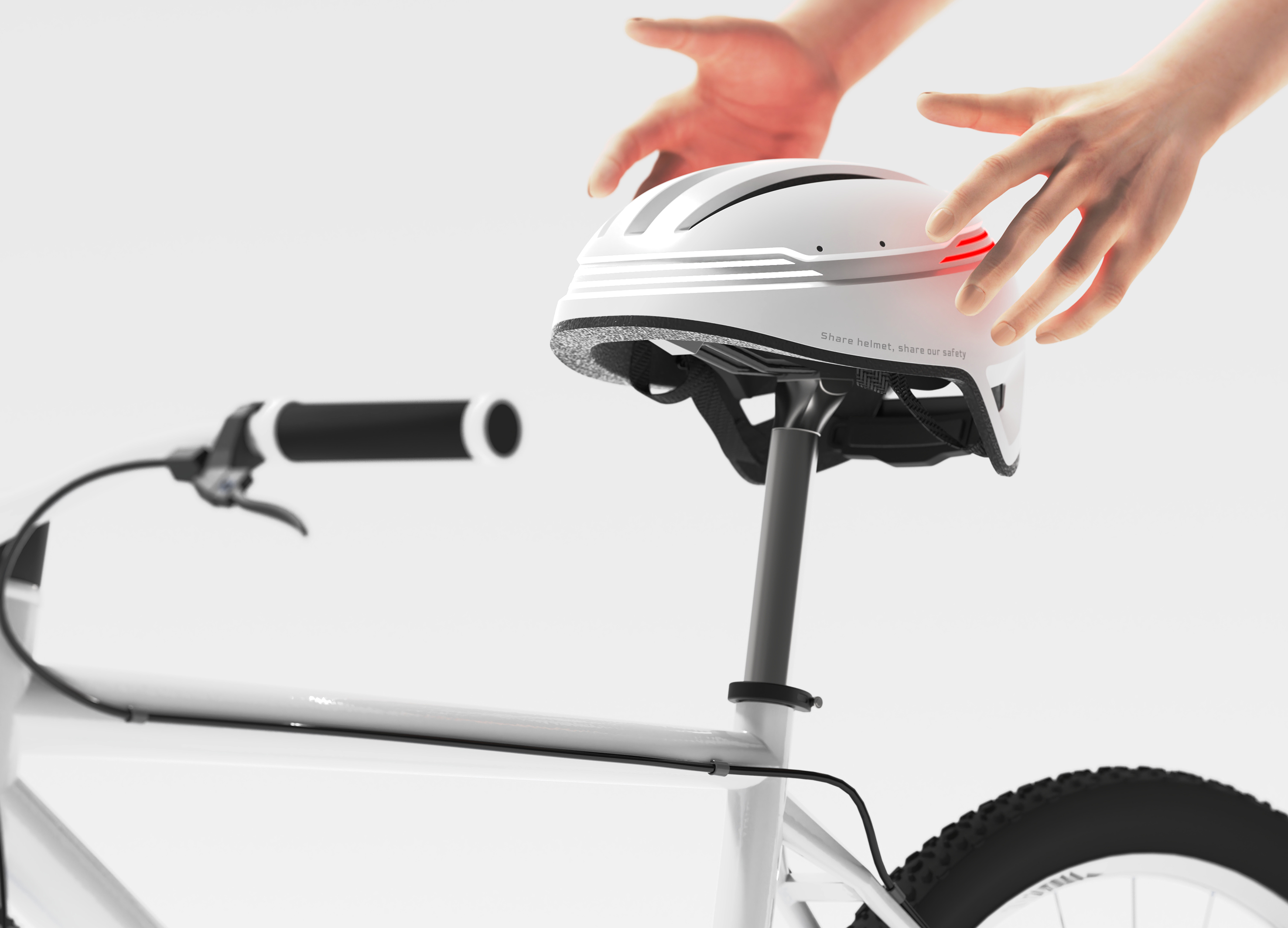
Hellomet
KONKUK University Glocal Campus
Korea
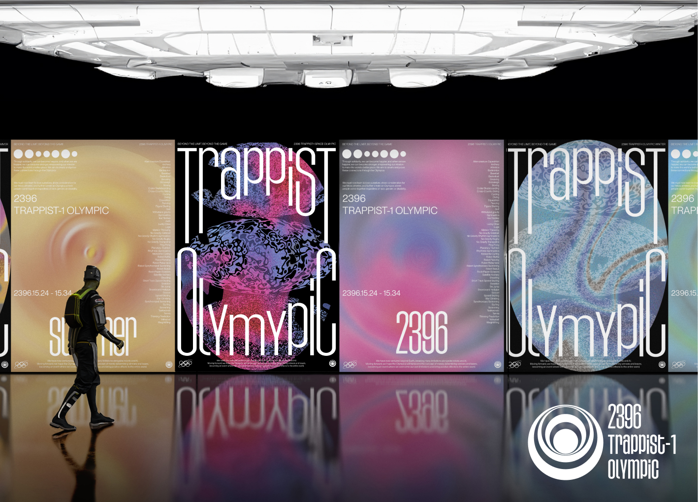
Space Olympics Brand Identity Design
Sungshin Womens University
Korea
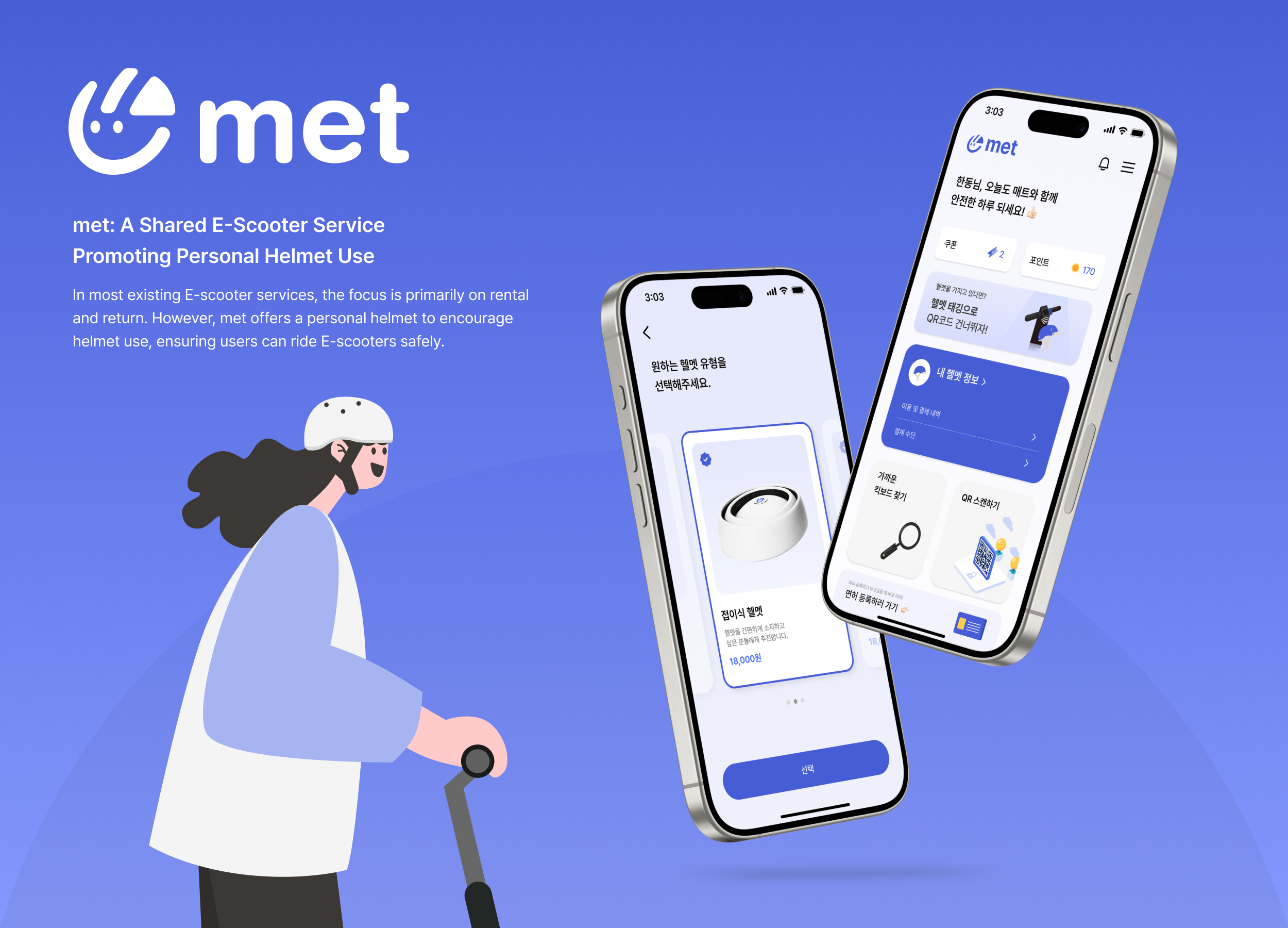
met
4met
Korea
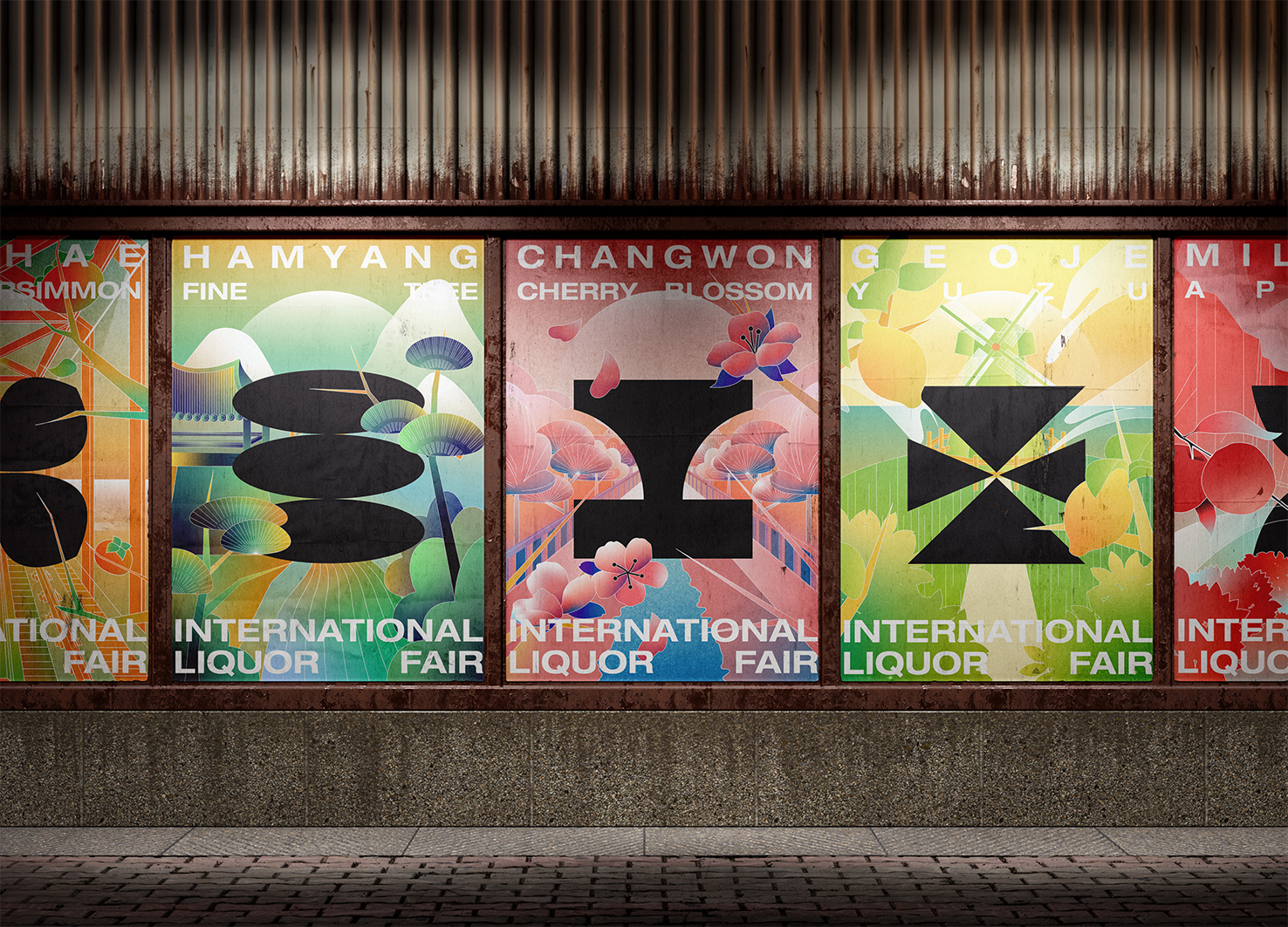
GyeongNam International Liquor Fair
Hongik University and Sangmyung University
Korea
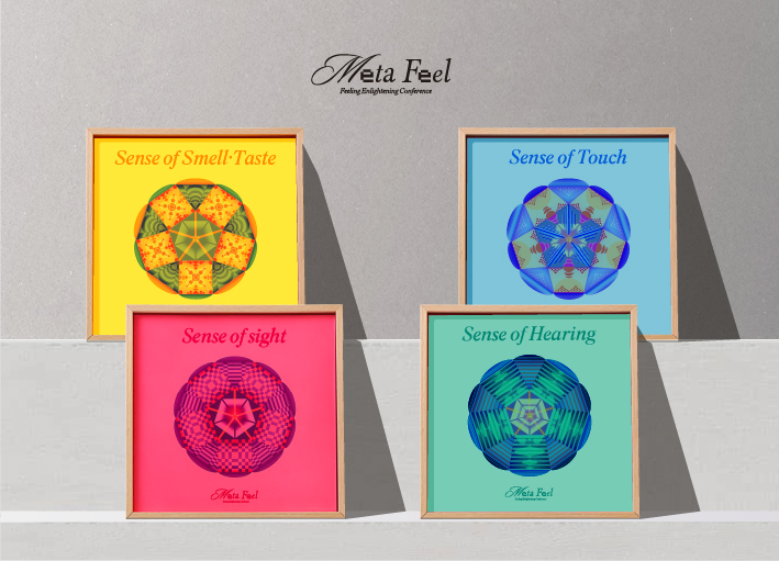
META FEEL
Sejong University
Korea
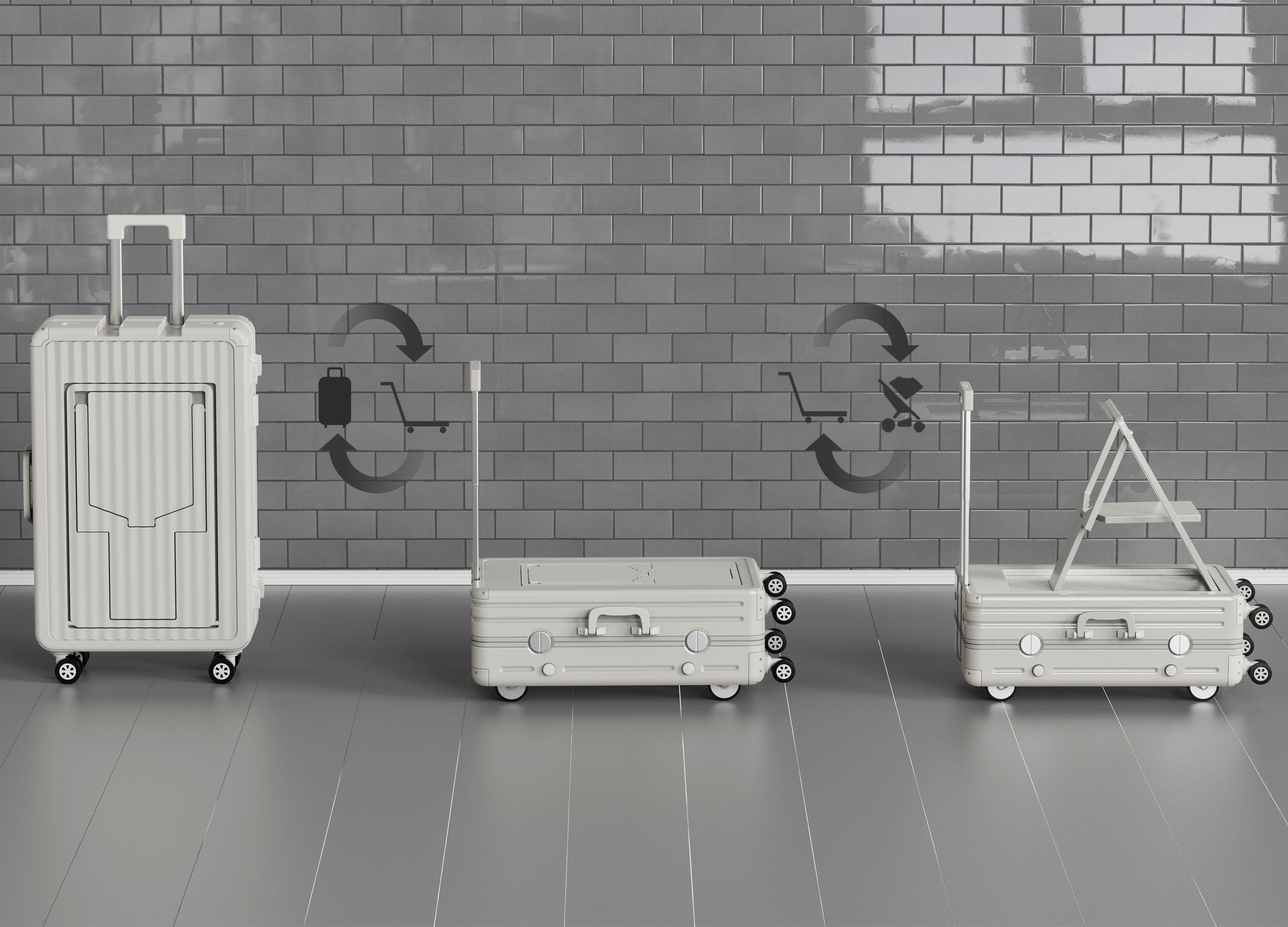
Trolley Trunk
School of Design Dalian Minzu University
China
Refugium
Sangmyung university
Korea
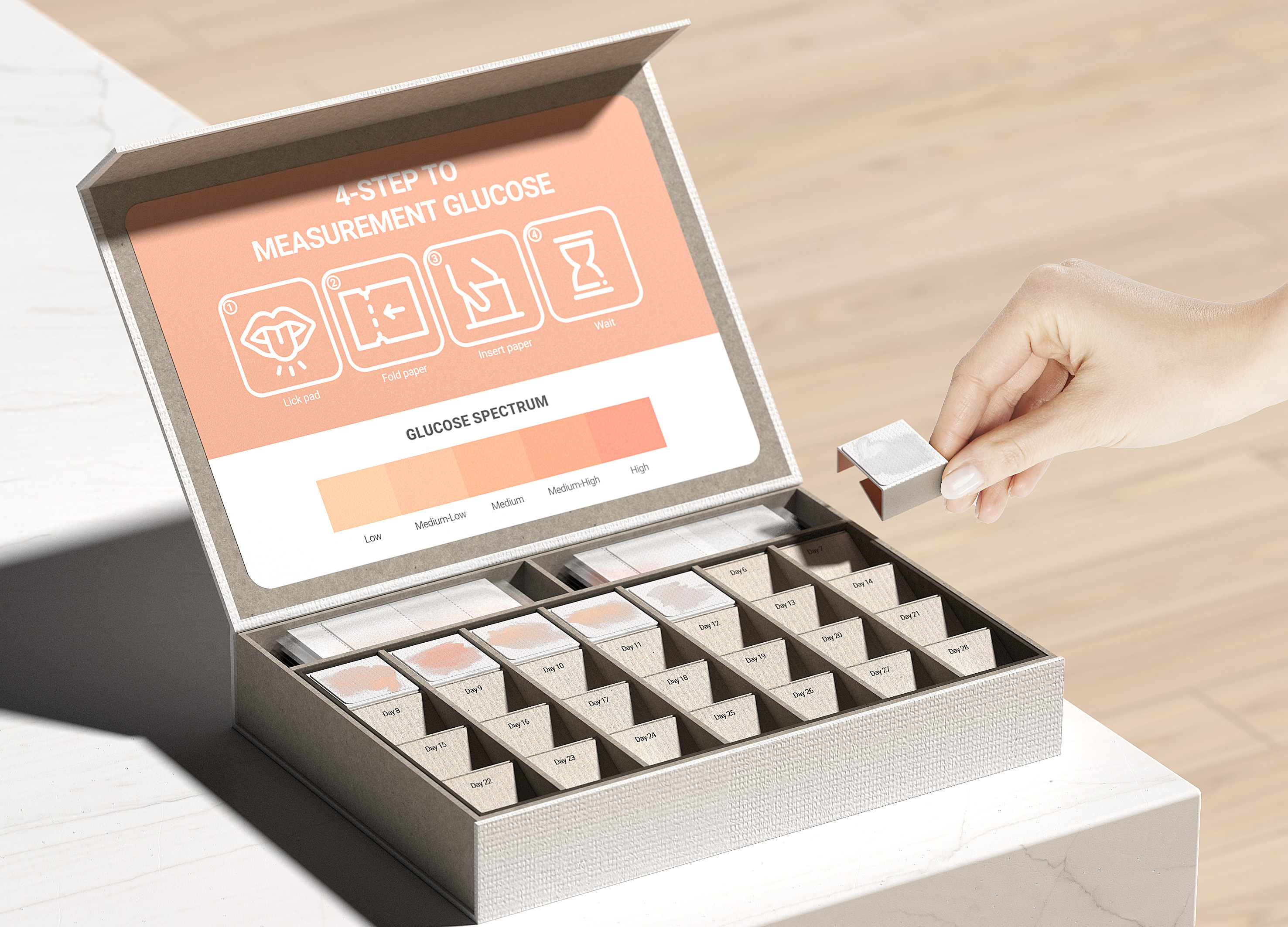
Paper glucometer Kit
Konkuk University Glocal campus
Korea
Warmie
Shih Chien University
Chinese Taipei


Partner & Sponsor
More


info@asiadesignprize.com
#14057, 905 49, Beolmal-ro 102beon-gil,
Dongan-gu, Anyang-si, Gyeonggi-do, Korea
#14057, 905 49, Beolmal-ro 102beon-gil,
Dongan-gu, Anyang-si, Gyeonggi-do, Korea
Founder: Doyoung Kim
Business Registration Number: 454-86-01044
Online Sales License No.: 2021-Anyang Dongan-1081
Copyright © DESIGNSORI Co., Ltd.
Business Registration Number: 454-86-01044
Online Sales License No.: 2021-Anyang Dongan-1081
Copyright © DESIGNSORI Co., Ltd.
