Innerflo
Communication
Regions
Korea
Year
2026
Award
WINNER
Affiliation
Thegrove Co., Ltd.
Designer
Eunhye Park
English
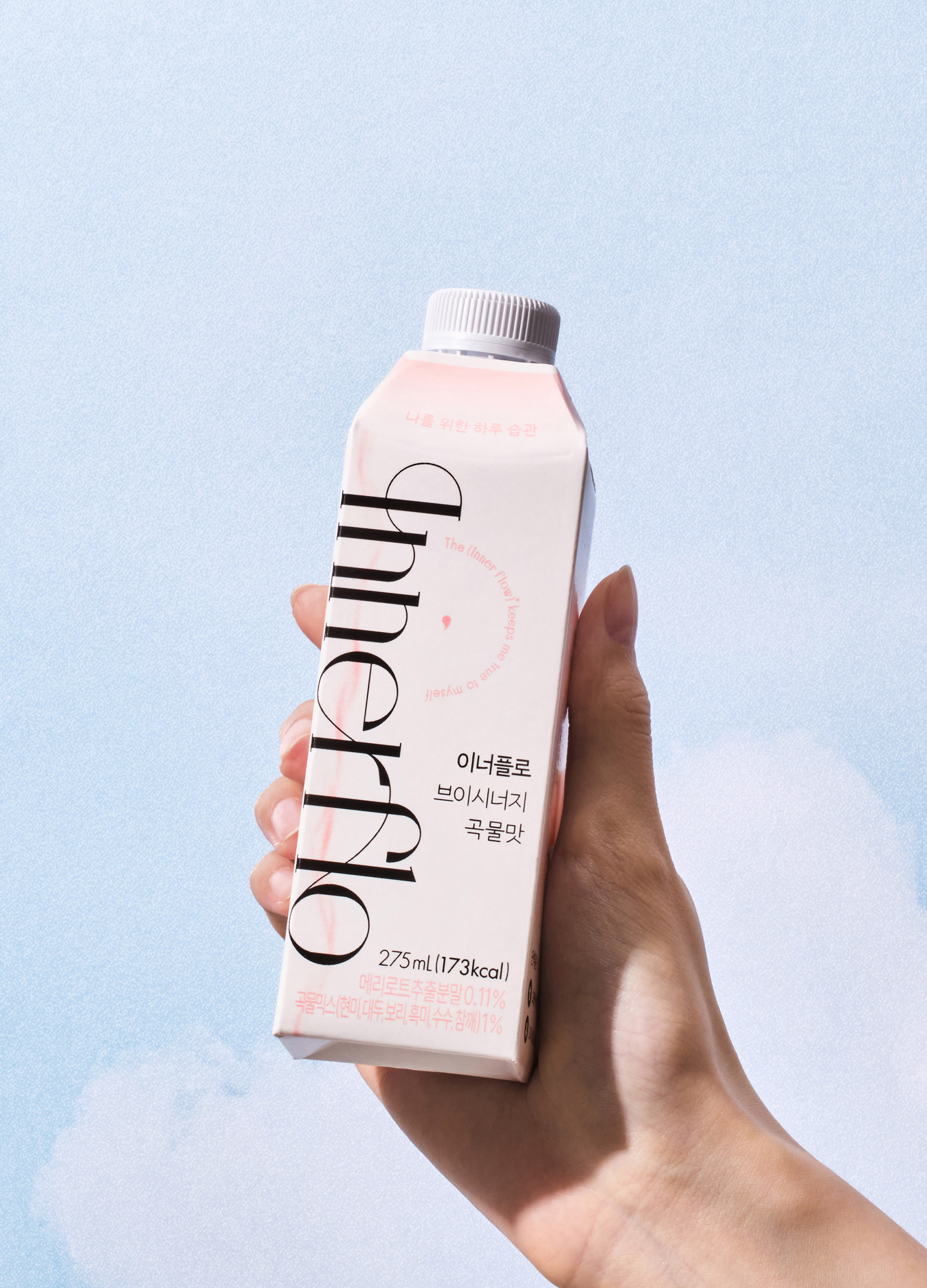
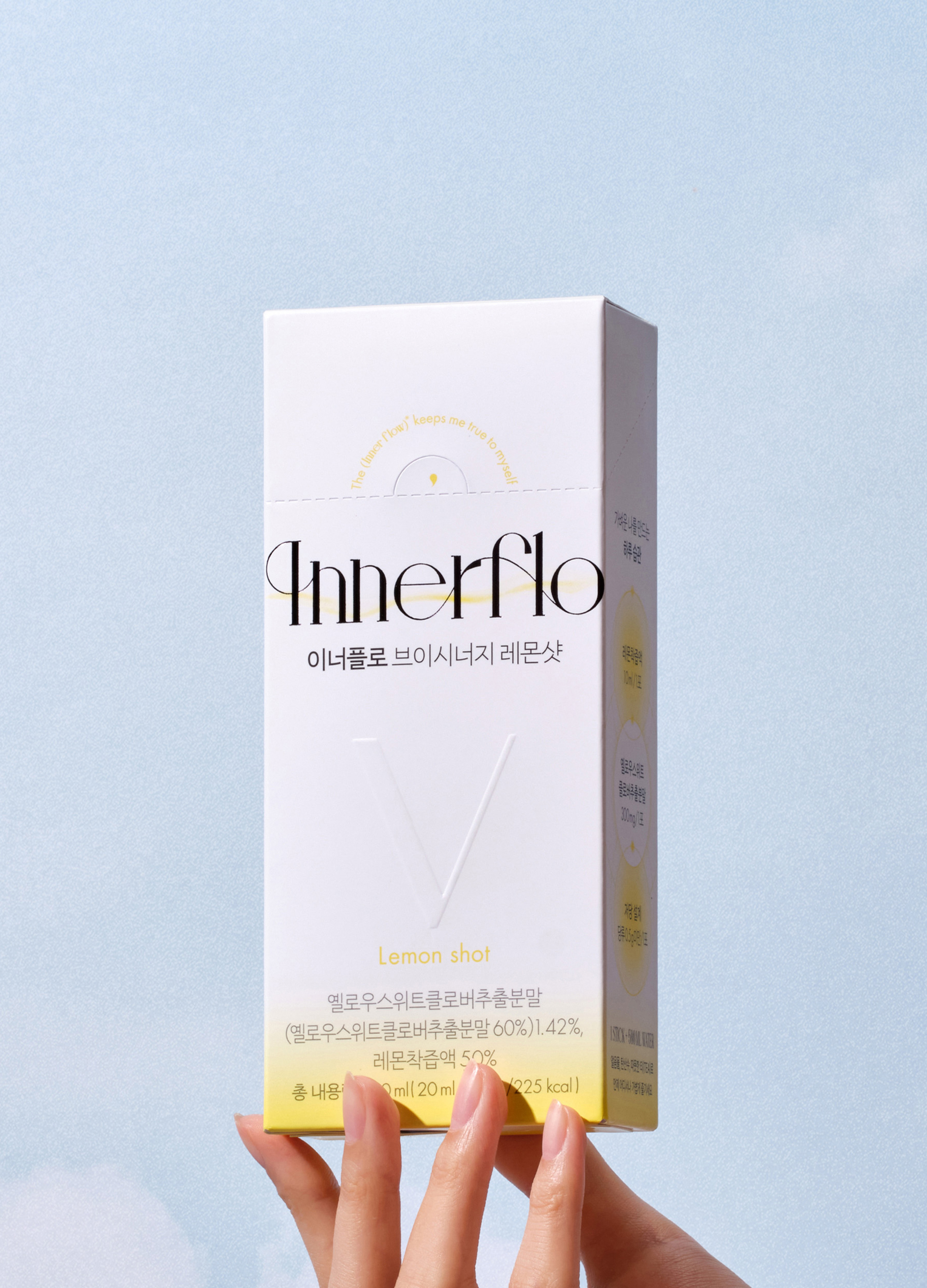
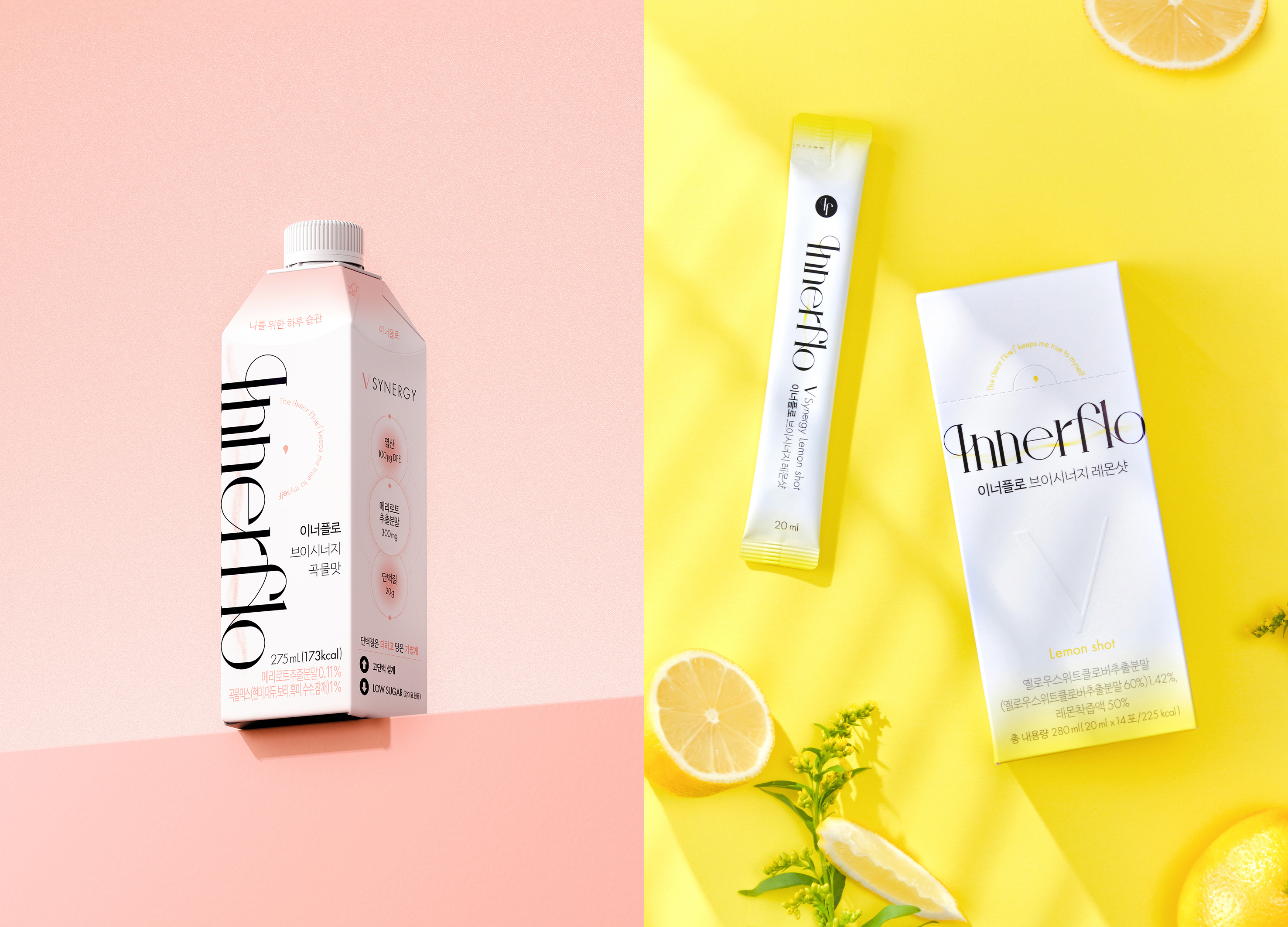
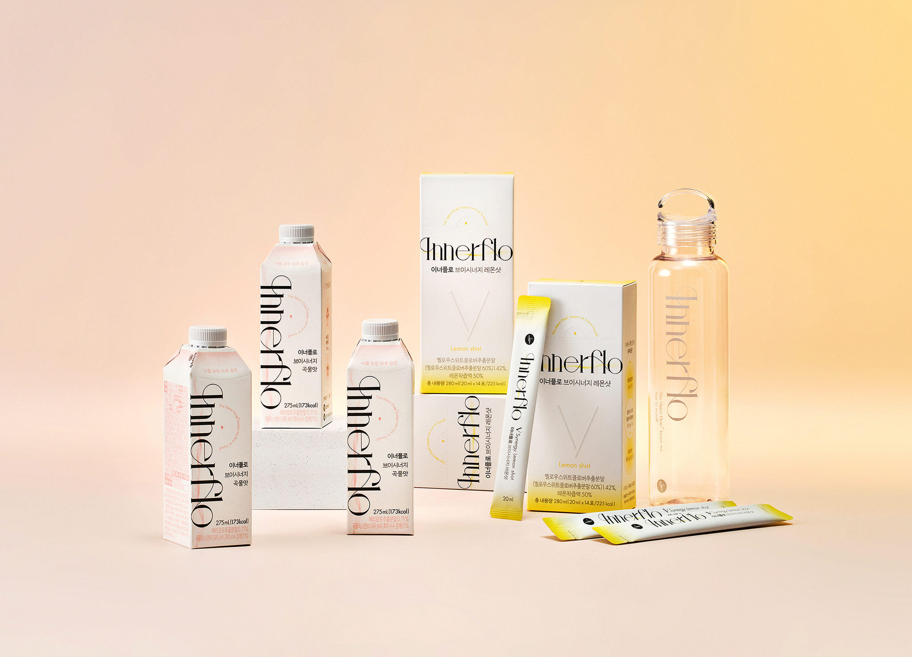
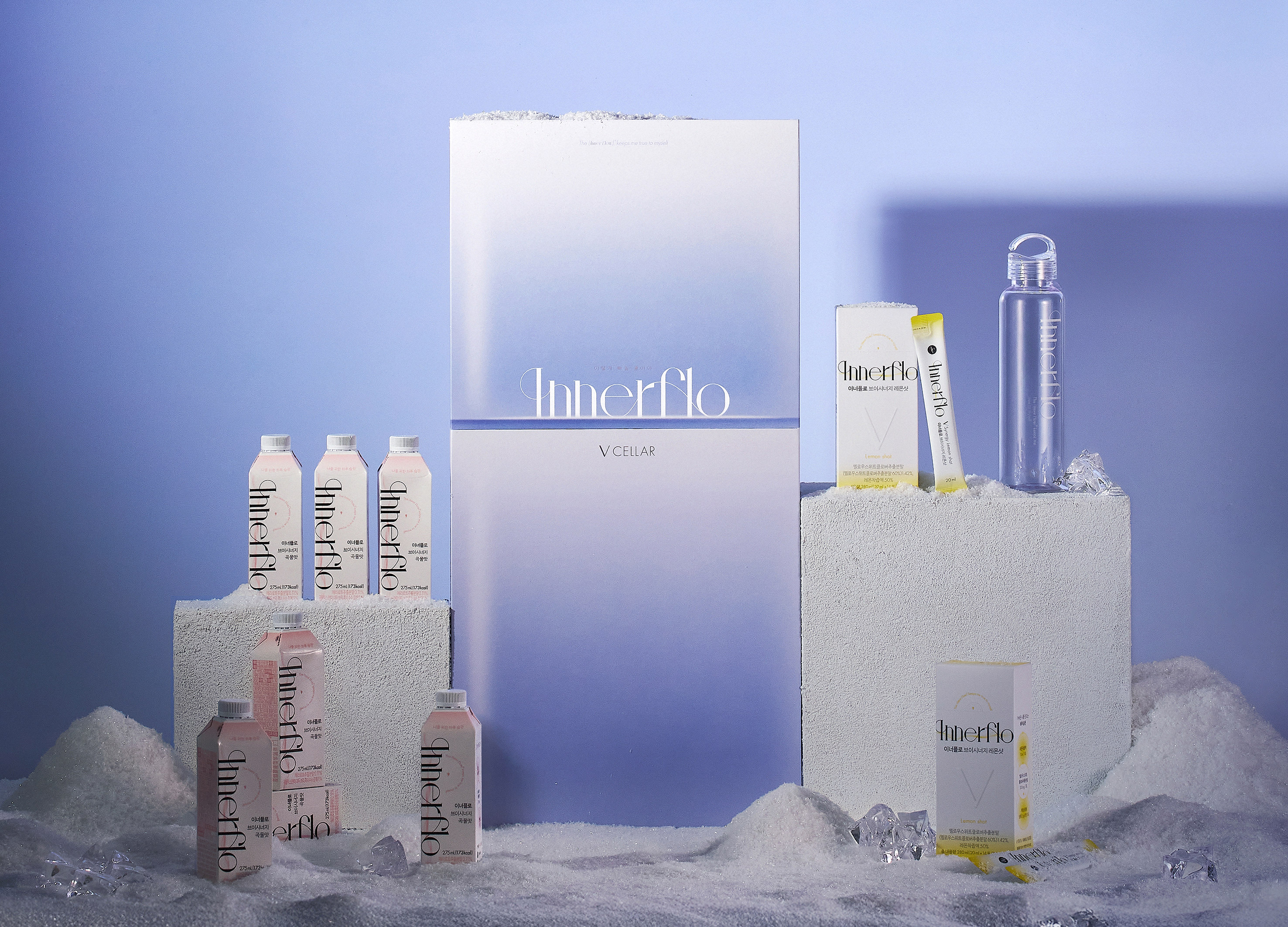
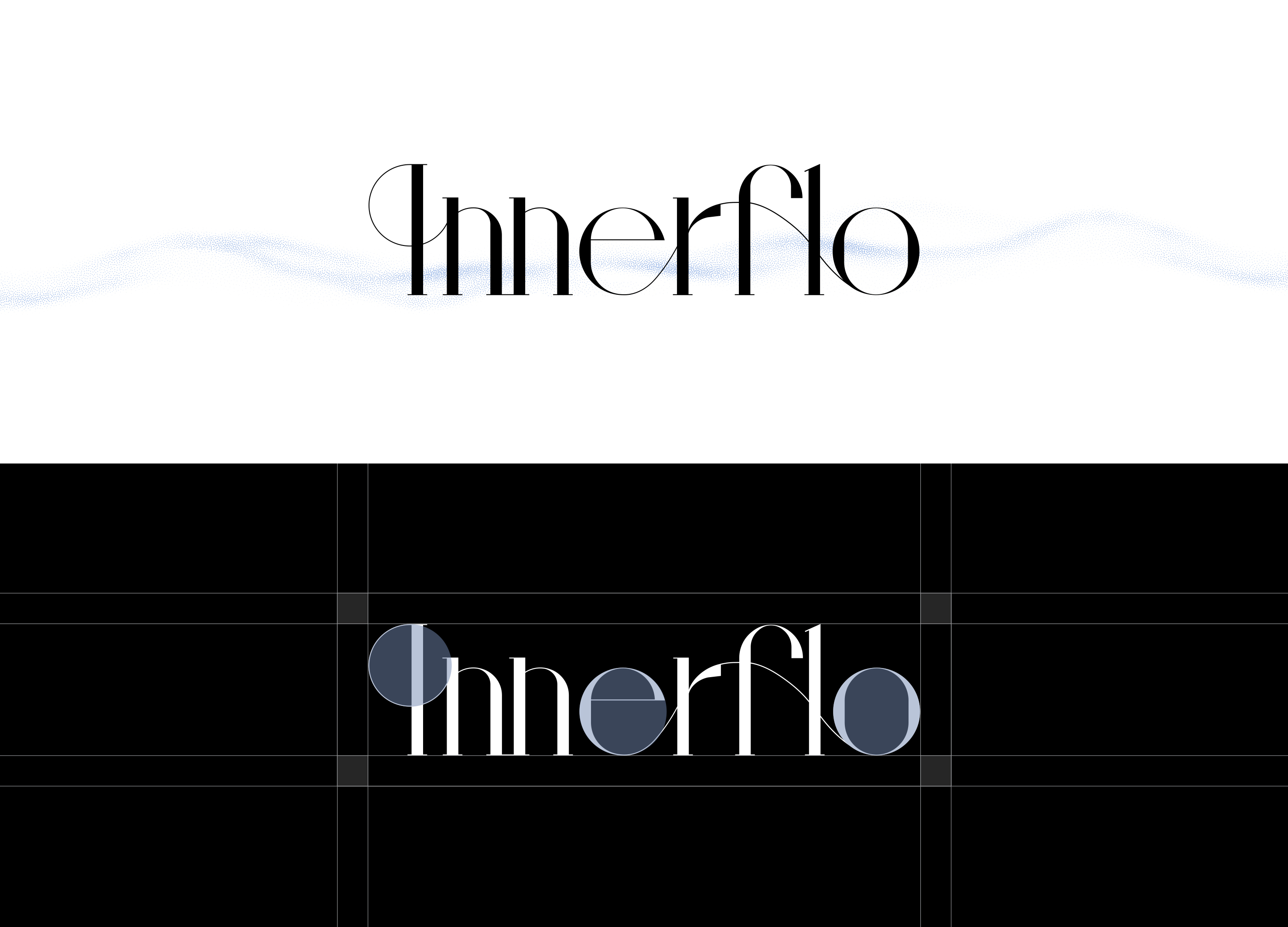
INNERFLO blends “INNER” and “FLOW,” embodying the mission to support smooth internal circulation for a lighter daily life. Developed by pharmacists analyzing the triple mechanism of swelling—inflammation, fluid balance, and circulation—the formula features Melilot, a heritage ingredient used by European nobility. The logo’s three interconnected circles visualize this mechanism and the brand’s sense of balance. The primary blue signifies lightness, while pink and yellow accents distinguish product lines and strengthen brand identity.
Native
이너플로(INNERFLO)는 INNER(내부의)와 FLOW(흐름)의 합성어로, “몸속 순환을 원활하게 돕는다”는 브랜드의 핵심 역할과 철학을 담고 있습니다. 네이밍에는 붓기로 고민하는 모든 이들이 하루를 물 흐르듯 가볍게 보낼 수 있기를 바라는 메시지가 담겨 있습니다.
이너플로의 제품 개발은 약사진이 수백 편의 논문을 기반으로 붓기의 트리플 메커니즘(염증·수분·순환)을 분석하는 과정에서 시작되었습니다. 고대 유럽 귀족들이 사용해온 메리로트를 핵심 성분으로 선정하고, 연구 기반 배합 설계를 통해 맞춤형 붓기 케어 솔루션을 제안합니다.
이러한 특징을 시각적으로 표현하기 위해 로고는 트리플 메커니즘을 상징하는 세 개의 원을 유기적으로 결합해 ‘흐름’의 개념을 구현했습니다. 간결하면서도 움직임이 느껴지는 구조는 브랜드 정체성과 이너플로가 추구하는 균형·조화의 가치를 담아냅니다.
제품 디자인은 로고를 메인 그래픽 요소로 크게 배치해 브랜드 정체성을 명확히 전달합니다. 메인 컬러 블루는 ‘붓기에서 자유로운 가벼움’을 상징하며, 핑크(브이시너지 곡물맛)와 옐로(브이시너지 레몬샷)의 색상 체계는 제품군을 직관적으로 구분합니다.
Website
Positive Comments


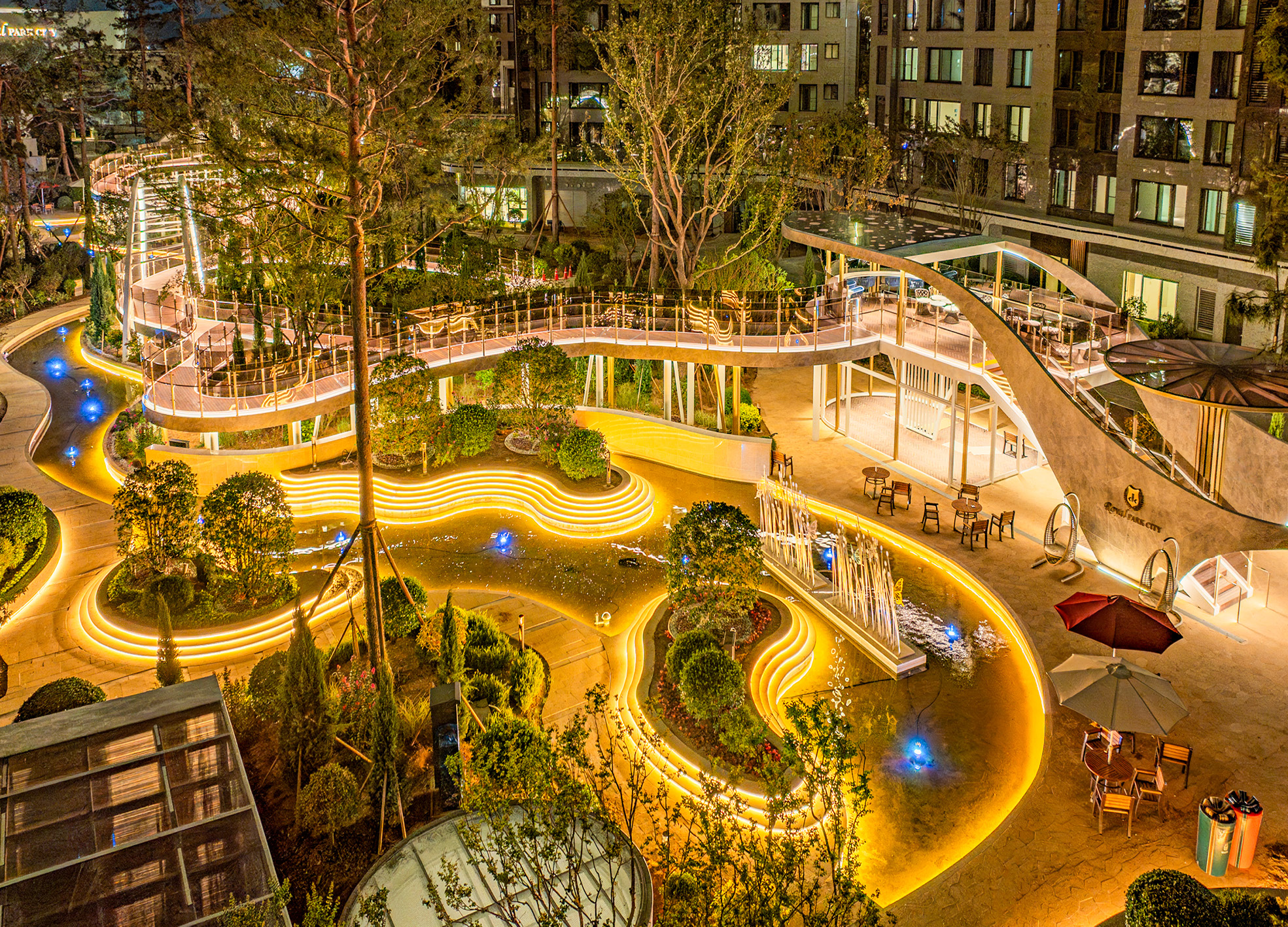
The Wind Library Garden
Samsung C&T Co., Ltd.
Korea
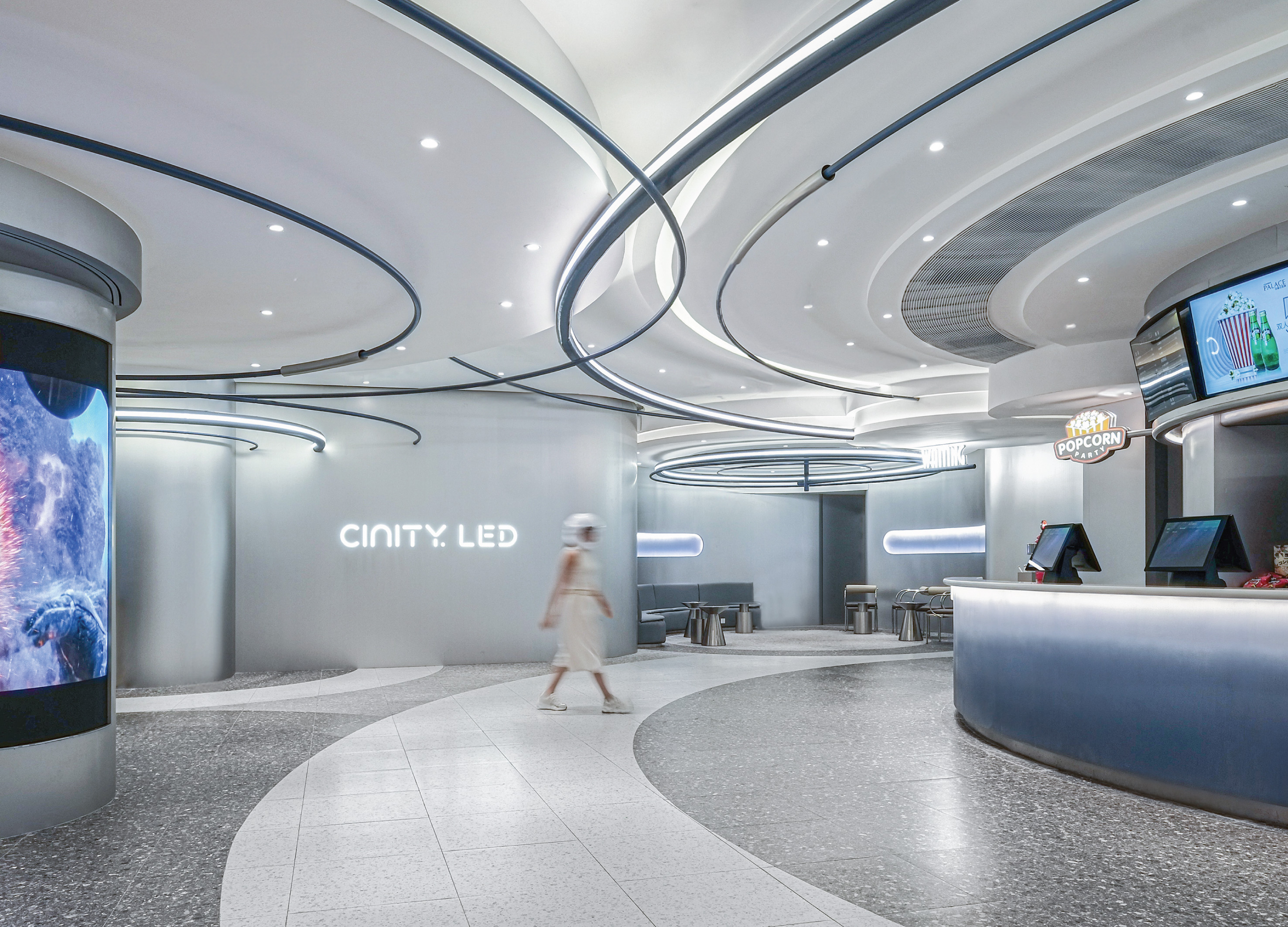
Orbital Dawn
Design Action
China Hong Kong
Suhyang Promenade
Samsung C&T Corp. Resort Group GSS Team Corp.
Korea
Kmong Service Identity Rebranding
Duedance
Korea
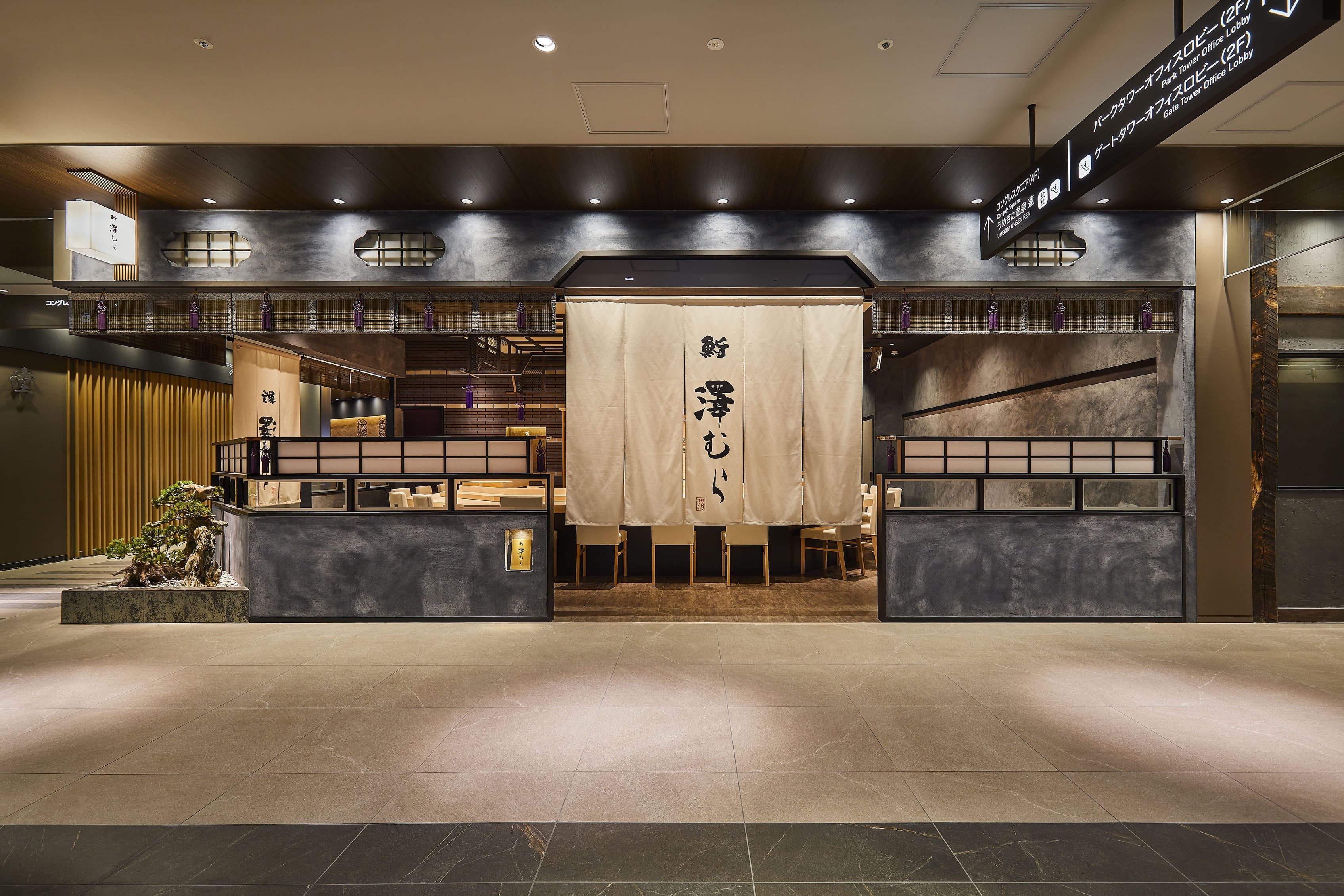
Sushi Sawamura
Reco Inc.
Japan
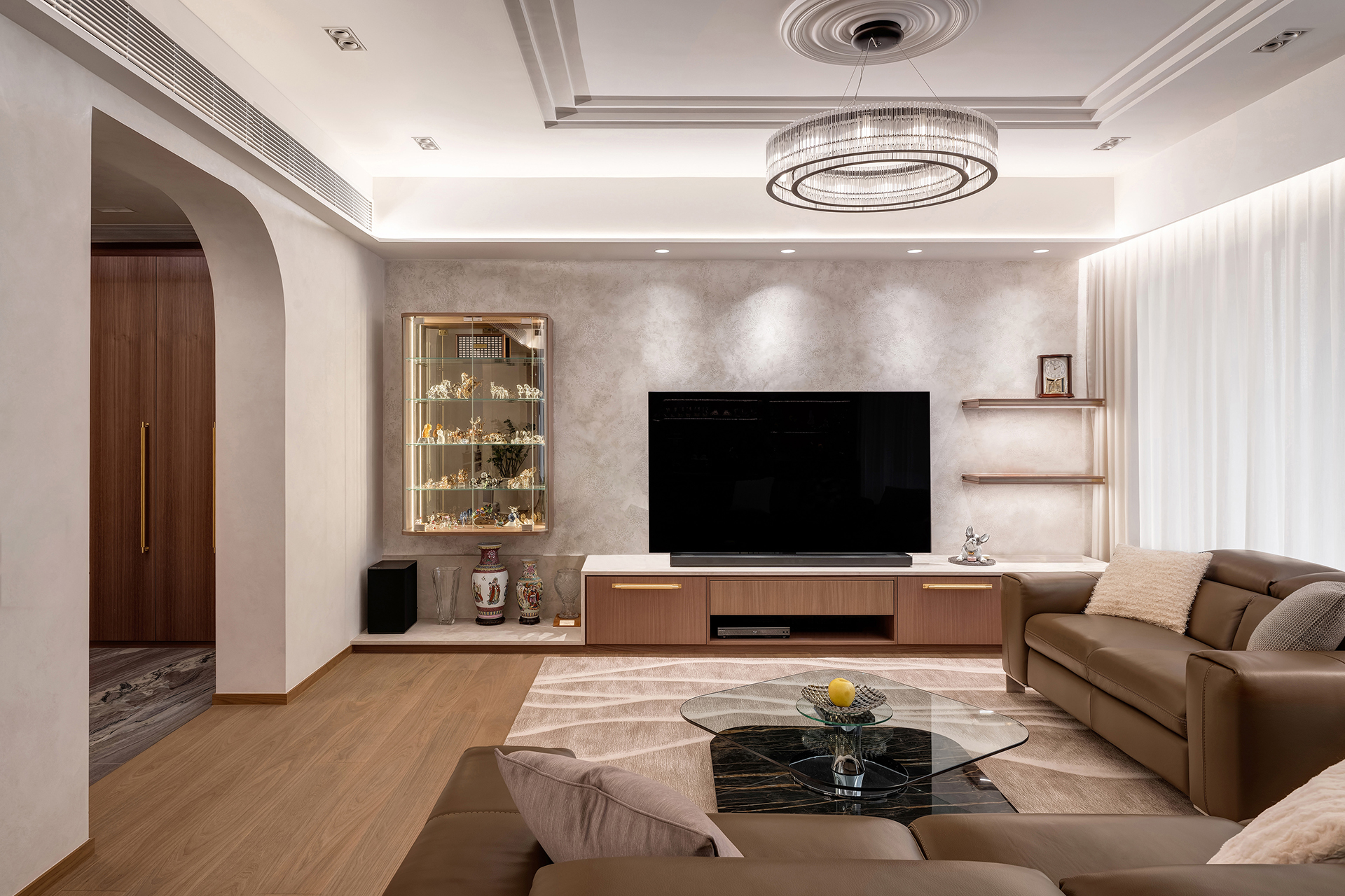
Sophisticated Living Retreat for the Mature
Haven Design Limited
China Hong Kong
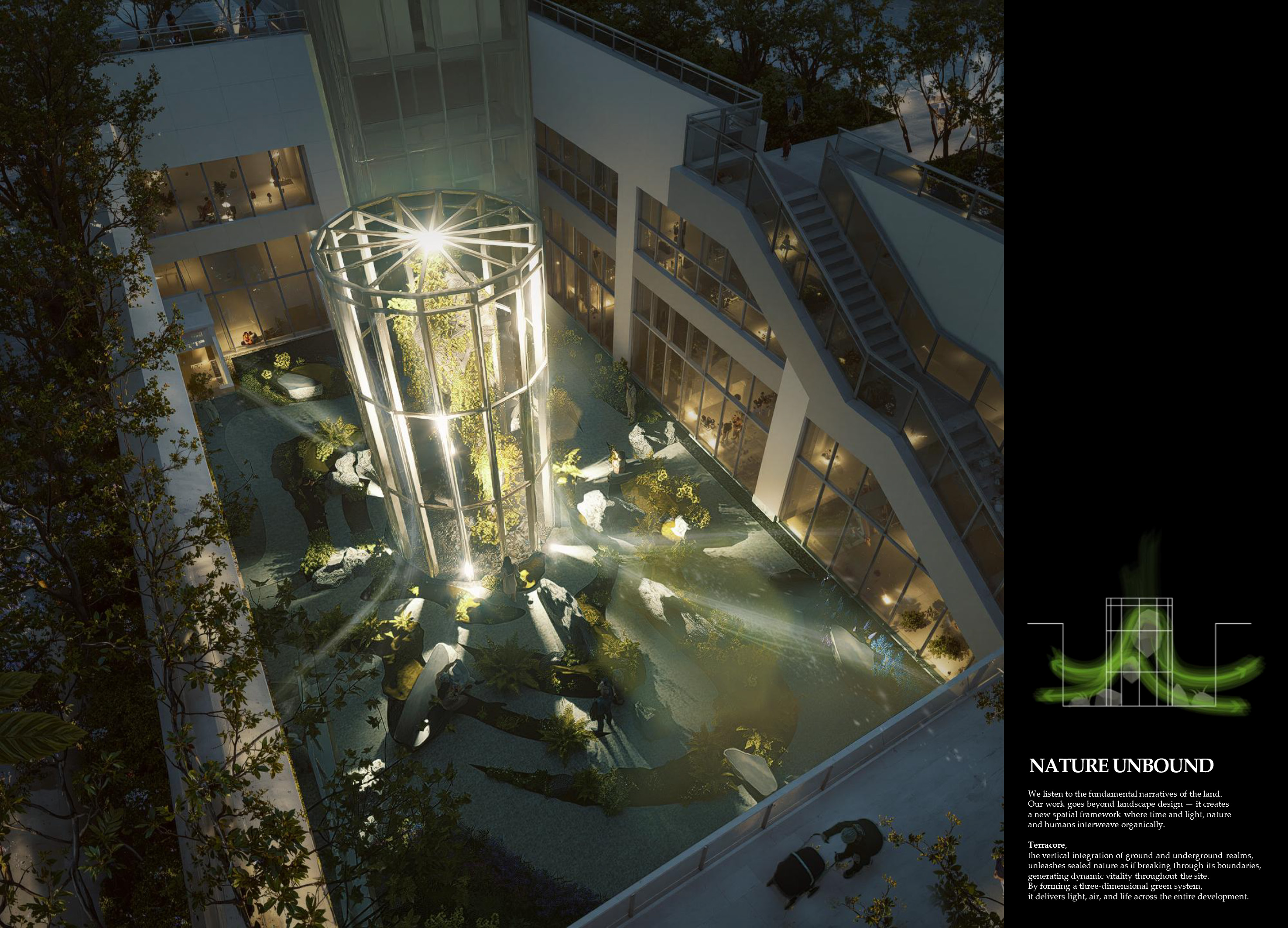
NATURE UNBOUND
LOTTE E&C with BONSIGUDO
Korea
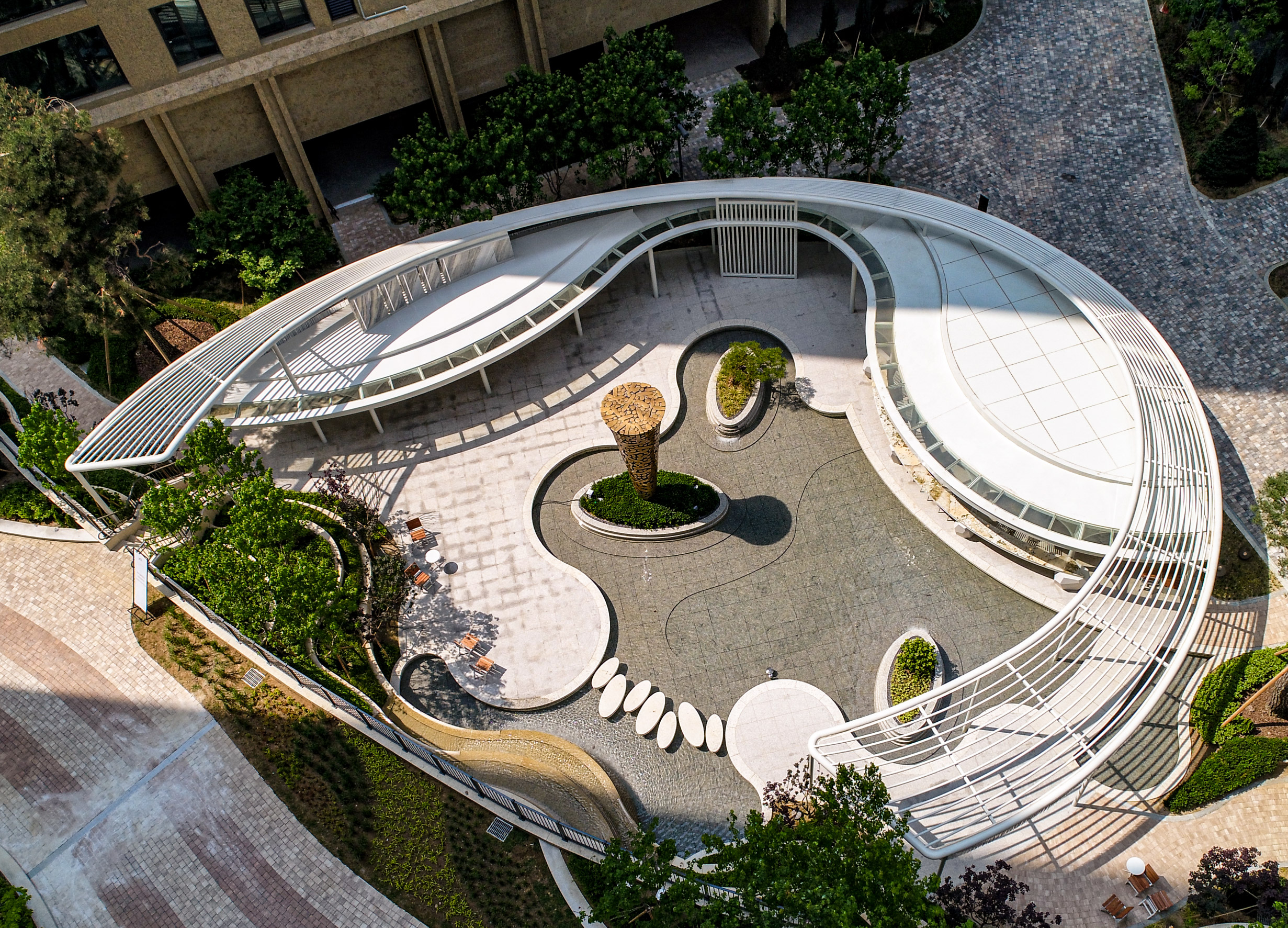
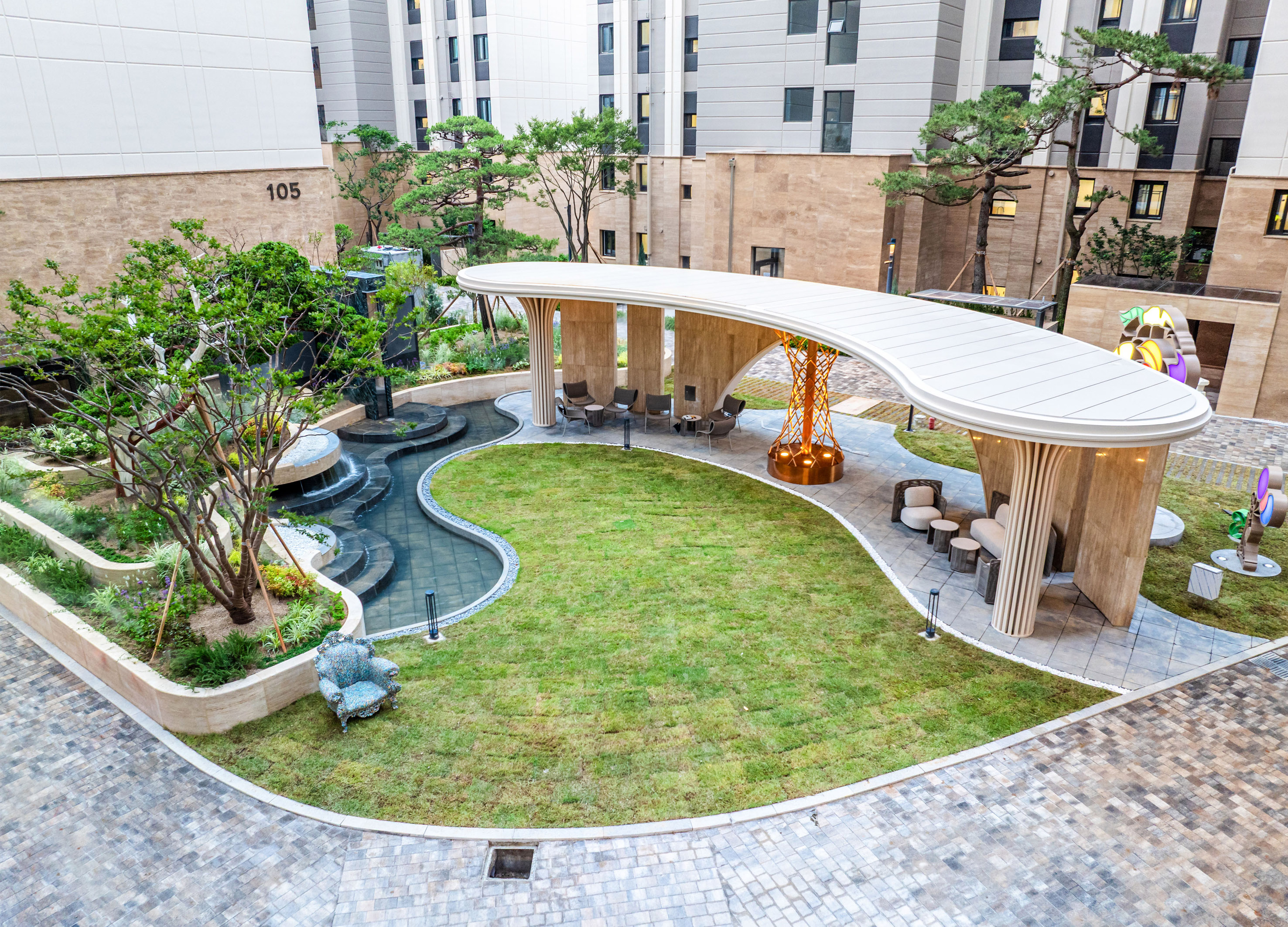
Maple Island Garden Lounge
The New Inc.
Korea
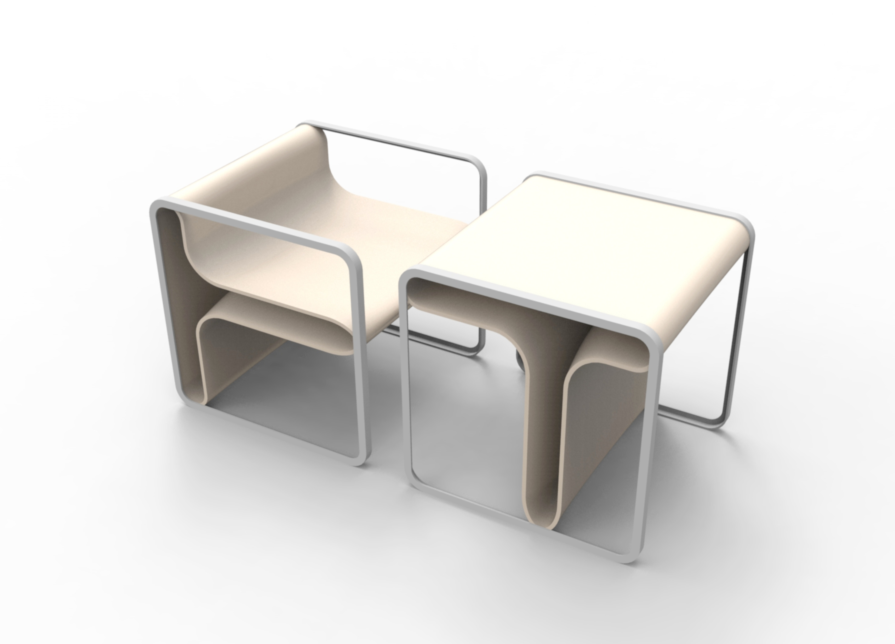
The Sharp Reco Furniture
POSCO E&C
Korea
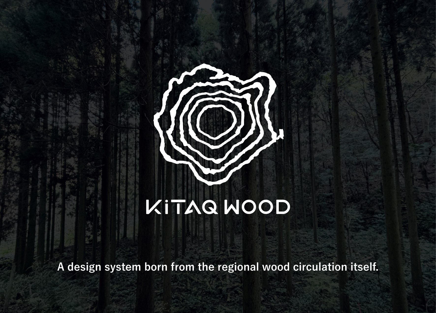
KiTAQ WOOD
okazaki design Co., Ltd.
Japan
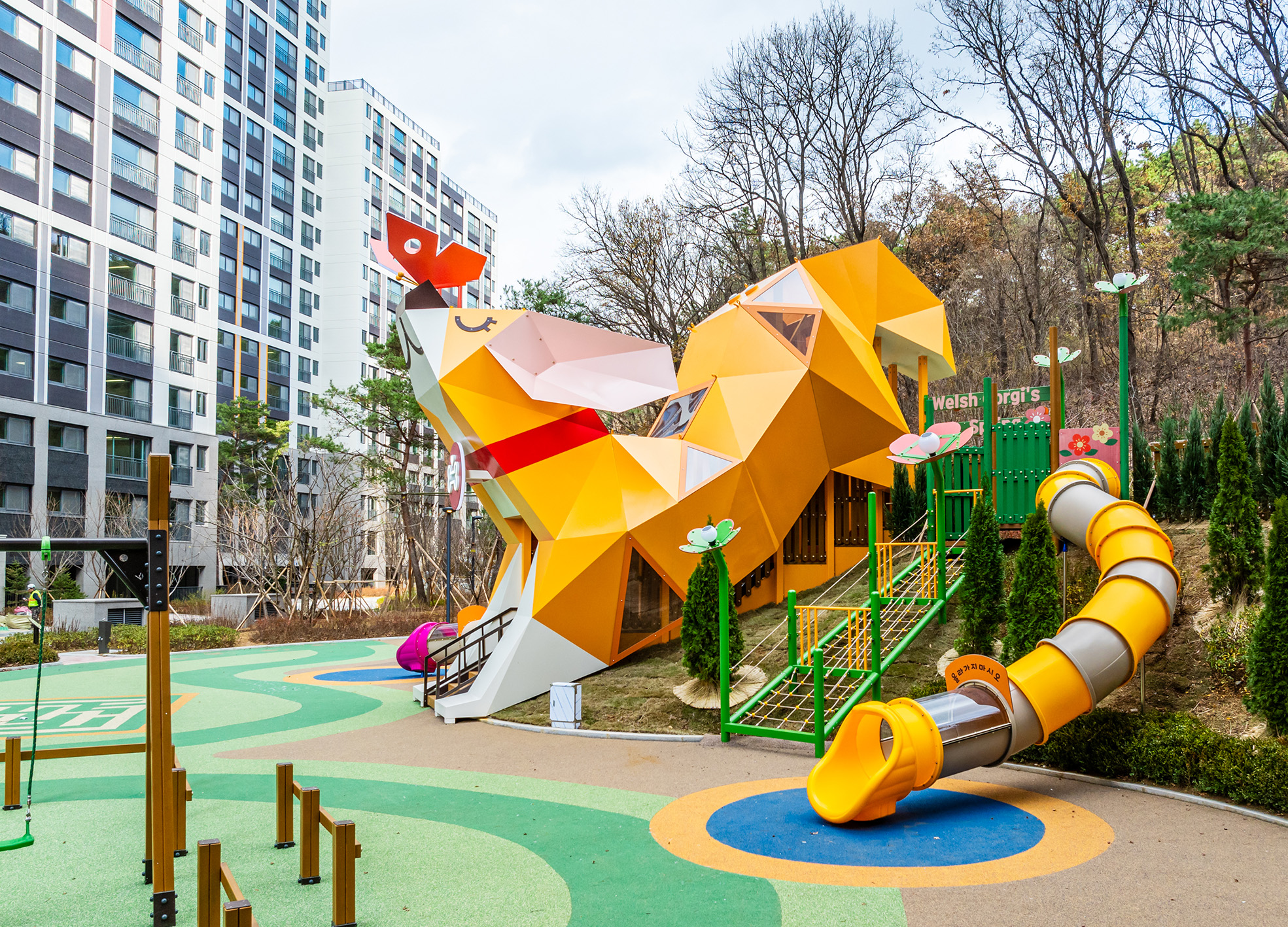
Welsh Corgis Spring Playground
HYUNDAI E&C Corp.
Korea
Atelier
hdec Co., Ltd.
Korea
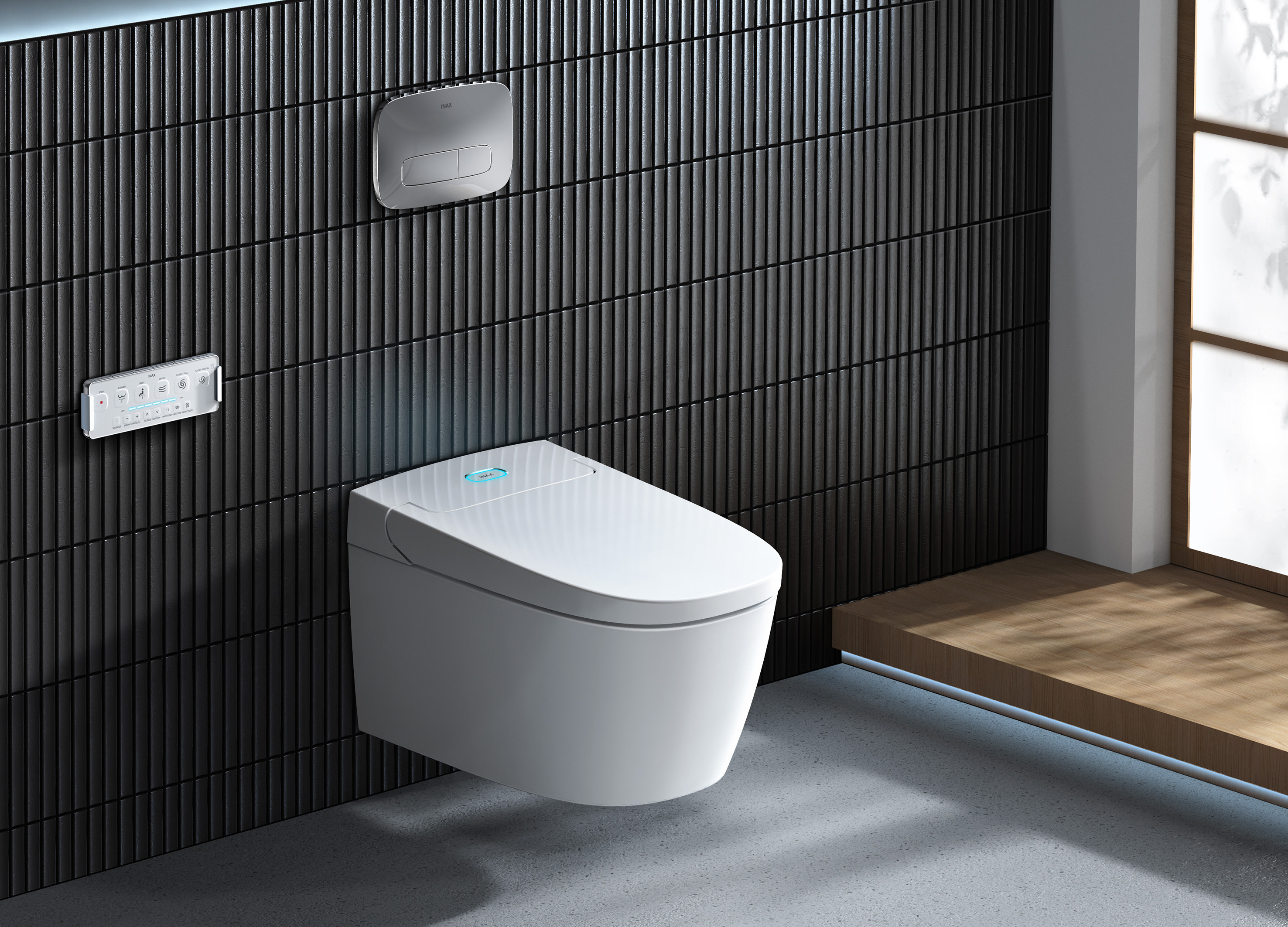
SARAS Wall Hung Shower Toilet
INAX
Singapore
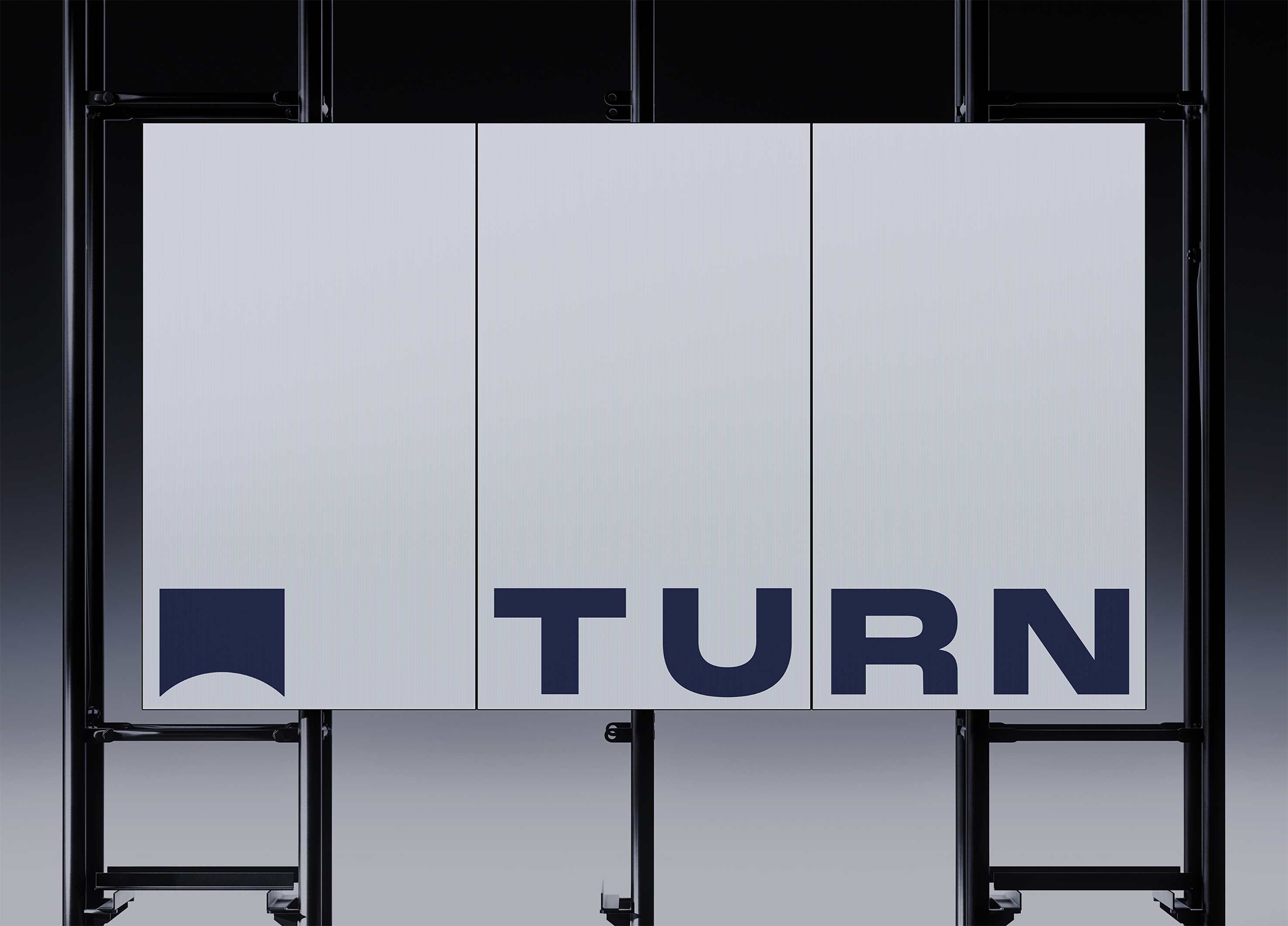
TURN
tedo Inc.
Korea
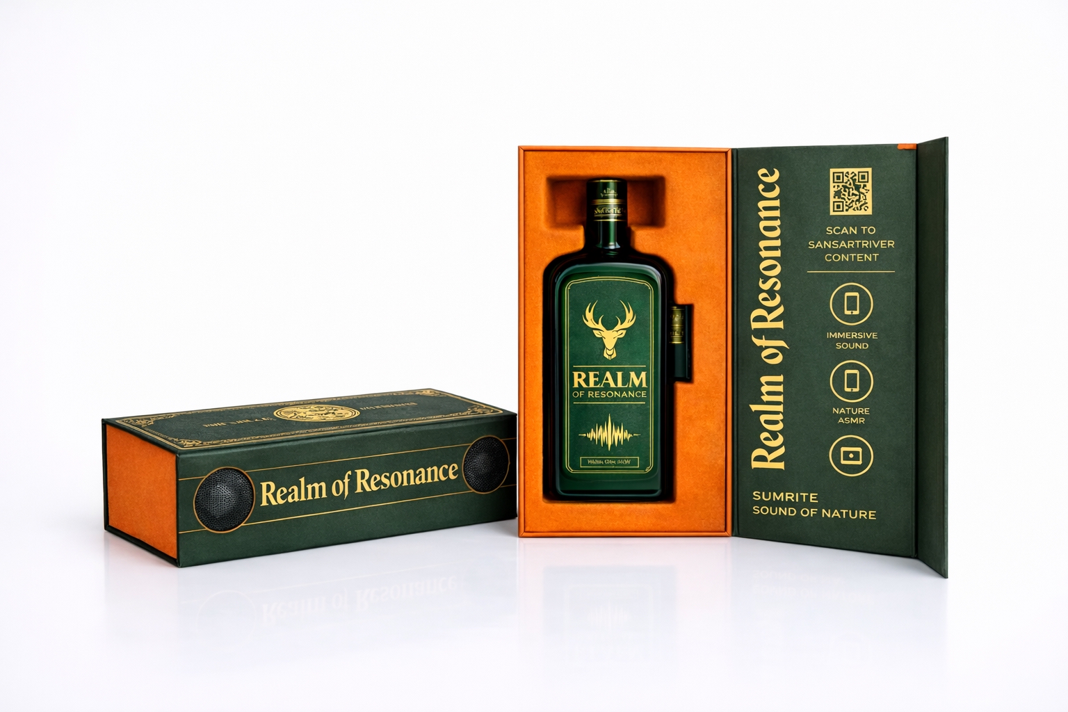
Realm of Resonance
PARCO PACIFIC Co., Ltd.
Taiwan
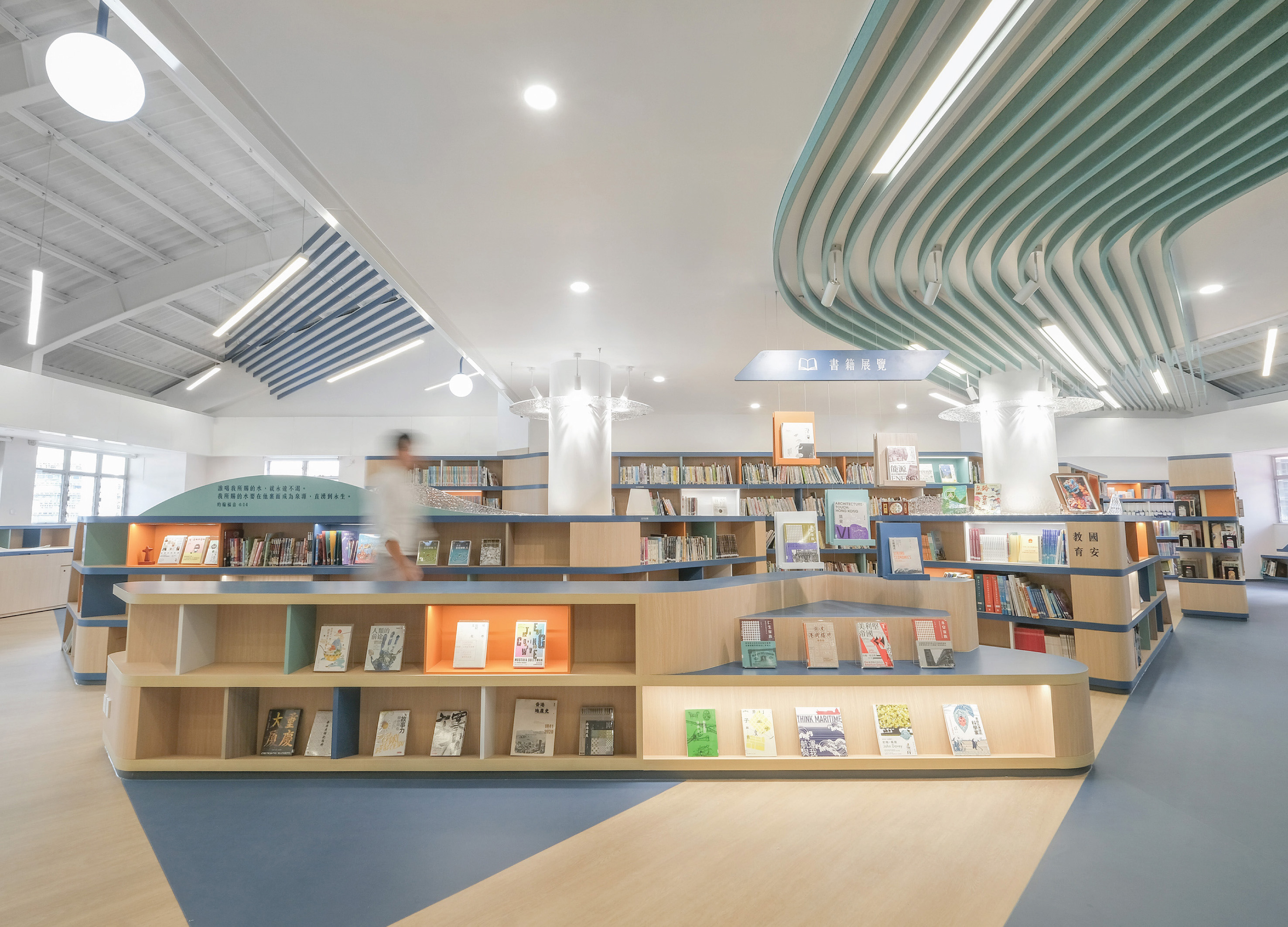
The Confluence Library
Design Action
China Hong Kong
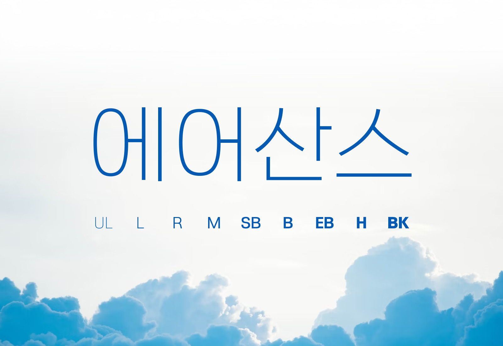
Rix AirSans
RixFont Co., Ltd.
Korea
Innerflo
Thegrove Co., Ltd.
Korea


Partner & Sponsor
More


info@asiadesignprize.com
#14057, 905 49, Beolmal-ro 102beon-gil,
Dongan-gu, Anyang-si, Gyeonggi-do, Korea
#14057, 905 49, Beolmal-ro 102beon-gil,
Dongan-gu, Anyang-si, Gyeonggi-do, Korea
Founder: Doyoung Kim
Business Registration Number: 454-86-01044
Online Sales License No.: 2021-Anyang Dongan-1081
Copyright © DESIGNSORI Co., Ltd.
Business Registration Number: 454-86-01044
Online Sales License No.: 2021-Anyang Dongan-1081
Copyright © DESIGNSORI Co., Ltd.
