Kmong Service Identity Rebranding
Communication

Regions
Korea
Year
2026
Award
WINNER
Client
kmong
Affiliation
Duedance
Designer
Joonghyun cho
English
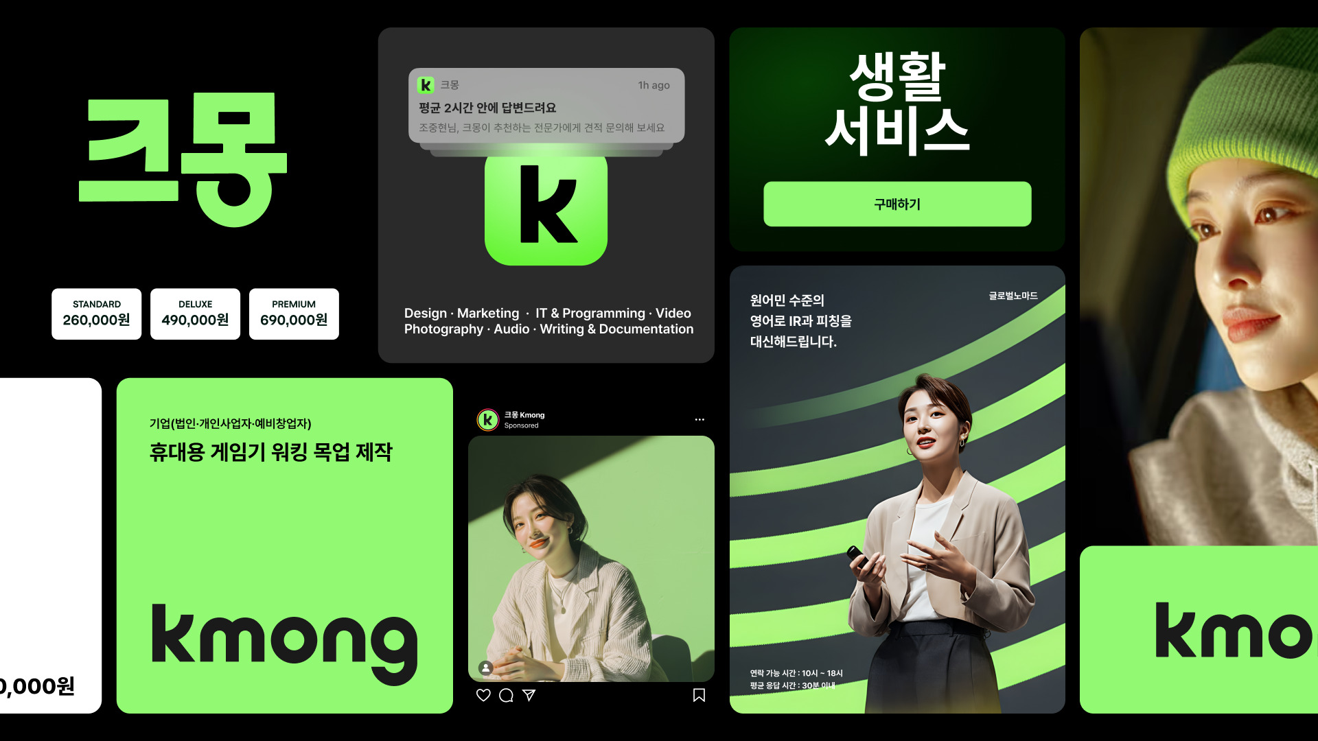
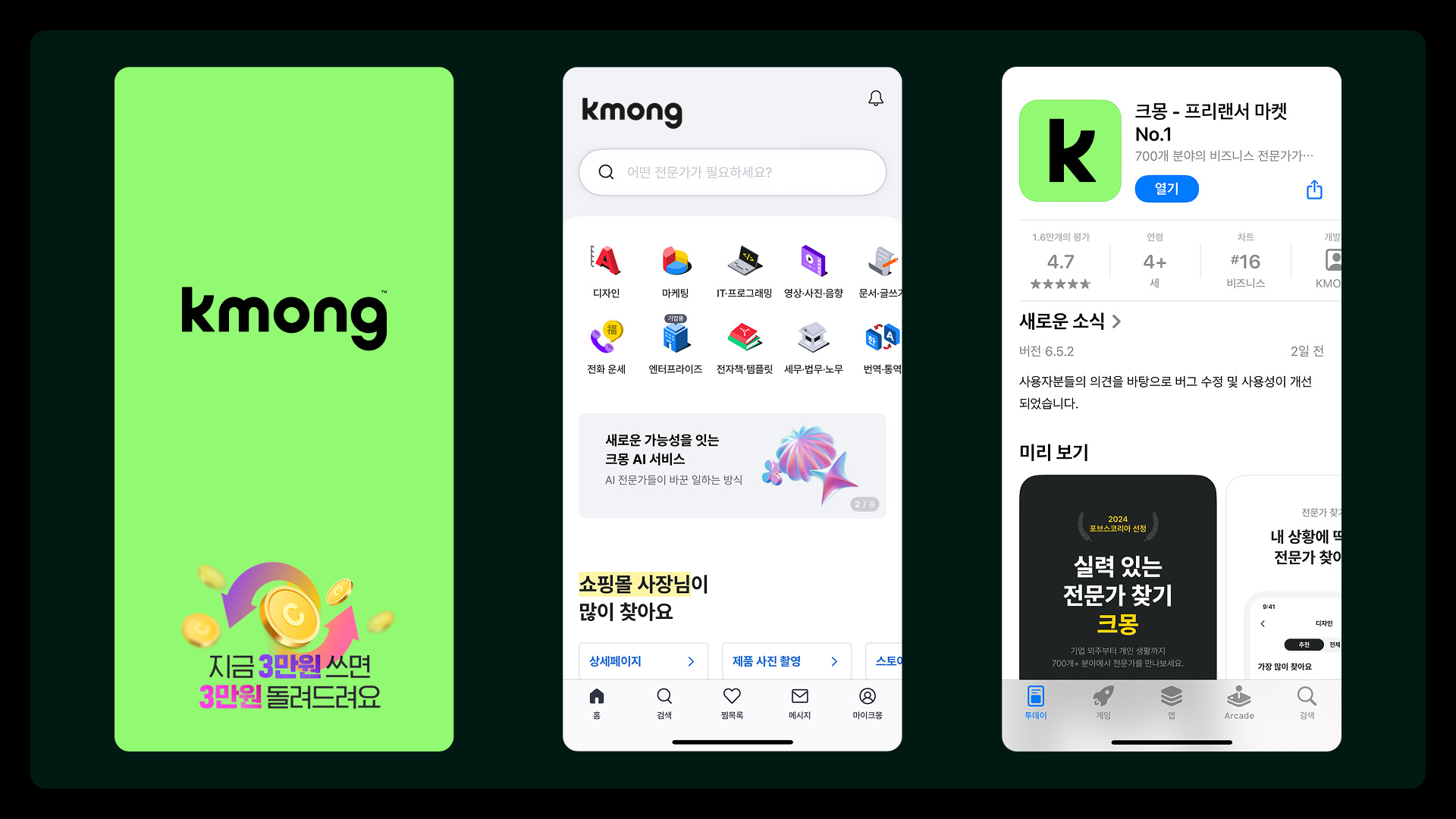
Founded in 2012, Kmong has grown into South Korea’s largest freelance platform, serving over 3 million users and 500,000 professionals. As the platform expanded toward the enterprise market, a clear B2B positioning became essential to reflect its evolving role.
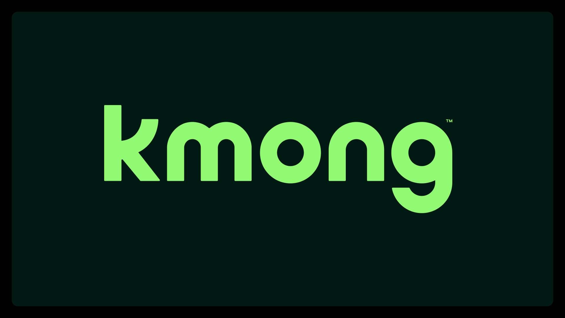
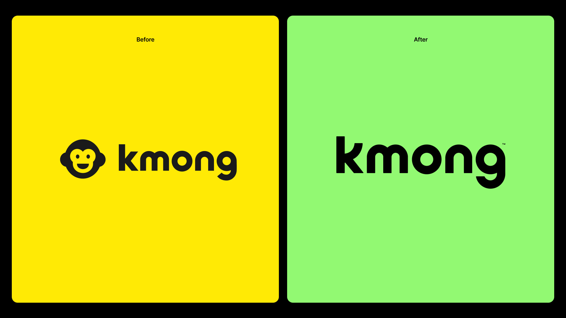
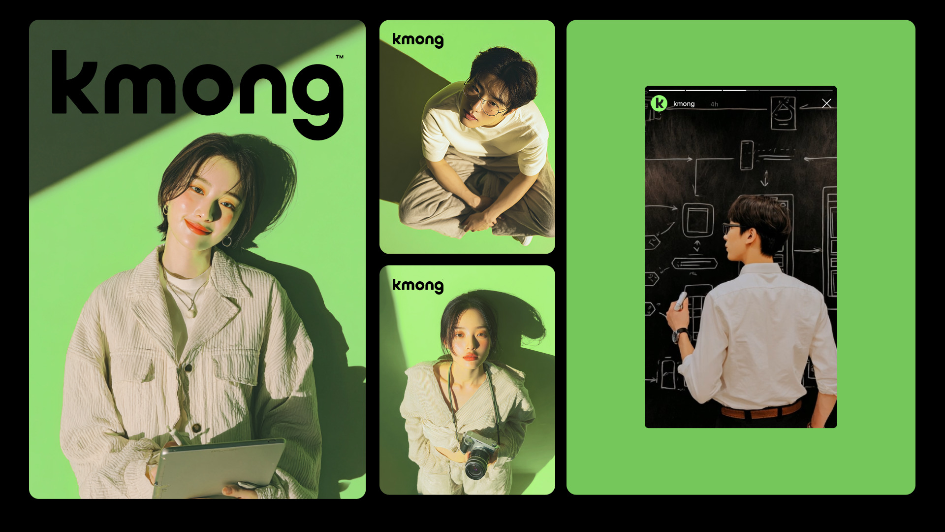
Kmong replaced the character with a wordmark, making the name itself a symbol of trust and professionalism. Yellow was replaced by “Kmong Green,” expressing credibility, growth, and innovation for B2B markets. The redesigned ‘K’ embodies upward growth and collaboration, subtly referencing brand heritage and marking a shift toward long-term professional leadership.
Native
우리는 크몽이 더 이상 ‘친근한 플랫폼’으로 보이면 안 된다고 판단했다. 13년간 유지해온 원숭이 캐릭터는 성공의 상징이었지만, 동시에 엔터프라이즈 시장으로 나아가는 데 가장 큰 장애물이기도 했다. 2012년 재능마켓으로 출발한 크몽은 이미 300만 회원, 50만 전문가가 활동하는 대한민국 최대 휴먼클라우드 플랫폼이었다. 현실의 비즈니스는 대기업, 전문직, B2B 거래 중심으로 완전히 이동해 있었지만, 브랜드는 과거에 머물러 있었다.
우리는 이 불일치를 제거하는 데서 리브랜딩을 시작했다. 캐릭터를 폐기하고 ‘크몽’이라는 이름 자체를 로고로 만드는 워드마크 전략을 선택했다. 설명이 필요한 상징 대신, 이름 그 자체가 전문성과 신뢰를 대표하도록 설계했다. 컬러 역시 과감했다. 한국 플랫폼 시장에서 의미를 상실한 옐로우를 버리고, 신뢰·성장·확장을 담은 ‘크몽 그린’을 정의했다.
워드마크의 ‘K’는 우상향 곡선으로 성장과 협업을 시각화하며, 과거 캐릭터의 흔적을 남겨 단절이 아닌 진화를 말한다. 이번 리브랜딩은 크몽의 변화가 아니라, 우리가 시장의 기준을 다시 세운 결과다.
Website
Positive Comments


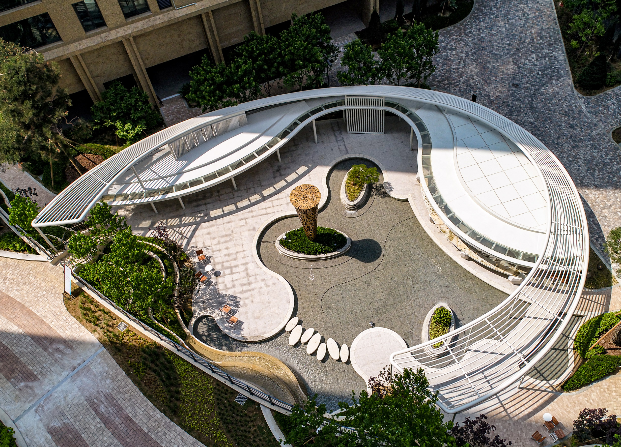
The Wind Library Garden
Samsung C&T Co., Ltd.
Korea
Orbital Dawn
Design Action
China Hong Kong
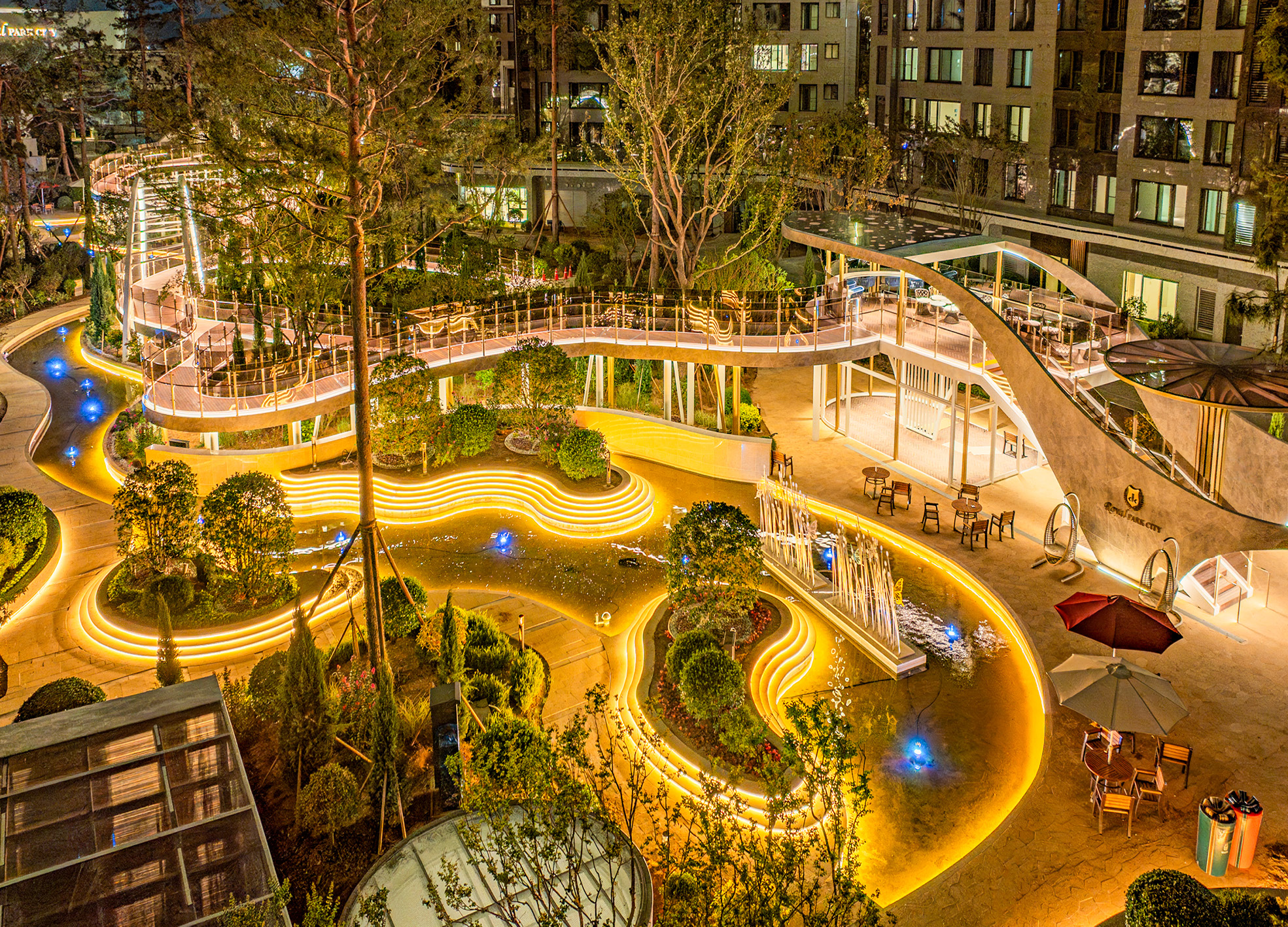
Suhyang Promenade
Samsung C&T Corp. Resort Group GSS Team Corp.
Korea
Kmong Service Identity Rebranding
Duedance
Korea
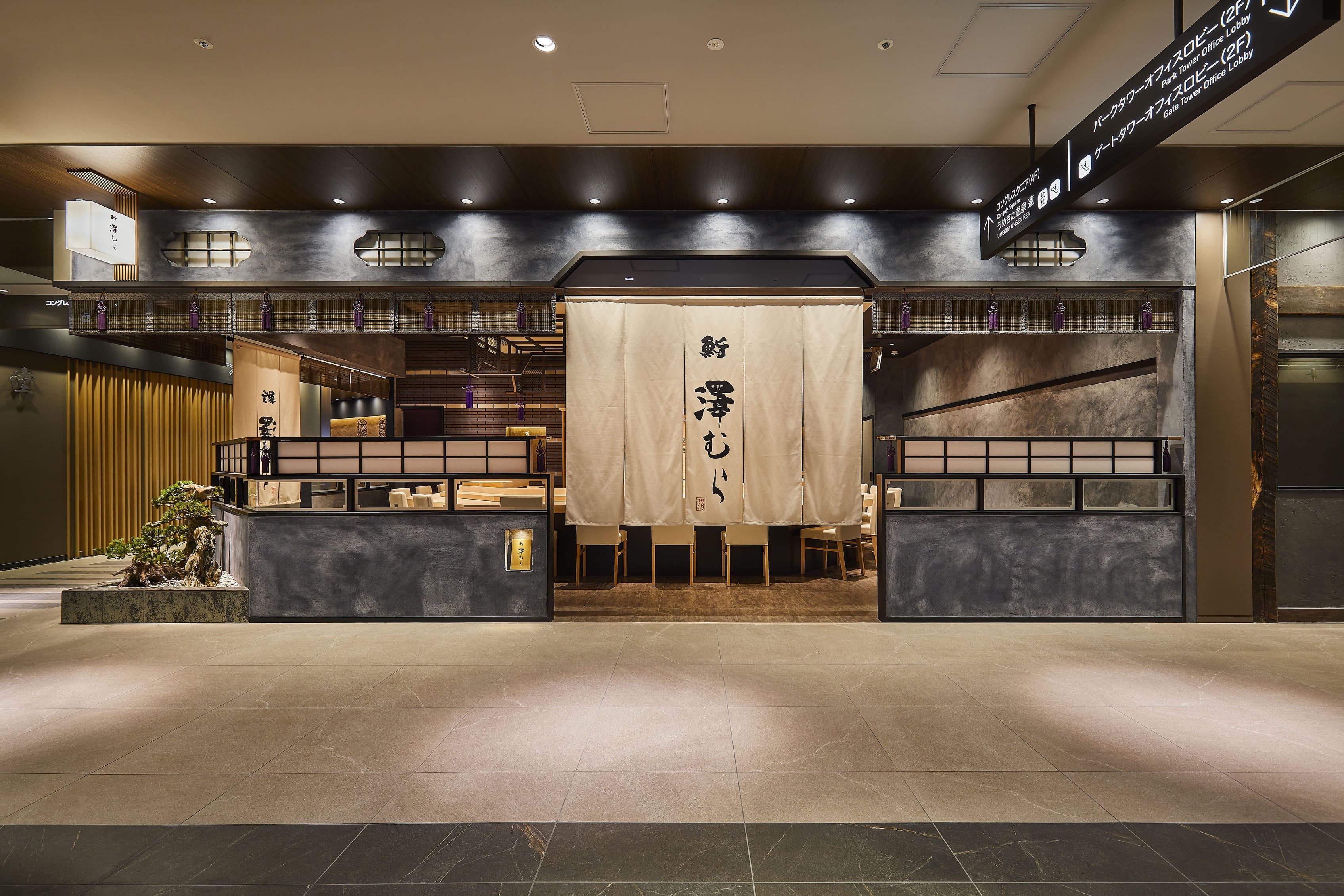
Sushi Sawamura
Reco Inc.
Japan
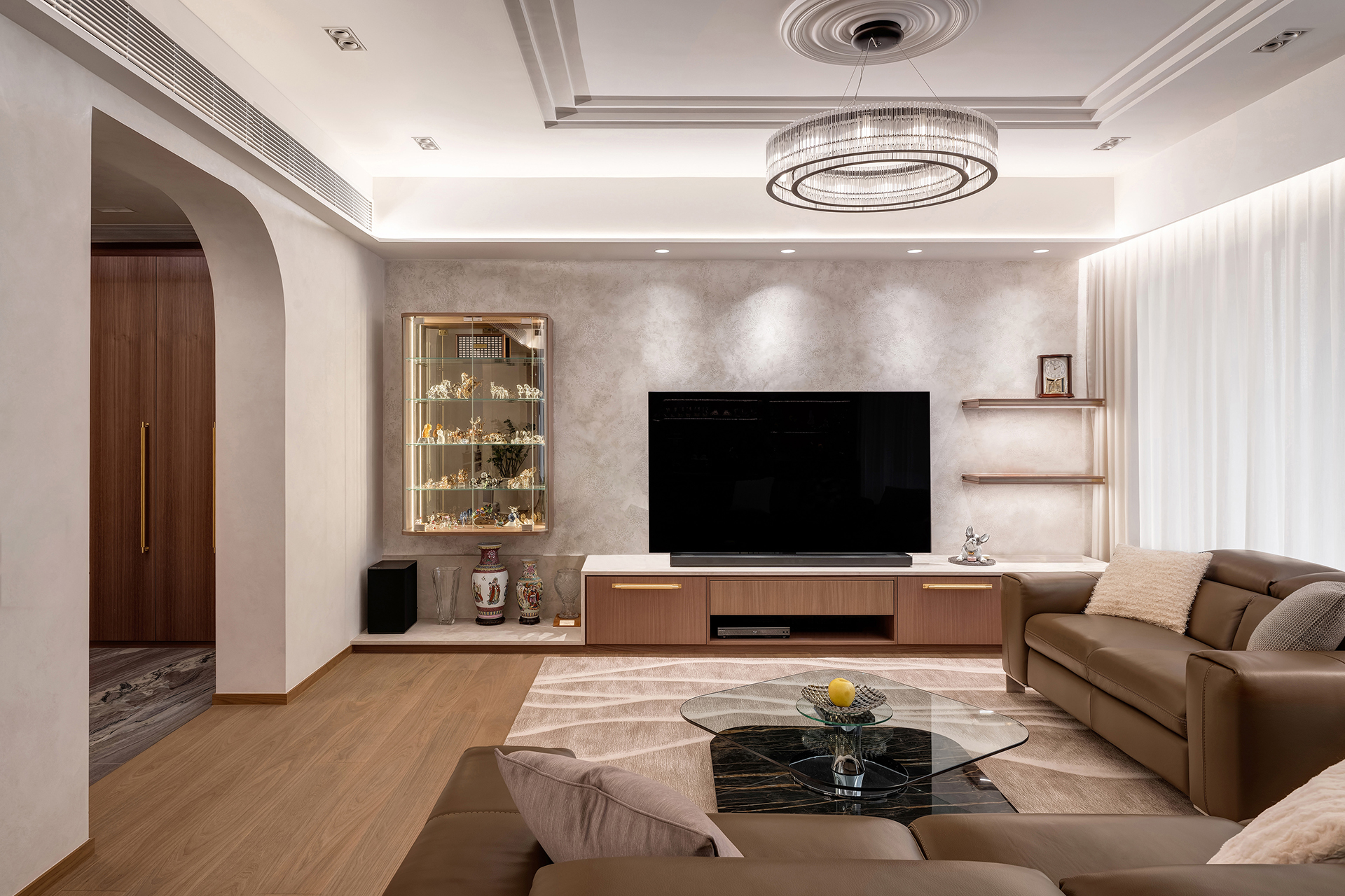
Sophisticated Living Retreat for the Mature
Haven Design Limited
China Hong Kong
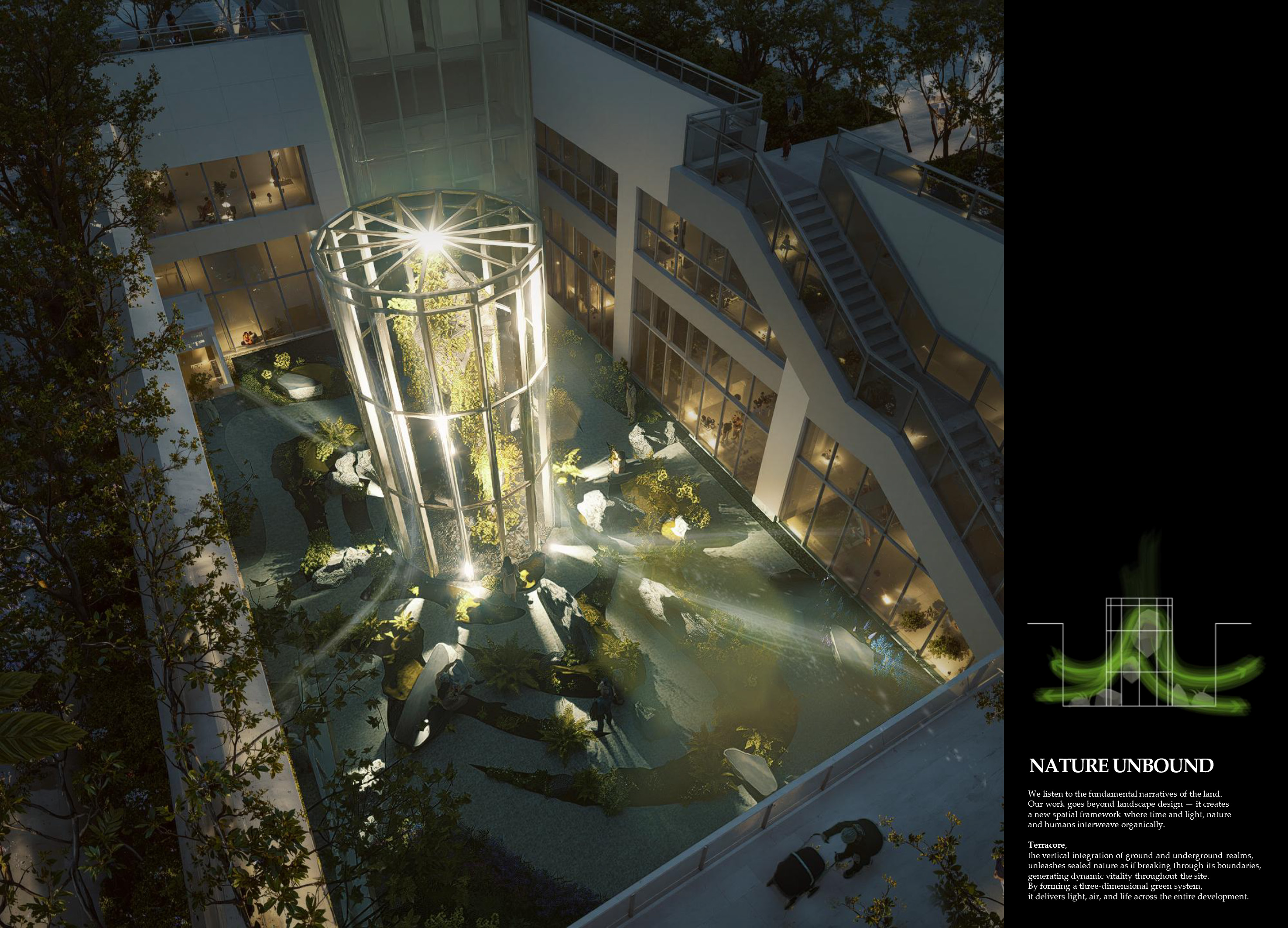
NATURE UNBOUND
LOTTE E&C with BONSIGUDO
Korea
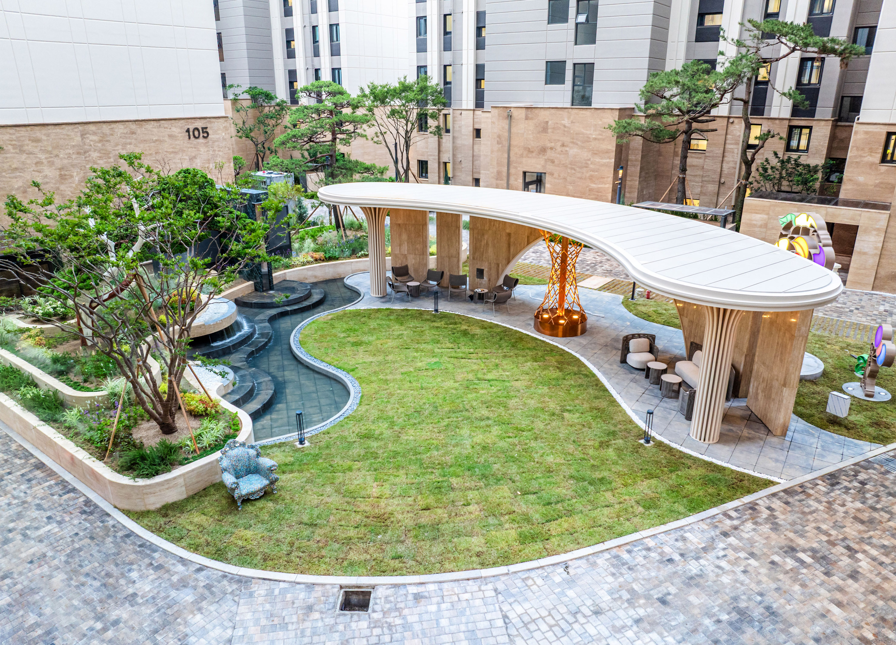
Maple Island Garden Lounge
The New Inc.
Korea
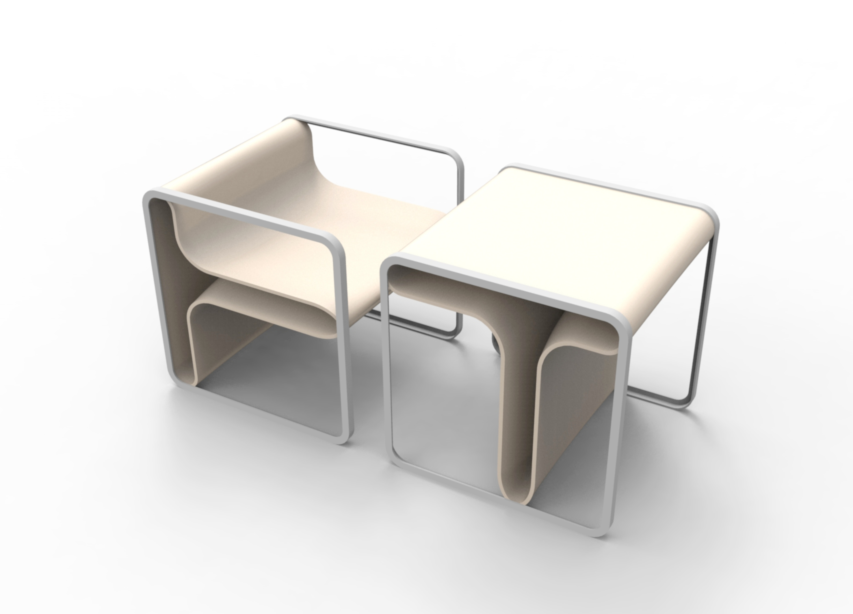
The Sharp Reco Furniture
POSCO E&C
Korea
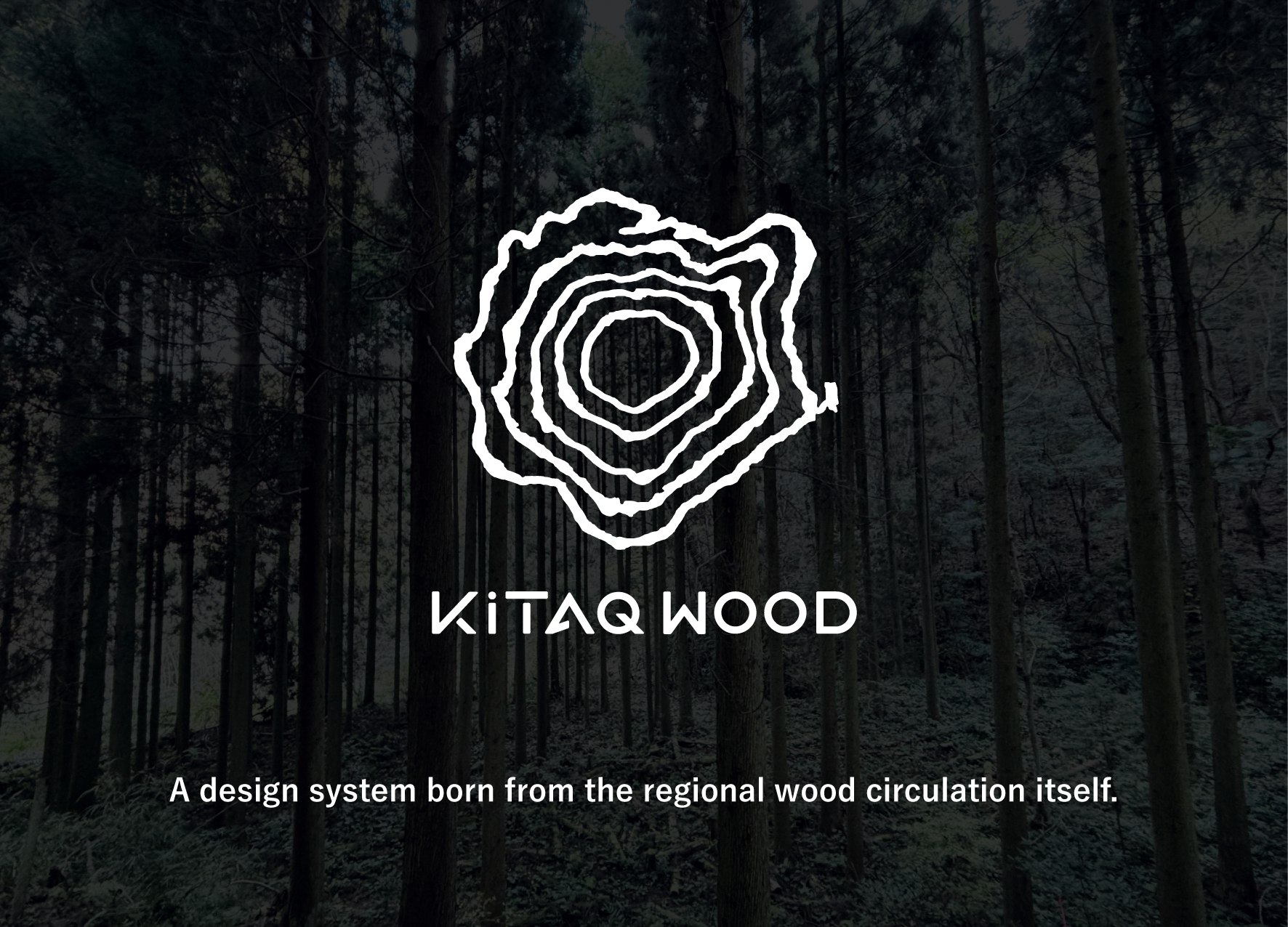
KiTAQ WOOD
okazaki design Co., Ltd.
Japan
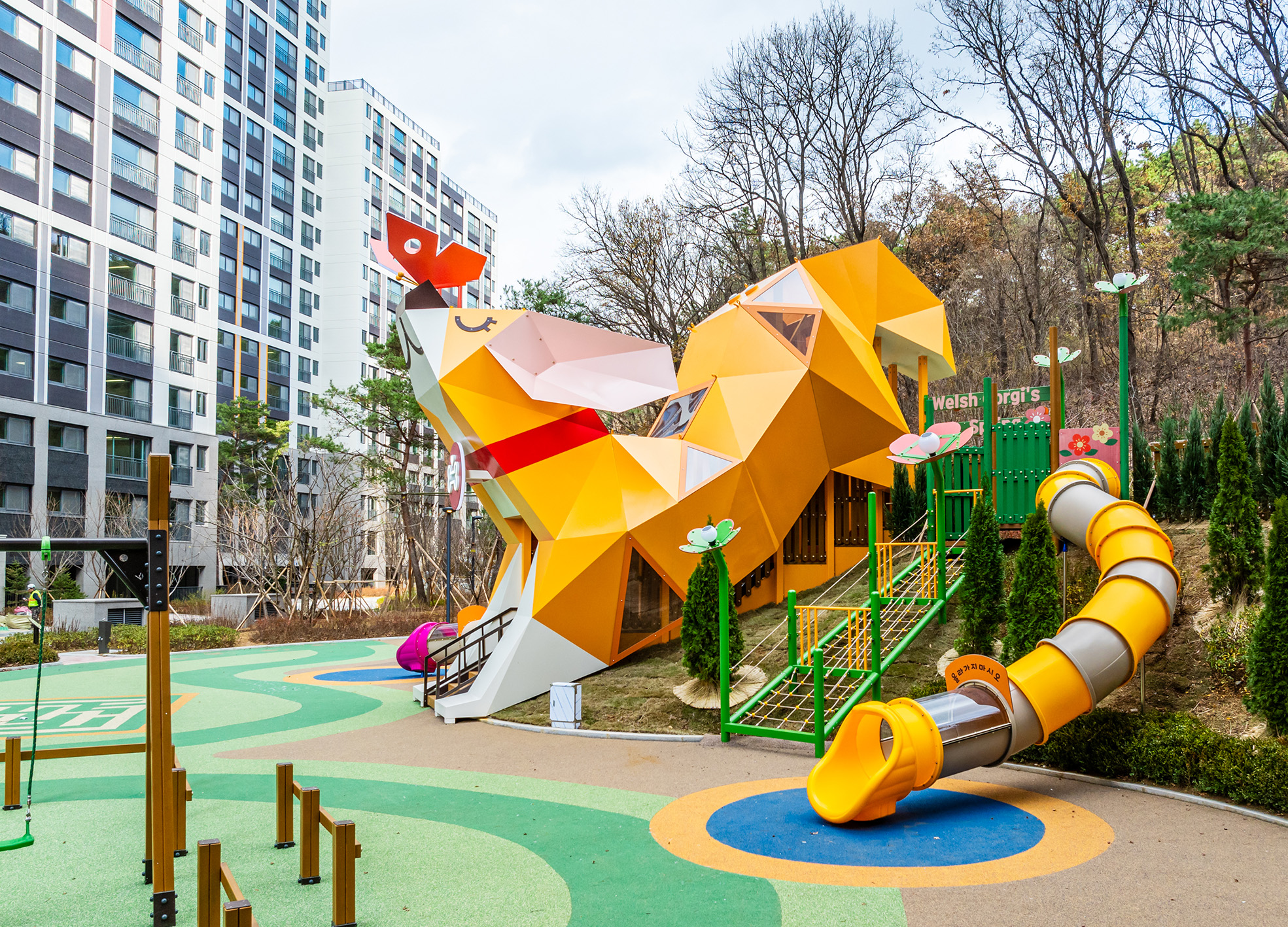
Welsh Corgis Spring Playground
HYUNDAI E&C Corp.
Korea
Atelier
hdec Co., Ltd.
Korea
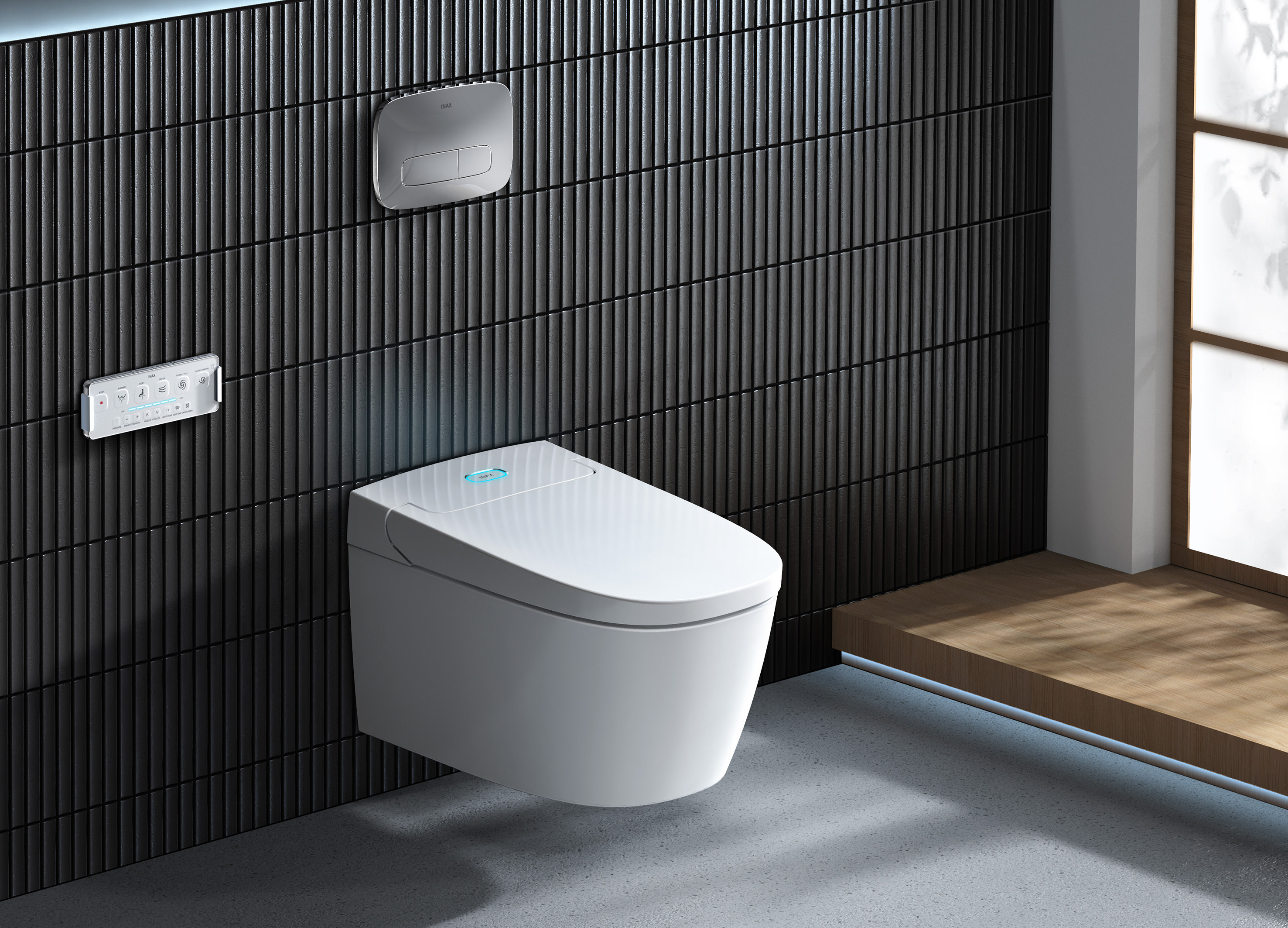
SARAS Wall Hung Shower Toilet
INAX
Singapore
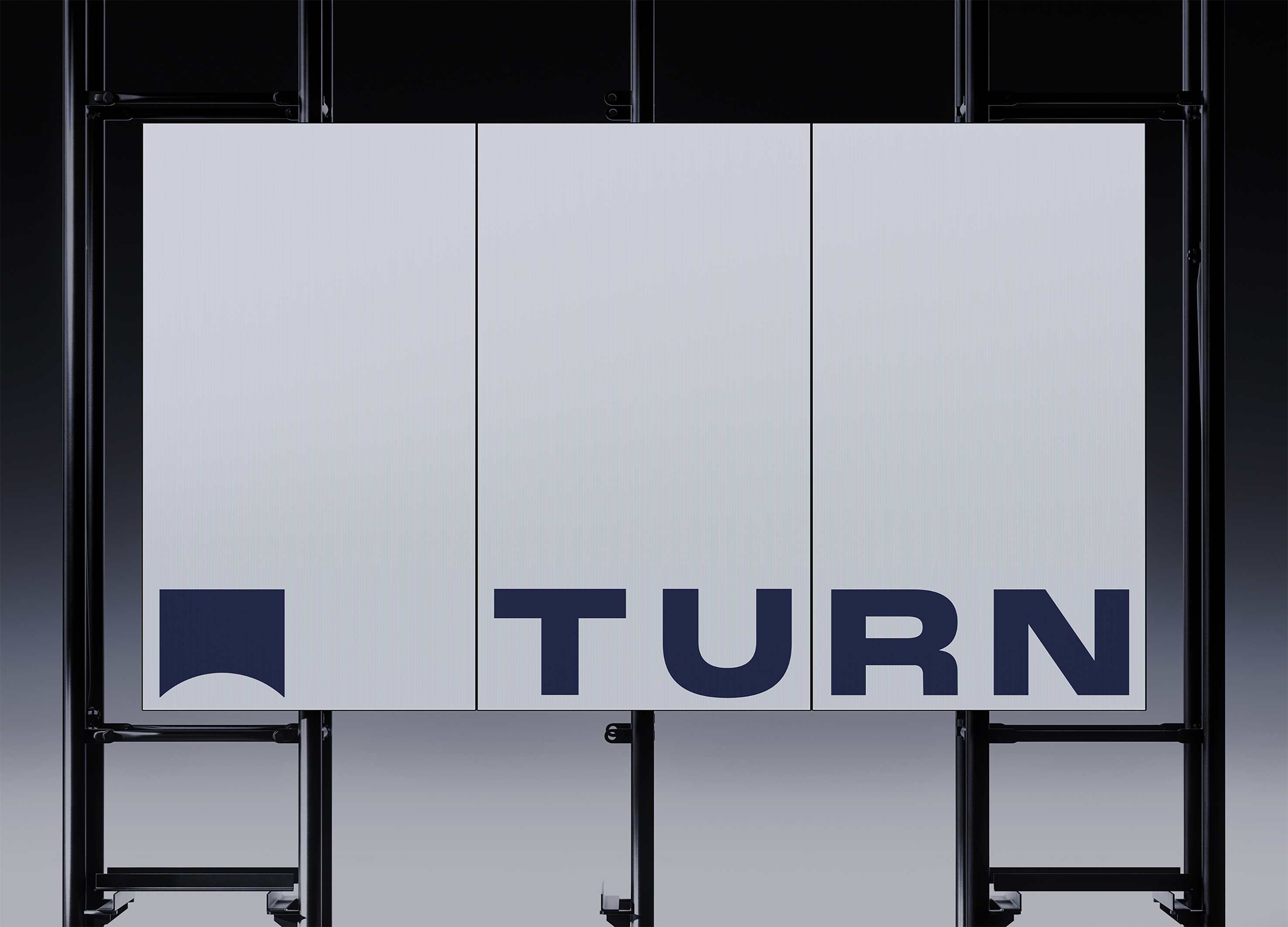
TURN
tedo Inc.
Korea
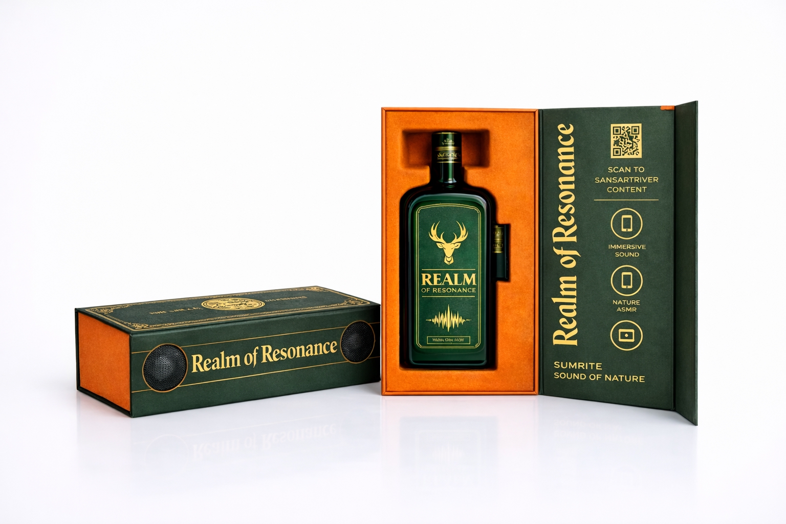
Realm of Resonance
PARCO PACIFIC Co., Ltd.
Taiwan
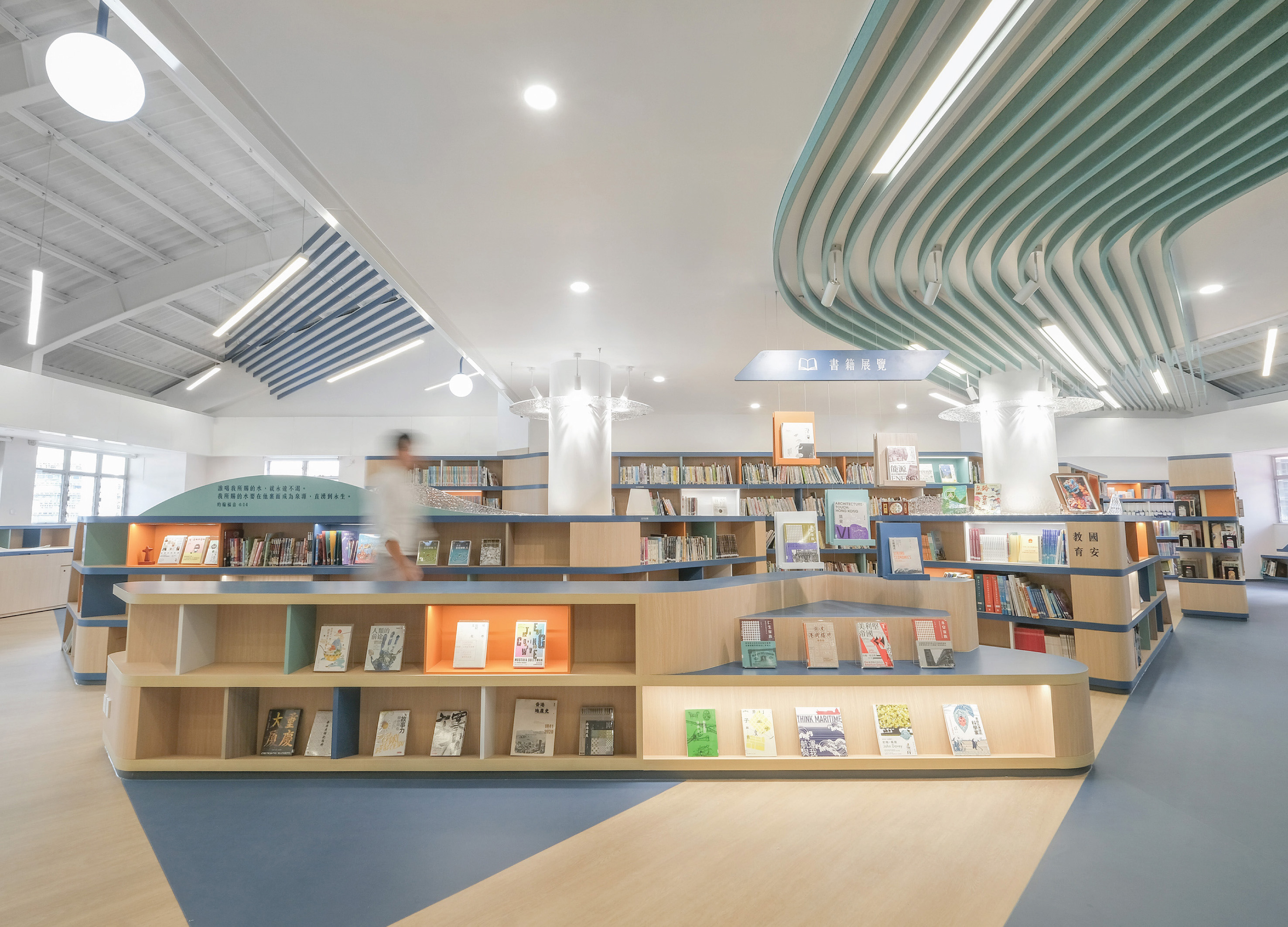
The Confluence Library
Design Action
China Hong Kong
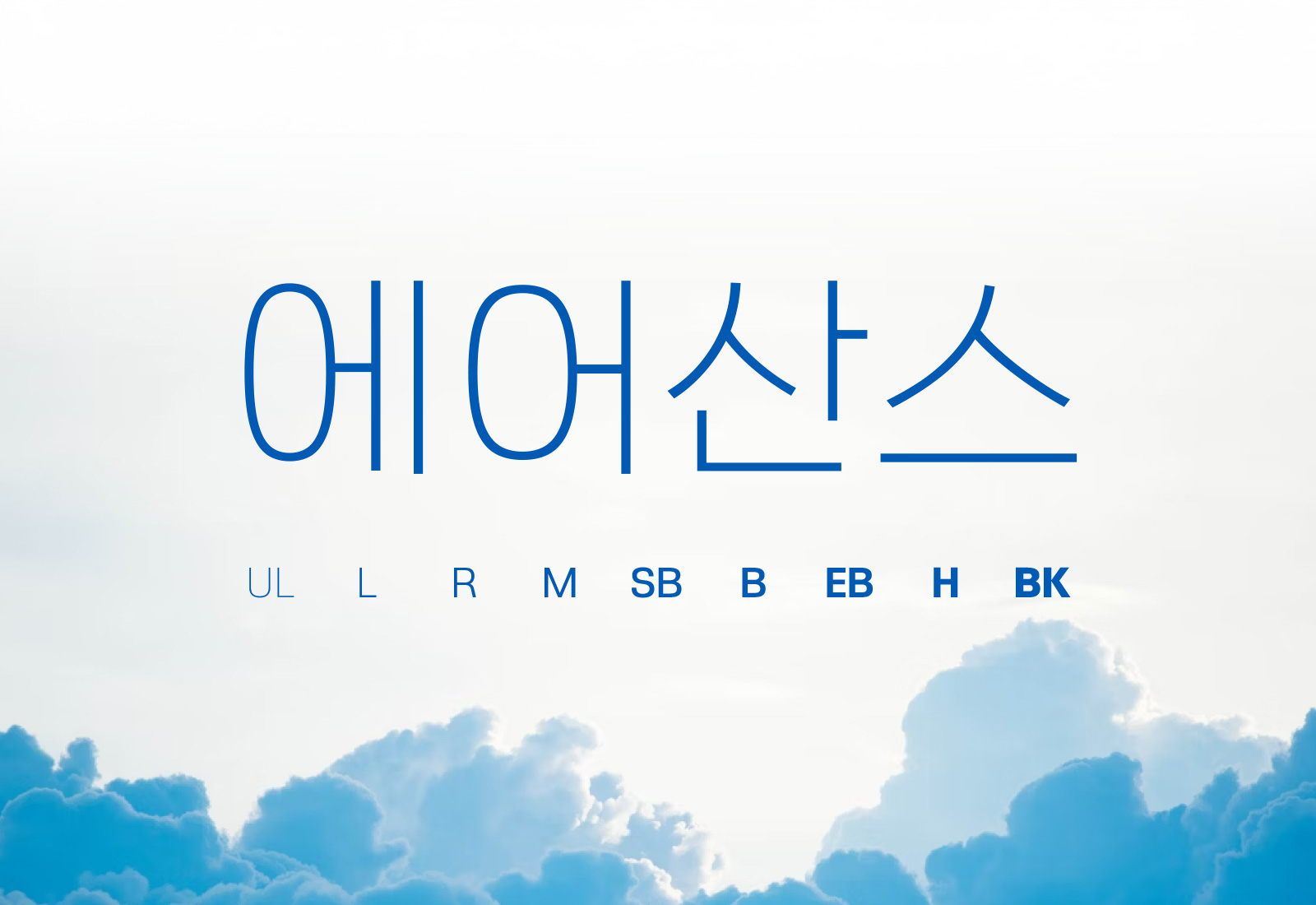
Rix AirSans
RixFont Co., Ltd.
Korea
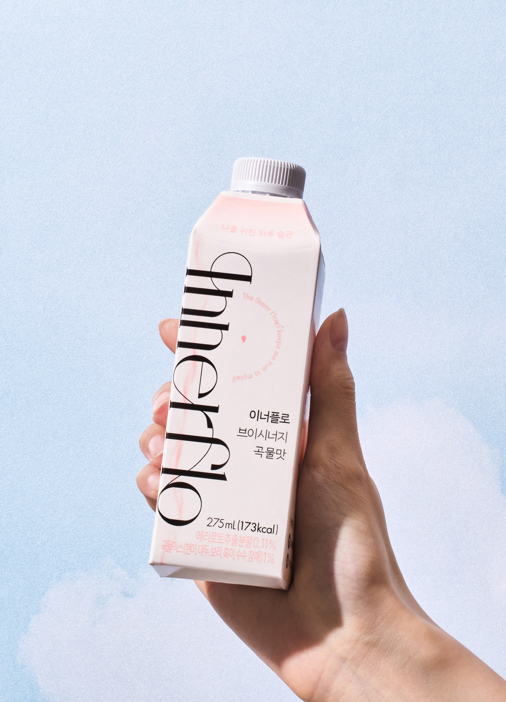
Innerflo
Thegrove Co., Ltd.
Korea


Partner & Sponsor
More


info@asiadesignprize.com
#14057, 905 49, Beolmal-ro 102beon-gil,
Dongan-gu, Anyang-si, Gyeonggi-do, Korea
#14057, 905 49, Beolmal-ro 102beon-gil,
Dongan-gu, Anyang-si, Gyeonggi-do, Korea
Founder: Doyoung Kim
Business Registration Number: 454-86-01044
Online Sales License No.: 2021-Anyang Dongan-1081
Copyright © DESIGNSORI Co., Ltd.
Business Registration Number: 454-86-01044
Online Sales License No.: 2021-Anyang Dongan-1081
Copyright © DESIGNSORI Co., Ltd.
