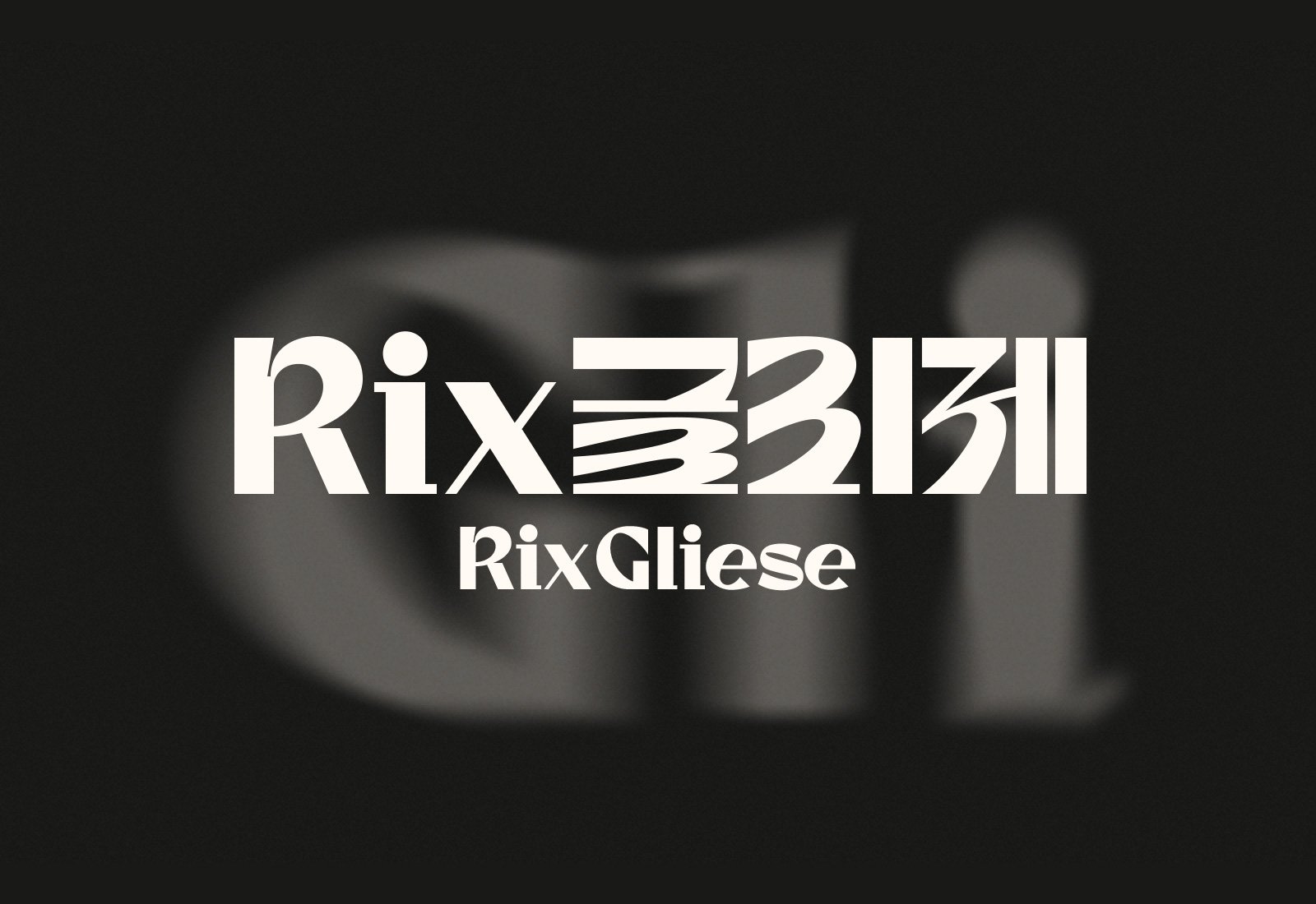
Rix Gliese
Communication
Regions
Korea
Year
2026
Award
WINNER
Affiliation
RixFont Co., Ltd.
Designer
Hyunju Yu
English
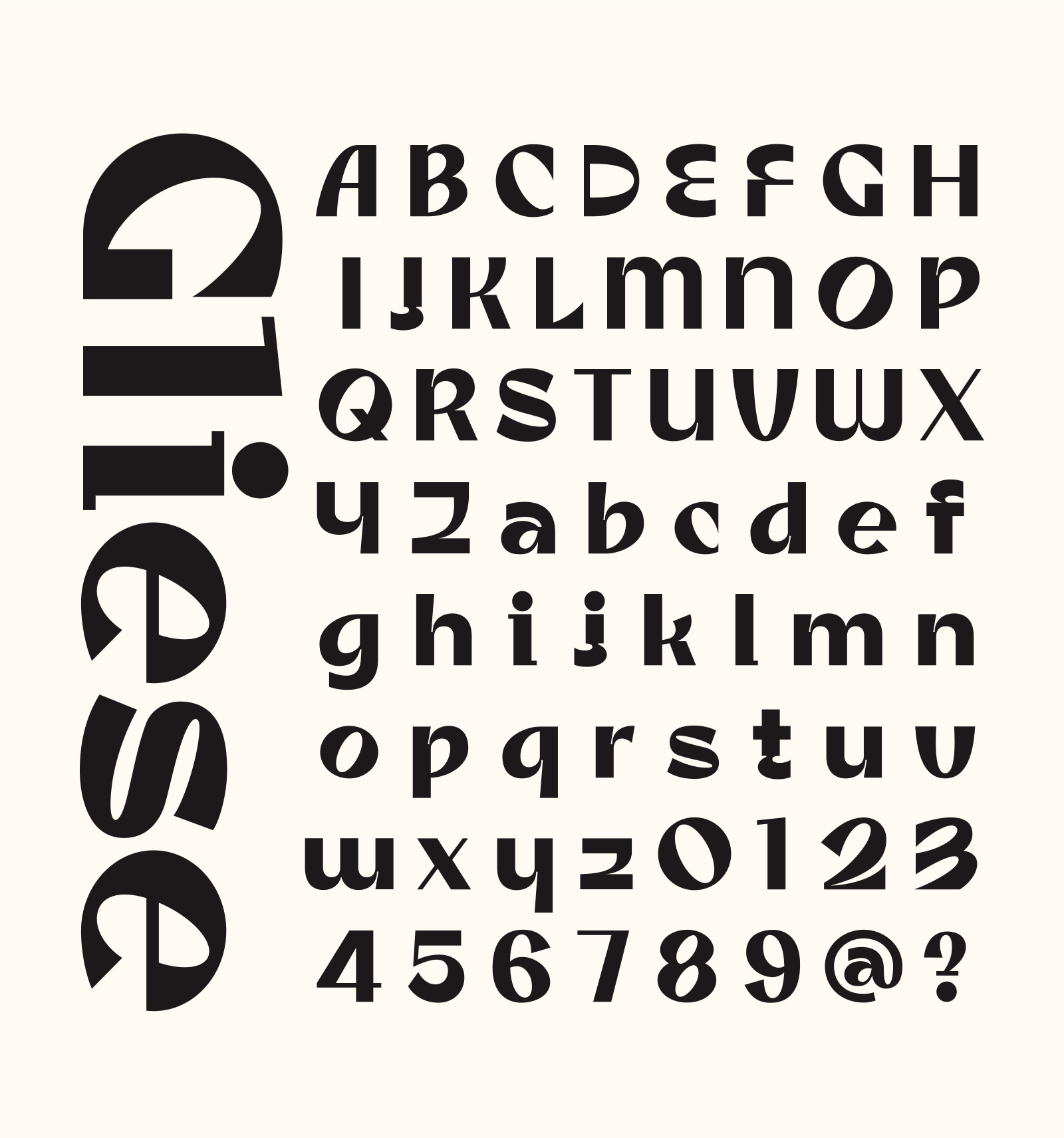
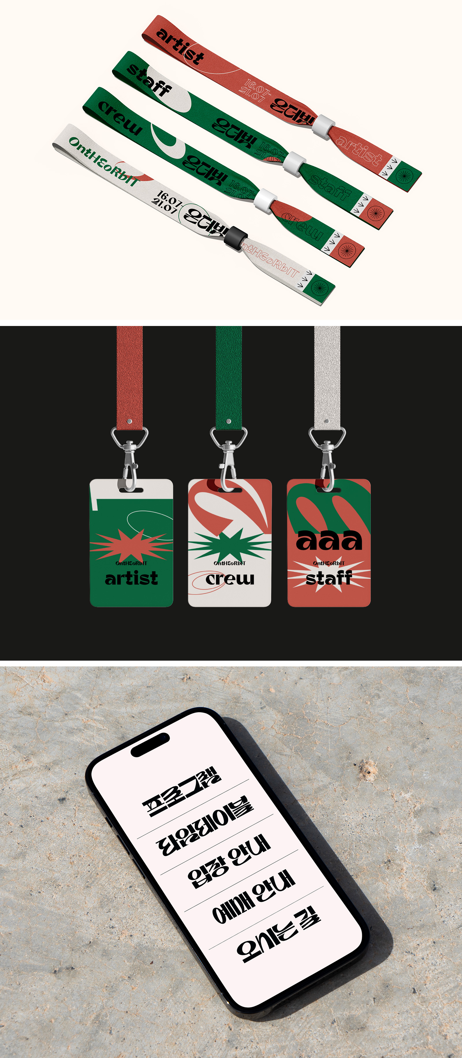
Rix Gliese is a display typeface inspired by starlight and meteor trails, blending fluid curves with bold linear contrast for a rhythmic visual character. Its concept captures the energy of extending lines and the sweep of curves, allowing each glyph to act as a sculptural form. Key consonants feature a “3-shaped” curve that unifies the rhythm, while forms shift between initial and final positions for expressive variation. With strong contrast and distinctive proportions in both Korean and Latin sets, the typeface delivers impact for titles, campaigns, packaging, and event identities, functioning not just as text but as a graphic element.
Native
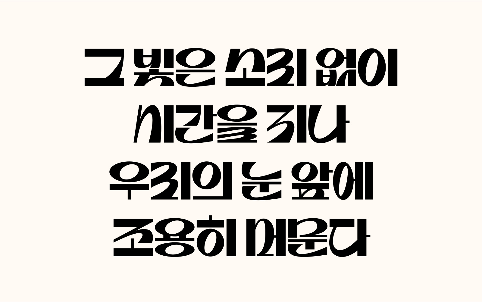
Rix글리제는 별빛의 흐름과 유성의 궤적에서 영감을 받아, 유연한 곡선과 강렬한 직선 대비로 리드미컬한 시각 경험을 구현한 제목용 서체입니다. ‘유성의 꼬리’를 모티브로 힘 있게 뻗어나가는 선과 부드럽게 휘도는 곡선을 담아 글자 자체가 조형적 오브제로 작동하도록 설계되었습니다.
특히 ㄹ·ㅌ·ㅈ 등 핵심 자소에 적용된 유려한 곡선 구조와 위치에 따라 변화하는 자소 형태는 문장에 생동감을 더합니다. 강한 획 대비와 독창적 프로포션을 통해 브랜드 타이틀이나 슬로건 등 시각적 임팩트가 필요한 곳에서 고유한 존재감을 드러내며, 텍스트를 넘어 그래픽 오브제처럼 활용될 수 있다는 점이 가장 큰 차별성입니다. 서체의 표현 가능성을 확장한 이번 작업이 강렬한 메시지를 구축하는 데 영감이 되길 기대합니다.
Website
Positive Comments


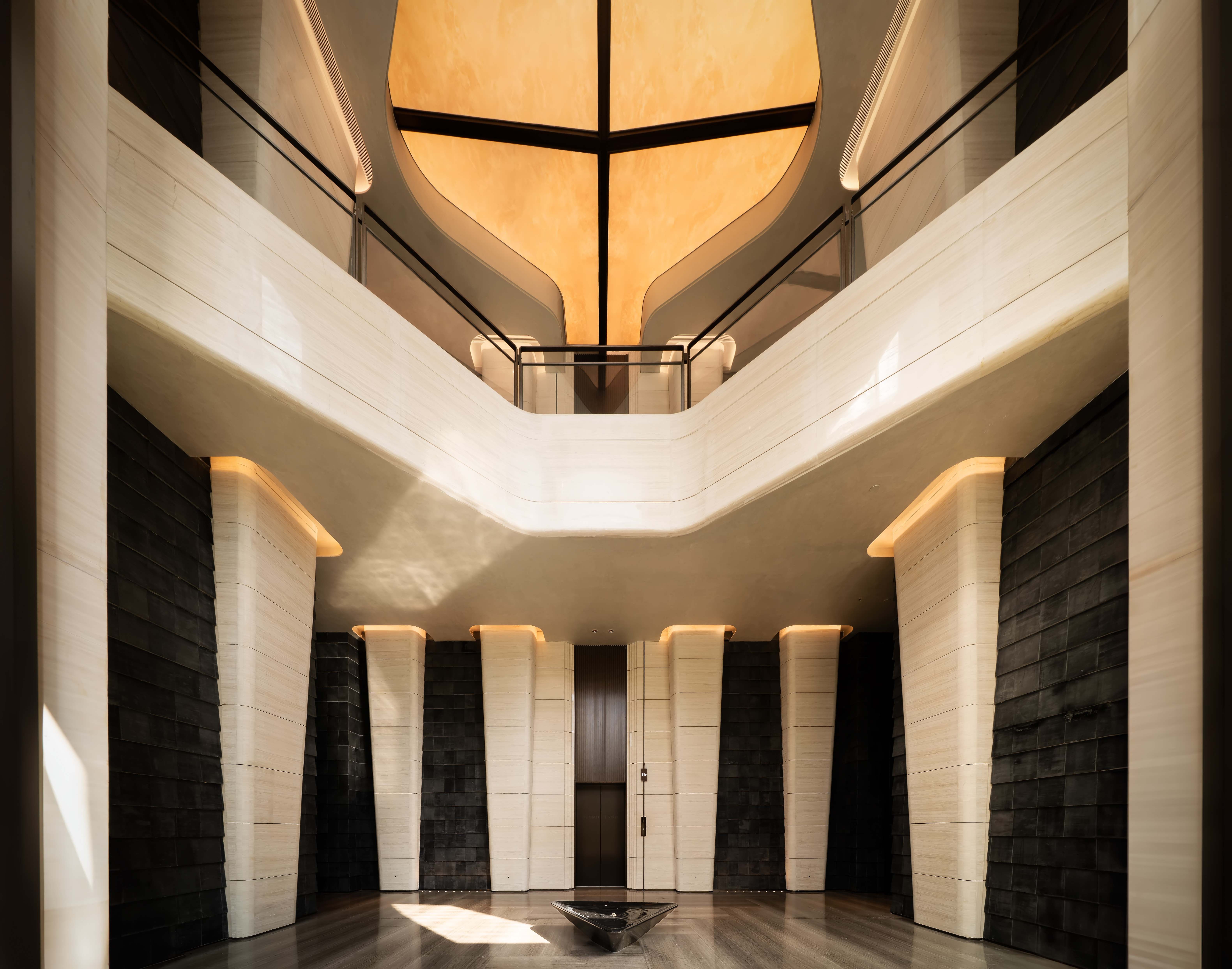
LONGFOR SUMMIT LAND EXHIBITION CENTER
Shenzhen Das Design Co., Ltd.
China
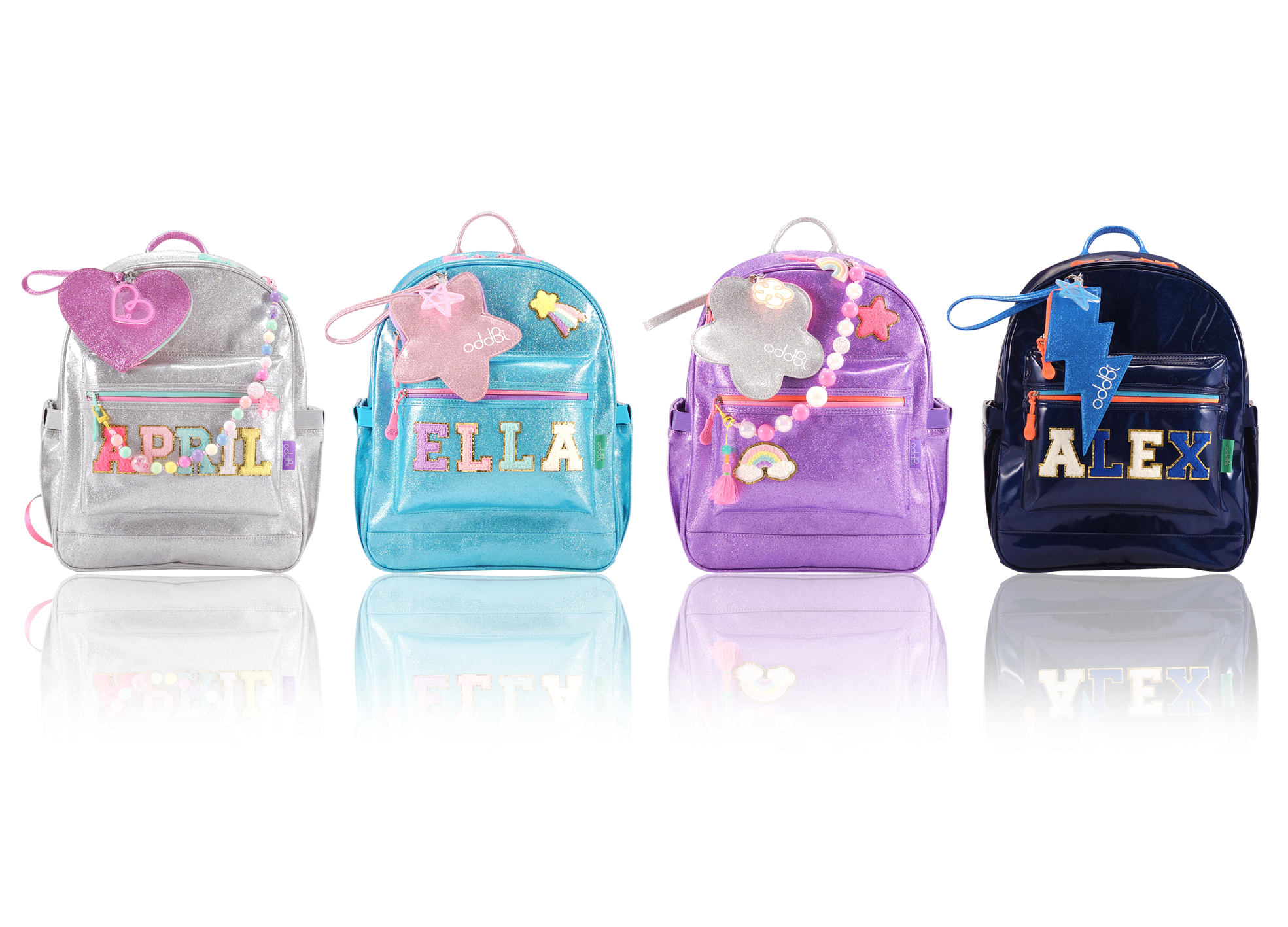
Be odd Be you Hi Me Backpack
oddBi
Korea
Rix Gliese
RixFont Co., Ltd.
Korea
STUDIO SUPERPICK Visual Branding
Channel A B&C Co., Ltd.
Korea
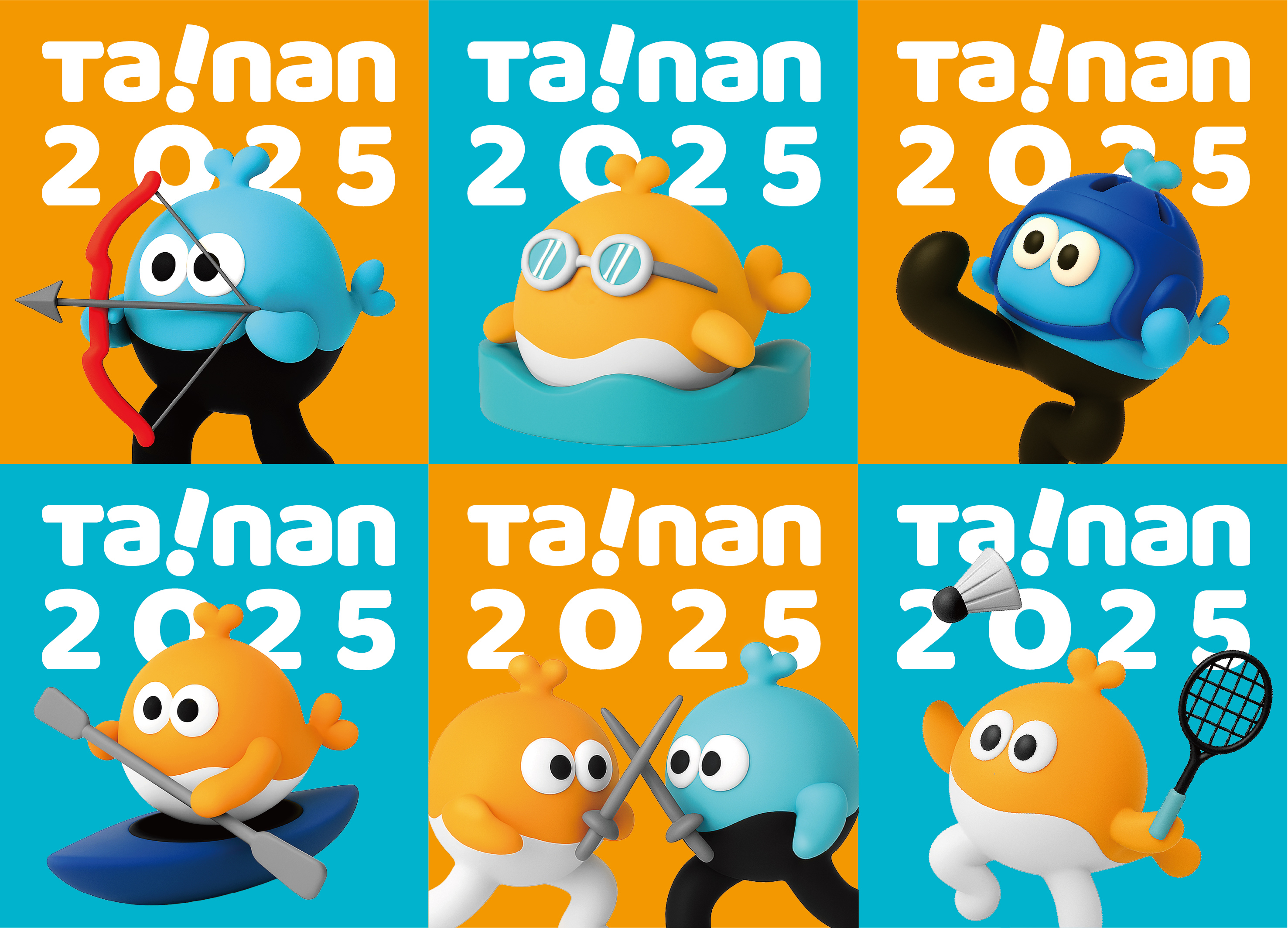
National High School Athletic in Tainan 2025
T Bridge ltd.
Taiwan
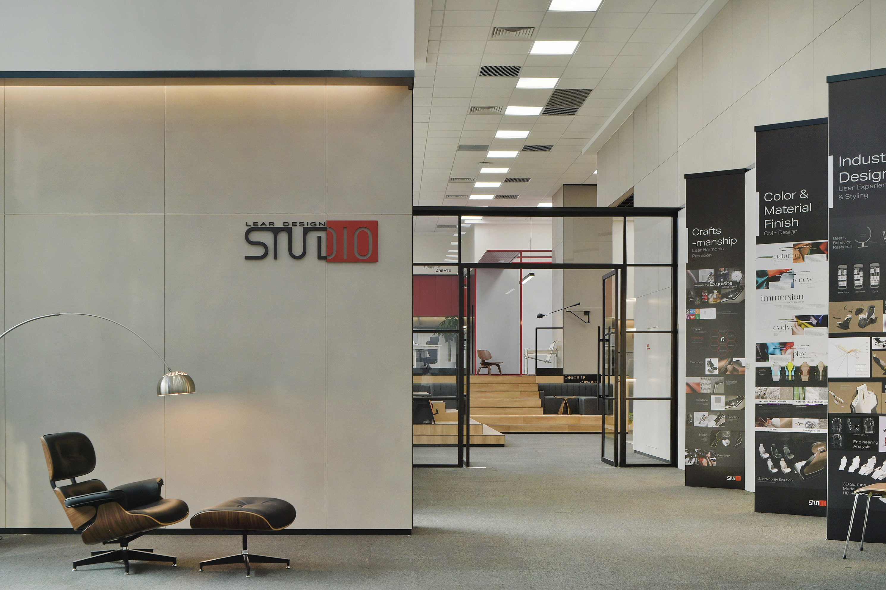
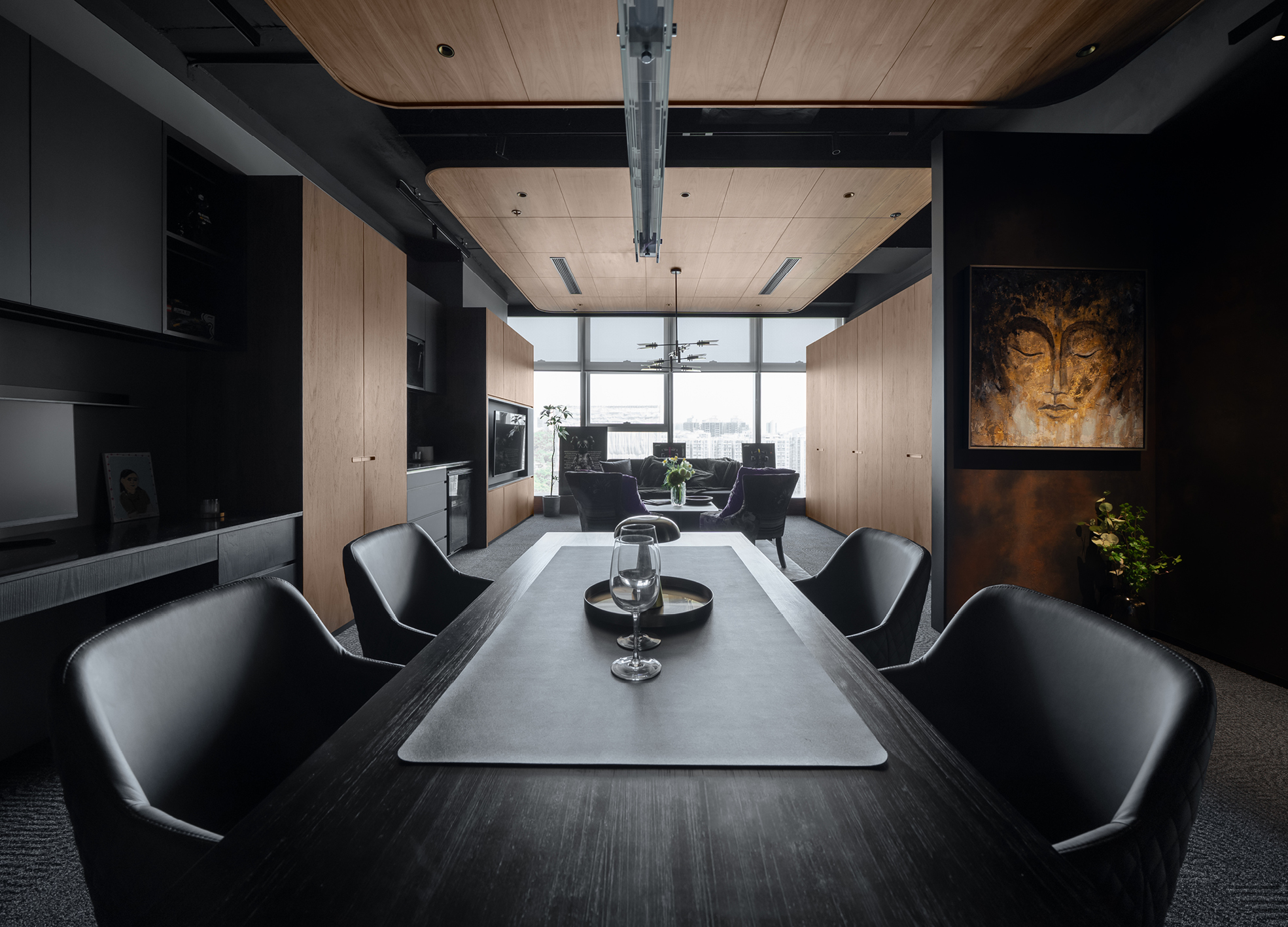
LEAR CEC R&D Center Studio Room
Shanghai Silencio Architectural Engineering Design Co., Ltd.
China
Private Hub TG
LYYH Studio
China Hong Kong
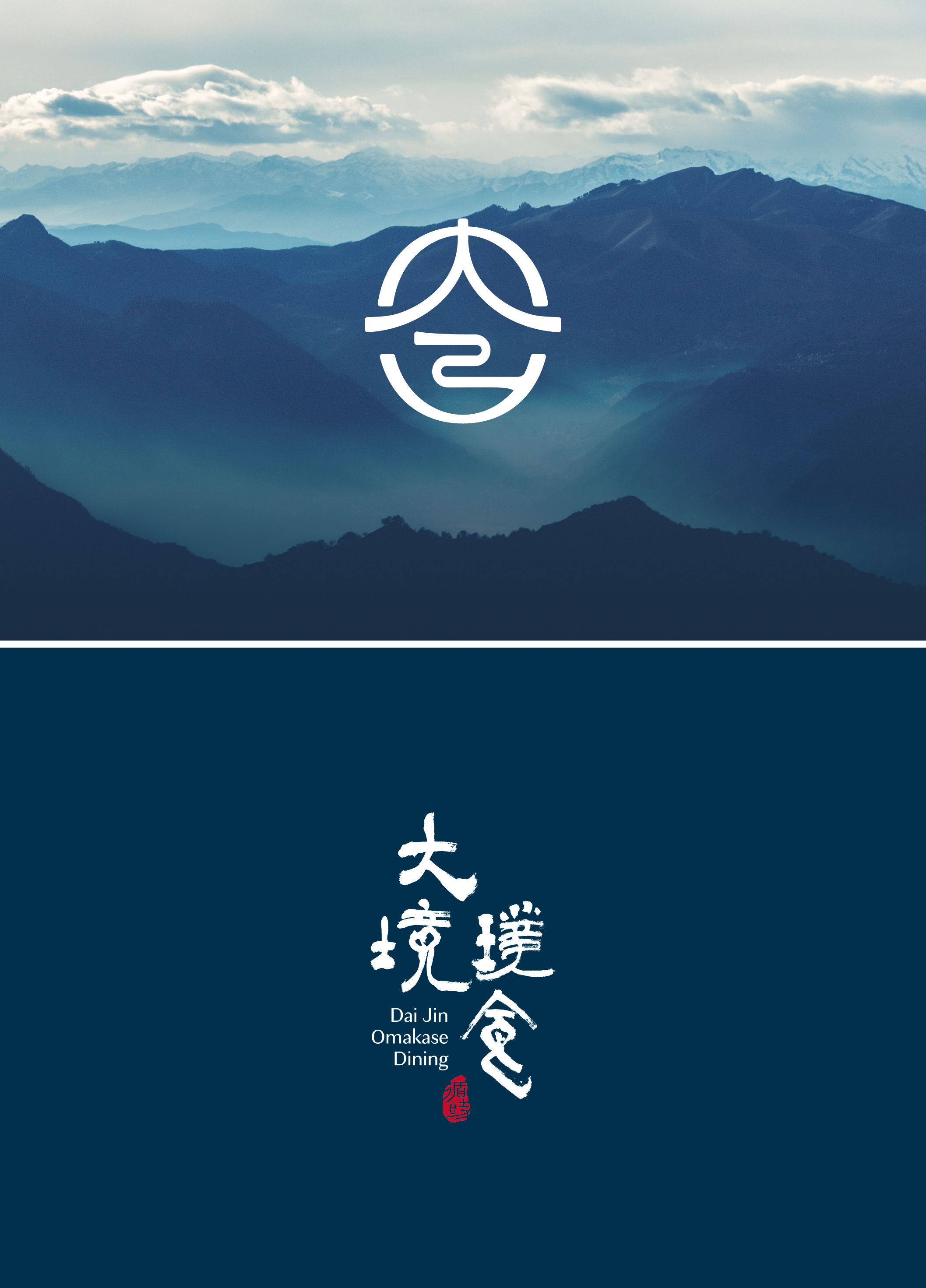
Dai Jin Omakase Brand Identity
Fengworks Design Office Co., Ltd.
Taiwan
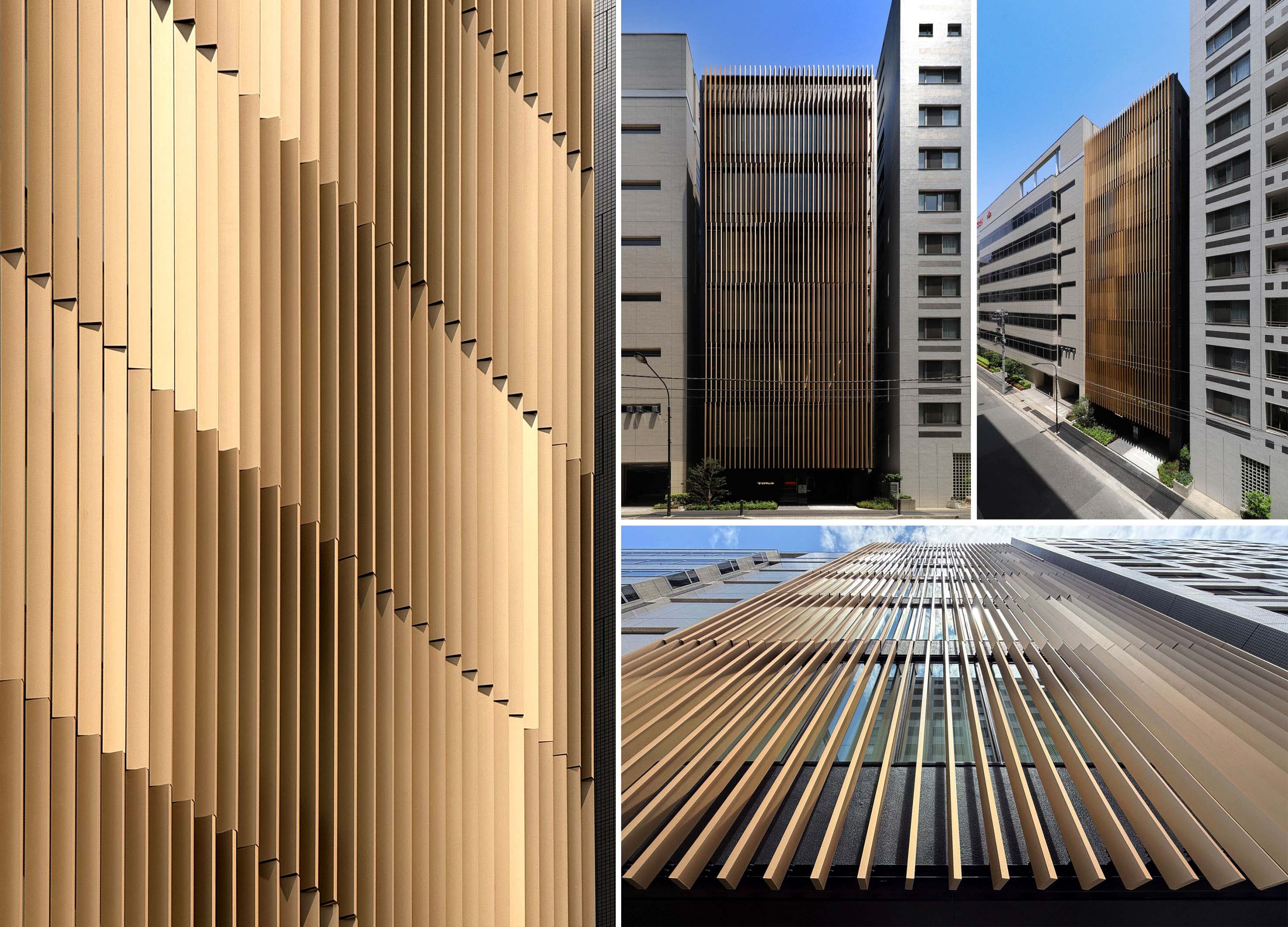
HIGETA BUILDING
MR STUDIO and Chuo Nittochi Co., Ltd.
Japan
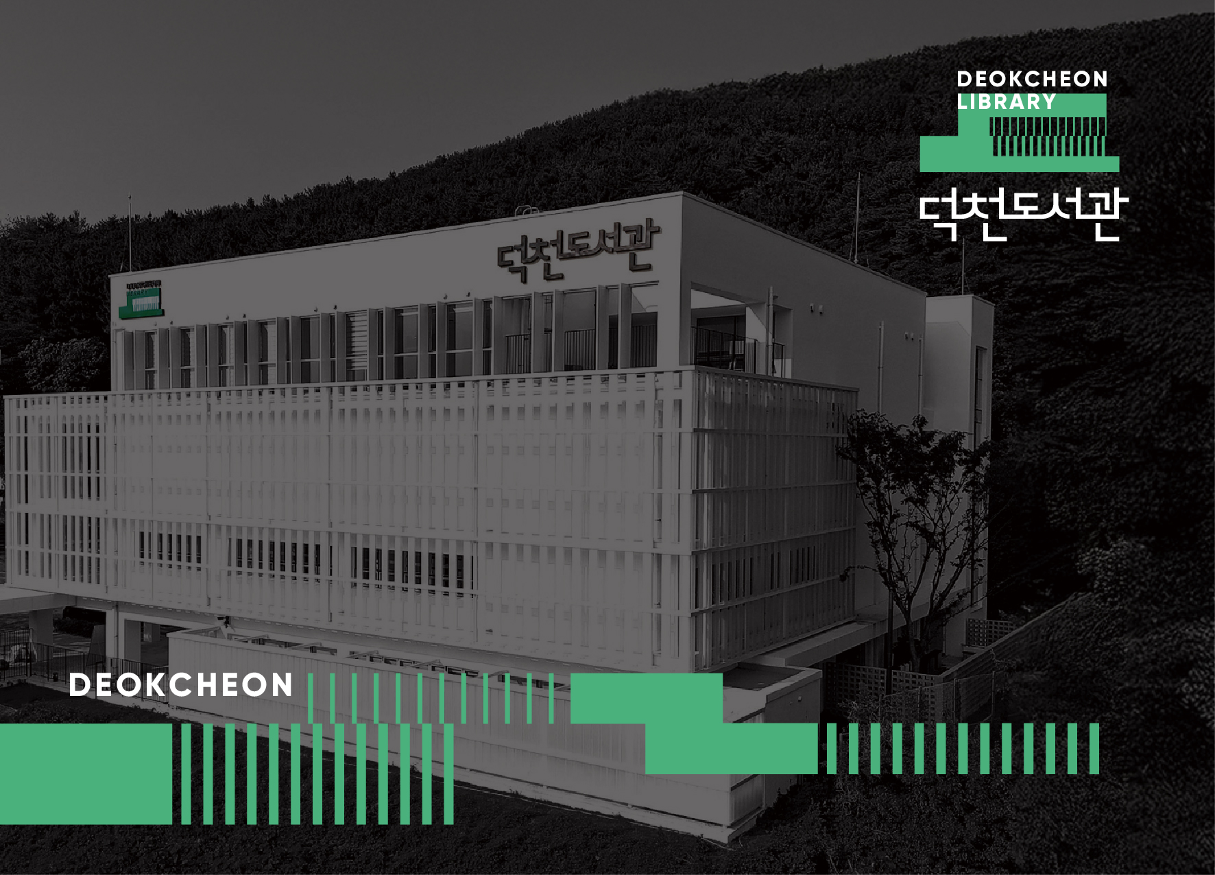
Branding Design for Deokcheon Library
DESIGN MIND PLUS Co., Ltd.
Korea
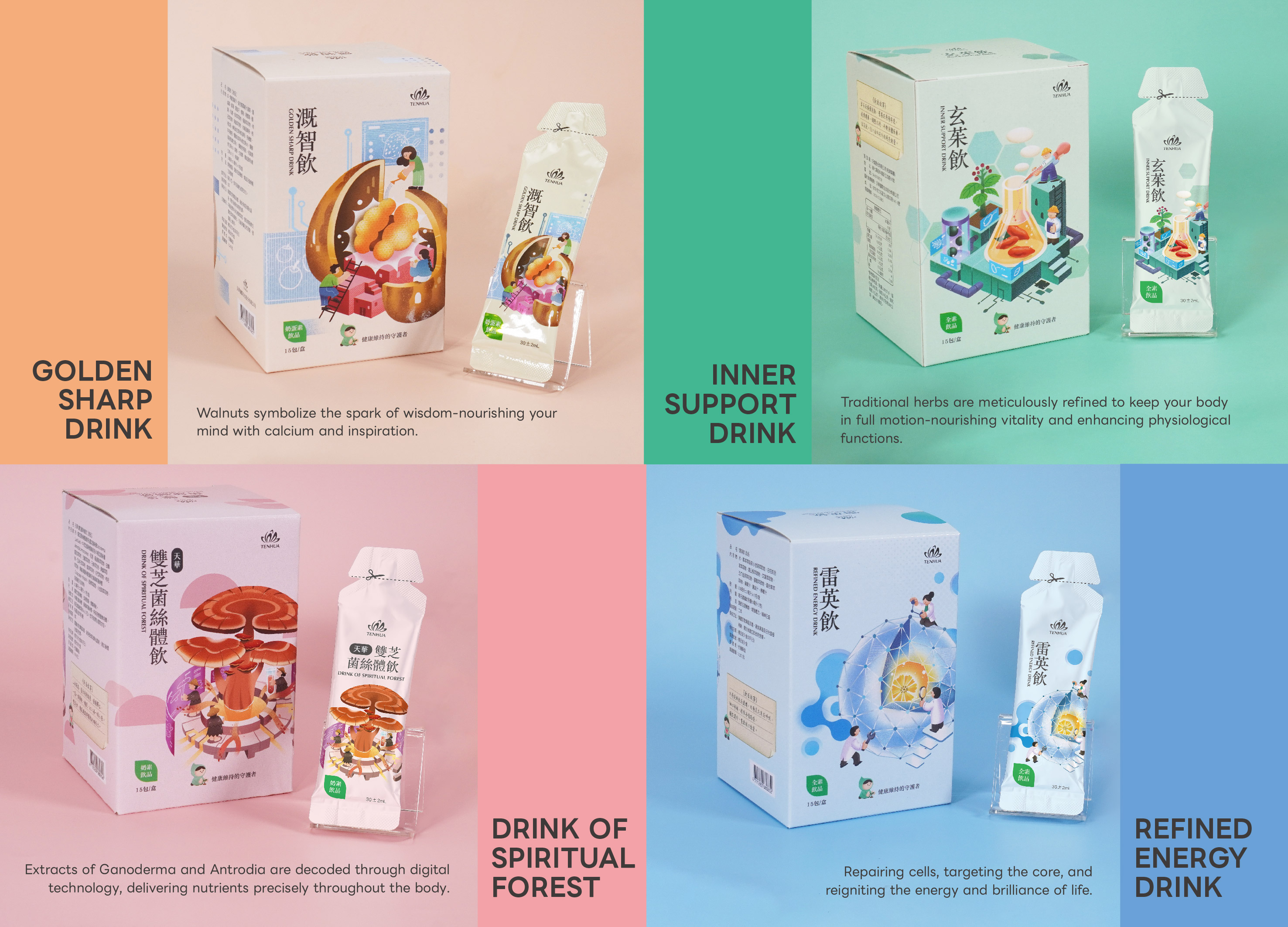
The Guardian Packaging Design Series
CHANCER DESIGN Co Ltd
Taiwan
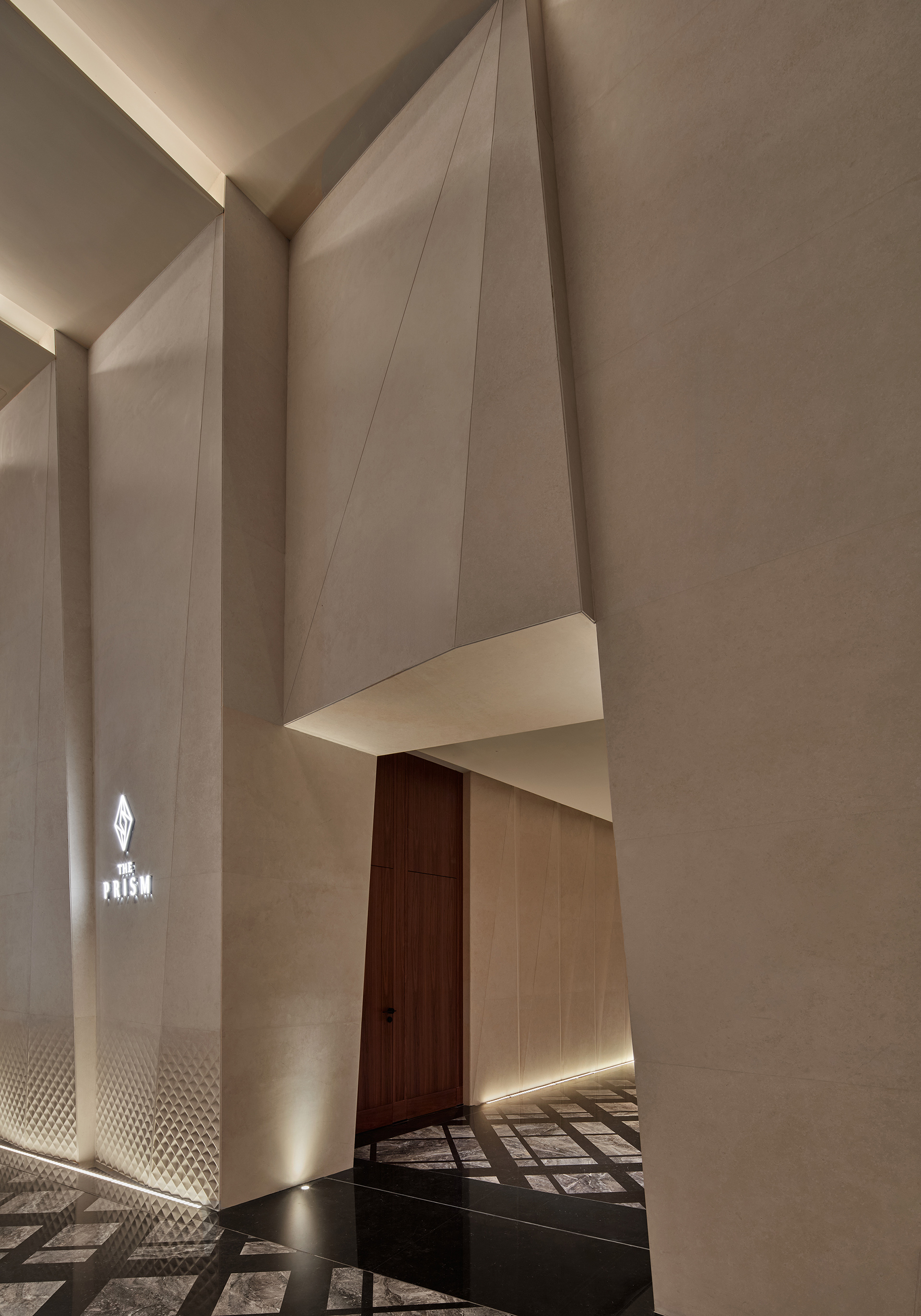
The Prism Shanghai
Dejoy International Architects
China
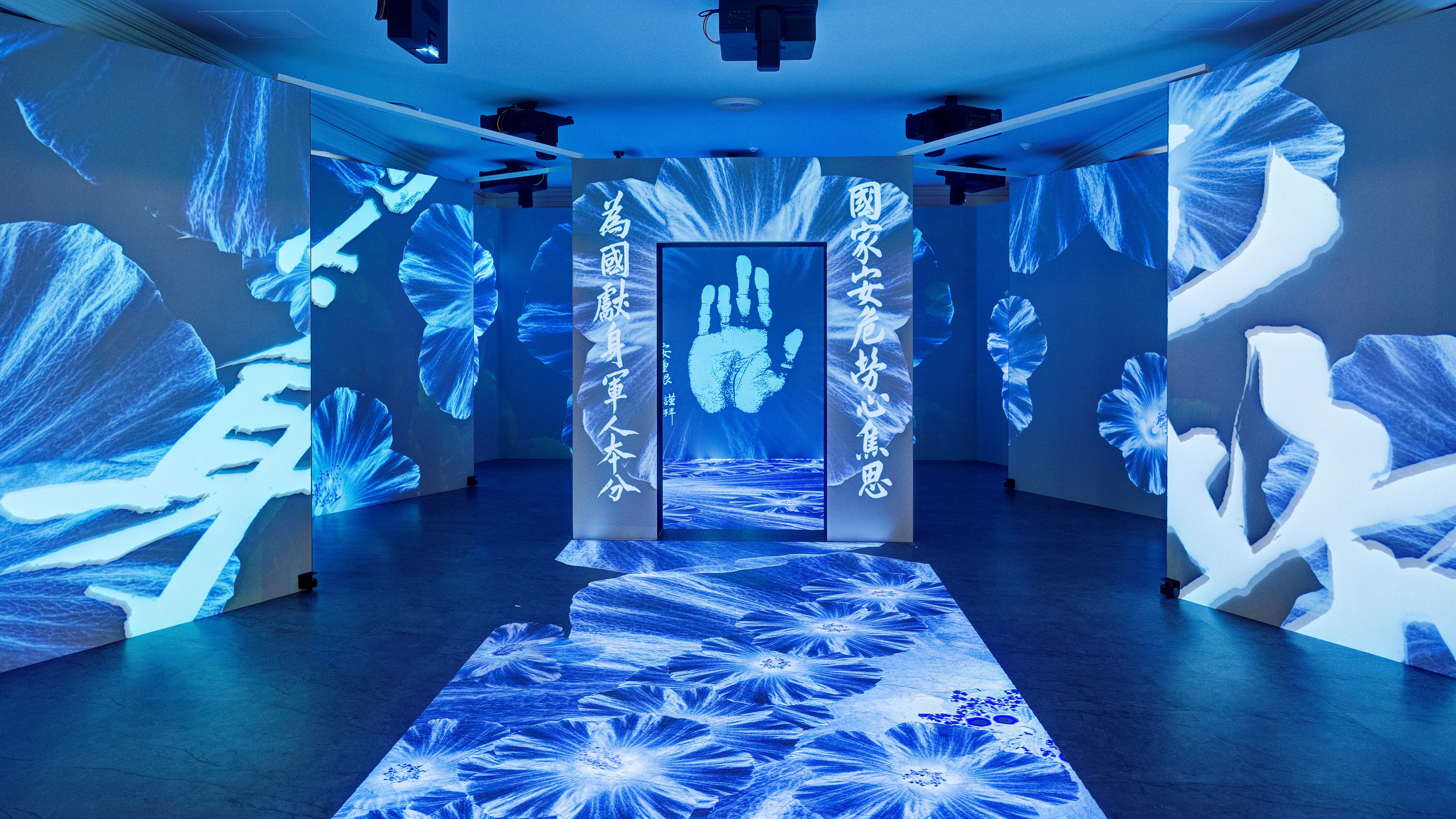
80th Anniversary of Korea Liberation exhibit
Younginspace Co., Ltd.
Korea
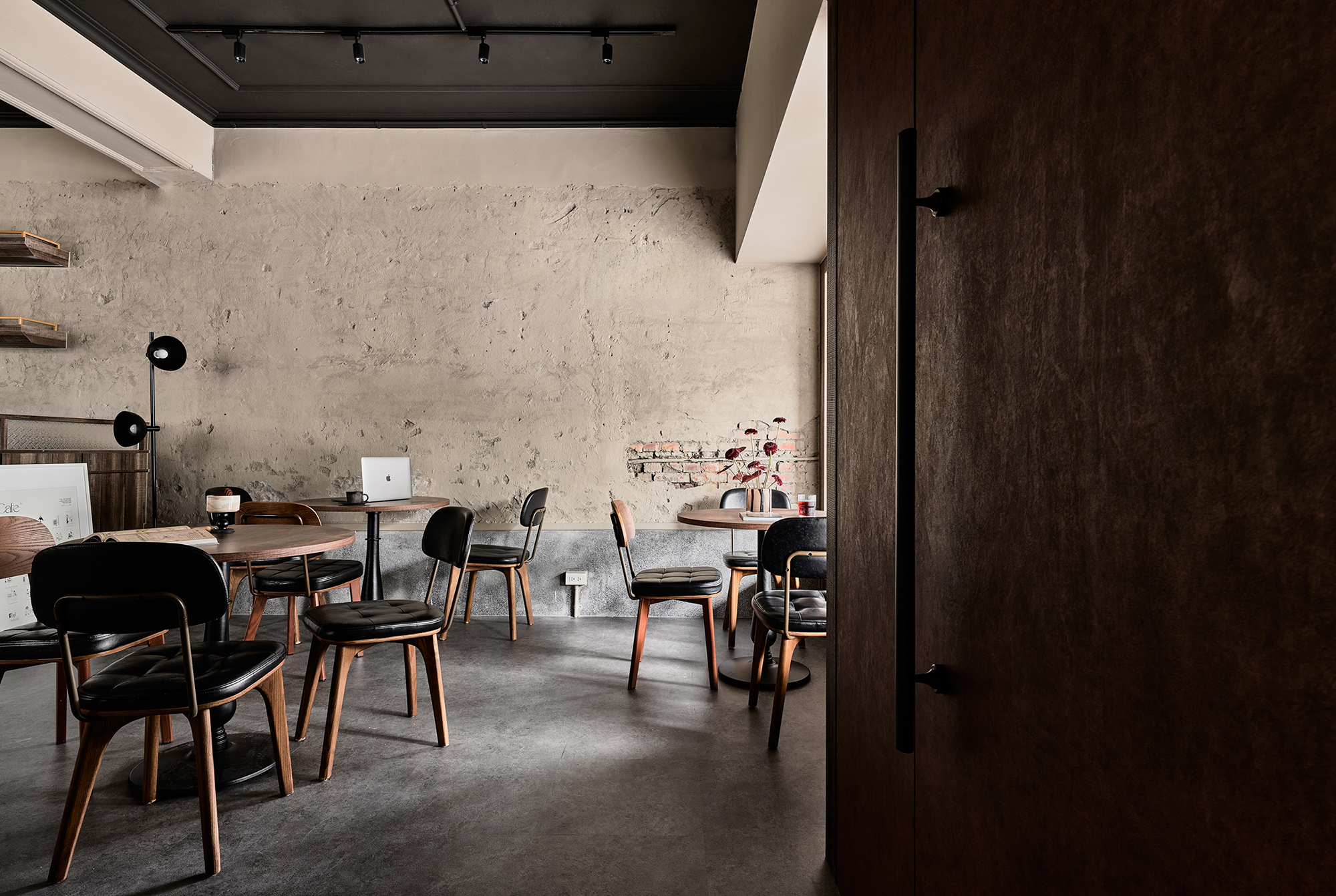
Wooden Nook Cafe
SAMMI DESIGN
Taiwan
JINCOSTECH Brand Renewal
Design Astrein & Jincostech Corp.
Korea
A Narrative in White
AD design
Chinese Taipei
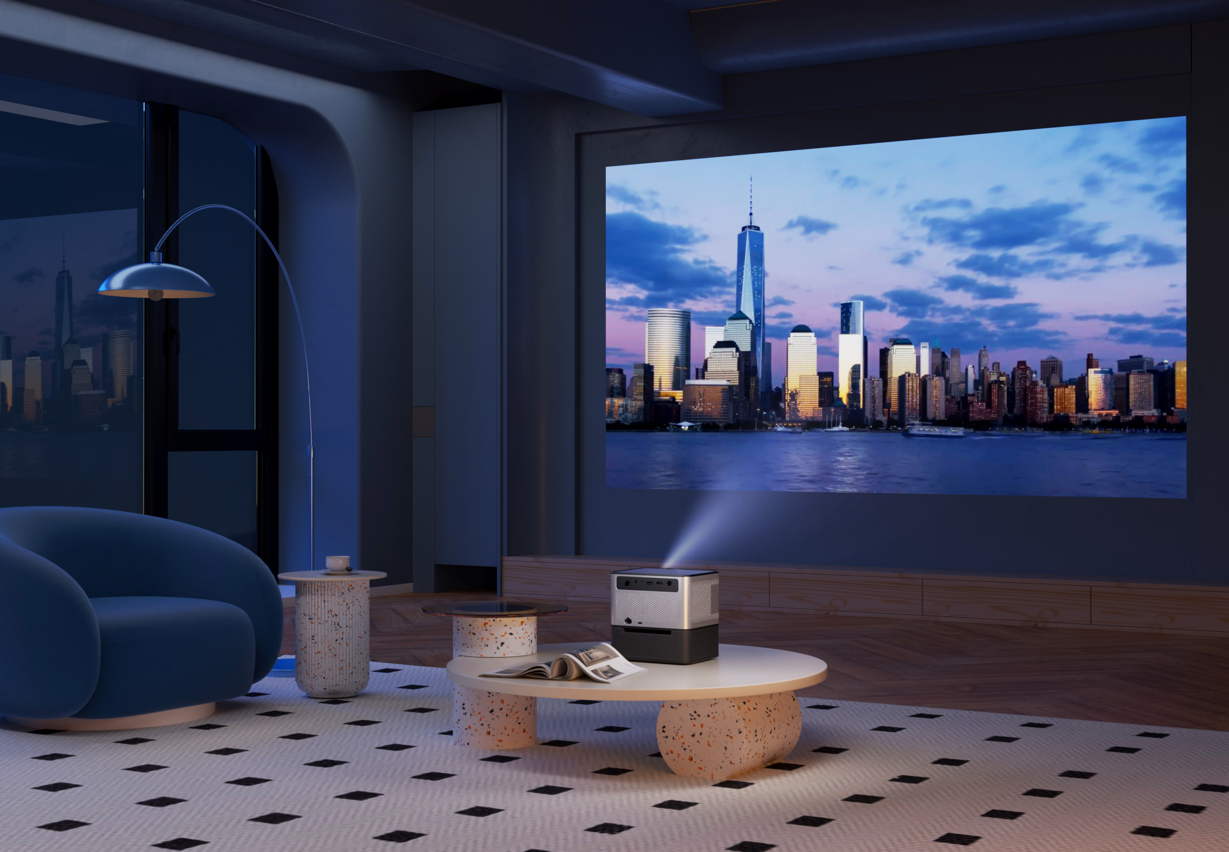
X3 MAX Projector
Shenzhen TFlRETEK Technology Co.Ltd. Co., Ltd.
China
Dwelling in Shelter
Y UN Design Co., Ltd.
Chinese Taipei


Partner & Sponsor
More


info@asiadesignprize.com
#14057, 905 49, Beolmal-ro 102beon-gil,
Dongan-gu, Anyang-si, Gyeonggi-do, Korea
#14057, 905 49, Beolmal-ro 102beon-gil,
Dongan-gu, Anyang-si, Gyeonggi-do, Korea
Founder: Doyoung Kim
Business Registration Number: 454-86-01044
Online Sales License No.: 2021-Anyang Dongan-1081
Copyright © DESIGNSORI Co., Ltd.
Business Registration Number: 454-86-01044
Online Sales License No.: 2021-Anyang Dongan-1081
Copyright © DESIGNSORI Co., Ltd.
