Miracle Cruise BI Development
Communication
Regions
Korea
Year
2026
Award
WINNER
Client
Panstar Co., Ltd.
Affiliation
Crackthenuts Co., Ltd.
Designer
CHOI HYE JEONG
https://youtu.be/jJoWX4I0as0?si=BTCgo3J3UV6slf15
English
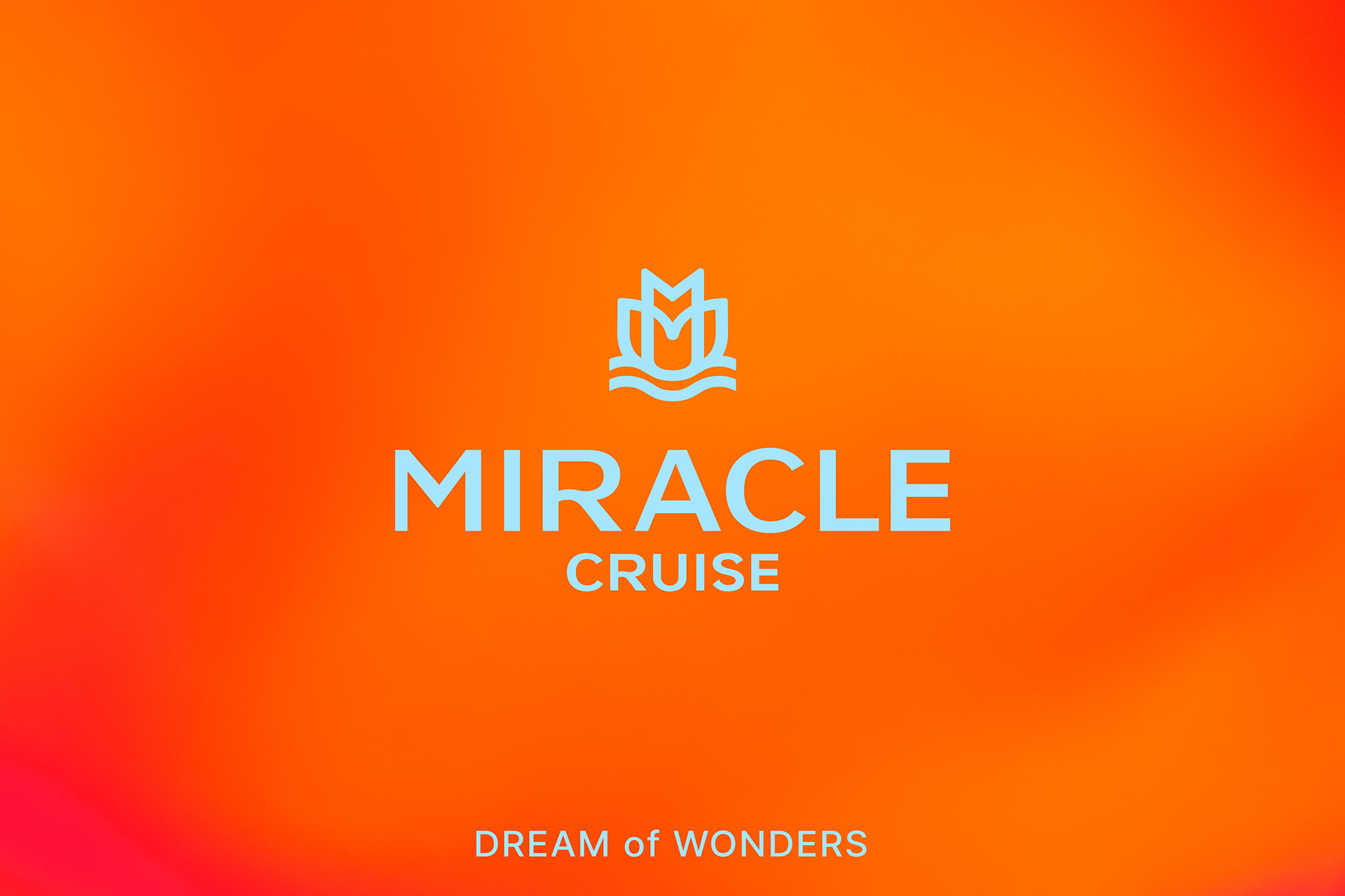
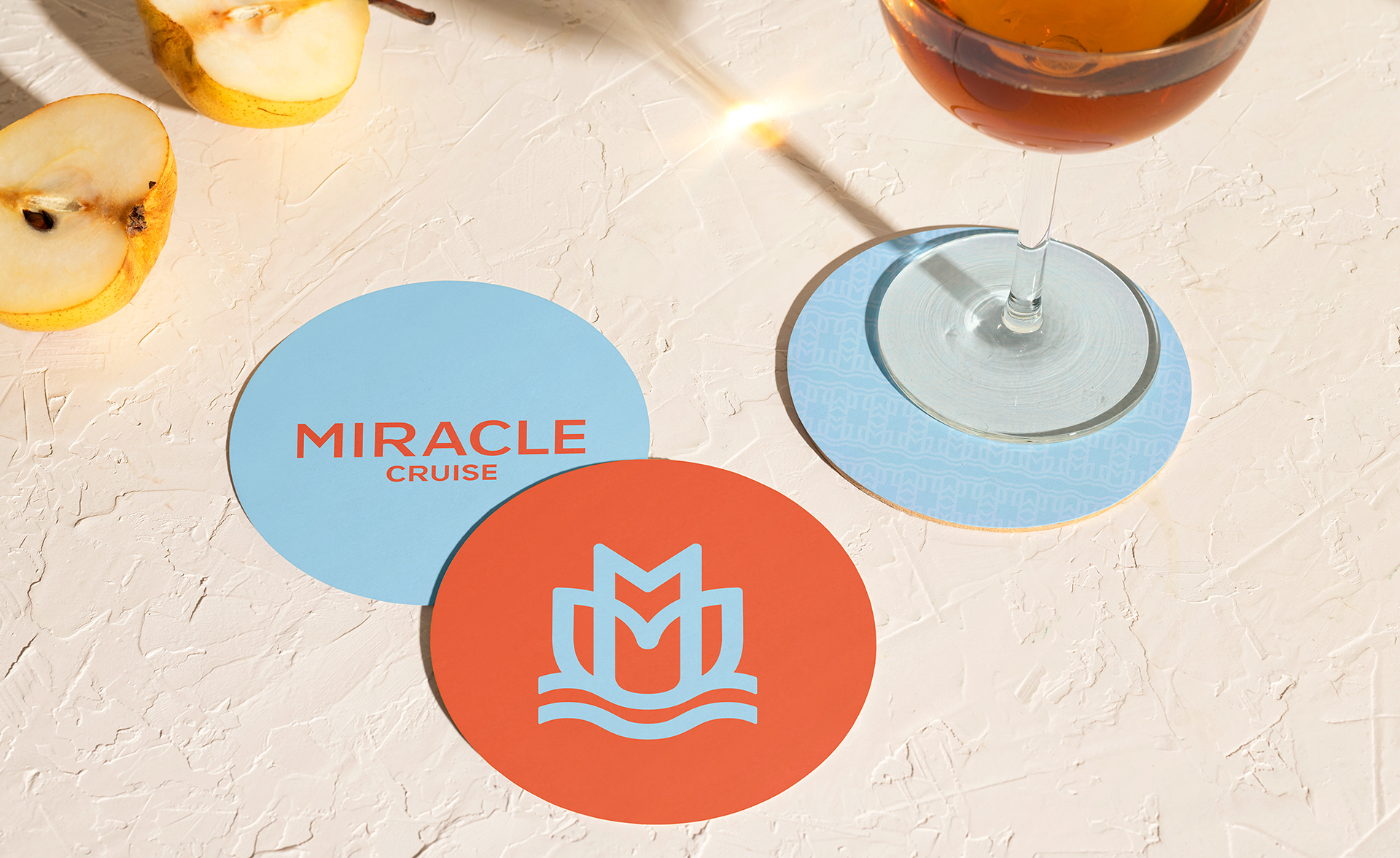
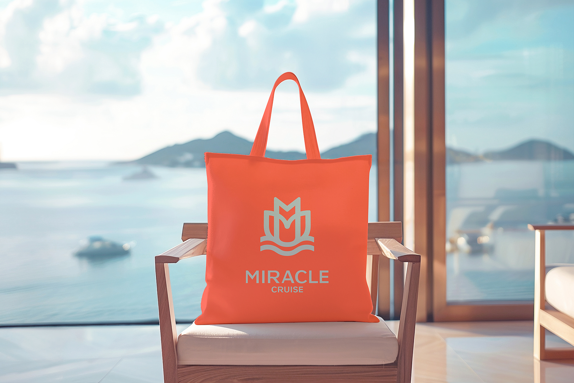
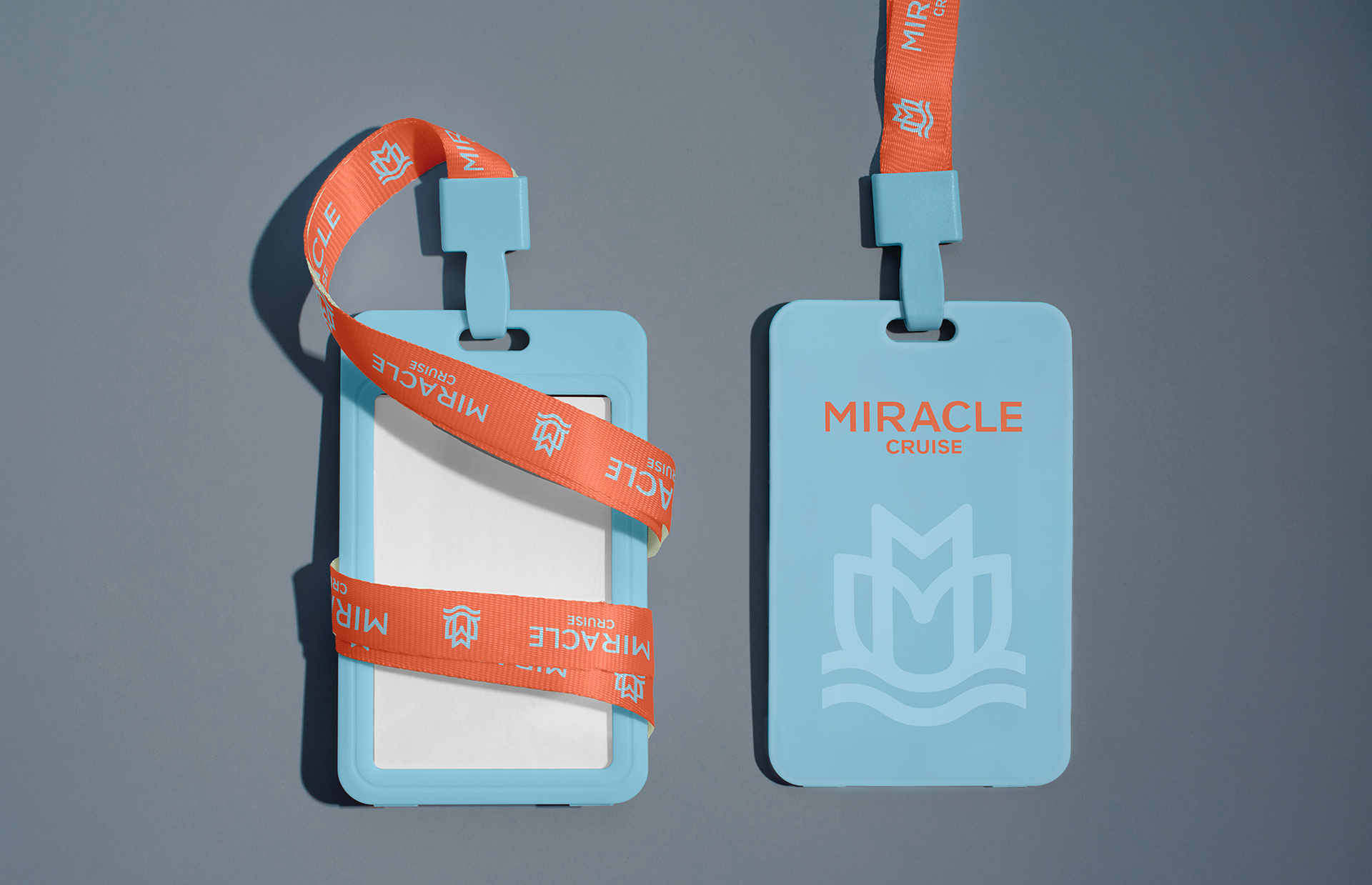
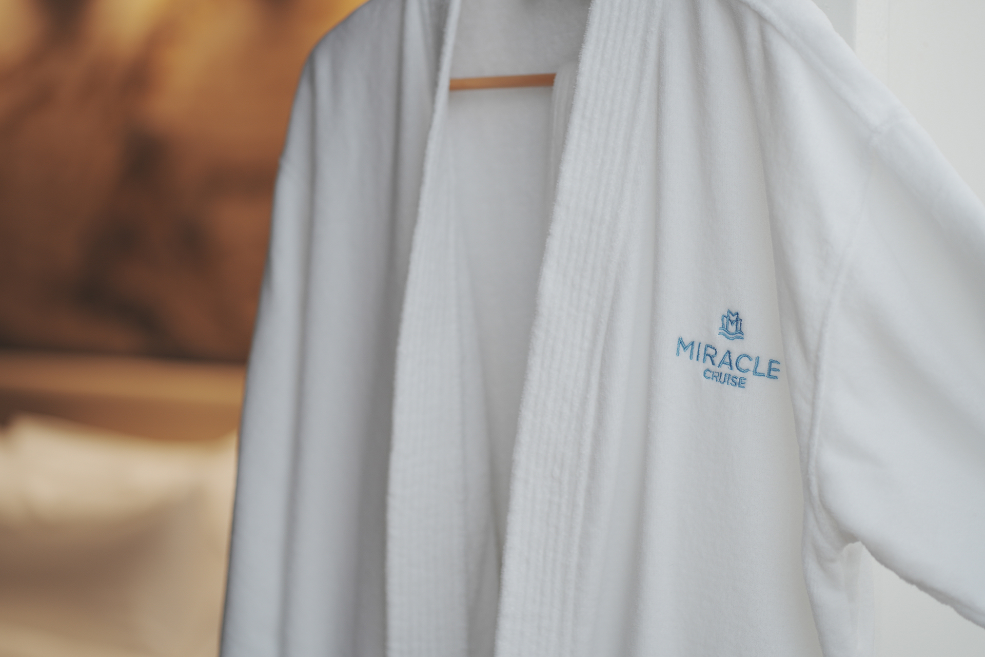
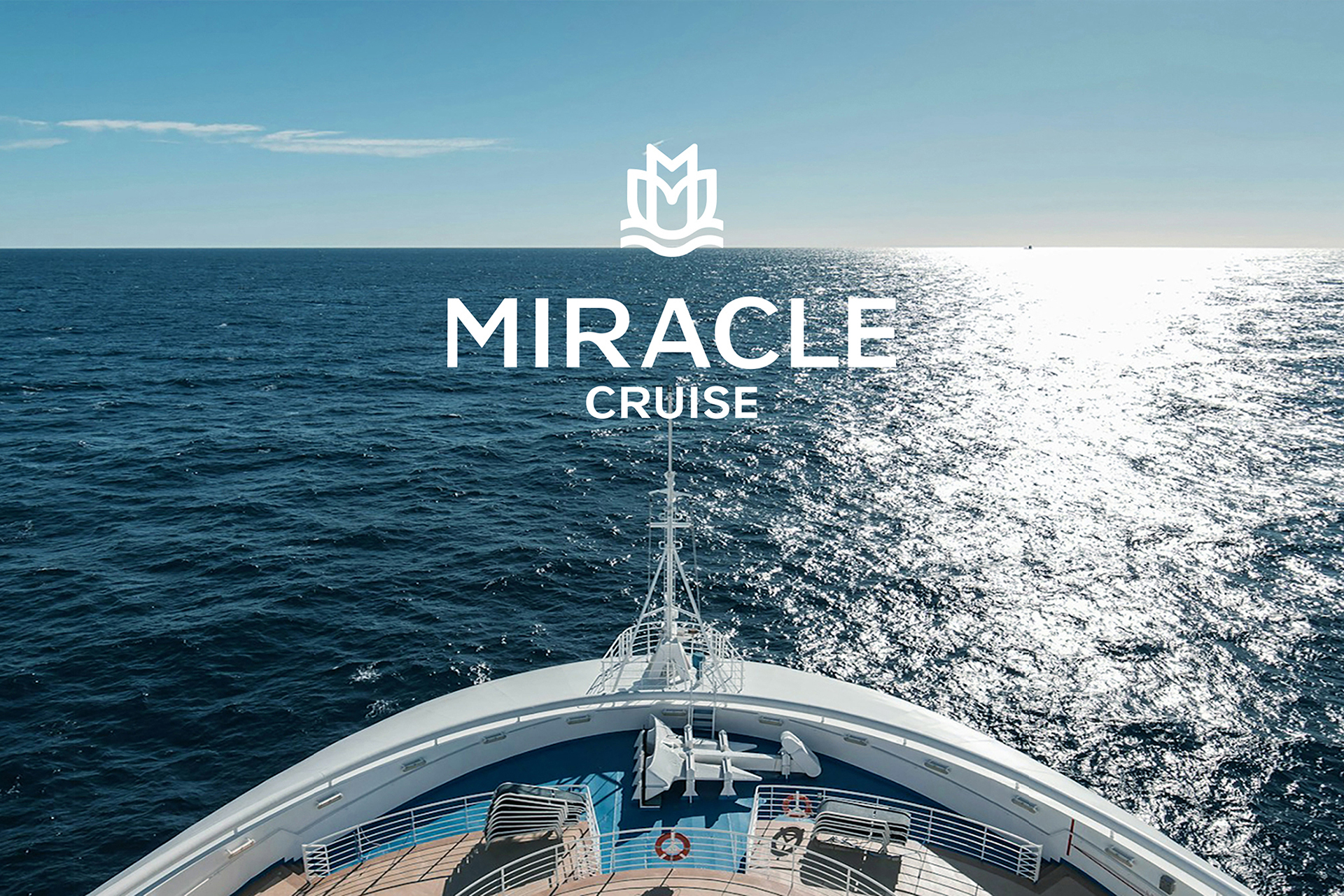
Miracle Cruise is the first premium cruise built in Korea. The special and luxurious experience on the sea is visualized in a sophisticated way with a slogan of 'dream of wonders'. The symbol is a cruise ship moving forward, symbolizing Miracle Cruise, which is leading the cruise industry. The M of Miracle is shaped like a blooming flower, symbolizing the experience of a fantastic cruise.The logotype gives a sense of the luxurious and romantic cruise trip. The bright color combination of orange and light blue makes you look forward to a trip on the sea with pleasant excitement.
Native
다양한 여가 방식에 대한 수요가 생기면서 국내에 크루즈 여행객이 현저히 증가하고 있는 추세입니다. 이러한 상황에서 국내에서 첫 신조한 프리미엄 크루즈인 팬스타그룹의 Miracle Cruise를 위한 브랜드를 개발하였습니다. 바다 위에서의 특별하고 럭셔리한 경험을 육지에서와는 다른 경이롭고 꿈결같은 시간이자 바라던 꿈이 실현되는 기적(Miracle)의 시간으로 정의하여 Dream of Wonders라고 하는 브랜드 슬로건을 도출하고 이를 시각화하였습니다. 심벌은 물살을 가르며 전진하는 크루즈의 형상으로 크루즈 산업을 선도하는 Miracle Cruise를 의미합니다. Miracle의 M을 바다 위에서 피어오르는 꽃과 같이 추상적으로 형상화하여 환상적인 크루즈에서의 경험을 상징적으로 나타낸 디자인입니다. 로고타입은 세련된 이미지로 물결의 곡선을 R에 적용하여 고급스럽고 여유로운 크루즈 여행의 멋을 느끼게 합니다. Orange와 Light Blue의 화사한 컬러 조합으로 바다 위 여행을 기분 좋은 설렘으로 기대하게 합니다.
Positive Comments


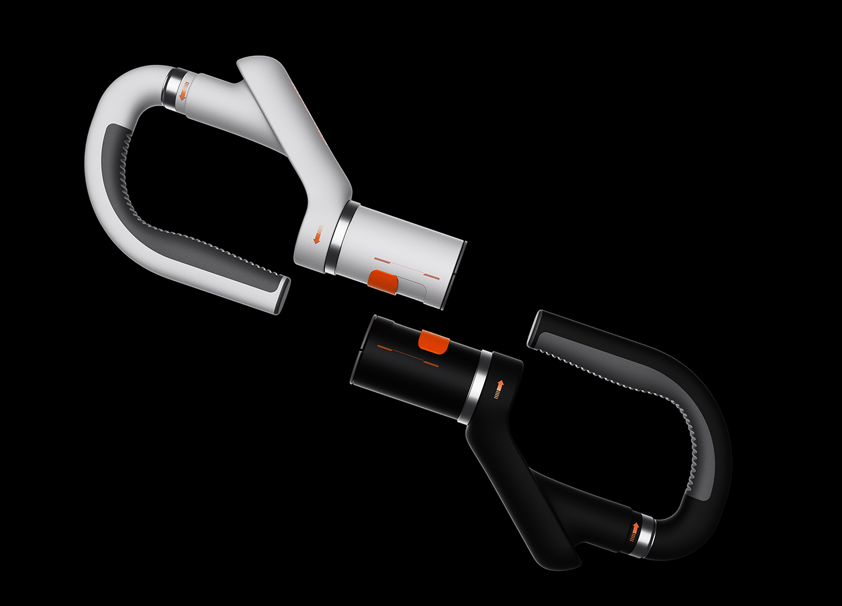
Hand Stretcher Stabilizer
Wuhan University of Science and Technology
China
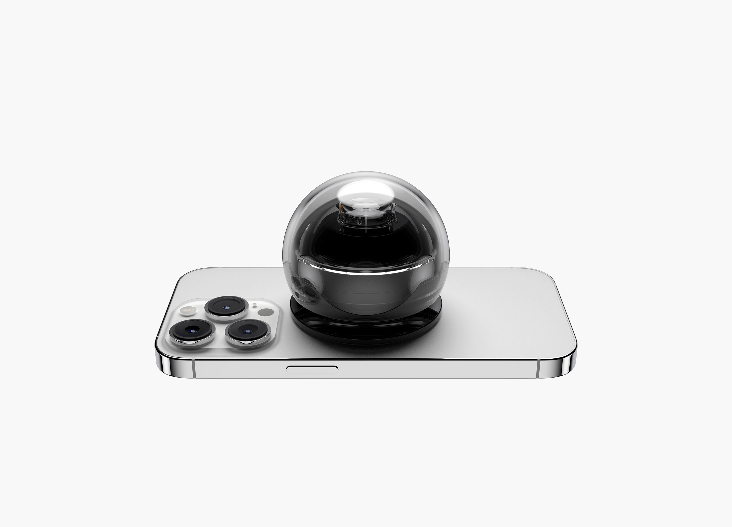
Sphere
Konkuk University
Korea
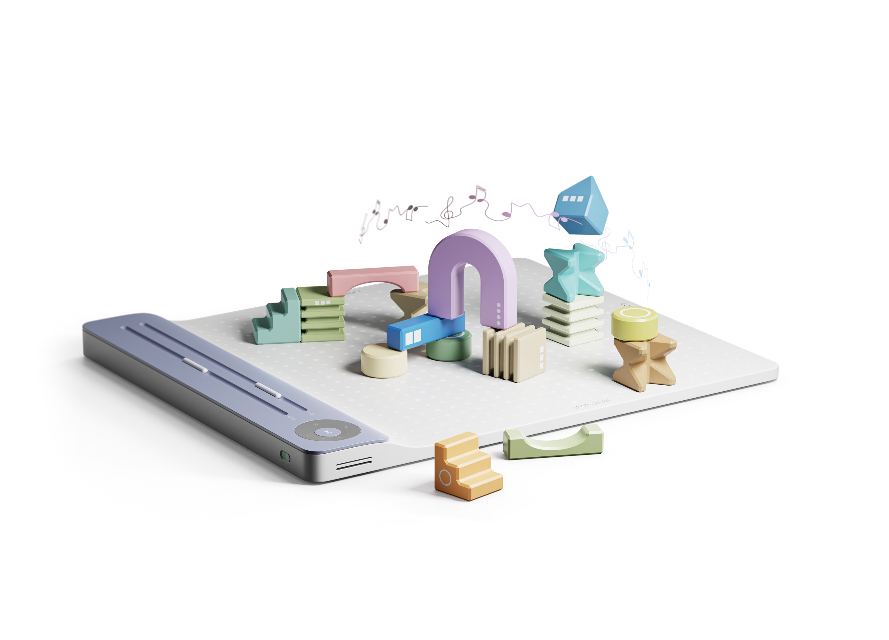
MUSICIAN
Zhejiang University of Technology
China
CLAB
CLAB
Korea
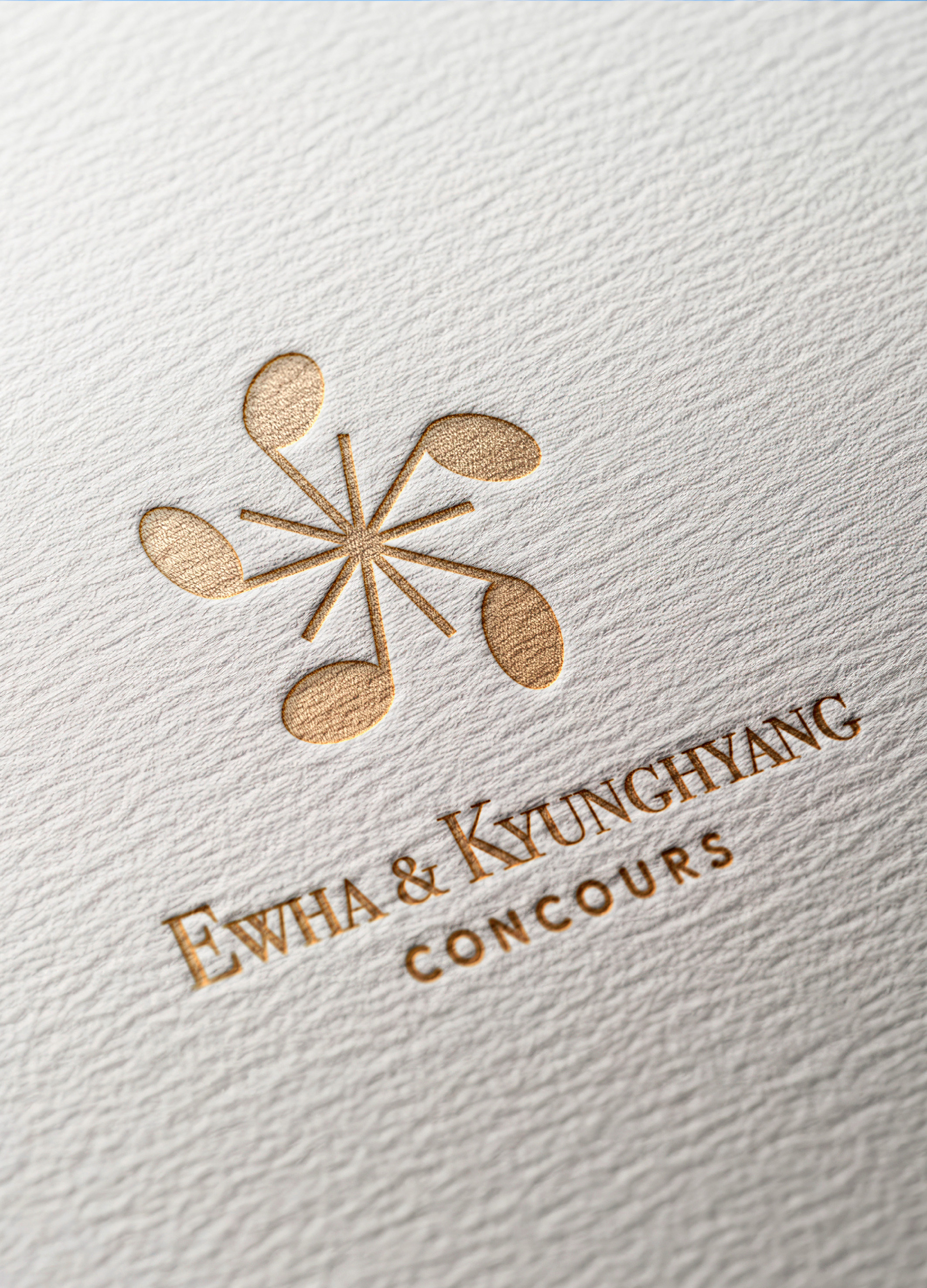
Ewha & Kyunghyang Concours Branding
YounghaPark Studio
Korea
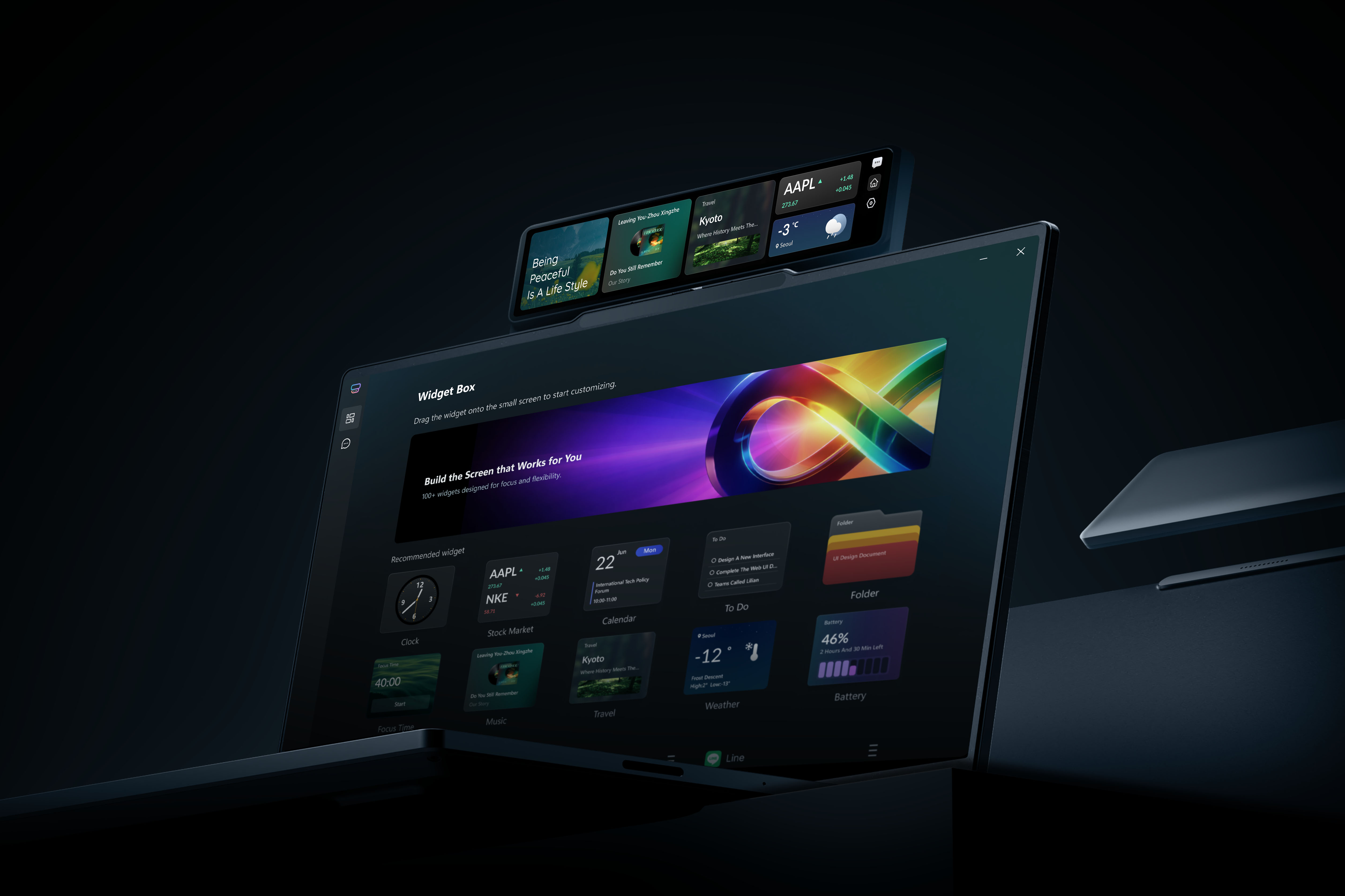
MagiCenter
Lenovo Beijing Co., Ltd.
China
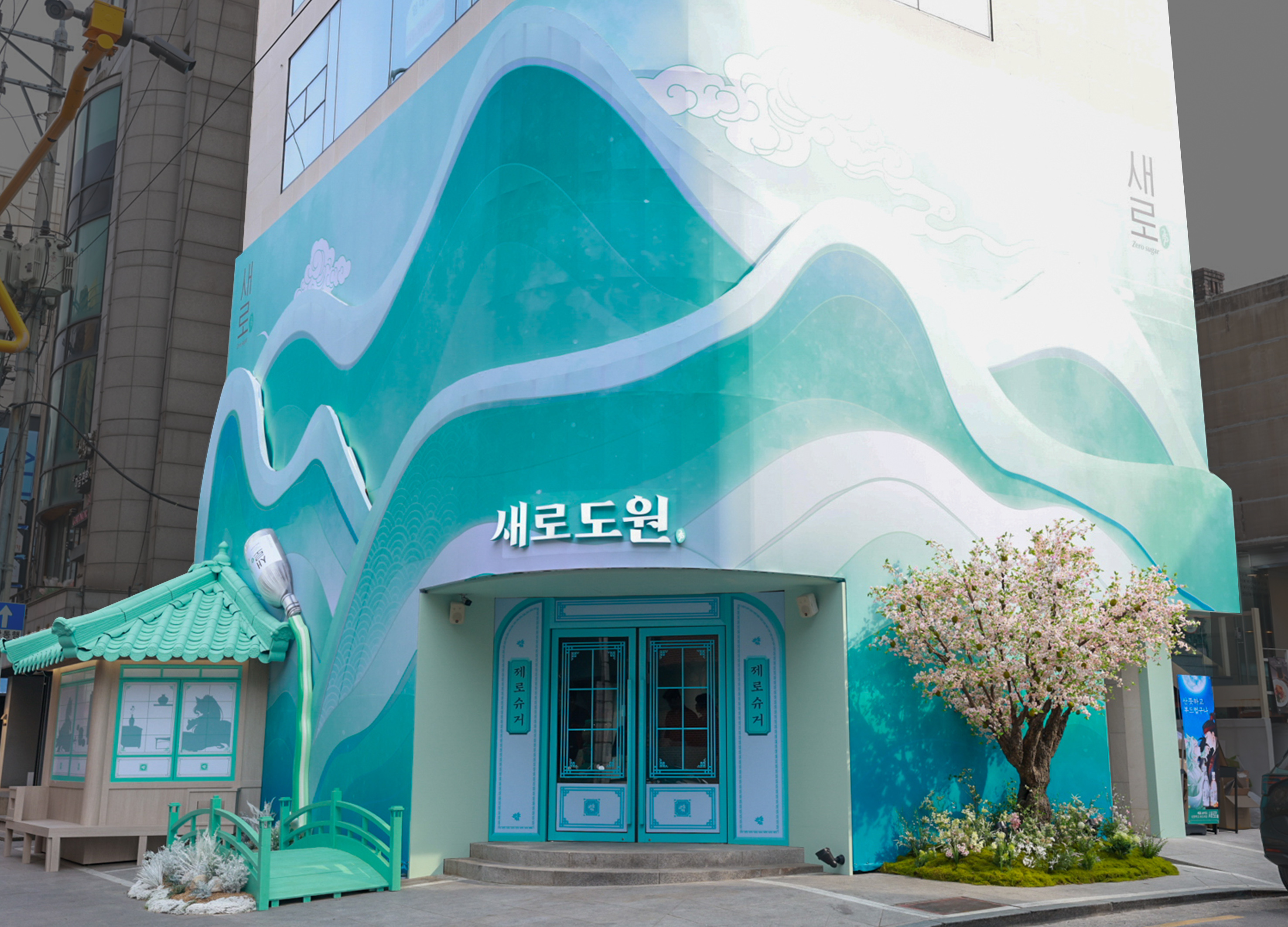
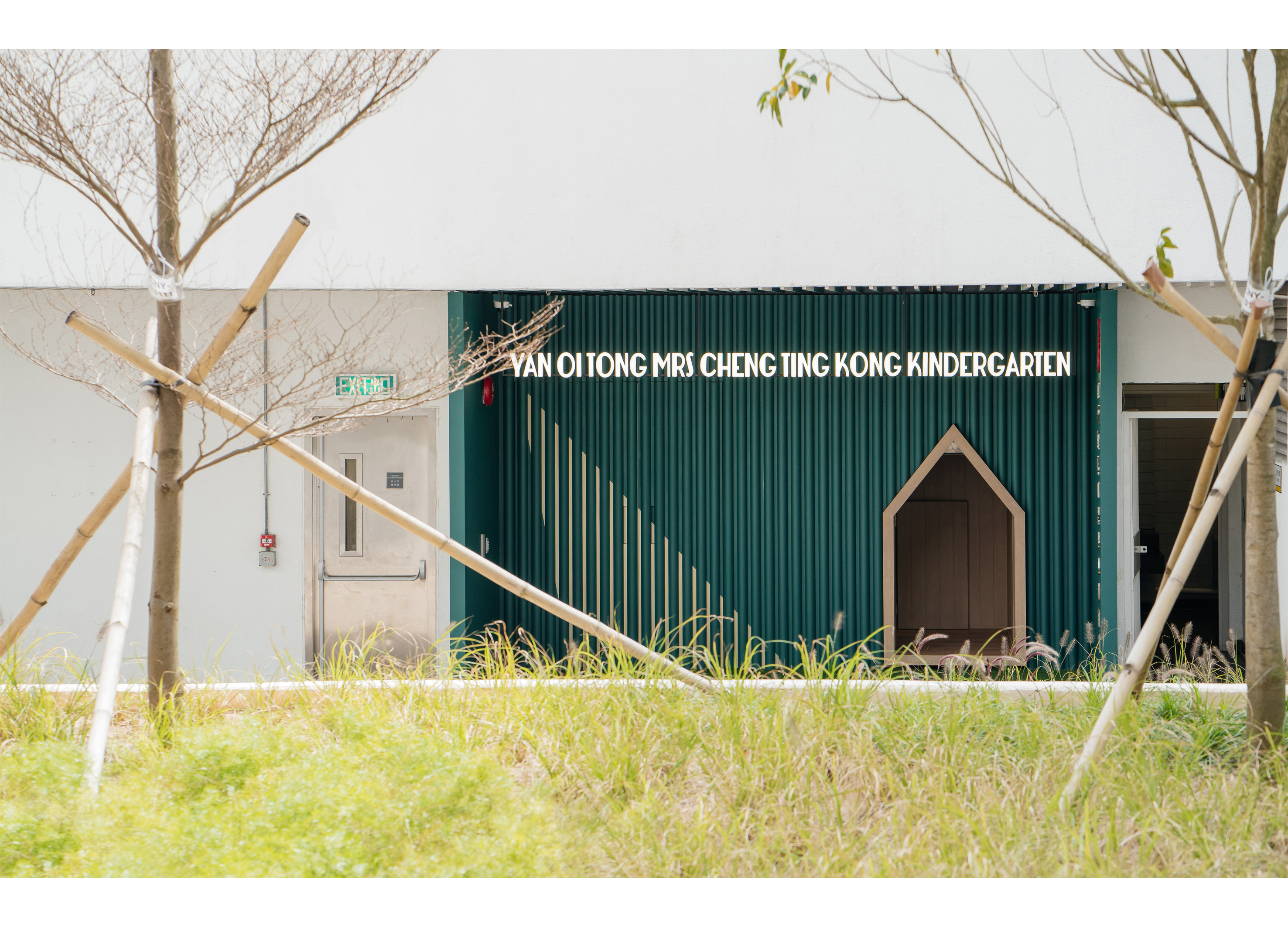
Saerodowon Brand Experience Space
OOB Co., Ltd.
Korea
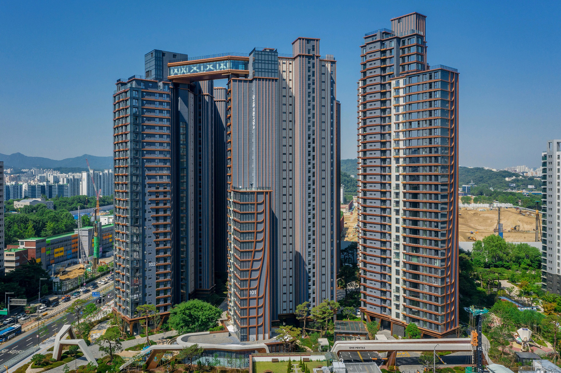
RAEMIAN ONE PENTAS EXTERIOR
SAMSUNG C&T CORPORATION
Korea
Light Forest
MINISO
China
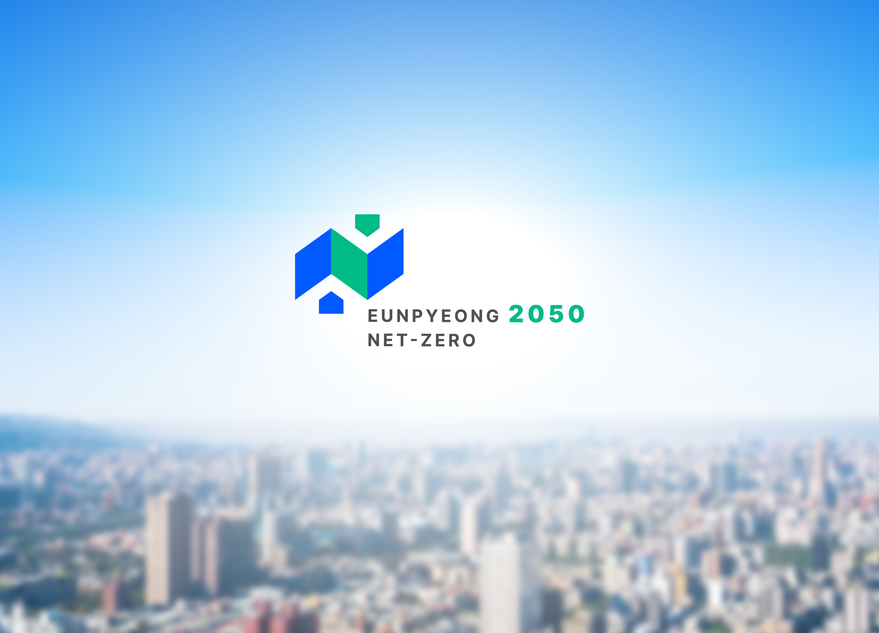
EUNPYEONG 2050 NET ZERO
DIN
Korea
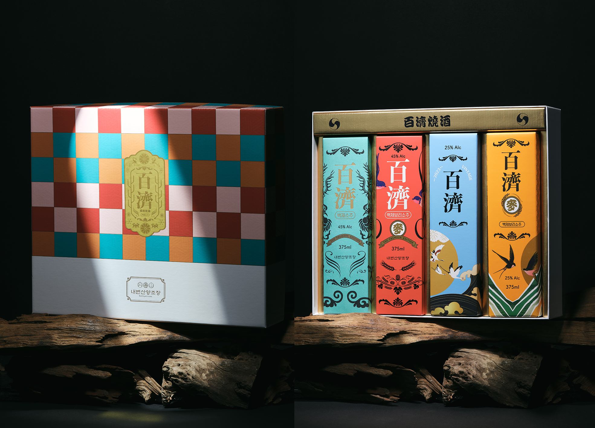
Baekje Soju Set Package Design
OCKHAMS BRANDING Co., Ltd.
Korea
Miracle Cruise BI Development
Crackthenuts Co., Ltd.
Korea
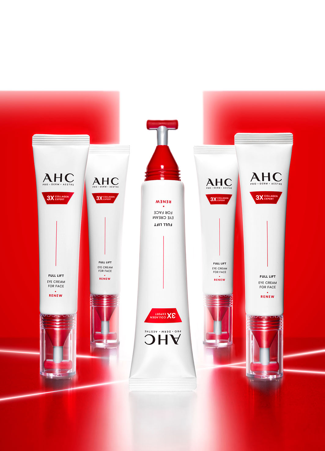
FULL LIFT EYE CREAM FOR FACE
CARVERKOREA
Korea
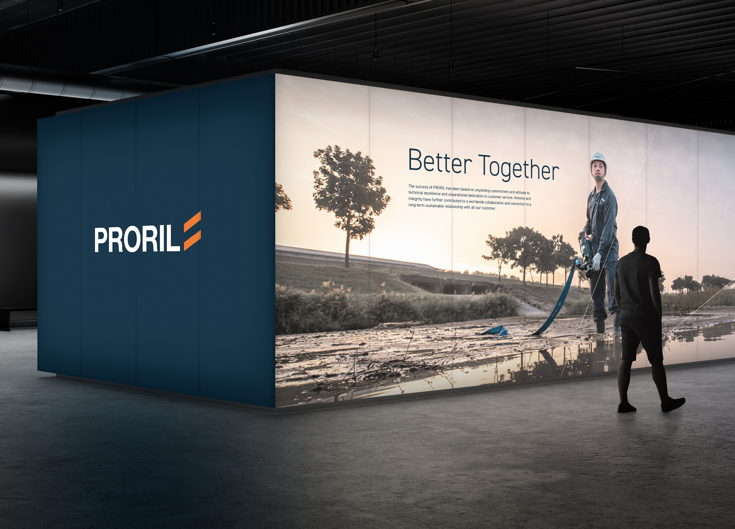
PRORIL PUMPS
CoFound
Taiwan
Drama as an Education Tool
cocoon architecture ltd
HONG KONG, CHINA
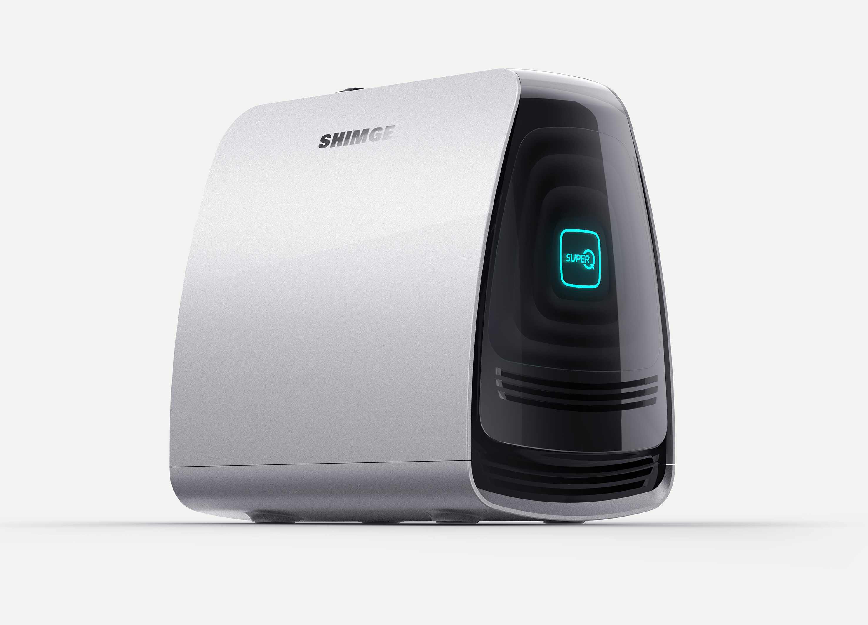
Super Q Pump
TEAMS Design Shanghai Co., Ltd.
China
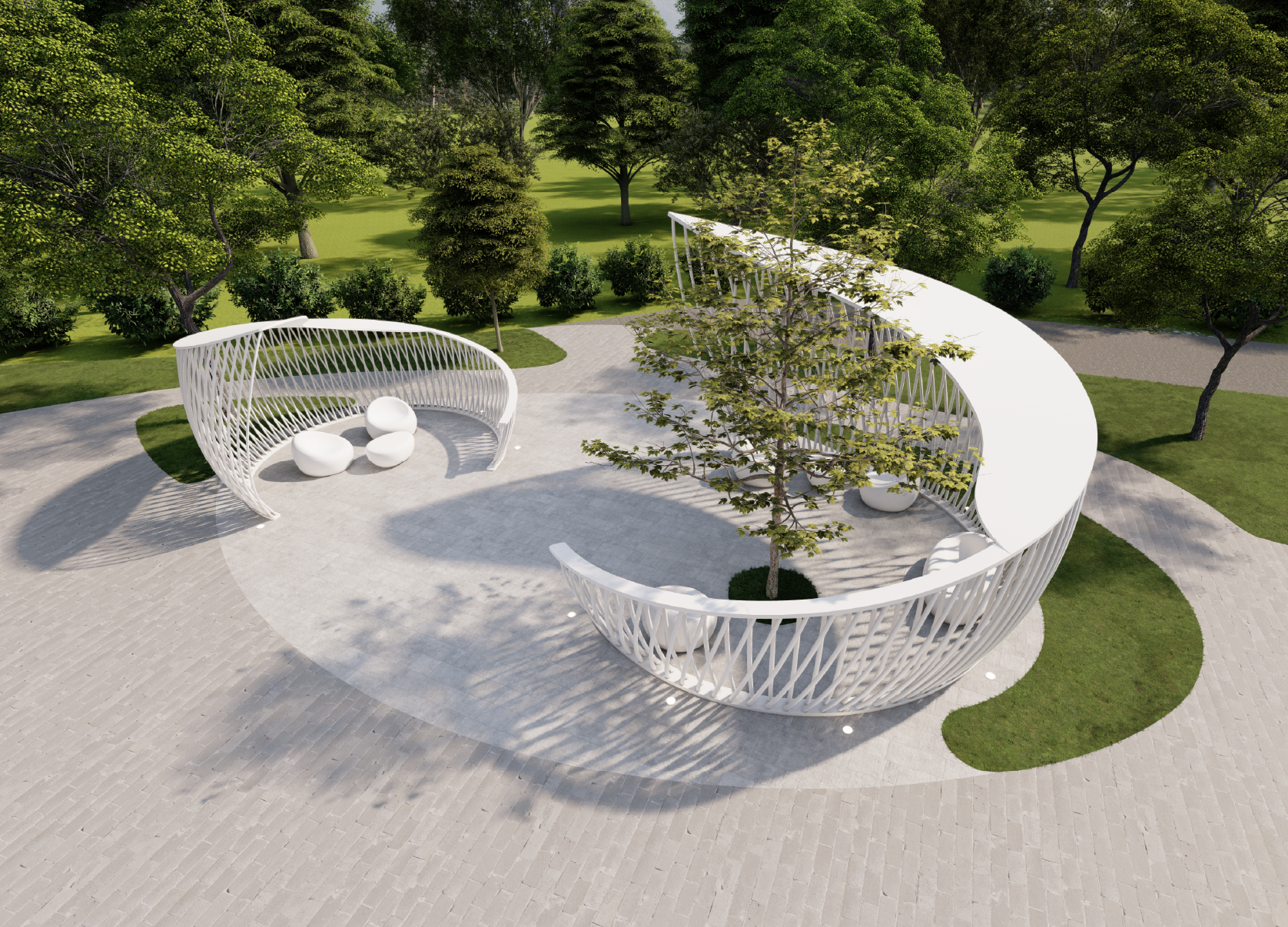
Nest Inspired Shelter
The New Inc.
Korea
EARTH SAVER
LOTTE ENGINEERING & CONSTRUCTION Co., Ltd.
Korea


Partner & Sponsor
More


info@asiadesignprize.com
#14057, 905 49, Beolmal-ro 102beon-gil,
Dongan-gu, Anyang-si, Gyeonggi-do, Korea
#14057, 905 49, Beolmal-ro 102beon-gil,
Dongan-gu, Anyang-si, Gyeonggi-do, Korea
Founder: Doyoung Kim
Business Registration Number: 454-86-01044
Online Sales License No.: 2021-Anyang Dongan-1081
Copyright © DESIGNSORI Co., Ltd.
Business Registration Number: 454-86-01044
Online Sales License No.: 2021-Anyang Dongan-1081
Copyright © DESIGNSORI Co., Ltd.
