The most significant change in Korean design in 2026 is its expanding focus from products to experiences. Designers are no longer concerned only with perfecting a product’s form and function. They also consider the space in which it is placed, how users move through that space, the order in which information is read, and the atmosphere created by light and sound. Data from the Korean winners featured in the 2026–2027 Asia Design Trend Report provides clear evidence of this shift.
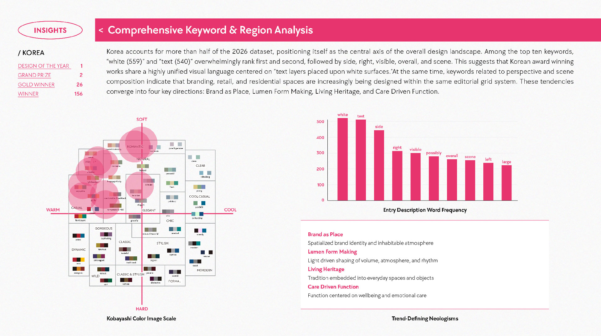
The ten most frequently used words in Korean winning entries are white (559), text (540), design (384), wall (368), side (344), black (325), room (313), modern (299), left (279), and right (266). The fact that white and text each appear more than 500 times indicates the repeated use of white backgrounds and text centered information structures. The high frequency of wall, room, side, left, and right is equally important. It shows that the analysis focuses less on individual products and more on the spaces and usage scenes in which those products appear.
These results show that Korean design is connecting graphic, spatial, and product design as a single user experience rather than treating them as separate disciplines. The report summarizes this development through four keywords: Brand as Place, Lumen Form Making, Living Heritage, and Care Driven Function. Their common direction is clear. Design success is being measured not simply by visual appeal, but by what users actually see, how they move, what they choose, and how they interact with a product or space.
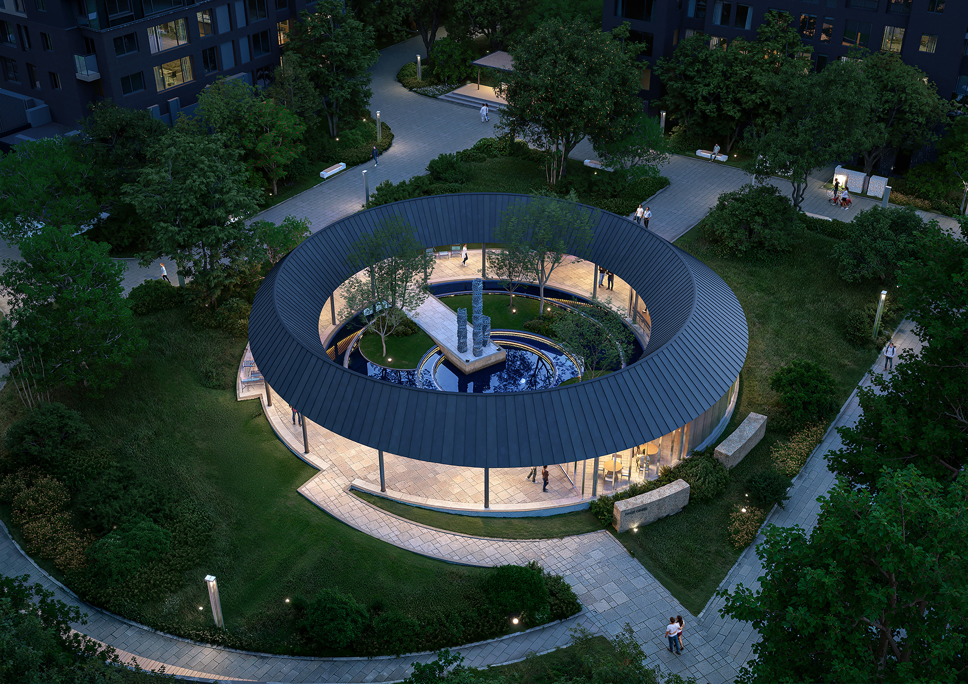
< PARK OASIS, ASIA DESIGN PRIZE 2026 DESIGN OF THE YEAR >
The first trend, Brand as Place, describes the expansion of a brand beyond logos and graphics into spatial experience. PARK OASIS, selected as the ADP Design of the Year, connects a residential complex, a public park, and a corporate brand through two concentric circles. This structure serves more than a symbolic purpose. It directs visitor movement, clarifies the relationship between the park and the residential area, and allows people to experience the brand directly. It demonstrates how brand identity can be integrated into spatial operation and user circulation.
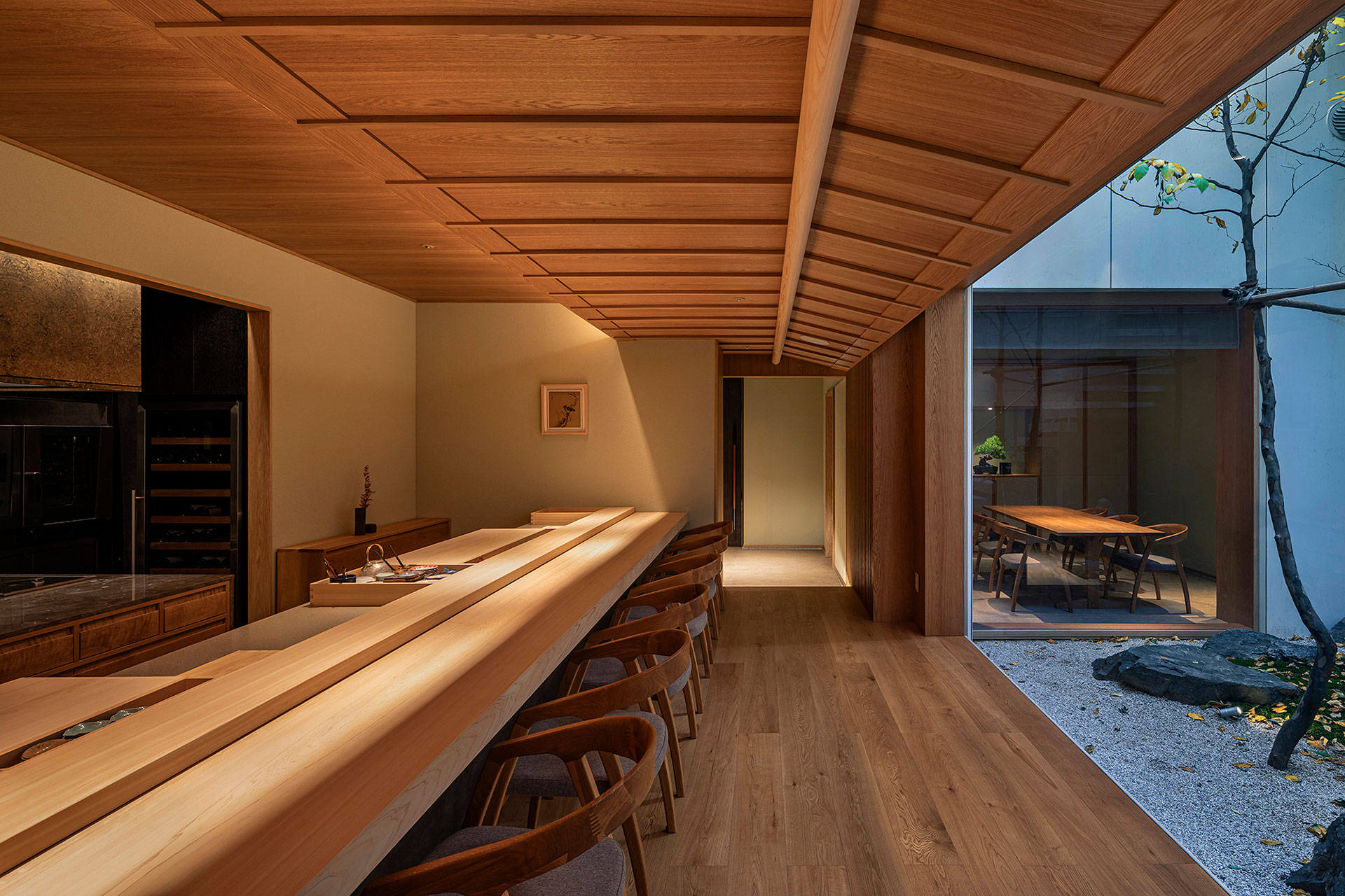
< Sushi Sou Quiet Density and Pure Presence, ASIA DESIGN PRIZE 2026 GRAND PRIZE >
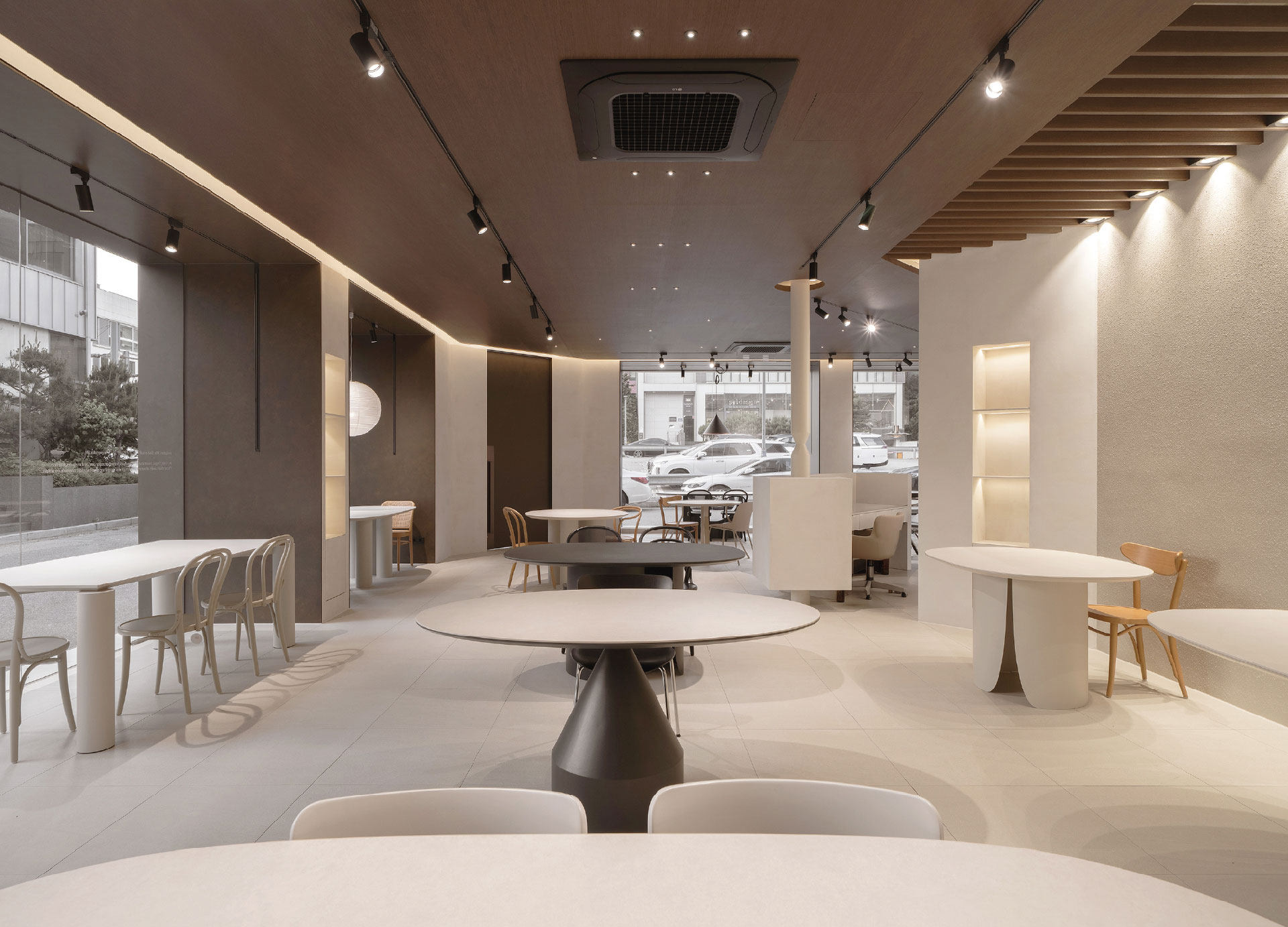
< FIABA NEST showroom, ASIA DESIGN PRIZE 2026 GOLD WINNER >
Sushi Sou Quiet Density and Pure Presence and the FIABA NEST showroom demonstrate the same direction. Rather than repeatedly displaying logos, both spaces create consistency through materials, lighting, furniture placement, and circulation. Users can understand the atmosphere and service standards each brand represents without reading a separate explanation. In contemporary spatial branding, the key issue is not how often a brand is displayed, but how consistently its standards are applied throughout the space.
The second trend, Lumen Form Making, uses lighting as a central element of user experience rather than as decoration. The frequent appearance of side, right, left, visible, and scene in descriptions of Korean winning entries indicates that spatial composition and the movement of the eye are receiving more attention than conventional front views of products. Lighting highlights products, helps users locate entrances, indicates direction, and influences how long people remain in a space. Changes in brightness, reflection, and shadow can therefore alter both the function and atmosphere of an environment.
In retail environments, this approach also supports marketing performance. Lighting directs customer attention toward specific products, distinguishes one zone from another, and creates settings that encourage branded photography and social sharing. In product design, reflective surfaces and status lights help users understand whether a device is operating. Light is becoming an interface for communicating information and guiding behavior, not simply a way to enhance form.
The third trend, Living Heritage, applies traditional elements to contemporary life. In the past, designers often relied on recognizable symbols such as the structure of a hanok or traditional patterns. Recent winning projects take a different approach. Rather than displaying tradition directly, they incorporate it into the way a product is used, as well as into its proportions, materials, and colors. The emphasis is on creating products that modern consumers can use naturally, not on highlighting a traditional image.
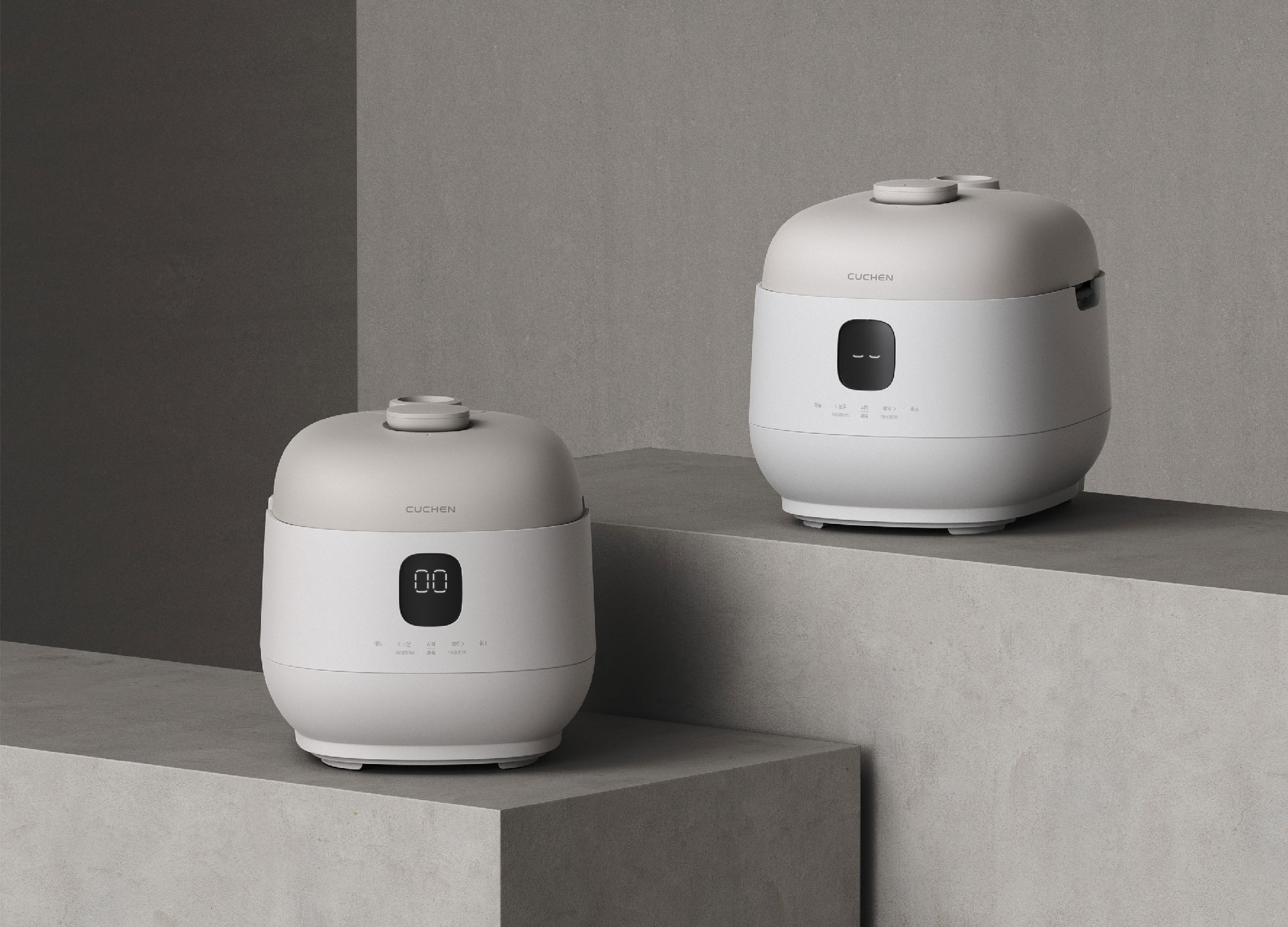
< CUCHEN IH Pressure Rice Cooker, ASIA DESIGN PRIZE 2026 GRAND PRIZE >
The CUCHEN IH Pressure Rice Cooker is a representative example. Although the rice cooker is closely connected to Korean food culture, adding traditional patterns alone does not make its design distinctly Korean. This product simplifies the controls and uses a form and color palette that fit comfortably into a contemporary kitchen, improving everyday usability. Its significance lies in translating tradition into a product experience suited to current lifestyles rather than treating it as visual decoration.
The fourth trend, Care Driven Function, prioritizes convenience and safety throughout the user journey rather than emphasizing the number of features. Air purifiers for infants, medical interfaces, and home appliances reduce common points of error and help users find essential information quickly. Button placement, information hierarchy on screens, reach, cleaning, and maintenance are all treated as parts of the experience. User centered design is expanding beyond basic convenience to include health, safety, and long term maintenance.
Together, these four trends show Korean design moving from a product centered approach to an experience centered one. Product quality remains fundamental, but users do not evaluate products in isolation. They also consider where they encounter them, how easily they can understand information, how they move through a space, and how convenient the product is to maintain after use. Design competitiveness increasingly depends on how consistently these different touchpoints are connected.
The first reason this change is happening so quickly in Korea is the pace of urban and industrial development. New stores, services, and digital platforms appear rapidly, shortening the replacement cycles of products and spaces. Companies must provide a consistent brand experience across multiple touchpoints instead of relying on a single outcome for an extended period. As a result, the designer’s role has expanded from creating products to connecting branded spaces, digital interfaces, and service operations.
The second reason is the high level of expectation among Korean consumers. When purchasing a product, they consider not only function and price, but also how well it fits into a space, how easy it is to use, the brand image it communicates, and how it will appear when shared online. From a business perspective, inconsistent quality across products, packaging, stores, apps, and customer service makes brand trust difficult to sustain. Korean design integrates multiple disciplines into a single experience in response to this demanding consumer environment.
The third reason is the global expansion of Korean content. As K pop, Korean dramas, and Korean food gain influence worldwide, design has taken on the role of visualizing a distinctly Korean experience. Simply repeating traditional motifs is not enough. Global users must be able to understand and use the result easily while still recognizing what differentiates a Korean brand. The spatial organization of PARK OASIS, the restrained interior of Sushi Sou, and CUCHEN’s usability focused product design communicate Korean characteristics through contemporary experiences.
This shift is also changing the international position of Korean design. In the past, its strength was the ability to absorb global trends quickly and adapt them to the domestic market. Today, a growing number of Korean projects are proposing new forms of user experience. The fact that Korean winners account for more than half of the ADP 2026 dataset demonstrates the scale of this development. More important than the number of awards, however, is the consistent direction visible across branding, spatial design, products, and services.
Ultimately, Korean design in 2026 is defined less by what is made than by what users experience. Brands are expressed through space, lighting guides attention and behavior, tradition is adapted to contemporary use, and function improves convenience and safety. By connecting these elements across everyday life, Korean design is moving beyond product quality to offer a more complete and globally competitive user experience.











#14057, 905 49, Beolmal-ro 102beon-gil,
Dongan-gu, Anyang-si, Gyeonggi-do, Korea
Business Registration Number: 454-86-01044
Online Sales License No.: 2021-Anyang Dongan-1081
Copyright © DESIGNSORI Co., Ltd.