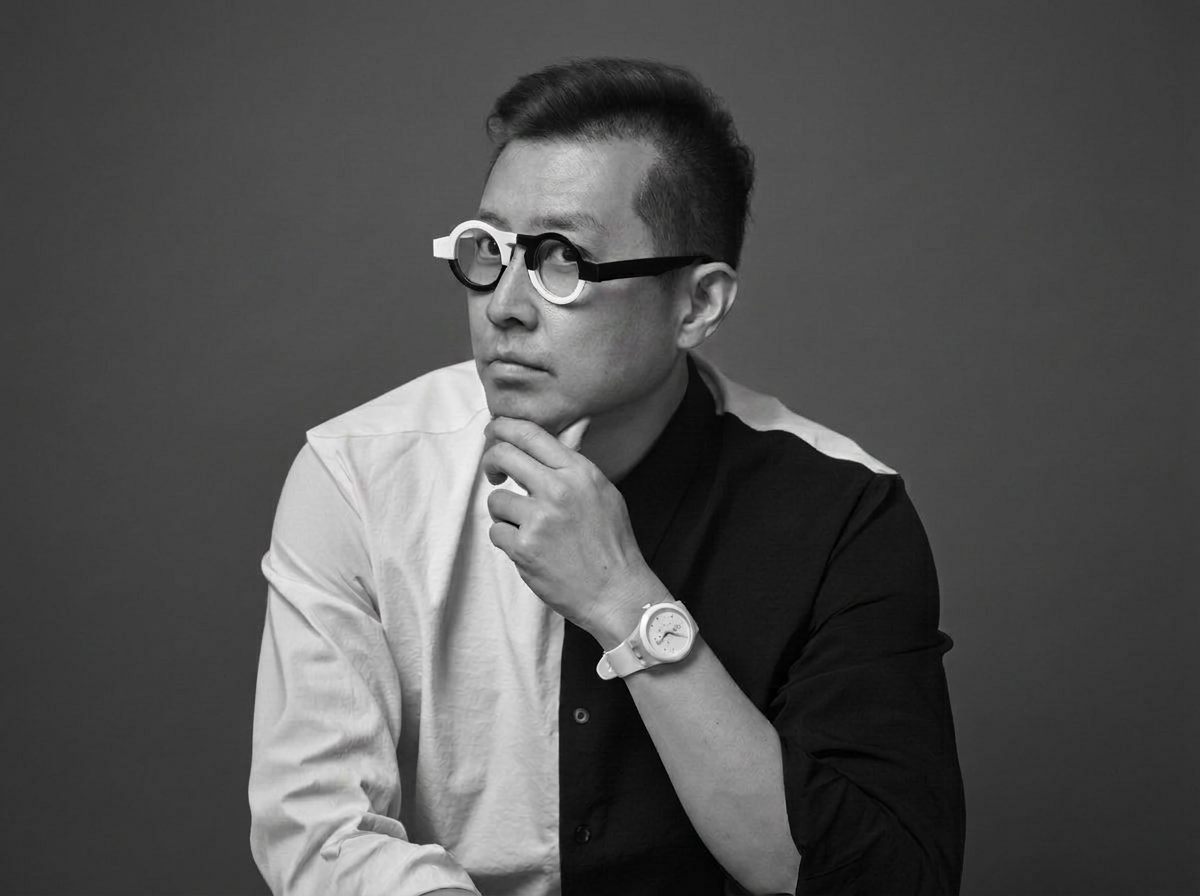
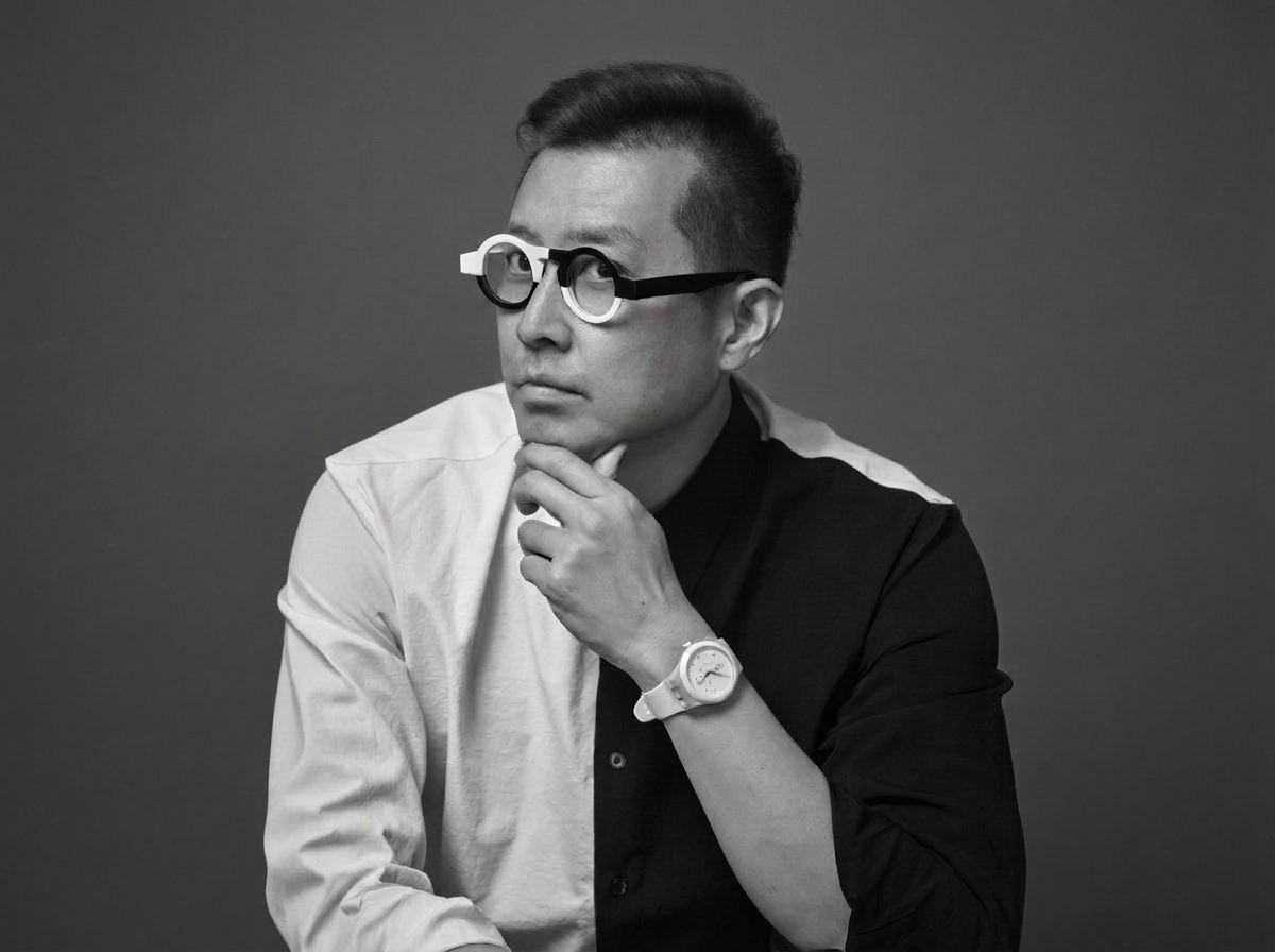
Youngha Park Head of Creative Center · CCO, FRUM
“Branding and visual design no longer remain within a single defined field. Across different contexts such as events, education, F&B, the defense industry, music competitions, and personal exhibitions, designers must interpret the purpose and character of each project and create a new visual language accordingly. Rather than relying on the typical images associated with a particular industry, designer Youngha Park creates new brand experiences through intentional combinations and unfamiliar approaches. In this interview, we discuss his project methods across diverse industries, the balance between commercial design and personal work, and the subjectivity and attitude that designers must preserve in the age of AI.”
First, please briefly introduce yourself. We would appreciate it if you could tell us about the studio where you currently work, your role within your organization, and the overall range of design work you are mainly involved in.
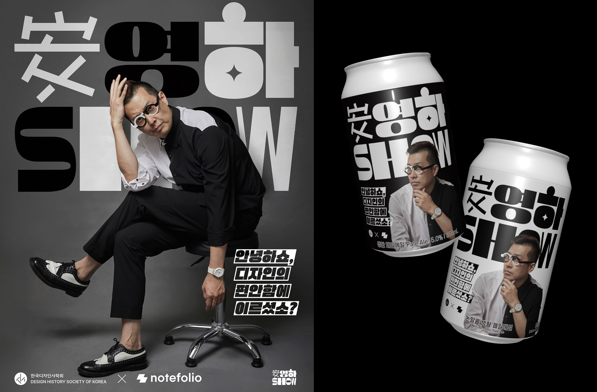
I currently serve as Chief Creative Officer (CCO) at FRUM, a professional creative consulting agency with 24 year history, where I oversee the company’s overall design direction. Alongside this role, I also run my own design studio, YounghaPark Studio, which is now in its fourth year. I also serve as an Adjunct Professor at Korea National University of Arts and Hongik University, mainly leading courses related to BX design and industrial branding.
In addition, I serve as Director of Education at the Korean Society of Design History. In reality, it is not easy to balance work at a company with a personal business. Fortunately, the CEO of FRUM has been very supportive. He once referred to the example of Karl Lagerfeld, who successfully found balance while working as chief designer at Chanel and running his own brand. He also respects the academic side of my work, including my university teaching. Thanks to this understanding, I am able to work across multiple roles. FRUM mainly works on strategies and visible marketing solutions based on the convergence of knowledge, creativity, and technology. We carry out a wide range of projects, including digital platform and content development, operation, and brand experience design. YounghaPark Studio mainly works on commercial and non commercial projects based on branding and graphic design. About half of these projects are for overseas clients in the United States and Europe.
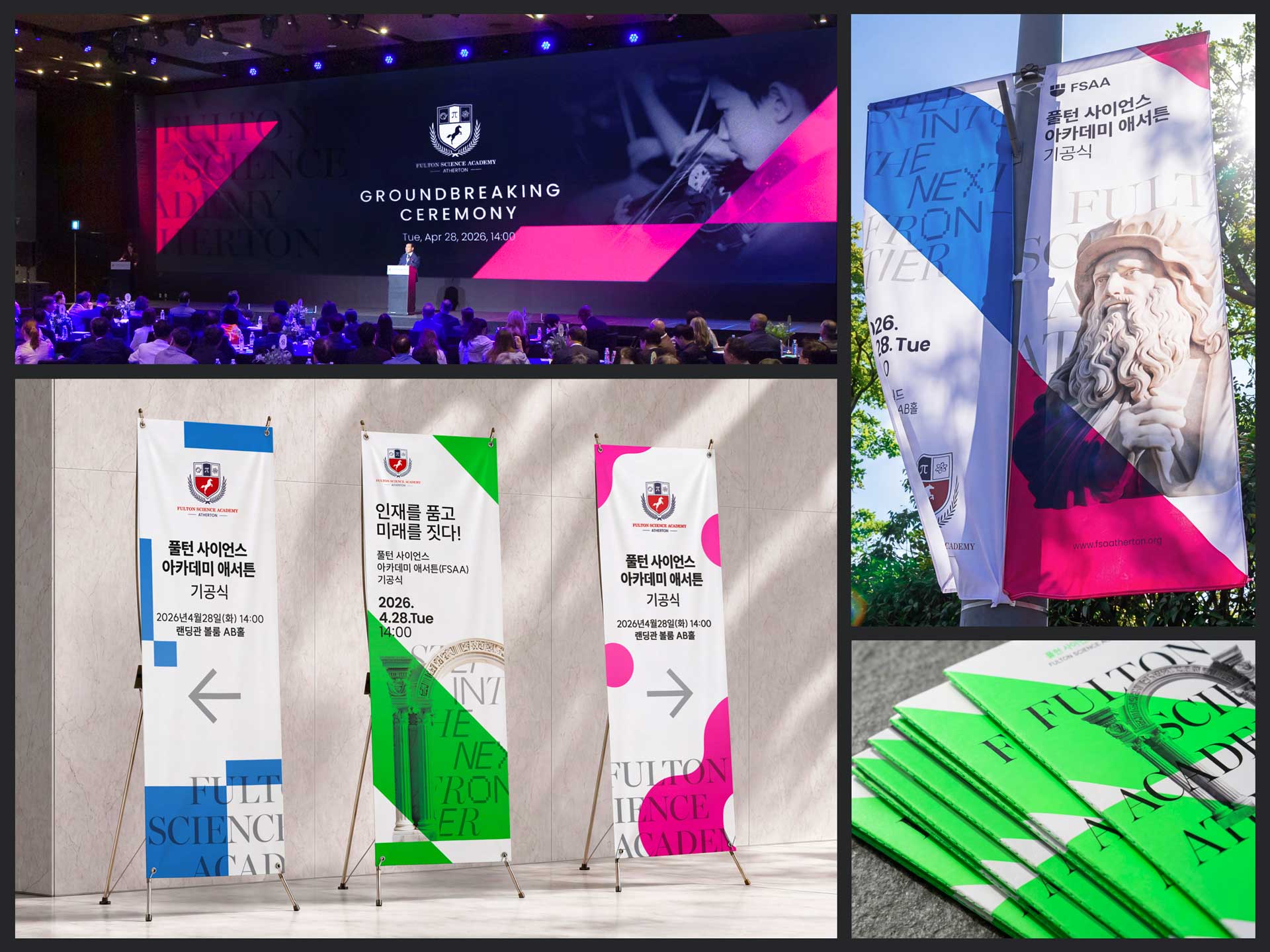
We would like to hear about your recent event design project for the groundbreaking ceremony of the international school FSAA. When planning visual design for events or ceremonies that could otherwise end as one time occasions, what kind of message and spatial experience did you want to leave with the participants?
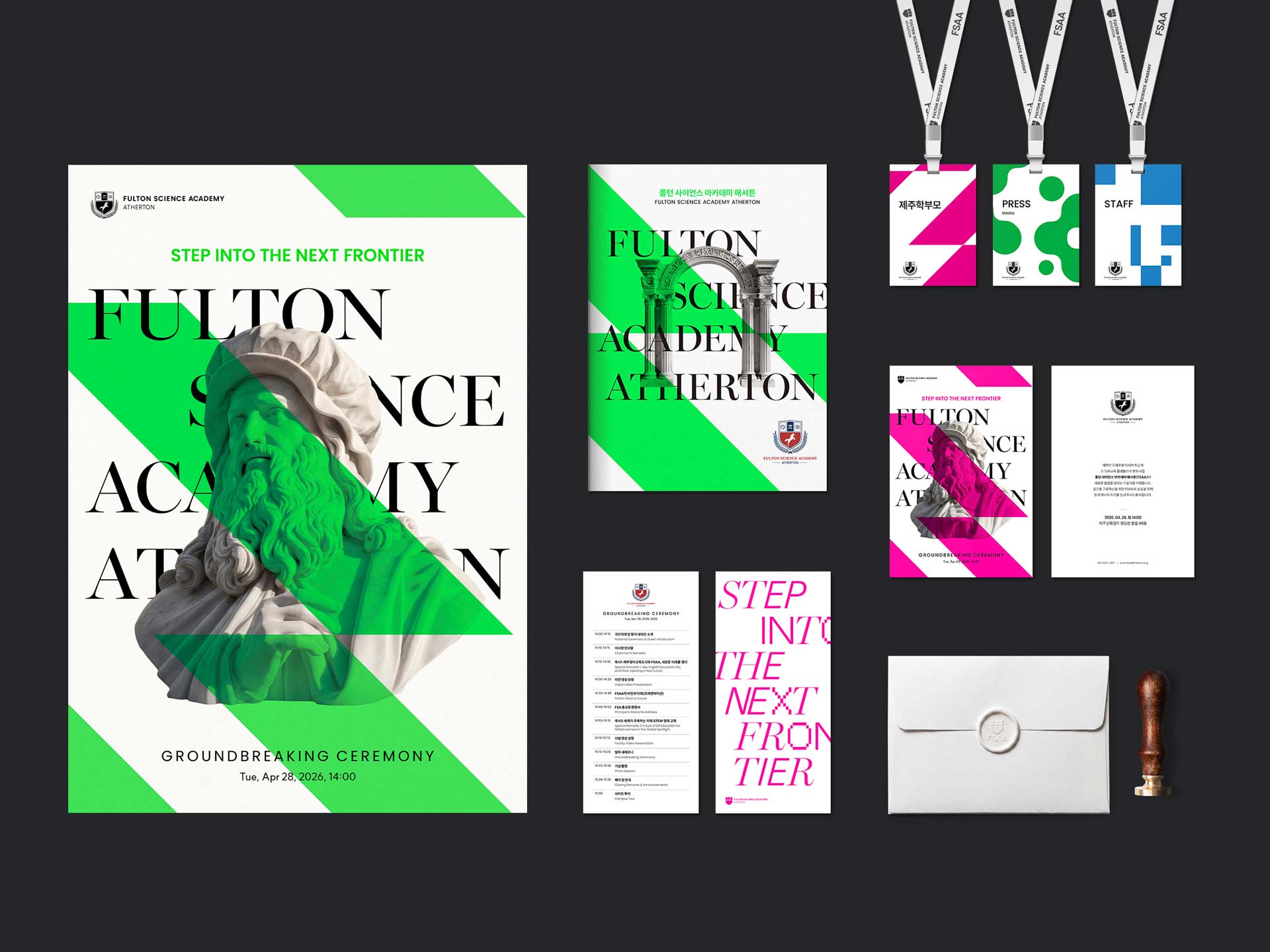
Fulton Science Academy, or FSA, a school for gifted science students headquartered in Georgia in the United States, has a traditional scholarly image, as can be seen from its decorative emblem. On the other hand, FSAA had a strong desire to localize itself while pursuing a more future oriented and innovative brand image than the main campus, in line with the age of AI. Because FSAA aims for the persona of a creative, convergence driven researcher, I felt that it needed a more experimental, unconventional, yet refined visual expression. For that reason, I used two fluorescent spot colors as the main colors, which are not commonly used in the education sector, and expressed a sense of innovation through dynamic diagonal graphic elements. The blacklight inside the event venue further emphasized these fluorescent colors, creating a distinctive atmosphere.
The title typography, which partially combines sans serif, serif, and pixel style typefaces, symbolizes convergence. Beyond that, we paid close attention to details. For example, we used exposed thread binding and matched the thread color with fluorescent green as a visual accent. We also produced a custom sealing wax stamp engraved with a seal in order to add a sense of prestigious tradition to the future oriented image. Fulton Science Academy Atherton promotes an integrated STEAM education that balances science, technology, engineering, art, and mathematics. Based on this concept, we established a visual style centered on the image of Leonardo da Vinci, who symbolizes the Leonardian type of talent, and combined monochrome images such as arches and compasses with graphic elements.
We did not want the school to look like a dull or conventional science academy for gifted students. Instead, we wanted to express the atmosphere of a school often found in the western United States, one that feels free, progressive, innovative, and pragmatic. When parents and students choose a school, information about the school is of course important. However, before they directly experience the quality of education, visual identity such as the logo and typography can influence how they judge or trust the school’s level. The groundbreaking ceremony design was the first step in that process, so we wanted to create a strong first impression. Since the main campus did not have many graphic motifs or assets beyond its emblem and colors, we wanted to use this opportunity not simply to create a one time design for the ceremony, but to establish a distinctive visual language for FSAA that could continue to be used in the future to build a consistent tone and manner.
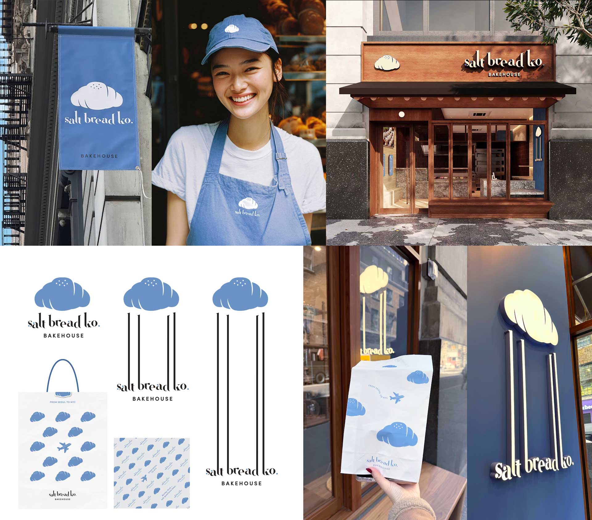
Your branding work for Salt Bread Ko., a bakery in New York, is also very interesting. In the global and multicultural scene of New York, how did you approach the visual identity of a bakery brand, and what was the most important focus during the branding process?
Salt bread originally comes from Japan, and although the trend has already passed its peak in the Korean market, it is still a completely new concept in the West. As a result, salt bread has recently become very popular in New York. In particular, beyond the basic plain salt bread, combinations with various spreads such as caviar toppings and yuzu cream cheese have gained strong popularity. In this branding process, I created a cloud shaped symbol to intuitively visualize the soft and fluffy texture, which is one of the most important characteristics of salt bread. I also introduced a design system in which the brand text flexibly stretches, sensorially emphasizing the chewy texture unique to salt bread.
Furthermore, in order to clearly communicate to the public that the brand is based on a Korean style salt bread culture, I expressed the symbolic scene of an airplane flying from Seoul to New York as part of the brand’s graphic elements. We also made a strategic shift during the naming stage. The original business name proposed by the client was a rather ordinary and predictable form, with “Co.” for “Company” added after “Salt Bread.” However, I noticed that the client is a second generation Korean American and that his family name is Ko. By playfully using the similarity in pronunciation and also suggesting a connection to Korean culture, I proposed changing “Co.” to “Ko.” As a result, from the naming stage onward, we were able to build a distinctive identity that clearly differentiated the brand from its competitors.
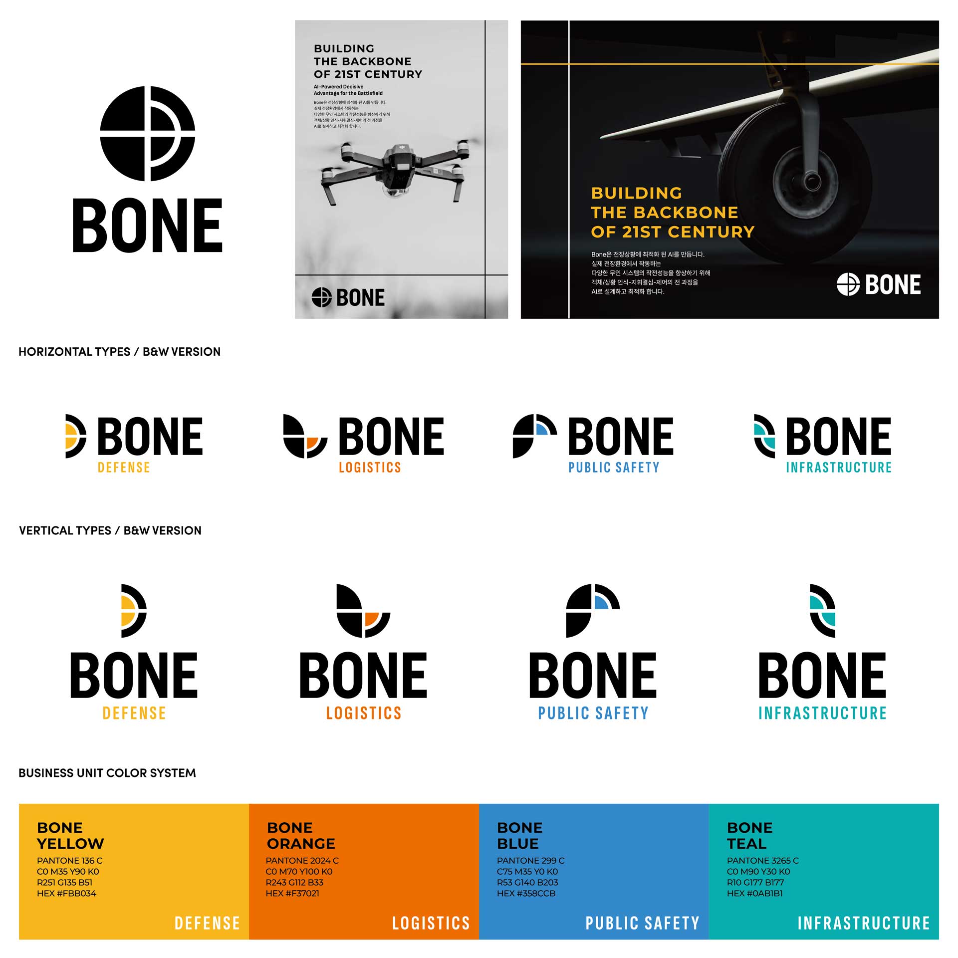
You also carried out the rebranding of BONE, a defense startup in Silicon Valley. What was the biggest challenge in building a visual language for the defense industry, which can be a rather specialized and heavy subject, and how did you resolve it?
The visual language of the defense industry is usually rigid and heavy in tone and manner, often centered on achromatic colors. Fortunately, the client was very open to a new visual approach. Thanks to this, we were able to successfully move away from the fixed communication style of the existing defense industry, which tends to rely on a single rigid symbol. As an alternative, we built a new sub brand system in which the logo flexibly transforms into the initials D, L, P, and I, intuitively representing the categories of each business division. Each category can also be clearly distinguished through its own accent color.
In the process of establishing the brand’s dedicated colors, we developed a refined sub color palette based on military camouflage, including olive, charcoal, and brown. In addition, in order to clearly differentiate the brand image from conservative competitors in the industry, we creatively used the cross line and quarter circle curve of the symbol, which intuitively evoke a target or sniper scope, and developed two new graphic motifs exclusive to the brand.
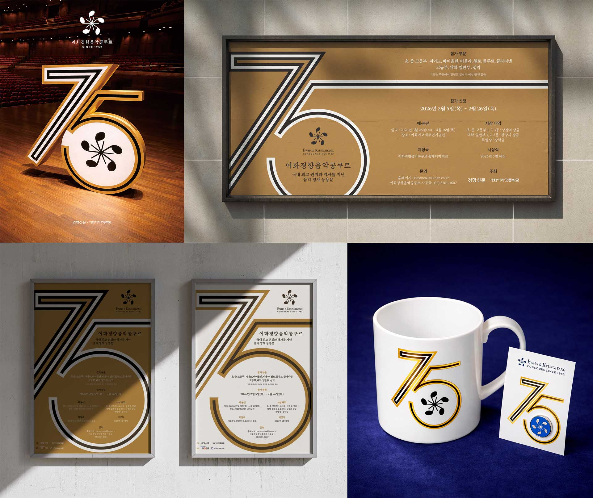
< Ewha & Kyunghyang Concours Branding, ASIA DESIGN PRIZE 2026 Winner >
Your work for the 75th Ewha & Kyunghyang Concours also stands out. You work on projects with completely different characteristics, from events, F&B, and defense startups to classical music competitions. When planning identities for such different fields, do you have a particular approach or methodology that you apply?
I am not sure whether I can say that I have a very special method of my own. However, during the planning process, I try not to be trapped by typical stereotypes. Whatever industry a project belongs to, I try to experiment with unconventional styles that are not commonly used in that field or that break away from established customs. For example, instead of following a predictable formula such as, “An F&B brand should naturally look like this,” I try to propose a fresh solution from the opposite direction, asking, “Could an F&B brand be expressed in this way?” Of course, in order to realize such new ideas, the process of persuading the client is essential, and there are many cases where it is not easy to overcome conservative standards.
To bring out this shift in thinking, I often use a technique called “Forced Relationships” during the ideation process, even though I would not call it an elaborate academic methodology. Forced Relationships is a brainstorming technique that intentionally connects and combines two or more objects or heterogeneous ideas that may seem completely unrelated at first glance, in order to generate new creative ideas that did not previously exist. The form of the symbol for the 75th Ewha & Kyunghyang Concours is also the result of applying this technique. We visually combined the pentagonal pear blossom symbol, which represents Ewha Girls’ High School, one of the long standing co hosts of the competition, with the musical note, which represents the essence of music. Through this process, we arrived at the current symbolic mark that feels both integrated and distinctive.
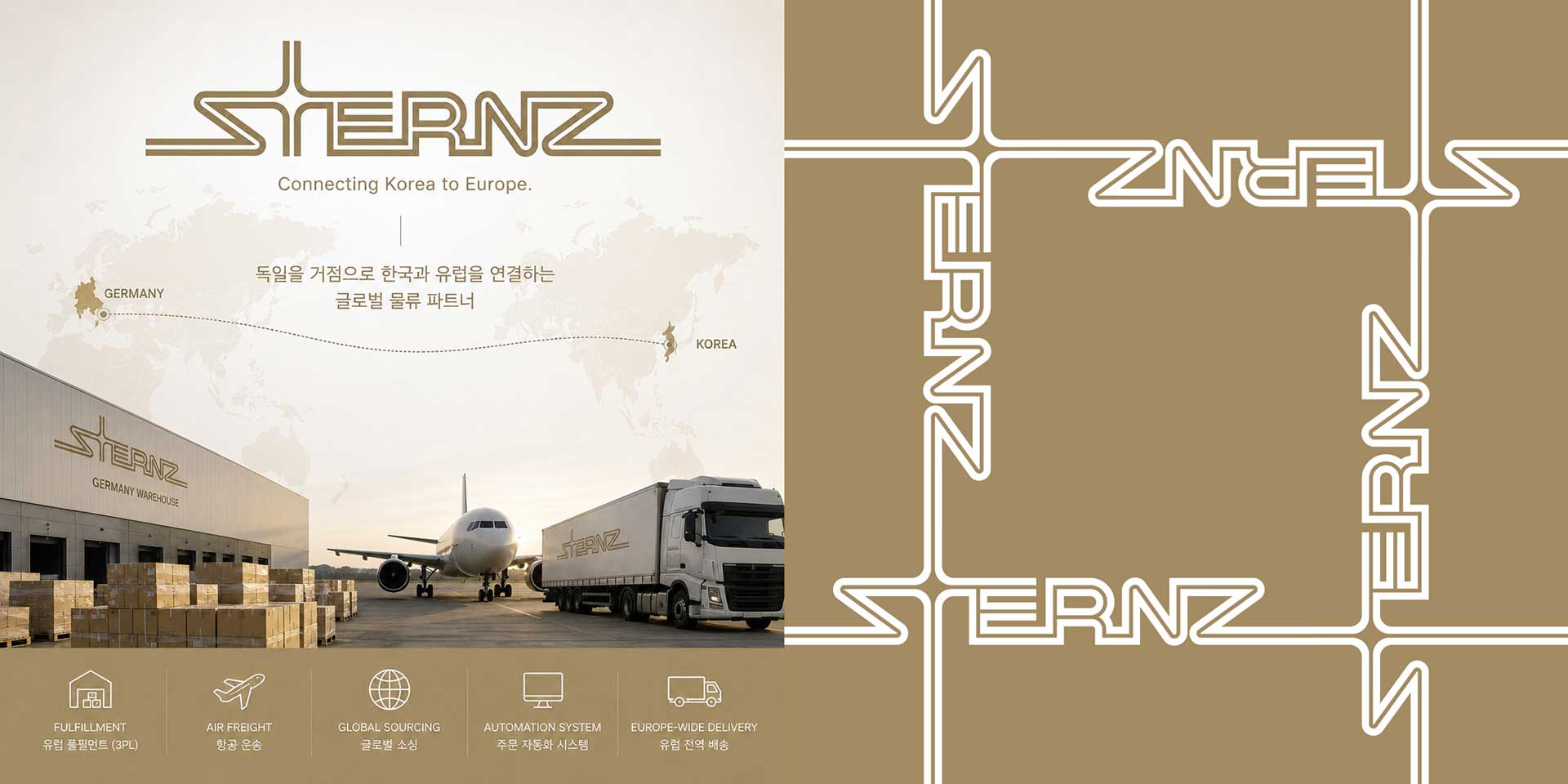
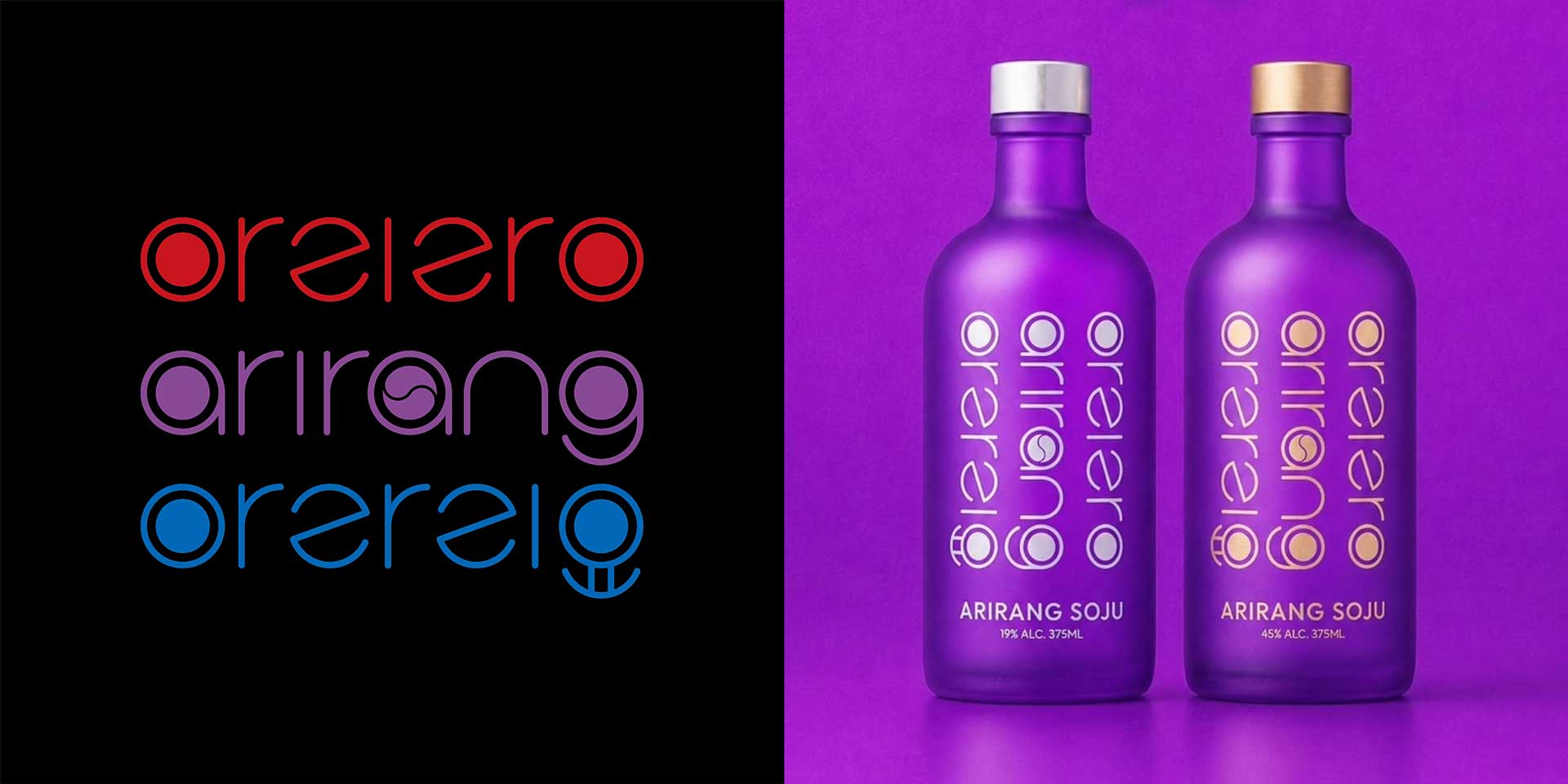
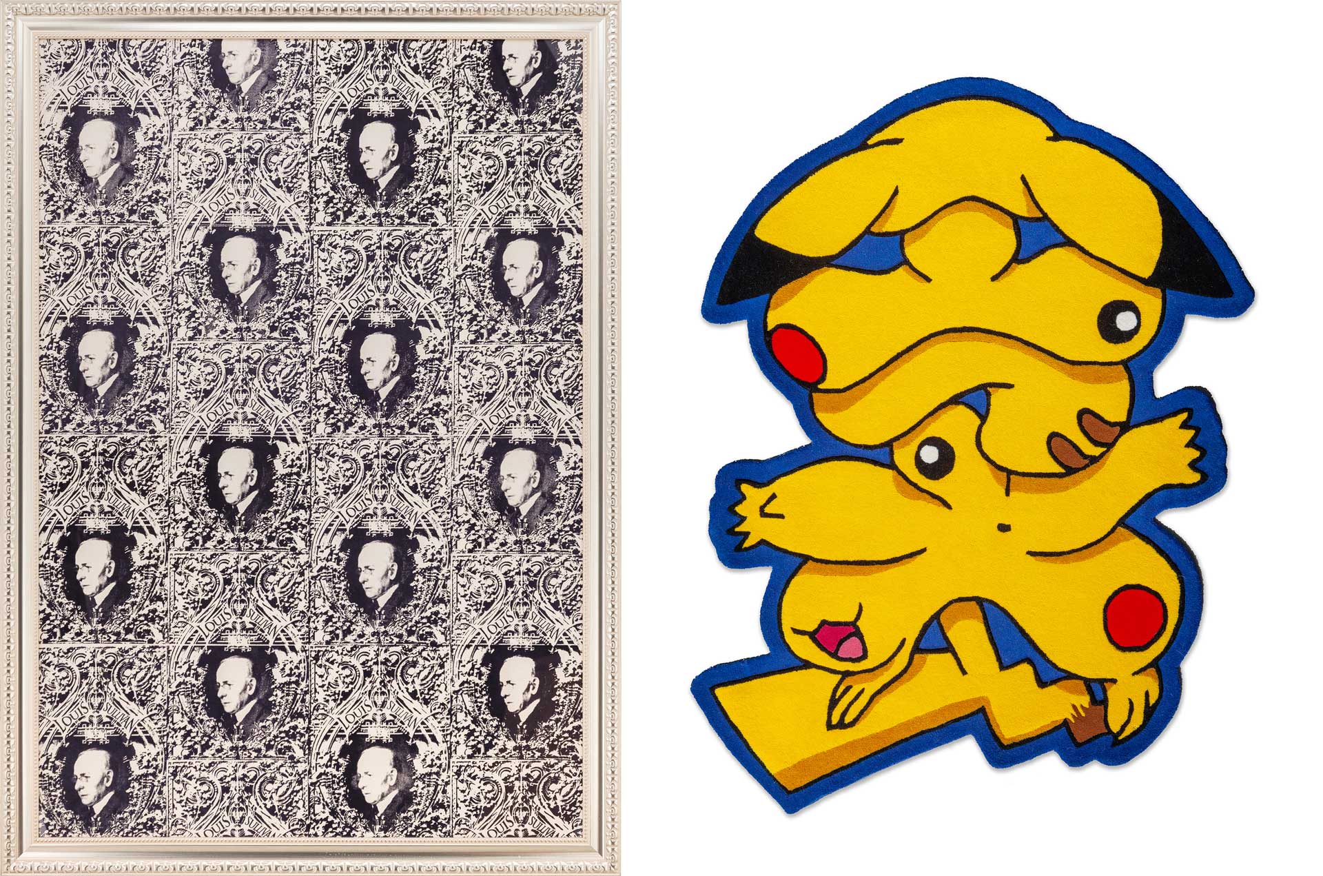
I understand that you have a strong affection for your personal work, just as much as for commercial projects. How do you balance commercial work, which must fulfill the client’s objectives, with personal work, which fully contains your own message? How do these two types of work inspire each other?
I have worked at large corporations, agencies, and many other companies over the years. However, when I repeatedly worked only on projects belonging to the company I was part of, even if the projects were excellent and gave me a sense of achievement, I often felt a sense of emptiness and thirst because there was nothing that was entirely my own. It was only when I began to carry out non profit exhibitions and experimental, non commercial personal work alongside my professional work that I truly felt alive as a designer. Commercial projects and personal work clearly have a mutually developmental influence on each other. For that reason, I always recommend designers working in commercial design to continue their personal work whenever they have the time.
There are also many moments when I become stuck while developing a design concept for a project and ideas simply do not come. To overcome this, I intentionally arrange my schedule so that different types of work overlap slightly and run in parallel. If you keep digging deeply in only one spot, you may eventually become trapped in that hole and unable to get out. Instead, I find it much more effective for problem solving to broaden the field of view and explore multiple points in diverse and relatively shallow ways. Working on completely different types of projects at the same time may seem as though it would weaken concentration, but in fact, they often provide excellent inspiration for one another.
I even gain fresh insights from the fictional project processes I conduct with students in my university classes. These clues often provide practical help in solving difficult issues within my personal work or professional projects at the company. The reason I continue teaching at universities despite my busy schedule is not because I am aiming for a particular title or academic position. It is purely because of this exchange of inspiration. As the years go by, opportunities to communicate freely with young people in their early twenties, who may be even younger than the youngest members of an organization, become increasingly rare. But in the classroom, while working intensely with them on a single project, I also learn a great deal from the younger generation and gain fresh inspiration and deep fulfillment. These moments of exchange are the greatest driving force that allows me to continue moving forward as a designer without becoming exhausted.
In recent years, the fields of brand experience and visual design have been rapidly evolving along with changes in media and technology. Are there any global design trends or shifts in visual language that you are paying particular attention to these days?
With the rapid development of generative AI technology, we have clearly entered an era in which even non designers who have not professionally studied design can easily produce highly polished visuals and design outcomes. However, while most machine generated outputs appear visually perfect and smooth, they often feel somewhat artificial beneath the surface and seem to lack the emotional quality unique to humans. Because of this, visual fatigue toward standardized AI generated results is gradually increasing among the public.
As a result, consumers and audiences seem to be developing a deeper sense of empathy for analog outcomes, even if they may appear rough or imperfect on the surface, because they reveal the creator’s intense thought process and honest humanity. They seem to be seeking these qualities more urgently. For this reason, across the global design industry, there is a clear philosophical movement toward actively embracing the “aesthetics of imperfection” in branding. Rather than blindly pursuing mechanical perfection, designers are intentionally planning and designing imperfection through highly refined direction.
Unless generative AI goes through the designer’s precise intervention and adjustment, it ultimately has the fundamental technical limitation of repeatedly producing similar averages from existing data. Therefore, in the coming era, the designer’s own distinctive personality and originality, craftsmanship refined over a long period of time, the rarity of originality, and the “non standardized artistic value” that boldly breaks away from AI’s formatted output data will become more powerful competitive strengths in the market than ever before.
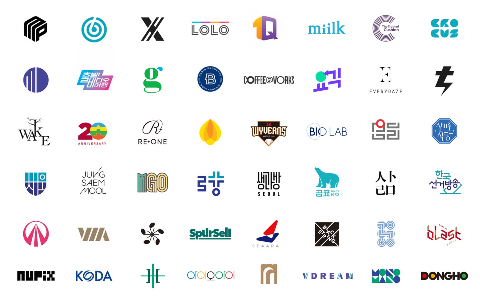
From setting a company’s vision to shaping even the smallest sensory experiences of users, the areas that designers must intervene in and coordinate are gradually expanding. Amid these changes, how do you think the role of brand and visual designers should evolve in the future?
The role of designers is clearly expanding, and in that respect, the development of generative AI is helping in many areas. Among the students I teach, the younger they are, the more heavily they tend to depend on AI. Many people predict that designers who cannot use AI well will fall behind. However, the issue is subjectivity. Some people begin by habitually asking AI without thinking or reflecting for themselves, and they blindly rely on unverified information produced by AI that has not been properly trained. I believe designers must be cautious about this kind of attitude.
In a broadcast program, novelist Kim Ae Ran once said that what makes humans different from AI is hesitation. Through the margin and emotion created by that hesitation, a creative work finally gains differentiated power and weight. In the end, designers must be able to lead AI rather than be led by it. They must also know how to stop at the right point, even if something appears unfinished. I also believe that it is very important not only to think, but to write, draw, and express one’s thoughts directly.
Finally, are there any new projects you would like to challenge yourself with in the future, or any design value that you would like to leave in the world over the long term?
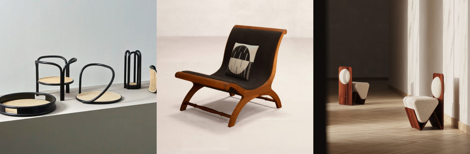
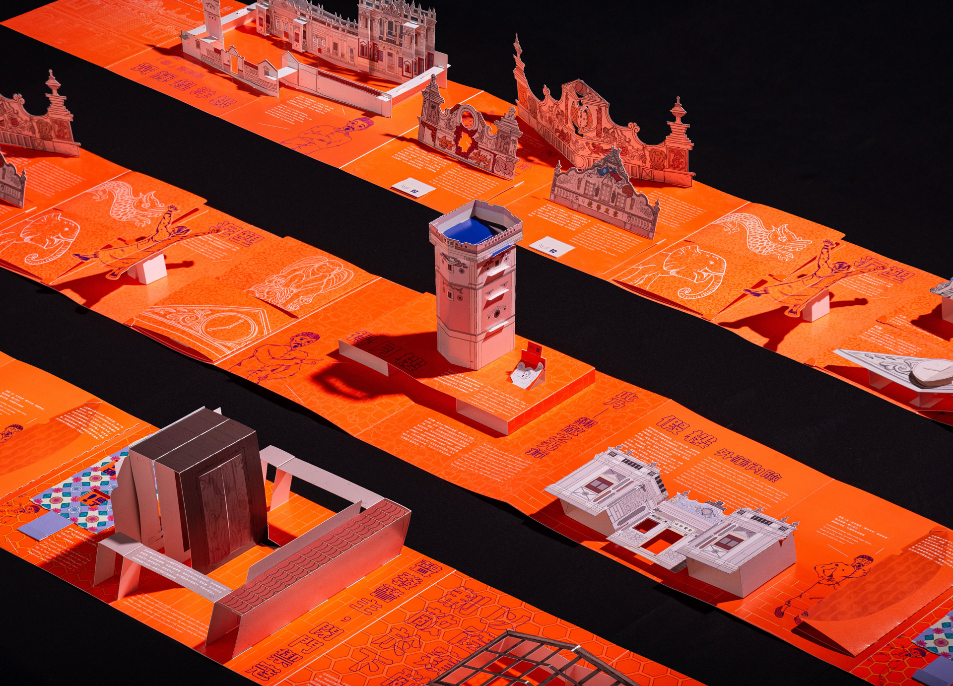
Last year, I had a good opportunity to participate in a fairly large exhibition in New York, and this fall, I will also hold an exhibition at Gana Art Center. I would like to continue working as an artist as I do now and take on the challenge of building my own experimental body of work. In 2007, I published a travel book titled New York’s Treasure House with my wife, who is a chef. In 2028, when I turn fifty, I would also like to publish a meaningful book as a way of looking back on the first half century of my life. Rather than leaving behind a grand design value, I would like to leave designs in the world that can be remembered and talked about by later generations.














#14057, 905 49, Beolmal-ro 102beon-gil,
Dongan-gu, Anyang-si, Gyeonggi-do, Korea
Business Registration Number: 454-86-01044
Online Sales License No.: 2021-Anyang Dongan-1081
Copyright © DESIGNSORI Co., Ltd.