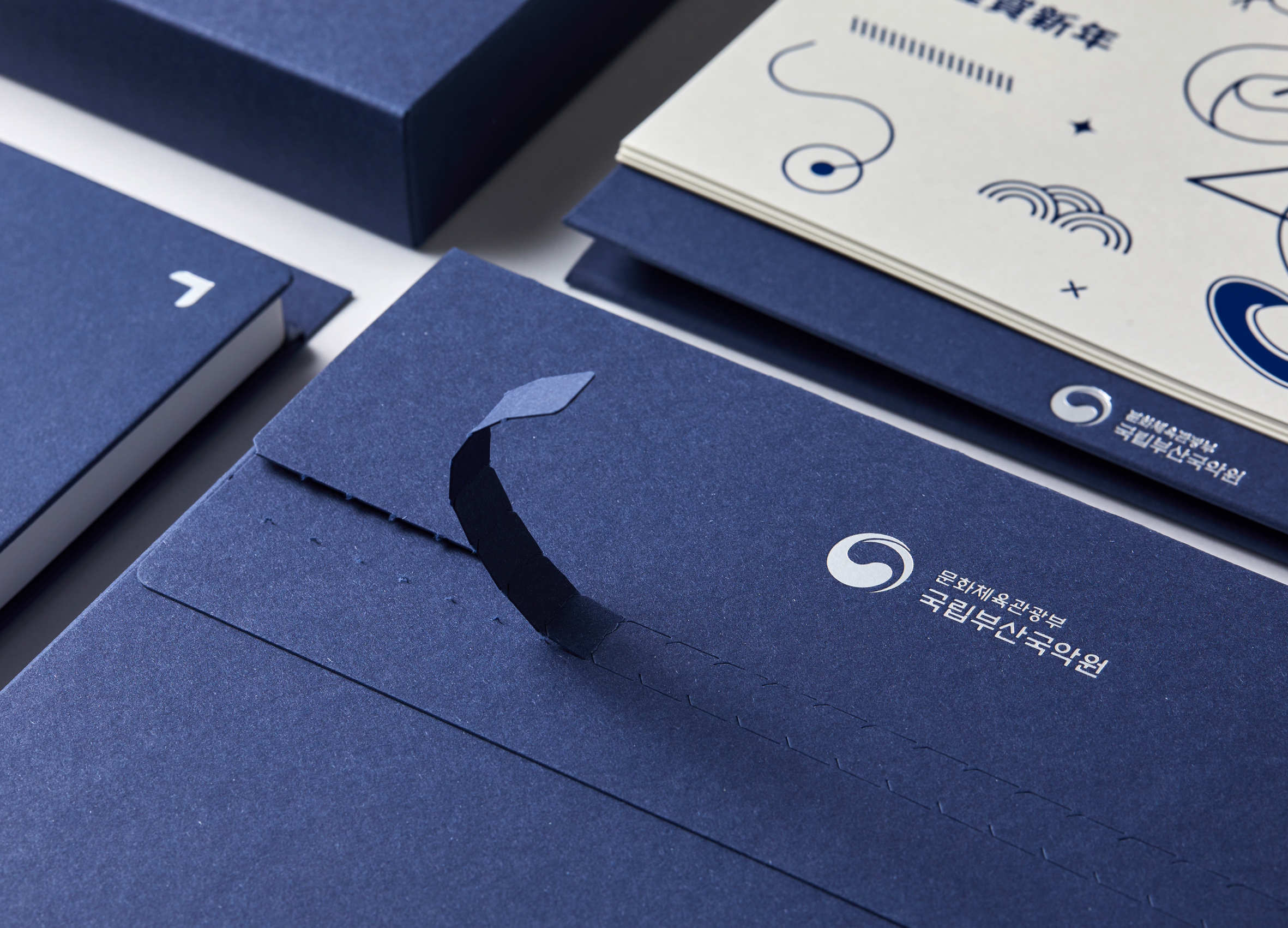
Shiroa Brand Identity Renewal
Communication
Regions
Korea
Year
2026
Award
WINNER
Client
Shiroa Postpartum Care Center
Affiliation
Design Astrein & Shiroa Postpartum Care Center
Designer
Doeun Kang, Mingyeong Kim
English
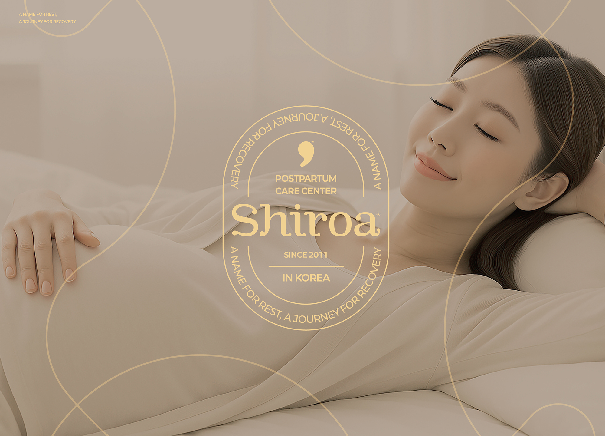
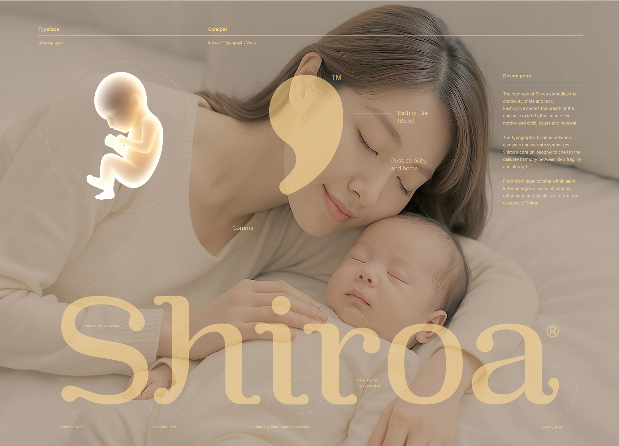
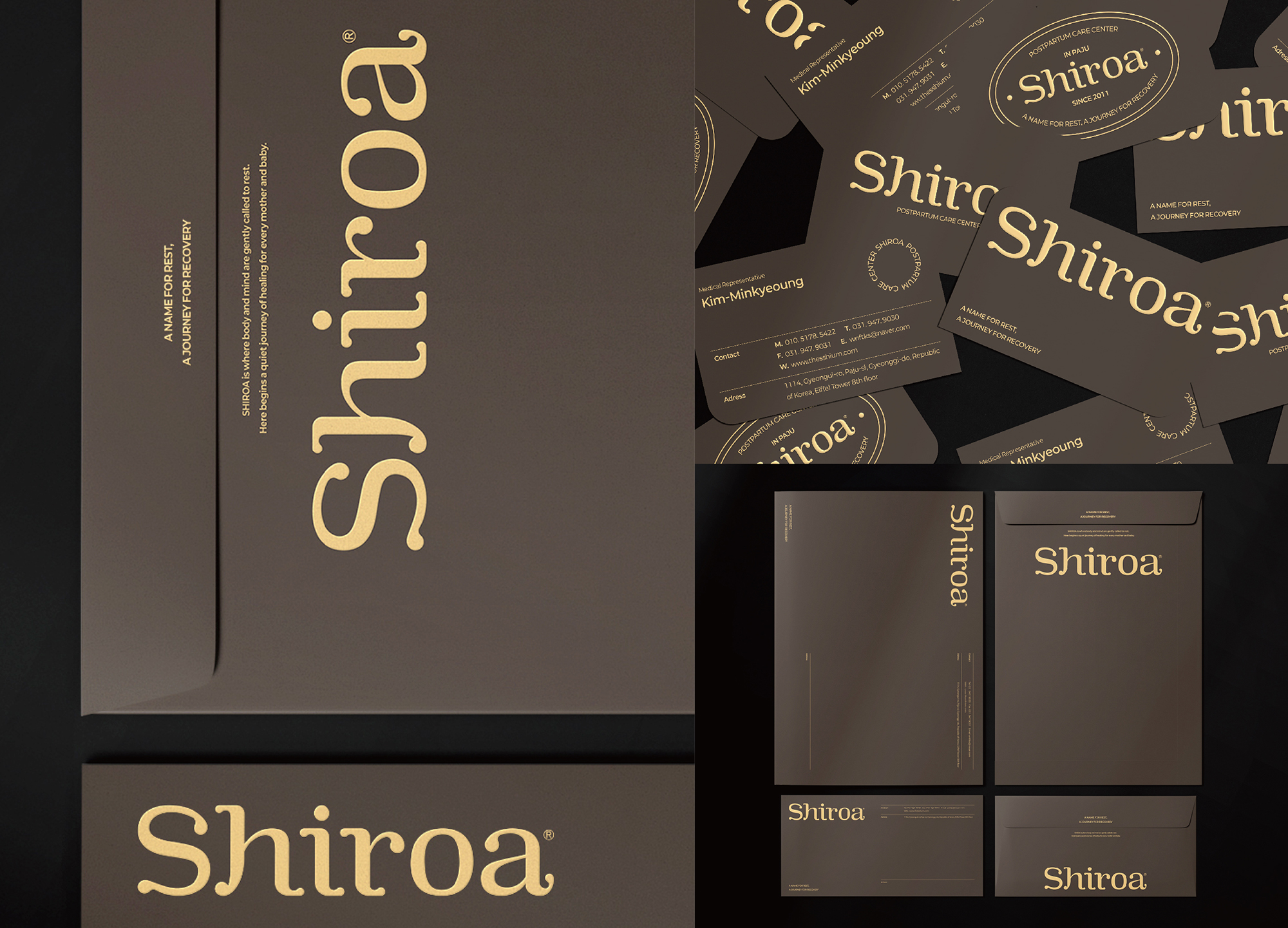
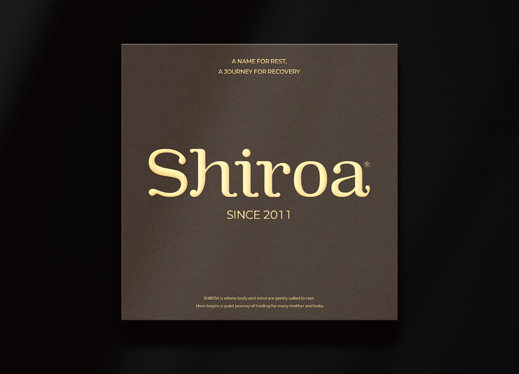
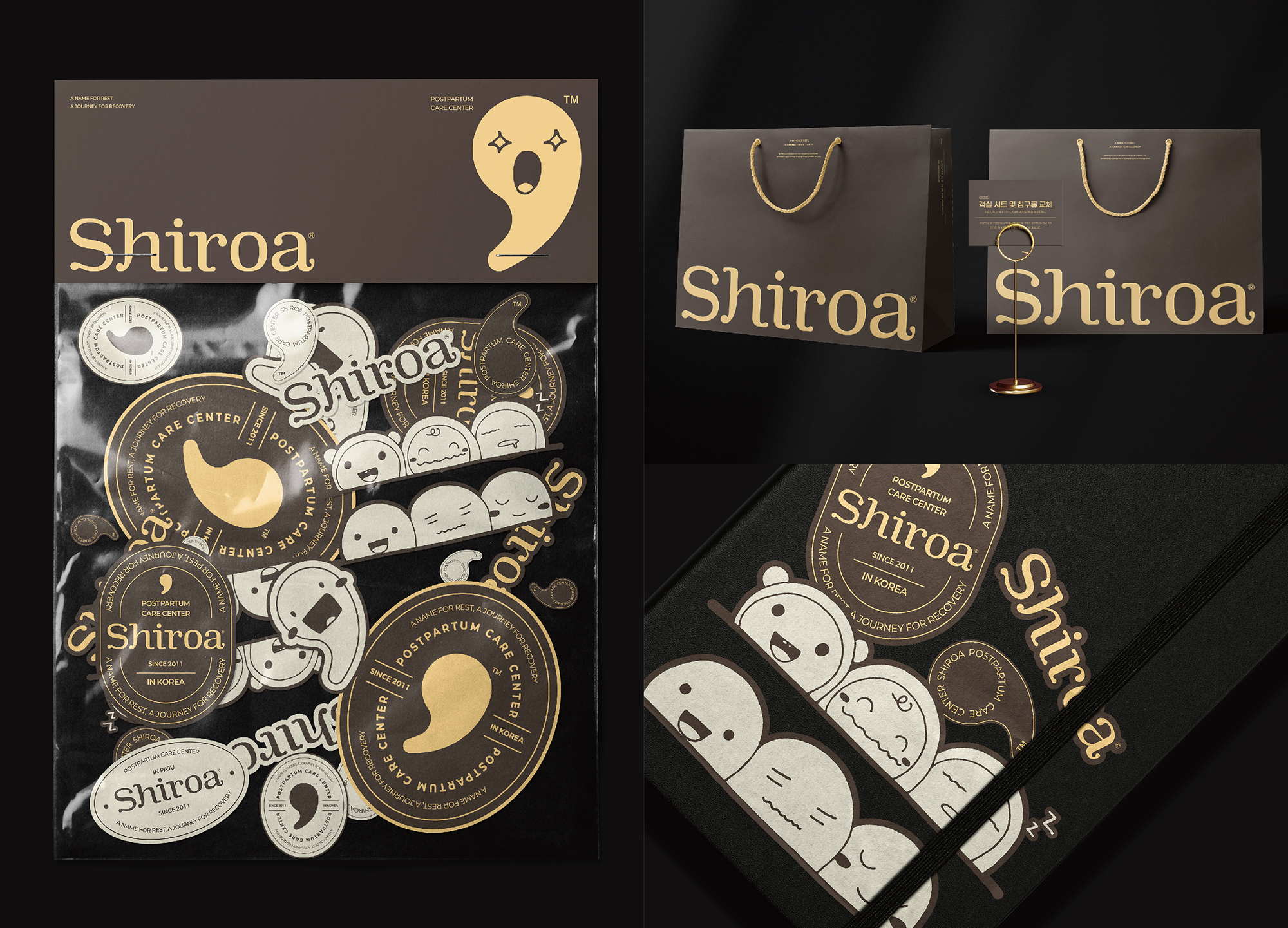
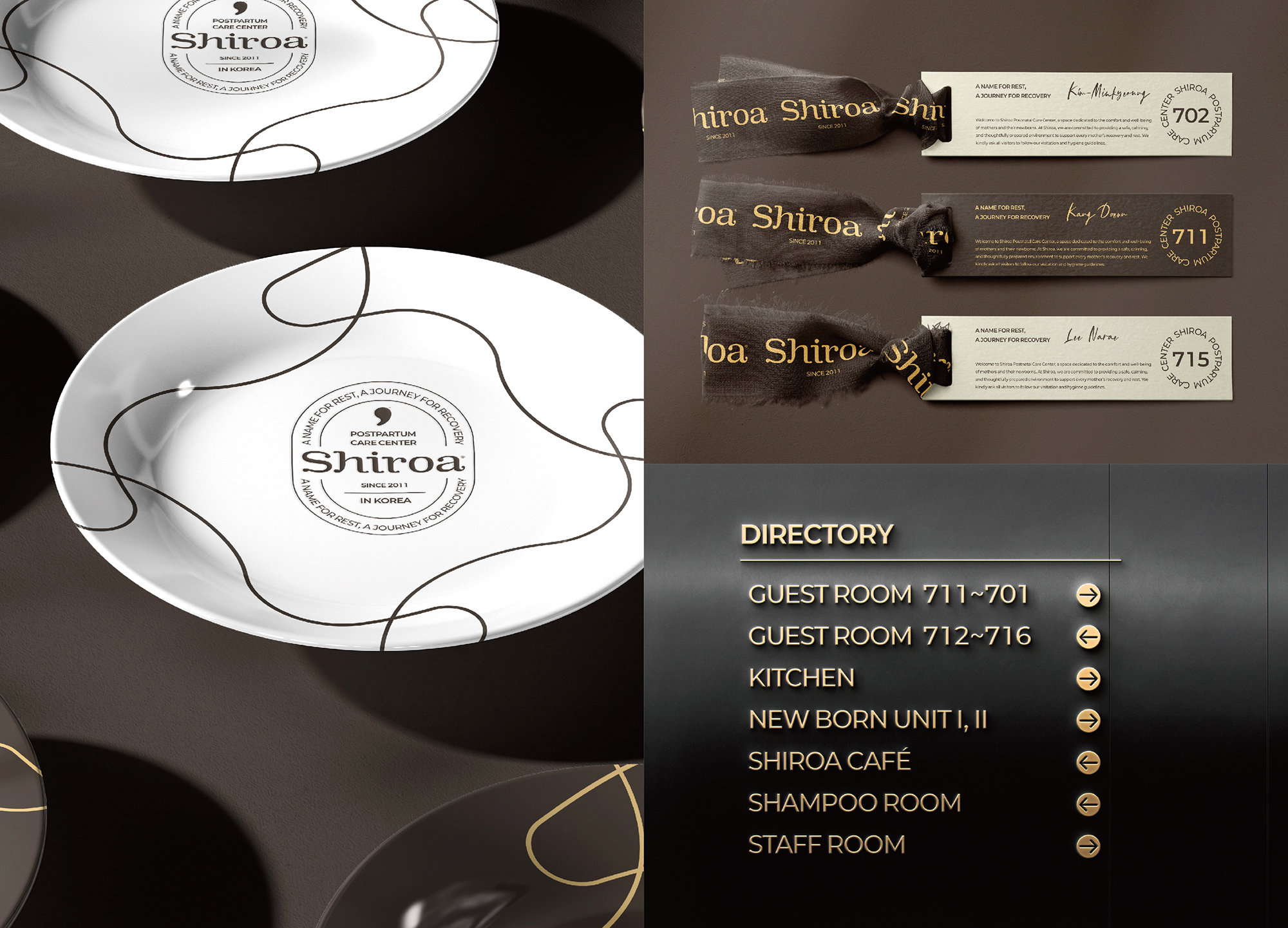
Shiroa is a rebranding project for a postpartum care brand that redefines rest and recovery through design. The new name SHIROA, evolved from SHIUM (rest) and ROA (journey), was created to build a global brand beyond trademark limits. Its identity centers on motherhood, uniting mother and baby as one. The symbol merges a comma with a baby’s form, representing life’s beginning and gentle breath. The logotype, derived from the same curve, visualizes harmony between rest and care. Through a flexible identity system, the symbol adapts to emotional variations and applications across goods and media, creating a refined and human brand experience.
Native
시로아(Shiroa)는 ‘쉼과 회복의 본질’을 디자인으로 재정의한 산후조리원 브랜드 리브랜딩 프로젝트입니다.
기존 ‘쉼(SHIUM/Rest)’에서 발전된 새로운 이름 ‘시로아(SHIROA)’는 쉼(SHIUM)과 회복의 길(ROA)에서 유래하였으며, 상표권 한계를 극복하고 글로벌 확장을 목표로 개발되었습니다. 브랜드의 핵심은 ‘산모와 아기’의 관계에 집중하여 두 존재를 하나로 상징화한 데 있습니다. 쉼표(Comma)와 아기의 형상을 결합한 심볼은 삶의 시작, 호흡, 그리고 휴식을 의미하며, 쉼표에서 비롯된 로고타입은 회복의 리듬을 시각적으로 표현합니다.
또한 플렉서블 아이덴티티 시스템을 적용해 아기의 표정이나 감정 변화, 굿즈·광고 등 다양한 확장이 가능하도록 설계되었습니다.
Website
Positive Comments


Whispered Luxury
YUAN SHUO DESIGN
Taiwan
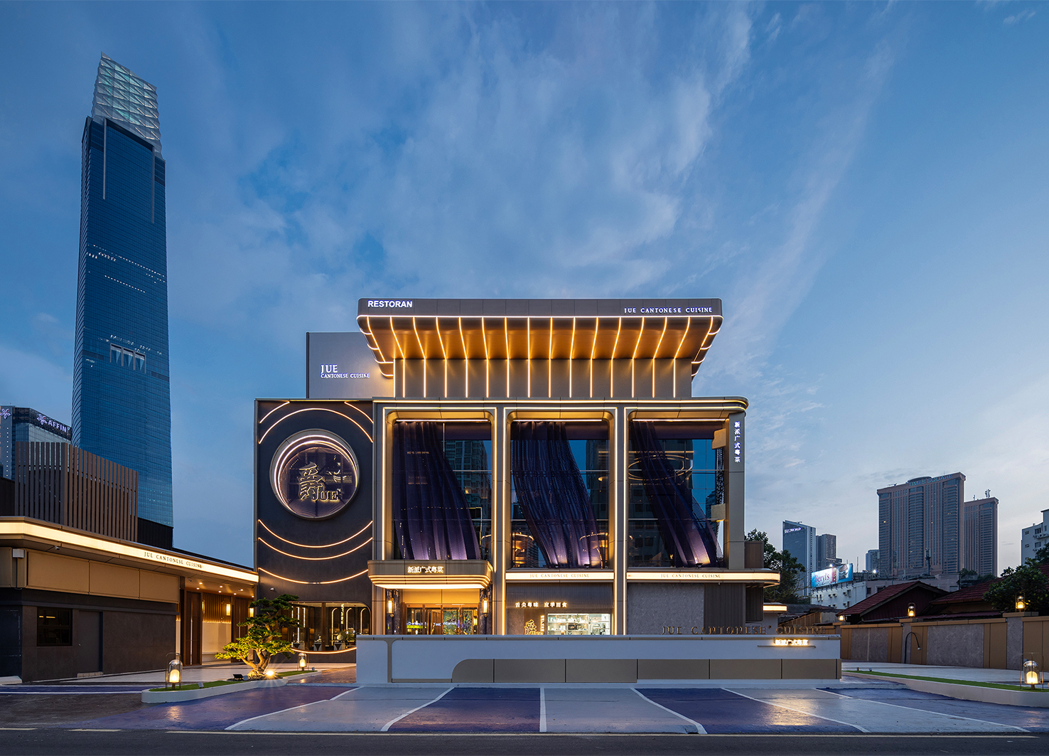
JUE Restaurant
Seee Design Studio
Malaysia

RAEMIAN ONE PERLA EXTERIOR
SAMSUNG C&T CORPORATION
Korea
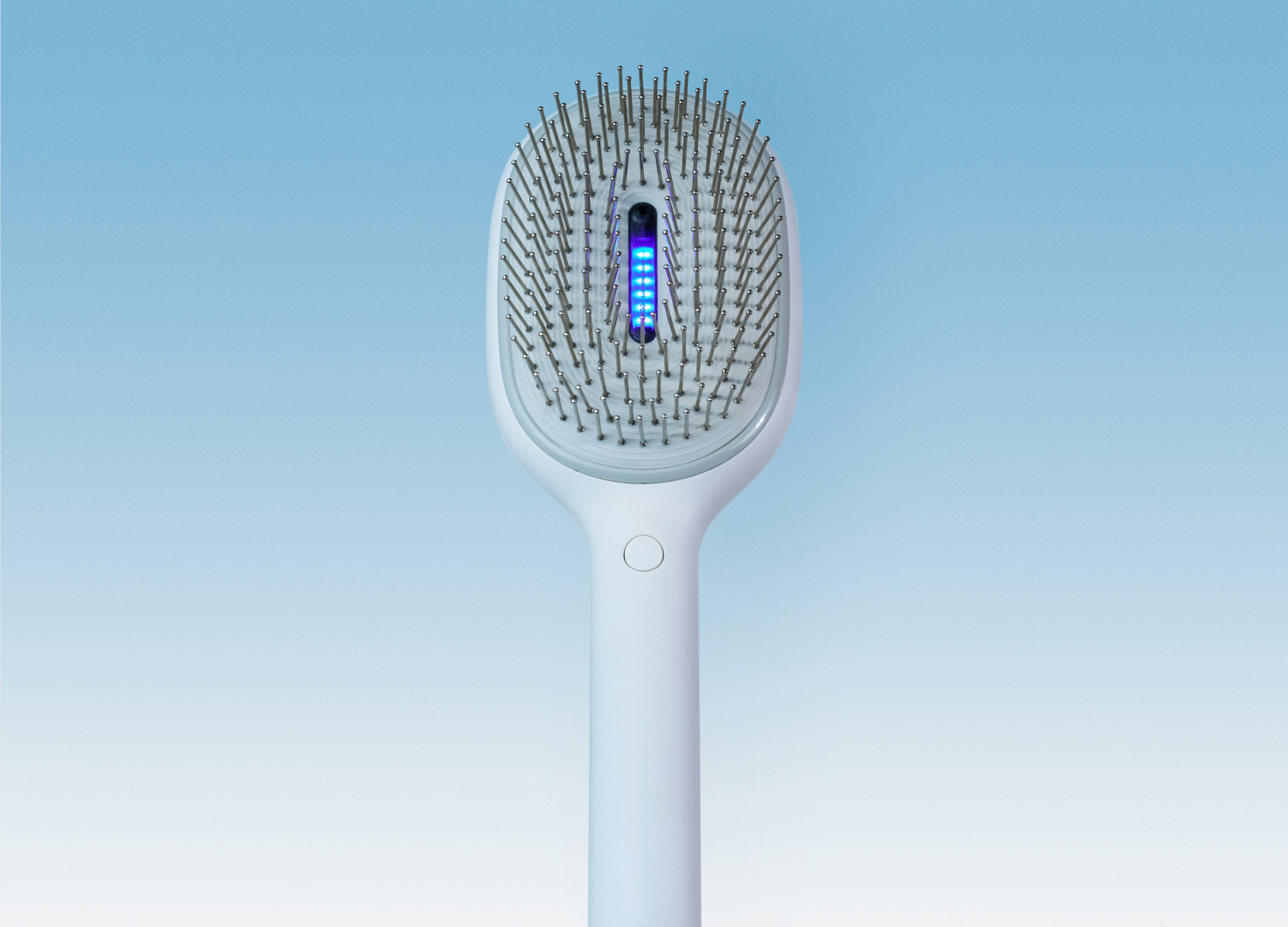
Lumion Brush
MINISO
China
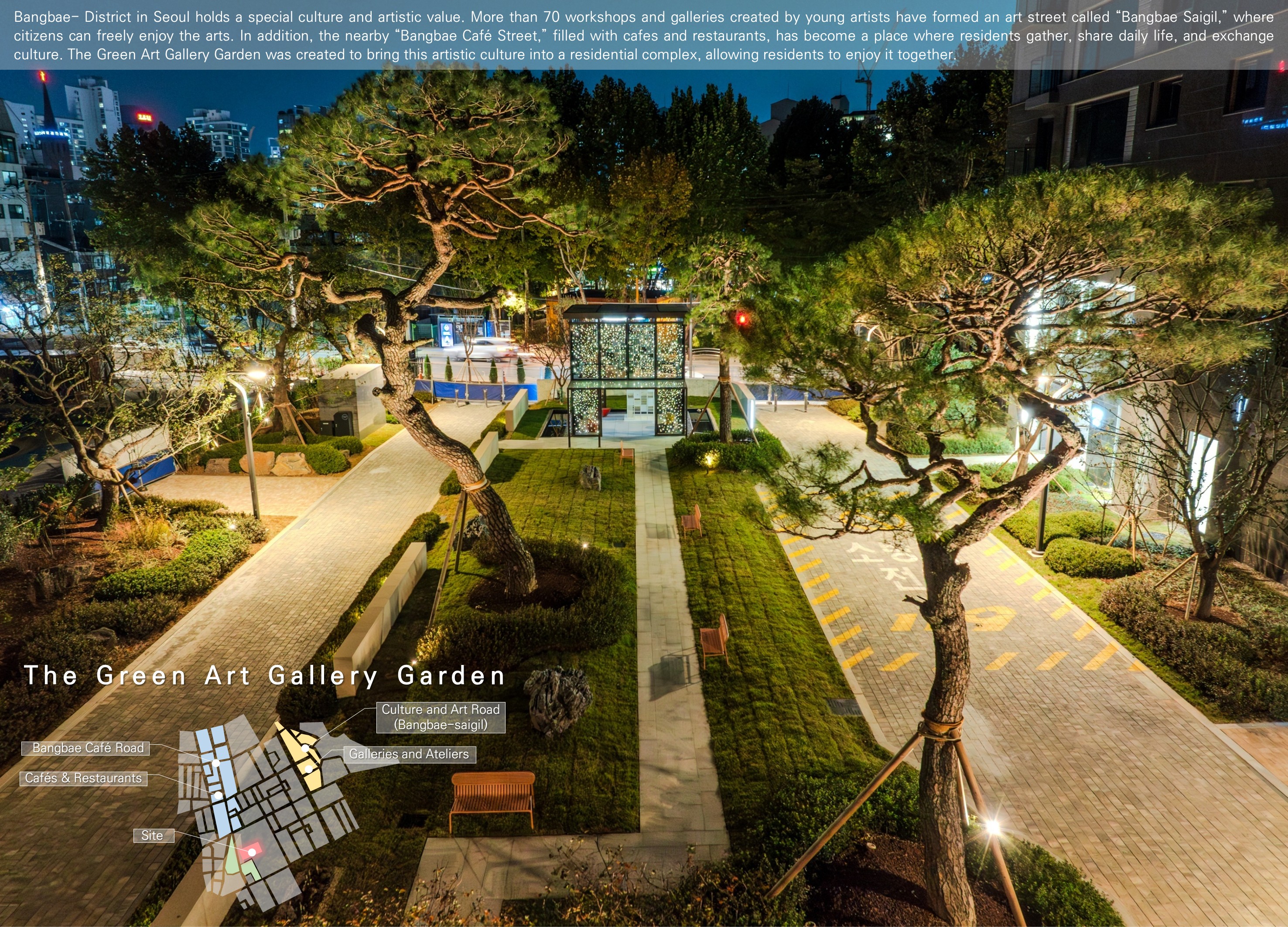
The Green Art Gallery
Samsung C&T Co., Ltd.
Korea
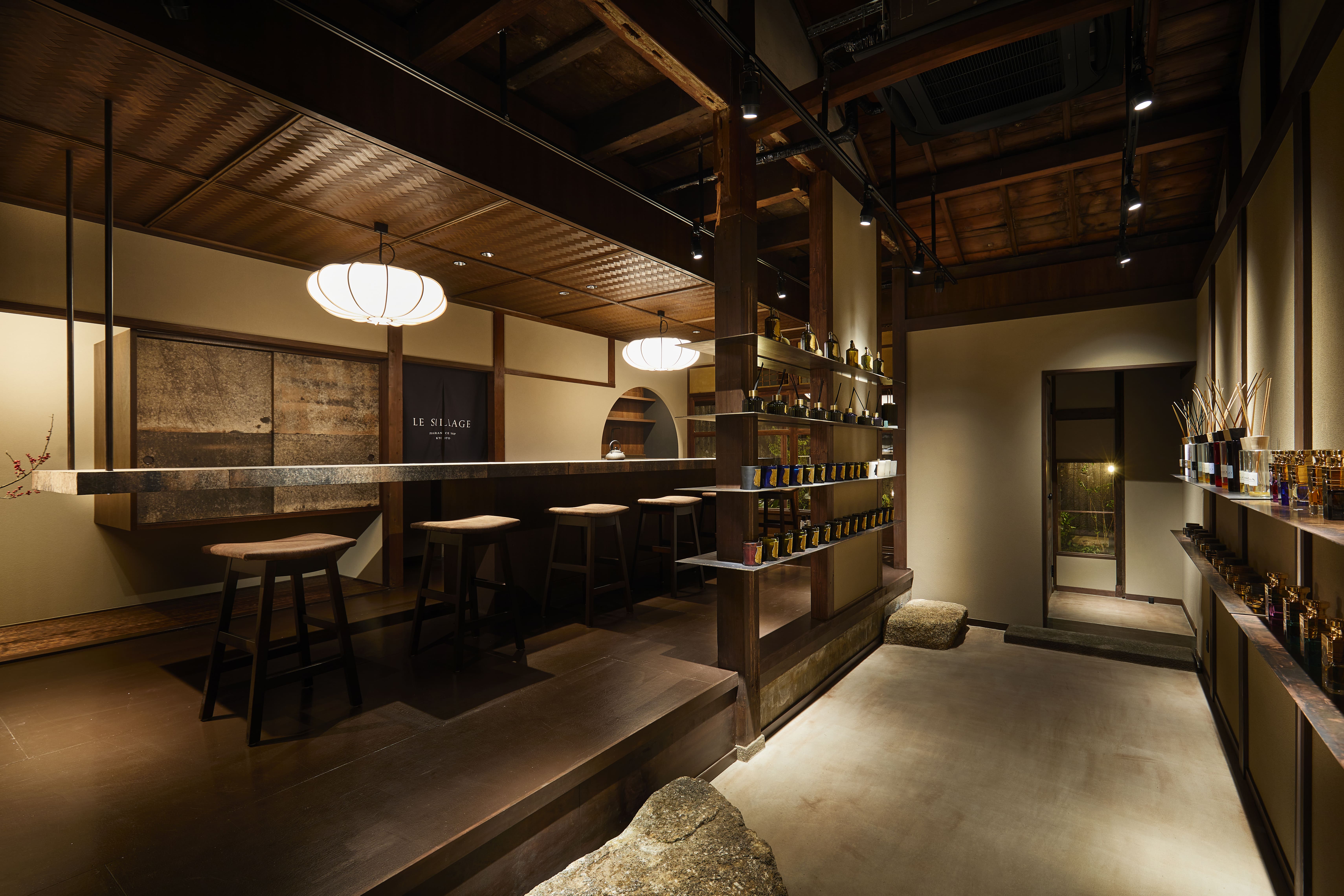
LE SILLAGE FRAGRANCE SHOP KYOTO
Reco Inc.
Japan
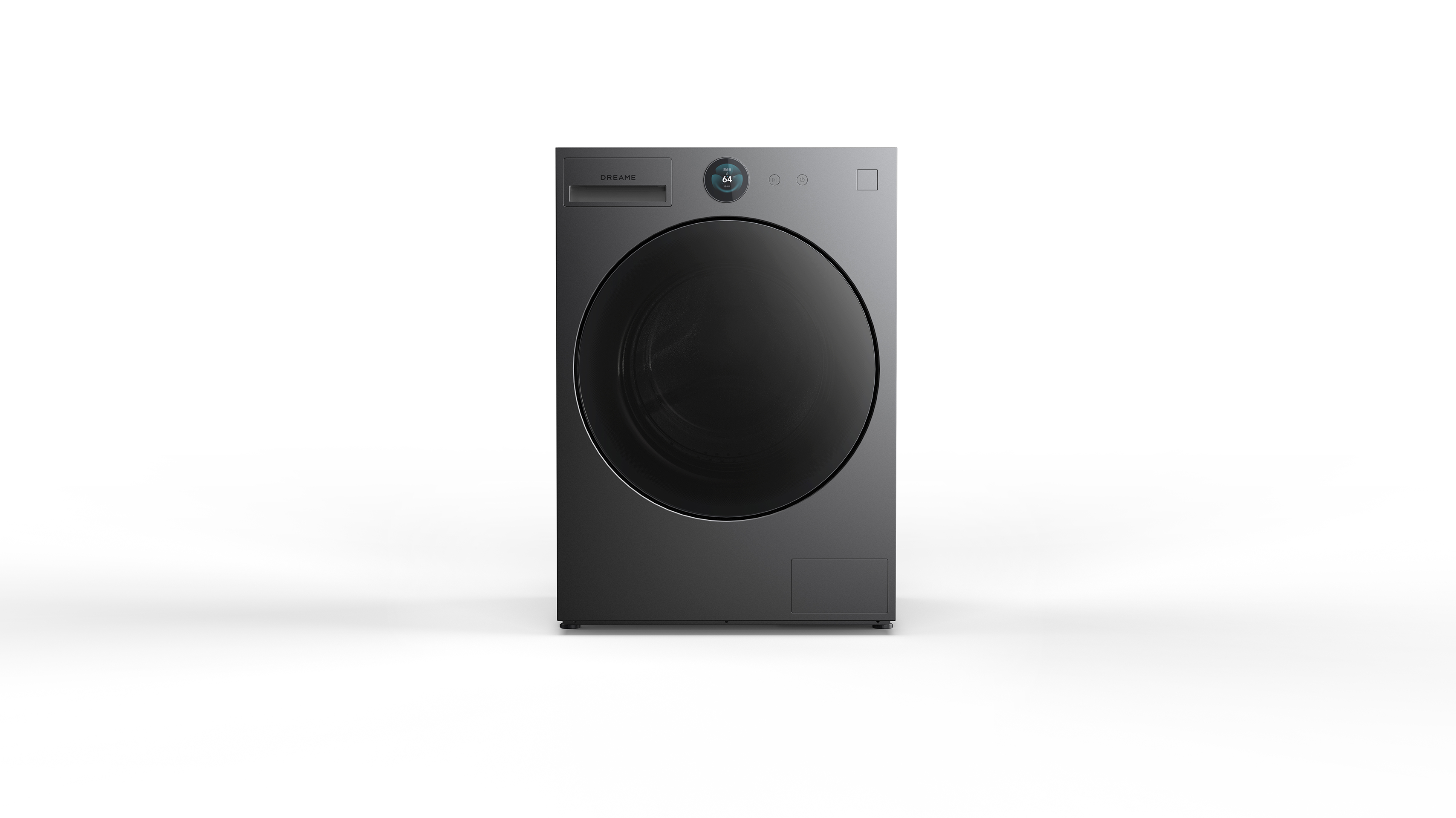
L9 Laundry Series
Nanjing NexChip PureTech Co., Ltd.
China
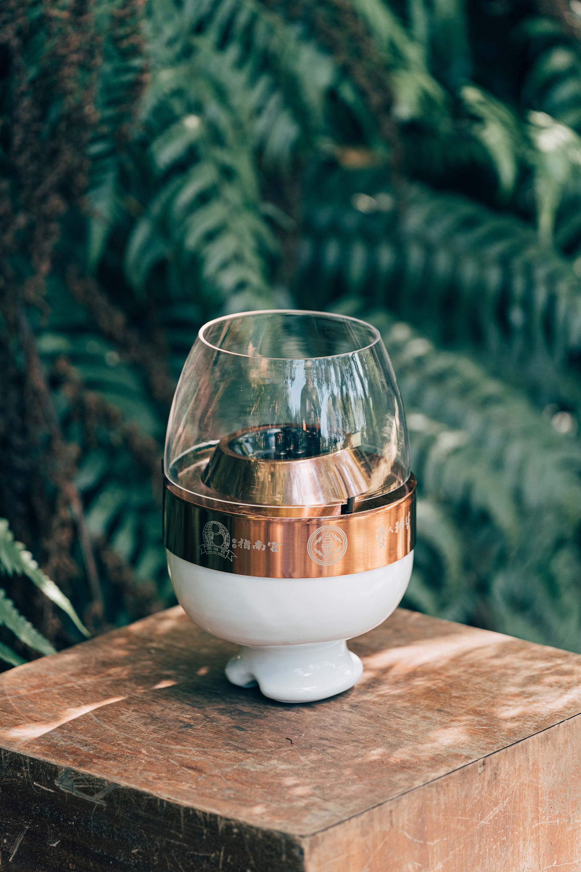
Eternal Heart Lantern
Taiwan Power Company
Taiwan
THE WAVE
Samsung C&T E&C Group Corp.
Korea
IPARK WATER OBJET
HDC Hyundai Development Company Co., Ltd.
Korea
2025 Calendar Package
BREEZE PARTNERS
Korea
Luminous Library
Design Action
China Hong Kong
Kenbo House
KENBO Co., Ltd.
Japan
Fat Wood Byobu
Muneji Toh Architects Co., Ltd.
Japan
Shiroa Brand Identity Renewal
Design Astrein & Shiroa Postpartum Care Center
Korea
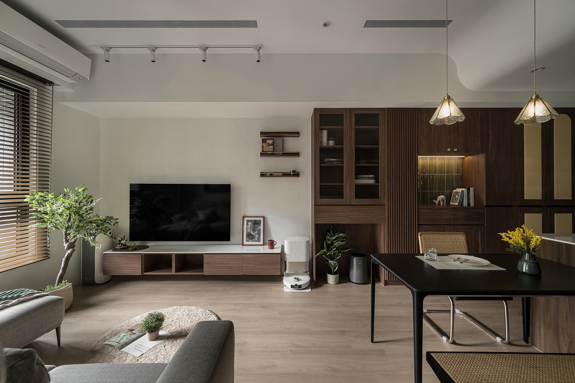
Lingering Warmth
Cozy Nest Interior Design
Taiwan
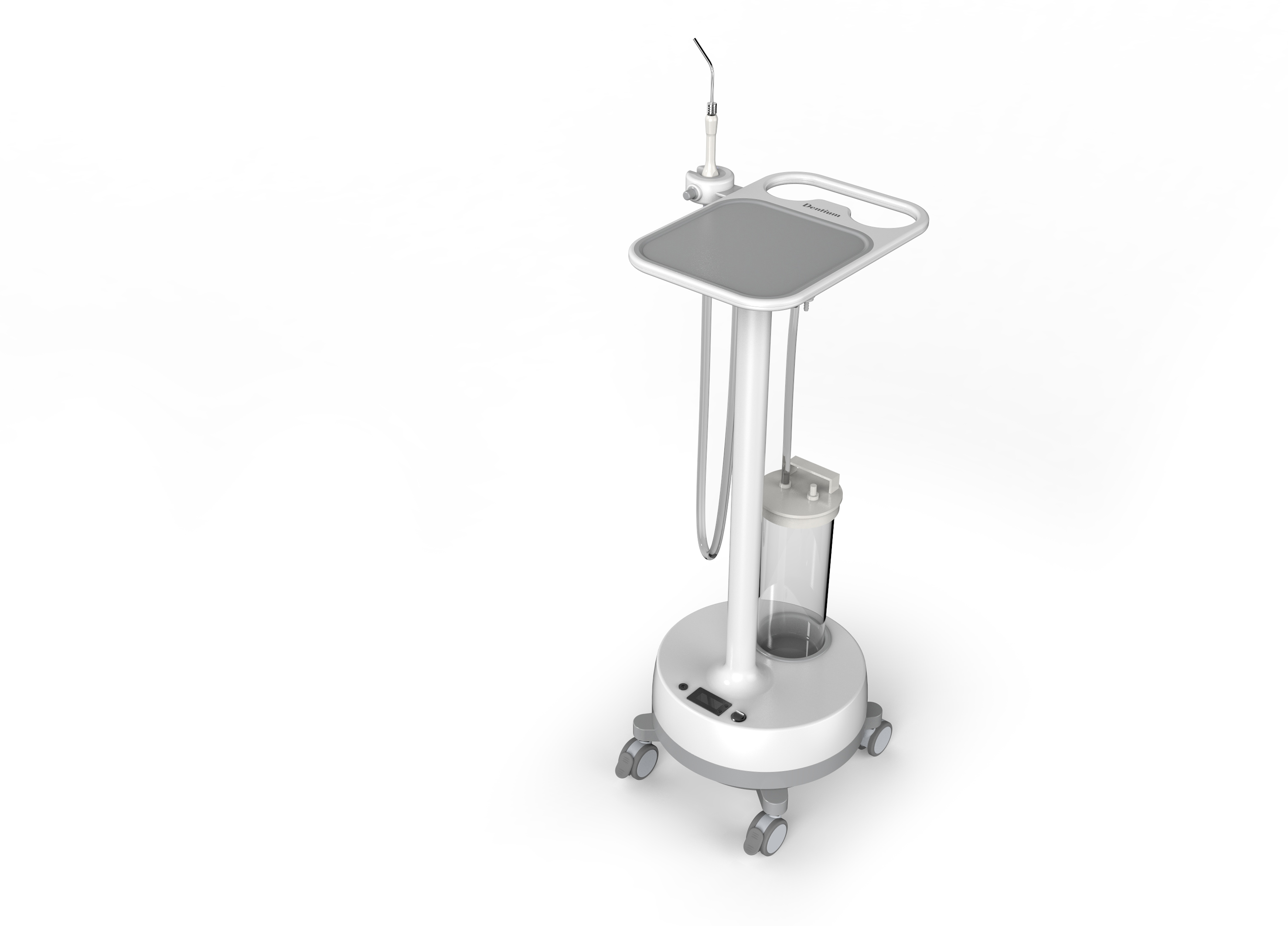
Dental mobile suction Device
PINO Co., Ltd.
Korea
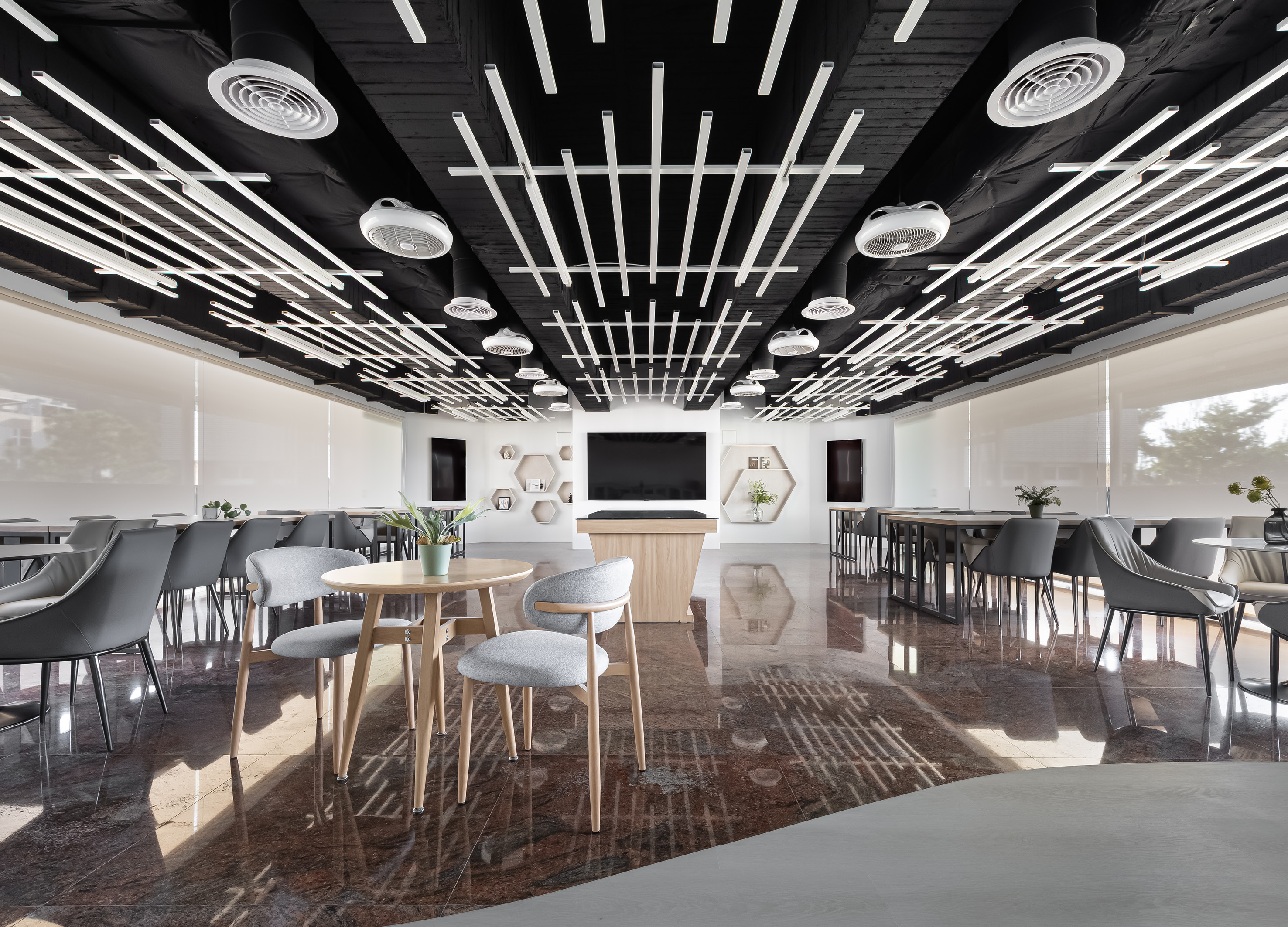
Alumni Hall of NCUE
MUSA International Design Interior Decoration
Chinese Taipei


Partner & Sponsor
More


info@asiadesignprize.com
#14057, 905 49, Beolmal-ro 102beon-gil,
Dongan-gu, Anyang-si, Gyeonggi-do, Korea
#14057, 905 49, Beolmal-ro 102beon-gil,
Dongan-gu, Anyang-si, Gyeonggi-do, Korea
Founder: Doyoung Kim
Business Registration Number: 454-86-01044
Online Sales License No.: 2021-Anyang Dongan-1081
Copyright © DESIGNSORI Co., Ltd.
Business Registration Number: 454-86-01044
Online Sales License No.: 2021-Anyang Dongan-1081
Copyright © DESIGNSORI Co., Ltd.
