
Editor-in-Chief, the Asia Design Prize
For a long time, design existed in a territory that resisted clear explanation. Form and function, proportion and color balance were often interpreted through the intuition of designers or the language of critics, leaving design ultimately positioned as a language of sensation. People could instantly recognize when a work felt “good,” yet explaining exactly why was never simple. The 2026–2027 Asia Design Trend Report begins precisely at that point. It is an attempt to read design not as an abstract emotional field, but as a structure of data. More specifically, it is an effort to trace how design reflects and evolves alongside the spirit of its time through the flow of data itself.
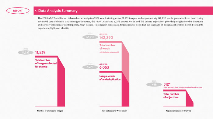
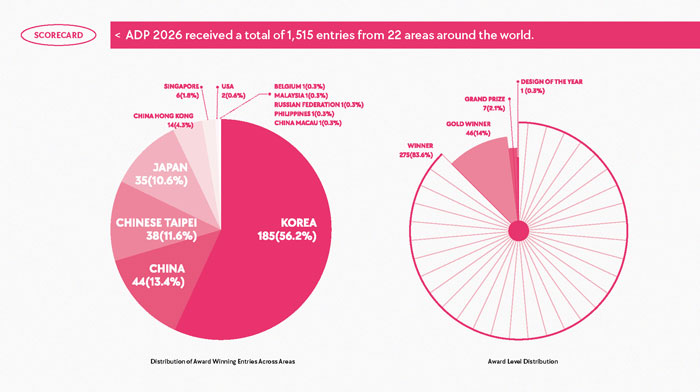
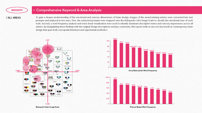
This year’s report is based on 329 award winning projects selected from 1,515 entries submitted across 22 regions worldwide, alongside 11,539 high resolution images. Approximately 142,290 words were extracted from project descriptions, jury comments, and image based AI prompts. Among them, 6,053 refined keywords and 512 descriptive adjectives became the core analytical dataset. Beyond simple keyword frequency analysis, the report also integrates color frequency mapping through the Kobayashi Color Image Scale, allowing subtle emotional atmospheres and tonal directions within the works to be visualized and cross examined. Rather than merely organizing stylistic trends, the report attempts to decode what contemporary Asian design is actually communicating through the intersection of text, image, and emotional coordinates.
What makes the data compelling is not simply its scale, but the shift embedded within it. Compared to 2025, the descriptive density per project increased dramatically. Designers are no longer explaining their works solely through form and function. Context, emotion, attitude, and ethics are increasingly becoming part of the design narrative itself. Design is evolving into a field that speaks more expansively than before, and the 142,290 words in this report resemble less a collection of texts and more a map of how contemporary design thinks. One of the most revealing findings lies in the keyword rankings themselves. Contrary to expectations, the most dominant word across the entire dataset was not “form,” but white (911). It was followed by text (758), space (756), room (735), modern (633), and wall (575). This suggests that Asian design in 2026 shares a common visual foundation built around restrained white surfaces and minimal structures, while differentiation increasingly emerges through light, materials, atmosphere, and emotion. The question is no longer what has been added, but what kind of mood lingers within the experience.
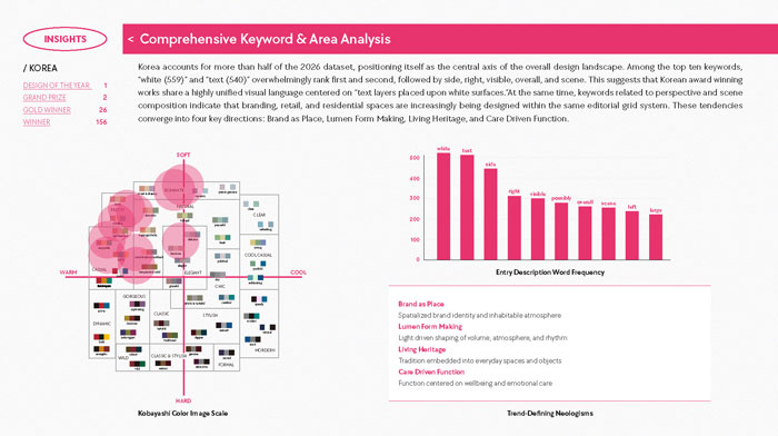
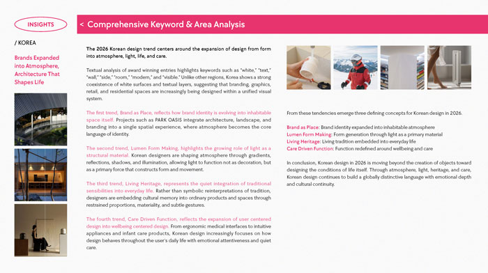
Regional differences become even more fascinating. In Korea, white (559) and text (540) appear at nearly identical frequencies, revealing how brand typography is being absorbed directly into spatial composition. China shows an even distribution between room (122), white (119), and space (114), emphasizing large scale interior environments. In Japan, wooden (81) enters the top rankings, signaling a stronger sensitivity toward materiality and landscape. Meanwhile, Hong Kong places room (100) ahead of space (85), reflecting a focus on carefully orchestrated experiences within compact environments. Even within the shared framework of Asian design, each region speaks through a distinctly different visual language. This is where the significance of the report truly emerges. Traditionally, design trend analysis has relied heavily on the intuition of curators, editors, or critics. This report instead reads repeated patterns through 11,539 images and 142,290 words. Of course, data itself can never be completely neutral. Which works were submitted, selected, and awarded already reflects a series of choices. Yet at the very least, we now possess a new framework for discussing design not simply through subjective feeling, but through accumulated patterns and recurring structures.
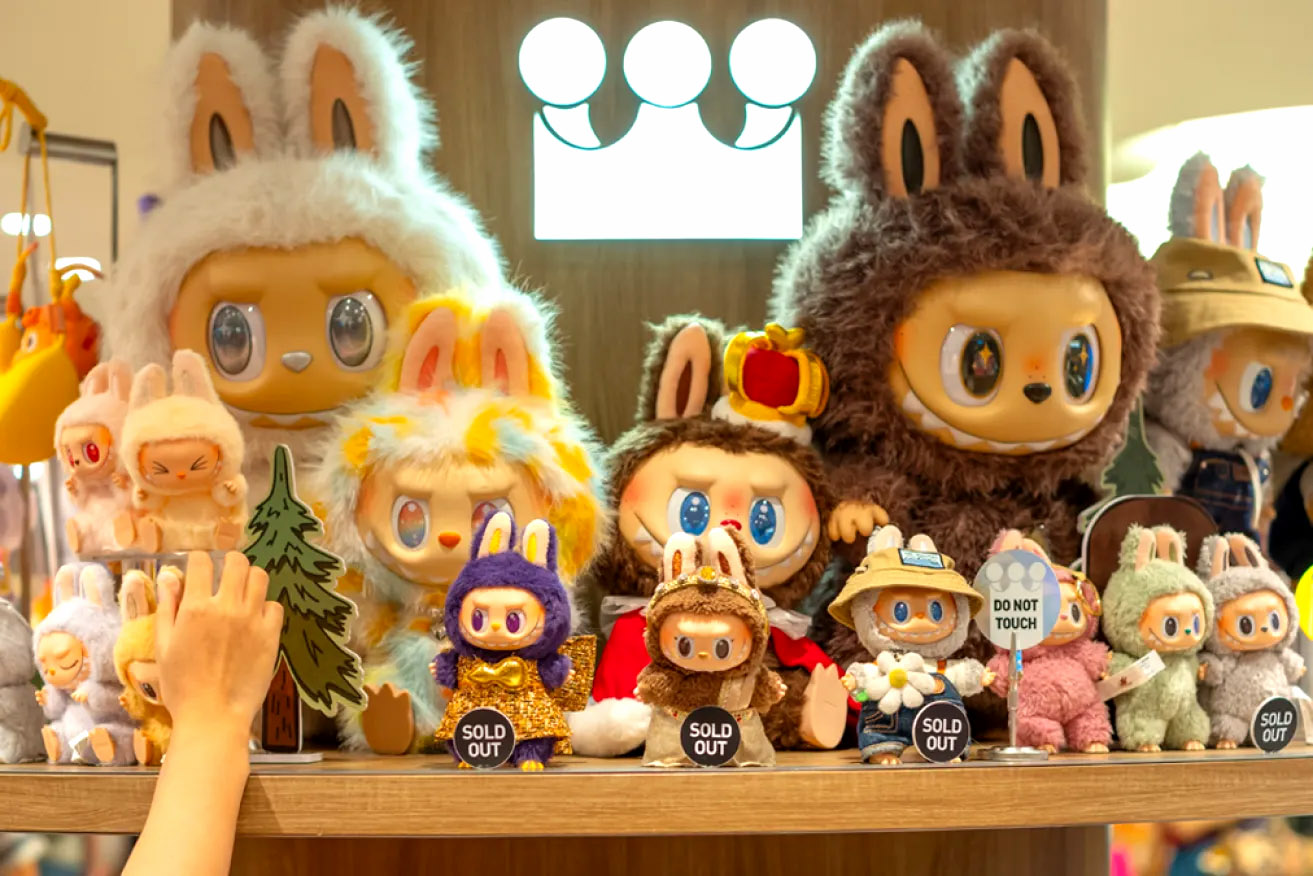
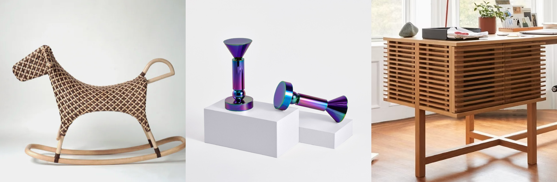
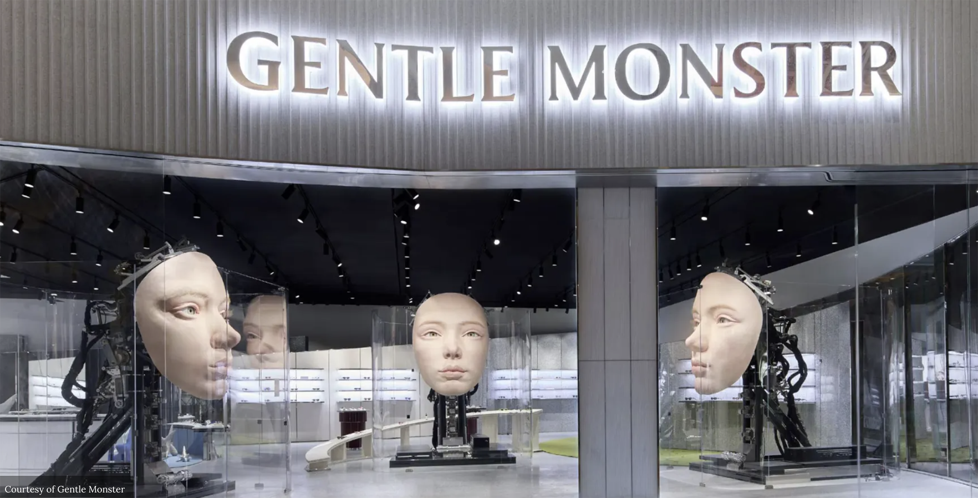
Another notable shift is the report’s use of the term “Region” rather than “Country.” This reflects an approach that prioritizes cultural and emotional context over administrative boundaries. Korea, China, Japan, Taiwan, and Hong Kong each reveal entirely different vocabularies and atmospheres despite belonging to the same broader Asian context. Data based analysis allows these subtle distinctions to appear with far greater clarity. More importantly, this report does not stop at summarizing trends. It attempts to trace where design itself is moving. If the 2025 report proposed four major directions through Senterface, Neoditional, Identeling, and Livingformal, then 2026 sees these ideas evolve into new codes: LUMINSCAPE, BIOFORMA, BRANDLIVING, and CIVITONE. Light becomes a primary material. Nature transforms into living systems and organic structures. Brands evolve into inhabitable experiences. Public design begins to embrace warmer emotional tones and systems of care.
The integration of text analysis and color analysis also gives this report unique significance. Within the Kobayashi Color Image Scale, Korea gravitates toward polished and peaceful tones, China toward bold and luxurious atmospheres, and Japan toward calm and genuine sensibilities. In many ways, this can be seen as one of the first attempts to visualize the emotional atmosphere of design through data.
Ultimately, the report proposes two central ideas. First, design has entered an era in which it can be read through data. Second, the direction revealed by that data increasingly points toward intangible values such as atmosphere, emotion, and care. Design is no longer limited to shaping objects. It is expanding into the design of environments, emotional conditions, and the experiences within which people live and remain. This series begins with those 142,290 words. In the chapters ahead, we will explore the four major trend codes alongside the evolving design languages of Korea, China, Japan, and Taiwan. Reading design through data is ultimately about discovering new ways to understand design more deeply. We are entering an era in which the challenge is no longer simply how to see design better, but how to read it more precisely.


#14057, 905 49, Beolmal-ro 102beon-gil,
Dongan-gu, Anyang-si, Gyeonggi-do, Korea
Business Registration Number: 454-86-01044
Online Sales License No.: 2021-Anyang Dongan-1081
Copyright © DESIGNSORI Co., Ltd.
