Maguro
Space
Regions
China Hong Kong
Year
2023
Award
WINNER
Affiliation
MOI Interior Design
Designer
Frank Lo Tsz Chung
English
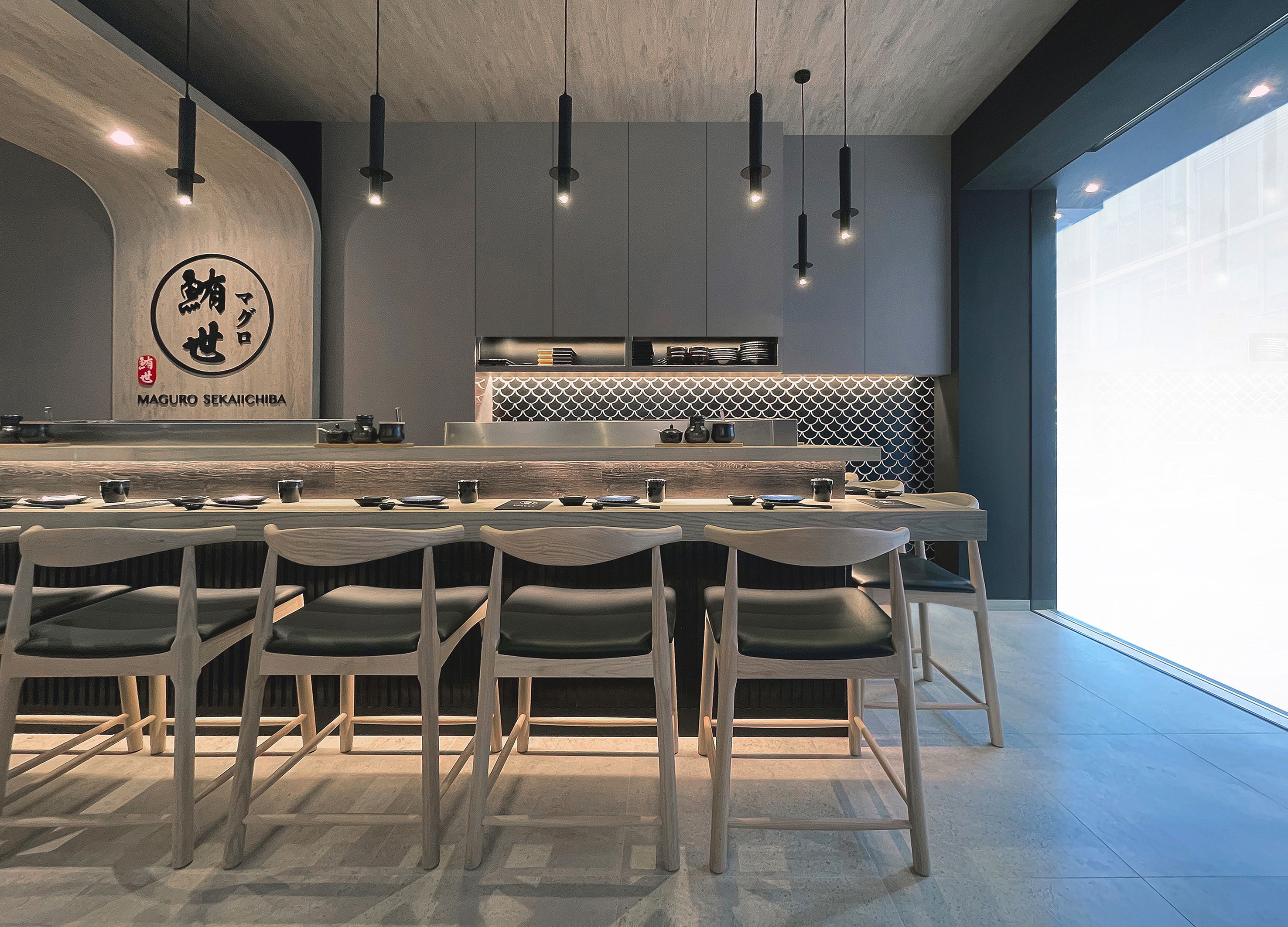
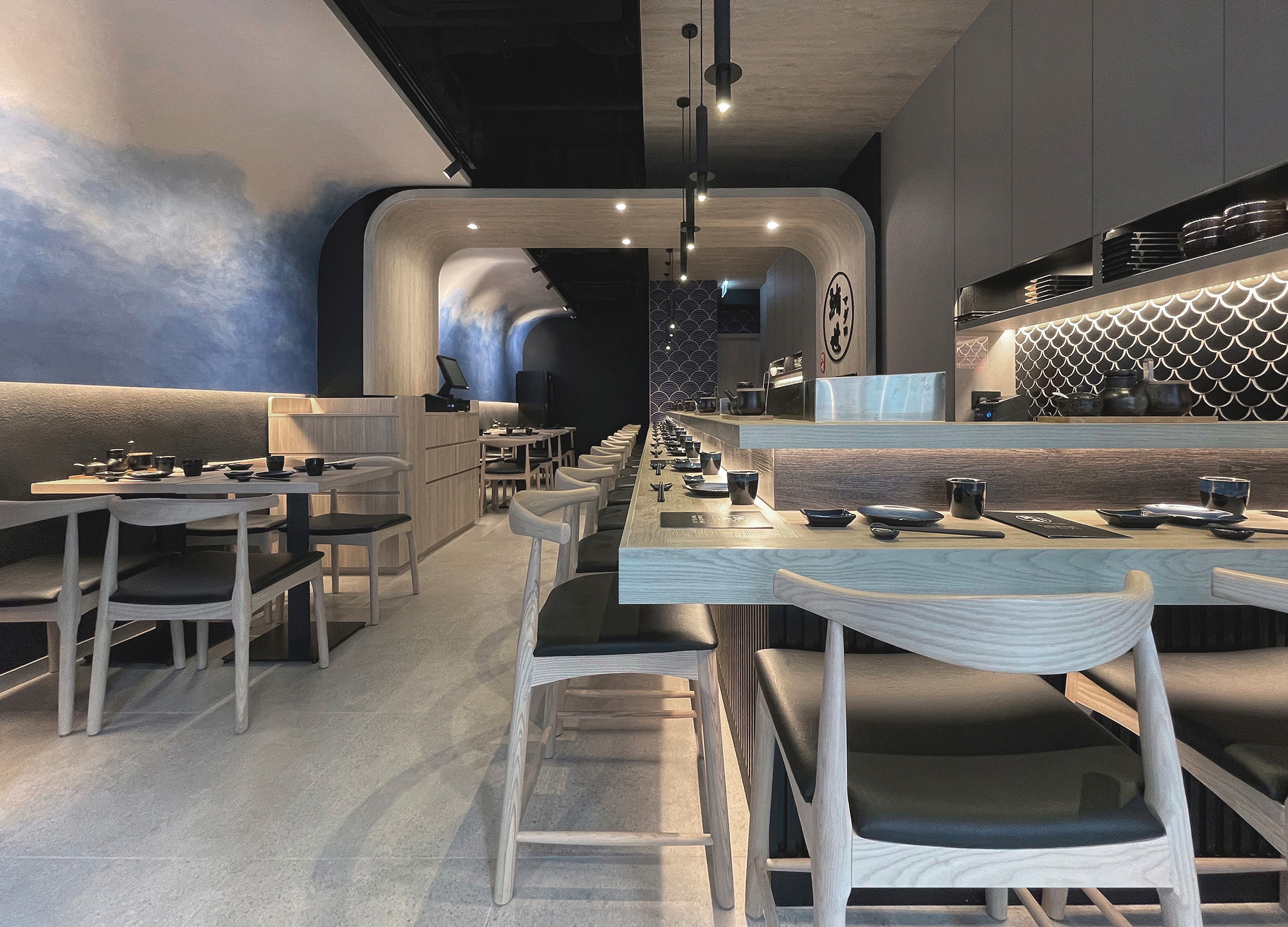
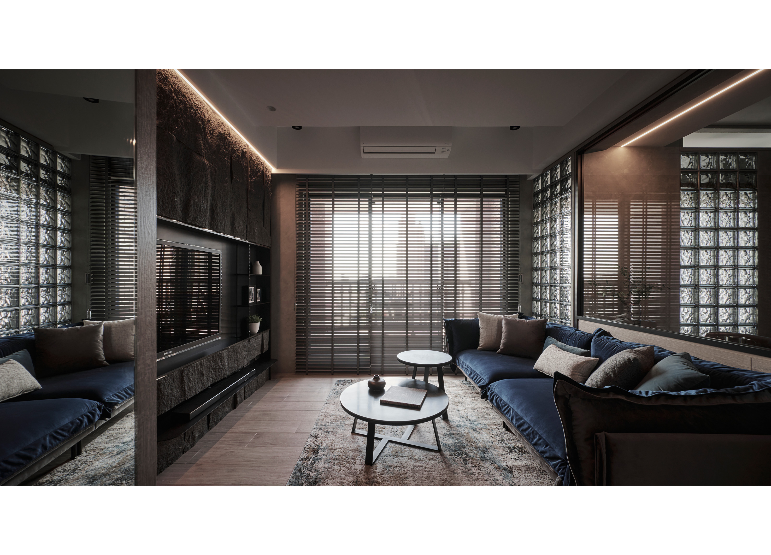
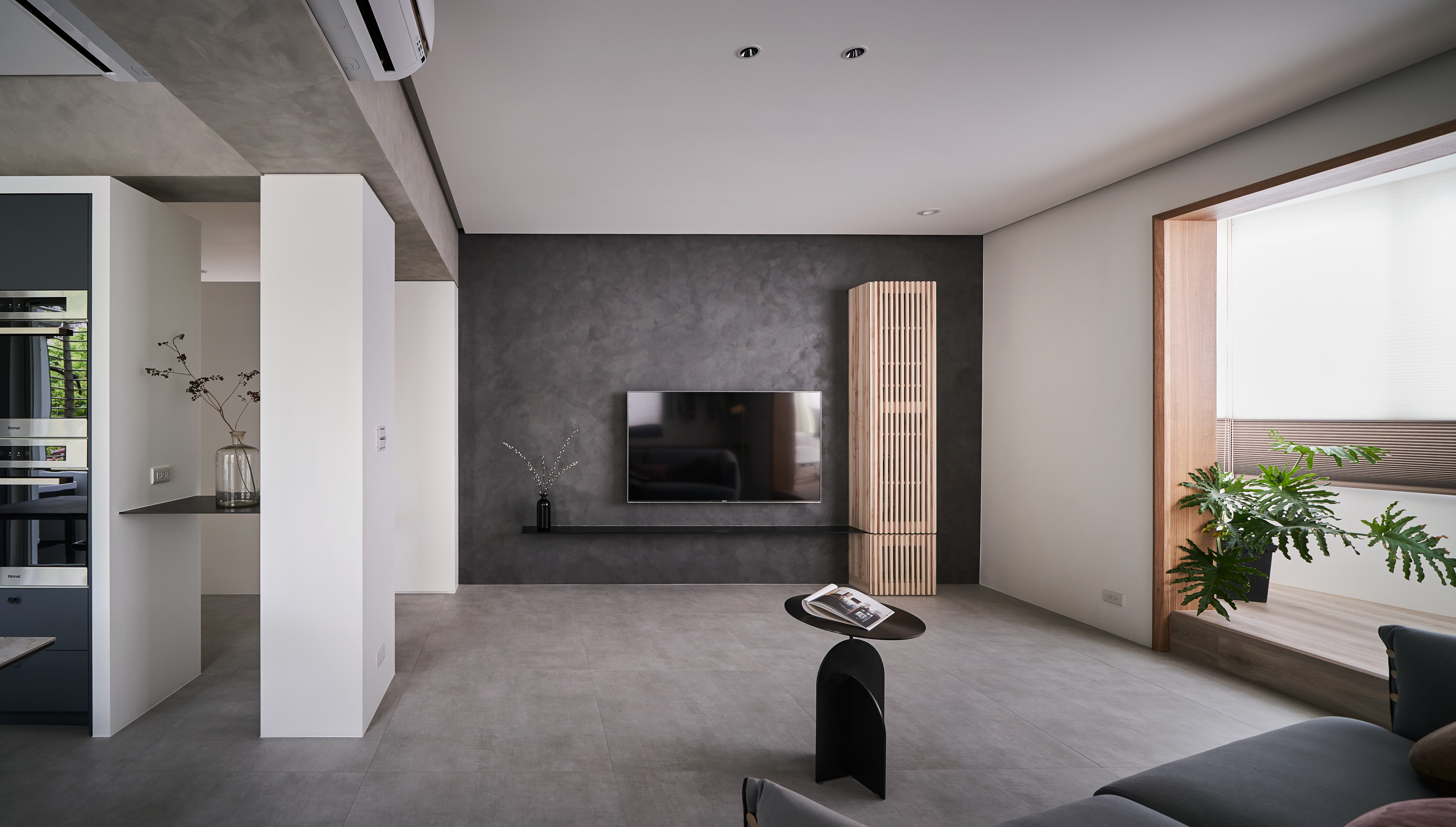
Tuna is called hon maguro in Japanese, which literally means “genuine”. The restaurant is divided into two sections. The designer added a set of arched wooden frames here. You will find the heart of the Tuna Maguro, which is decorated with sweeping lines and wood colors that connect both sides of the restaurant. These frames are the defining features of the restaurant. The areas on both sides were reconnected through light wood color and curved lines. This location is the core of the restaurant, as well as the meaning of "Hon Maguro", which is a metaphor for the restaurant's heart.
Native
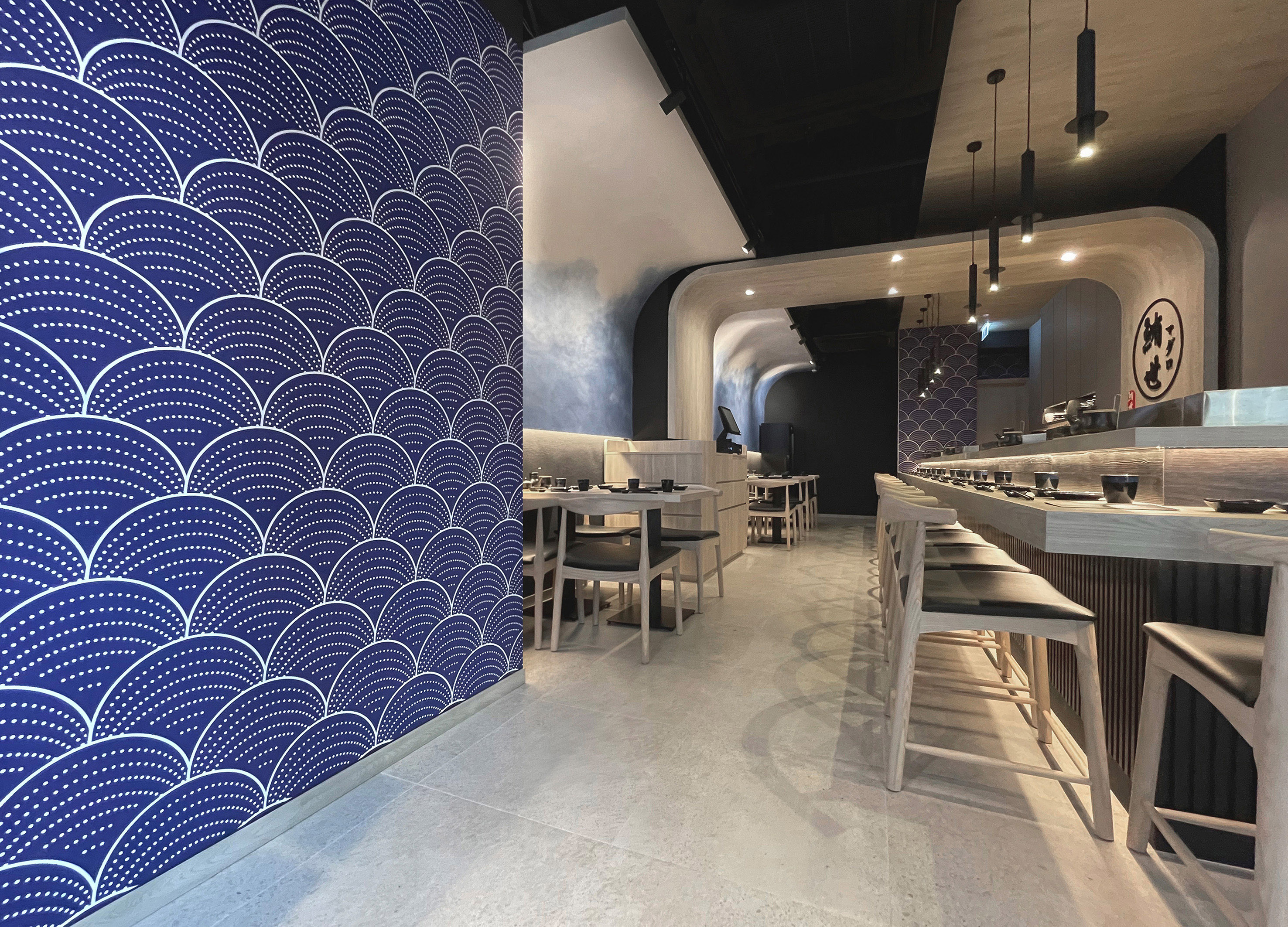
以藝術漆畫出海浪 搭配猶如浮世繪般的波浪牆紙
踏入餐廳,左邊的牆身鋪設了深藍色牆紙,紋理猶如浮世繪的波浪一樣,韻味十足。
再往內走,會發現用餐區有另一道長達八米的特色牆,以"湧浪"作為意念,令到食客一甫進店內,
便感受到全店焦點所在,留下深刻印象。
這道牆採用了意大利藝術漆,從藍色部分逐漸暈染散開至白色部分,呈現海浪的形態。
而且,設計師還把特色牆延伸至天花板,形成弧形的假天花,感覺就像真實的海浪那樣,
把餐廳覆蓋起來,讓人彷彿置身海邊一樣,更能夠感受到海鮮食材的鮮
魚鱗特色牆寓意生意向上 櫥櫃設計蘊含匠人精神
設計師在牆身鋪砌了黑色魚鱗磁磚,與吧台的黑色木條子飾面互相襯托,層次更為突出,
同時提升了餐廳的格調。其中,魚鱗磁磚的排列方式表示著魚身向上,象徵餐廳的生意能夠蒸蒸日上,顯得更有特色。
除此之外,設計師也特別把吧台區的櫥櫃設計成和服的外形,看似就如張開雙臂一樣,把吧台區擁抱其中。
平時壽司師傅站在櫥櫃的中間位置製作料理,以背後的這組櫥櫃作襯托,感覺就像向客人展示自己寄託於料理之中的誠意,
讓客人更感受到匠人的精神,表達壽司師傅以"心"製作。
另外,餐廳的中段有一條結構柱,把餐廳一分為二,設計師在此加設了一組拱形大木框,透過淺木色和弧形線條,把兩邊的區域重新連繫起來,
這個位置也就是全店的核心“鮪Maguro”。
Positive Comments


4paradigm Sage HyperCycle CESS
Fourth Paradigm (Beijing) Data & Technology Co., Ltd.
China

HeatConductive Smart Textiles CrossOver Scarf
Fab2care Limited
China Hong Kong
My Boundary
Nanyi Design Interior Design Studio
Chinese Taipei
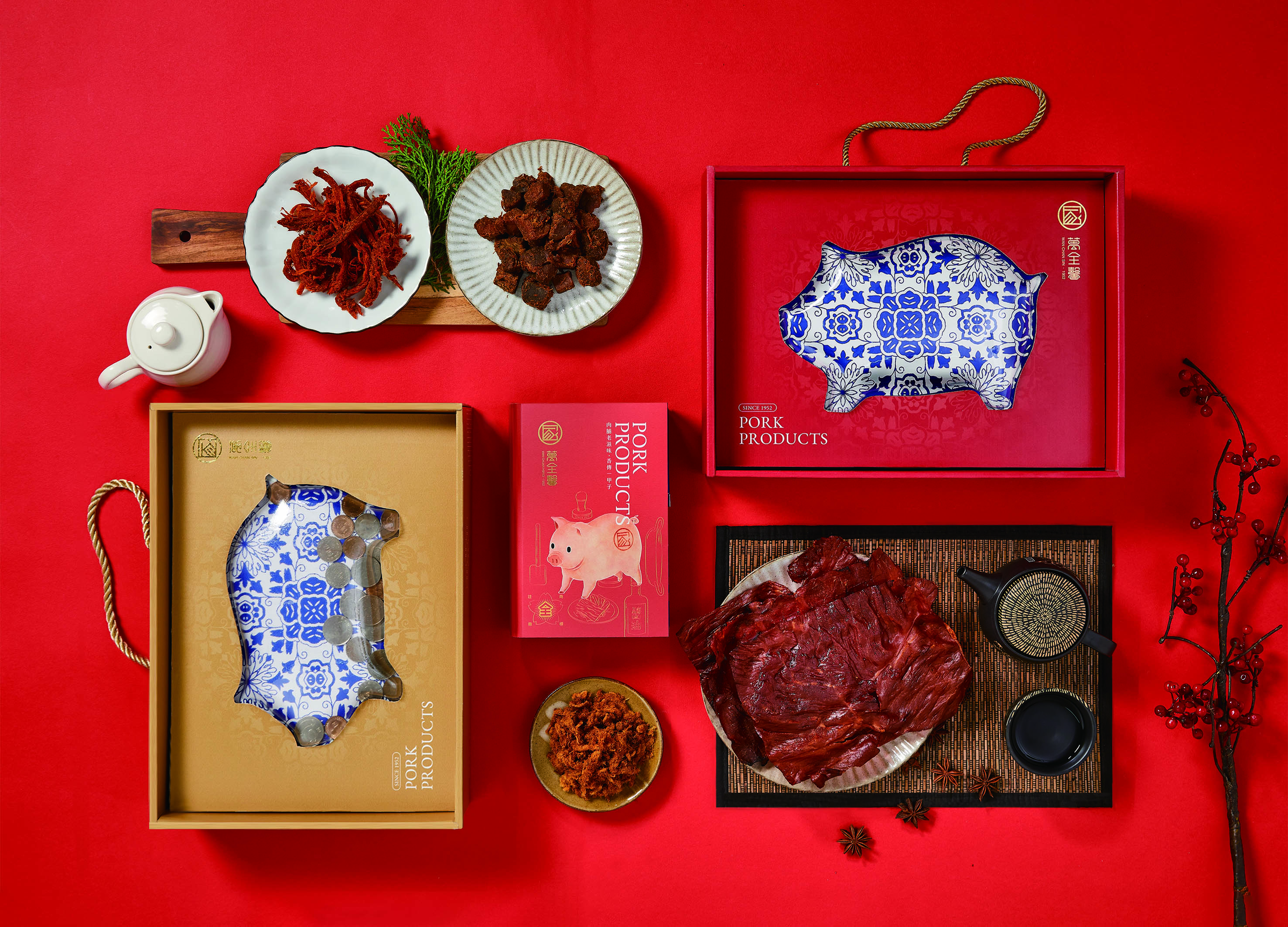
60 year memories of WAN CHUAN HSING
IDEAMAX DIGITAL VISUAL DESIGN Co., Ltd.
Chinese Taipei
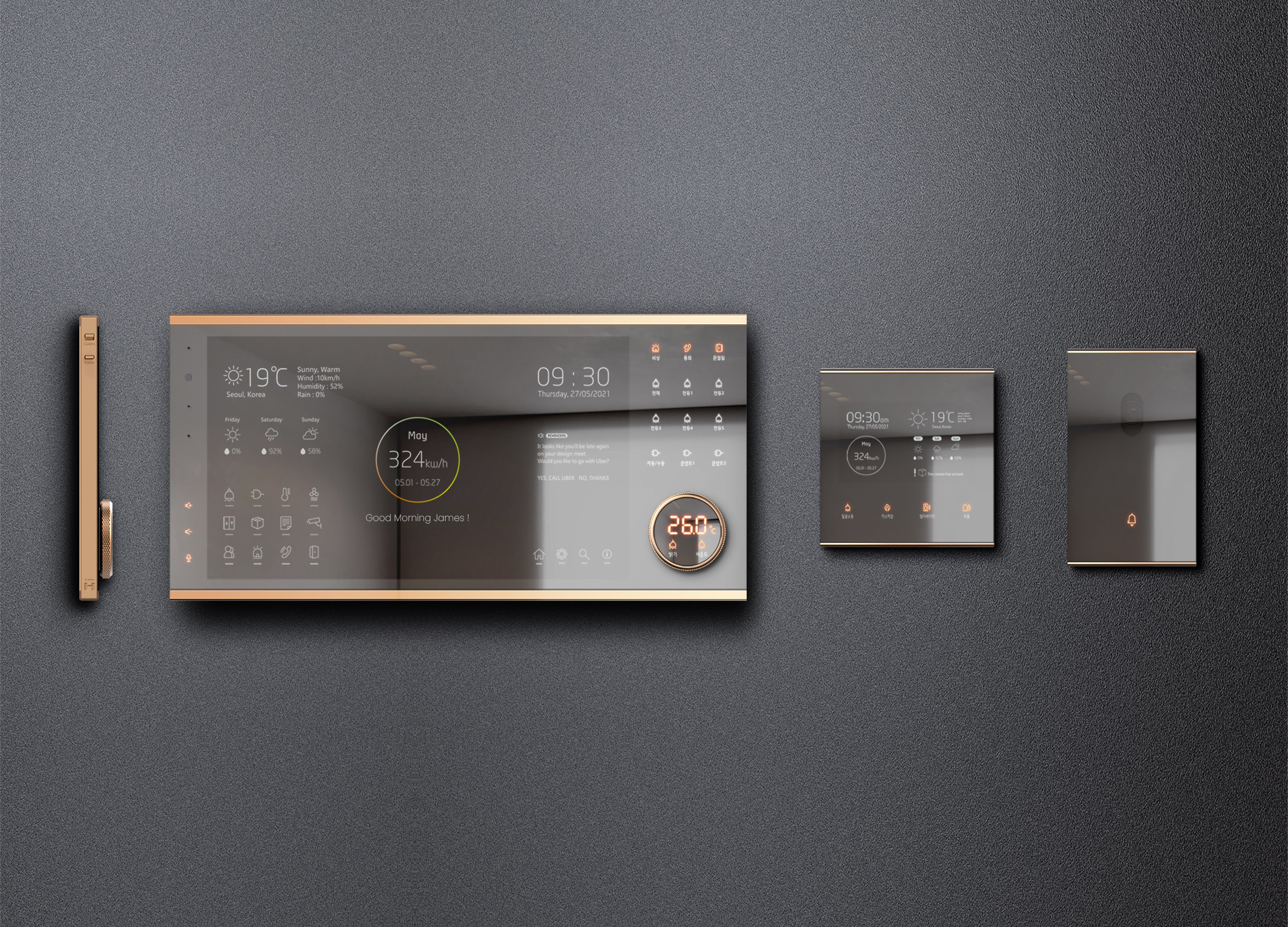
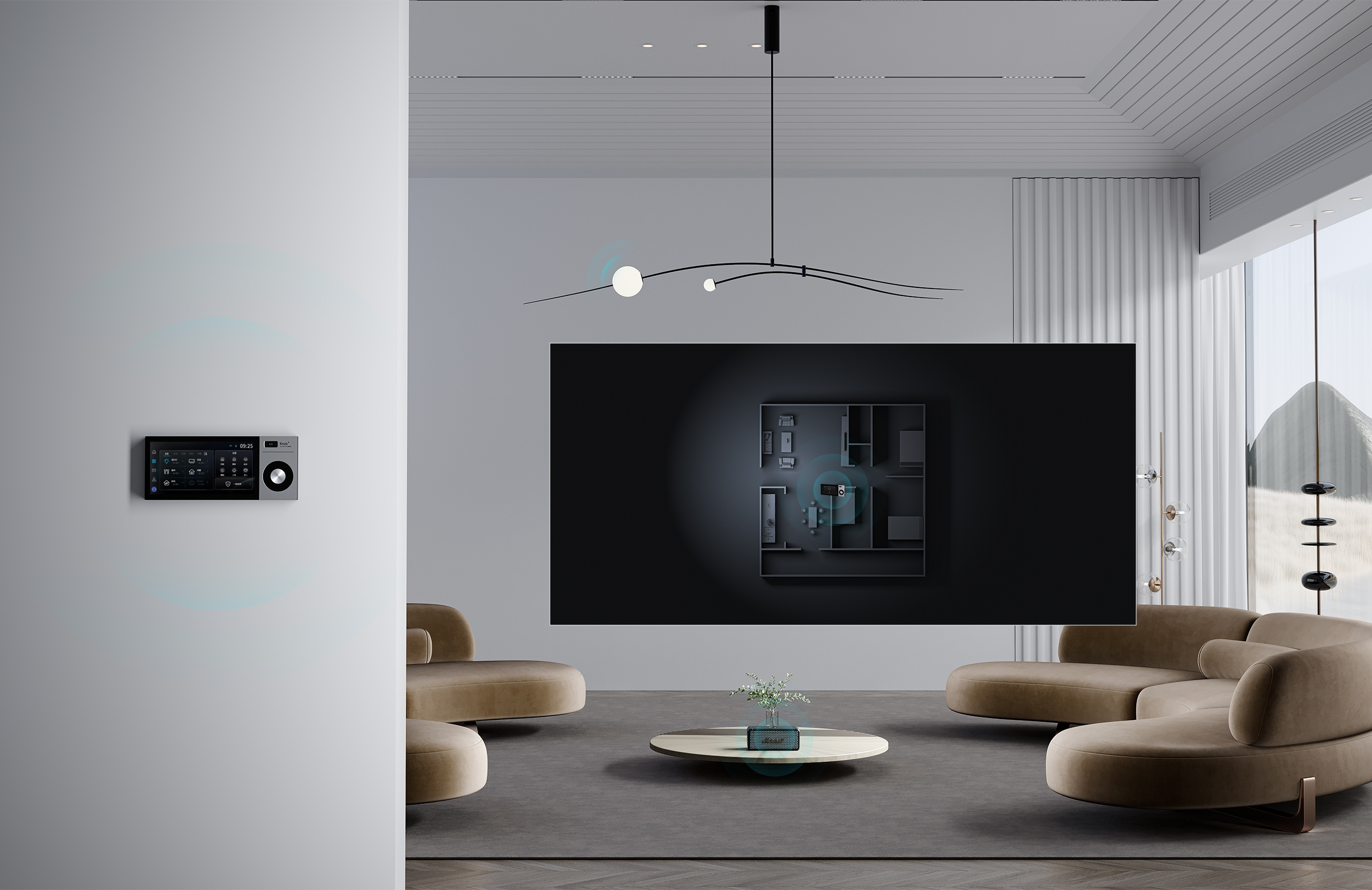
Smart Home Solution System HDHN 4000SET
HyundaiHT Co., Ltd.
Korea
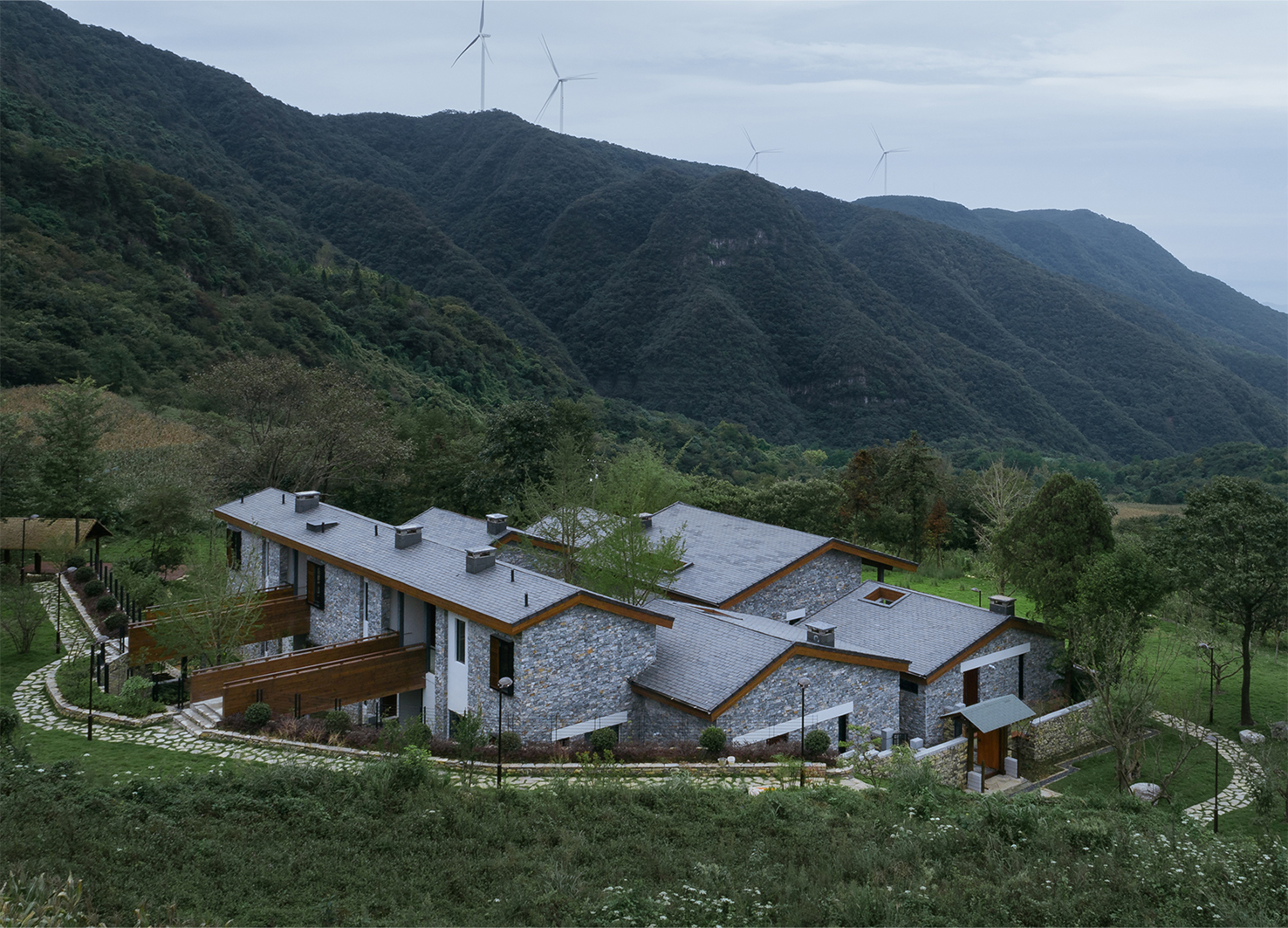
Daotianyi Moutain Hotel
Huazhong University of Science and Technology
China
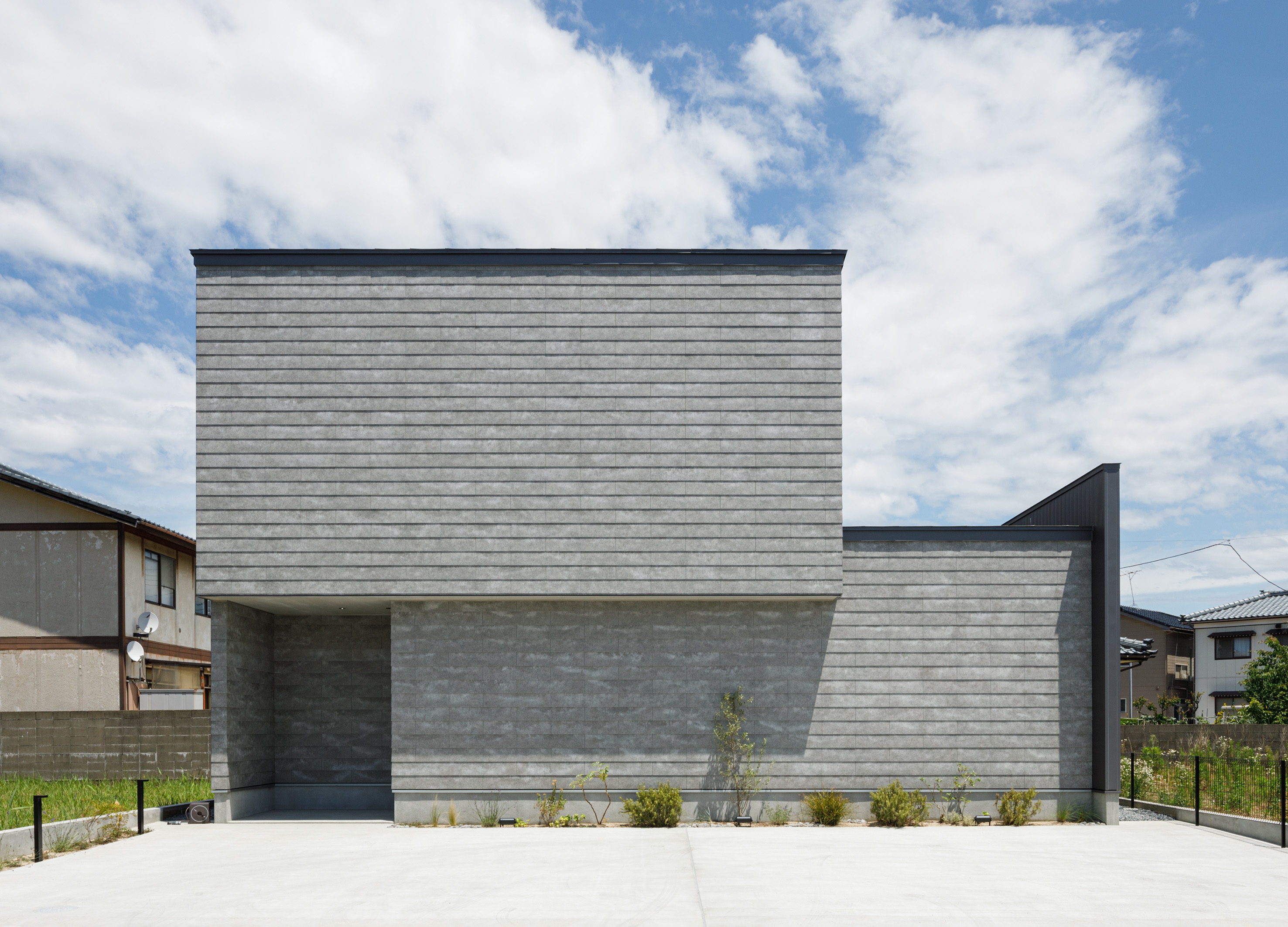
House in Niigata
Kiryu Construction
Japan
DNAKE Sapphire Series
DNAKE XIAMEN INTELLIGENT TECHNOLOGY Co., Ltd.
China
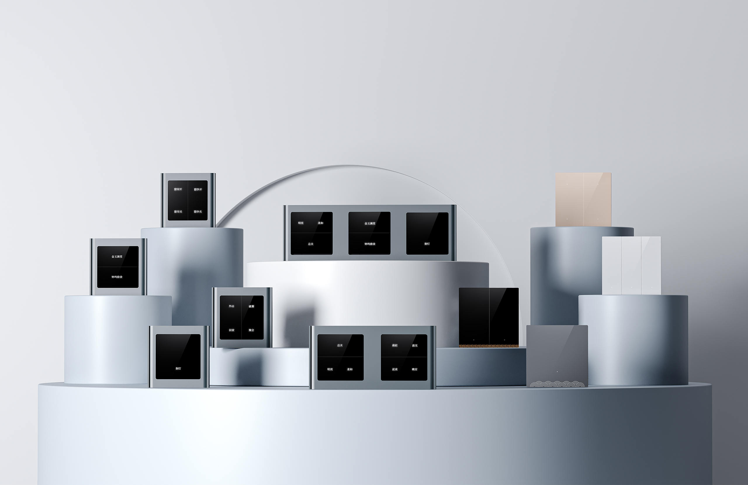
DNAKE Smart Central Control Screen Knob
DNAKE XIAMEN INTELLIGENT TECHNOLOGY Co., Ltd.
China
Maguro
MOI Interior Design
China Hong Kong
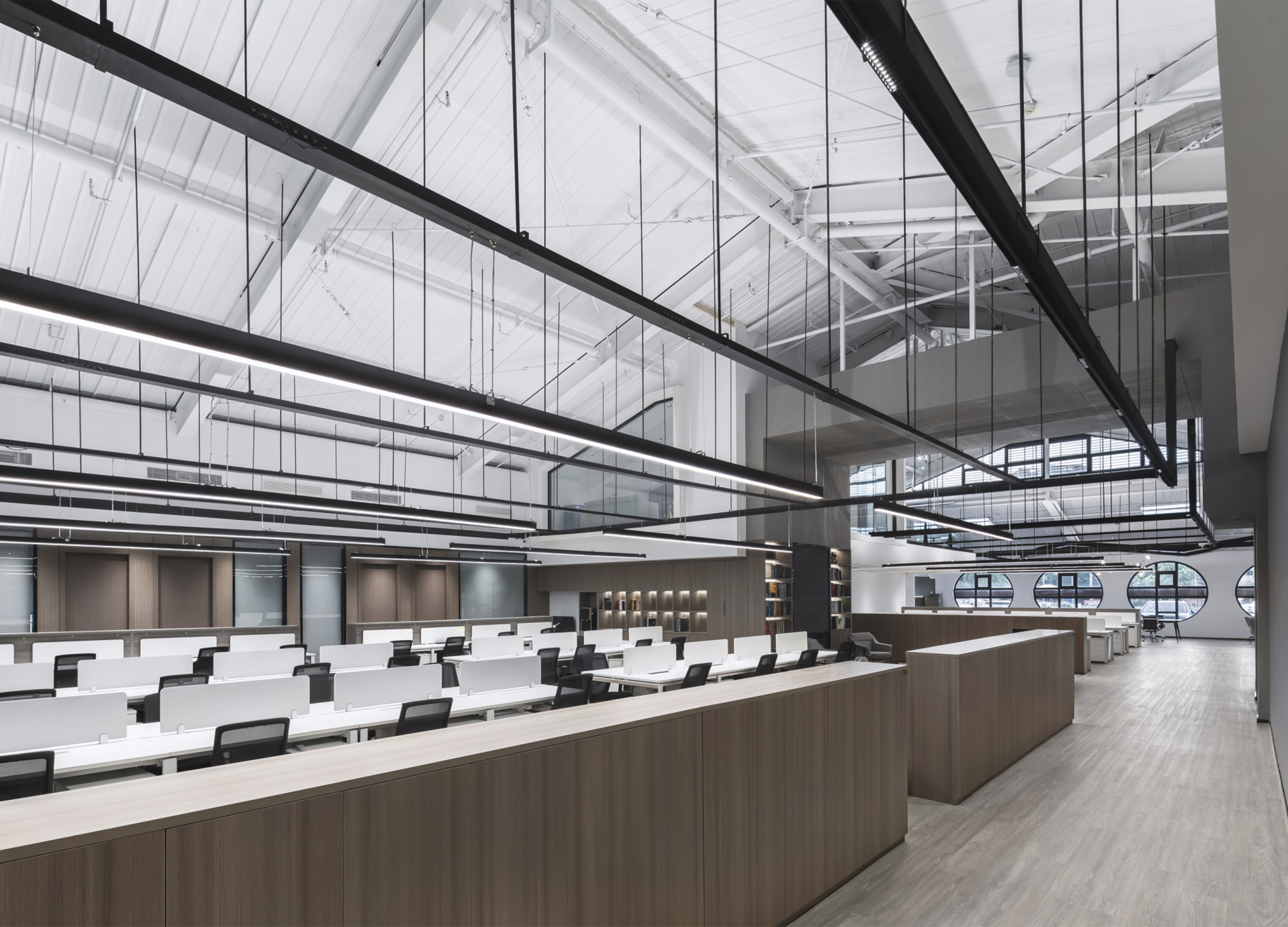
RENOVATION OF OLD WAREHOUSE ON THE NORTH BUND
Shanghai WYH Design Co., Ltd.
China
BTS
MoreIn Design
Taiwan
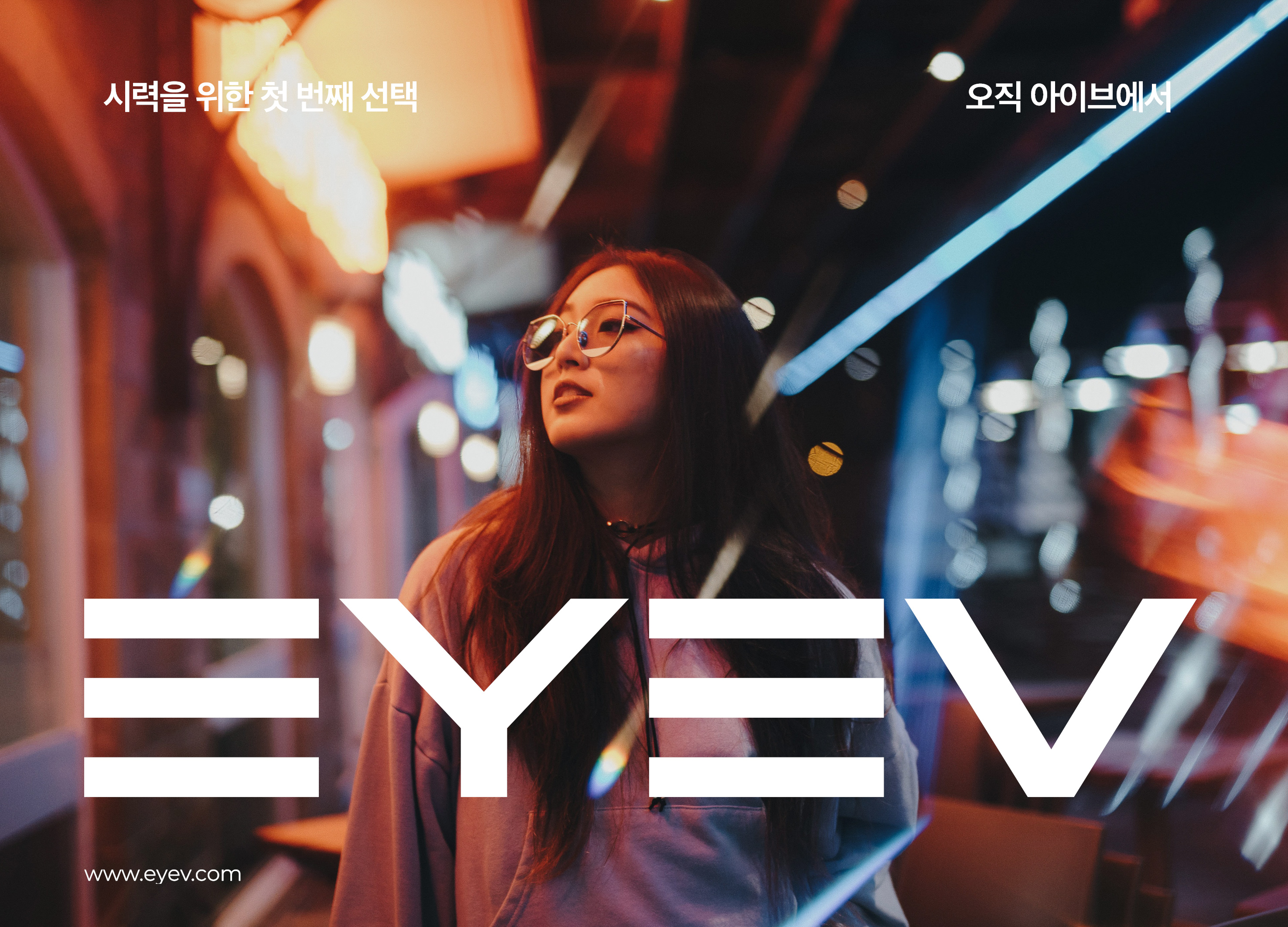
EYEV
EYEV
Korea
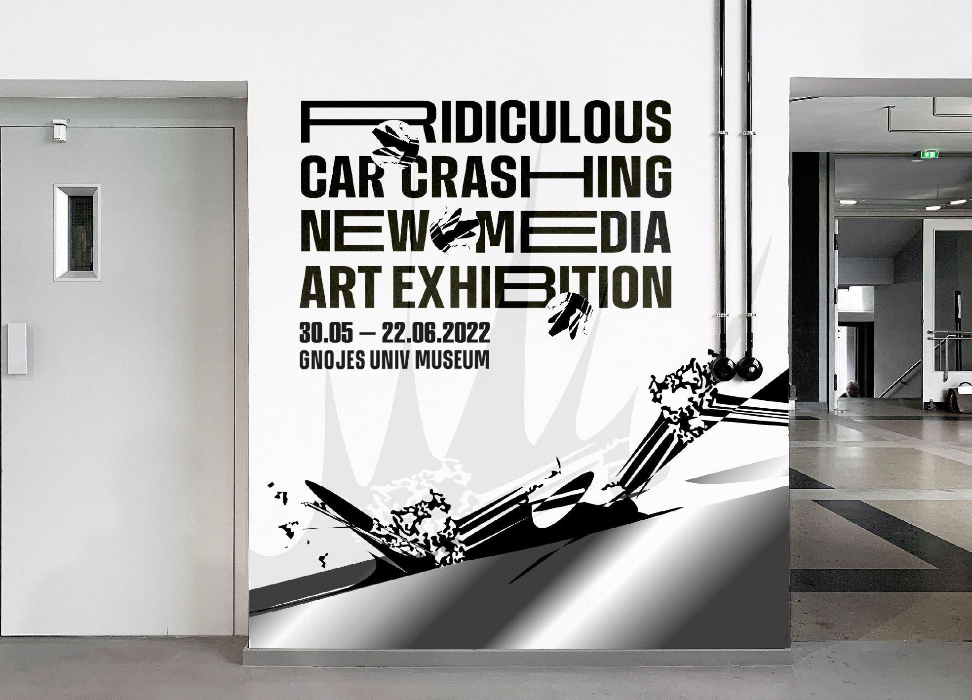
Ridiculous Car Crashing New Media Art
Sejong University
Korea
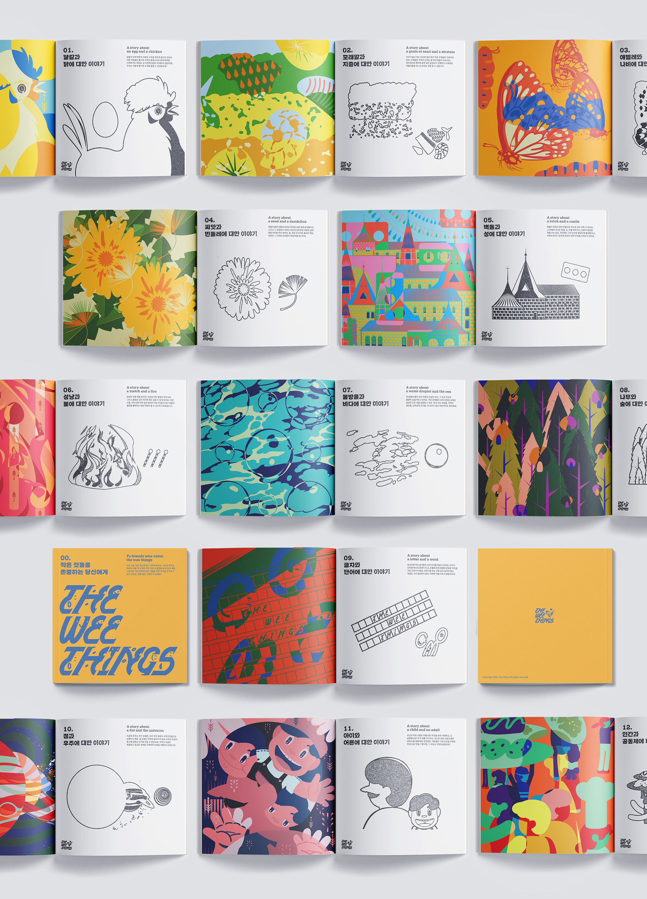
THE WEE THINGS
SUNGSHIN WOMANS UNIVERSITY
Korea
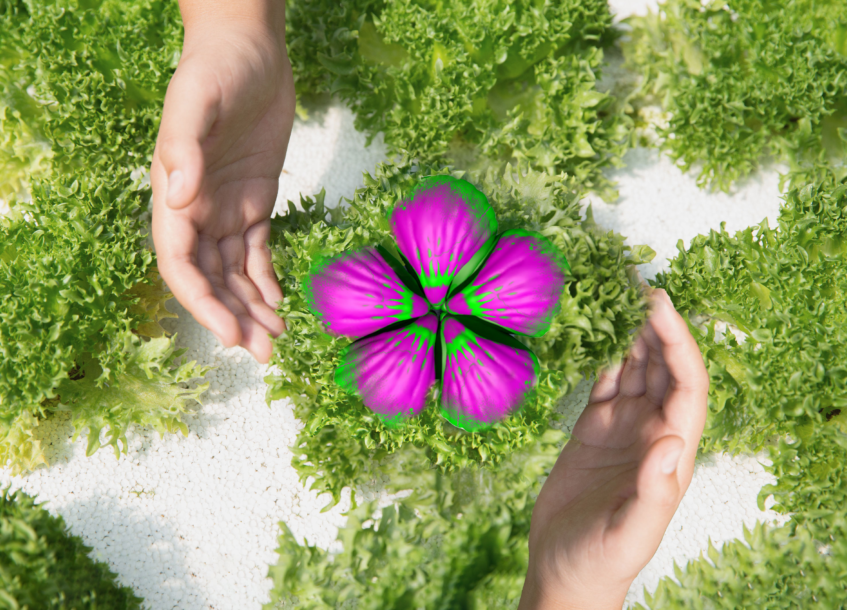
Hand in hand family fruit
Sejong University
Korea
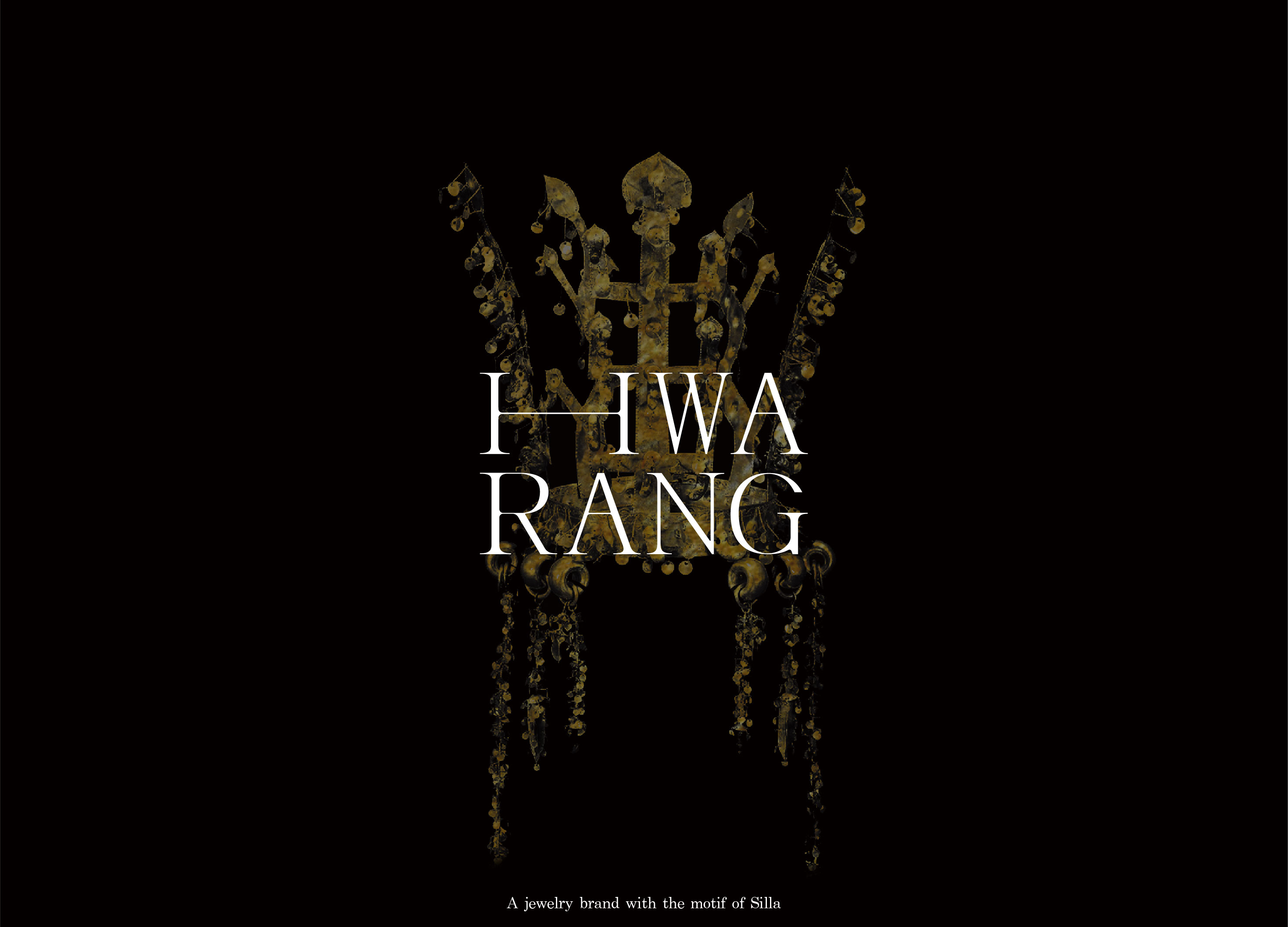
HWARANG
Sungshin Women University
Korea
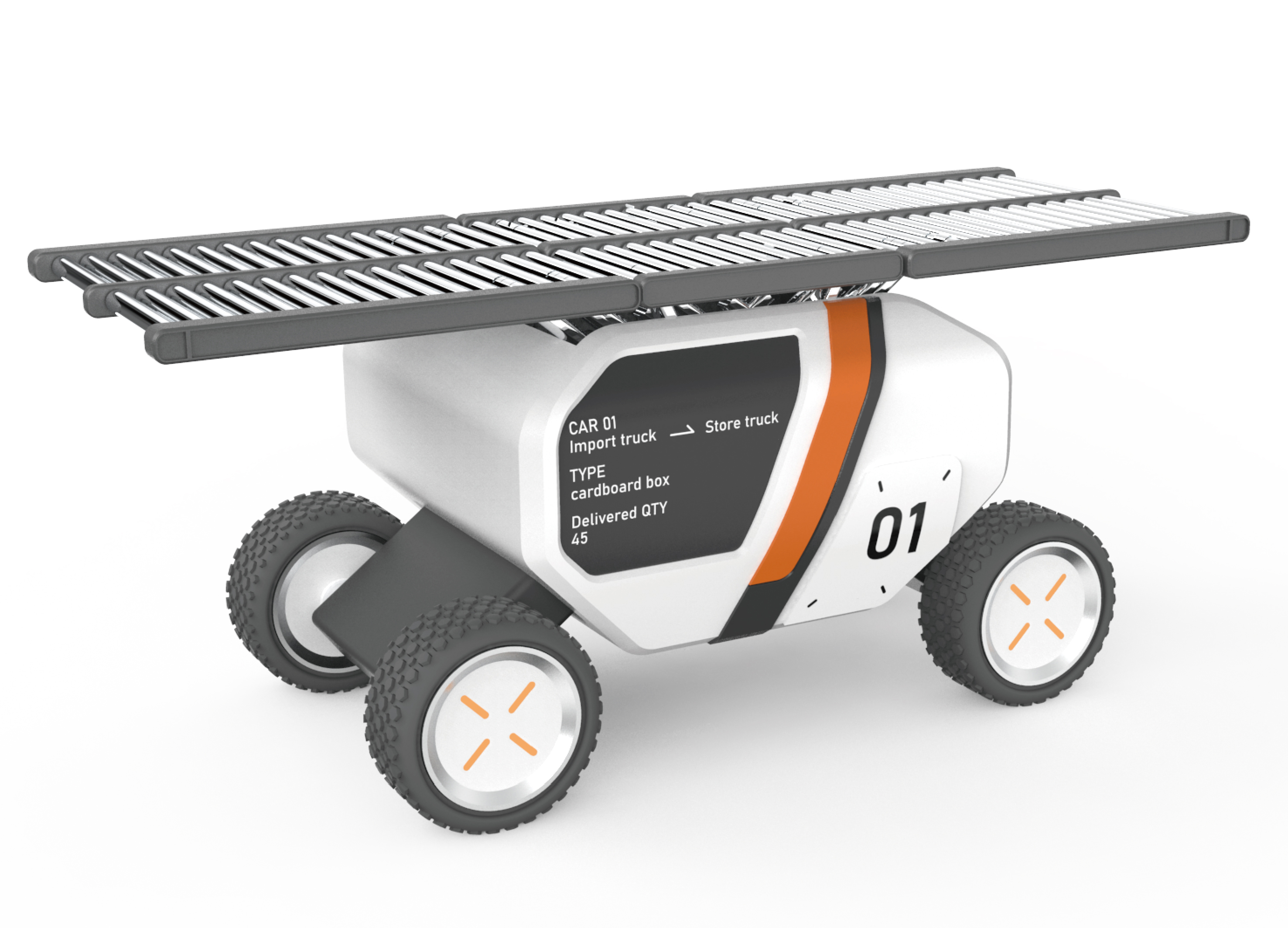
COS Conveyer
Ming Chi University of Technology
Taiwan


Partner & Sponsor
More


info@asiadesignprize.com
#14057, 905 49, Beolmal-ro 102beon-gil,
Dongan-gu, Anyang-si, Gyeonggi-do, Korea
#14057, 905 49, Beolmal-ro 102beon-gil,
Dongan-gu, Anyang-si, Gyeonggi-do, Korea
Founder: Doyoung Kim
Business Registration Number: 454-86-01044
Online Sales License No.: 2021-Anyang Dongan-1081
Copyright © DESIGNSORI Co., Ltd.
Business Registration Number: 454-86-01044
Online Sales License No.: 2021-Anyang Dongan-1081
Copyright © DESIGNSORI Co., Ltd.
