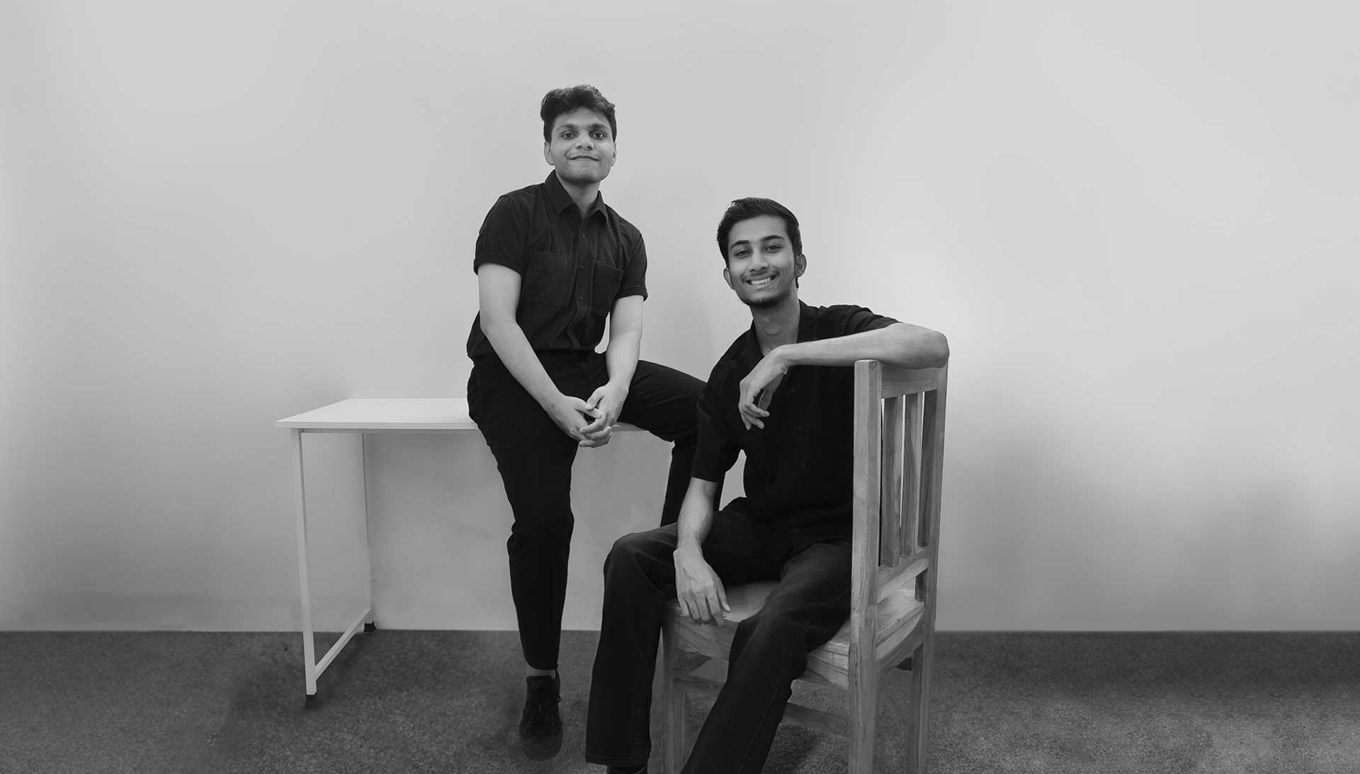
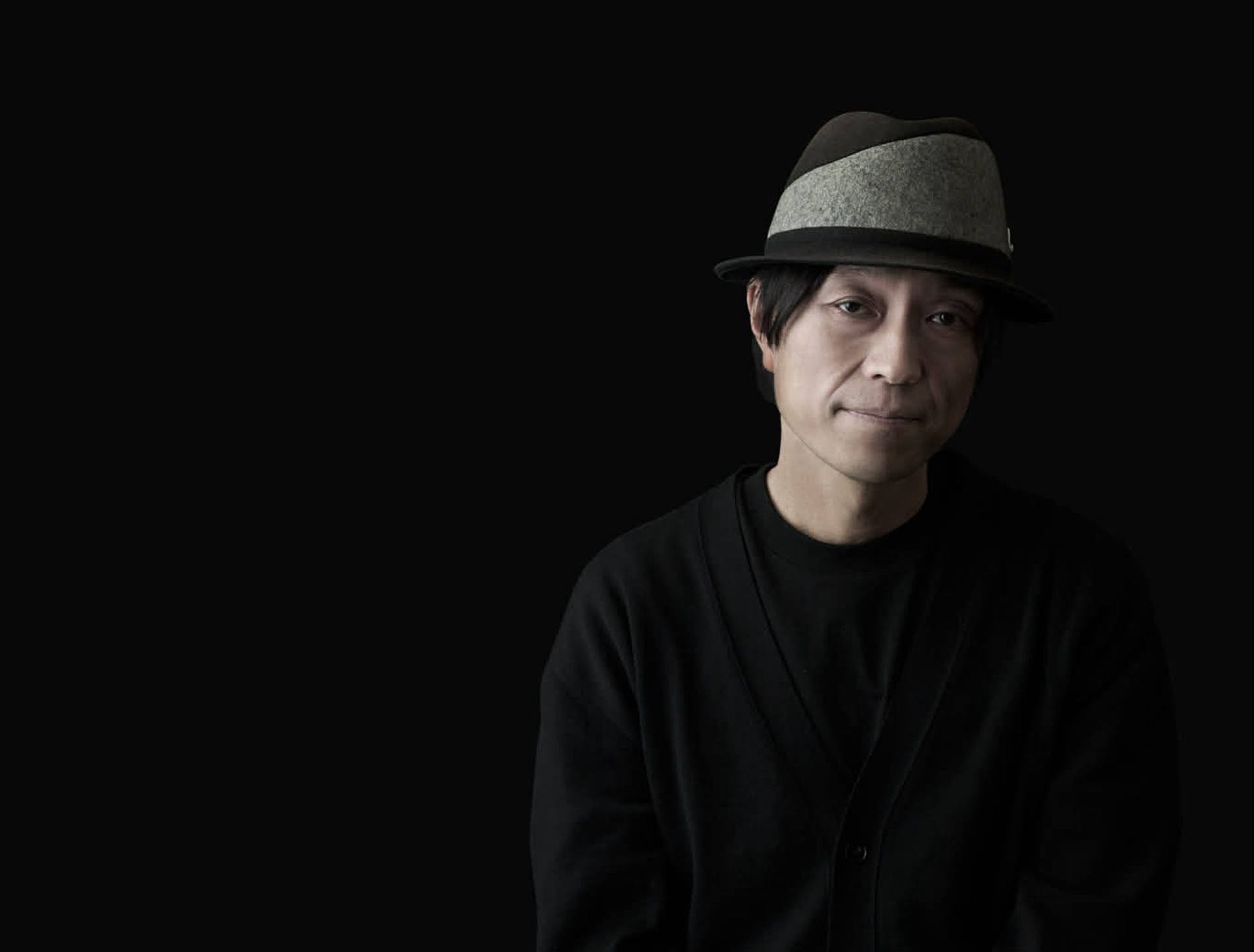
Anusheel Gurjar and Srajan Jain Co-Founder of House of Katha
“This interview follows two founders based in Indore, India, and traces how they translate the duality and sense of balance that runs through Indian design into a brand system through House of Katha. It reveals the moments when opposing forces such as order and chaos, nature and culture, come together in a single frame through harmony, and shows in concrete terms how creative coding and system driven thinking expand into a broader brand experience. Rather than explaining outcomes, we look closely at their methodology, focusing on how they design stories that a brand can be remembered by.”
To begin, could you introduce your respective backgrounds and share how House of Katha was founded? What led you to approach branding not merely as a design outcome, but as a structure built on narrative and meaning?
We are friends from college and have known each other for eight years. Both of us come from small towns near Indore, which is also where House of Katha is currently based. The company was born from a pact between five friends to start our own design practice before 2024. While the others went on to pursue different paths, Srajan and I continued living together in Bangalore while working at separate design firms. After a few years of professional experience, we left our jobs last year and started House of Katha in Indore using our savings. While studying brand design in college, we realised that brand building is very similar to storytelling and character development. Instead of a person, you are defining a company or an organisation and its persona, behavior in the form of visuals. At the same time, we were deeply inspired by a saying by the late Mr. Piyush Pandey: one learns facts, one believes truth and one remembers stories. This idea resonated strongly with us and shaped our approach to building brand narratives. Our company name reflects this belief as well, ‘Katha’ means story in Hindi.
House of Katha treats branding as more than visual identity, approaching it as a system shaped by culture, context, and storytelling. In your view, what defines a truly strong brand story, and what elements are most critical when translating that story into design?
We believe in approaching a problem from different lenses. It's our ability to shift our role from being an artist to a designer to a technologist while approaching the same brief that helps us set apart. This switch in perspective helps us create uncanny connections during the process. As brand builders, it is utmost important for us to keep asking Why? and Why not? The duality of these simple questions can help us realise essential factors for design. For example, while working on a tech brand, instead of creating mood boards based on current trends or collecting references for clean design, we are developing storyboards and key artworks similar to those used in animated films. We use a world-building methodology, where we define how the brand’s world would feel from its own perspective. What behaviours, colours, elements, and spaces does it inhabit? Exploring these narrative contexts helps us establish a stronger and more coherent brand story.
India is a society layered with diverse regions, languages, religions, and social structures. Within such a complex cultural landscape, what challenges and opportunities do you see in building a brand with a unified voice?
Despite our diversity, we believe India speaks with a shared voice. Within all our complexities lie common ethos, values, and ways of being that resonate across the country. At a broader level, we believe in harmony and in how its meaning shifts with context. While building brands at scale in such a diverse nation is challenging, it is also an opportunity to create dynamic and flexible systems. This allows us to introduce multiple languages, region-specific illustrations, and culturally nuanced content that resonates deeply with local audiences.
Your work often reinterprets traditional narratives, craft sensibilities, and humanistic perspectives into contemporary brand language. How do you navigate the balance between tradition and modernity, and are there guiding principles that shape this process?
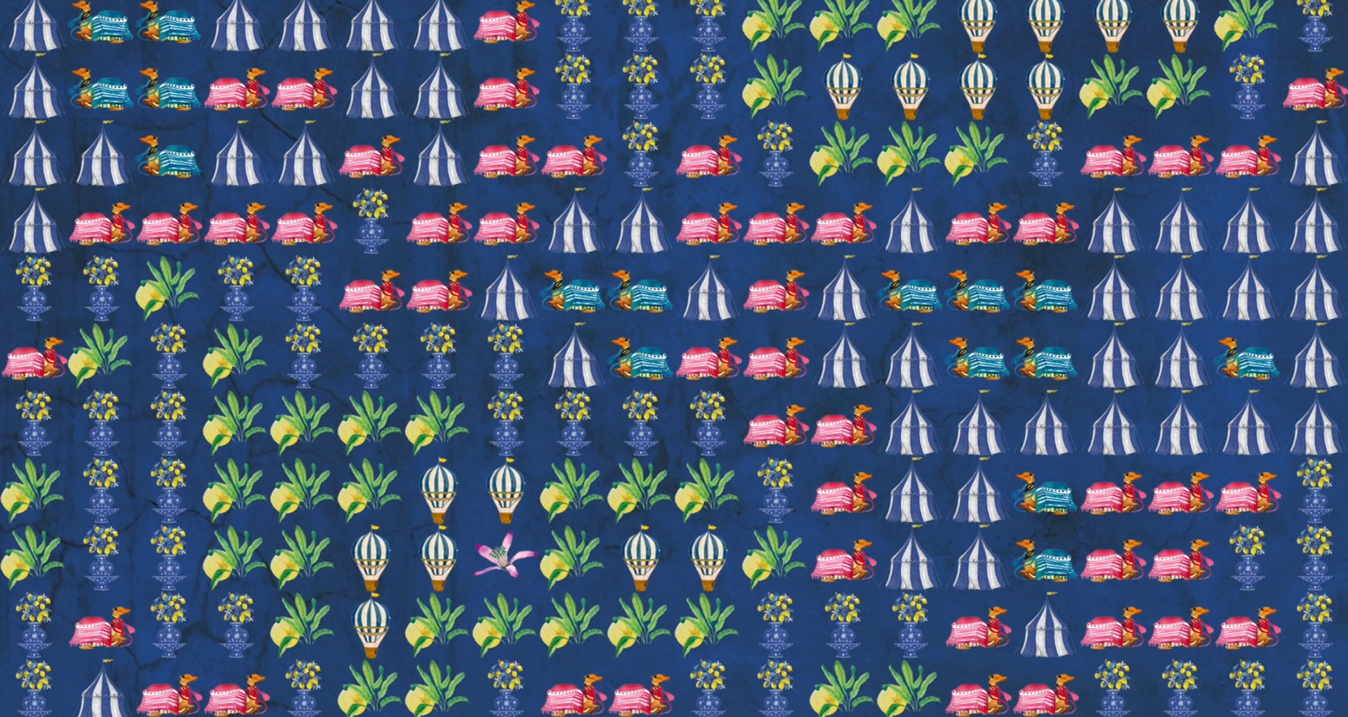
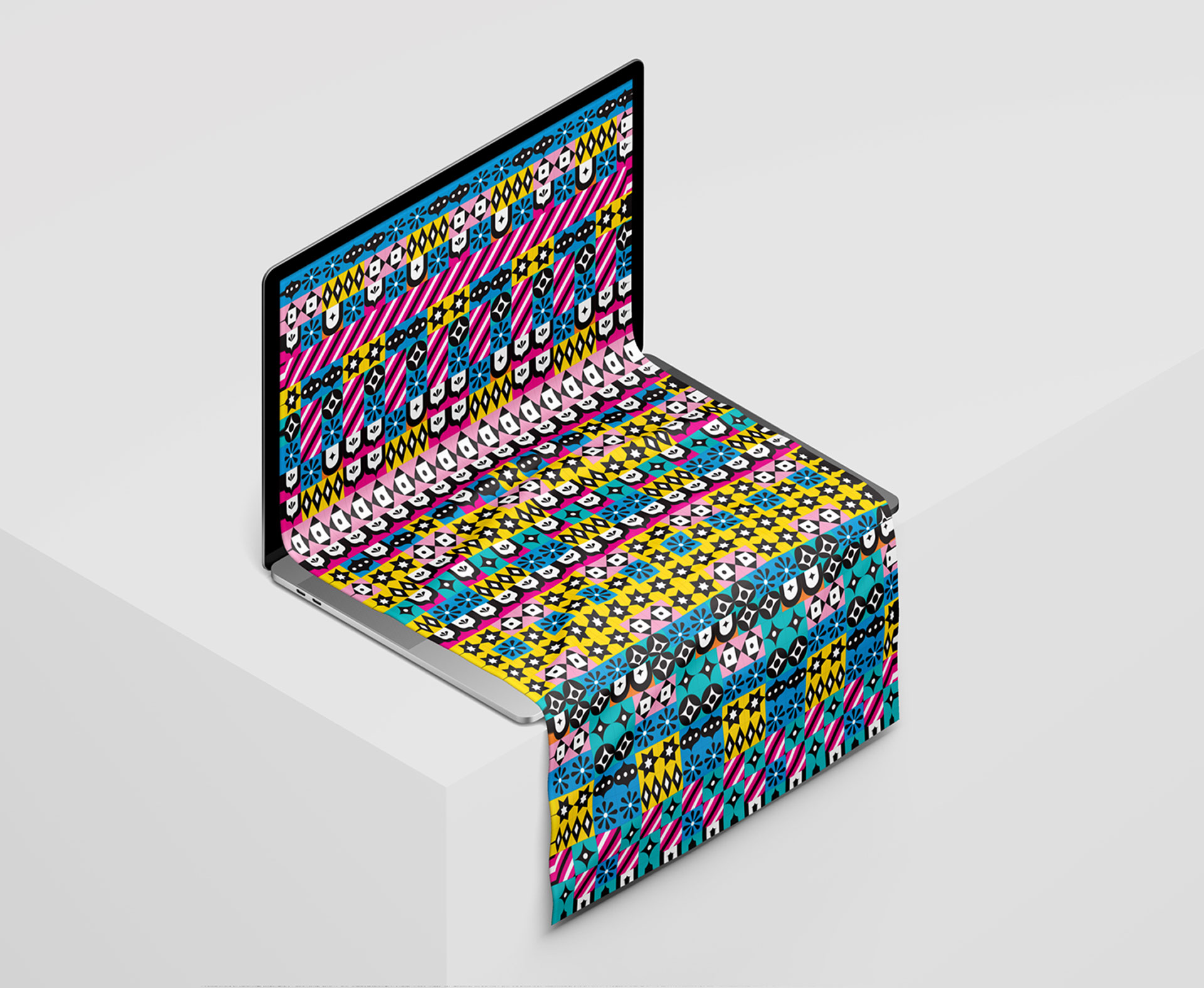
Technology and tradition share more similarities than we often realise. Both are systems designed to function across different contexts and periods of time. A strong example is handloom weaving, which acts as a bridge between tradition and technology. The process of weaving is an analog form of computation with each thread carefully calculated to create patterns in fabric. To us, this mirrors how code maps pixels line by line on a screen. One of our guiding principles is to recognise such patterns in traditional practices, understand their underlying logic, and reinterpret them using modern tools. A small shift in perspective or storytelling can lead to narratives that feel both unexpected and deeply relatable, while retaining a sense of uniqueness. “If you want to learn about culture, listen to stories. If you want to change the culture, change the stories.” — Michael Margolis
At a time when global brand language is becoming increasingly standardized, what value does cultural specificity hold? In your opinion, what aspects of identity must Asian brands preserve in order to remain competitive on a global stage?
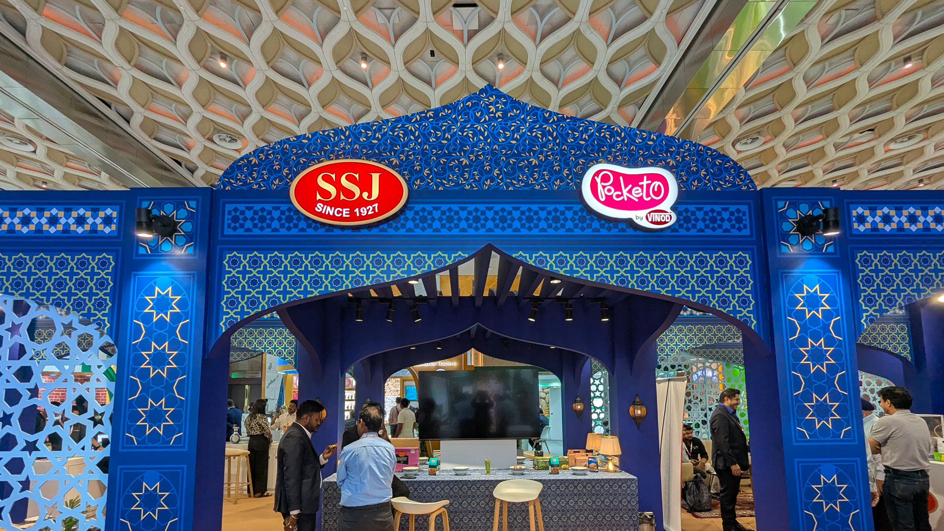
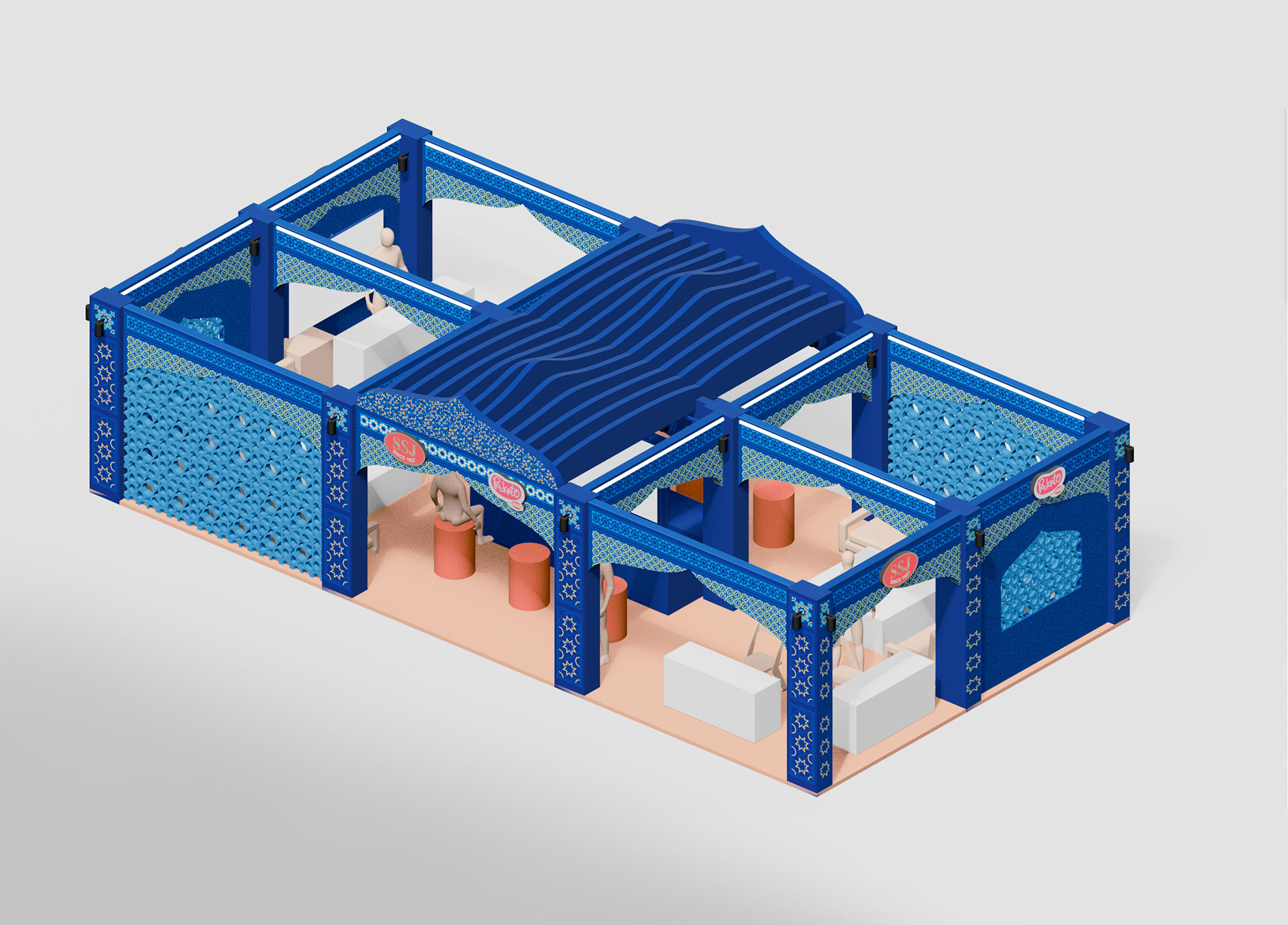
Since the global brand language has become increasingly standardized, introducing cultural specificity will introduce a sense of belonging in its simplicity. Asian cultures often bring unique ways of interpreting familiar design concepts, and these perspectives should be embraced. For instance, what is commonly called white space in Western design is referred to as open space in Japanese design, a space to pause, breathe, reflect, and contemplate. A simple shift in terminology reveals a deeper philosophical approach. Similarly, traditional Indian design is guided less by minimalism or maximalism and more by harmony. Indian temples, for example, are richly carved with figurines and motifs across every surface, yet remain balanced because they are formed from a single material introducing a delicate play of light. They are neither minimal nor maximal in nature. Preserving such cultural principles is essential for maintaining authenticity and helps Asian brands stand apart on the global stage.
Could you share a project where the brand’s core narrative and its social or cultural context came together most meaningfully? What did this project represent for you as practitioners?
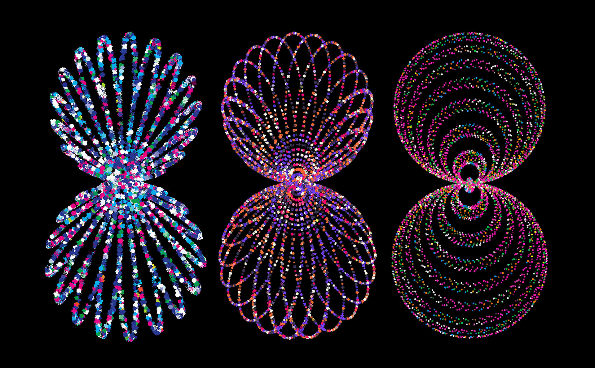
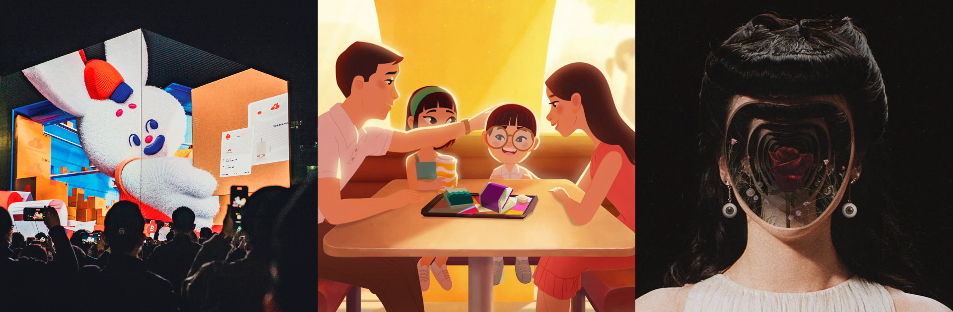
One of our earliest projects involved creating projection-mapping visuals for the launch of Nicobar, a contemporary lifestyle brand, in Chandigarh. Along with the store opening, the brand was introducing new product collections and wanted the visuals to reflect the essence of the city. To honour Chandigarh, we crafted a dynamic animation inspired by the city's grid-like design, using circles that evolve and multiply every 10 seconds, symbolizing the growing energy and collective movement of people and the event itself. It transformed from a visual concept into a vibrant narrative of urban life and celebration with the brand. It took us a lot of time to arrive at such a simple yet coherent idea. It took us a long time to arrive at such a simple and coherent idea. Through this process, we realised that the meaningful connection we often search for as designers is sometimes right in front of us. In our case, it was the city’s geographical structure itself, something we initially overlooked while focusing more on the brand than on its cultural context.

In an environment where branding is often driven by speed and immediate results, how do you protect the value of long term brand building? Why do you believe time remains an essential component in creating meaningful brands?
Forces of nature can move mountains, carve rivers, and reshape entire landscapes when given enough time. We believe branding works the same way. A brand is not about creating a brief moment of shine. It is the accumulation of relationships built through repeated encounters and experiences, where trust slowly takes root. That is why, in an environment obsessed with speed and instant results, we try even more deliberately to protect the value of long term brand building. The first thing we focus on is not what looks good right now, but what will remain steady over time. We clarify the principles first. What the brand believes in, what it chooses not to do, and the attitude it wants to carry in how it speaks and acts. When those standards are clear, the brand’s tone and world view hold together even as campaigns and content change. Without them, the faster you move, the more inconsistent the output becomes, and the brand inevitably grows tired.
Another important point is not to confuse consistency with efficiency. To us, consistency is not repeating the same thing. It is the ability to make decisions in the same direction even when circumstances change. So when we design brand systems, we do not just list fixed rules. We build structures that can flex and adapt across regions, languages, and channels. In a complex context like India, that flexibility is exactly what makes long term continuity possible.
Looking at Asia as a whole, how do you see the current design and branding landscape evolving? Are there ways of thinking or strengths unique to Asian design that differ from Western centered design discourse?
We are witnessing a growing cross-pollination of disciplines. Architects collaborate with biotechnologists to create living structures, while brand designers work with creative technologists to build tools and digital ecosystems that generate visuals. This shift highlights the need to create future-ready brands that translate beyond traditional mediums. When we were first introduced to creative coding, the visual language we encountered was dominated by stark black-and-white aesthetics, RGB colours, and glitch-based graphics. This had become the accepted norm, largely because many practitioners in the space were based in the West. As we began experimenting ourselves, we introduced Indian motifs, patterns, and colour palettes into our work. This resulted in designs that blended tradition with technology and allowed us to stand apart. We believe Asian design will grow stronger by looking inward, inspiring from culture and craft and reinterpreting them for the contemporary world.
Finally, what kinds of efforts and movements do you believe are necessary to strengthen solidarity and exchange within the Asian design market? What role do you hope House of Katha will play within the broader Asian design community in the future?
We as a practice pursue wonder, first and foremost. We think it's important to keep the childlike creative spirit alive to explore uncharted territories. Keeping this in mind, we the collective continent can explore a few of those realms. Maybe a cross pollination of design philosophies from various cultures, or collaborations between practitioners across the cultures- not for some commercial project but to make for the sake of making. We are already practising this at a smaller scale by collaborating with friends across different industries on projects driven by shared curiosity rather than commercial outcomes. This approach has helped us broaden our perspectives and build meaningful, lasting relationships. We hope to see more designers adopt this anti-disciplinary way of working, while also embracing the richness that our cultures offer.


#14057, 905 49, Beolmal-ro 102beon-gil,
Dongan-gu, Anyang-si, Gyeonggi-do, Korea
Business Registration Number: 454-86-01044
Online Sales License No.: 2021-Anyang Dongan-1081
Copyright © DESIGNSORI Co., Ltd.
