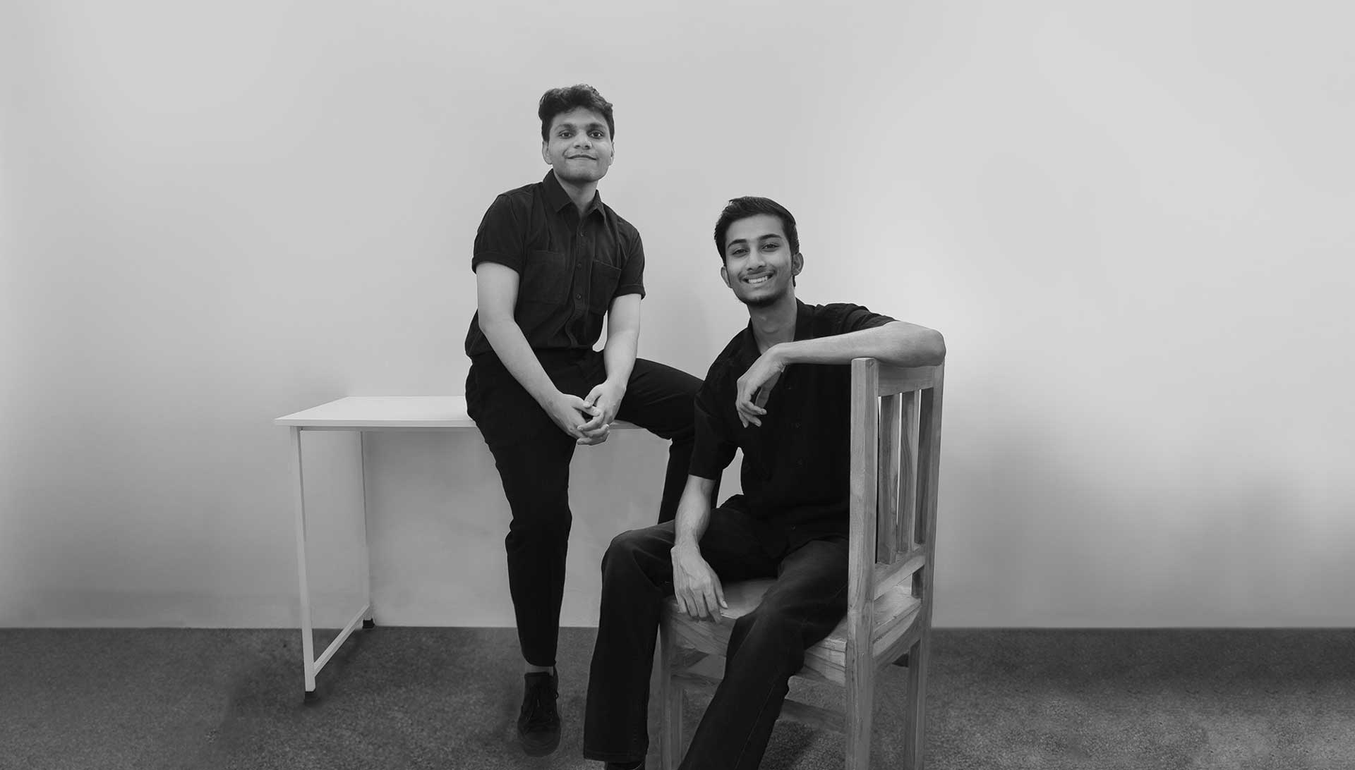
Branding director Shun Kawakami Founder of artless Inc.
“Many design firms excel in individual domains such as architecture, spatial design, branding, or graphic design. Yet as projects expand across disciplines, the core message often blurs, and the level of finish can vary from one touchpoint to another, making the work harder to read as a single language. Maintaining the same standard from large scale planning down to the smallest details is more difficult than it seems. artless Inc. is a team that has consistently met that challenge. Starting from BI and VI, they extend into space, signage, web, and UI UX, while ensuring every output connects as one integrated brand experience. In this interview, we explore the attitude behind their coherence and the principles of visual language that let a brand’s personality be felt as an atmosphere, even without explanation.”
To begin, please introduce yourselves and artless Inc. We would love to hear about the background and vision behind the studio, and the direction of your current work.
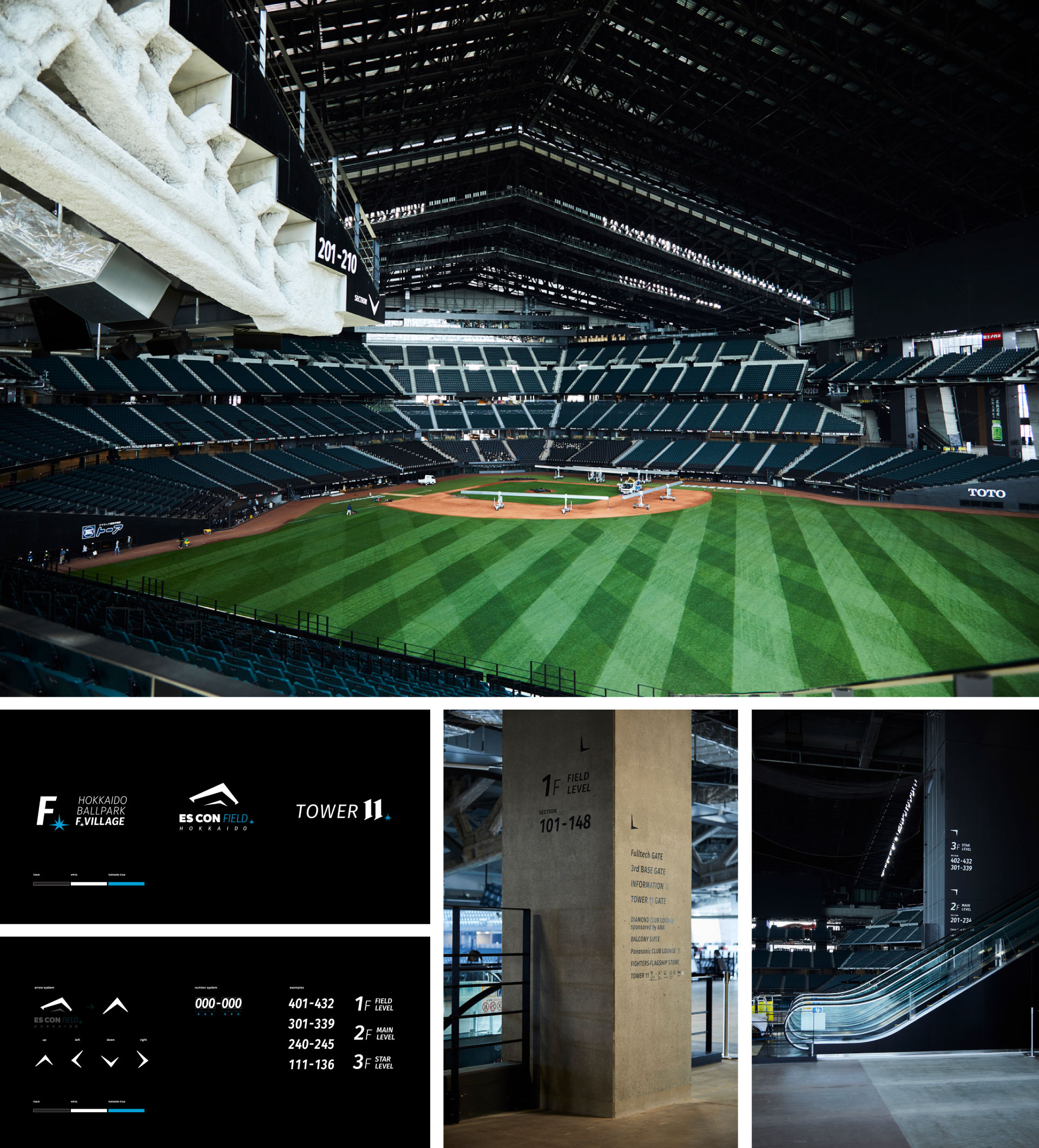
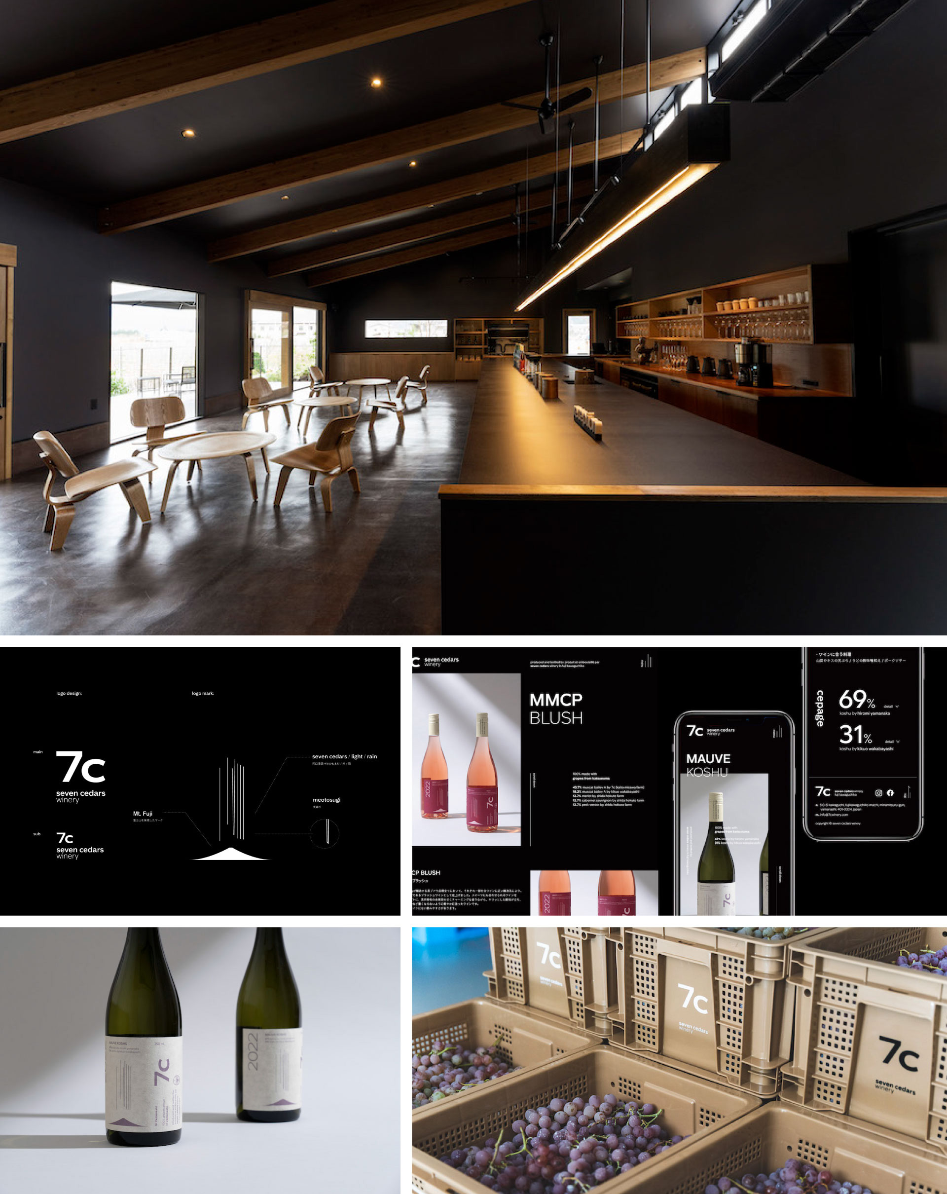
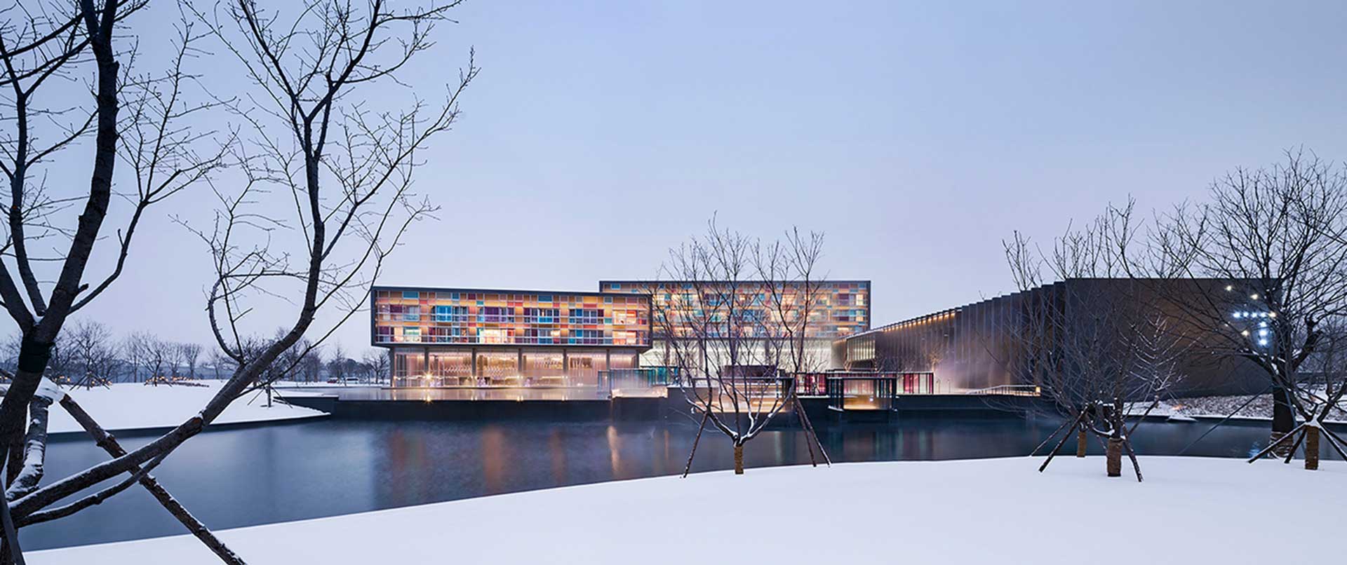
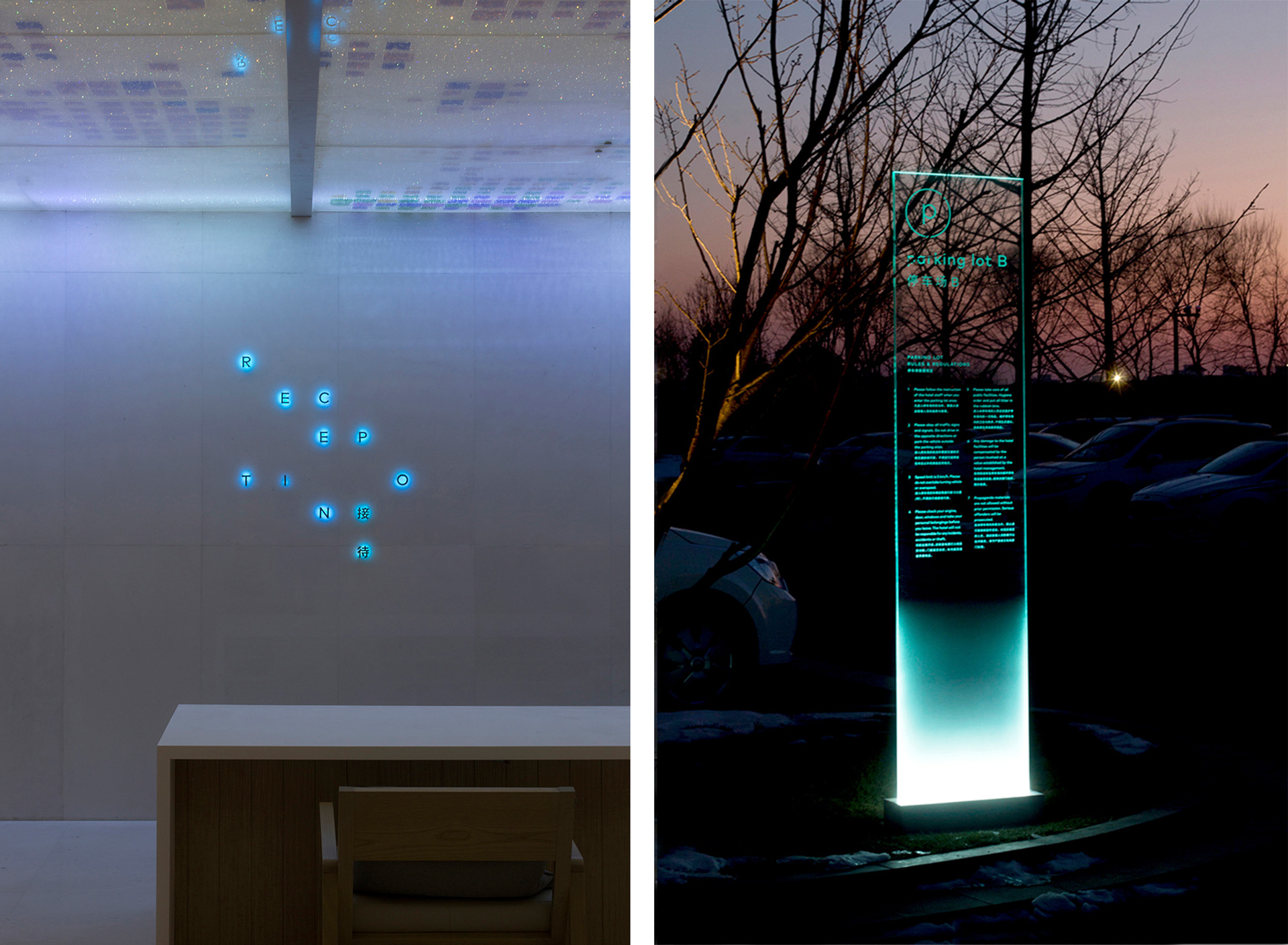
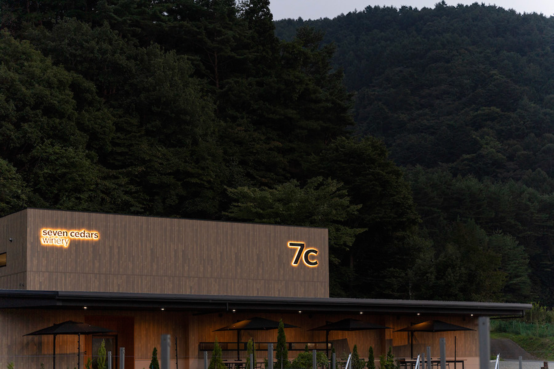
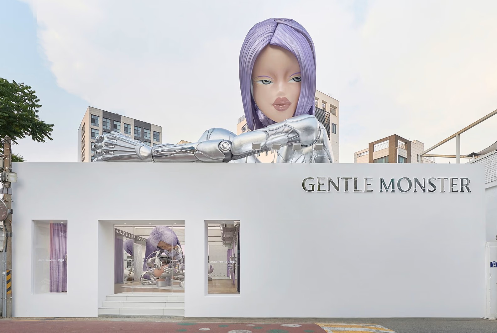
artless Inc. is a branding agency based in Tokyo, Kyoto, and Karuizawa. We work across urban and natural settings, and our practice has developed globally by moving beyond boundaries of nation, culture, and discipline. Our team is a trilingual organization working in Japanese, English, and Chinese. With this multi perspective foundation, we focus on building a brand from the level of vision and strategy through to the upper stages of branding, including BI (Brand Identity) and VI (Visual Identity). What we ultimately aim for is not simply to produce visually pleasing outcomes, but to clarify invisible concepts such as what a brand believes in and the attitude by which it moves, then translate that into a consistent visual language and experience. For this reason, we develop comprehensive branding and creative direction across design systems such as logos, typography, color, graphics, and signage, as well as physical design including architecture, interiors, and landscape, and digital communication such as web and UI UX. In the end, our goal is not to expand touchpoints, but to create a brand experience in which every touchpoint reads as one coherent language.
artless Inc. is known for an integrated approach that spans art, design, architecture, graphic, and web. What kind of design practice are you pursuing through this cross disciplinary method?
At artless Inc., we see art and design as a visual language. We believe visual language has the power to communicate intuitively even when words, borders, and cultural contexts differ. From that starting point, we work with a global perspective while also integrating sustainability and Japan’s distinctive sense of aesthetics. These may appear to point in different directions, but for us they form a single, integrated attitude. In particular, we center our practice on a stance of visual communication, making invisible concepts such as vision and philosophy visible. We believe the role of design is not to decorate form, but to reveal a brand’s thoughts, values, and emotional texture through a clear order. Moving across multiple fields is not an end in itself, but a methodology that enables a brand to speak in the same language in every scene.
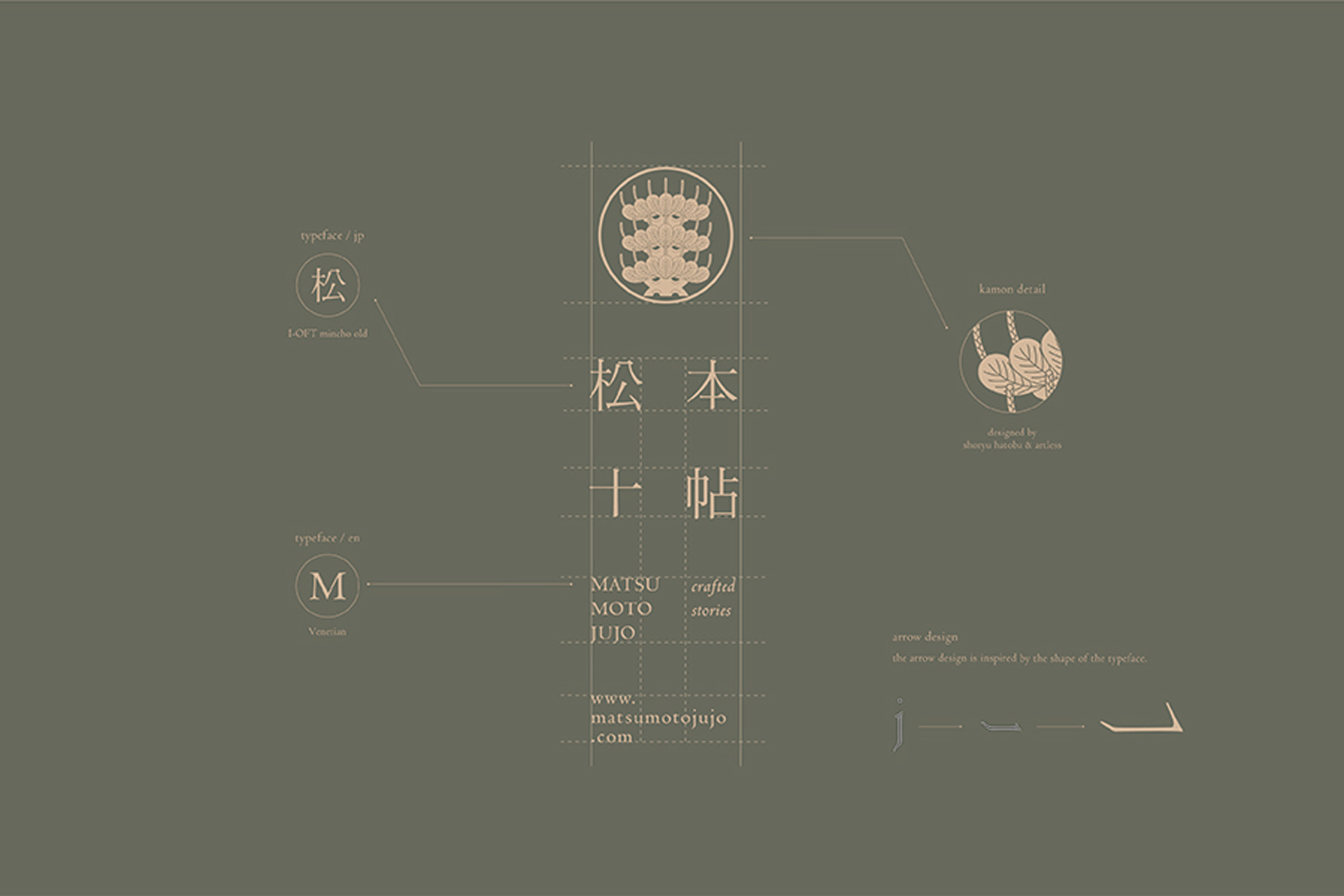
What ideas and values shape the “Japanese aesthetics” at the core of your studio? Please share how Japanese beauty is expressed in artless Inc.’s work in concrete terms.
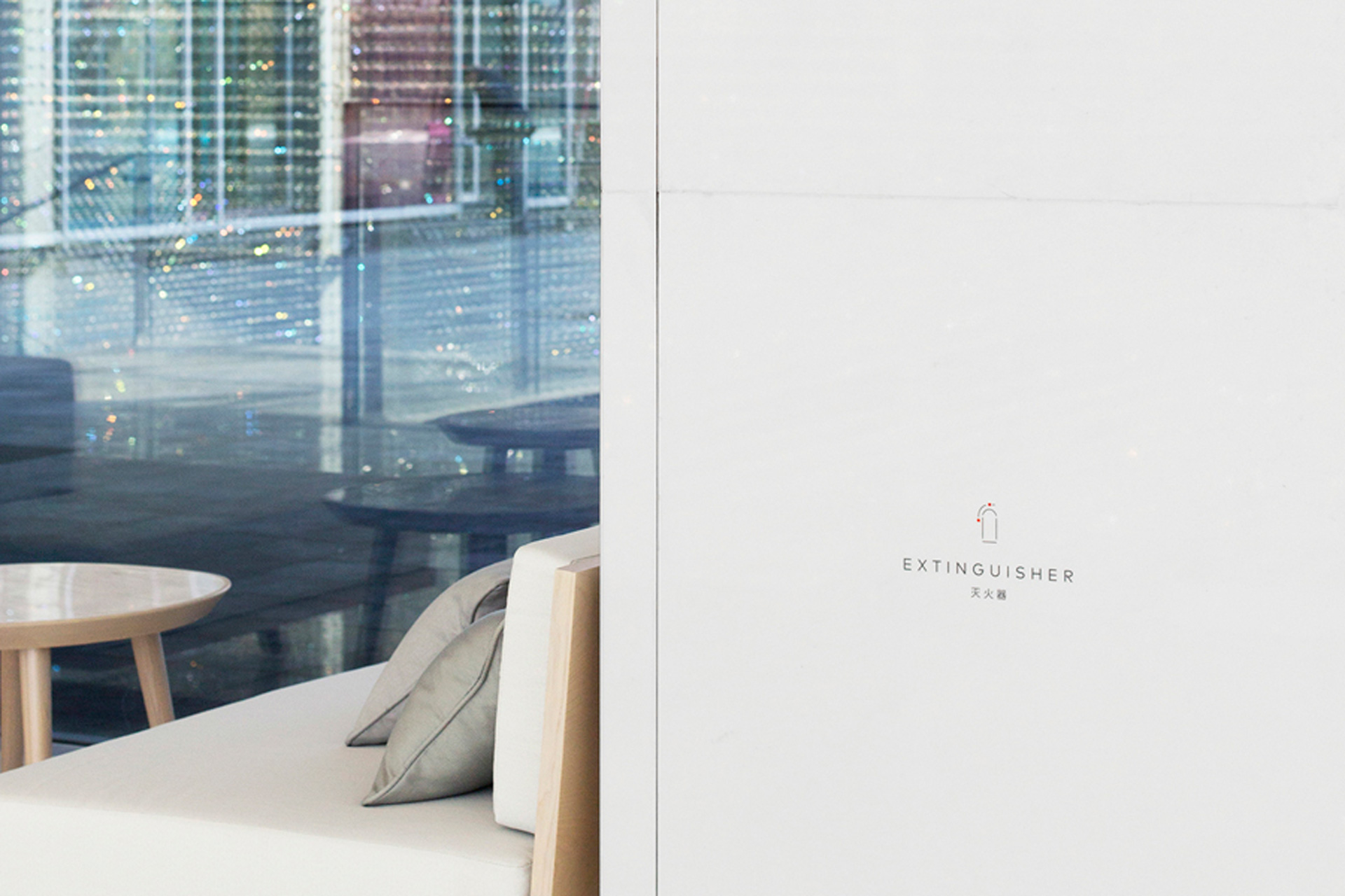
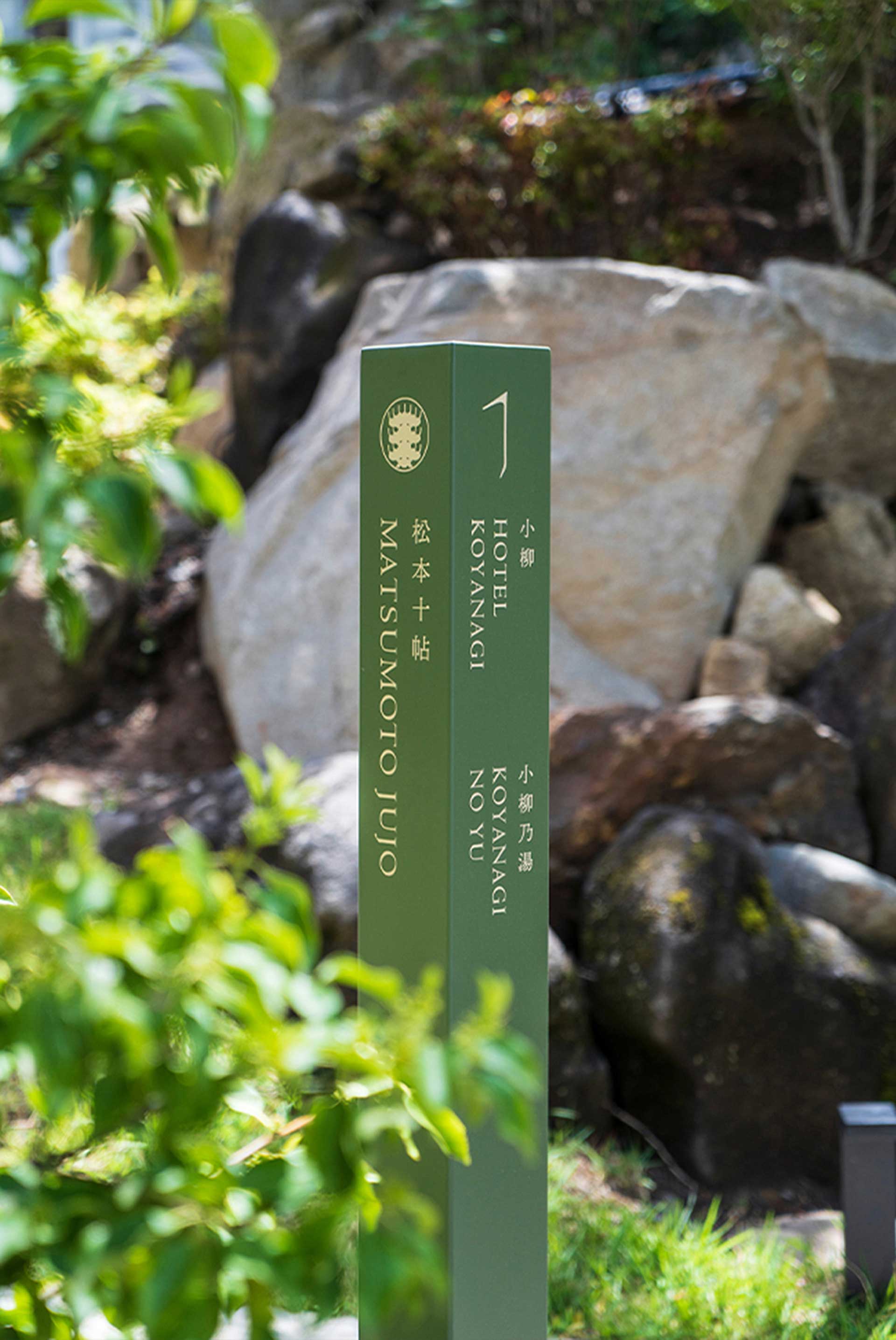
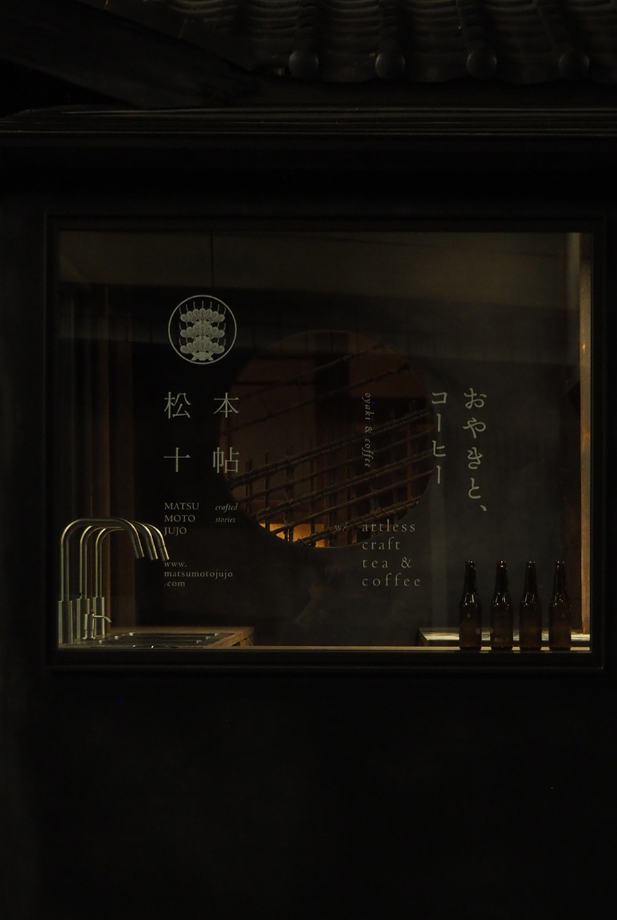
For artless, “Japanese aesthetics” is not a surface style or a decorative expression of being Japanese. Rather, we see it as a foundation for making invisible ideals, namely philosophy and spirituality, visible through a quiet and poetic order. In other words, Japanese beauty is less about the outward appearance of an outcome and more about the way of thinking that organizes the outcome. We clearly state our mission as follows: rooted in Japanese aesthetics, we integrate modernity, sustainability, and a global perspective. The key point is that integration is not simply mixing elements, but unifying them into a consistent attitude. In practice, Japanese aesthetics appears through a clear composition that removes excess, a sense of near silent negative space, and a way of shaping visual order so that it becomes the rhythm of the user’s experience. Ultimately, Japanese aesthetics functions as a shared criterion across all projects and as the starting point for translating a brand’s philosophy into visual form.
Your work integrates user sensibility and emotion into one experience across spatial design, packaging, branding, and web. When you unify diverse touchpoints into a single design language, what do you prioritize most?
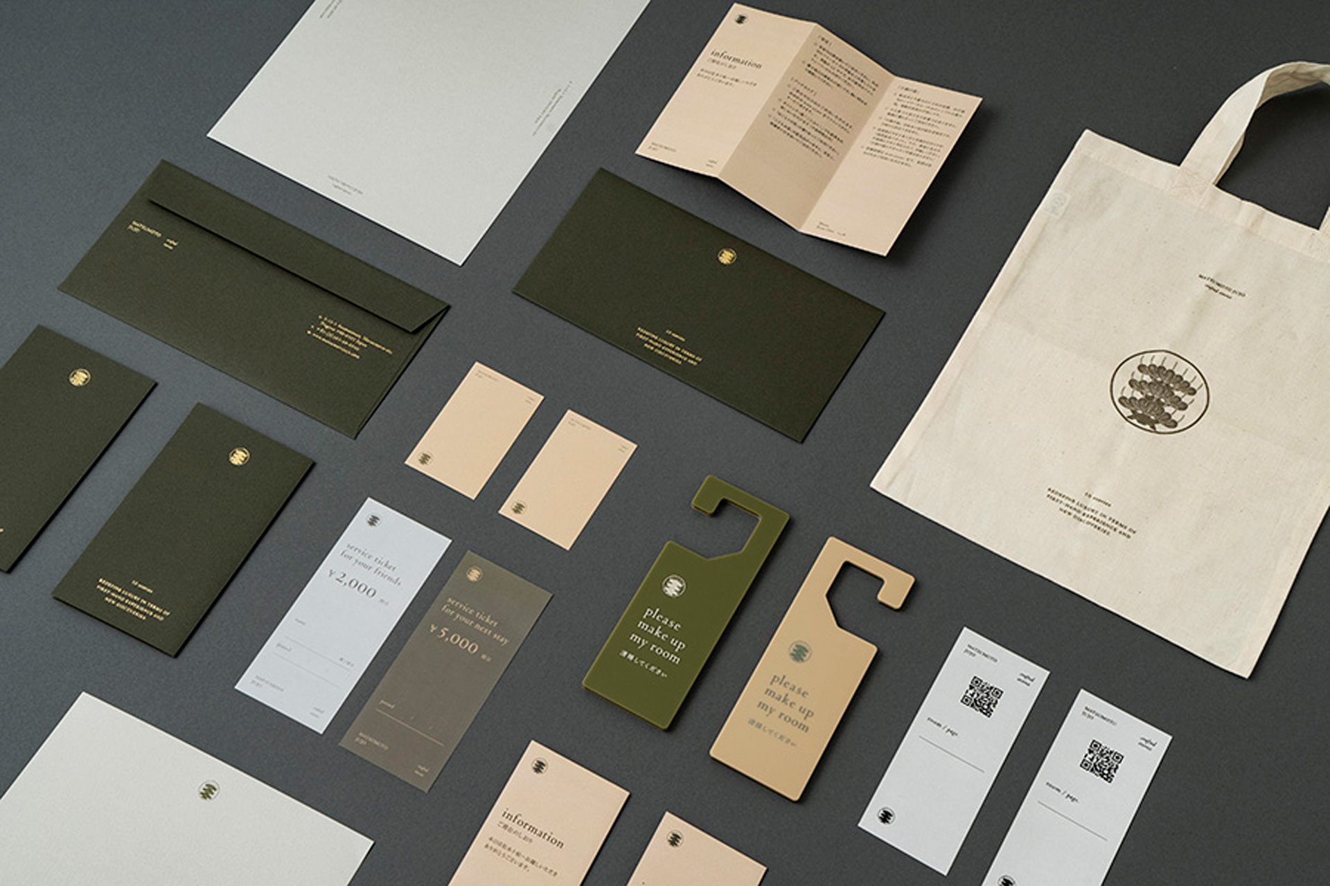
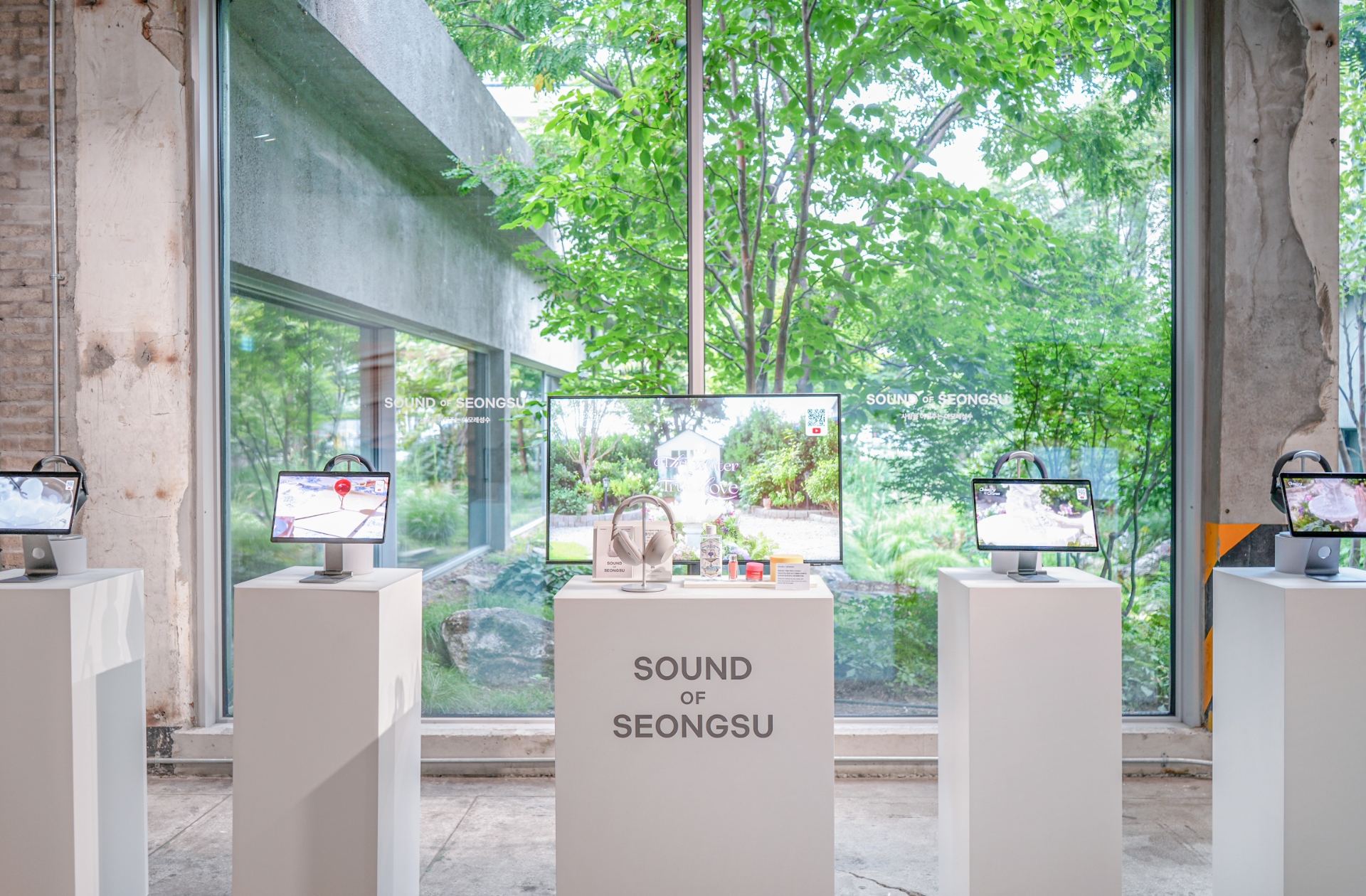
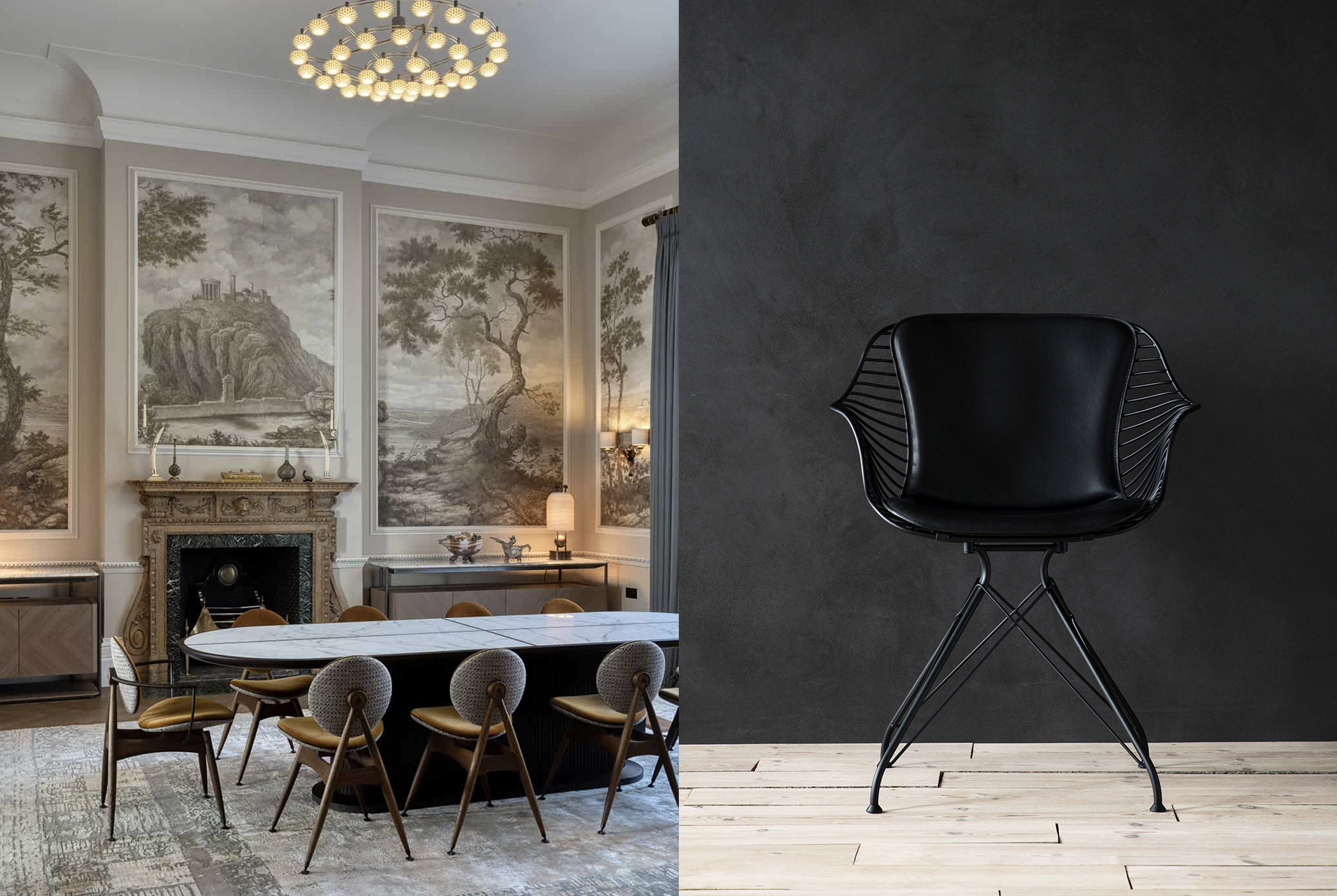
What we value most is making a consistent idea visible. When a brand’s thinking is clearly articulated, the outcome will point in one direction no matter how many touchpoints are involved. That is why, in the design process, we place particular emphasis on consistency in typography, design composition, and color tone. Here, consistency is not a rigid uniformity that forces rules, but a coherence that allows the brand’s atmosphere to remain intact in every scene. Even if the logo and packaging, the space and the web appear to be different media, users should feel them as one experience. We believe what supports that experience is ultimately the rhythm of typography, the temperature created by color, and the order of composition.
You develop projects in settings that include both city and nature, such as Tokyo, Kyoto, and Karuizawa. When reading place and environmental context, what perspectives and processes do you apply?
We place great importance on integrating diverse viewpoints. In particular, we actively embrace the differences in perspective that emerge within bilingual, or more precisely multilingual, environments. Rather than resolving opposing conditions such as city and nature, global and local into one side, we tend to treat the tension and balance between them as design material. We believe new expressions emerge when opposing perspectives and elements are integrated. Even in the process of reading a place, we avoid imposing a predetermined image. Instead, we first accept the site’s real conditions, its texture, rhythm, and ways of living, then organize the work so that the brand’s attitude can sit naturally on top of them. Ultimately, we see place not as decoration, but as a condition that changes the very way a brand language is realized.
artless Inc. excels at expanding BI and VI into a comprehensive brand experience across space, graphics, signage, and web. When translating the essence of a brand into visual language, what criteria do you consider most important?
When translating a brand’s essence into visual language, the most important criterion for me is whether it allows people to feel the brand’s personality and attitude sensorially, even without explanation. The goal is not simply to be seen as beautiful or stylish, but to create a state in which users naturally accept the brand’s character, almost like an atmosphere in the air. This matters because brand experience does not always come with explanation. People encounter the mood first, then interpret meaning. That is why visual language must communicate attitude before it communicates information. When an outcome is felt as one experience with sensory consistency, we believe the brand persuades before it speaks.
While based in Japan, you have worked on projects across Asia and globally. When engaging users and brands in different cultural contexts, how do you secure universality?
A major foundation is that I have continually moved across different places and intentionally kept inputting diverse experiences. I see movement not merely as physical travel, but as training that changes habitual ways of seeing. When cultures differ, the standards people assume as natural also shift, and those differences play an important role in refining universality. Another factor is the composition of our team. Our members come from diverse nationalities and cultural backgrounds, and I believe this layered foundation helps us create both distinctiveness and universality at the same time. The process of coordinating different standards becomes, in itself, a form of verification that strengthens a brand’s language.
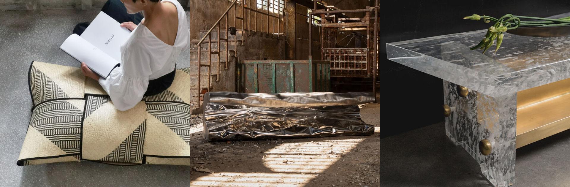
Your studio highlights sustainability and quiet beauty as key values. How are these values realized in actual projects, ideally with concrete examples?
When we define vision and philosophy at the upper stage of brand planning, we install sustainability into that foundation. As a result, sustainability is not something added in the later phases of a project, but a premise that exists from the beginning. In other words, we design so that sustainability is embedded in the brand’s attitude, including not only what to make, but what to leave behind and how the brand will operate over time. Quiet beauty follows the same logic. Rather than exaggerated expressions designed to stand out, we prefer a way in which a brand naturally earns trust through lasting order and restrained sensibility. We see this as a value that includes not only visual aesthetics, but also the structure and decision criteria through which a brand moves.
Your work is characterized by a distinctive expression where art, design, architecture, and digital naturally connect. Could you introduce your internal production system and project process?
At artless, every project output passes through my sensibility and filter. That is why my sensibility and perspective are naturally woven into our work. We do not see this as imposing personal taste, but as a way of maintaining consistent aesthetic criteria across the studio. What is especially important is the process by which my unique essence permeates the entire team. When that process functions naturally, the artistry and design quality do not fluctuate from project to project, and the work connects in the same language across different domains. Ultimately, our production system is less a structure of divided labor and more a way for one sensibility to be shared across the organization, and we believe that shared sensibility determines the completeness of a project.
Looking ahead, what themes, new experiments, or long term vision would artless Inc. like to pursue?
We want to continue working in the global market with a style that integrates Japanese aesthetics with a global perspective and sensibility. In truth, this feels less like a new goal and more like a vision that has remained unchanged since I became independent 25 years ago, when I was still nothing. Even as times change and media evolves, what we want to protect is an attitude of organizing invisible concepts into visual language. Based on that attitude, we hope to continue working across boundaries and helping brands articulate their philosophy more clearly, in ways that can be felt before they are explained.


#14057, 905 49, Beolmal-ro 102beon-gil,
Dongan-gu, Anyang-si, Gyeonggi-do, Korea
Business Registration Number: 454-86-01044
Online Sales License No.: 2021-Anyang Dongan-1081
Copyright © DESIGNSORI Co., Ltd.
