
These days, while scrolling through social media feeds, unfamiliar visuals often catch the eye. Thick black borders, text blocks that appear almost randomly placed, clashes of neon yellow and bright red backgrounds, and flat buttons with no shadows at all. This unfamiliar aesthetic, which directly defies the refined conventions of digital design, is called “Neo Brutalism.” “Why does it look so ugly, yet feel attractive?” This paradoxical reaction most accurately captures the essence of Neo Brutalism. Raw, unpolished, and unapologetically exposed, this aesthetic is rapidly spreading across all aspects of everyday life, branding, UI UX, web design, spatial design, fashion, merchandise, and advertising, resonating strongly with younger generations. This column traces the trajectory of that expansion through various real world cases and explores the message this unfamiliar form of beauty conveys.
From Concrete Architecture to Screens, The Lineage and Visual Language of Brutalism
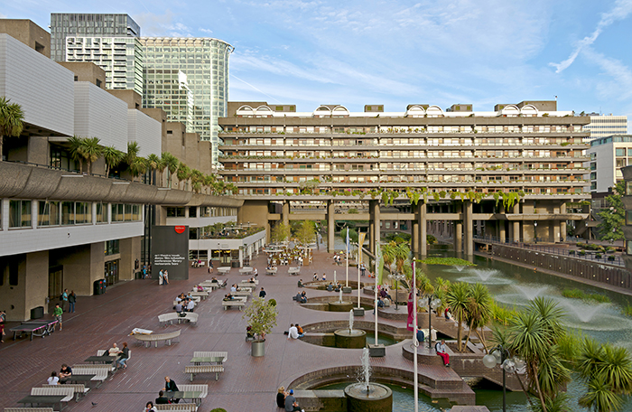
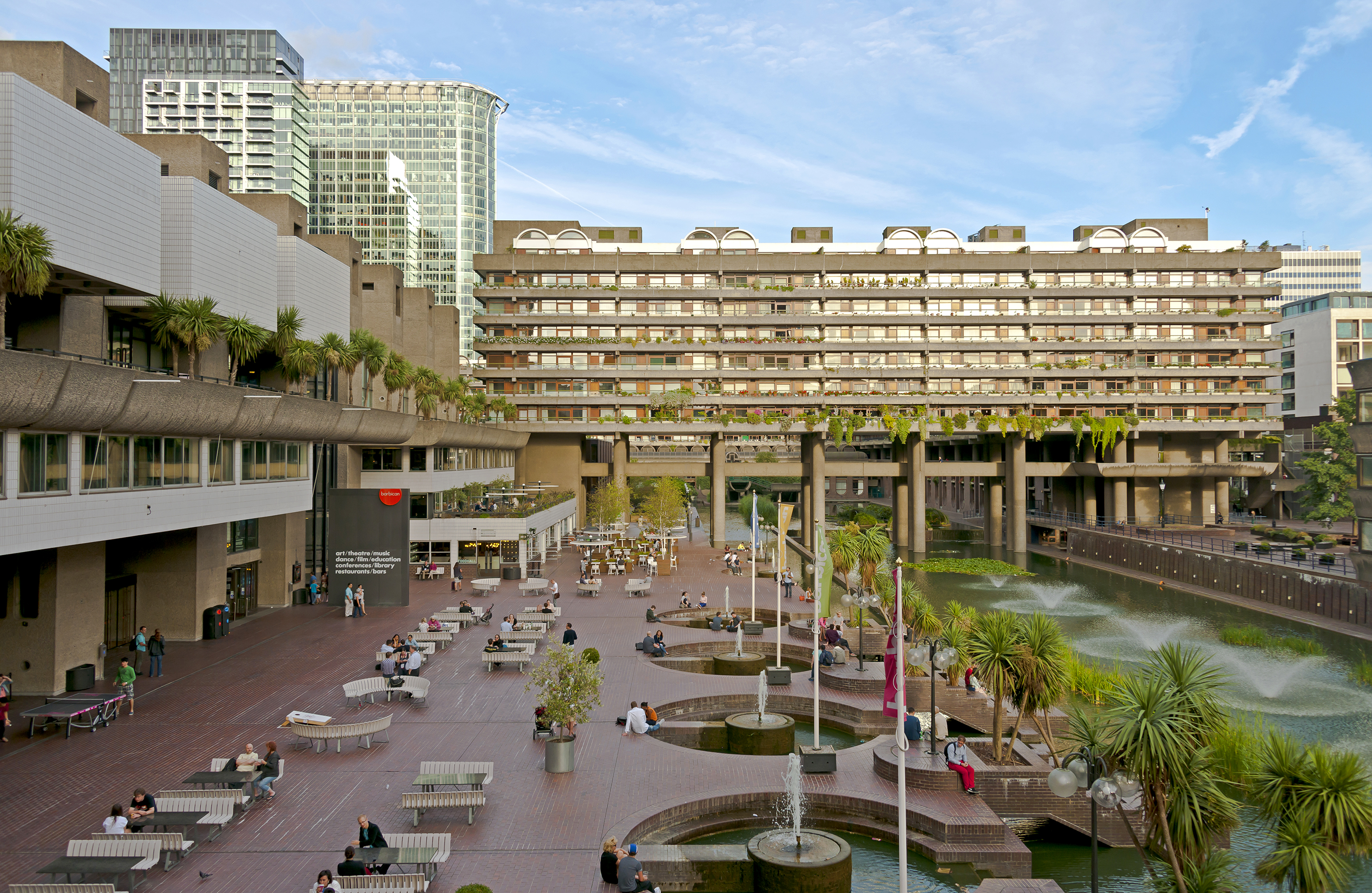
To understand Neo Brutalism, one must first trace it back to its origins. Brutalism emerged as an architectural style popular in Europe and the Soviet Union from the 1950s to the 1970s. Characterized by exposed concrete and the raw revelation of structural frameworks without decorative elements, the style takes its name from the French term béton brut (raw concrete). Notable examples include the Barbican Centre in London, Boston City Hall, and large public buildings of the former Soviet Union. This architectural honesty, “do not conceal materials, do not disguise structure,” was later translated into early web design in the late 1990s. It evolved into “Web Brutalism,” which intentionally preserved or recreated the crude layouts and default fonts of early HTML interfaces. In the 2020s, this sensibility merged with contemporary UI aesthetics, giving rise to Neo Brutalism.
The visual language of Neo Brutalism is defined by several clear principles. Thick black borders that emphasize the boundaries of elements, flat block shadows shifted at right angles instead of realistic gradients, highly saturated artificial primary colors such as neon yellow, mint green, and hot pink, layouts that deliberately break alignment, and immediate, abrupt interactions instead of smooth transitions. Each of these elements may feel awkward in isolation, but when combined into a system, they create a striking and coherent aesthetic. Beneath this visual language lies a consistent question: what does this design conceal, and what does it reveal honestly? Younger generations are drawn precisely to this question. In a digital landscape dominated in the late 2010s by flat design and material design, where every app seemed to speak the same visual language, the “ugliness” of Neo Brutalism emerged as an active rebellion against standardized refinement. The rise of filter free culture, the growth of platforms like BeReal, and fatigue toward over edited Instagram aesthetics all point in the same direction as Neo Brutalism’s visual language.
Rebellion on the Screen, Cases in Web Design, UI, and Branding
Neo Brutalism first took hold, and continues to evolve most dynamically, in web design. As websites began to reject the conventional rules of clean grids, consistent spacing, and smooth hover effects, they started to reshape the landscape of digital design. The website of the creative agency Hype 4 is often cited as a textbook example of Neo Brutalist web design. Its card based layout framed by thick black borders, offset box shadows applied to each element, alternating backgrounds of fluorescent yellow and white, and clashing section colors create a strong visual pull that makes users pause, scroll back, and re examine. Considering that an agency website functions as a portfolio meant to persuade clients, this choice is both highly experimental and strategically bold.
The portfolio platform Read.cv also reflects Brutalist principles through a typography driven layout that remains clean while exposing its structure. By avoiding excessive visual decoration and foregrounding content itself, it embodies the philosophy of Brutalism. The online education platform Buildspace gained strong support within developer and builder communities with its terminal inspired Brutalist UI, combining dark backgrounds, white text, and fluorescent accent colors. Its attitude of “we do not pretend to be pretty” became a signal of authenticity. Meanwhile, Neo Brutalist templates shared on the startup landing page builder Framer consistently rank among the most downloaded, establishing themselves as a default branding language for founders and indie hackers who aim to “build seriously without exaggeration.”
Portfolio tools such as Cargo and Format also show that Neo Brutalist layouts are among the most preferred styles for artists and designers. Ironically, they are chosen precisely because “the site does not outshine the work.” This shift is also visible in the Korean web design scene. Independent design studios and art directors increasingly adopt Brutalist web design elements such as thick dividing lines, intentionally asymmetric layouts, and monospace typography. Among younger designers in Seoul’s creative scene, Neo Brutalist web portfolios have become a signal that one is “in tune with the current moment,” evolving into a kind of career language in itself.
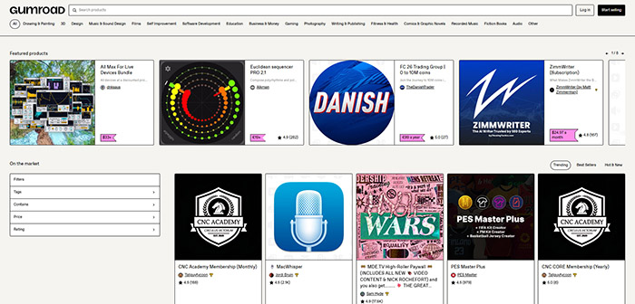
In UI product design, the digital goods platform Gumroad shocked the industry with its 2021 rebranding, introducing pink backgrounds, black borders, and buttons with offset shadows. The philosophy proposed by its founder, Sahil Lavingia, “deliberately under designed,” quickly spread across the creator economy. The payment platform Lemon Squeezy established strong brand recall in the rigid fintech sector through a bold three color system of yellow, white, and black, combined with thick outlined illustrations. Meanwhile, the design collaboration tool Figma demonstrated the establishment of Neo Brutalism as a systematic design language, with thousands of UI kits in this style shared within its community. The UK challenger bank Monzo broke away from the conservative image of financial brands with its coral colored cards and bold typography, while the cryptocurrency wallet app Rainbow Wallet uses high saturation colors and thick boundaries to present complex financial information in a surprisingly clear way. The developer tool Railway combines a dark background with neon green text and monospace fonts, creating a distinctive aesthetic that merges terminal sensibilities with Neo Brutalism.
This trend is also clearly visible in Korean brands. Musinsa consistently uses thick black borders and bold primary color clashes across its campaign banners and in app promotional UI, visually reinforcing its identity as “young and raw.” 29CM combines editorial photography with Brutalist typography to create an immersive experience closer to a fashion magazine than a typical shopping app. The limited edition sneaker trading platform KREAM delivers a sense of “scarcity” and “tension” through a UI built on strong black and white contrast and bold type. The early UI of the fintech app Toss set a new standard for many financial apps that followed, with its radical use of high contrast and simplified structure. Even in Kakao emoticons, characters featuring thick outlines and exaggerated expressions, rooted in a Brutalist sensibility, consistently rank among the most popular, aligning closely with the expressive language of younger generations.
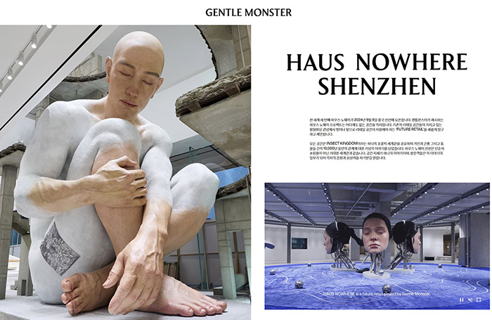
Brutalism as Space, Gentle Monster’s House Nowhere Seoul
One of the most striking Korean examples of Neo Brutalism translated from screen to physical space is undoubtedly Gentle Monster’s House Nowhere Seoul. Located in Seongsu, this space is not merely a flagship store. With unfinished looking concrete walls, heavily exposed steel structures, and rough, seemingly unrefined materials, every element is in fact the result of a carefully calculated Brutalist aesthetic. Rather than removing decoration, the strategy is to make structure itself the decoration.
What makes House Nowhere particularly noteworthy is how it transforms the architectural language of Brutalism into a fully realized brand experience. Visitors enter to buy eyewear but encounter unidentified objects, take photos against industrial textures, and naturally become content creators themselves. The visual identity of the space spreads rapidly across social media, turning the experience of “having been to Gentle Monster” into a cultural signal. Here, space is consumed before product, and experience before purchase, this is precisely how Brutalist aesthetics operate for younger generations.
The website of House Nowhere maintains this consistency on screen. Full screen imagery presented directly without excessive animation, bold typography, minimal navigation, and photography that preserves the raw texture of the space seamlessly extend the offline Brutalist sensibility into the digital environment. This continuity between online and offline reveals that Brutalism is not merely a style, but a comprehensive brand worldview. While Gentle Monster has long treated each store as an independent art installation, House Nowhere pushes this direction further. Raw materiality, bold scale, and intentional imperfection clearly demonstrate how Neo Brutalism manifests when translated into physical space. This brand stands as one of the most multidimensional examples proving that Neo Brutalism is not just a visual trend, but a lifestyle language.
This aesthetic is also rapidly permeating fashion and merchandise. Brands such as Balenciaga and Maison Margiela incorporate oversized silhouettes, raw materials, and deliberately distorted proportions into their collections, while Nike and Adidas use Brutalist graphics, thick block text and primary color backgrounds, in campaign posters to convey the energy of sports in a more primal way. In Korea, independent publishing brand Your Mind and stationery brand MOTMOT capture younger consumers by offering a premium sense of “handmade authenticity” through Riso prints that preserve ink textures and stamp packaging that retains imperfections.
The Beauty of the Unpolished
Every trend inevitably produces a counter trend. Some critics already argue that Neo Brutalism is becoming just another standardized visual formula. If everyone uses thick borders, those borders no longer signify rebellion. However, the core philosophy of Neo Brutalism, honesty, exposure of structure, and rejection of unnecessary decoration, connects to more fundamental questions in design beyond any single trend. Notably, this aesthetic also resonates with accessibility. High contrast color combinations, clear boundaries, and large typography not only create visual intensity but also improve readability for users with low vision or cognitive impairments. This creates an interesting intersection where the aesthetics of rebellion align with the principles of inclusive design.
Finding beauty in cracked, scratched, and imperfect surfaces rather than perfectly polished ones is not only a matter of design. It reflects the way younger generations communicate, rejecting the need to hide behind perfect filters and instead expressing raw emotions. Neo Brutalism is the visual translation of this mindset. From the rough concrete walls of Gentle Monster, to the pink buttons of Gumroad, the fluorescent web interfaces of Hype 4, and the thick black bordered banners of Musinsa, we hear the same voice. It is not the beauty of ugliness, but the beauty of the unadorned and the real. And that beauty shines most honestly, on the screens we look at every day, and in the spaces where we stand.


#14057, 905 49, Beolmal-ro 102beon-gil,
Dongan-gu, Anyang-si, Gyeonggi-do, Korea
Business Registration Number: 454-86-01044
Online Sales License No.: 2021-Anyang Dongan-1081
Copyright © DESIGNSORI Co., Ltd.
