Hanwha Eagles
Communication
Regions
Korea
Year
2026
Award
WINNER
Client
Hanwha Eagles
Affiliation
Grid
Designer
Hanwha Eagles, Matthew Wolff, Sang Mun, Dasol Kim, Jungeun Shin
https://youtu.be/jNBwSKzi3uE?si=Ui6mBzjtDmNqZQH7
English
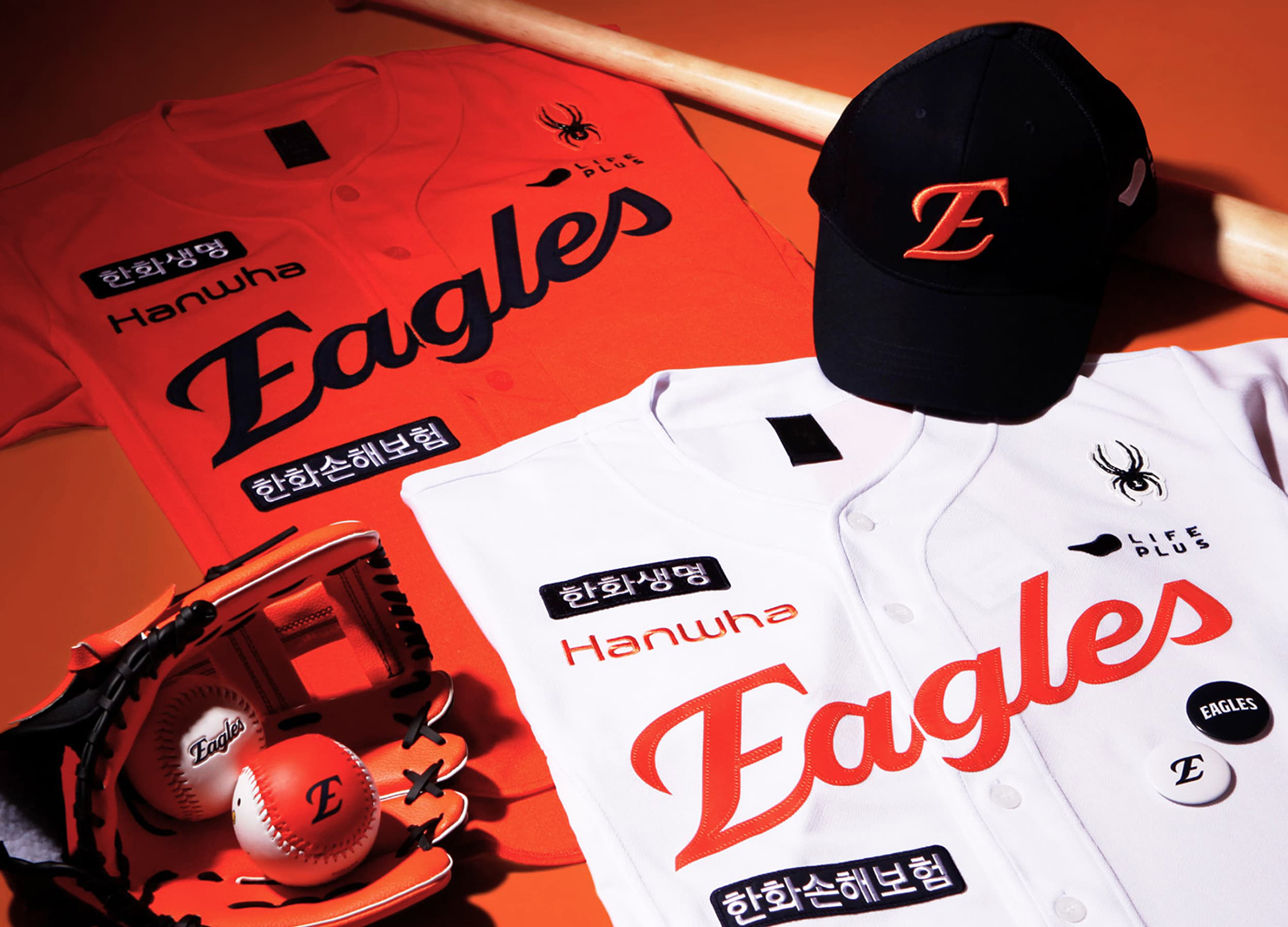
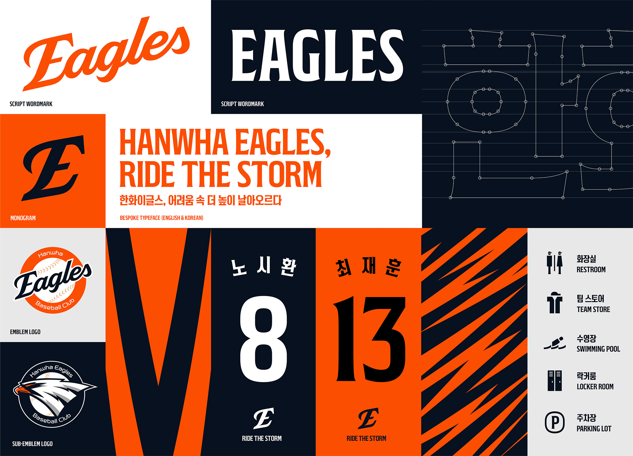
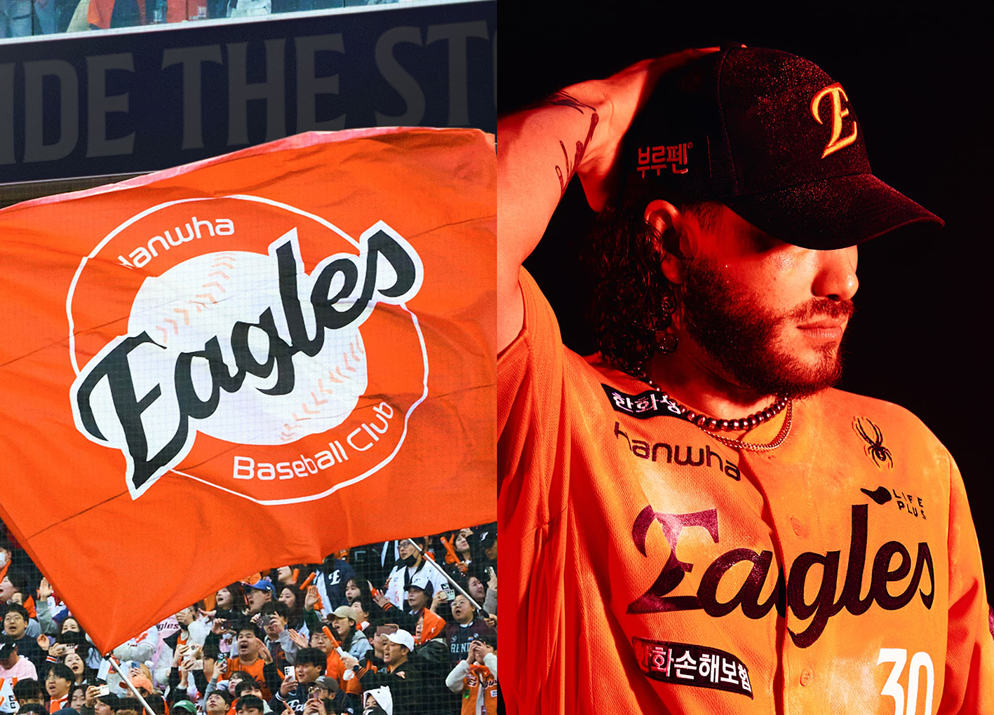
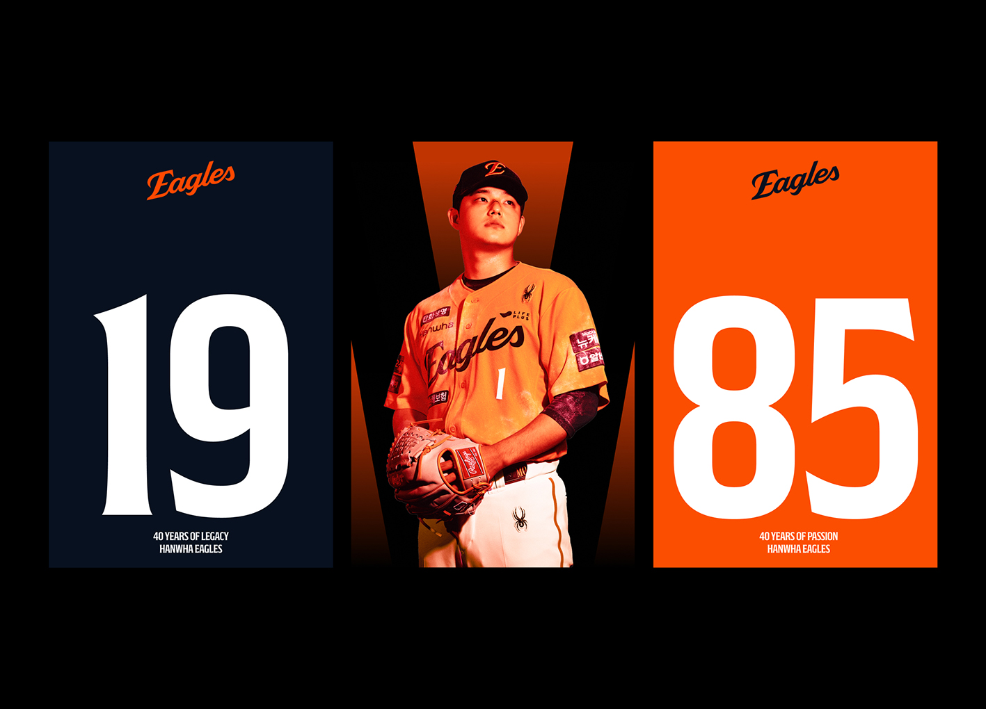
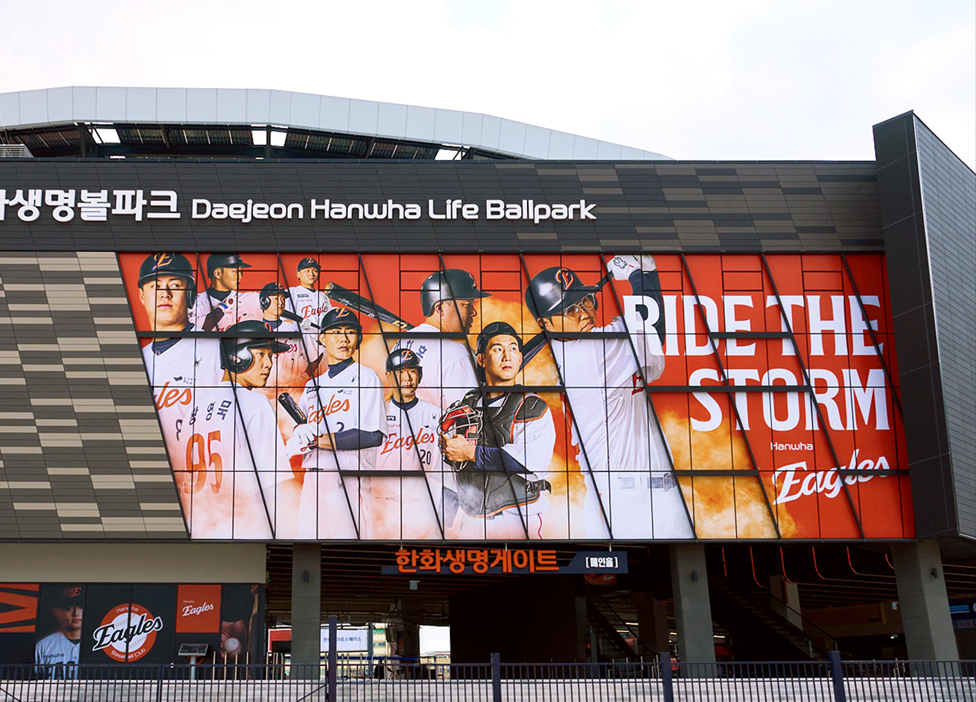
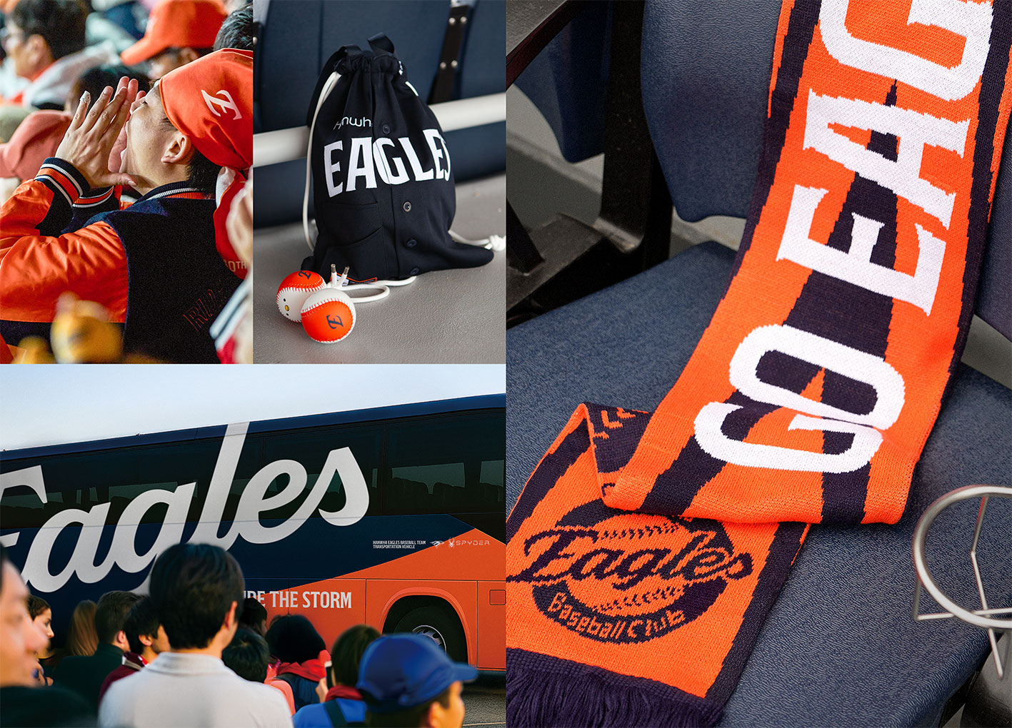
Hanwha Eagles, a Korean professional baseball team with over 40 years of legacy, renewed their brand with unwavering resilience. Inspired by the eagle spirit, the concept “RIDE THE STORM” represents a team that doesn’t avoid adversity but rises through it. This idea shaped a bold visual language drawn from the eagle’s talons, beak, and feathers to form a cohesive design system with bespoke typography, pictograms, and visual assets to elevate the fan experience. This identity extends across brand films, social content, merchandise, the home stadium, and citywide billboards—reinforcing the Eagles’ fearless presence and uniting fans with pride.
Native
40년 이상의 역사를 지닌 한국 프로야구팀 한화이글스는, 구단의 묵직한 결의와 질긴 투지를 담은 새로운 브랜드 아이덴티티로 재탄생했습니다. 이들의 이름에서 비롯된 상징적인 심볼 ‘독수리’에서 출발한 ‘RIDE THE STORM’ 브랜드 서사는, 폭풍을 두려워하지 않고 그 속을 뚫고 더욱 높이 비상하는 한화이글스의 강인한 정신력을 내포합니다. 이 서사는 독수리의 발톱, 부리, 깃털에서 영감을 얻어 비스포크 서체·픽토그램·그래픽 모티브 등을 포함한 대담한 비주얼 아이덴티티로 확장되었습니다. 새 아이덴티티는 브랜드 필름, 소셜 콘텐츠, 한화이글스 대전 홈구장, 빌보드 등 모든 접점에 일관되게 적용되어 한화이글스의 굳건한 투지와 팀 정신을 더욱 선명하게 전달하고 있습니다.
Positive Comments


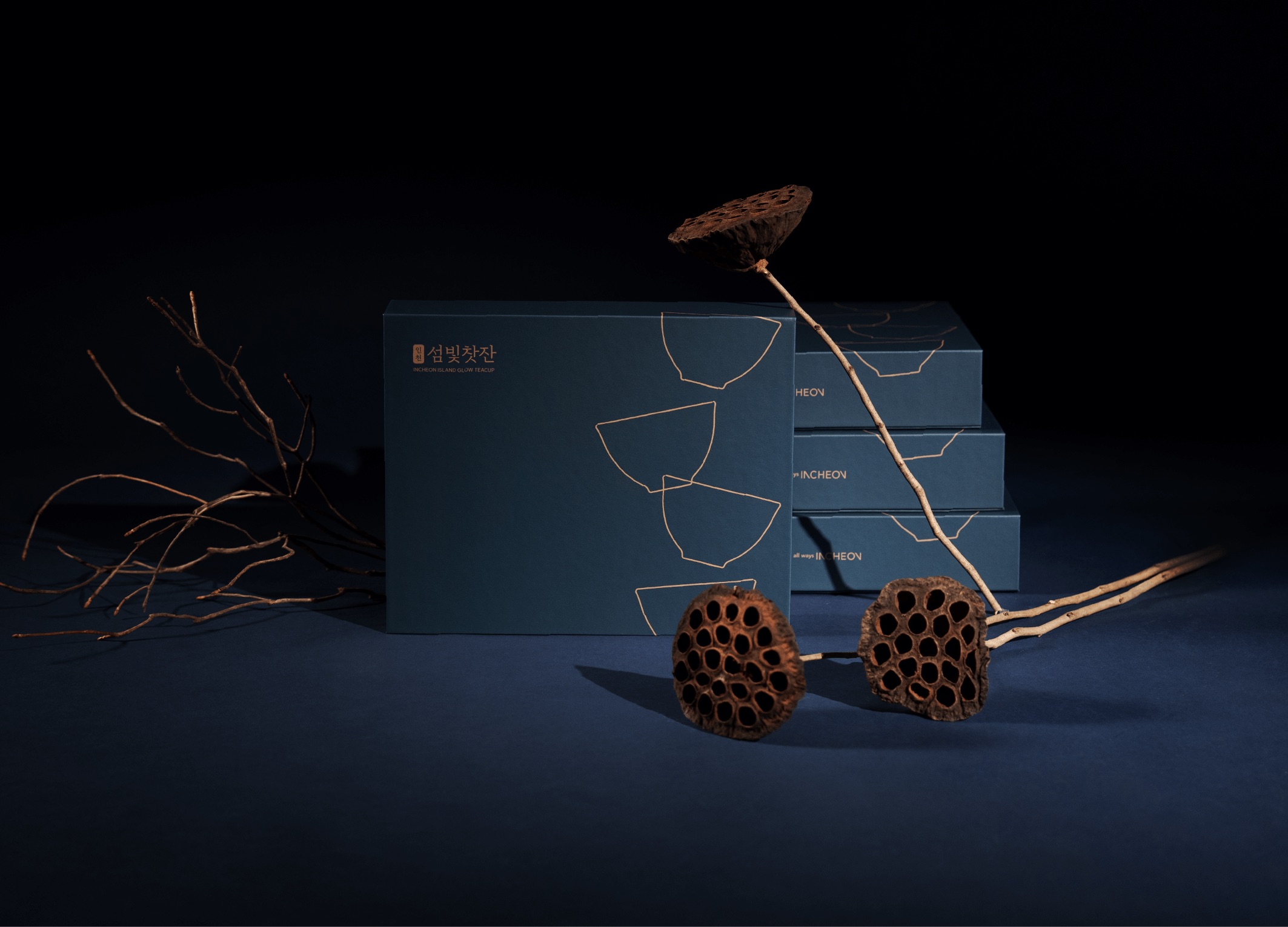
ISLAND GLOW TEACUP
Incheon Metropolitan City, OSAFE
Korea
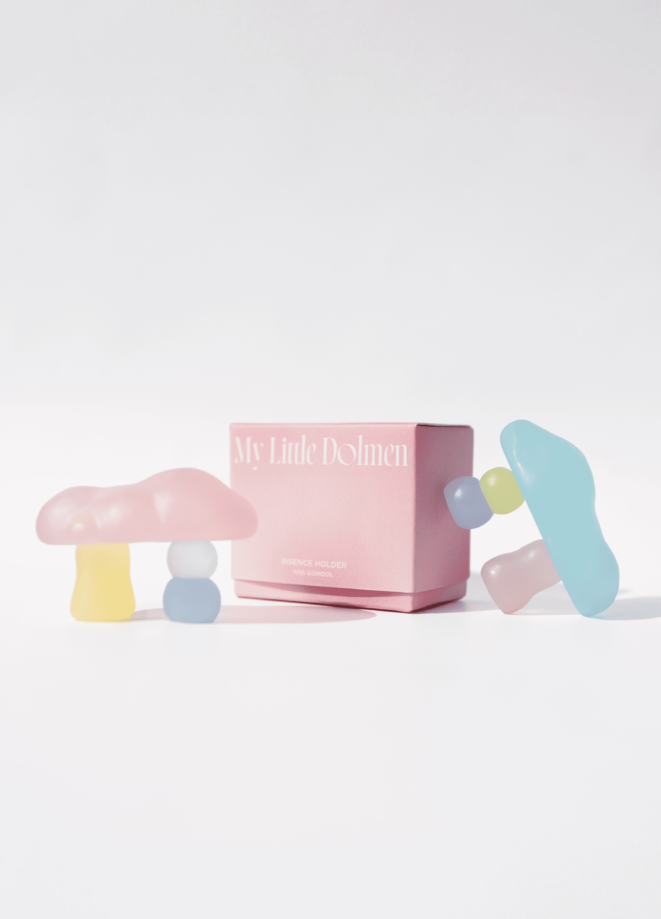
MY LITTLE DOLMEN
Incheon Metropolitan City, OSAFE
Korea
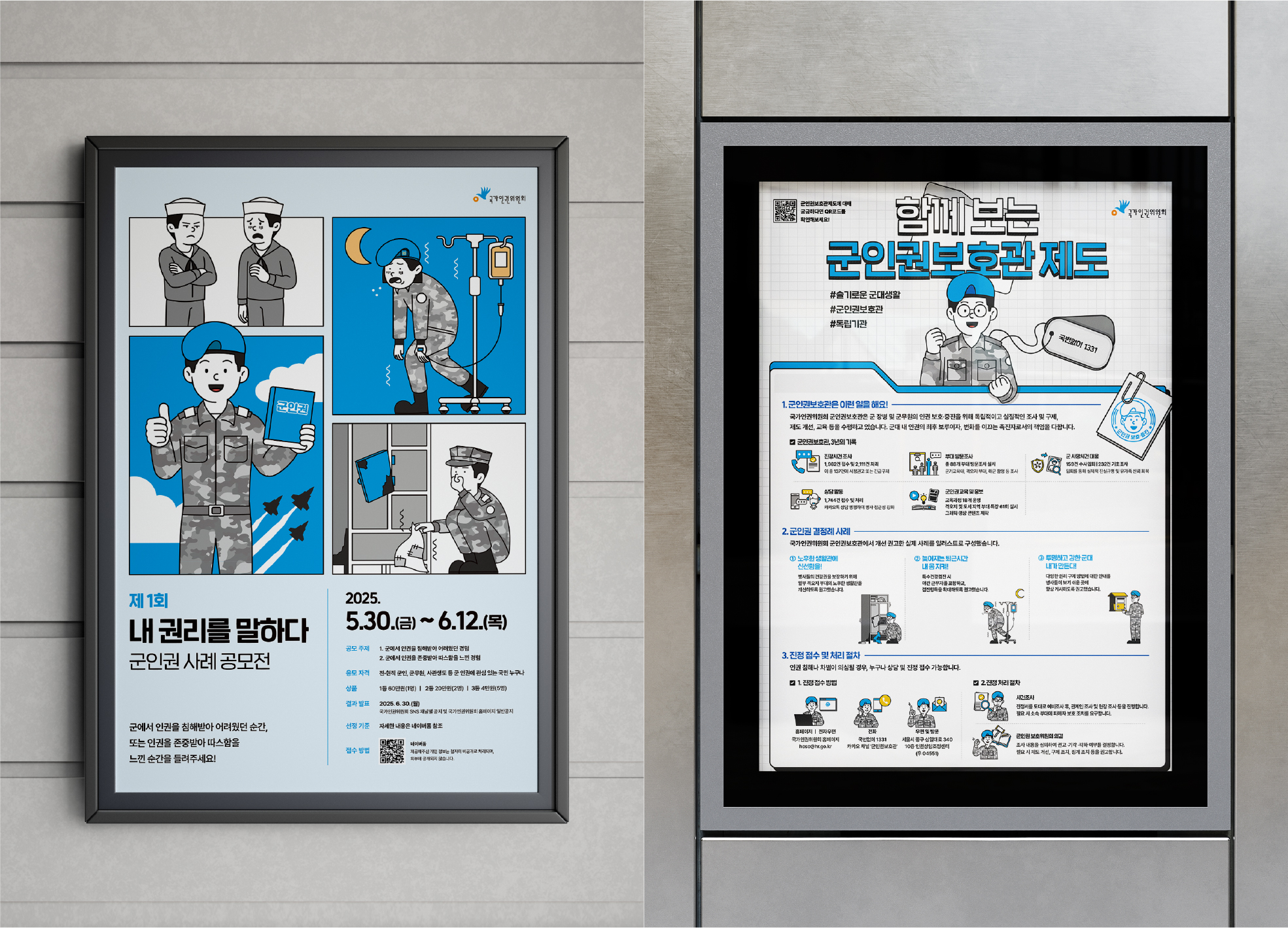
Military Human Rights Communication Design
OSAFE
Korea
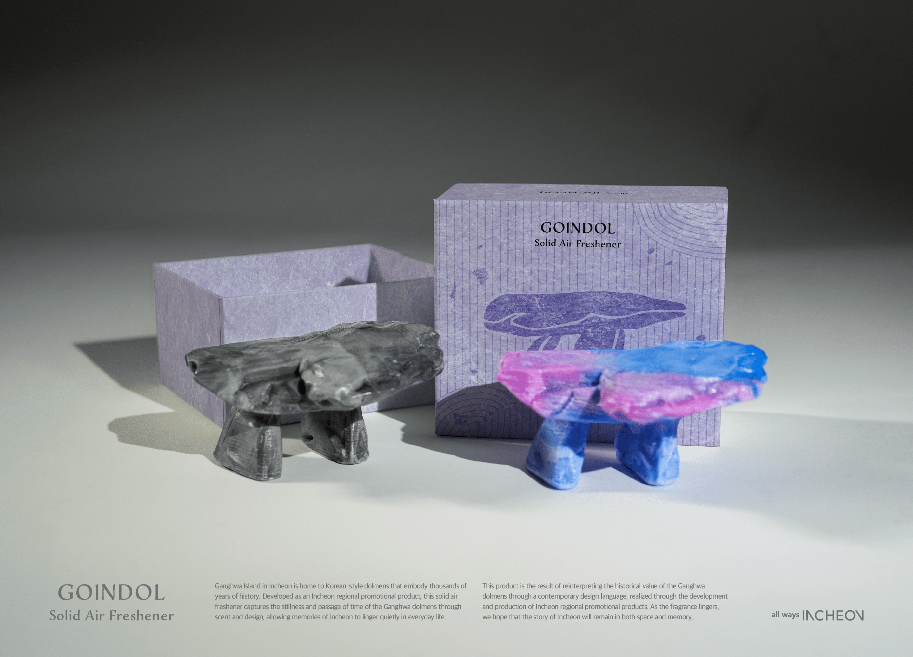
Ganghwa Dolmen solid Air Freshener
Incheon Metropolitan Cityhall, OSAFE
Korea
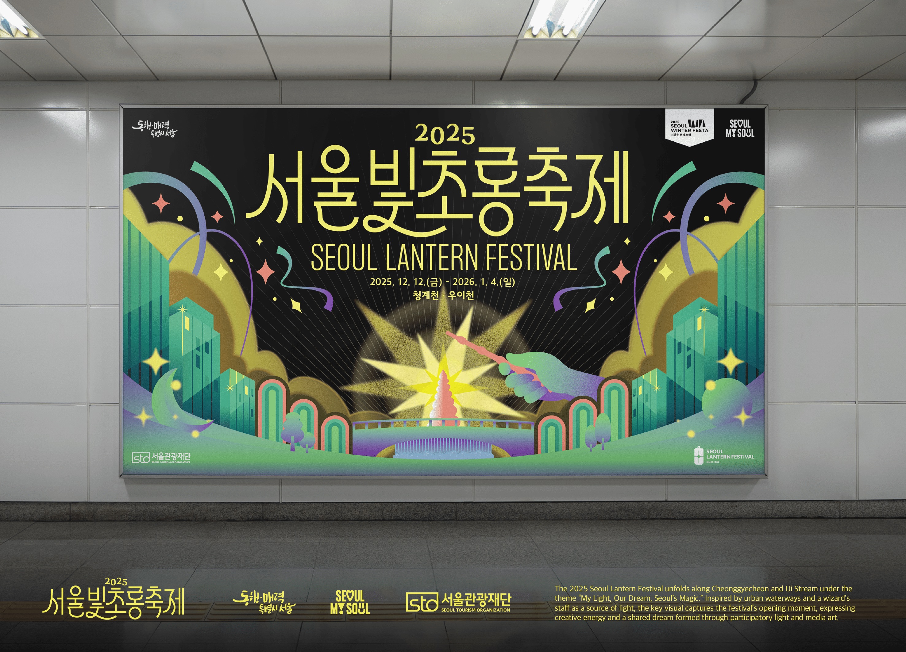
The Seoul Lantern Festival Key Visual
Seoul Tourism Organization, OSAFE
Korea
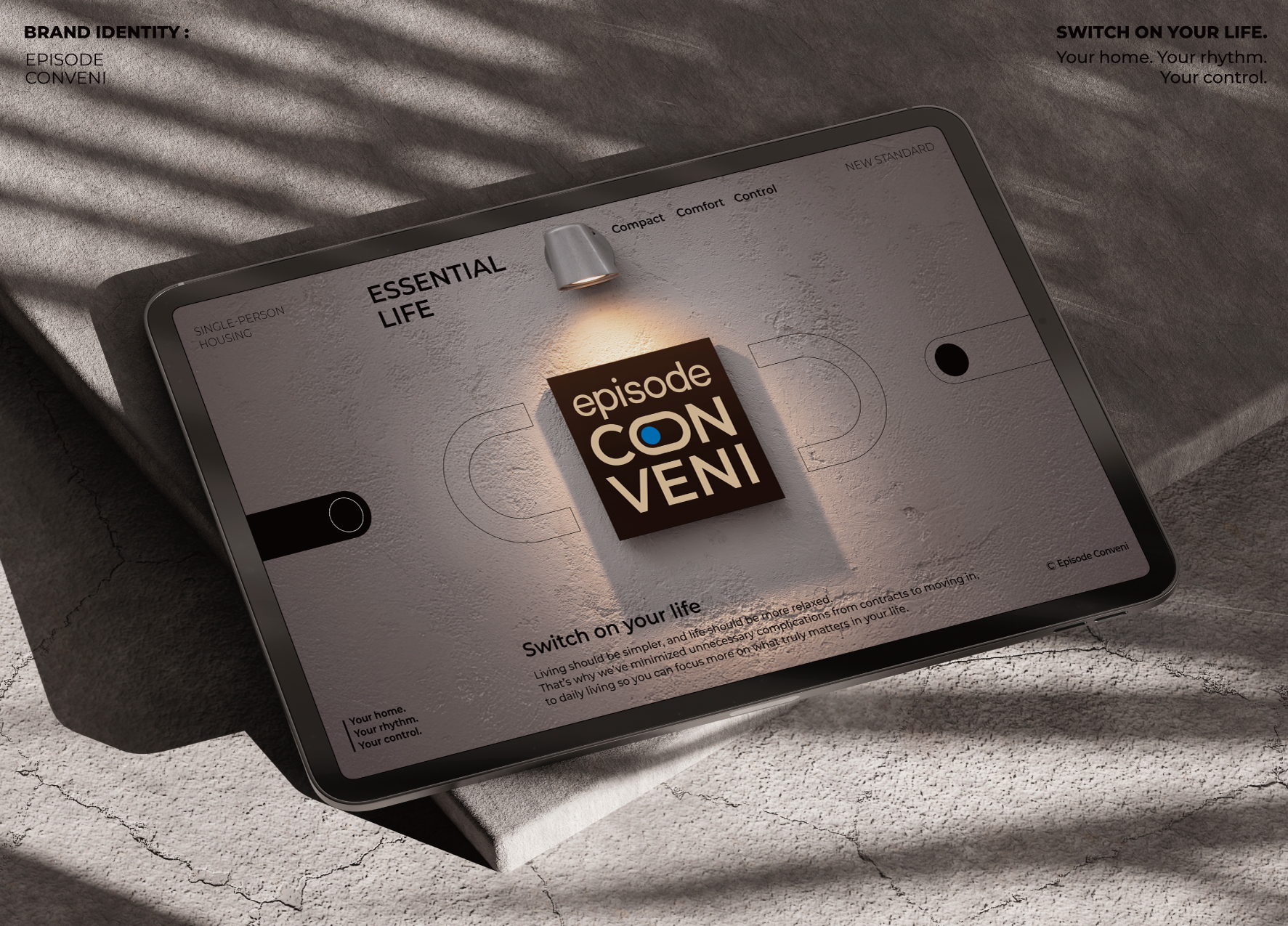
EPISODE CONVENI
SK D&D Co., Ltd.
Korea
Hanwha Eagles
Grid
Korea
2022 WHITE KITTE
4hearts Co., Ltd.
Japan
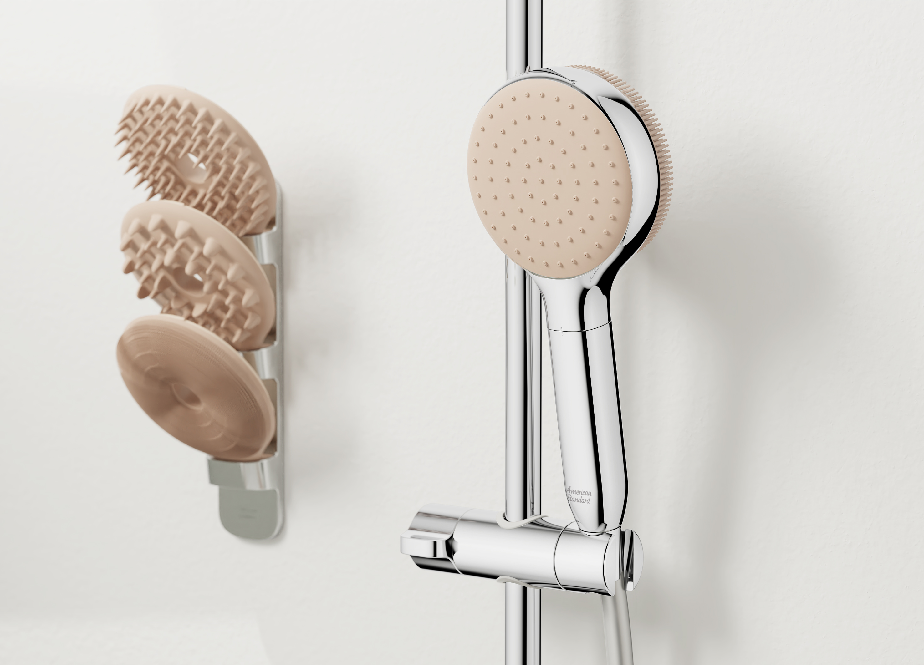
DuoCare Hand Shower
American Standard
Singapore
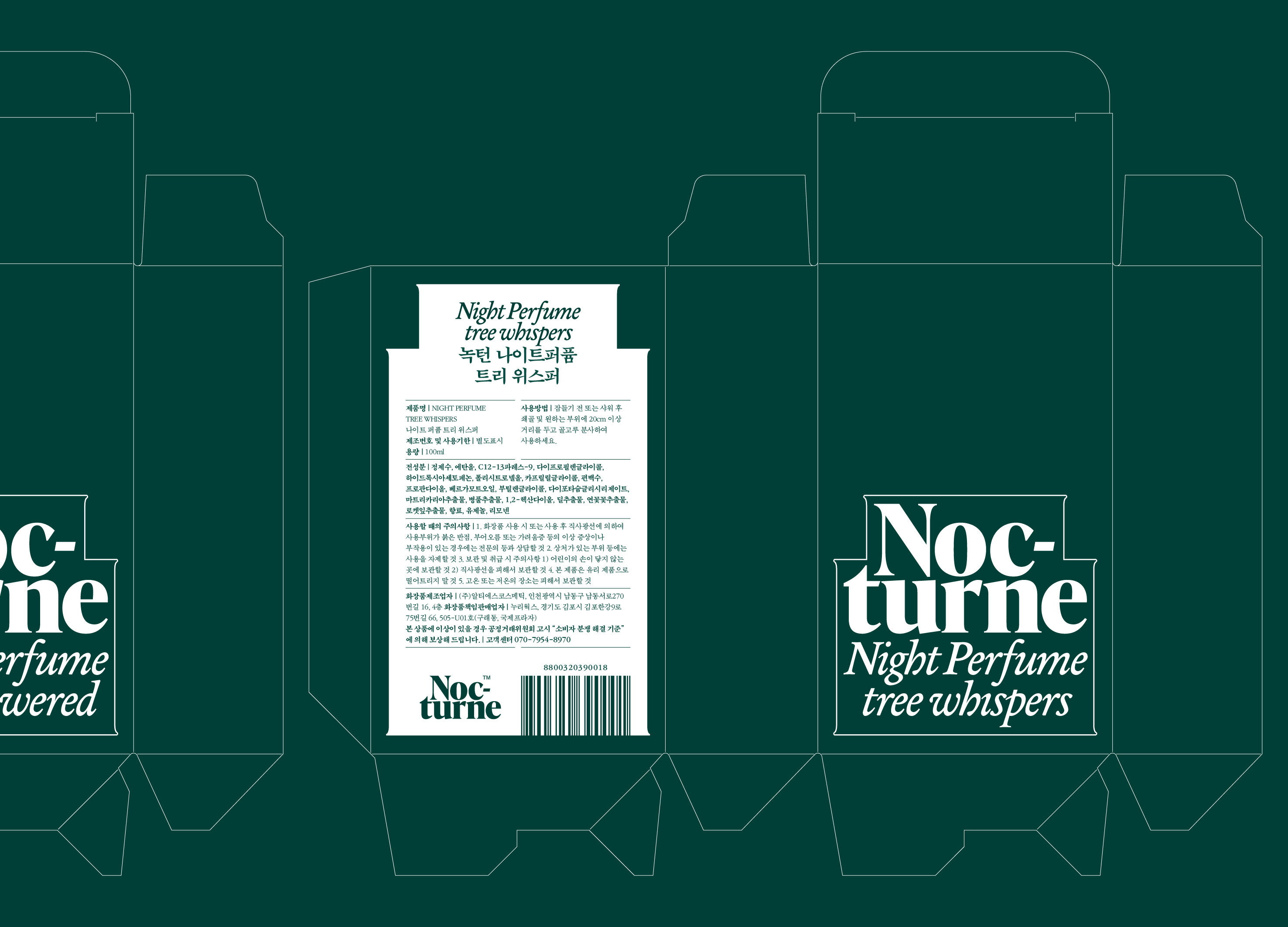
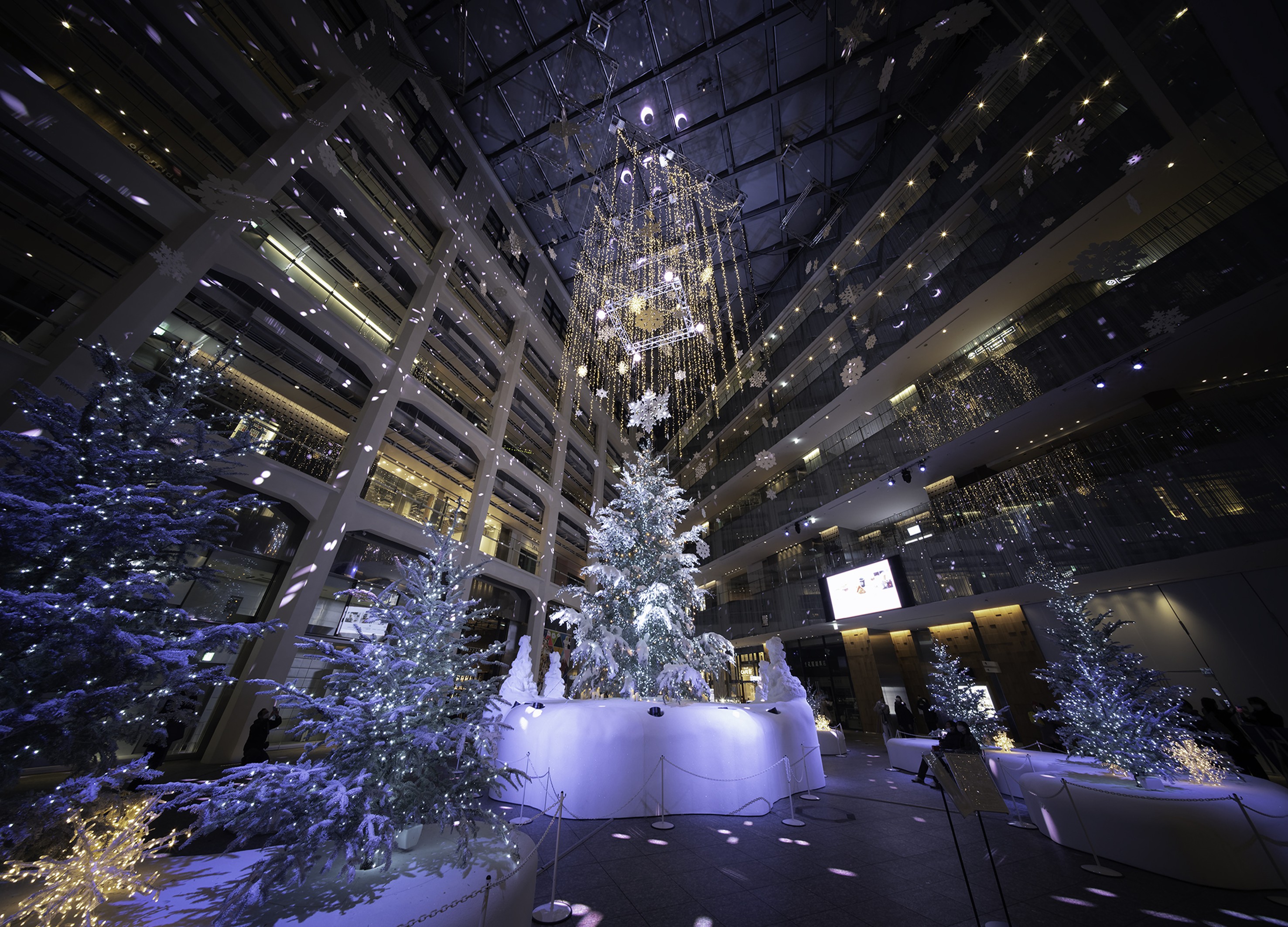
Nocturne
tedo Inc.
Korea
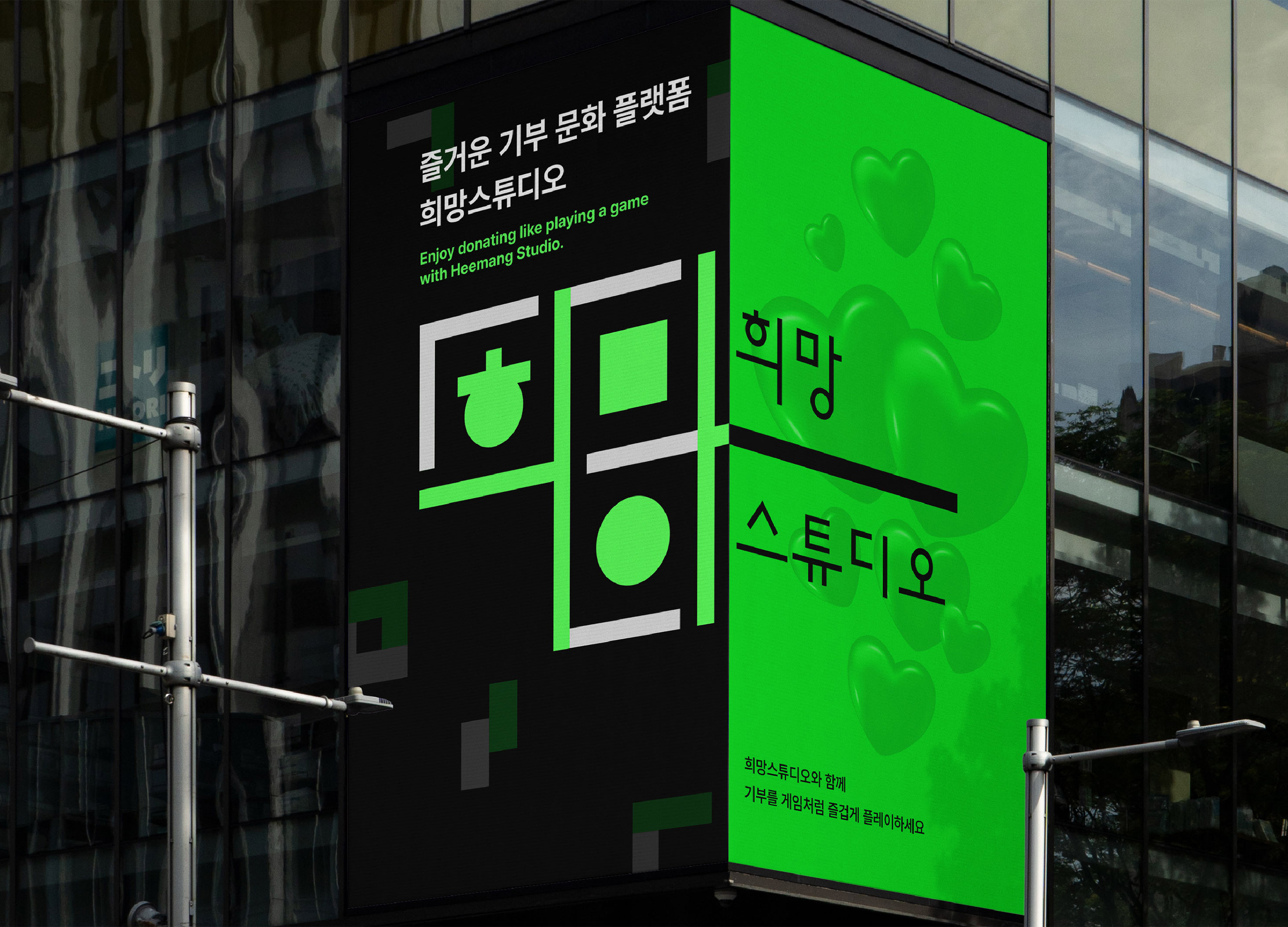
Gamification Donation Platform Heemang Studio
Smilegate Inc.
Korea

Kimchi Spread
Daesang Co., Ltd.
Korea
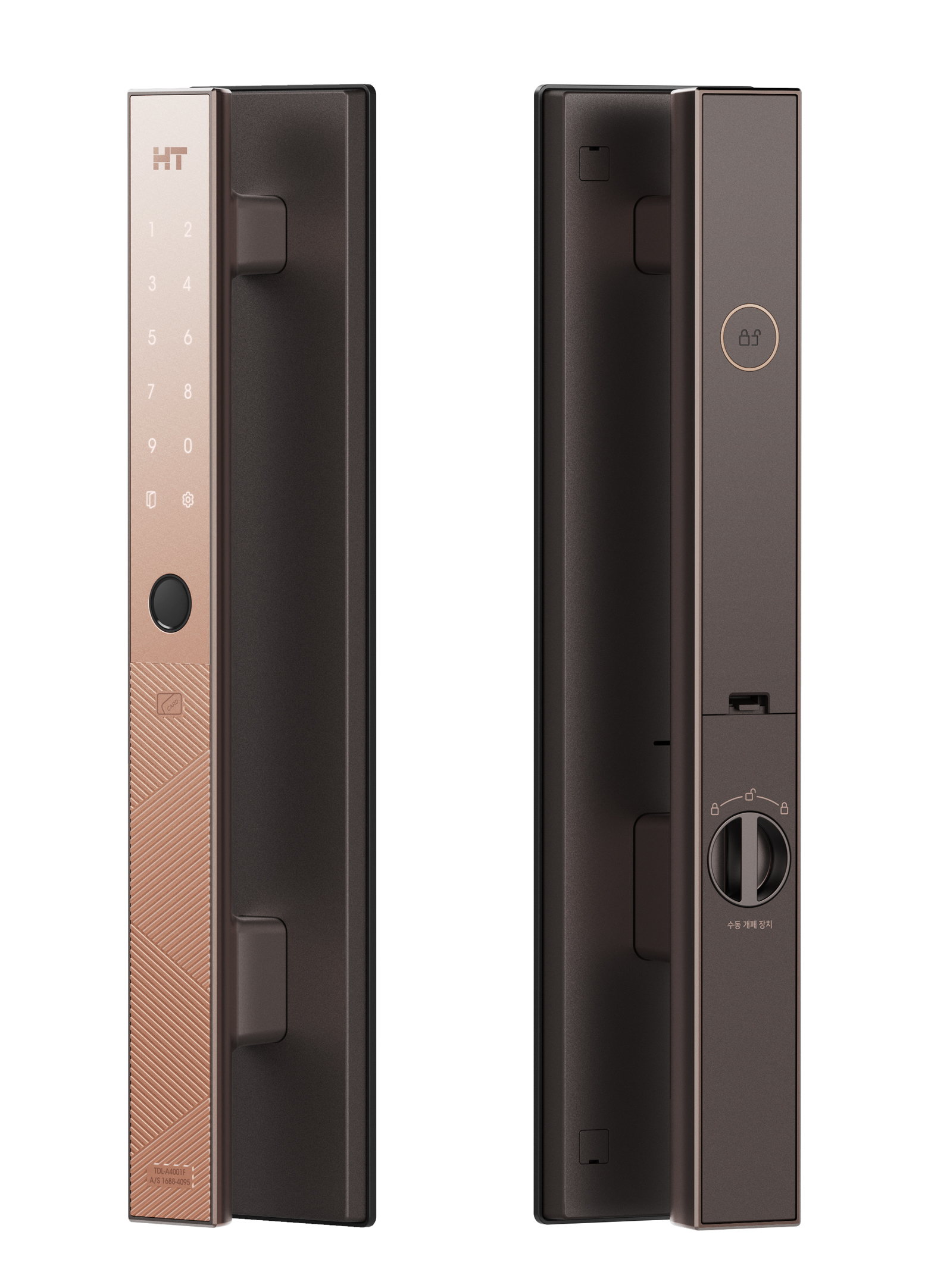
TDL A4001
HYUNDAI HT Co., Ltd.
Korea
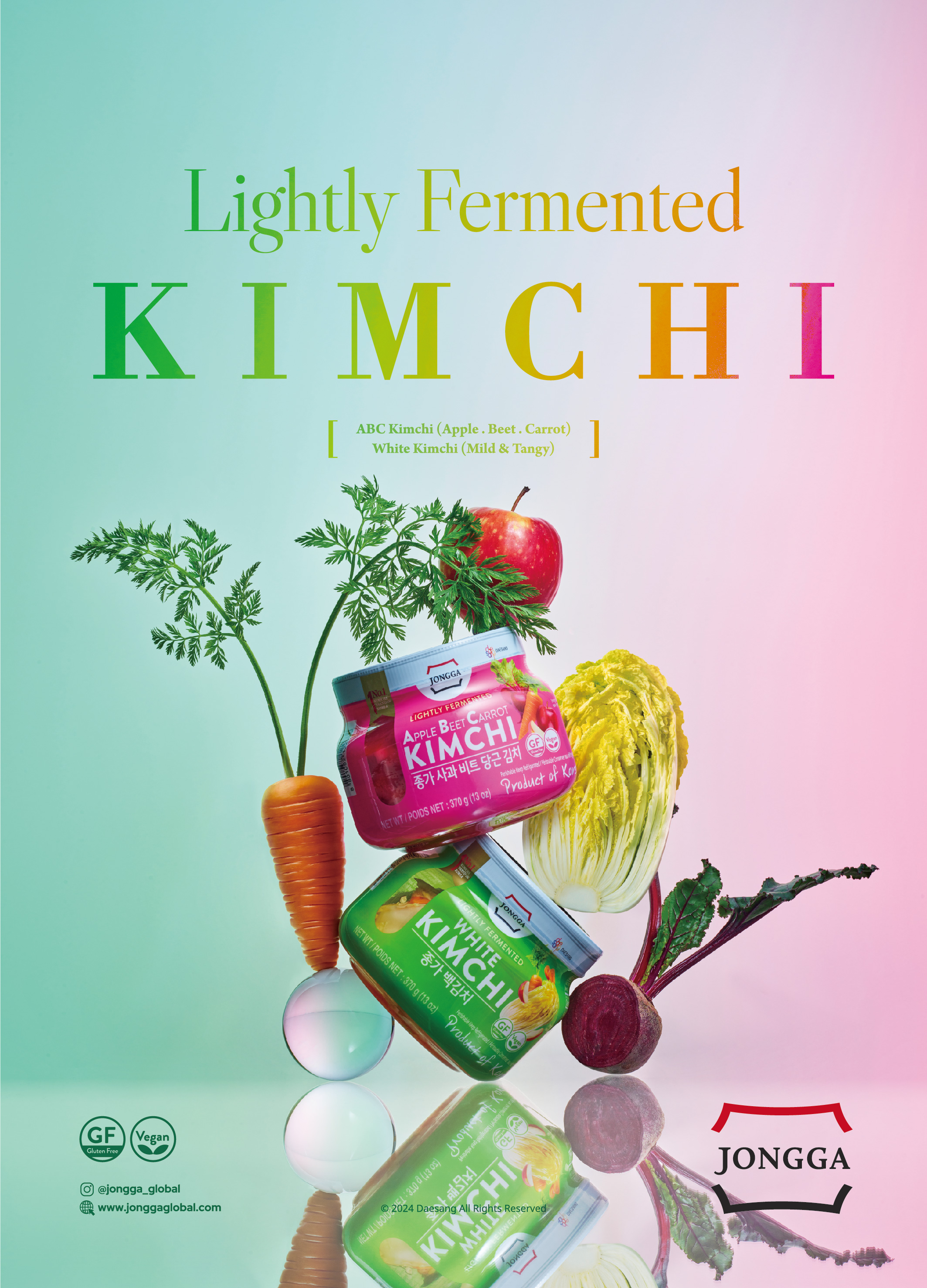
JONGGA Lightly Fermented Kimchi
Daesang Co., Ltd.
Korea
No Man is an Island
Yanxu Interior Decoration Co., Ltd.
Chinese Taipei
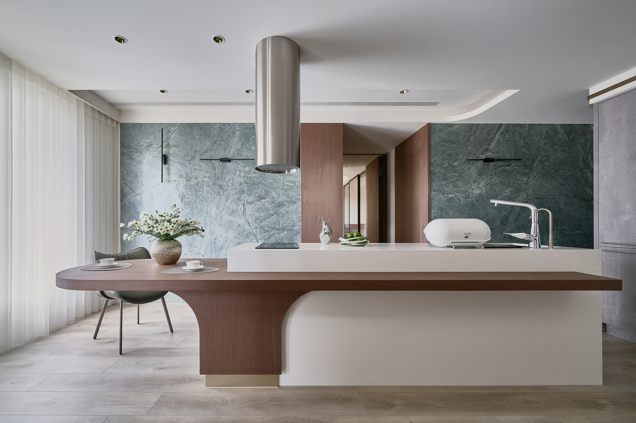
Maple Mont
GS E&C Corp.
Korea
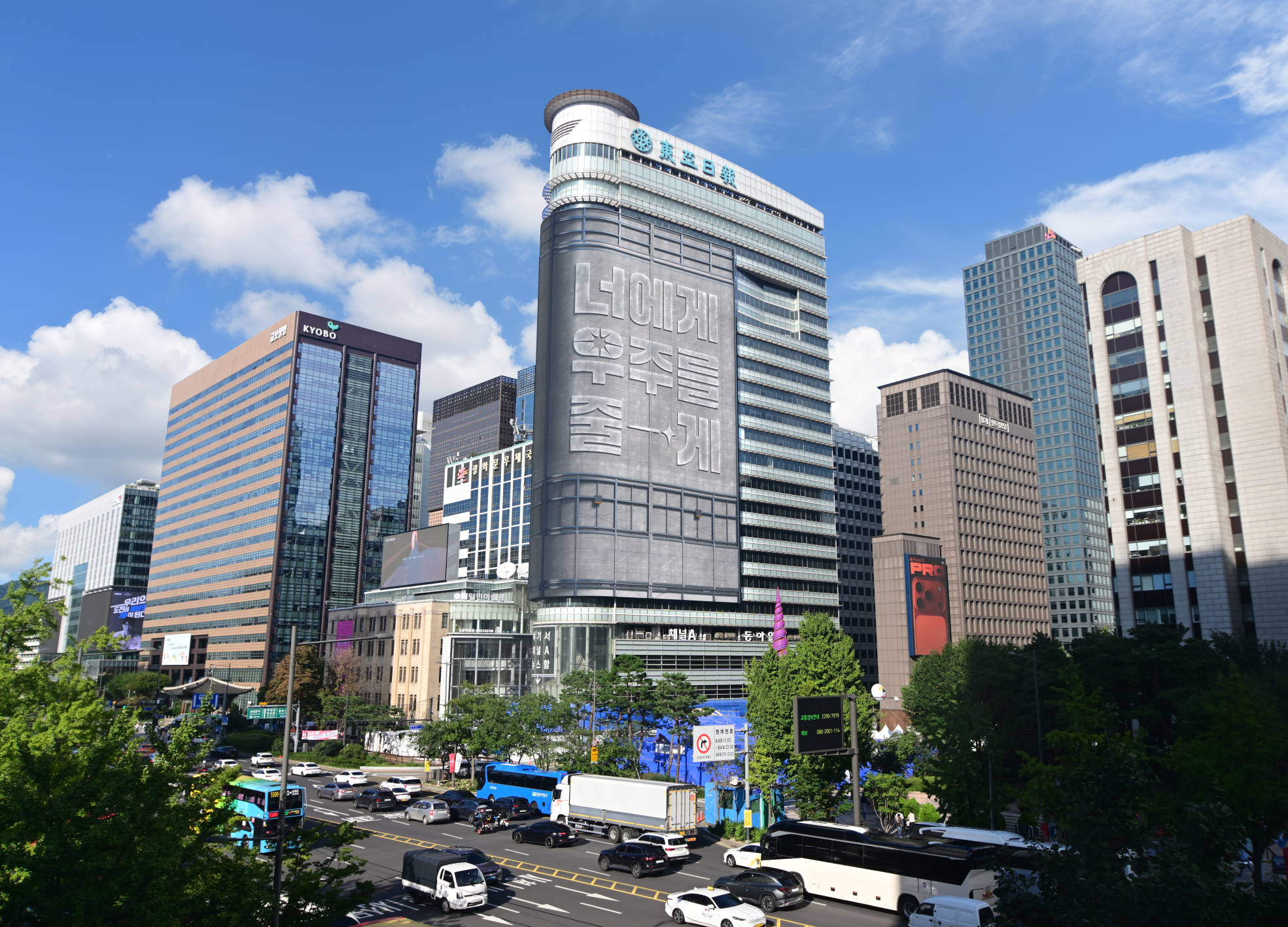
Giving You the Universe
CHANNEL A BNC
Korea
BUD Project
Balloon Inc. Inc.
Japan


Partner & Sponsor
More


info@asiadesignprize.com
#14057, 905 49, Beolmal-ro 102beon-gil,
Dongan-gu, Anyang-si, Gyeonggi-do, Korea
#14057, 905 49, Beolmal-ro 102beon-gil,
Dongan-gu, Anyang-si, Gyeonggi-do, Korea
Founder: Doyoung Kim
Business Registration Number: 454-86-01044
Online Sales License No.: 2021-Anyang Dongan-1081
Copyright © DESIGNSORI Co., Ltd.
Business Registration Number: 454-86-01044
Online Sales License No.: 2021-Anyang Dongan-1081
Copyright © DESIGNSORI Co., Ltd.
